




- Words
- Olivia Hingley
- —
- Date
- 16 September 2024
- Tags
An expansive and expressive brand refresh marks a more “flexible” Figma
To encompass a vastly changed brand and broader audience, Figma’s in-house design team have moved toward a more diverse graphic language – and moved away from cursors.
Share
Share
A lot can change in five years, something the folk at Figma know all too well. Back in 2019 when Figma last refreshed its identity, things looked very different for the brand. It was a single product company, focused at one specific audience: designers. Now, Figma has matured and evolved drastically. It offers multiple products and has run the massive Config conference since 2020, in the process becoming a leading name in the creative industry. Such a shift has meant that the people who use Figma everyday has changed; now, only a third of its users identify as a ‘designer’. Obviously, this meant that the brand was in need of a pretty significant change in the way it presented itself, but how do you begin to encapsulate such momentous changes? Damien Correll, creative director at Figma who has spent the last year leading the brand’s in-house refresh, tells all.
Sitting at the core of the concept is a new brand idea: ‘build by design’. Short and sweet, the idea reinstates that design is more than just a skill, department or process, it’s the “gravitational centre” of the brand. Three brand beliefs come from this idea: ‘design is everyone’s business’, which speaks to the flexibility and broad nature of design, while the second, ‘craft as a differentiator’, centres on the care and attention to detail that Figma propagates. “This belief speaks to that builder, that tinkerer, the self-selecting individuals that care deeply... craft is the convergence of both purpose and pride,” says Damien. And, the third and final belief is ‘the idea is just the beginning’. “It speaks to that drive in all of us,” says Damien. “I mean, having that bold, wild, audacious idea that’s just the start, you shouldn’t be satisfied with that. You should want to build it.”
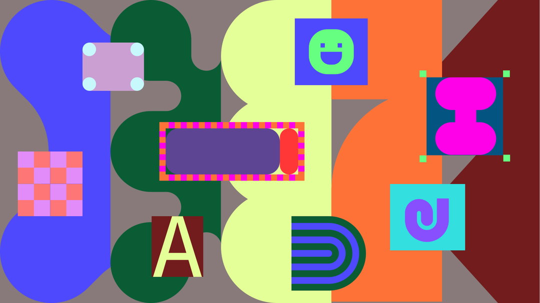
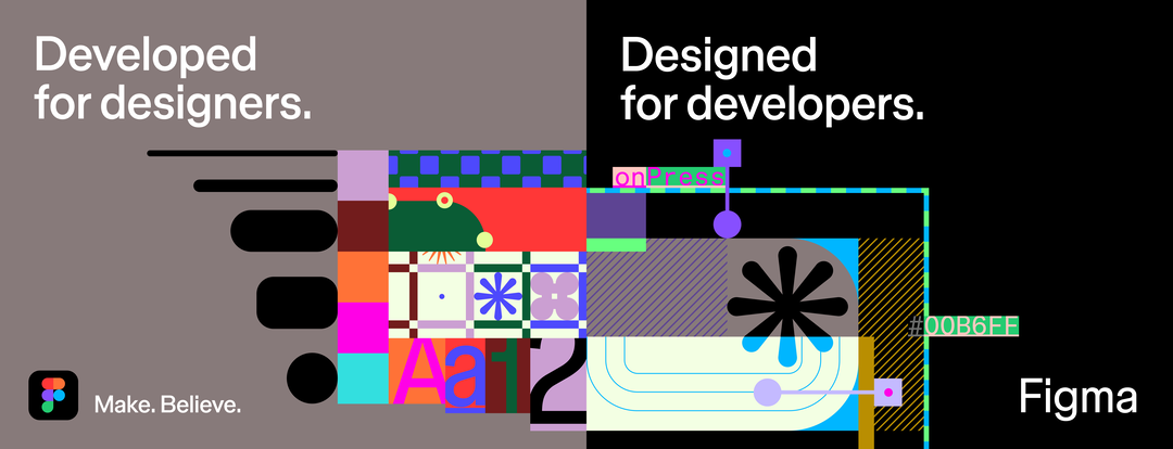
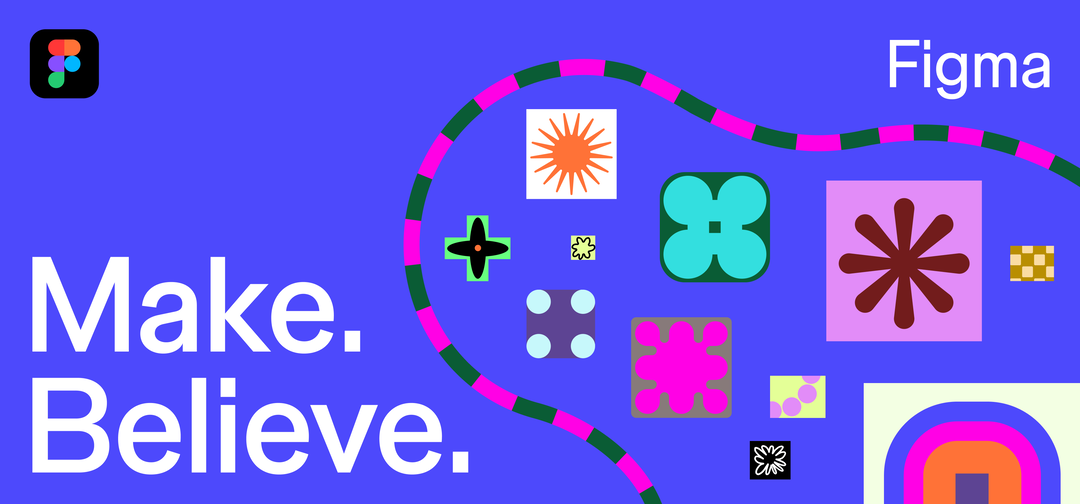
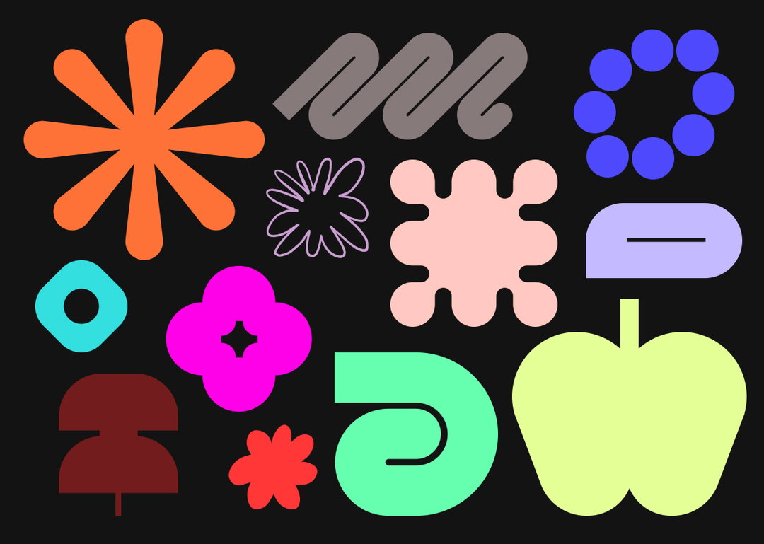
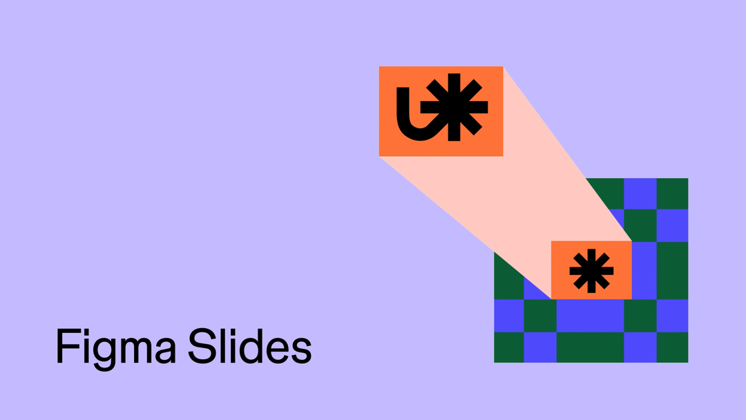
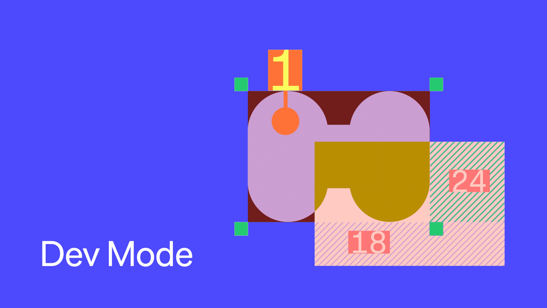
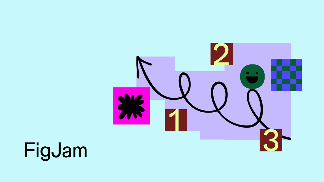
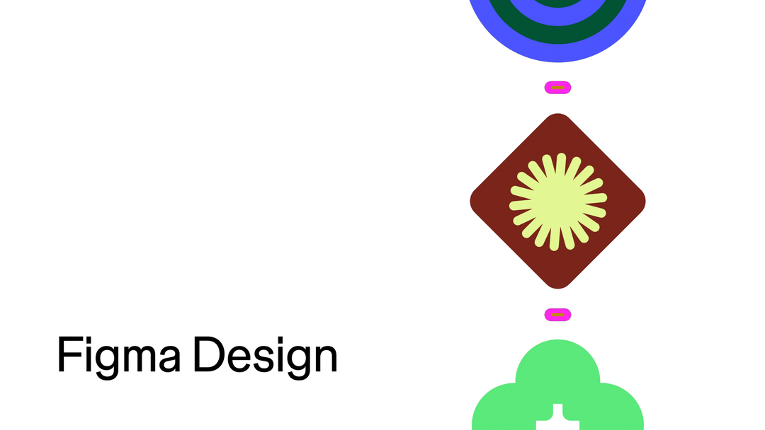
At first glance, one of the biggest changes is the incorporation of a broad range of illustrated graphics. While Figma’s previous look focused more on “basic geometry” – static, with black fine lines and block colour – this new look leans into a more diverse range of visuals. To create the various shapes, forms and icons that bounce around the grid – sparks, interlocking grids, smiley faces, letters and dots, to name a few – numerous rendering techniques were used, leading with an abstracted approach the visuals are meant to imply, rather than explicitly tell. Moreover, the range of styles is also a clever nod to the broader usership of Figma and the many hands that make up a project. If you were at Config, or have seen anything from the event, you might note some similarities between the brand refresh, and the playful abstract patterns that made up the conference’s type and visuals.
While leaning into this more free-flowing, abstract image-making, it still took a very “principled approach” to realise the illustrations, says Damien. A big focus was how each individual visual could play a role in storytelling; how can it represent (even if abstractly) what Figma does best? This means that each is brought to life via motion design, translating an activity, or behaviour that exists within Figma. Icons stretch, rotate and change shape, all reflecting the many stages and iterations an idea goes through in creative process, from the spark of ideation, the orderliness of the design process, and the schematic of the final build. “This kind of interactive dynamism is something we didn’t have in our previous visual language,” says Damien. Now, this motion allows to more accurately translate the vast potentials Figma offers.
Figma: Brand refresh (Copyright © Figma, 2024)

Figma: Brand refresh (Copyright © Figma, 2024)
Figma: Brand refresh (Copyright © Figma, 2024)
One thing you may notice you’re seeing a lot less of in this brand refresh is cursors – and it’s a very deliberate move. They’ll still feature when they’re explaining or launching a new feature, but in day-to-day visuals, they’re out. It’s an interesting choice, as being the inventors of FigJam and pioneering online collaboration, Figma kind of started the whole including cursors in your look. But the move has two clear reasons. Firstly, it was an exercise in constraint – “designers love constraints, right?”, says Damien. Like the more abstract graphics, he and the team wanted to see if they could tell the story of collaboration without the signifying iconography. What’s more, this helps the brand to lean into more of that behavioural element “like how one might manipulate something, or how someone might transform something, instead of just paying attention to the stimulated UI”, says Damien. Secondly, it’s a point of differentiation. In recent years, the team had seen more and more cursors floating about on many other websites. “While Figma pioneered multiplayer, and we do think it’s a really important part of our history, we don’t want to be stuck in the cursor zone,” says Damien.
Figma: Brand refresh (Copyright © Figma, 2024)
1 of 4
Figma: Brand refresh (Copyright © Figma, 2024)
1 of 4
Figma: Brand refresh (Copyright © Figma, 2024)
Type has also seen a big upheaval, seeing the brand go from an “off-the-shelf” type to a custom, Figma Sans. The team clearly have a lot of love for Dinamo’s Whyte, which has “served them well” since 2019, but in the refresh they sought something that could really “rationalise” their typographic palette as well as tightening it up, says Damien. Figma Sans has been designed by Swiss American foundry Grilli Type; the type is easy to use and apply, while still having that expressive edge, and it is also variable, flipping into a mono space which further adds to the ‘in-build’ feel of the whole identity. This legibility and simplicity was important, especially when it comes to the wordmark, to ensure it wasn’t “competing” with the bold and colourful graphic world it would eventually sit alongside, and was also incorporating well into newer aspects of the Figma offering, like its editorial website. To account for this new injection of colour, the wordmark’s palette has become more understated and harmonious or, in Damien’s words “buttoned up”.
If Damien were to summarise the thinking behind the whole refresh in one word, it would be “flexibility”. He continues: “We tried to create something highly flexible that allowed us to not only live in it today, but in five years not to be like ‘ok, we need to refresh the brand’.” The whole system – and its focal point of visual variation combined with typographic applicability – was created to allow for change, and hopefully, in another five years, to not feel out of date or not relevant enough. This idea of relevancy was also a major driver; despite the growth of Figma in recent years, resting on their laurels would be a dangerous game. “Relevancy is never a fixed thing, and it’s something that we need to keep working out,” says Damien.
The new rebrand launches today with a massive campaign that runs from highway 101 to New York’s Times Square.
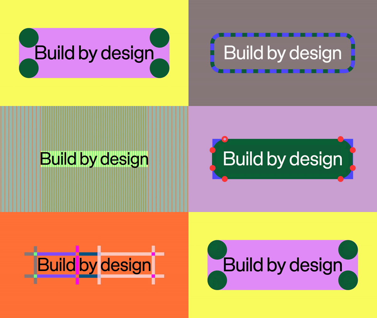
Figma: Brand refresh (Copyright © Figma, 2024)
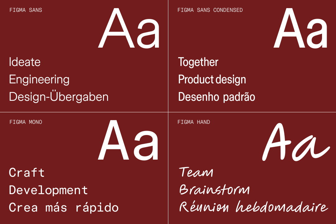
Figma: Brand refresh (Copyright © Figma, 2024)
Figma: Brand refresh (Copyright © Figma, 2024)
Figma: Brand refresh (Copyright © Figma, 2024)
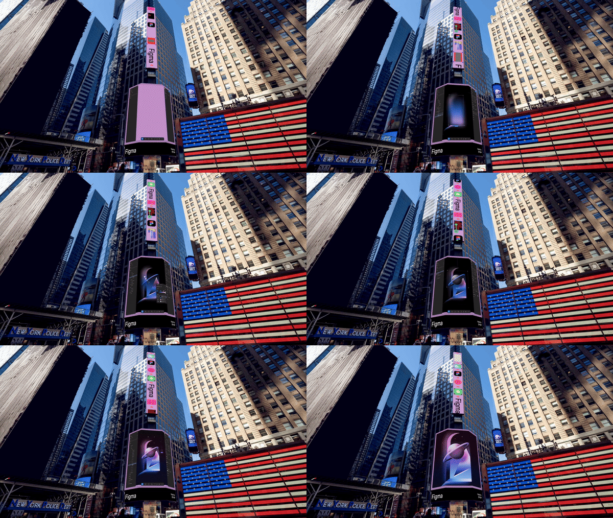
Figma: Brand refresh (Copyright © Figma, 2024)
Figma: Brand refresh (Copyright © Figma, 2024)
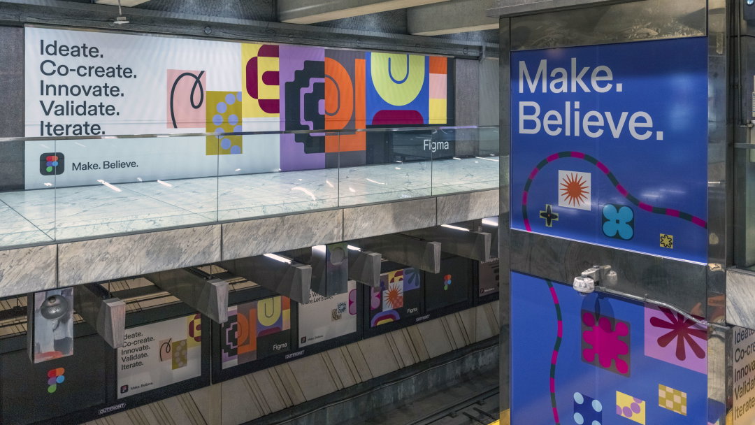
Figma: Brand refresh (Copyright © Figma, 2024)
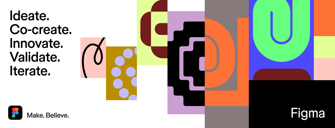
Figma: Brand refresh (Copyright © Figma, 2024)
Hero Header
Figma: Brand Refresh (Copyright © Figma, 2024)
Share Article
Further Info
About the Author
—
Olivia (she/her) is associate editor of the website, overseeing the day-to-day editorial projects as well as Nicer Tuesdays events. She joined the It’s Nice That team in 2021. ofh@itsnicethat.com
To submit your work to be featured on the site, see our Submissions Guide.





