- Words
- Elizabeth Goodspeed
- —
- Date
- 28 October 2026
- Tags
Exactly how Apple Music used sound to build its new brand identity
For its rebrand of Apple Music, TBWA\Media Arts Lab set out to visualise sound. The result involved months of experimentation, a surprising amount of oil, and a renewed appreciation for showing your workings.
Share
Share
It’s recently come to my attention that I have the television taste of someone almost three times my age. My preferred comfort watch is Antiques Roadshow (whose US advertisers include the AARP and American Cruise Lines), closely followed by Monty Don’s Gardener’s World. But, for whatever reason, I’ve found myself watching a lot more of another nostalgic old person show in the past year: How It’s Made. There’s something undeniably satisfying about seeing how the everyday objects in your life are created from scratch; who wouldn’t want to see a behind-the-scenes for peanut butter, aluminum cans, kayaks, and computer chips all in one tidy half hour? I suspect there’s another reason I’ve recently been succumbing to clips of gummy worms being extruded: the rise of AI.
“What would happen to liquid glass if we injected it with sound?”
James Taylor
As the line between real and faux becomes increasingly difficult to discern, knowing how something was made has become more important than ever. The story of how a poster, website, or brand identity was made now feels almost as salient as the finished product. People want to know that there was an idea behind the work, and that producing that idea took some effort (see also: the rise of people faking handicraft). If How It’s Made satisfies our curiosity about how things happen, behind-the-scenes content now satisfies a growing desire to know that something actually happened at all.
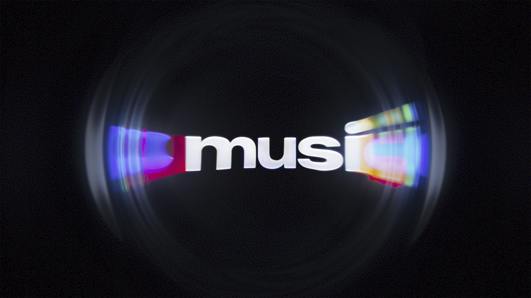
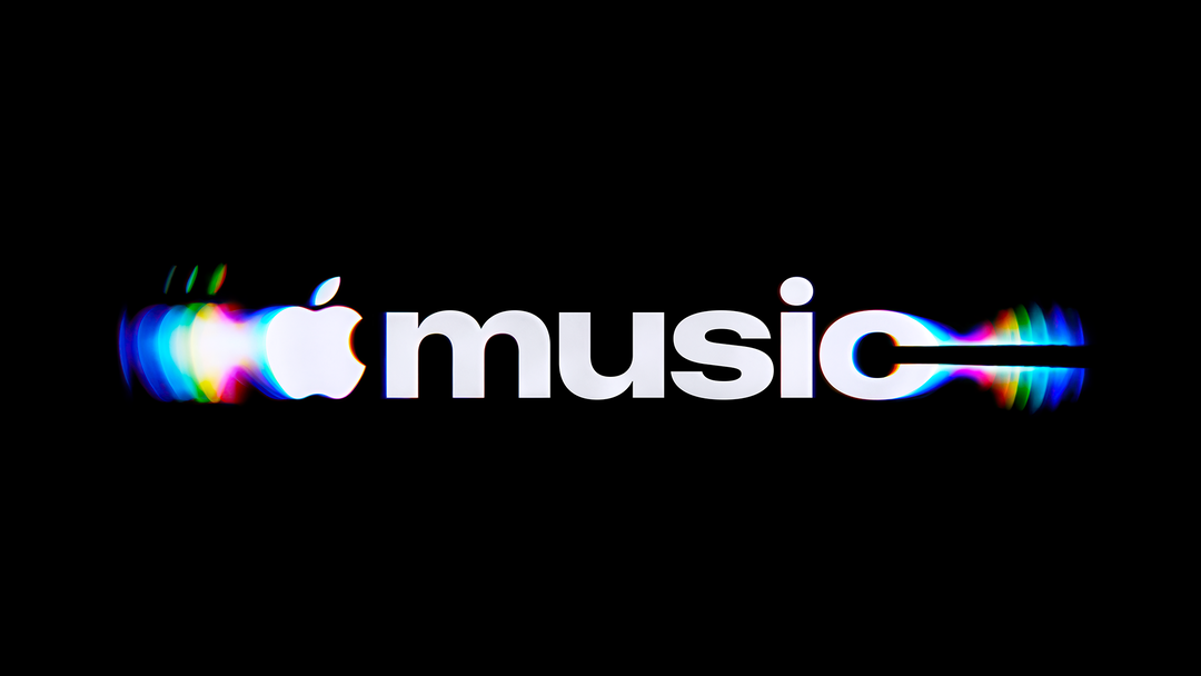
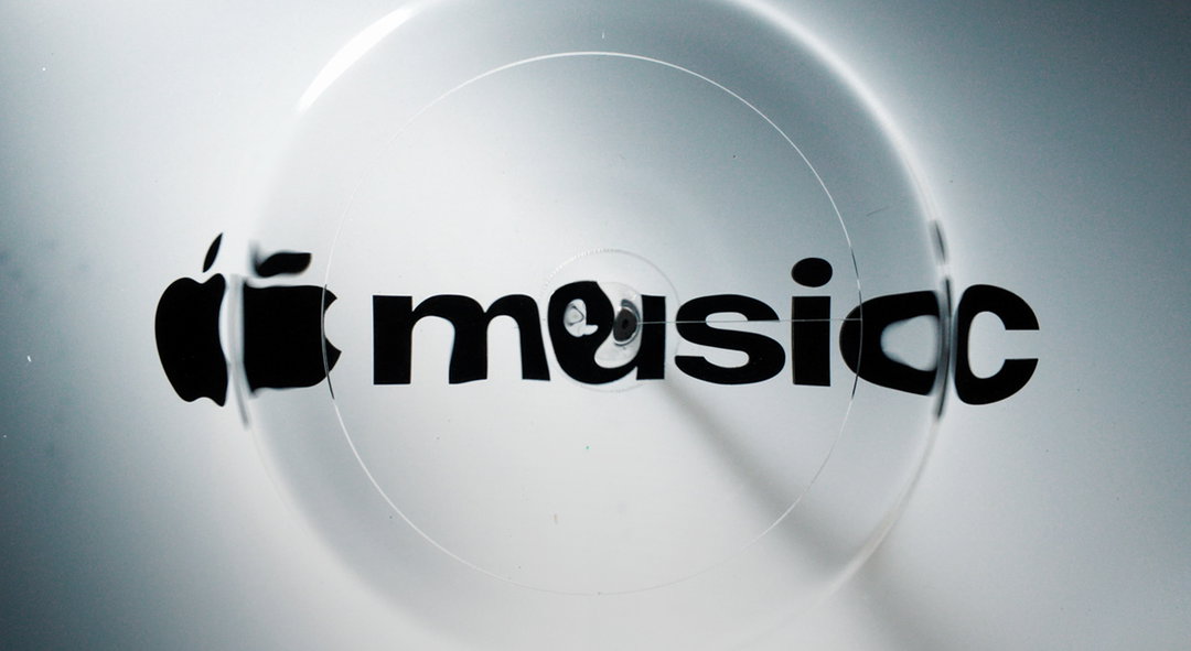
This brings me to Apple Music. The streaming service recently unveiled a new visual identity developed by creative agency TBWA\Media Arts Lab, accompanied by a behind-the-scenes film that makes an unusually compelling case for watching how a brand identity gets made. As it turns out, the rippling, refractive visuals weren't just animated to look like they were responding to music. They were actually made by real sounds (alongside a physical process that involved months of experimentation and rather elaborate machinery).
For James Taylor, global head of design at Media Arts Lab (MAL), the idea behind the refreshed Apple Music identity was a simple one: “to put the music back in Apple Music.” In looking at the existing brand, James felt that while Apple Music was an exceptional product – well-considered and unmistakably Apple – something of its musical character had been lost. “It felt like technology, but how do we make it feel like music again?” he says. So, about a year ago, he posed this identity’s now-key question to his team: “What if Apple Music could be actually made by music?”
The idea of making music visible wasn’t entirely new territory for Apple, of course. As far back as 2001, iTunes’ iconic visualisers could generate swirling, colourful animations in response to whatever song was playing. But MAL’s current ambition was a bit more meta: rather than simply translating sound into a visual, the hope was to actually use music itself to create a physical image in the world.
TBWA\Media Arts Lab: Apple Music rebrand (Copyright © Apple, 2026)
TBWA\Media Arts Lab: Apple Music rebrand (Copyright © Apple, 2026)
“We would test cadences and compositions of notes that sounded great and find that the visuals looked terrible.”
James Taylor
The group began by prototyping ideas using CG and animation, exploring how sound waves and ripples might translate into a visual language. But another challenge soon emerged: how to make the result feel distinctly Apple, and specifically Apple right now. The company had, after all, just introduced Liquid Glass, a new design language built around translucent, refractive surfaces. So the question evolved from simply what if the identity were made by music? to something more specific: “What would happen to liquid glass if we injected it with sound?” James recalls asking.
MAL brought this question to Optical Arts, the production studio it had previously collaborated with on the Apple TV identity (another project by MAL that made extensive use of practical effects). As it happened, Optical Arts had already been conducting its own experiments with sound. No surprise; James describes them as “an innovation house – tinkerers”. The studio proposed using liquid, specifically oil, to make the sound visible – a material that, while novel for Apple Music, has a long history in live music visuals, from the psychedelic “Liquid Light” shows of the 1960s to DIY gigs today. Making the oil respond to sound in precisely the way they wanted, however, would require months of experimentation, custom-built machinery, and even purpose-made software.
TBWA\Media Arts Lab: Apple Music rebrand (Copyright © Apple, 2026)
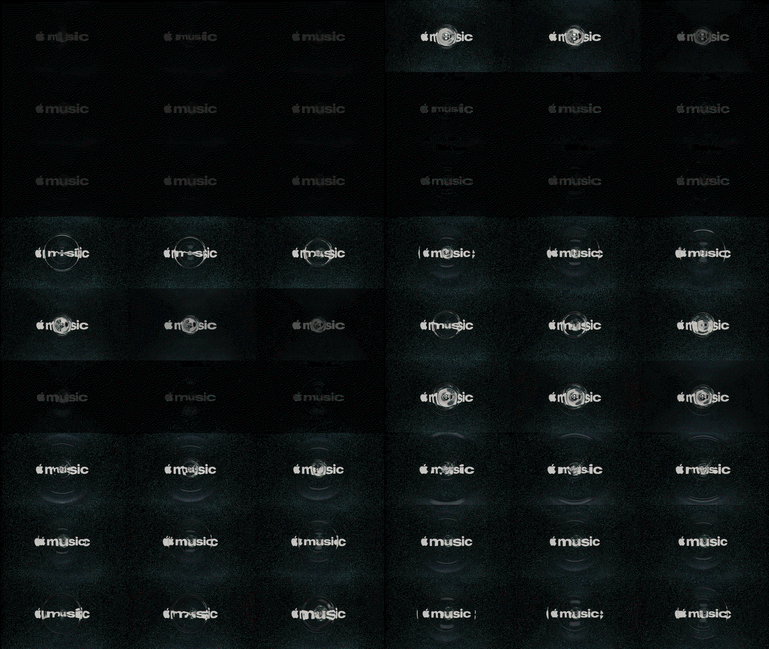
TBWA\Media Arts Lab: Apple Music rebrand (Copyright © Apple, 2026)
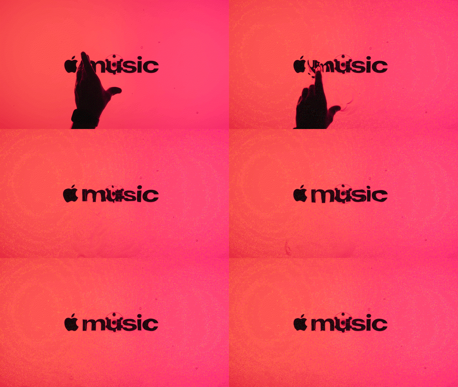
TBWA\Media Arts Lab: Apple Music rebrand (Copyright © Apple, 2026)
The first order of business was figuring out what kind of oil would actually work. Optical Arts experimented with oils of different viscosities, looking for a liquid responsive enough to move with sound, but thick enough that its surface wouldn’t immediately break into waves. “There was a time where we couldn’t get it to work,” James admits. Over roughly eight to ten weeks of research and development (R&D to the real ones), Optical Arts tested different formulations and developed a custom apparatus capable of translating sound into controlled movement. “We had to invent machinery and software to make it happen. It wasn’t anything off the shelf,” James says. “I didn’t even realise this until we were on set for the shoot,” he says, “but Optical Arts had completely vibe coded this whole piece of software to take musical notes, reduce them down to sine waves, then program those sine waves into this machine.”
Getting the oil to move as intended was one thing. Getting it to move in a way that looked good was another entirely. During their R&D phase, MAL quickly found that playing too many notes at once would result in a frothy mess, and beautiful chords did not produce beautiful visuals. “We would test cadences of notes and compositions of notes that sounded great and find that the visuals looked terrible,” James recalls. This led to a new approach: instead of starting with a pretty tune and seeing what it looked like, the team started from a visual effect they liked and worked backwards to see what notes produced it.
“There were times where we could have cheated and we didn’t.”
James Taylor
At first, sound was only ever intended to generate visuals, not necessarily to be heard as part of the finished identity. “When we started originally, we only wanted music to make the visuals,” James explains. “And then I thought, ‘What if it also sounded good?’” Once the team knew which notes would produce the desired waves, those notes became the ingredients for a sonic signature. Musician Fred Again and sound studio NEST Acoustics were tasked with turning this limited musical palette into a sonic logo for Apple Music. James notes that these narrow constraints were exactly what led Fred to say yes to the project: “He told us ‘I want to do this because this is hard.’”
The final Apple Music animation is made from more than a hundred individually shot frames composited together. “There were times where we could have cheated and we didn’t,” James says. This commitment to authenticity, and focus on process, is also reflected in how the identity was launched. In addition to sharing the core identity applications themselves, MAL and Apple released a behind-the-scenes film that shows what it took to make the final image: the rig within a giant warehouse, on-screen sound-waves, and many hands around glass, oil, and plexi.
This is a notable degree of transparency for a studio whose visual output is often presented with little explanation of its authorship (and whose existence itself is a bit of inside knowledge to begin with; MAL’s own website features no case studies, and most of its work is broadly attributed simply to Apple, despite it being its own separate entity). James describes MAL as being quite “surgical” when it comes to deciding whether to show any kind of process work, explaining that “when there is a real story to tell,” it’s important to share it. Given the current state of technology, he adds that “people are looking for more reasons to believe in what we’re doing, and trust what we’re doing.”
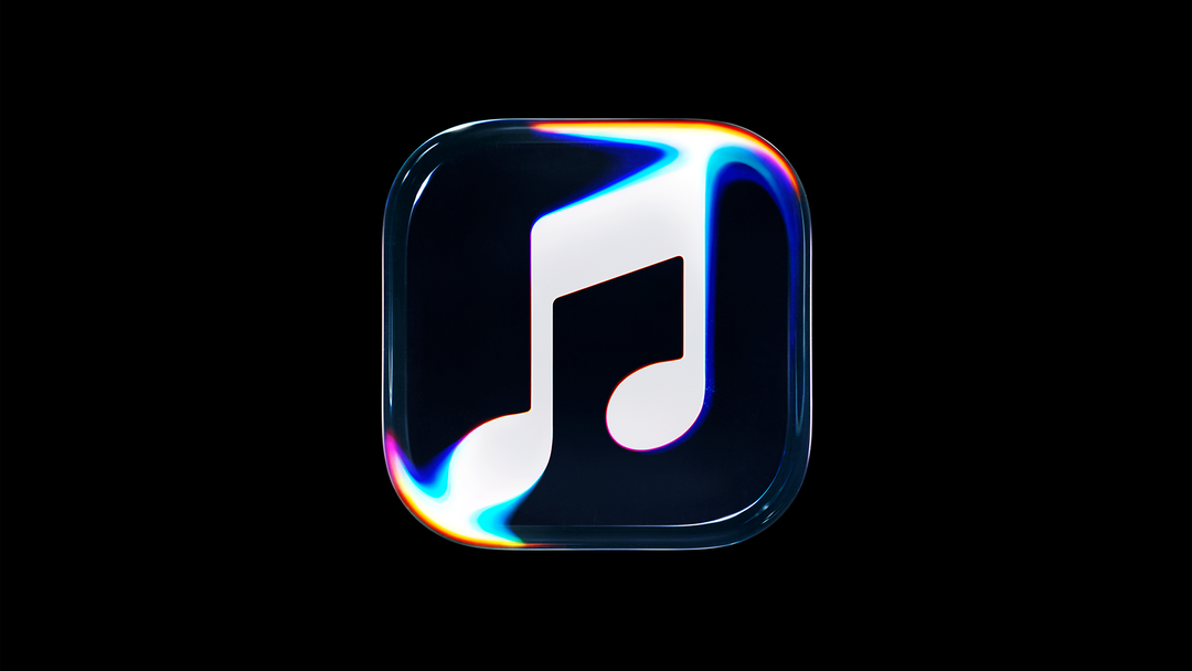
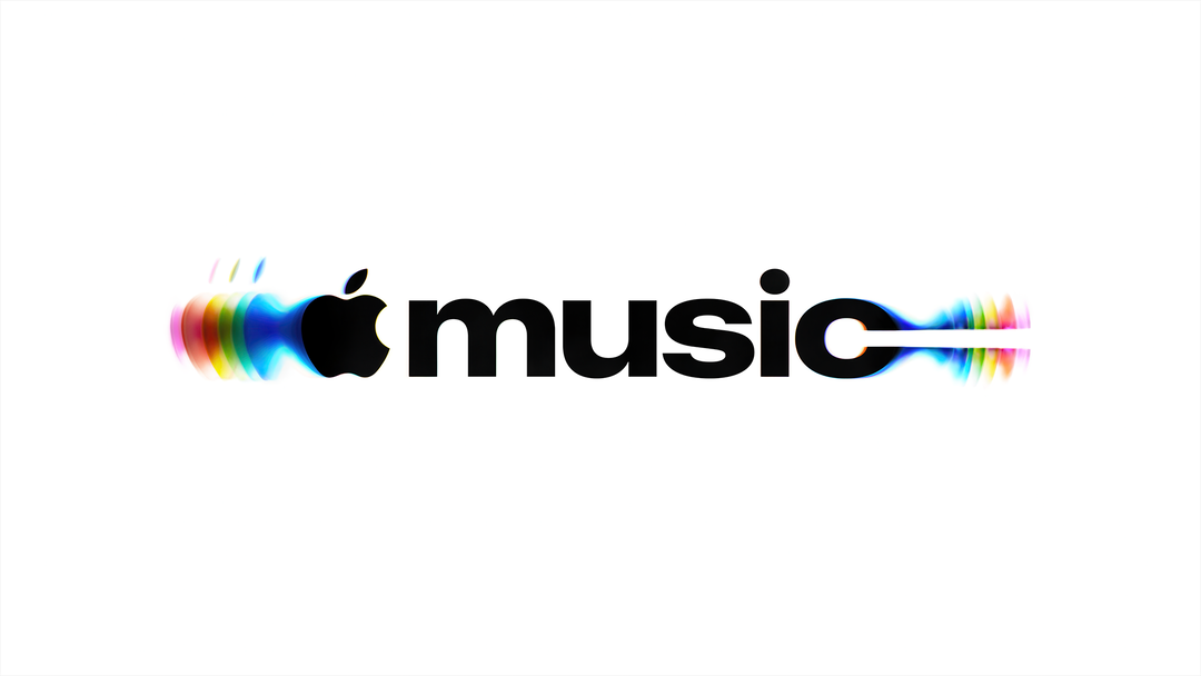
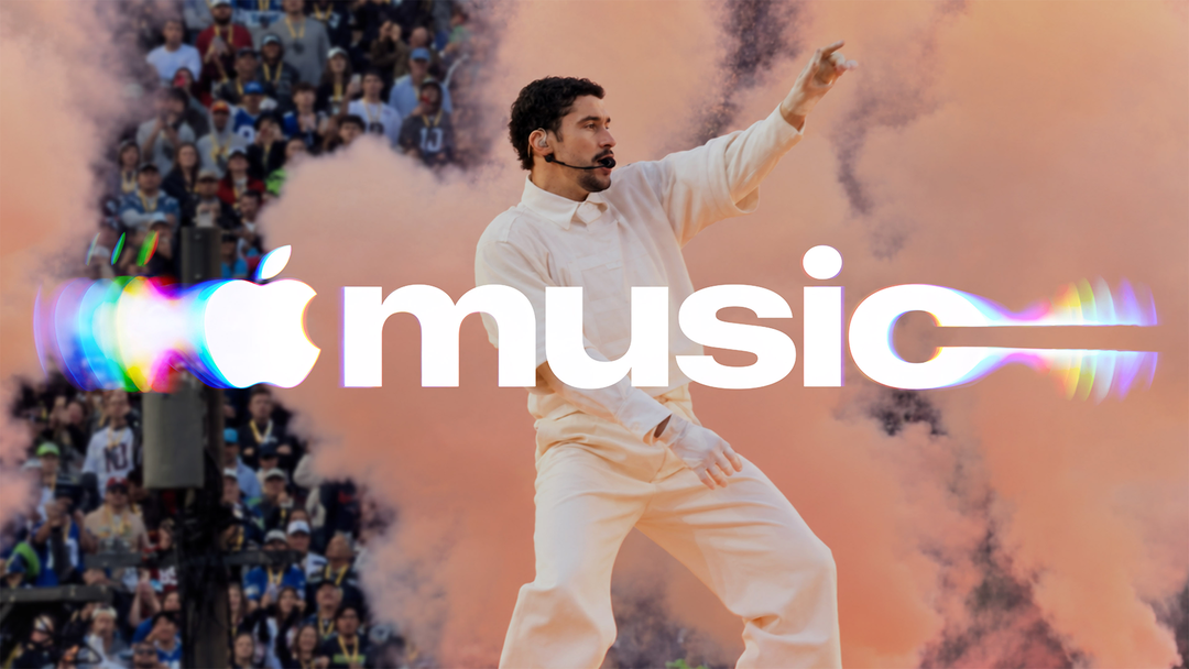
Making a good behind-the-scenes film is one thing; MAL still had to figure out how to translate its innovative ripple effect into a practical, flexible visual system built for everyday use. To do this, the team developed six or seven variations of the ripple effect, each designed around a different Apple Music feature: AutoMix, Spatial Audio, Lossless Audio, etc. For example, AutoMix, a feature that automatically mixes one song into the next, uses a glass treatment that makes one image appear to transition into another through transparency, echoing the effect of a DJ mixing tracks. These treatments are designed to work in both moving and static applications; as James describes it, the goal was for everything to feel alive, so that “even when it’s static, it should feel like it’s affected by music.” In still photographs, then, refracted and displaced elements suggest the movement of the oil, even without any actual animation.
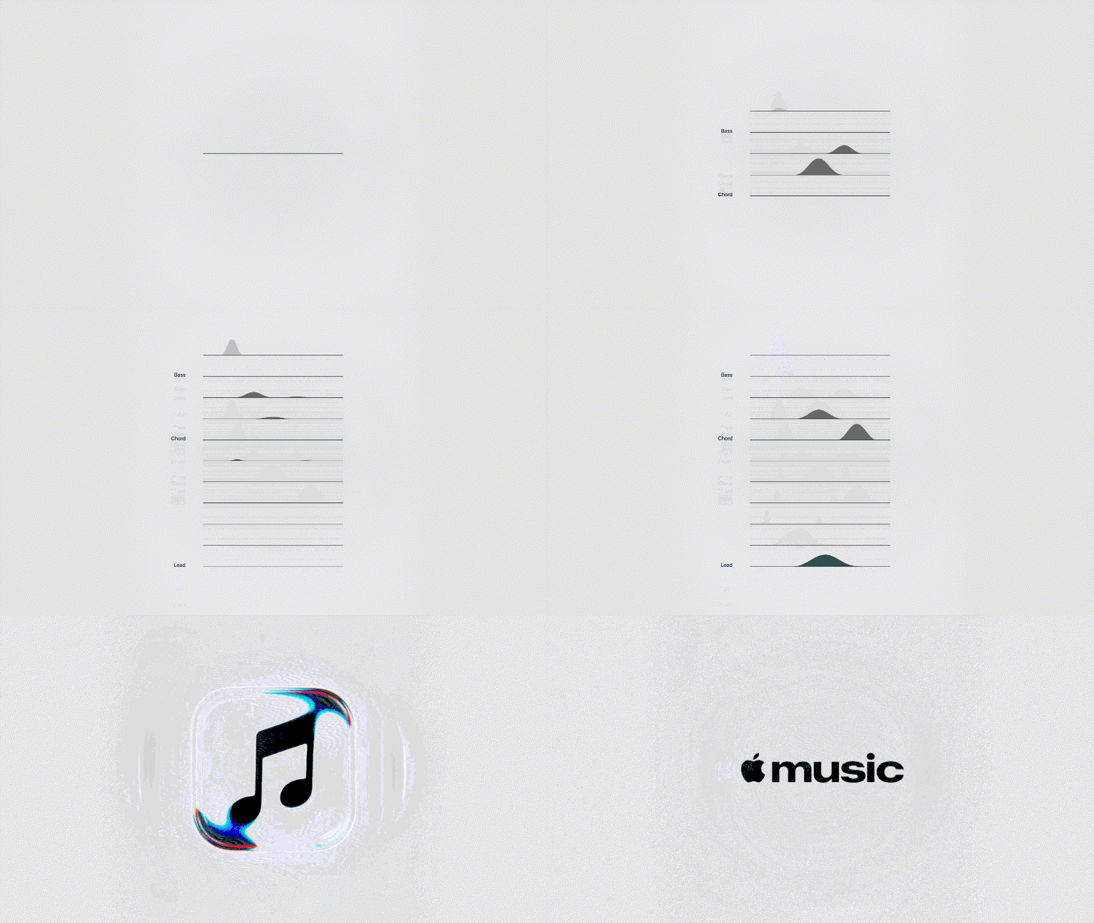
TBWA\Media Arts Lab: Apple Music rebrand (Copyright © Apple, 2026)
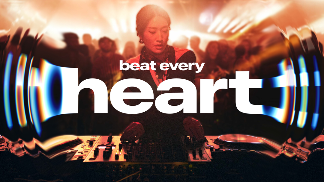
TBWA\Media Arts Lab: Apple Music rebrand (Copyright © Apple, 2026)
“A finished image in 2026, after all, reveals very little about how it came to exist.”
Elizabeth Goodspeed
In contrast to the newer, splashier (ha ha) visual effects of Apple Music, the typography is a pleasantly utilitarian extension of Apple’s existing visual language. The new wordmark uses the expected SF Pro, Apple’s proprietary typeface, taking advantage of the family’s now-expanded range of weights and widths to give Apple Music a more youthful, energetic personality while still maintaining a connection to its parent brand. Notably, the new lettering is wider, rather than more condensed – an idiosyncratic choice for a brand that primarily lives on handheld devices, where designers often favour narrower typography to maximise a smaller amount of space. Beyond the letters themselves, James says the team also paid particular attention to how the word “Music” sat alongside the Apple symbol, especially the visual weight of the M, which had previously felt a bit heavy next to the fruit icon. As the brand continues to roll out, James says the same refractive effects seen in the glass imagery will also show up across typographic headlines and other typographic applications.
The new identity is mostly black-and-white – moving away from the prior bright pinkish red – with any colour that does appear emerging from the natural colours seen in the prismatic effects of the oil. When other colours are seen, they come from the artists being featured: “We wanted to let the content drive the colour and the vibrancy,” James says. This approach mirrors MAL’s work for Apple TV and the rest of the Liquid Glass UX world, where a restrained master brand allows individual content to provide much of the visual personality.
For all the thought that’s gone into the finished identity, the making-of video is still the thing James has the most to say about. He says people have described feeling “hopeful and joyful” watching it – something he attributes to a simple fascination with seeing people make things (take note, Science Channel!) A finished image in 2026, after all, reveals very little about how it came to exist. Funnily enough, when I ask why he’s so attached to this secondary asset, he argues that the behind-the-scenes film shouldn’t be considered a secondary asset at all. “They’re primary assets in a way,” he says. “People care that we care.”
TBWA\Media Arts Lab: Apple Music rebrand (Copyright © Apple, 2026)
TBWA\Media Arts Lab: Apple Music rebrand (Copyright © Apple, 2026)
TBWA\Media Arts Lab: Apple Music rebrand (Copyright © Apple, 2026)
Hero Header
TBWA\Media Arts Lab: Apple Music rebrand (Copyright © Apple, 2026)
Share Article
Further Info
About the Author
—
Elizabeth Goodspeed is It’s Nice That’s US editor-at-large, as well as an independent designer, art director, educator and writer. Working between New York and Providence, she’s a devoted generalist, but specialises in idea-driven and historically inspired projects. She’s passionate about lesser-known design history, and regularly researches and writes about various archive and trend-oriented topics. She also publishes Casual Archivist, a design history focused newsletter.