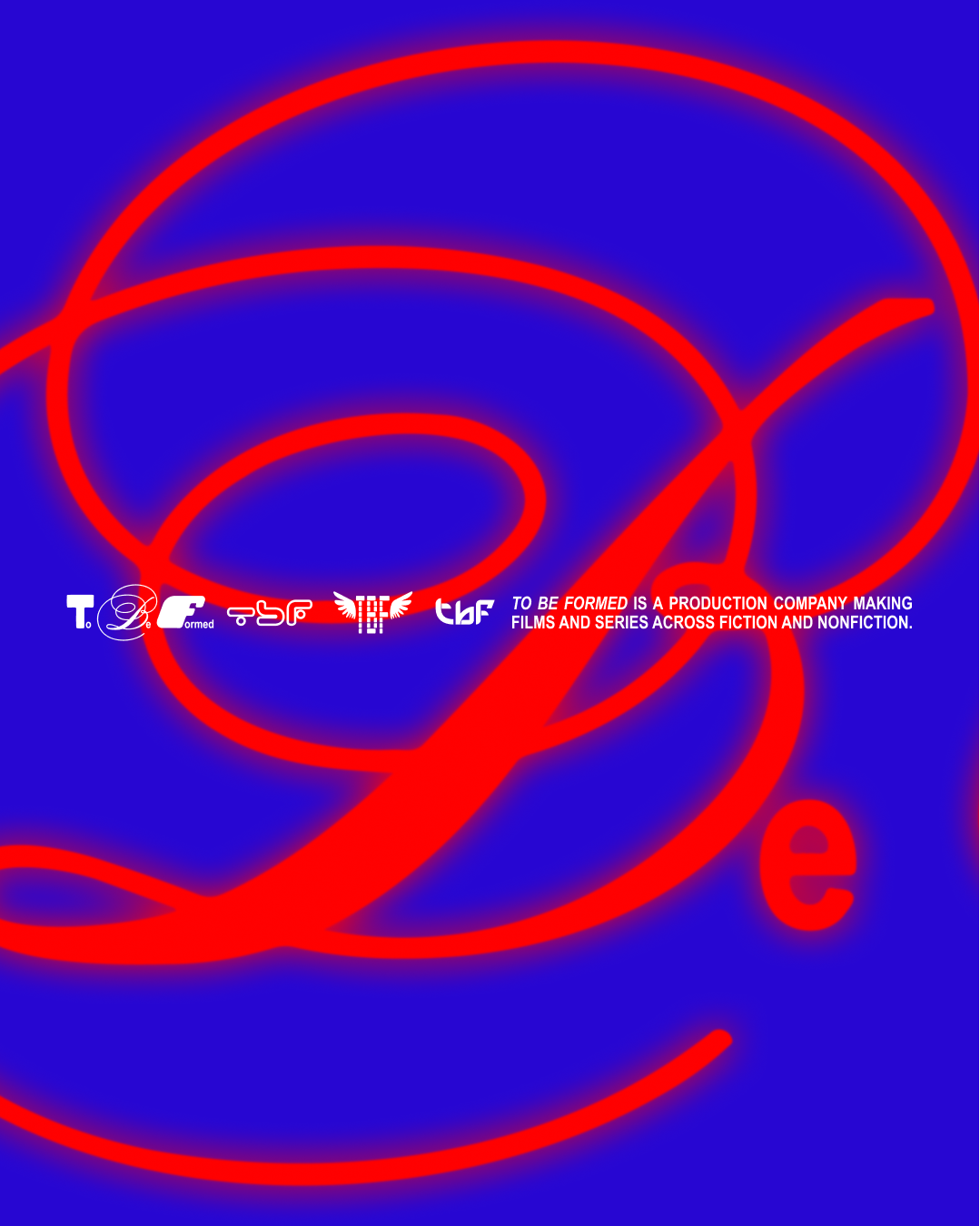
The brand for Lance Oppenheim’s production company has chaos built in
Far from being one singular idea, Day Job’s brand for To Be Formed is the culmination of experimentation and playing with Oppenheim’s irreverent cinematic world.
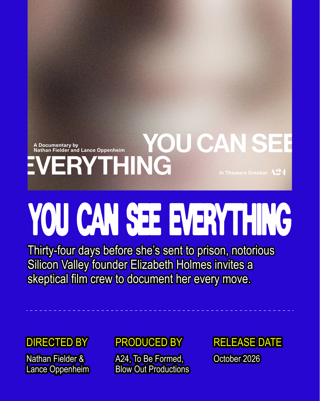
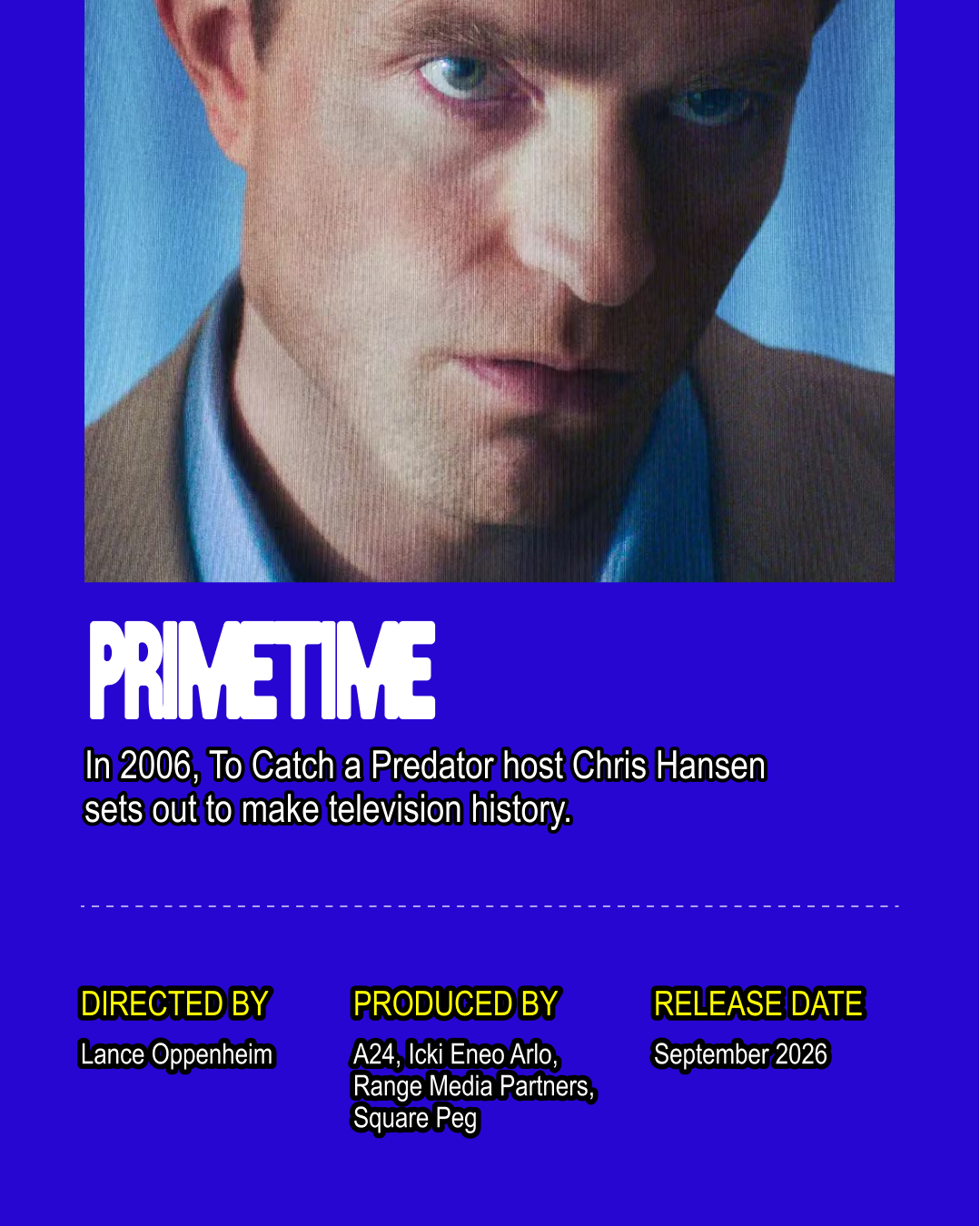
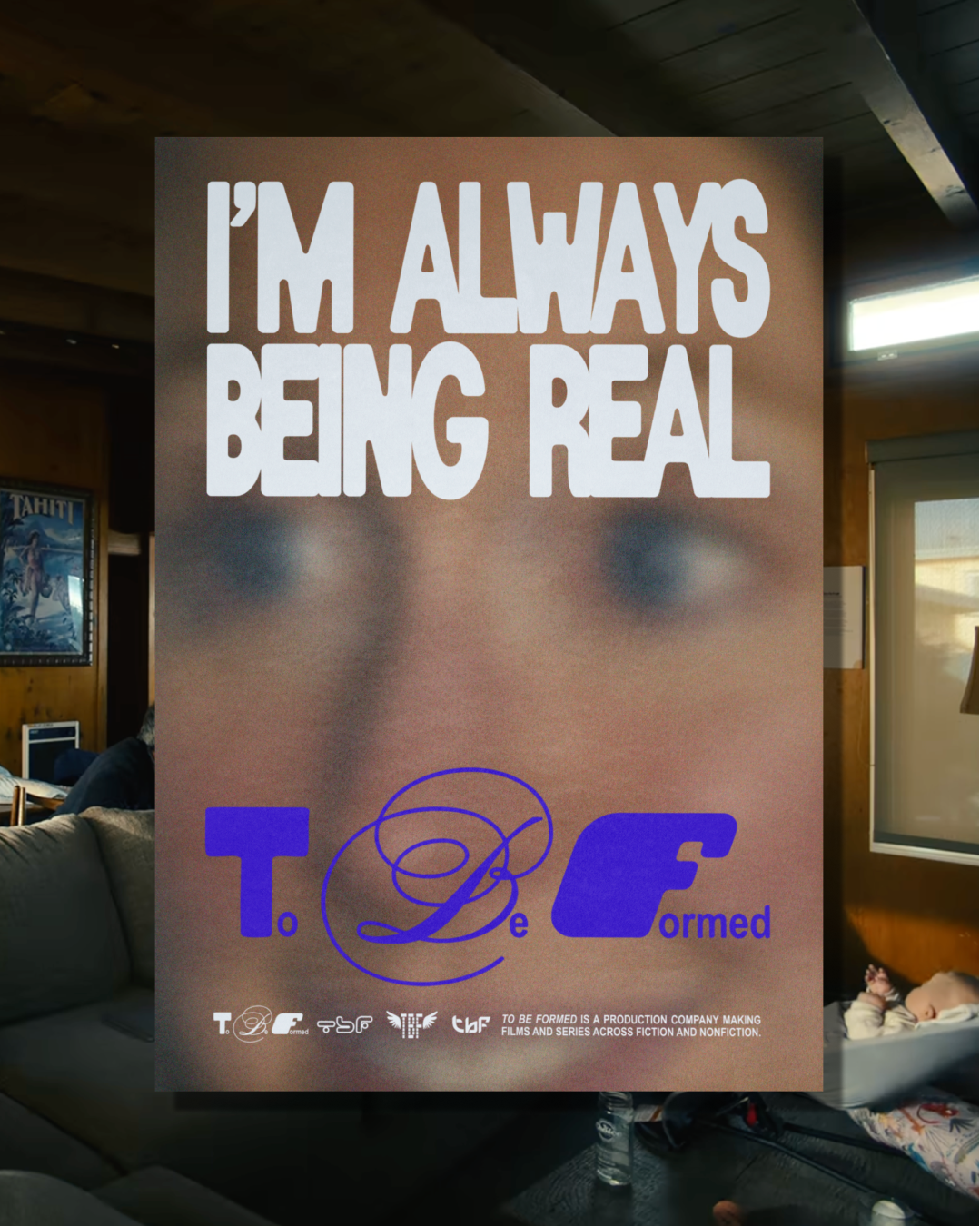
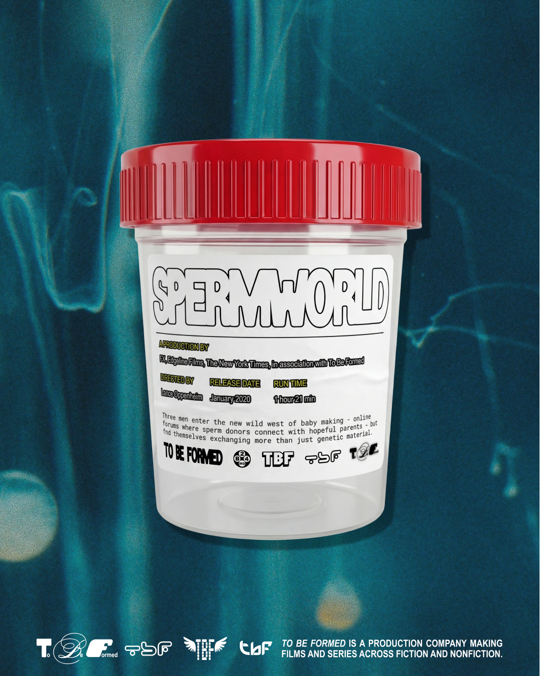
“We spend all day trying to make things interesting,” Rion Harmon tells It’s Nice That. He’s the co-founder of Day Job, an LA-based creative studio that lives up to Rion’s description. One such project is Day Job’s brand for To Be Formed, a production company co-founded by Lance Oppenheim, the renowned filmmaker behind Primetime, You Can See Everything and Phoebe Bridgers’ Lost Boys music video – all of which were released in 2026 alone. Reflecting the oddity and otherworldliness of Lance’s work, To Be Formed’s brand is electric and unconventional, especially for a production company. “We wanted to make something as idiosyncratic as Lance’s work,” Rion says, “something that you can’t quite put your finger on or fully explain.” After all, Lance’s films occupy an unusual area between fiction and non-fiction, “we wanted to play in that liminal space, intentional but also haphazard and odd,” he adds.
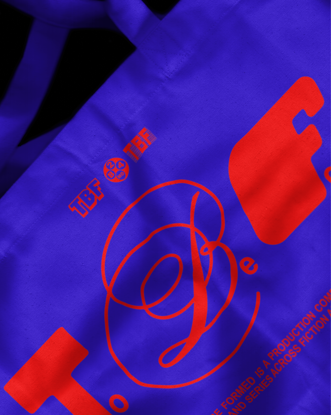
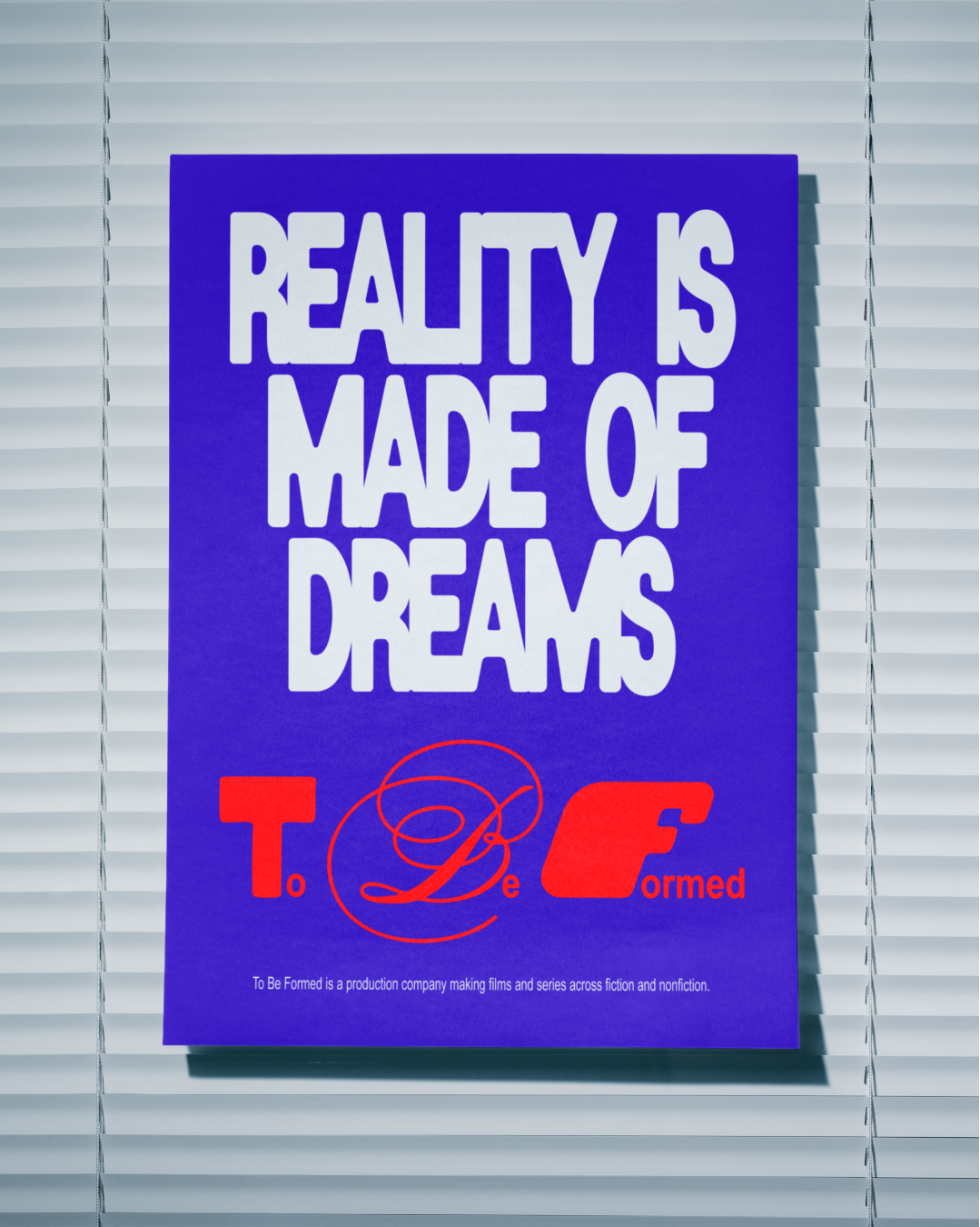
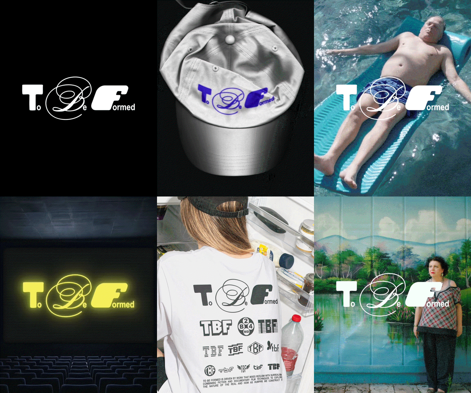
As a result, To Be Formed’s wordmark is florid and formidable – quite unafraid to take up space – and is punctuated with contrast, both contextually next to other production companies, but also within the mark itself. Thick forms sit next to slim calligraphic lettering with varying x-heights, achieving the irreverent, odd vision, which flows across the whole brand. “We looked at all kinds of type and design references from old off-kilter book covers to early 00s DVD menu screens,” Rion recalls, “eventually settling on an identity that encompasses a lot of different ideas and doesn’t feel like one specific thing.”
GalleryDay Job: To Be Formed (Copyright © Day Job, 2026)
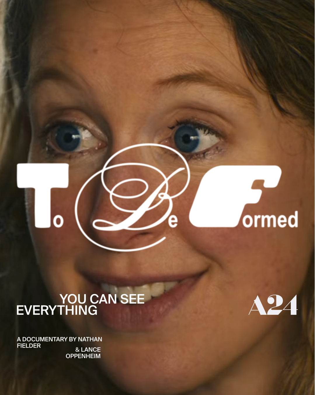
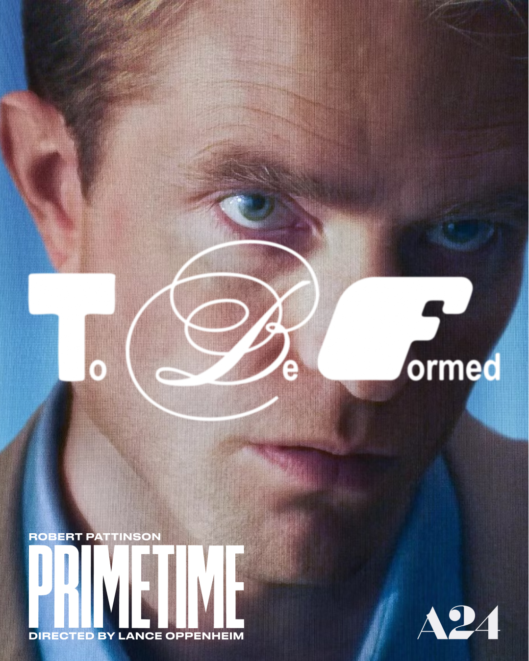
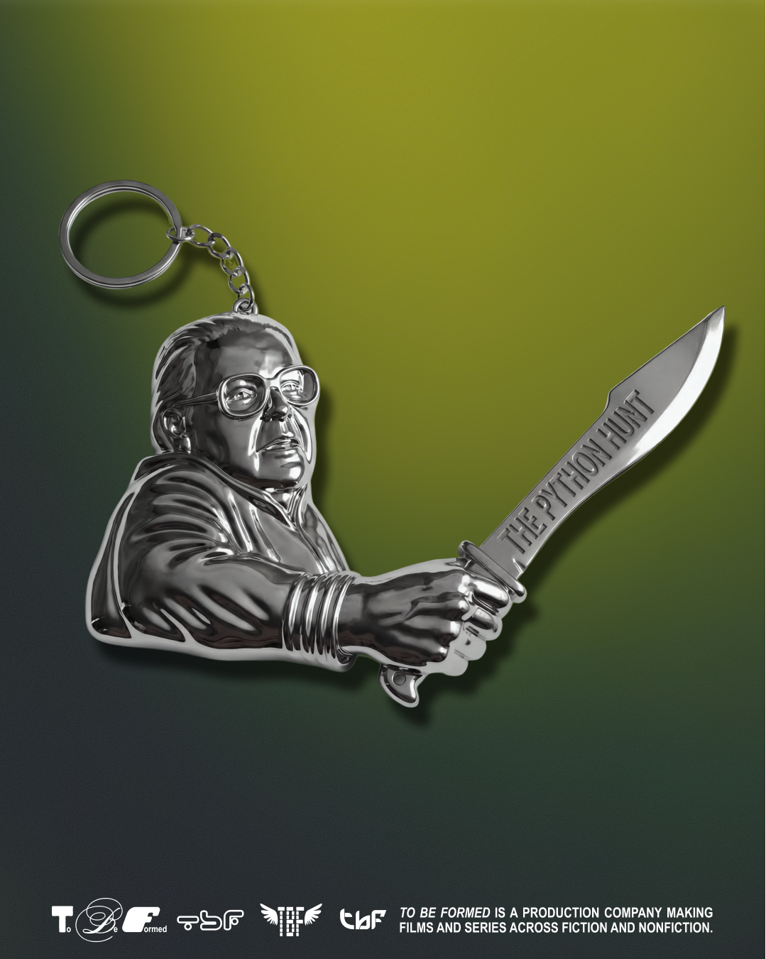
While there’s one primary wordmark, there are also a whole host of other secondary ones. “We actually made about 20 additional wordmarks for them to play with interchangeably, many pastiche to the broader corporate media culture,” says Rion. The primary logomark is as an amalgamation of them all. Appropriately Oppenheim, and equally befitting of its name. “To Be Formed’s name started as a placeholder title,” Rion says, with Lance ending up keeping it as he felt it a true reflection of how we makes movies, not necessarily knowing what the final narrative will be before going into production. Similarly, as Rion explains, “the wordmark itself is a few different ideas at once,” a state that is constantly in flux. “The primary wordmark was developed by one of our staff designers, Orysia Zabeida, who wanted it to feel like it was about to be formed into something new.”
When rolled out across To Be Formed’s website, the identity comes into its own – it fully demonstrates the extent of its aesthetic references and off-kilter approach to conventional design wisdom. “We wanted the site to have some tension to it like Lance’s films,” Rion explains, “making it stylised but not over-produced and referential but unique,” culminating in a digital space that feels like how you’d remember a website being designed twenty years ago. “We gave it a dreamlike quality with the mementos from each movie as the navigation,” Rion says, speaking to the bedlam at the bedrock of the brand. “I think when there’s chaos built into the identity, ever-evolving expression becomes part of the brand equity, reliably experimental,” he ends.
GalleryDay Job: To Be Formed (Copyright © Day Job, 2026)
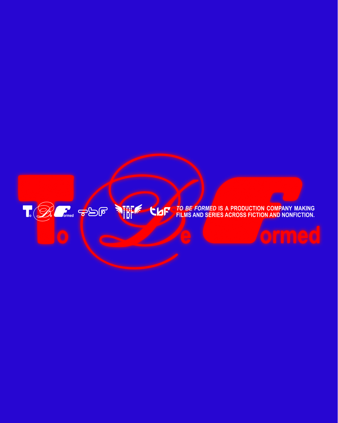
Hero Header
Day Job: To Be Formed (Copyright © Day Job, 2026)
Share Article
Further Info
About the Author
—
Hailing from the West Midlands, and having originally joined It’s Nice That as an editorial assistant in March 2020, Harry is a freelance writer and designer – running his own independent practice, as well as being one-half of the Studio Ground Floor.