Atelier Bingo puts its own spin on a ten-year-old Tuscan wine
The French illustration and graphic design studio has taken inspiration from Avignonesi’s landscape, vineyards and agricultural practices for a new label created as part of the winery’s Late Release project.
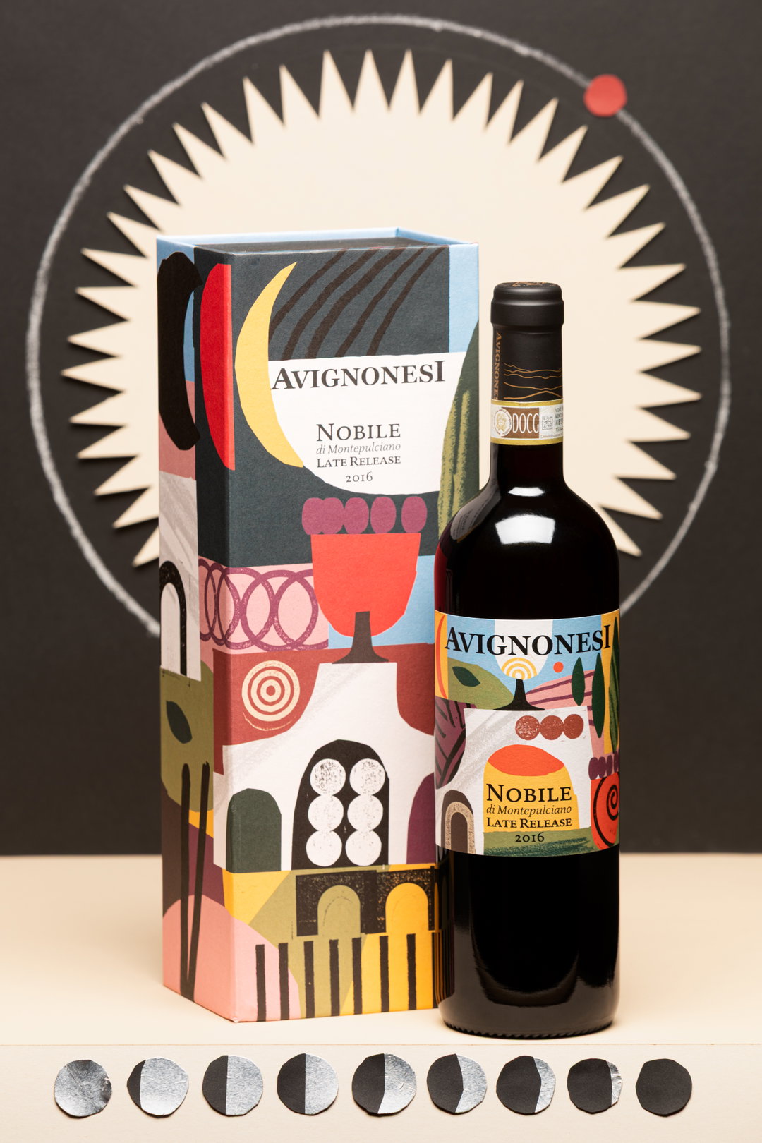
Who said wine had to be boring? For wine company Avignonesi, returning their Vino Nobile di Montepulciano to the world ten years after its harvest is cause for a whole new visual identity. The 2016 vintage, made from 100 per cent Sangiovese, has spent years ageing in bottle at the winery in Tuscany. Now, 9,000 bottles are being released as part of Avignonesi’s Late Release project, each wrapped in an artwork by French graphic design and illustration studio Atelier Bingo.
Late Release starts with a simple idea: keep a wine at the estate and see how it evolves over time, then invite an artist to look at that particular vintage from a new perspective. Previous editions have seen Amrita Marino interpret the 2014 vintage and Italian illustrator Carlo Stanga take on 2015. For 2016, Avignonesi worked with Milanese gallery, stationery shop and printing workshop Bonvini 1909 to bring Atelier Bingo into the picture.
(Copyright © Atelier Bingo, 2026)
(Copyright © Atelier Bingo, 2026)
(Copyright © Atelier Bingo, 2026)
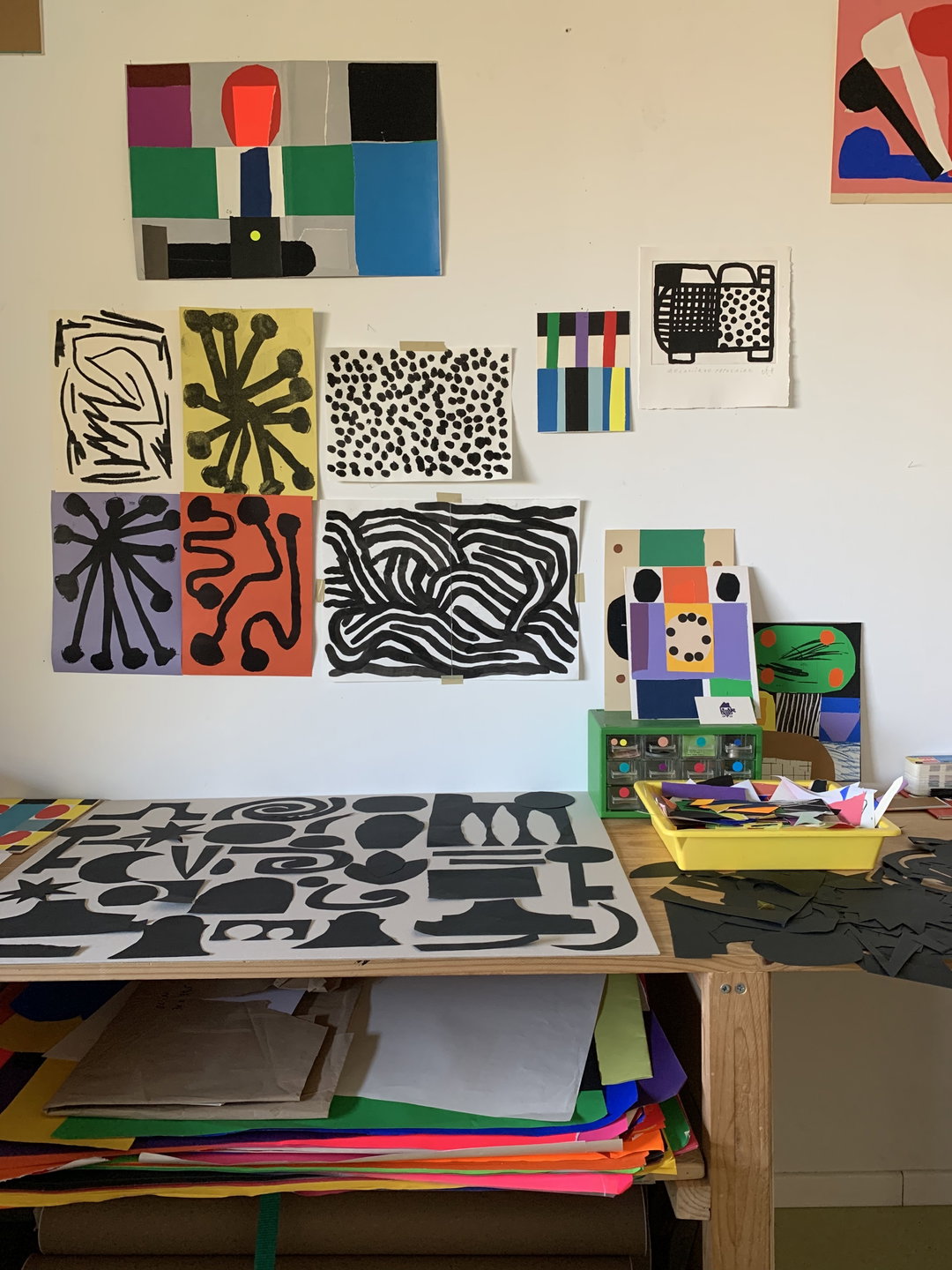
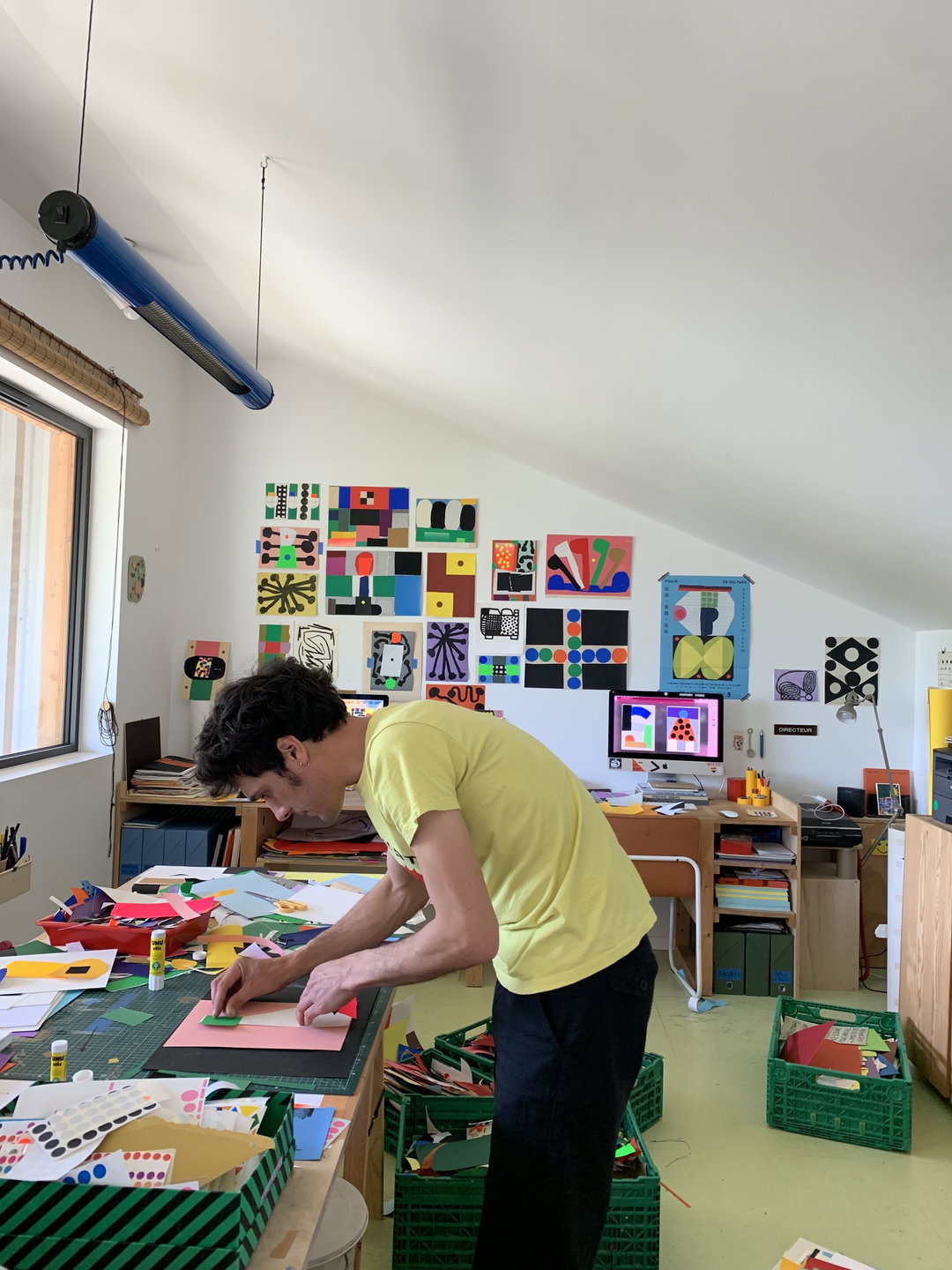
Founded by Adèle Favreau and Maxime Prou, Atelier Bingo’s practice moves between graphic design, collage, screen printing and etching, with cut paper, colorful shapes, textures and overlapping forms all retaining the marks of their making. For Avignonesi’s CMO Daniele Carlini, that directness offered an interesting counterpoint to the process behind the wine itself.
“With Atelier Bingo, we were drawn to the physicality of their work: collage, colour, shapes, textures, things made by hand,” says Carlini. “There is something very immediate and joyful about their work, which creates an interesting contrast with a wine that has spent almost ten years quietly evolving in a cellar.”
The brief was deliberately open. Rather than asking Atelier Bingo to create something that looked like Avignonesi, the winery gave the duo the story of the wine, the vintage and its home at Le Capezzine, then let them respond in their own language. “We didn’t want to commission Atelier Bingo and then ask them to behave like Avignonesi,” says Carlini. “If you invite a different artist for every vintage, you have to be comfortable with giving up some control.”
(Photo by @cartacarbone Copyright © Avignonesi, 2026)
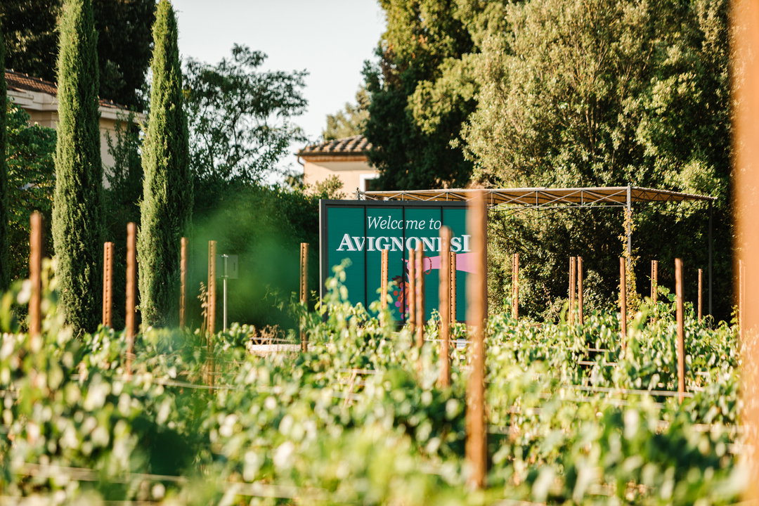
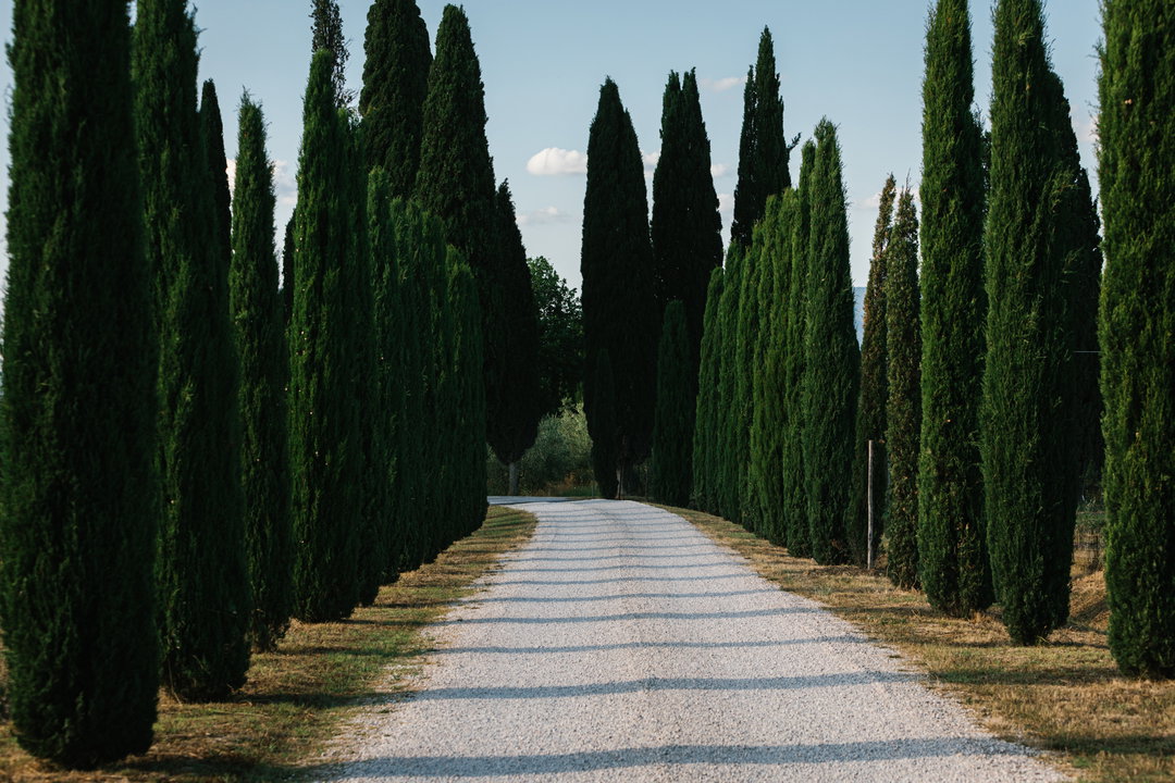
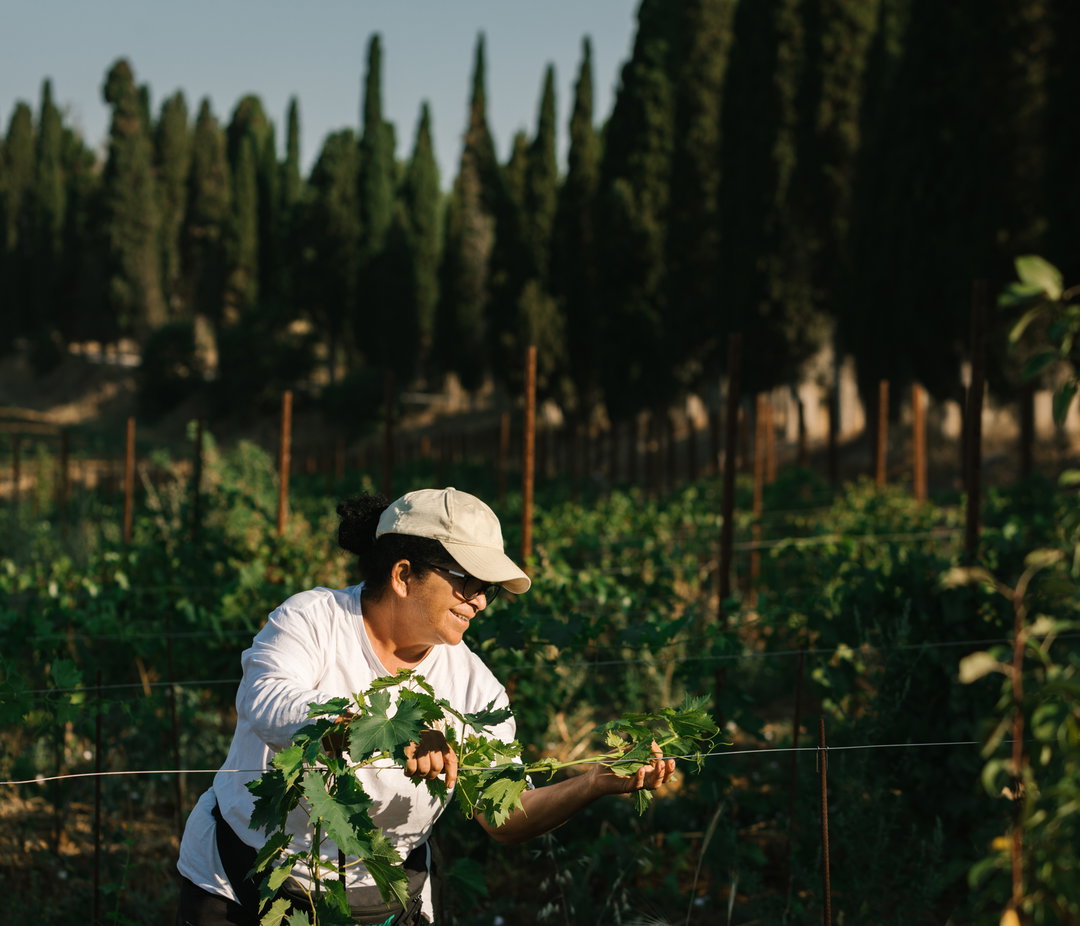
For Atelier Bingo, the ideas didn’t arrive immediately. Instead, they came during a visit to Tuscany in April 2026, when Favreau and Prou spent several days exploring the Avignonesi estate, its vineyards and the surrounding landscape. “Our work is very much based on what we see and feel,” the pair explain. “It was really our visit to Tuscany, to the Avignonesi estate and Le Capezzine, that triggered the research.”
The colours, hills, soils and seasons became their raw material, but the duo were keen to avoid producing a literal picture of Tuscany. “We wanted to represent Le Capezzine and the territory we had discovered, but without creating a literal or figurative representation,” they add. “Instead, we wanted to translate sensations through colours, shapes and textures.”
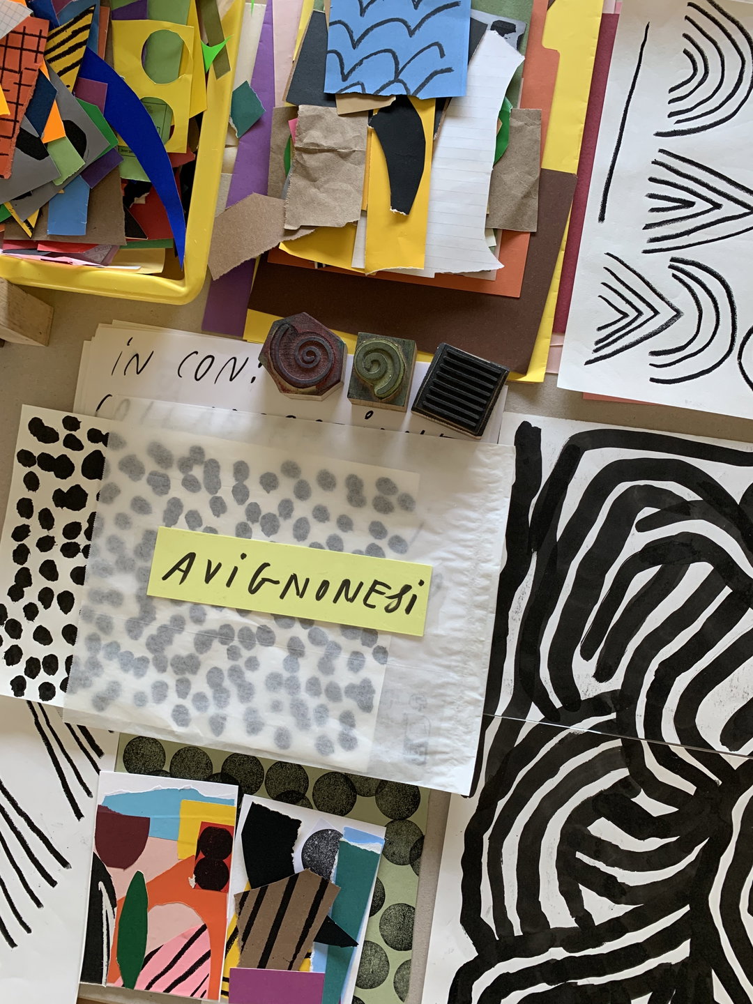
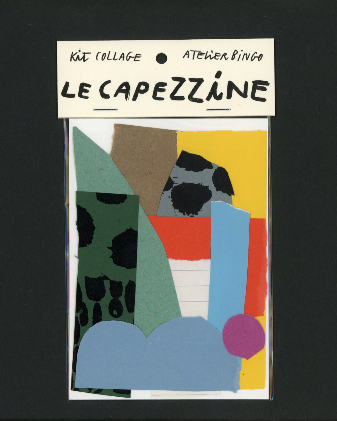
Back in the studio, that translation became distinctly artisanal. Paper was cut, lines drawn, marks made and stamps used, before the fragments were scanned and recomposed as a collage. On the finished label, architectural forms meet the profiles of Tuscan hills, plants, grapes and abstract signs, with pinks, reds, greens and earthy tones giving the landscape a more instinctive interpretation. The box extends the artwork further, unfolding into a larger, continuous image when opened.
(Photo by @cartacarbone Copyright © Avignonesi, 2026)
(Photo by @cartacarbone Copyright © Avignonesi, 2026)
That relationship between material, place and making is also where Bonvini 1909 comes in. Founded in Milan in 1909, the historic stationery shop and printing workshop has become a space for exhibitions and collaborations alongside its original activities. Its co-founder Roberto Di Puma sees the project as an opportunity to let an artist approach wine without being constrained by the conventions of branding. “Perhaps the main difference is that an artist does not necessarily have to explain the product,” he says. “An artist can establish a freer relationship with it, made up of associations, perceptions and interpretations.”
There are only 9,000 bottles of the edition, but Avignonesi hopes the artwork might give them a life beyond the wine itself. “We like the idea of a wine bottle becoming an object you want to look at, touch and perhaps keep after the wine is gone,” says Carlini. More broadly, he hopes the project can position wine within a wider creative culture. “Wine is agriculture, of course, but it also has a relationship with design, art, food, places and the way we live. Late Release gives us an opportunity to make some of those connections visible.”
Gallery(Copyright © Avignonesi, 2026)
(Copyright © Atelier Bingo, 2026)
(Copyright © Avignonesi, 2026)
Sponsored by
Avignonesi
Avignonesi is a biodynamic winery in Montepulciano, Tuscany. Its Late Release project brings wine and contemporary visual culture together, inviting artists and designers to interpret selected vintages returning from the winery’s cellar years later
Hero Header
(Copyright © Atelier Bingo, 2026)
Share Article
Further Info
About the Author
—
This article was sponsored by a brand, so is marked up by us as Sponsored Content. To understand more about how we work with brands and sponsorships, please head over to our Work With Us page.