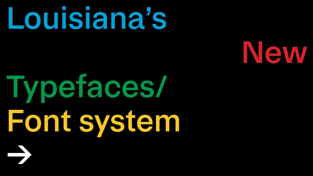
A2 Type adds Louisiana Museum of Modern Art to its repertoire of typefaces for iconic institutions
Rigour and research underpin A2 Type’s typographic system, drawing directly from the museum’s architecture and extensive print archive.
Share
If you haven’t heard of A2 Type, you’ve undoubtedly seen its work. The London-based type foundry was founded over 25 years ago by Scott Williams and Henrik Kubel and has since gone on to forge bespoke typographic systems for brands and cultural and civic institutions, the likes of The New York Times, GOV.uk, The Sunday Times and LinkedIn. The pair are also long-time collaborators with Margaret Calvert, which has led to new lettering and signs for Great British Rail. If that wasn’t already enough iconic institutions, A2 Type has now added another to its repertoire.
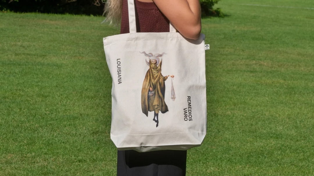
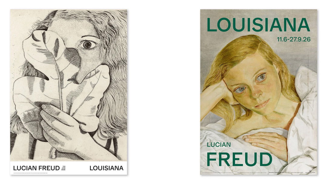
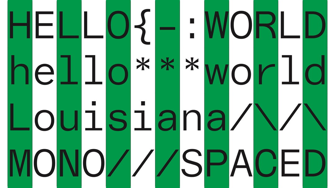
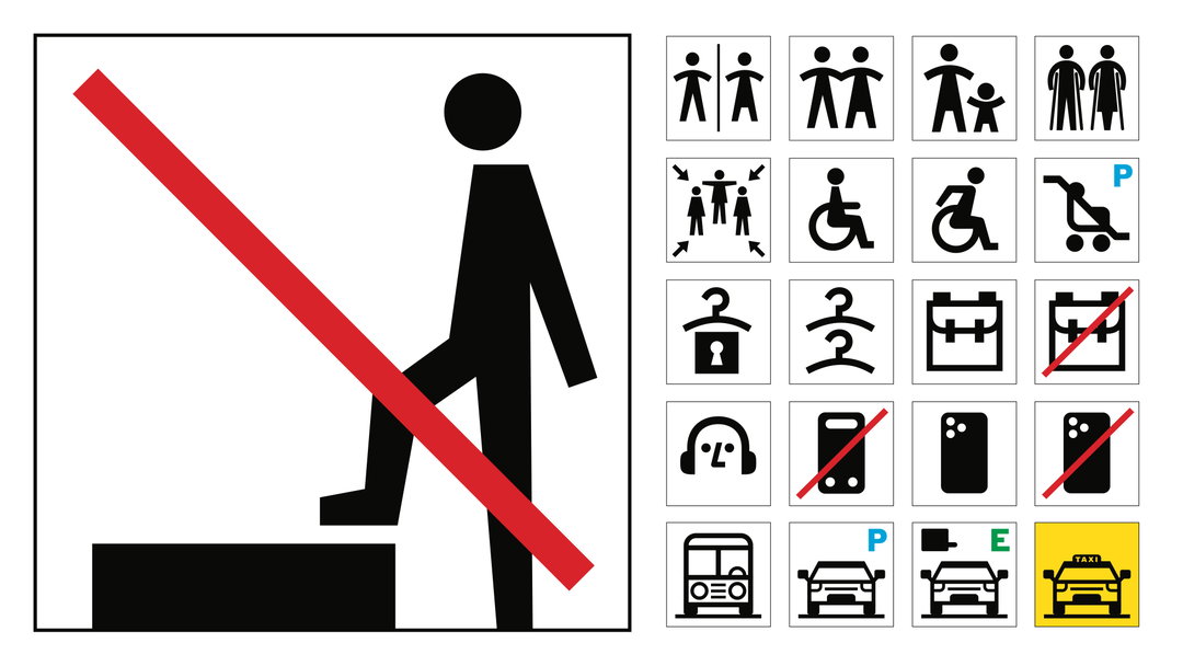
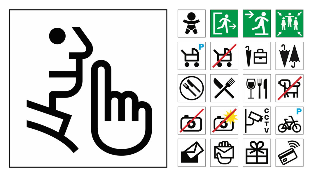
“Louisiana Museum of Modern Art approached us with an exciting brief,” Scott tells us, “to design a new serif font for their members’ magazine, Louisiana Magazine.” As the project with the Danish art museum progressed however, the scope evolved, expanding to a set of sans, sans serif and special-use typefaces – with a plethora of weights to boot. The museum now had an expansive typographic system to be implemented, made up of four typefaces: Louisiana Grotesk, Louisiana Mono, Louisiana Antikva, and Louisiana Plakat. “The project culminated in the commission of a custom set of pictograms that directly relate to the fonts,” Henrik adds, “intended for use both inside and outside the museum, totalling 80 unique pictograms.”
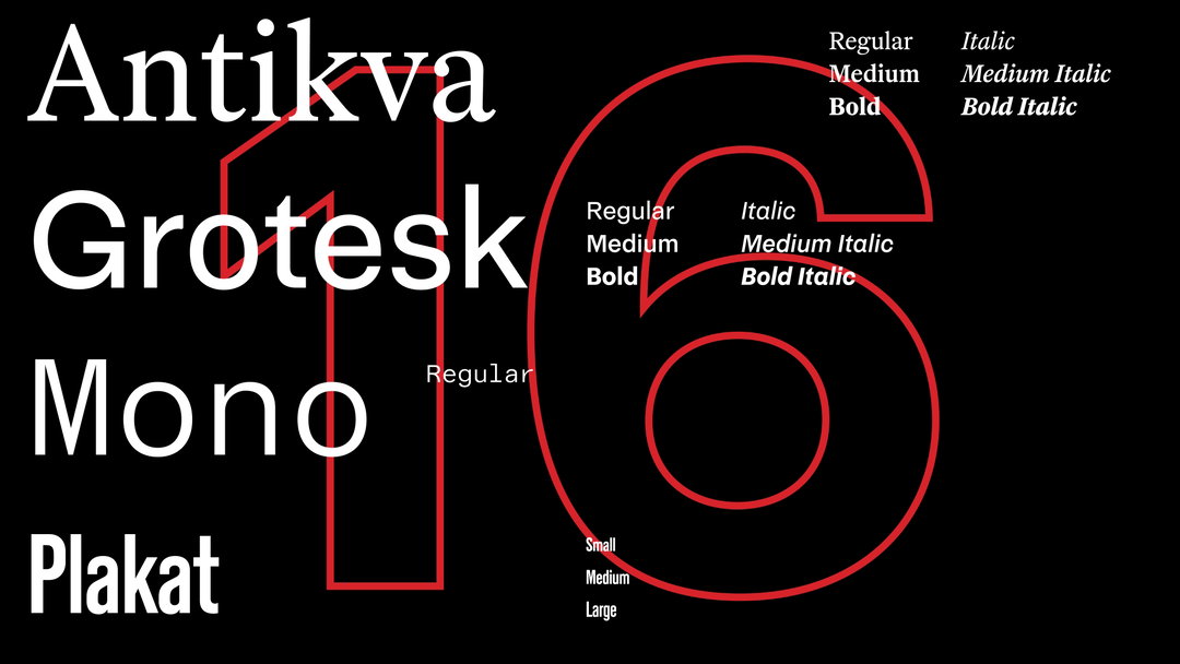
A2-Type: Louisiana Museum of Modern Art (Copyright © A2-Type, 2025/26)
The museum itself – its fascinating history and midcentury construction – provided the inspiration for the type family’s design. Having begun life in the 19th century as a personal villa, Scott explains how “over time, the museum has grown into a complex of buildings all constructed in the Danish modernist style.” Across the undulating, multi-level complex that makes up the museum, you’ll find striking pavilions, buildings and corridors – illuminated by different materials like glass, steel and wood – that are entwined with the natural world that surround them. You can feel this sense of contrast in both the detailed, divergent design of the museum’s serif, Louisiana Antikva, and the stylistic contrasts between the all of the family’s different styles.
“As well as the museum’s architecture, another source of inspiration was the museum’s extensive archive,” Henrik says; it holds every printed piece produced by the Louisiana Museum of Modern Art. “Our research identified three categories of typefaces used by the museum throughout its history,” including familiar faces like Helvetica, Akzidenz Grotesk, Univers, and Gotham, as well as some more obscure grotesque fonts. “Serif fonts were less prominently used but did form a collection of useful touch points,” they detail, “and a handful of poster-foundry condensed typefaces were also identified.”
A2 Type’s research directly informed the structure of the museum’s typographic system, ensuring it incorporated all three categories of typefaces. With that came a tremendous amount of testing. After all, designing one whole typeface is a huge thing, let alone four typefaces designed and optimised for both digital and printed spaces.
“The museum generates a diverse range of printed materials,” Scott says, “which resulted in a unique testing scenario,” Scott says. “With the assistance of the museum’s design team [directed by Marie d’Origny Lübecker], we conducted in situ testing of the fonts at multiple sizes and across a diverse range of surfaces.” Subsequently, A2’s work on Louisiana Museum of Modern Art’s typographic system is an A1 example of stylistic form and function, thematically embodying the museum’s history and contemporary perspective whilst meeting all of the practical needs that an institution of its reputation and scale demands.
GalleryA2-Type: Louisiana Museum of Modern Art (Copyright © A2-Type, 2025/26)
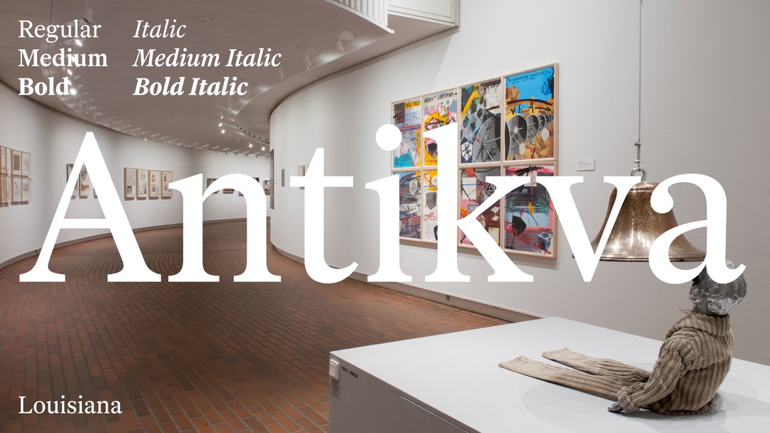
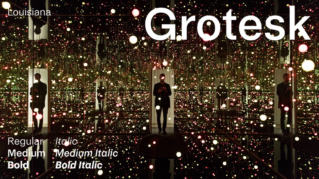
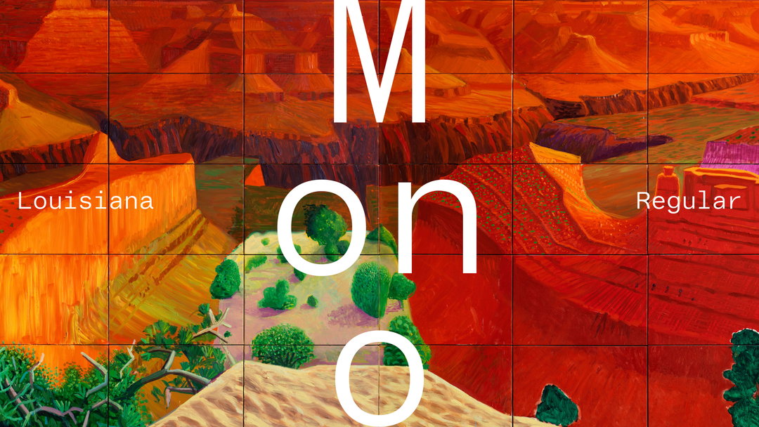
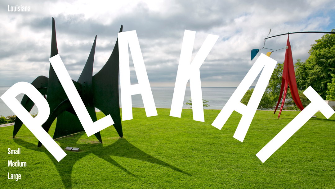
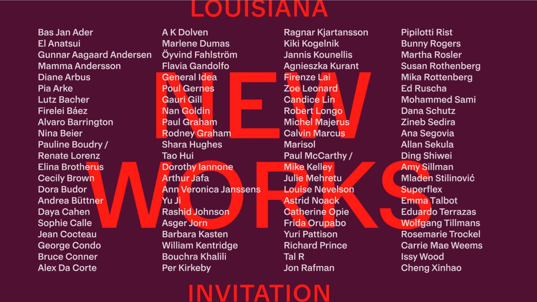
A2-Type: Louisiana Museum of Modern Art (Copyright © A2-Type, 2025/26)
GalleryA2-Type: Louisiana Museum of Modern Art (Copyright © A2-Type, 2025/26)
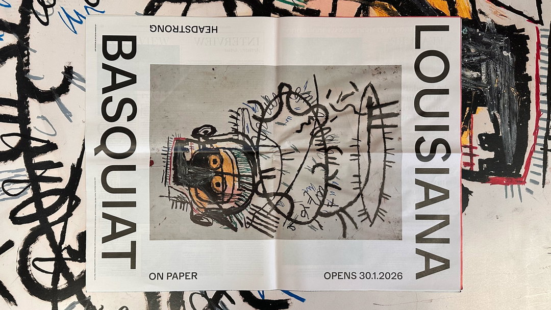
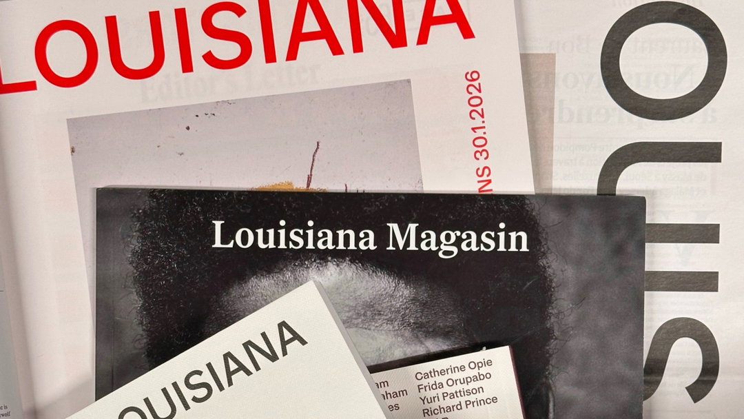
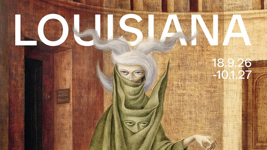
Hero Header
A2-Type: Louisiana Museum of Modern Art (Copyright © A2-Type, 2025/26)
Share Article
Further Info
About the Author
—
Hailing from the West Midlands, and having originally joined It’s Nice That as an editorial assistant in March 2020, Harry is a freelance writer and designer – running his own independent practice, as well as being one-half of the Studio Ground Floor.