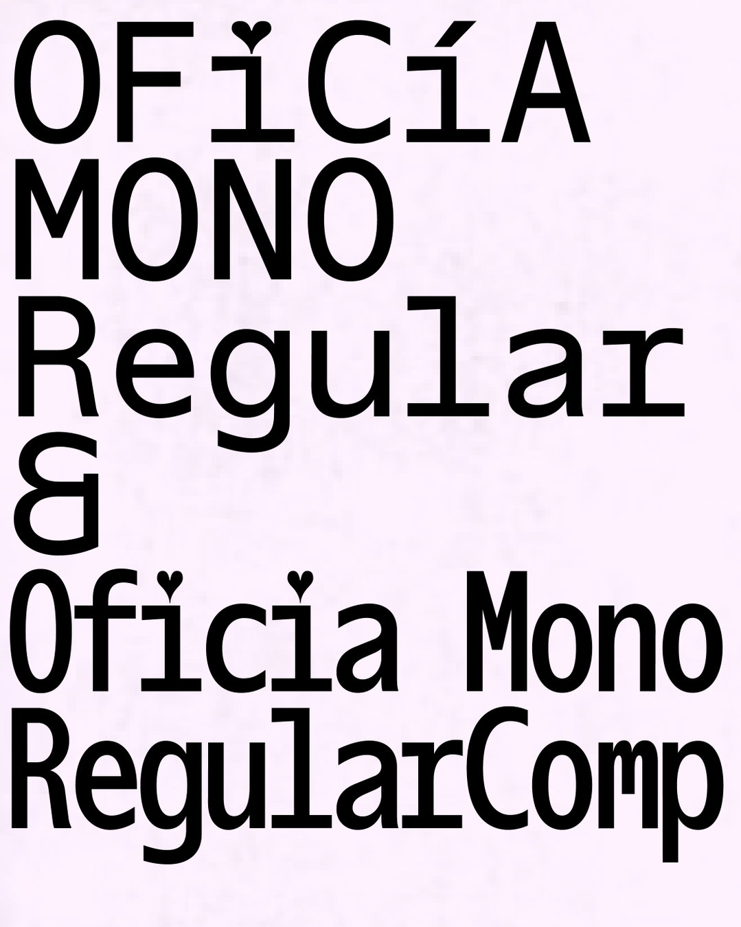
Tüpokompanii’s approach to type design centres on misreadings, mistakes and meaningful disruptions
Based in Tallinn, Estonia, this small studio is turning to native design languages and hidden typographic histories to shape a playful and vernacular approach.
Although Aimur Takk and Andree Paat of Tüpokompanii design typefaces with digital tools, the source material that so often starts their projects is uniquely analogue. In amongst their studio shelves you’ll find “an ever-growing collection of Soviet-era and antique printed ephemera: books, magazines, stamps, plastic bags and more”, shares Aimur – an archive the designers maintain as an ongoing source of inspiration for their original retail fonts or custom typeface projects for clients.
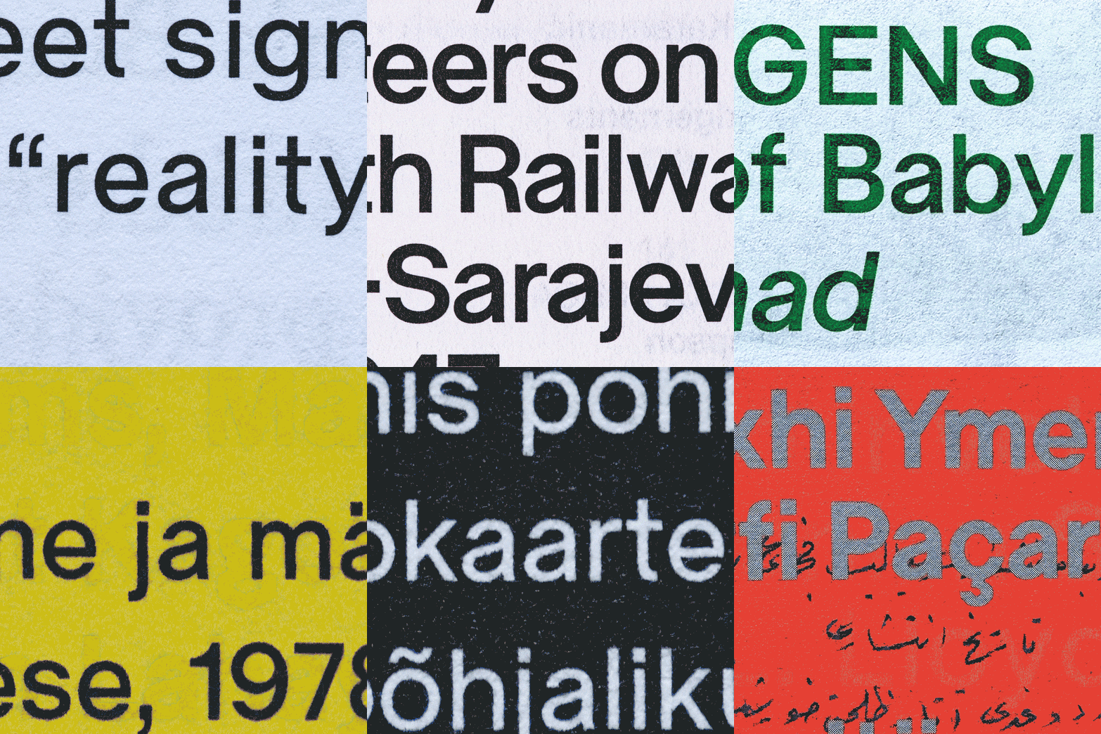
Based in Tallinn where “our local typographic landscape is seemingly quite sparse”, they say, the design duo are also interested in “neglected local design heritage or hidden corners of the global canon”, Andree adds, things like hand-painted signs, amateur lettering, low-quality printing errors, forgotten typefaces, “translating their qualities into contemporary digital tools without erasing their imperfections”.
Rather than chasing overly polished or “universal” typographic solutions, the studio likes to explore what type design can learn from “mistakes, limitations, and misreadings.” That’s why Aimur and Andree are often playing with forms and ideas that aren’t always the most practical things to try and turn into full lettersets, but could become something special for a project later down the line. Their latest typeface Juunior is a great example of where this spirited approach comes into play.
The designers also like to get stuck into sets of experiments with physical ways of producing letterforms, making impressions with silkscreen, letterpress, phototype and CNC-printing in the hopes of landing on ideas that our “streamlined digital workflows” might just miss. The whole aim of their practice? To craft letterforms that deserve a second glance – “type that carries a sense of tension, vulnerability, or quiet oddness”, Andree ends.
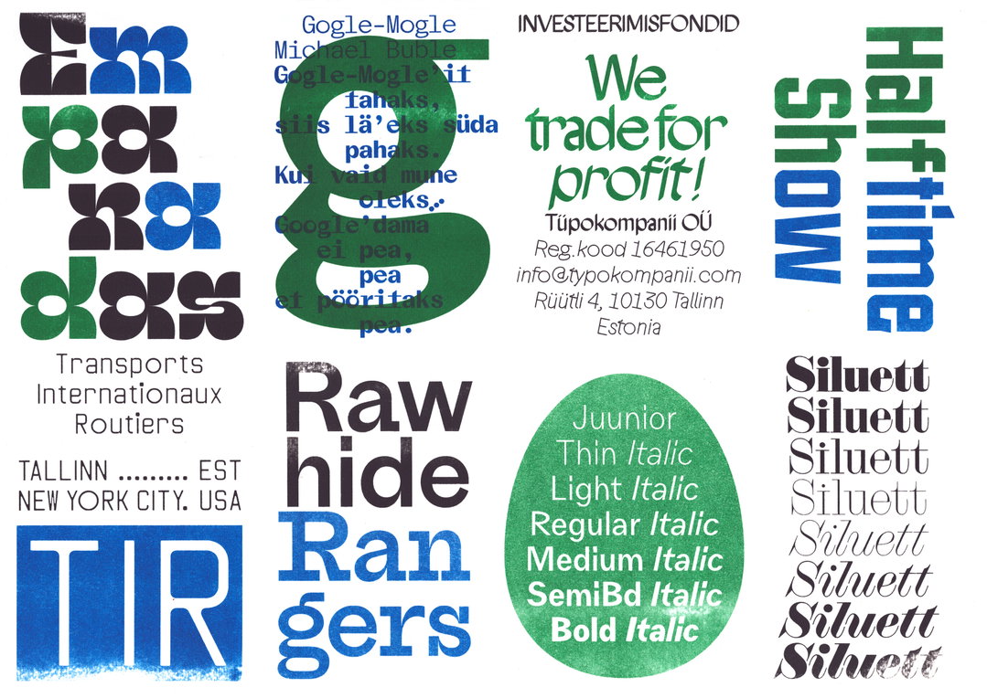
Tüpokompanii: Sample of fonts (Copyright © Tüpokompanii, 2025)
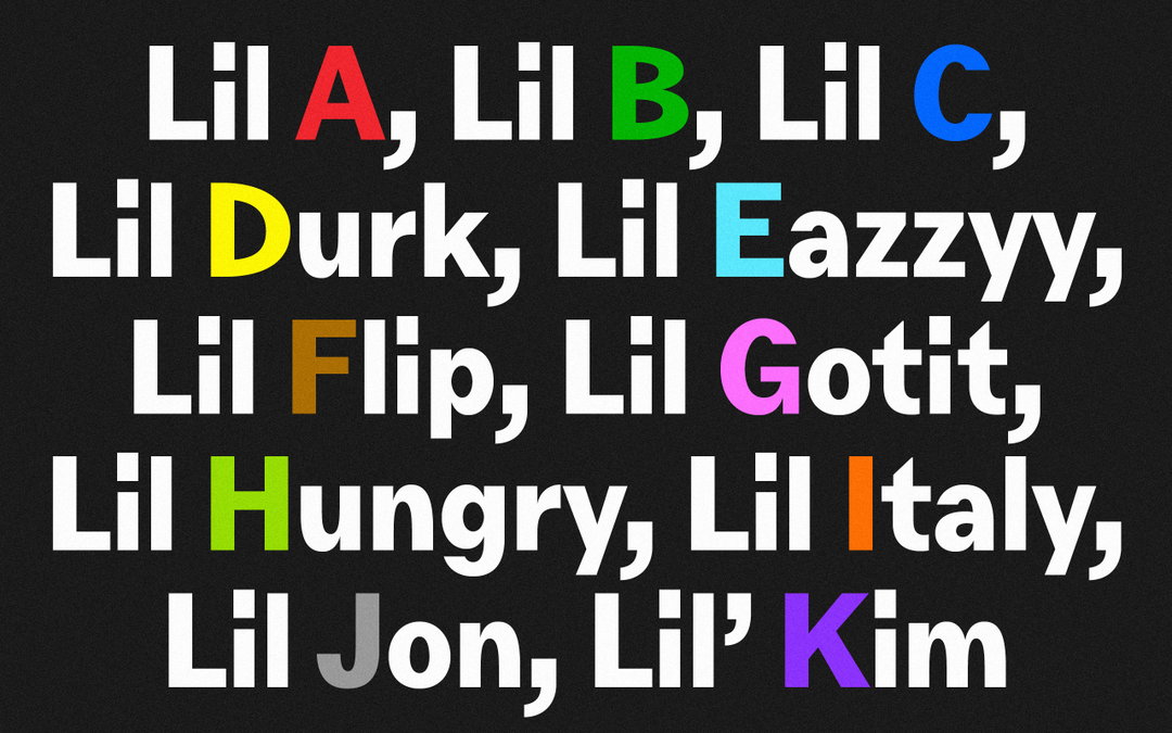
Tüpokompanii: Juunior (Copyright © Tüpokompanii, 2025)
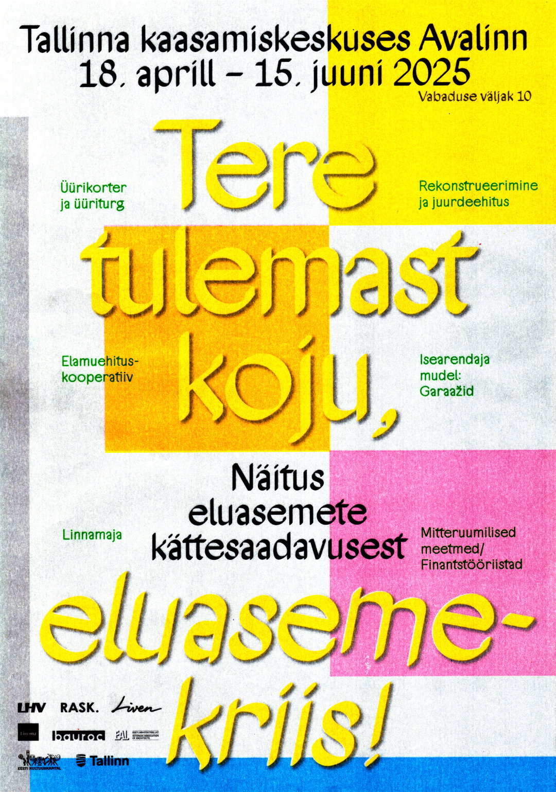
Tüpokompanii: “Tere tulemast koju, eluasemekriis!” exhibition poster (Copyright © Aimur Takk, 2025)
Tüpokompanii: Juunior (Copyright © Tüpokompanii, 2025)
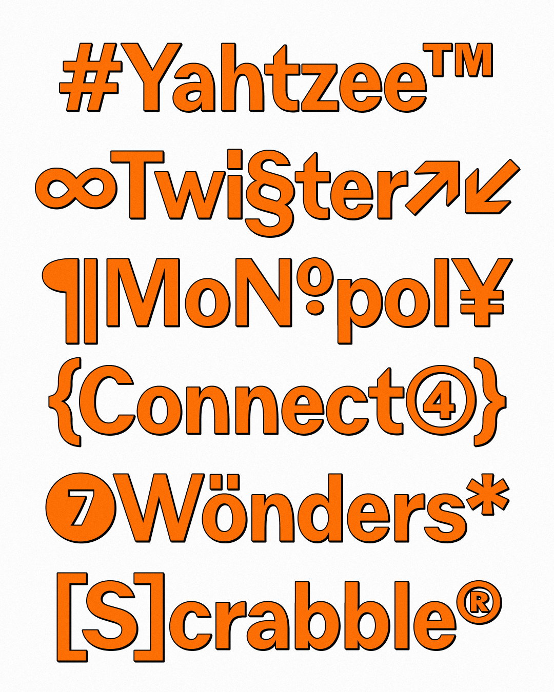
Tüpokompanii: Juunior (Copyright © Tüpokompanii, 2025)
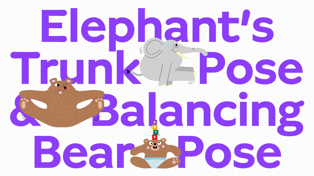
Tüpokompanii: Vitamiin (Copyright © Tüpokompanii, 2024)
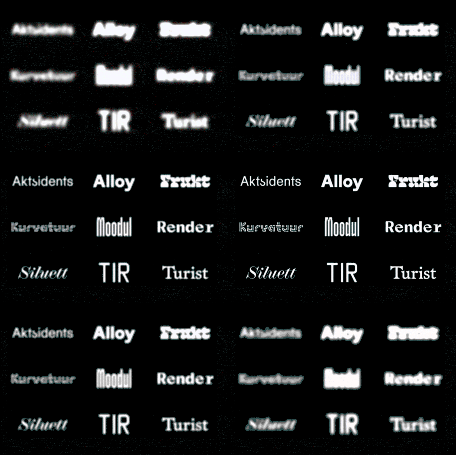
Tüpokompanii: Work-in-progress fonts, available on demand (Copyright © Tüpokompanii, 2025)
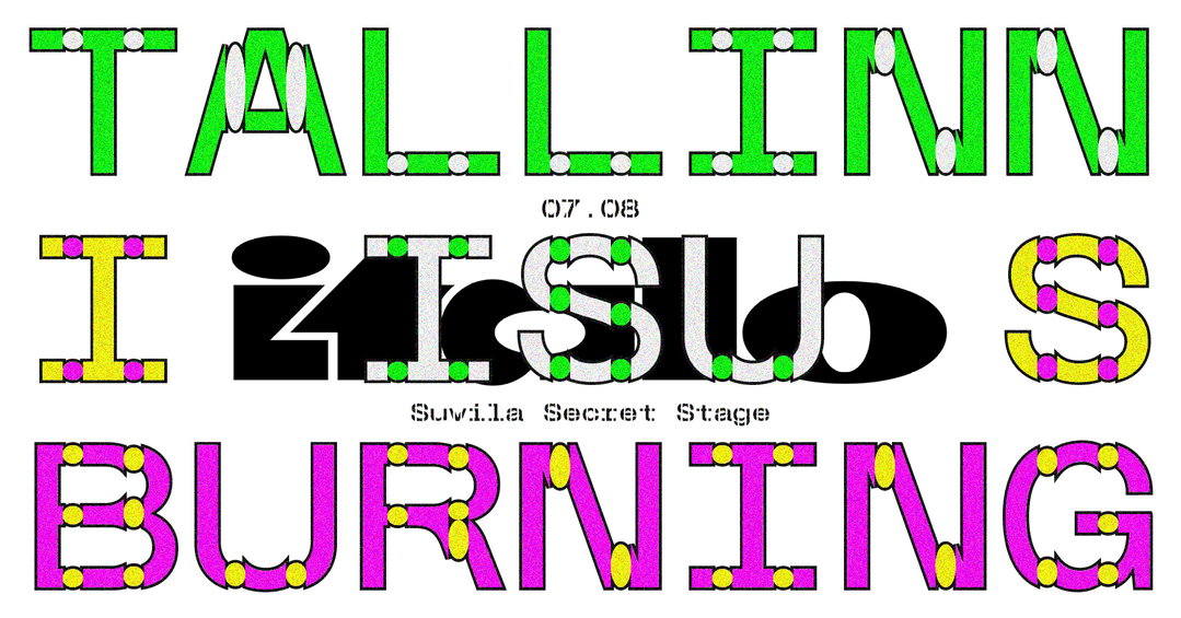
Tüpokompanii: “Tallinn is Burning” event cover (Copyright © Aimur Takk, 2021)
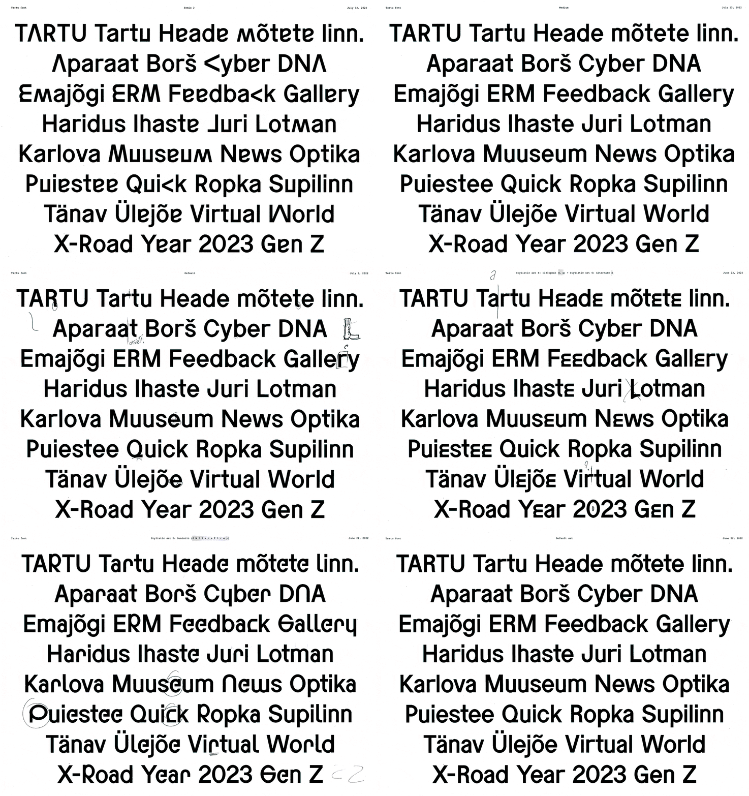
Tüpokompanii: Sketches of Tartu Semiootik, custom typeface with AKU (Copyright © Tüpokompanii, 2023)
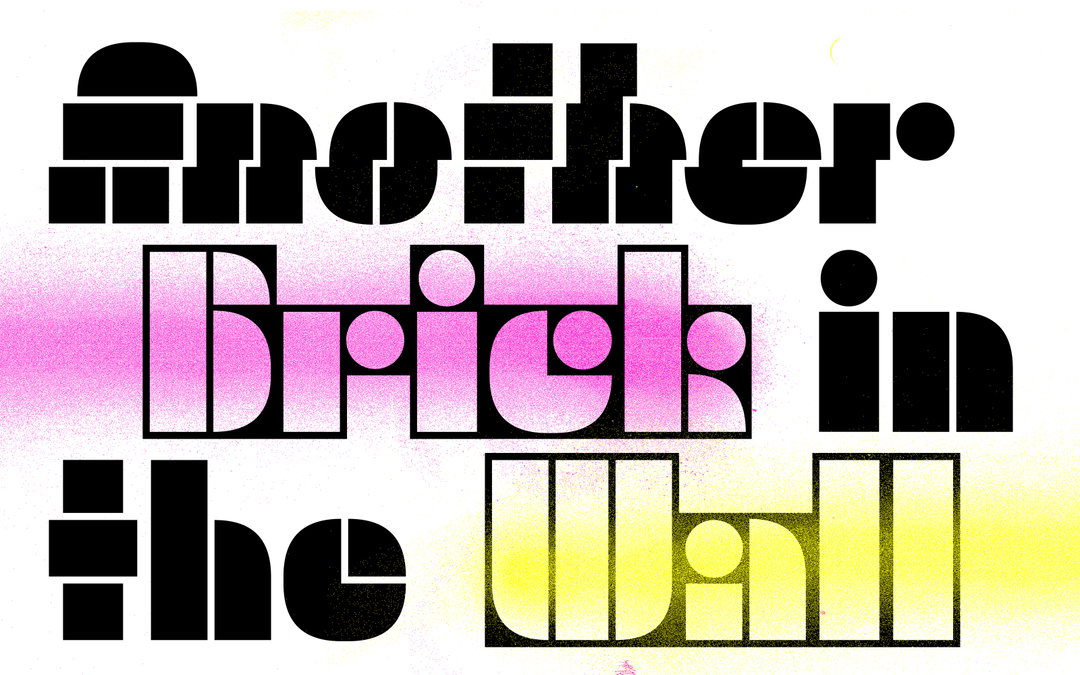
Tüpokompanii: Trafarett (Copyright © Tüpokompanii, 2023)
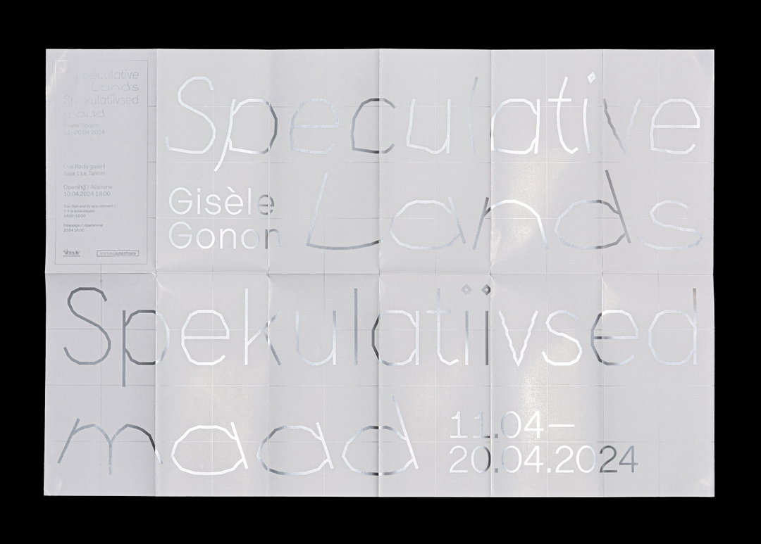
Tüpokompanii: “Speculative Lands” exhibition poster (Copyright © Andree Paat, 2024)
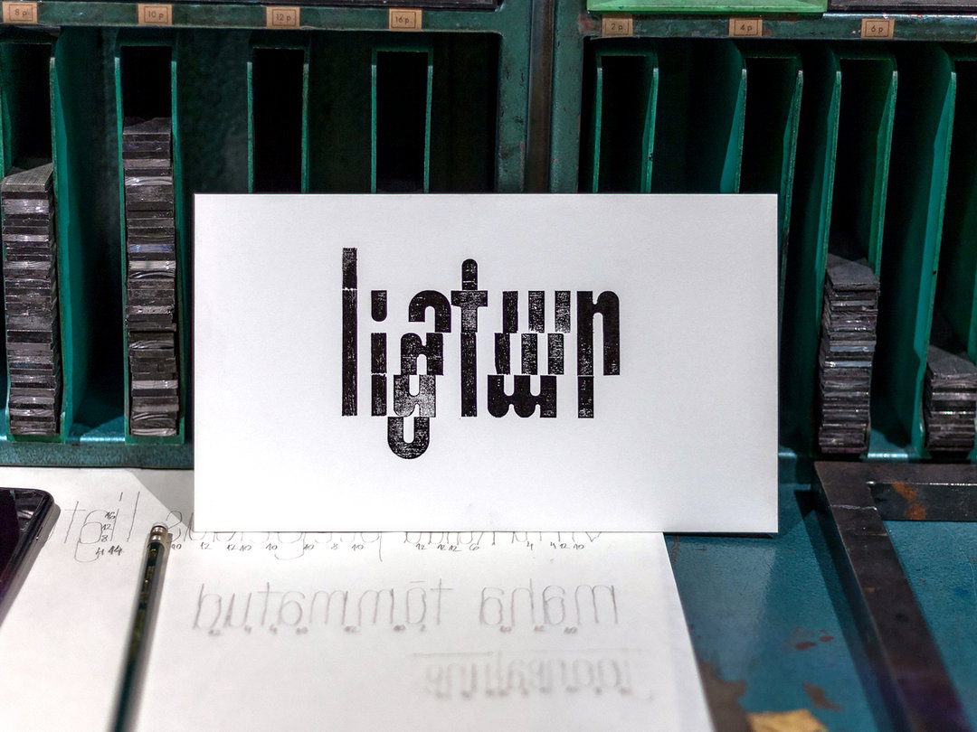
Tüpokompanii: Moodul, letterpress test print, Photo Henri Papson (Copyright © Tüpokompanii, 2025)
Hero Header
Tüpokompanii: Ladna in use (Copyright © Tüpokompanii, 2023)
Share Article
Further Info
About the Author
—
Ellis Tree (she/her) is a staff writer at It’s Nice That. She joined as a junior writer in April 2024 after graduating from Kingston School of Art with a degree in Graphic Design. Across her research, writing and visual work she has a particular interest in printmaking, self-publishing and expanded approaches to photography. ert@itsnicethat.com
To submit your work to be featured on the site, see our Submissions Guide.