Studio Frith brings nostalgia and charm to the visual identity of Swedish hotel Ett Hem
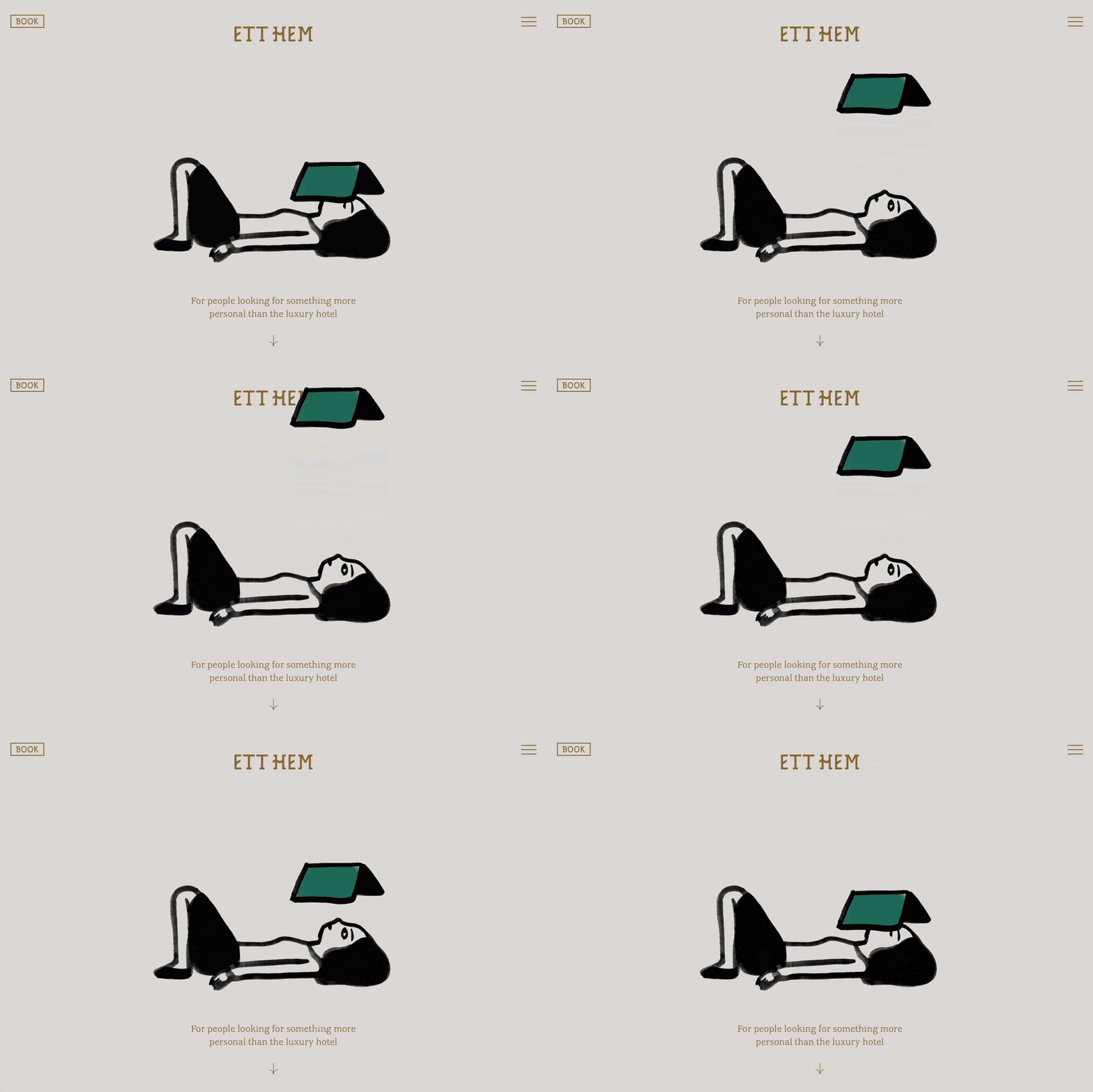
Frith evokes an equal sense of the traditional and the ultra-modern with a new typeface, surreal photography and short films by Polly Brown, and playful illustrations by Iris de Moüy.
Share
Studio Frith founder, Frith Kerr, first met Ett Hem owner, Jeanette Mix, back in 2010 through the hotel’s interior designer and founder of Studiolise, Ilse Crawford. “And after almost 15 years, we are still looking after all the aspects of the Ett Hem visual identity,” Frith tells us. From print, to digital, signage and now a complete overhaul of the Swedish hotel’s site. “Having such a long-standing connection with the brand means that, while we ensure consistency, we always consider how the visual language should evolve and reflect Ett Hem’s growth over time” she adds.
Ett Hem (translating to ‘a home’) has stood for over a century, originally built as a townhouse for a government official and his family in 1910. Opening its doors in 2012, the Östermalm neighbourhood has since seen it transform into the hotel it is today, while still maintaining its values of home. As such, much of the inspiration for the style of the site, was birthed through the Studio Frith team observing its visitors and their interaction with the space. “In response to this research we came up with the ‘Codes of Comfort,’’ Frith tells us, built on a set of rituals that “gently indicate the freedom of guests to do as they wish within the world of Ett Hem” – from playing board games on the floor of the living room, to falling asleep on the sofa next to their dogs.
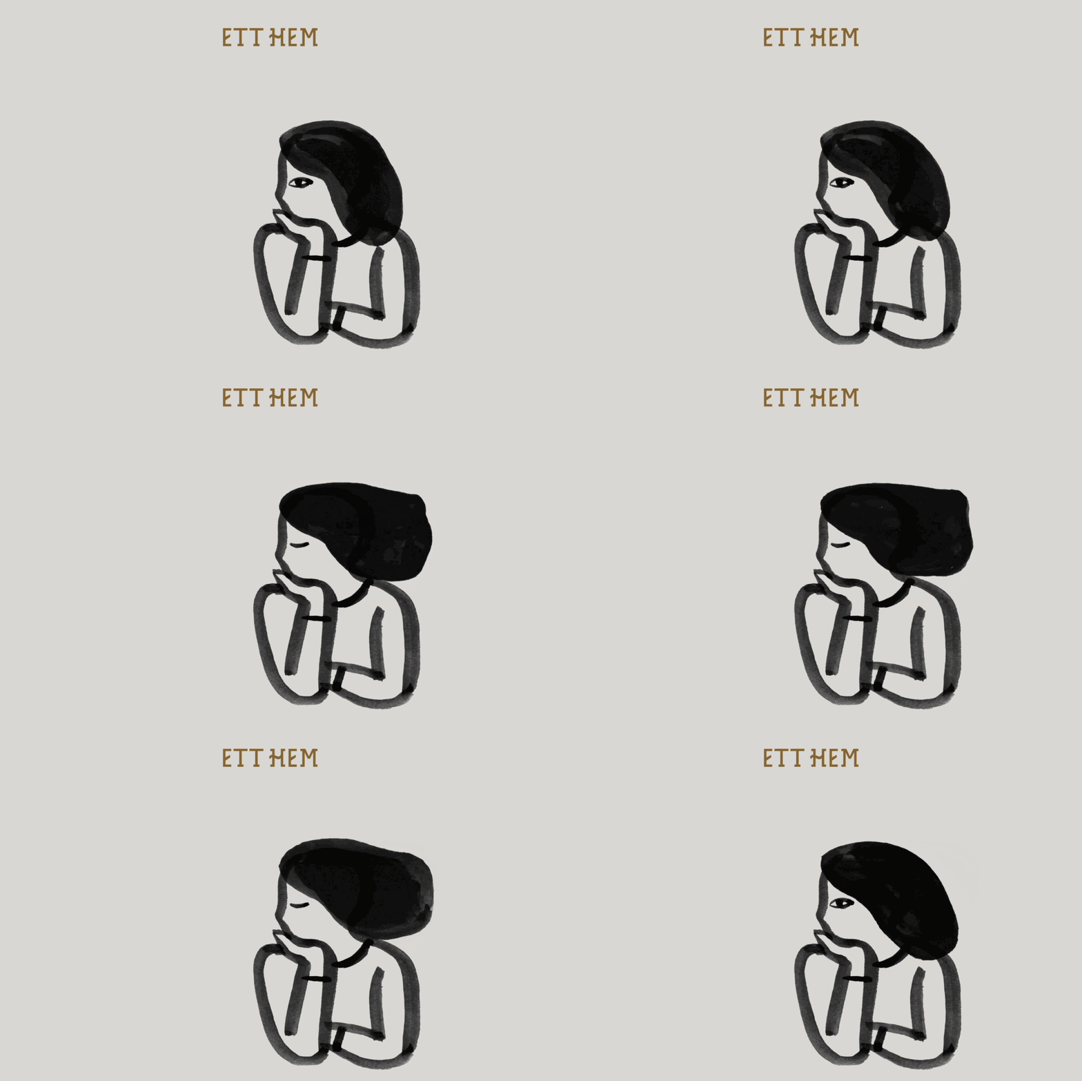
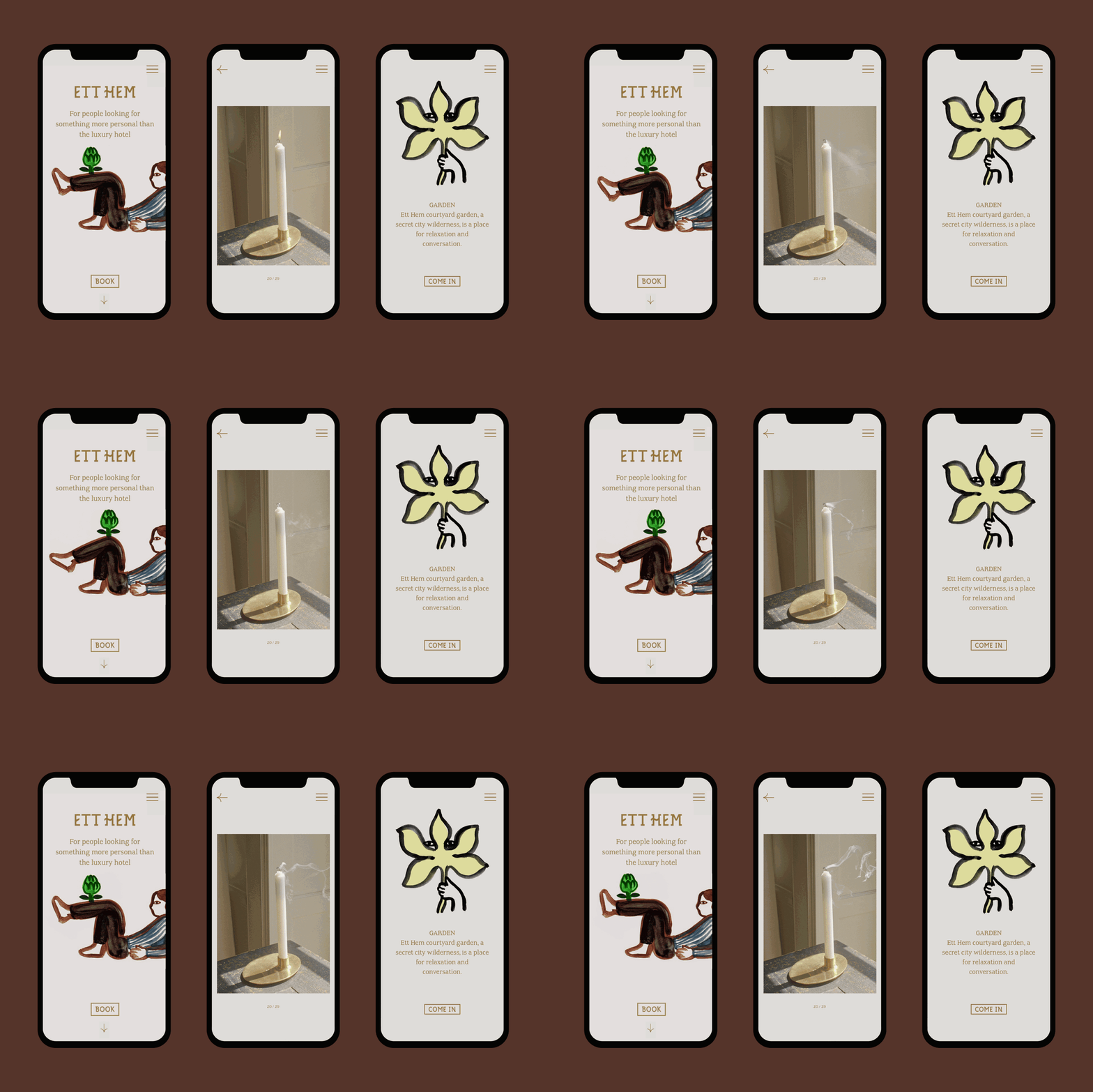
Studio Frith: Ett Hem identity, illustrations by Iris de Moüy (Copyright © Ett Hem, 2024)
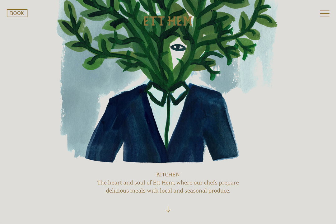
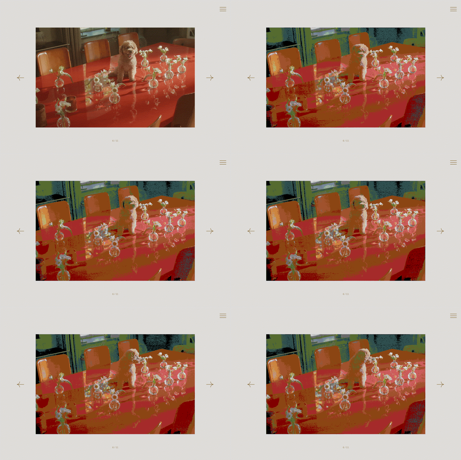
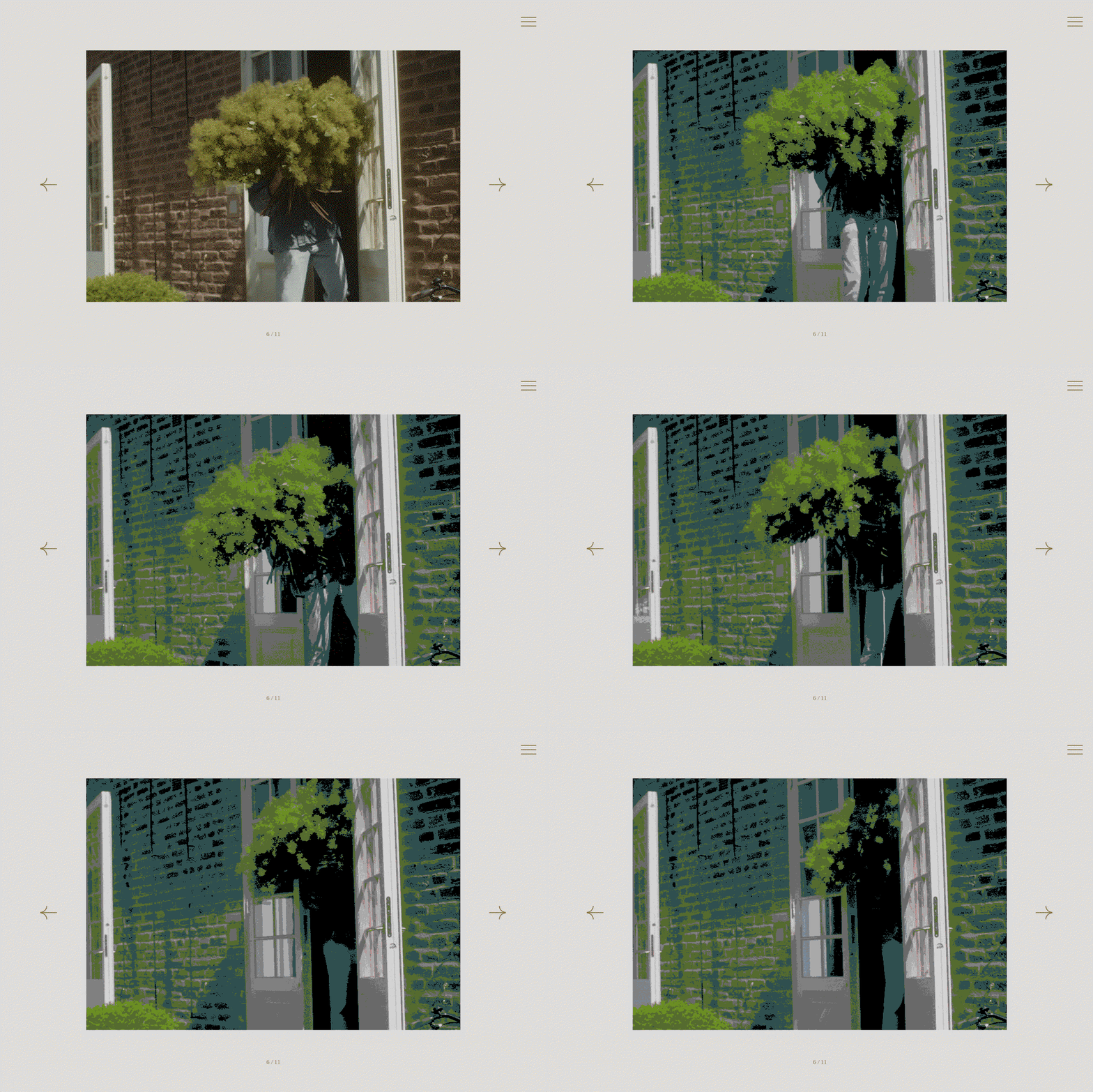
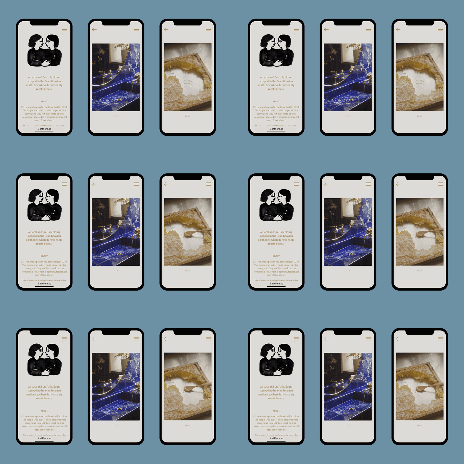
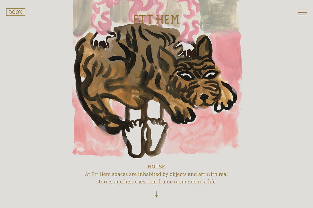
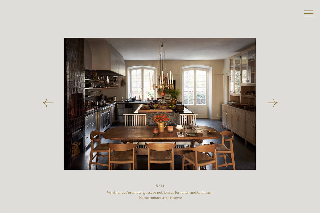
Throughout the site, the team’s art direction amplifies the Codes of Comfort to a level that potential visitors can see themselves in. There’s the illustrations and animations by Iris De Moüy, with playful yet recognisable activity and figures that travel across the home page; relaxing, holding house plants and admiring goldfish. Photographer Polly Brown focuses on prime spots within the hotel that are synonymous with home, with a particularly suave and earthy edge. She captures a red dining table in a way that is almost surreal, as the neighbouring window reflects the outdoor greenery and glistening glassware, but there’s a dog stood right on top of it – telling visitors that no matter how serene the carefully crafted space is, their furry friends are welcome too. And there’s also her short films that feel like home videos, evoking a sense of nostalgia.
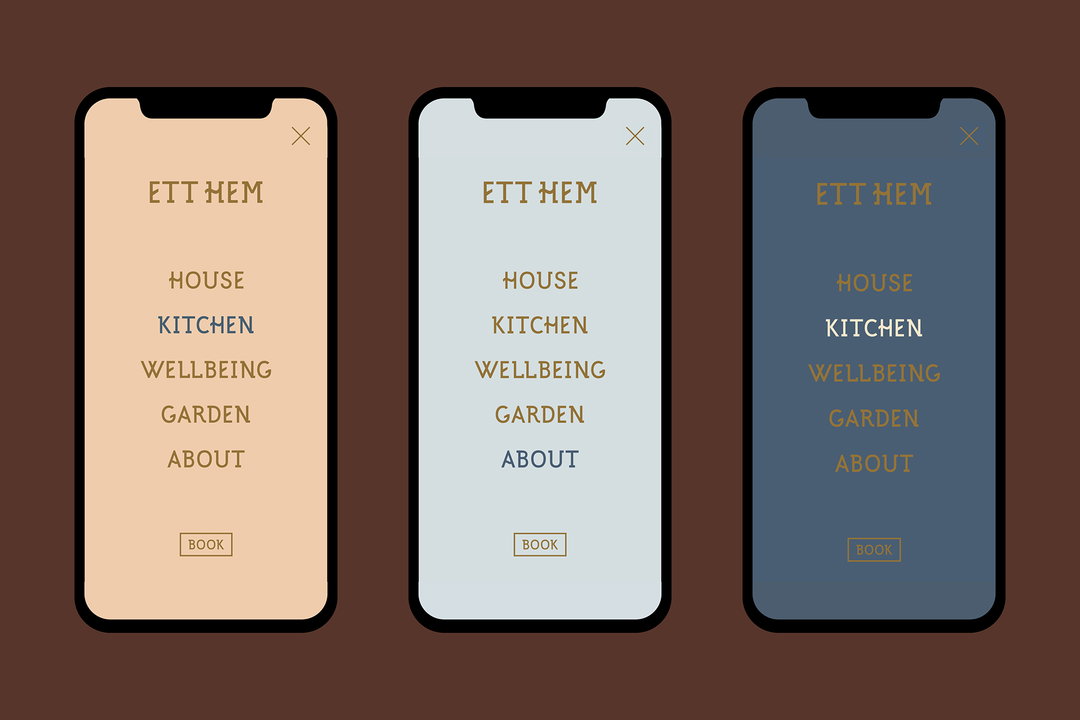
As Ett Hem is a local yet standout experience rooted in Swedish culture and history, the Studio Frith team wanted to amplify its traditional Swedish arts and crafts architecture through the creation of a typeface rooted in Swedish vernacular letterforms. “They were details of the original letterforms that really fascinated us and made us think they had the potential to exist outside of their time, now they have even reached the digital world,” she tells us.
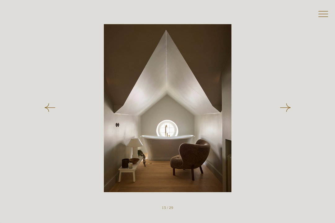
The Ett Hem site visually exemplifies the hotel as going beyond institution, hard to reach or pervasively strict. Frith says, “we combine formal and expressive and stillness and motion to strike a balance between sophistication and warmth that you find at Ett Hem”. She adds: “we wanted the site to capture the experience, simplicity and suggestivity, without the need for prescriptive rules or descriptive text”. And it surely does because we suddenly want to leave our homes to kick our feet up (at home) elsewhere.
GalleryStudio Frith: Ett Hem identity, illustrations by Iris de Moüy, photography and film by Polly Brown (Copyright © Ett Hem, 2024)
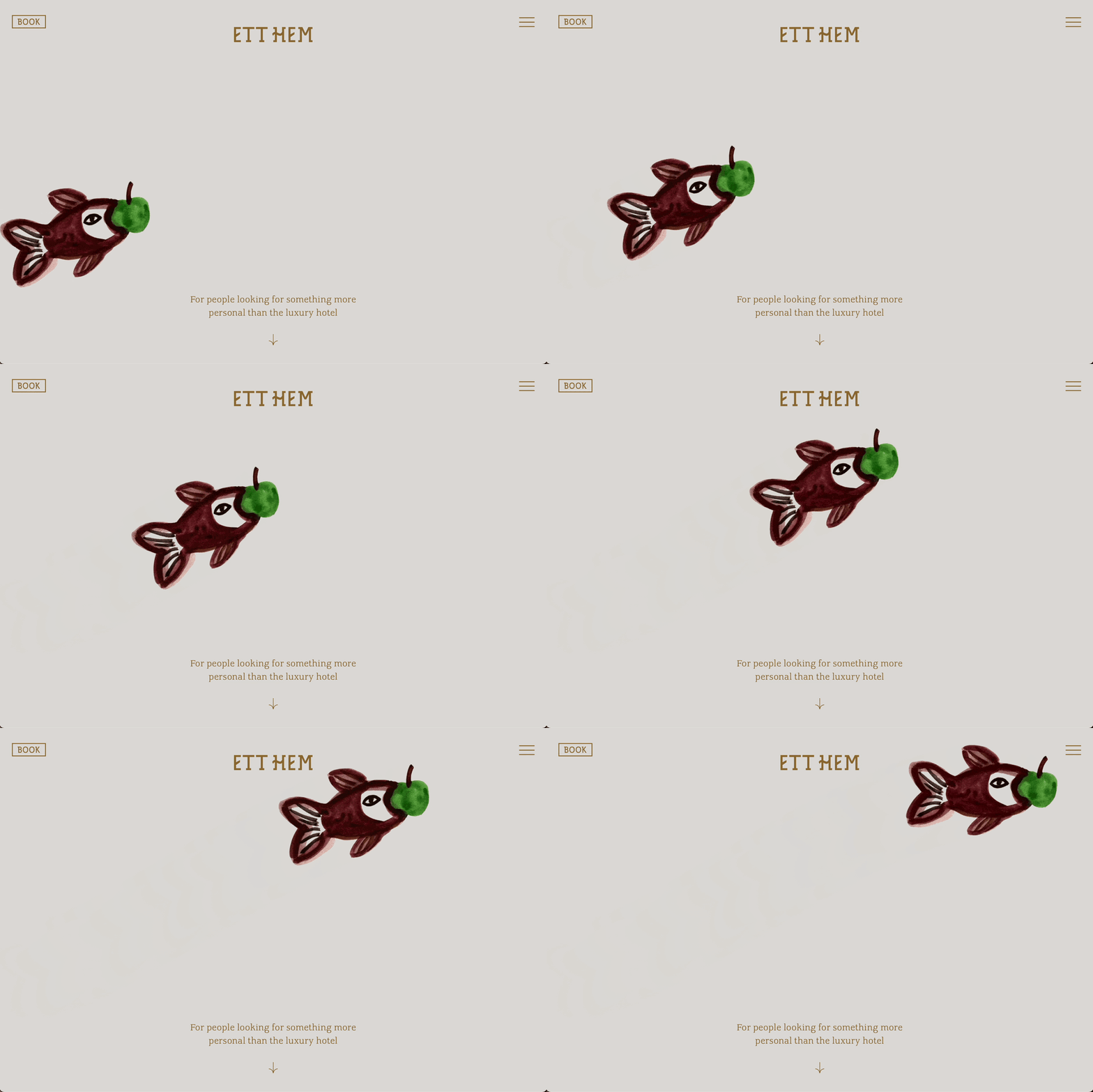
Hero Header
Studio Frith: Ett Hem identity, illustrations by Iris de Moüy, photography and film by Polly Brown (Copyright © Ett Hem, 2024)
Share Article
About the Author
—
Yaya (they/them) was previously a staff writer at It’s Nice That. With a particular interest in Black visual culture, they have previously written for publications such as WePresent, alongside work as a researcher and facilitator for Barbican and Dulwich Picture Gallery.