“We treat code as material”: Studio Dial weaves motion design into cocktail menus, Afghan textiles and city plans
The life of a design studio means designing a cocktail menu one day, coding motion design for entire cities the next. What Studio Dial does best is make it all intoxicating to behold.
Share
Studio Dial is a fledgling, female-led design and creative technology studio based in London, working across branding and coded tools for clients such as Google, Azra and Inner City Consulting. The studio tackles everything from brand refreshes and cocktail menus to campaign identities for generative tools and insurance platforms.
Bridging the physical and the computational, Studio Dial lets each practice inform the other so that the systems it builds carry the texture and intuition of hand-made graphics, even if they’re generative underneath. “We treat code as a material, something to be shaped and tested like paper and ink. Our tools are core to each of our projects – they hold our brand systems together, and they are usually the first thing we build and what shapes everything after,” says Natalia Witwicka, founder of Studio Dial. The best creative outcomes for Studio Dial are ones it didn’t plan for – and contrary to popular belief, these types of accidental wonders happen all of the time in computational design. “We collaborate a lot with the Google DeepMind team – it’s an endlessly fascinating territory, right at the edge of where design meets research and what’s technically possible. It keeps us on our toes, constantly finding new ways and techniques to build brand systems,” says Natalia.
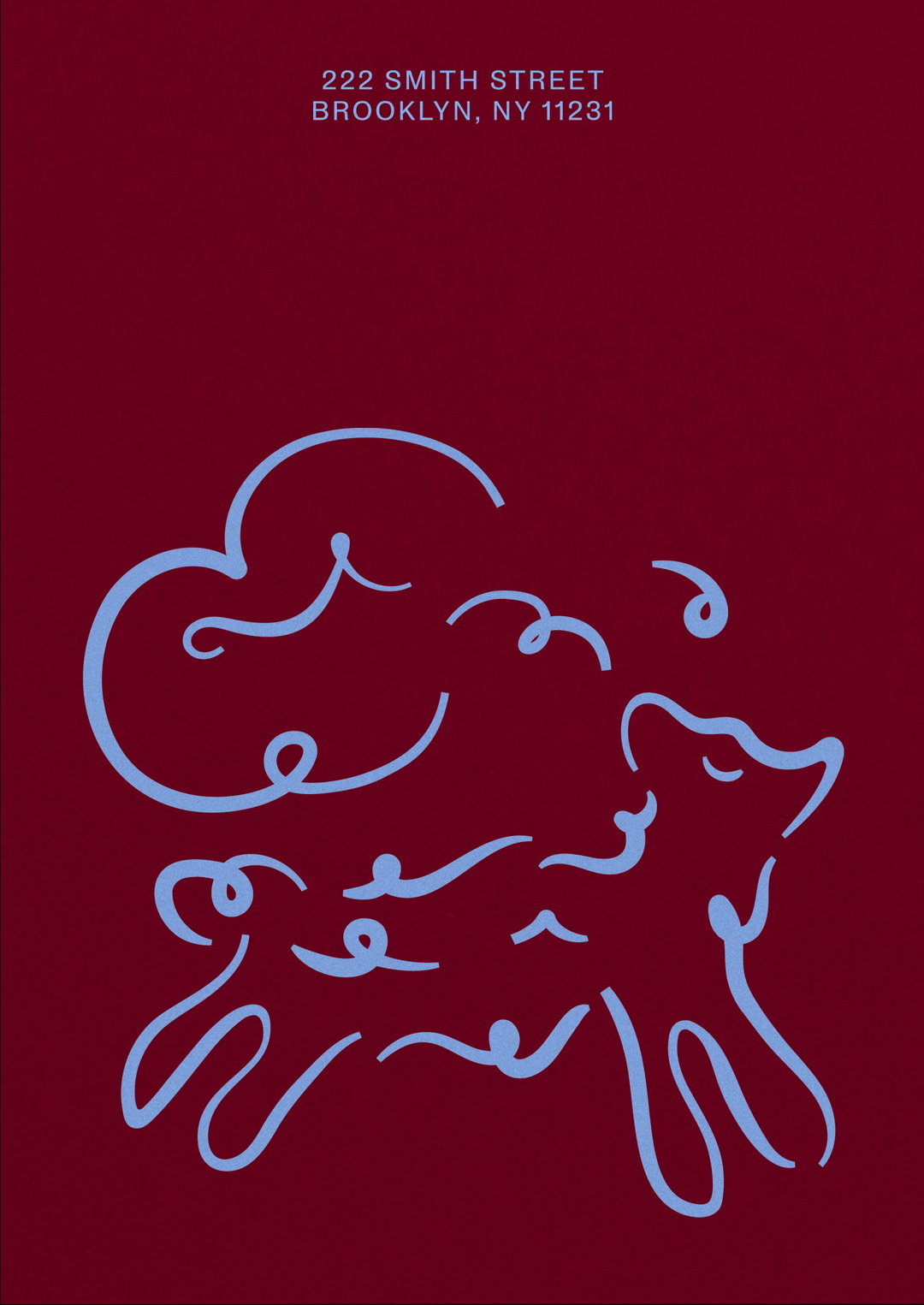
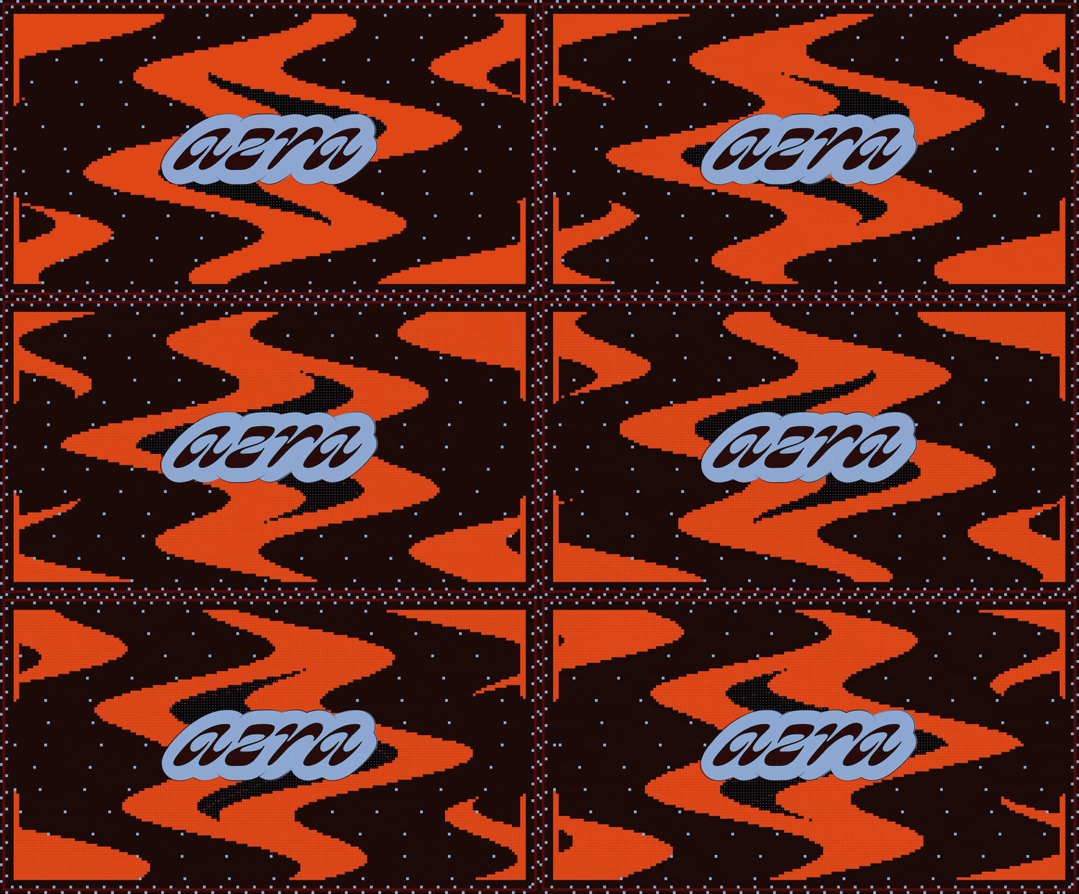
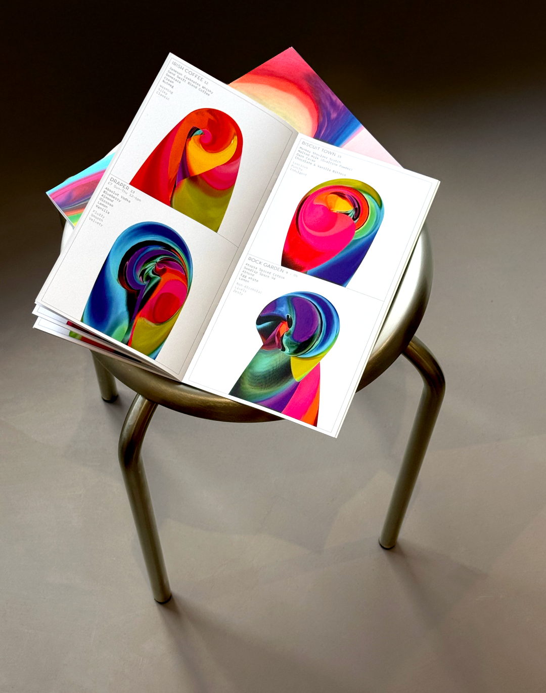
Studio Dial excels in textural works – with Case for Cities, the identity grew out of experiments in visually portraying growth until the shapes resolved into a skyline, resulting in beautiful gradients just like an evolving sunset. Meanwhile, the restaurant Azra’s identity started from research into traditional Afghan textiles and the cloud-band motif, leading to a generative tool that keeps producing new textile patterns – the studio literally weaves the brief into the design, taking inspiration from the physicality of textiles. And for Swift Bars, the physical motion of stirring a cocktail and the curl of a citrus twist became the seed for a generative pattern system, giving every drink on the menu its visual spin.
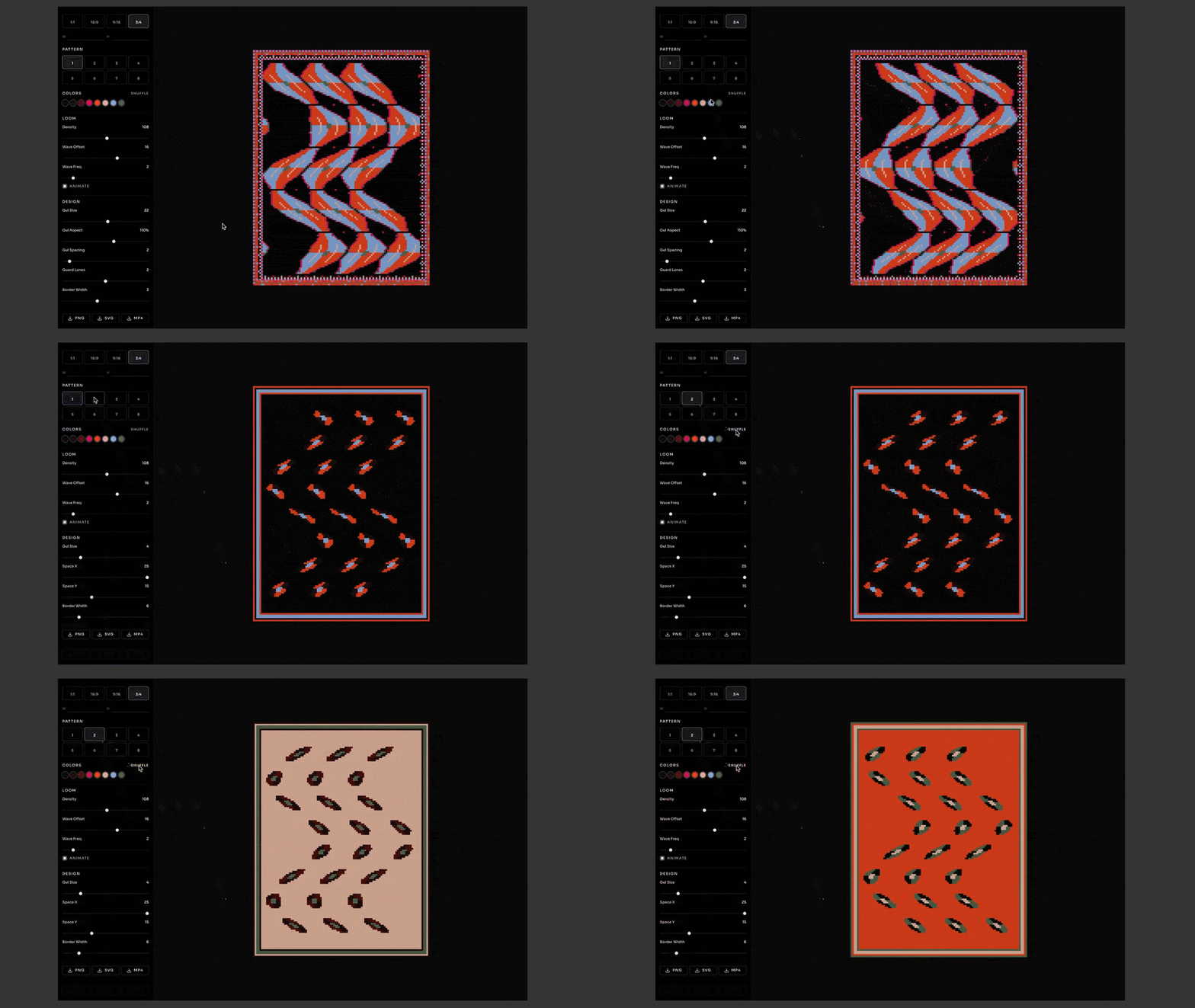
Studio Dial: Azra (Copyright © Azra, 2026)

Studio Dial: Azra (Copyright © Azra, 2026)
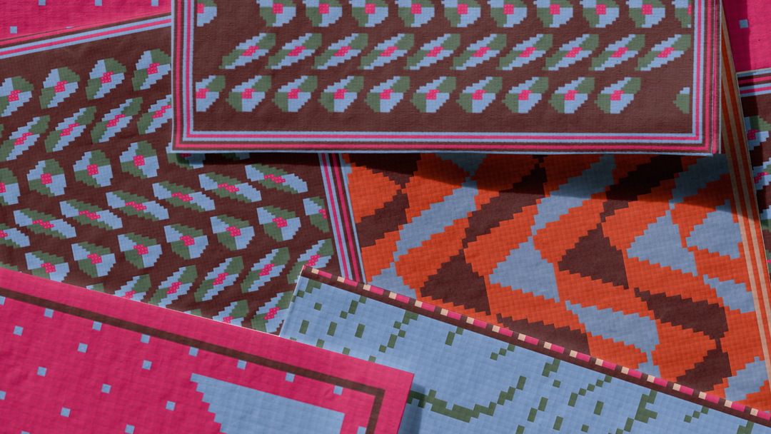
Studio Dial: Azra (Copyright © Azra, 2026)
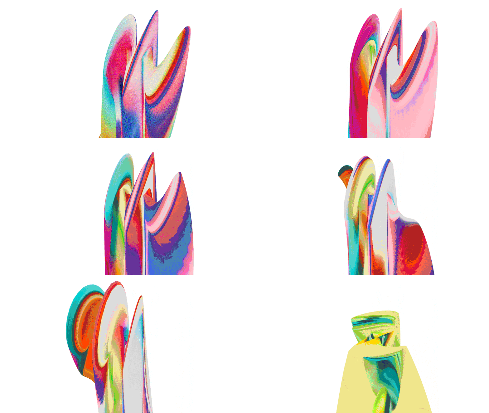
Studio Dial: Swift Bars (Copyright © Swift Bars, 2026)
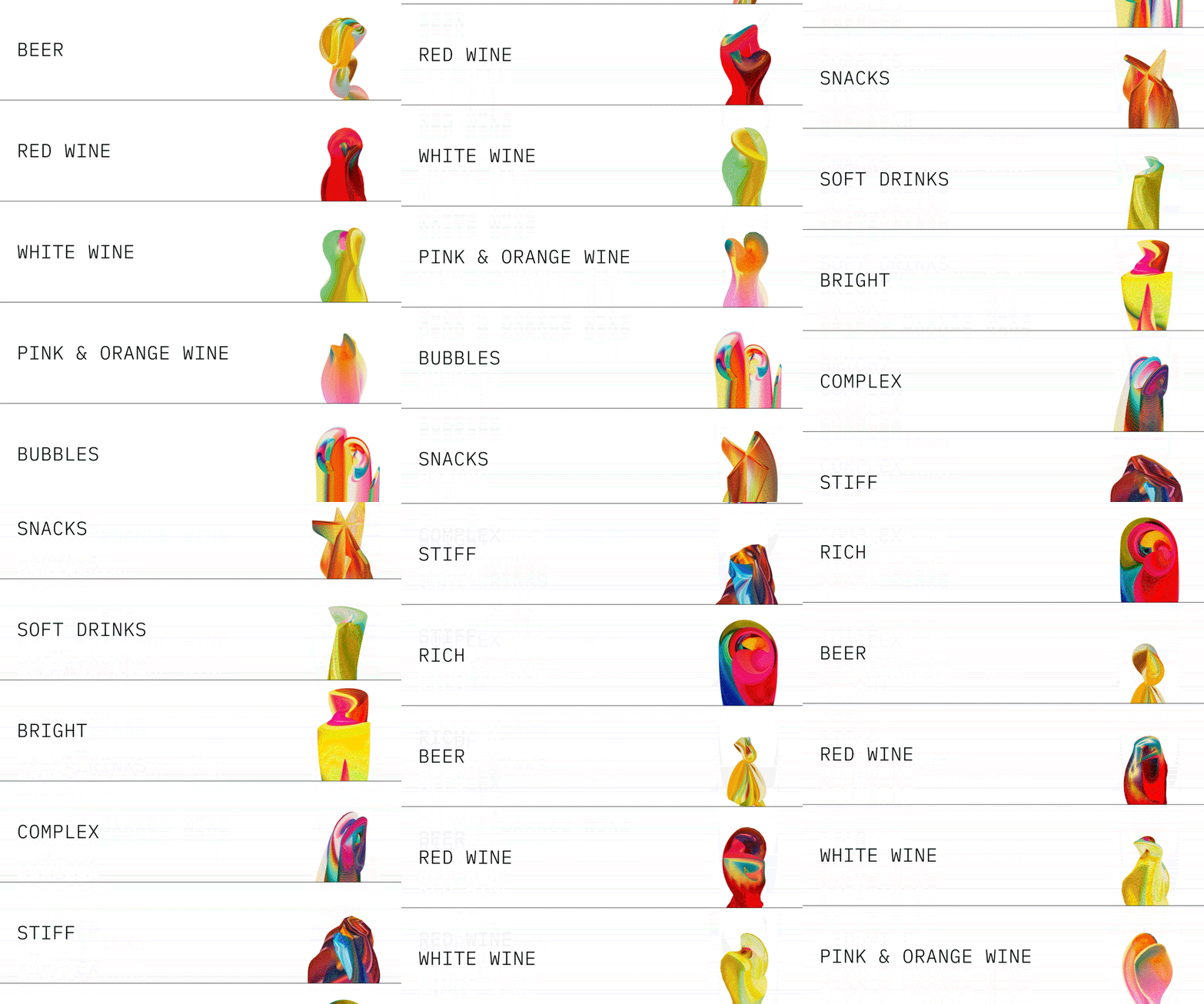
Studio Dial: Swift Bars (Copyright © Swift Bars, 2026)
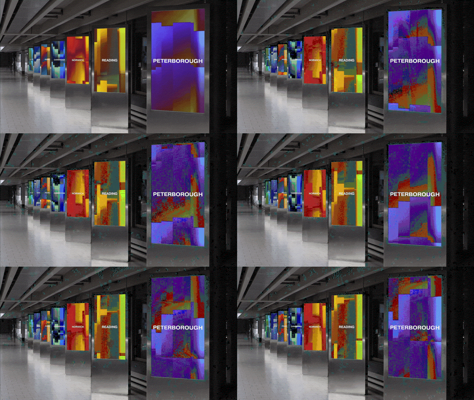
Studio Dial: Case for Cities (Copyright © Case for Cities, 2026)
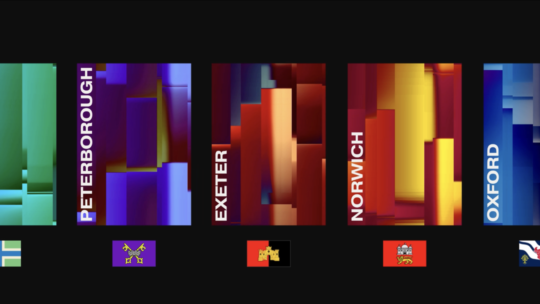
Studio Dial: Case for Cities (Copyright © Case for Cities, 2026)
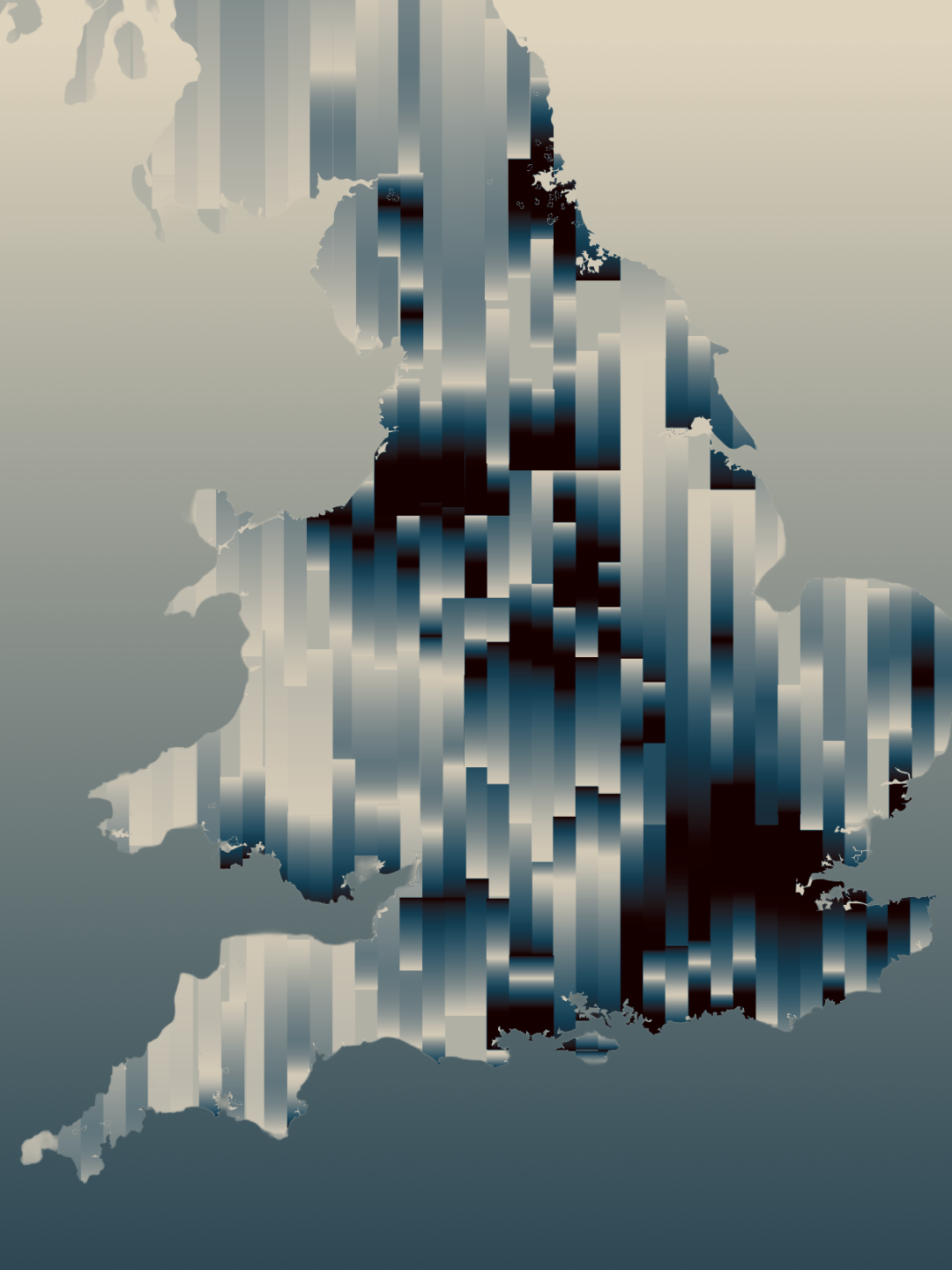
Studio Dial: Case for Cities (Copyright © Case for Cities, 2026)
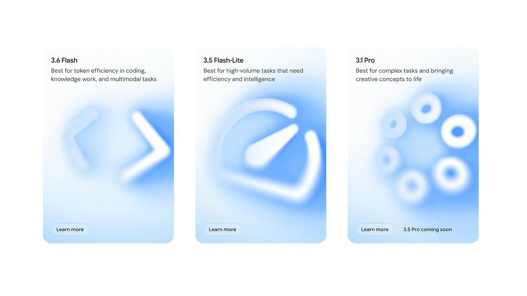
Studio Dial: Gemini (Copyright © Gemini, 2026)

Studio Dial: Gemini (Copyright © Gemini, 2026)
Hero Header
Studio Dial: Swift Bars (Copyright © Swift Bars, 2026)
Share Article
Further Info
About the Author
—
Paul M (He/Him) is a Junior Writer at It’s Nice That since May 2025. He has a strong interest in graphic design, digital kitsch, multimedia painting, collage, nostalgia, analogue technology and all matters of strange stuff. pcm@itsnicethat.com
To submit your work to be featured on the site, see our Submissions Guide.