




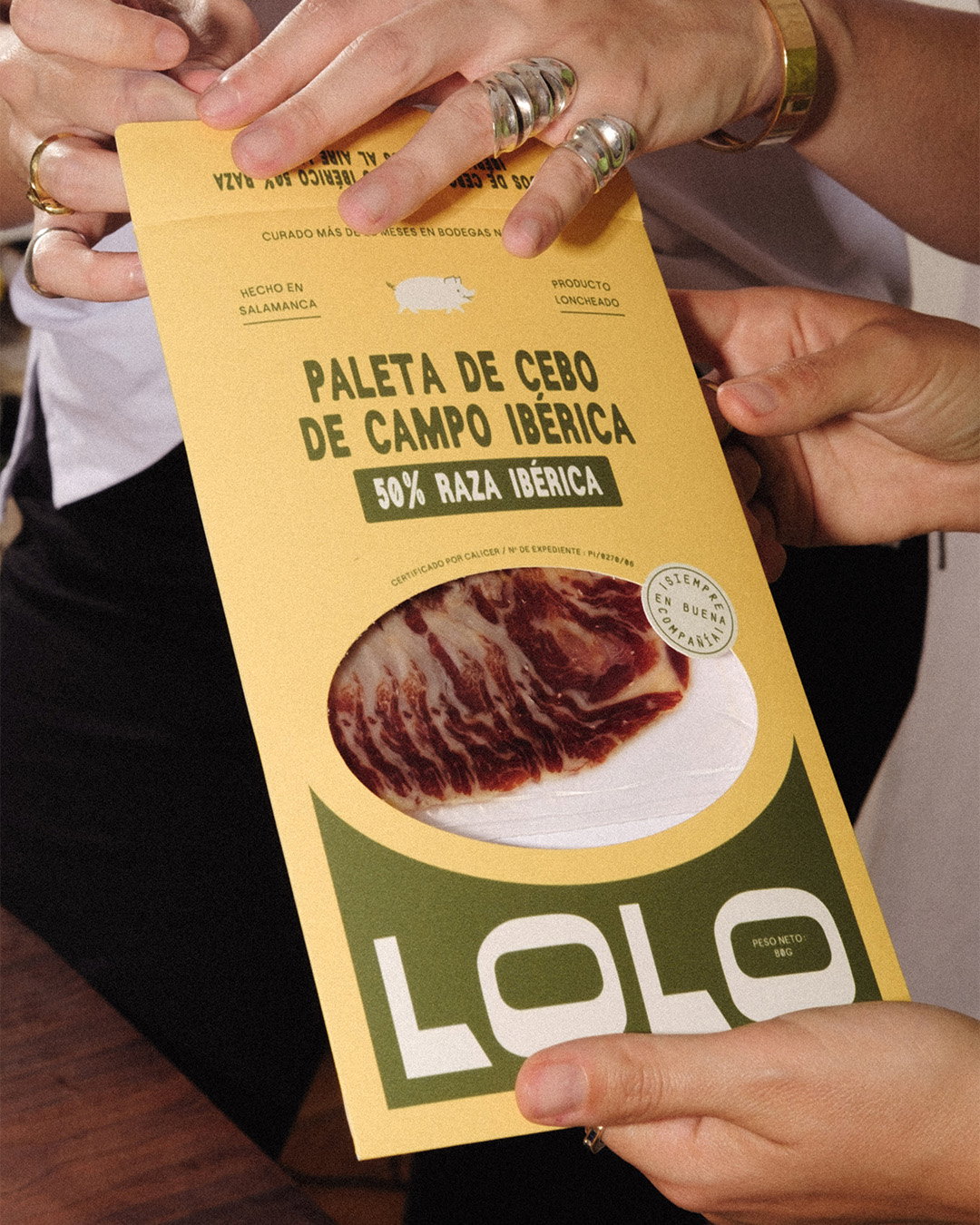
Odds Studio welcomes the warmth of tradition with a retro rebrand for Lolo
The French design studio brings an artisanal family food business back to life with an identity that brings a more modern audience to the table.
The co-founders of Odds Studio, Djelissa Latini and Amélie Warnault, are big foodies, and so they tend to land briefs that let them lean into their passion for all things dining adjacent. In comes Lolo, a family run, Spanish Iberic ham brand that adds yet another identity system that lends itself to the warm vintage feel of Odds’ portfolio. It’s what some might call a match made in heaven.
A family-run business crafted in the heart of Salamanca, Lolo was recently passed down to brothers Pablo and Valentin, who, whilst continuing the brand’s age-old traditions, wanted to refresh its look in order to appeal to a broader audience. “Their deep connection to Spanish culture – rooted in their family history – was a key inspiration for us,” shares Djelissa. “From the start, we wanted to infuse the brand with a sense of conviviality, generosity, and the joy of gathering around a big table with family and friends.”
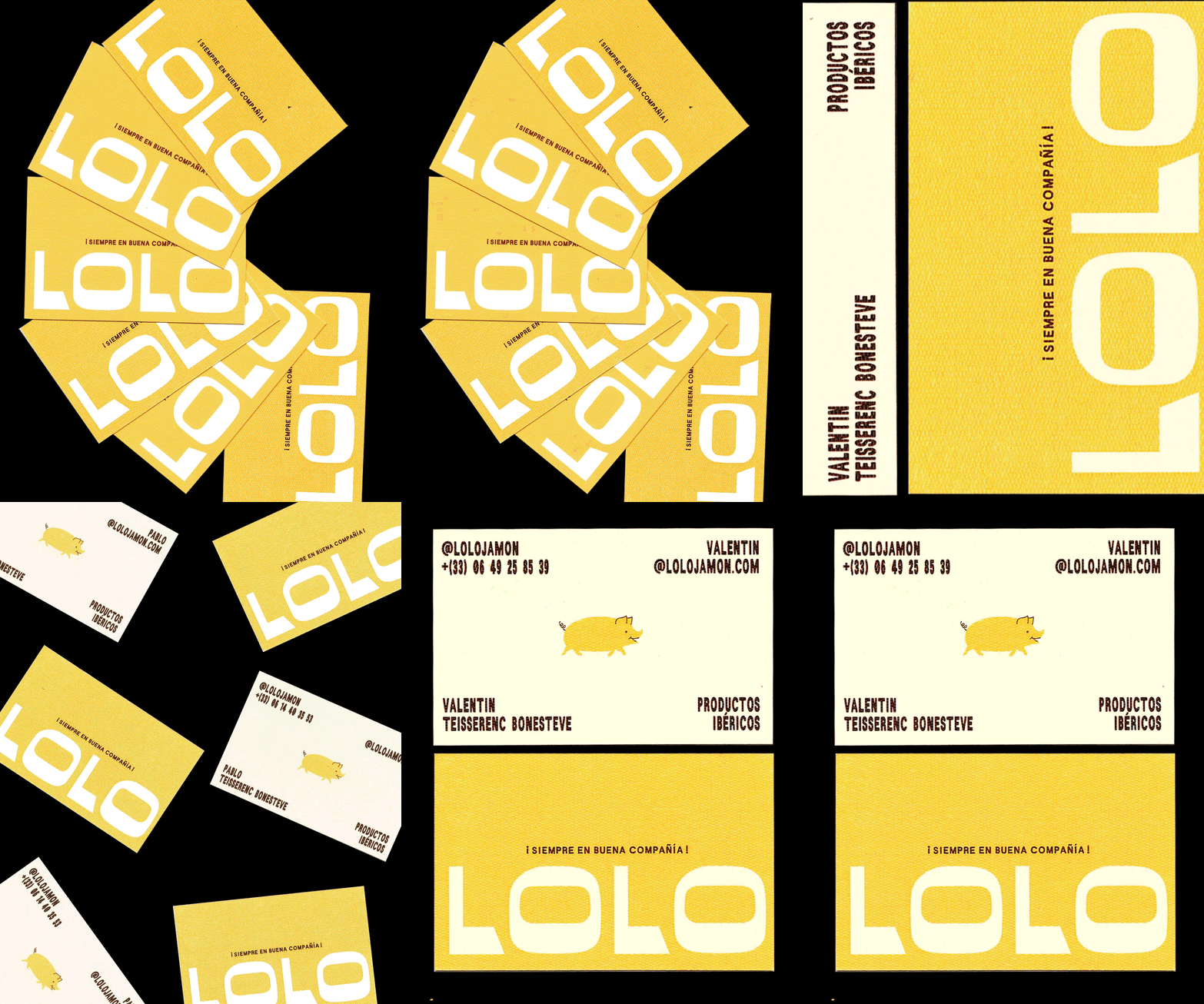
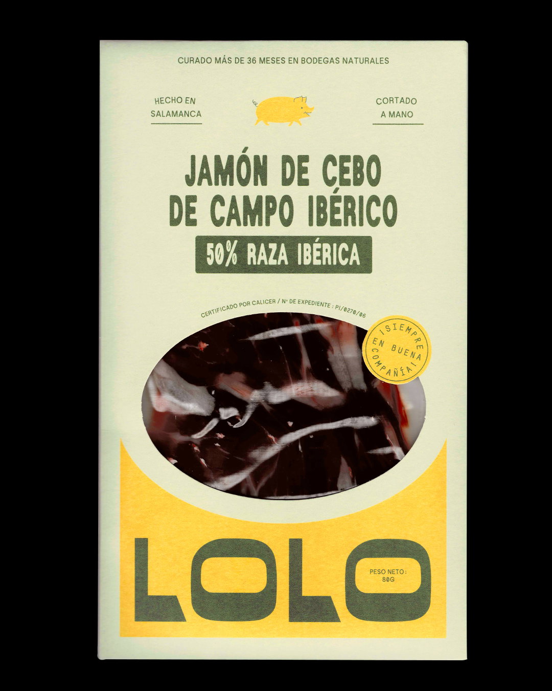
To build a brand that paid homage to tradition but welcomed newcomers, Odds studio began diving into extensive image archives in search of Spanish design details they could draw on that aligned with the brand’s story. From this research came Lolo’s bold new logo. “We took inspiration from old boutique signage to reflect the authenticity that was so important to the founders,”, explains Amélie. They made the brand’s stamp feel more playful and approachable in a sea of “high-end products often tend to be quite serious and lack any sense of fun”, she continues.
Odds Studio: Lolo Jamon (Copyright © Odds Studio, 2025)
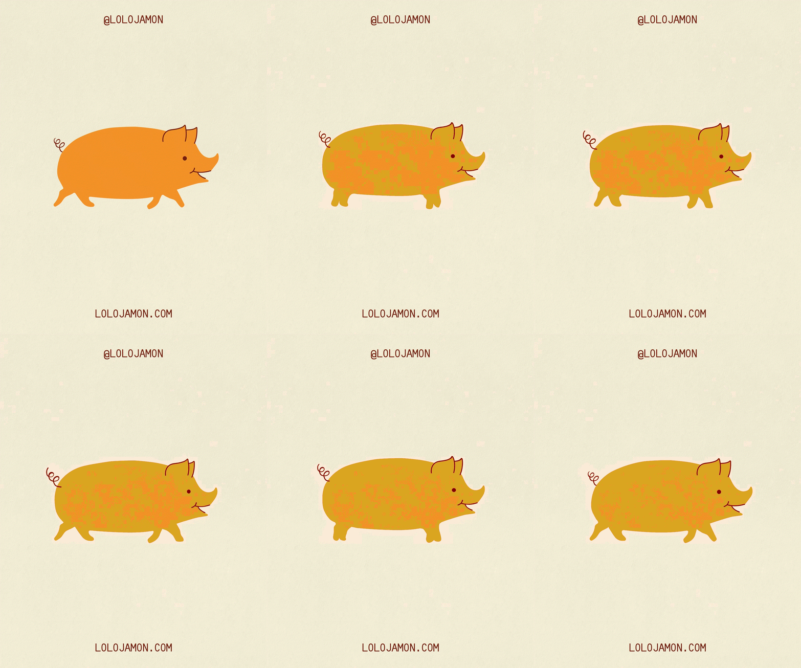
“We also noticed that pig illustrations are commonly used in this category, but they often resemble traditional butcher’s cut diagrams,” adds Djelissa. To incorporate a brand icon that felt up to date with more conscious meat consumers and the “respect and care given to the animals” in the making of the brands high-end products, the pair wanted to design a more expressive and engaging illustration. Once animated across applications and brought to life it “introduce[s] a modern twist to how we talk about meat in general”, she explains.
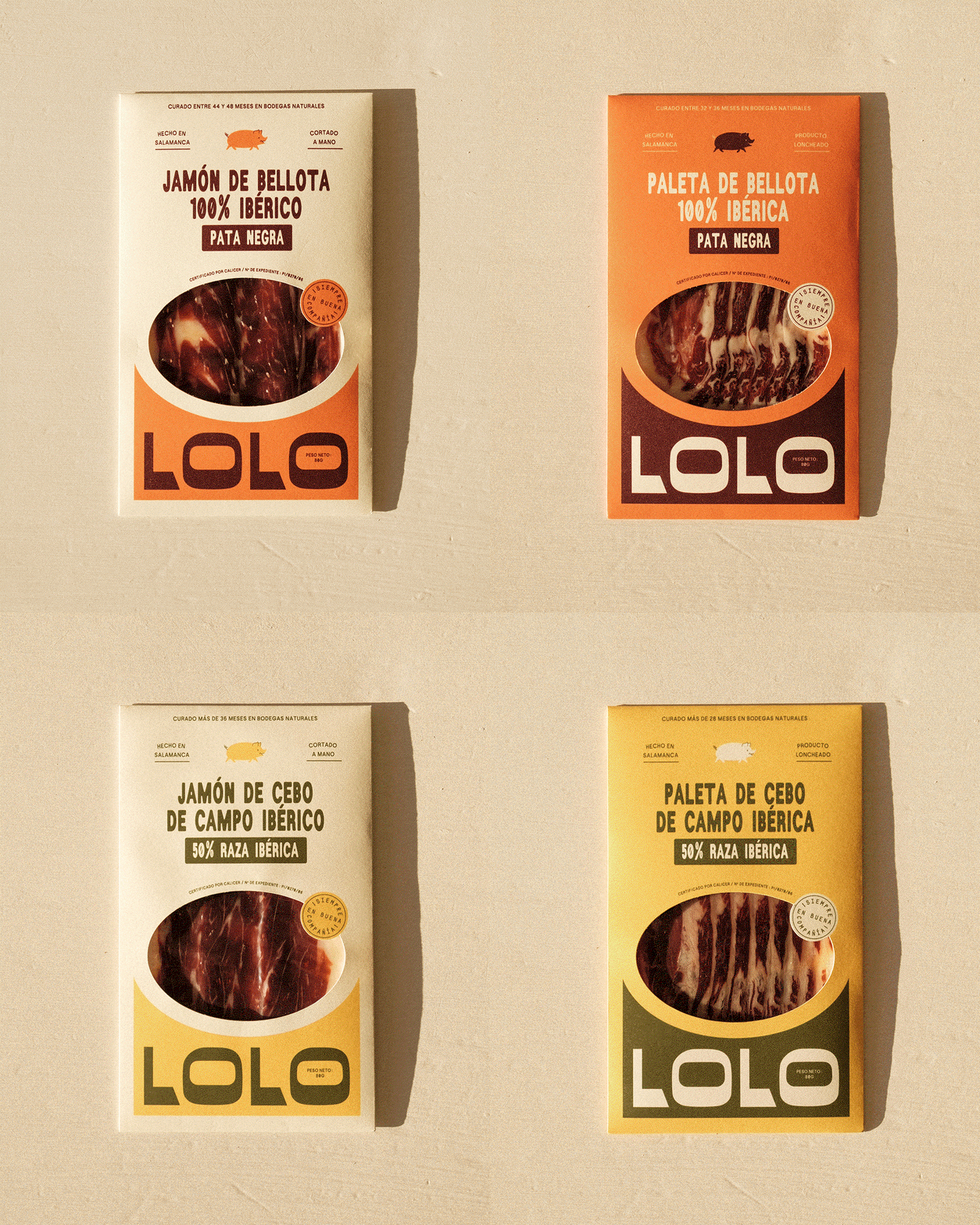
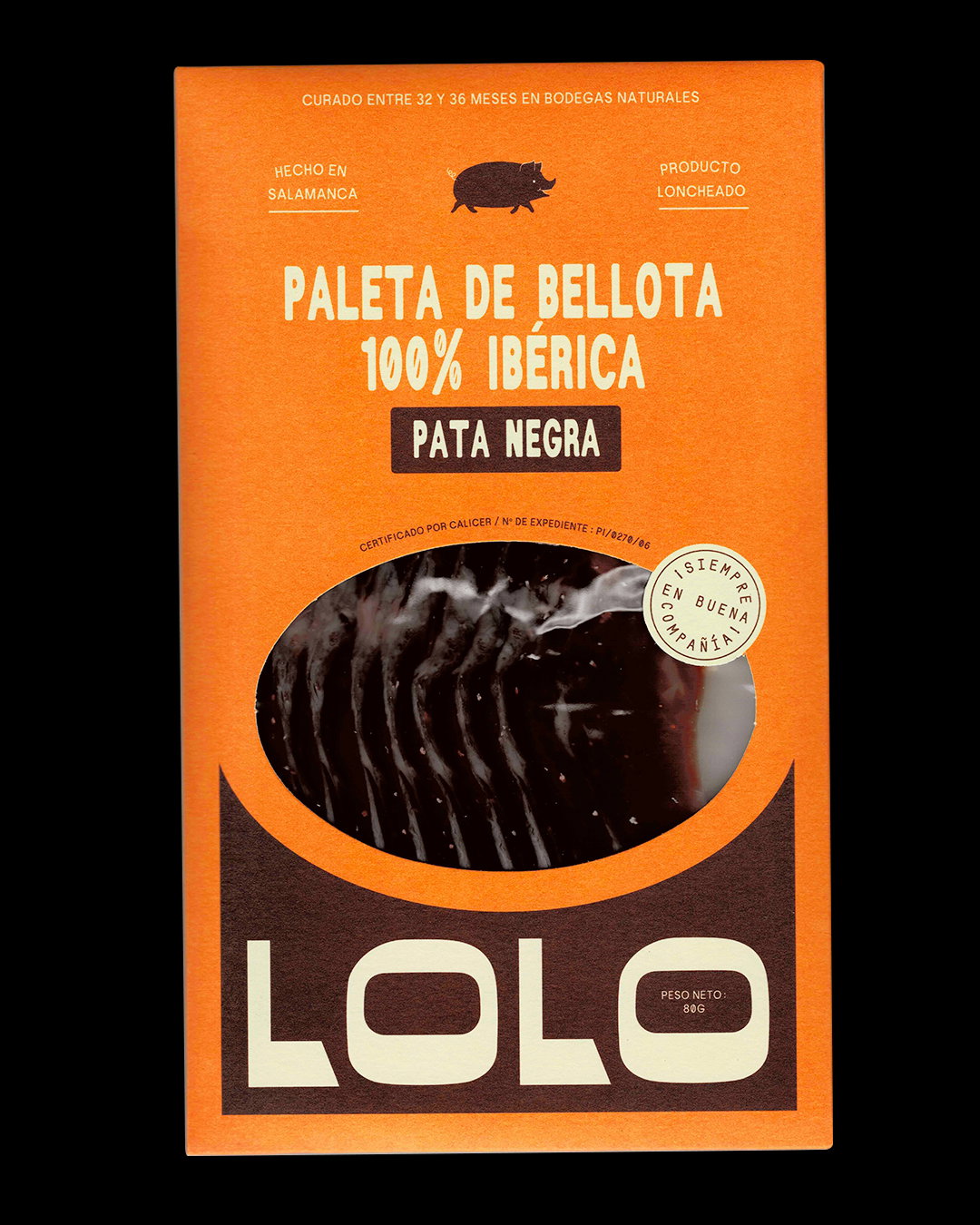
The high-end market was also predominantly offering up a black and white colour palette when it came to packaging, “so there was definitely room to bring some vibrancy and pizzazz!” says Djelissa. The pair went for warm tones to evoke a sense of comfort and timelessness that would stand out on shop shelves, drawing their inspiration for a set of natural hues from the landscapes of Salamanca where Lolo’s land is located. The palette was also an effective and straightforward way to differentiate between Lolo’s variety of products, a tool to fit around traditional colour codes that usually identify meat products in marketplaces.
Odds Studio: Lolo Jamon (Copyright © Odds Studio, 2025)
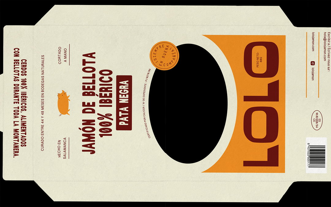
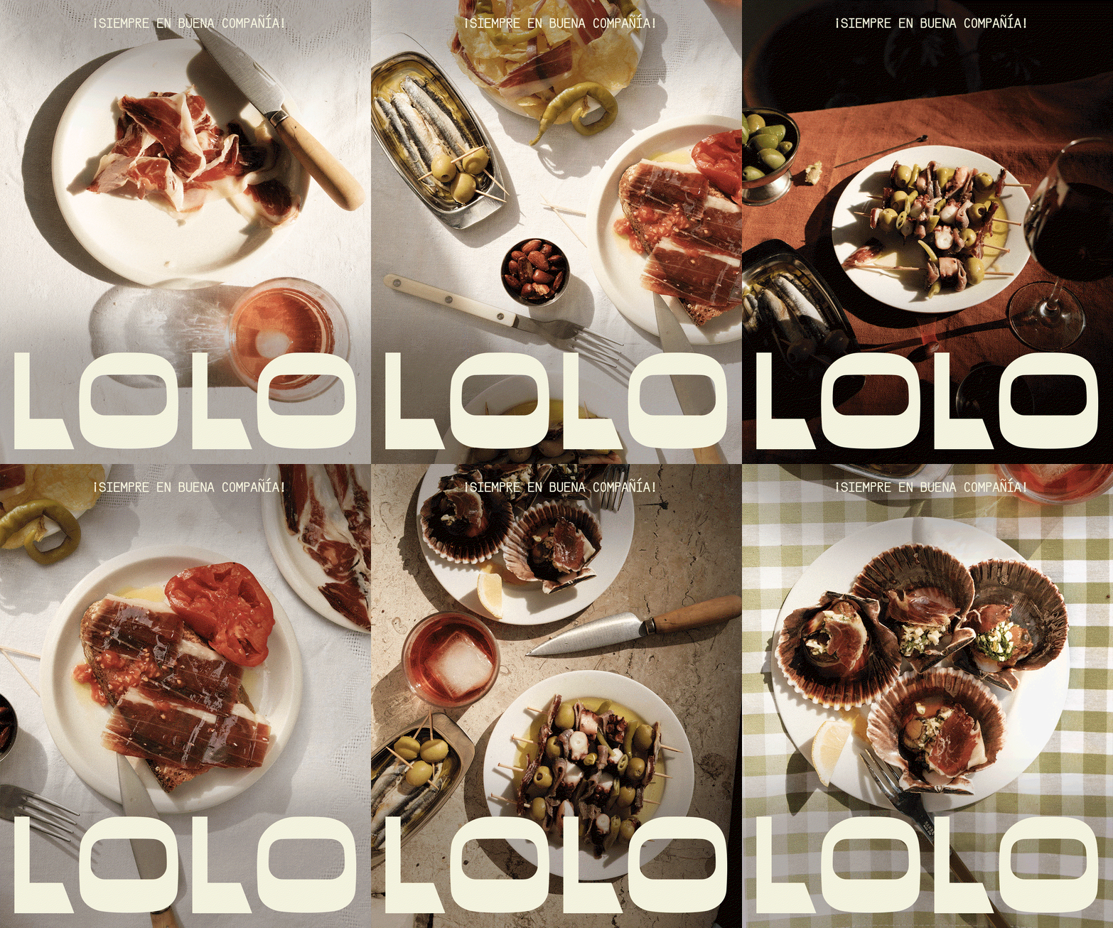
The cut-outs that came to define the fun approach to packaging also influenced the architecture of the identity across platforms with shapes inspired by “ceramic tiles and arched windows of traditional tapas bars”. These shapes also informed Lolo’s new website where items are categorised by hole punched tiles that match the products labels, marrying together print and digital. In all corners of the design system the studio “gravitated toward a warm, sunlit energy that could be reflected not only in the design but also in the photography”, shares Amélie. “We collaborated with our dear friend Delaney Inamine to shoot the first campaign under the beautiful sun of Marseille in the south of France and many other talented friends.”
Both authentic and forward-thinking the brand’s new identity modernises its rich heritage with creative visual codes that bring tradition to the fore, enticing curious newcomers not just elitist experts. “We hope it embodies the experience of stepping into a market stand, where the owner is warm, cheerful, and inviting”, ends Djelissa. “It’s less about buying a brand and more about experiencing a way of life – one that reflects the people, their passion, and the dedication they pour into their craft.”
GalleryOdds Studio: Lolo Jamon (Copyright © Odds Studio, 2025)
Hero Header
Odds Studio: Lolo Jamon (Copyright © Odds Studio, 2025)
Share Article
Further Info
About the Author
—
Ellis Tree (she/her) is a staff writer at It’s Nice That. She joined as a junior writer in April 2024 after graduating from Kingston School of Art with a degree in Graphic Design. Across her research, writing and visual work she has a particular interest in printmaking, self-publishing and expanded approaches to photography. ert@itsnicethat.com
To submit your work to be featured on the site, see our Submissions Guide.





