- Words
- Paul Moore
- —
- Date
- 19 October 2026
- Tags
SourceType’s Dictionary of the Illegible explores what happens when typography stops making sense
From metal band logos, watermelon emojis and comic book grawlixes to coded messages designed to evade online censorship, SourceType’s new book examines how illegible text can communicate and connect us.
Share
Share
SourceType is, far and away, one of the best... wait, I don’t know what SourceType is. A foundry? A collective? A publisher? The ultra-hyphenate SourceType claims to be much more than that: an index, a library, a classroom, a conspiracy, a dialogue. Whatever it is, it’s one of the best. I prefer to think of SourceType as the ultimate asset, an educational tool in how a group of creatives can join together to challenge book and typeface design. Its creative director, Laurenz Brunner (also the founder of the more simply definable design studio Studio Laurenz Brunner) is a major part of SourceType’s brilliant output. Based in a converted auto garage in Zurich and informed by high, low and popular culture and concepts, his newest book Dictionary of the Illegible explores the edges of language and visual communication, looking at where language begins and where it starts to dissolve.
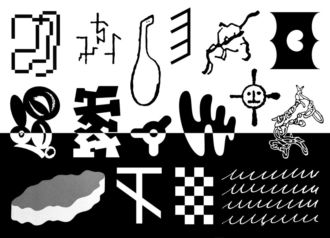
The book is a tour-de-force across typographic history, how it distorts, how it falls apart, how it loses meaning and in the process gains an even more significant texture. What is illegibility? Is it the same thing as unreadability? In our fast-shifting world of communication breakdown, type designers scramble to visually stand out, to offer accessibility, to achieve clarity and flexibility. But in Dictionary of the Illegible, the reader finds that type design has always created friction against ideas of media literacy, inverted how we see typography and played on our intuitions as highly communicative creatures.
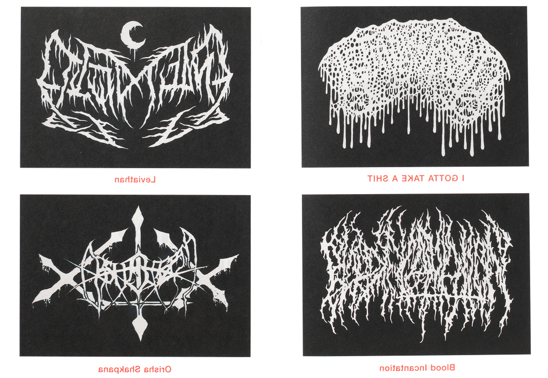
For example, think of comic book speech bubbles filled with punctuation – that’s called a grawlix and it suggests a type of censored swearing, but we don’t need to see profanity to know it’s there. What about metal band logos, which are notoriously illegible, so much so that it’s become a tradition for band logos to look like exploded Rorschach paintings made out of nervous systems of lightning bolts. To a metalhead’s eye, these logos may be illegible, but they are still readable – it suggests something powerful about how text can become exclusive, protective and gatekept. Below, Laurenz Brunner discusses how illegible typography can communicate beyond words, what metal band logos and coded online messages have in common, and why unreadable text might be more important than ever.
It’s Nice That (INT):
Let’s cut straight to the chase: is language dead?
Laurenz Brunner (LB)
:
I don’t think so. But language is becoming increasingly political. It is used as propaganda, polluted by misinformation, generated by bots and increasingly distorted by algorithms designed to capture attention rather than create understanding.
At the same time, social media paradoxically disconnects us from one another, as we become more isolated within a hyper-individualised, self-optimising society. Genuine human connection and interaction therefore become vitally important. Language remains fundamental to this – not simply as a means of speaking, but as a way of listening to and understanding one another, exchanging ideas and creating intimacy.
INT:
If illegibility isn’t a breakdown of communication, but rather a unique cultural condition (or an evolution of traditional, legible communication) how do you differentiate between something that is simply “bad typography” and something that is meaningfully “illegible”? (Is there such a thing as bad typography?)
LB:
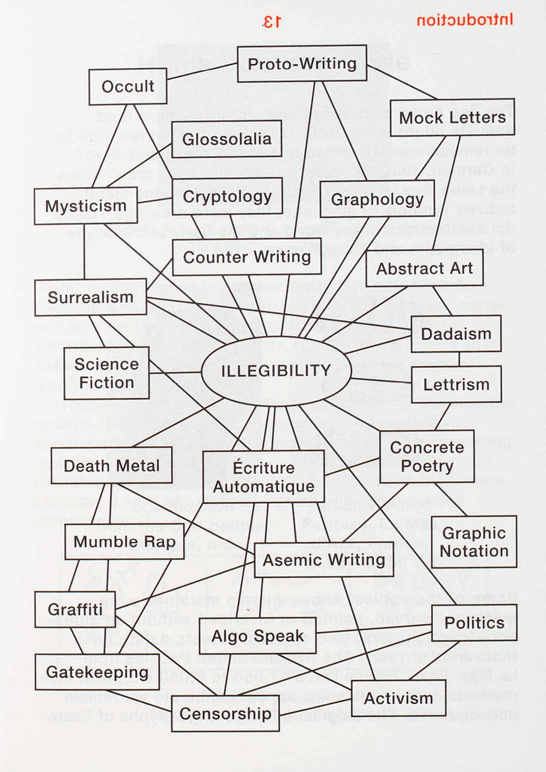
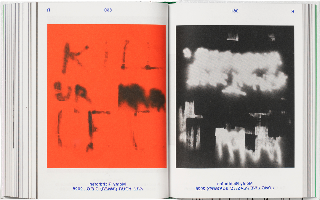
I think the beauty of abstraction lies in the space it opens up for interpretation by the reader. In that sense, I’m hesitant to make a distinction between “good” and “bad” typography. What might appear dysfunctional or incorrect in one context can become meaningful in another. Unlike art, which has fully embraced abstraction as an evocative and powerful form of expression, traditional writing has largely remained tied to narrative and semantic logic. My research looks for examples that challenge this convention and illustrates that language can be equally free.
SourceType: Dictionary of the Illegible (Copyright © SourceType, 2026)
SourceType: Dictionary of the Illegible (Copyright © SourceType, 2026)
INT:
What led you to the creation of this book? Did your interest in strange glyphic languages begin before or during your career in type design?
LB:
I grew up in Switzerland, immersed in perfectly “legible” systems – grids that ordered the streets, timetables, signage systems and the layouts of books. Legibility wasn’t just a visual principle; it shaped the national psyche: precise, neutral, controlled. It’s part of what defines Swiss cultural identity, including design. Yet that rigid clarity gradually began to feel constraining to me, and I found myself drawn instead to messier, more emotional codes: gritty type in fringe cultural magazines, raw, illegible metal band logos or graffiti scribbles on walls spoke to me.
These tangential observations of illegibility eventually evolved into a real obsession of mine. I began collecting and mapping examples from the edges of design, music, art, architecture, cinema, fashion and politics – tracing how the unreadable appears across cultures and throughout history. In 2016, I had the opportunity to exhibit the early stages of this research at ArtCenter in Los Angeles. The research, editing and design of the book continued for another 10 (!!!) years, eventually bringing this vast collection of illegible content together for the first time in the form of a dictionary.
SourceType: Dictionary of the Illegible (Copyright © SourceType, 2026)
SourceType: Dictionary of the Illegible (Copyright © SourceType, 2026)
“A 16th-century engraving and a Family Guy screen capture may have almost nothing in common [...] yet both can occupy that strange territory where language becomes something more than information.”
Laurenz Brunner
INT:
If illegibility isn’t a breakdown of communication, but rather a unique cultural condition (or an evolution of traditional, legible communication) how do you differentiate between something that is simply “bad typography" and something that is meaningfully “illegible”? (Is there such a thing as bad typography?)
LB:
I think the beauty of abstraction lies in the space it opens up for interpretation by the reader. In that sense, I’m hesitant to make a distinction between “good” and “bad” typography. What might appear dysfunctional or incorrect in one context can become meaningful in another. Unlike art, which has fully embraced abstraction as an evocative and powerful form of expression, traditional writing has largely remained tied to narrative and semantic logic. My research looks for examples that challenge this convention and illustrates that language can be equally free.
SourceType: Dictionary of the Illegible (Copyright © SourceType, 2026)
INT:
The title of the book is slightly tongue-in-cheek; a dictionary implies legible orders and definitions. So how did you go about creating a taxonomy of eccentric texts that defy simple categorisation?
LB:
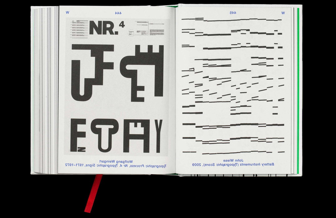
A lot of the material in the book hovers somewhere between image and text, so it felt important to present it within a legible system while leaving the content itself completely open to interpretation. During the process, I explored organising the material chronologically, as well as building chapters around different themes, but both felt too prescriptive. In the end, imposing the rigid order of the alphabet allowed the content to fall into a strangely non-linear sequence, creating unexpected juxtapositions and connections along the way. In that spirit, Dictionary of the Illegible is a productive paradox – an attempt to make meaning from content that inherently resists it.
INT:
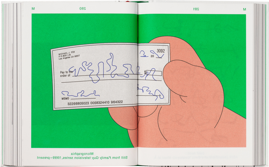
What is the connective tissue between a 16th-century engraving by Albrecht Dürer and a cryptic screen capture from Family Guy, or metal core band logos and Miffy? How do they speak the same “illegible” language?
LB:
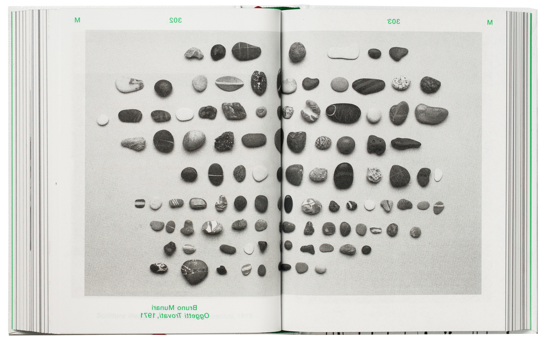
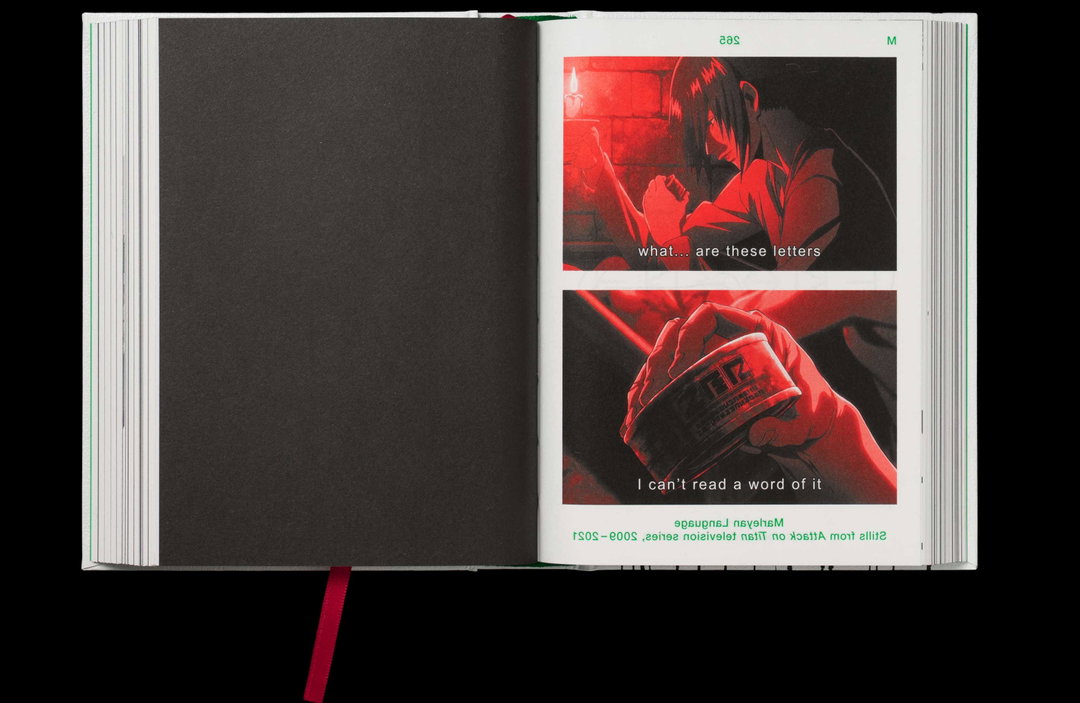
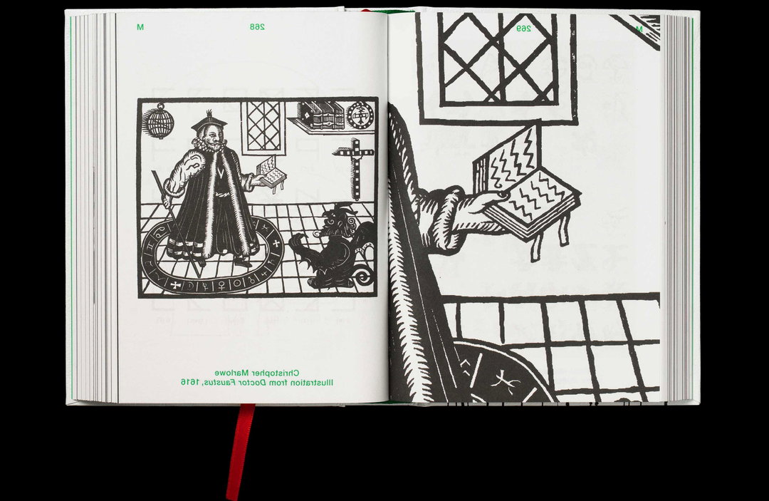
The connective tissue is perhaps less visual than conceptual. I’m interested in illegibility as something that continually reappears across completely different cultures, periods and contexts. A 16th-century engraving and a Family Guy screen capture may have almost nothing in common historically or aesthetically, yet both can occupy that strange territory where language becomes something more than information. Putting these things next to each other temporarily removes their usual hierarchies and contexts. Suddenly Dürer can speak to a metalcore band, or Miffy to an ancient inscription. The book is interested in precisely these unlikely connections – and in the fundamentally human impulse to encode, obscure and transform.
SourceType: Dictionary of the Illegible (Copyright © SourceType, 2026)
SourceType: Dictionary of the Illegible (Copyright © SourceType, 2026)
SourceType: Dictionary of the Illegible (Copyright © SourceType, 2026)
INT:
Early AI image and text generation brought forth new forms of illegibility through nonsensical and garbled text. AI has also brought forth AI scanning, predicative text, optical character recognition. What does human-generated illegibility serve us during these times?
LB:
One of the most recent examples of human-generated illegibility I’ve observed is the intentional obscuring of messages to circumvent censorship, profiling or shadow banning on social media – for example, writing “g*nocide” or using the 🍉 emoji to signal solidarity with Palestine. As machines become increasingly capable of reading and categorising language, illegibility can be a form of resistance. In this sense, obscuring language can become an essential tool for evading surveillance technologies, navigating spaces of political oppression, or simply communicating in ways intended to be understood by humans but not machines.
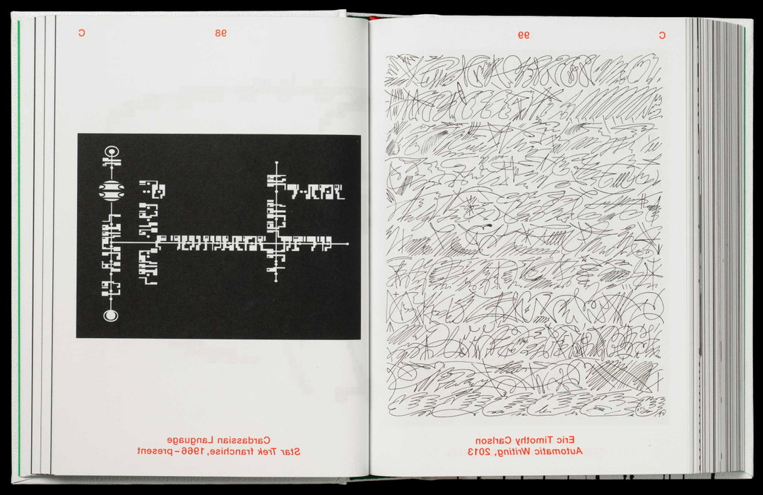
SourceType: Dictionary of the Illegible (Copyright © SourceType, 2026)
INT:
What is the ultimate lesson a graphic designer can take away from this book? How does teaching people to read the unreadable expand our visual and media literacy?
LB:
David Carson once said, “Don’t mistake legibility for communication”. That idea still resonates with me, because it encourages us to think about communication more holistically. Good communication doesn’t always have to be immediate, clear or efficient. It can be ambiguous, slow or obscure. In a hyper-accelerated world, there can be real value in language that slows us down, demands our attention and asks something of the reader rather than simply transferring information. Precisely because we have to engage with it, it can reach us in a more emotional, intuitive or even visceral way.
INT:
What’s your favourite form of “illegible” text?
LB:
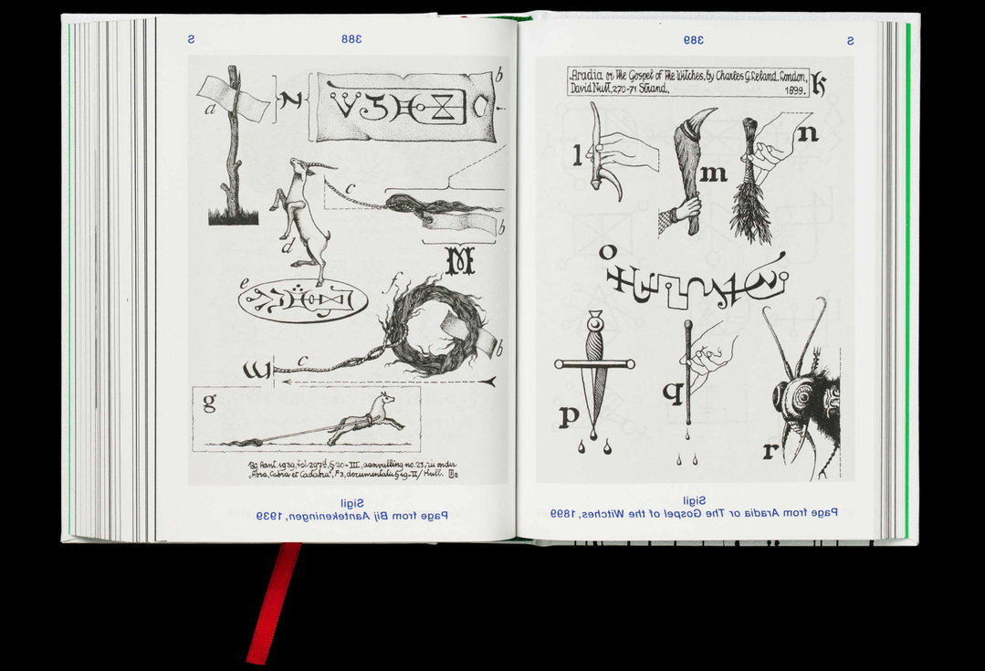
There isn’t a single example for me, but rather a larger phenomenon that became increasingly dear to me as the project developed: the way illegibility can protect knowledge. Across different cultures and periods, obscurity, codes and restricted forms of writing have been used to keep certain knowledge within a community – whether among minorities, subcultures or the occult. I find something beautiful in the idea that not everything is meant to be universally understood or made accessible. In that sense, illegibility can create a healthy boundary: it can conceal and protect, but also create intimacy and belonging among those who know how to read it.
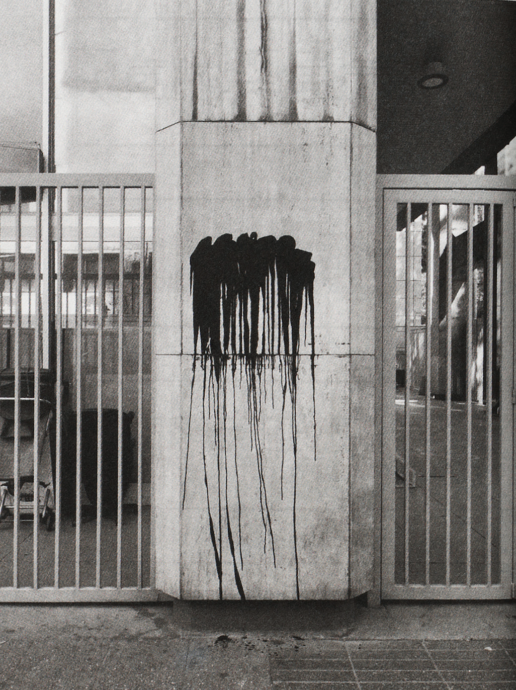
SourceType: Dictionary of the Illegible (Copyright © SourceType, 2026)
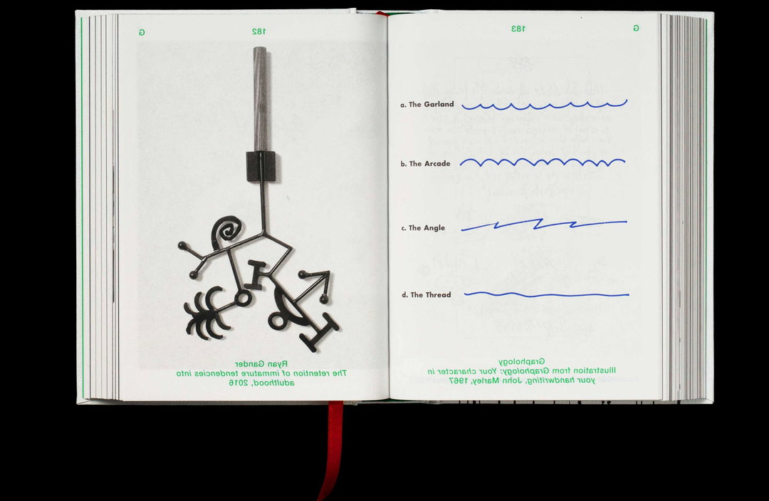
SourceType: Dictionary of the Illegible (Copyright © SourceType, 2026)
Hero Header
SourceType: Dictionary of the Illegible (Copyright © SourceType, 2026)
Share Article
About the Author
—
Paul M (He/Him) is a Junior Writer at It’s Nice That since May 2025. He has a strong interest in graphic design, digital kitsch, multimedia painting, collage, nostalgia, analogue technology and all matters of strange stuff. pcm@itsnicethat.com
To submit your work to be featured on the site, see our Submissions Guide.