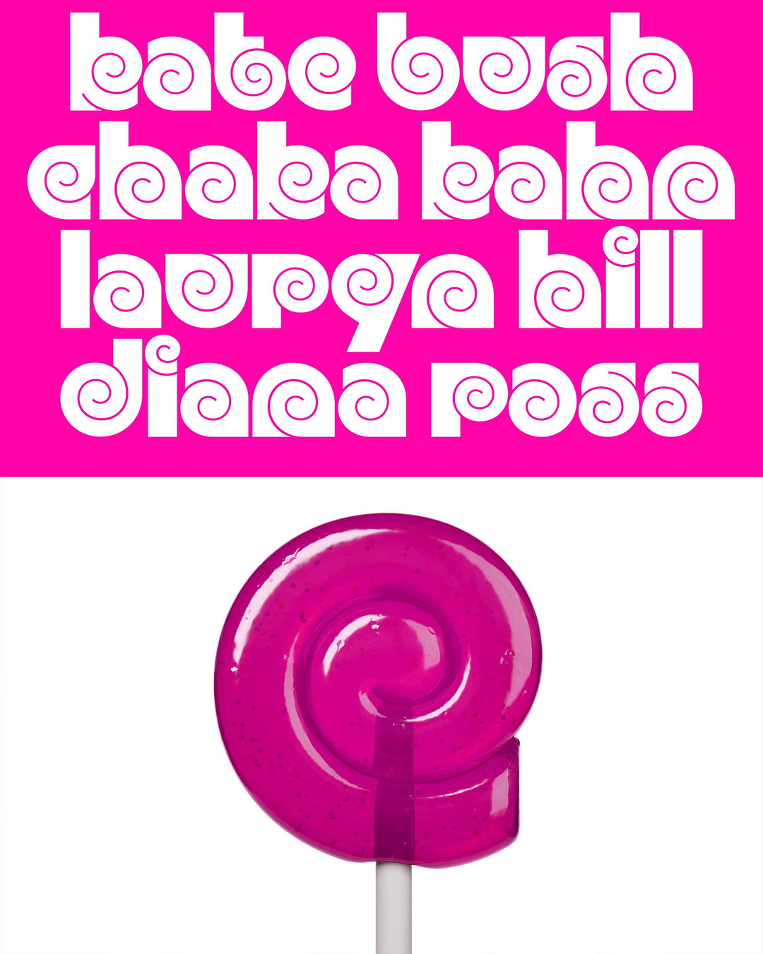
Are we stuck in the typographic principles of the 20th century? Matter Of’s new anti-design manual investigates
With essays, images and typography from a giant pool of collaborators, Matter Of’s book New New Typography is a cornucopia of ideas. It’s also a manual for the most unstable art: type design.
Share
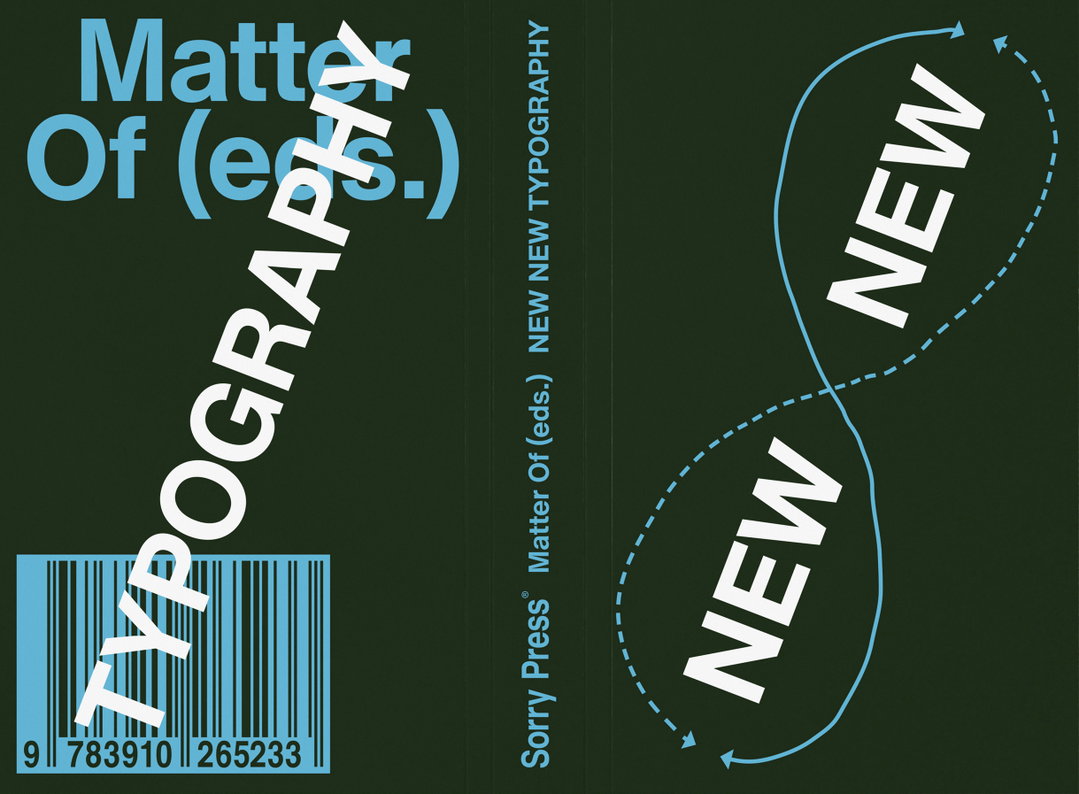
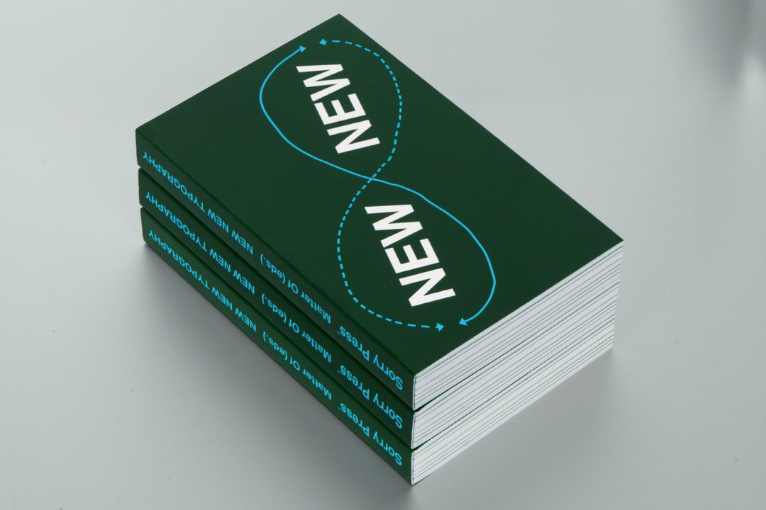
Are we stuck with the established typographic principles of the 20th century? This is what German design studio Matter Of is asking in its design book New New Typography (published by Sorry Press). The title is in direct reference to the proclamation of Jan Tschichold’s original “new typography” in Central Europe 100 years ago. Now Matter Of (and designer Wiegand von Hartmann) are at the spearhead of an even newer typographic revolution: the ‘new new,’ searching to unsettle established paradigms, expand vocabularies and innovate type design. That is, until it’s time for the ‘new new new’, but let’s not worry about that right now.
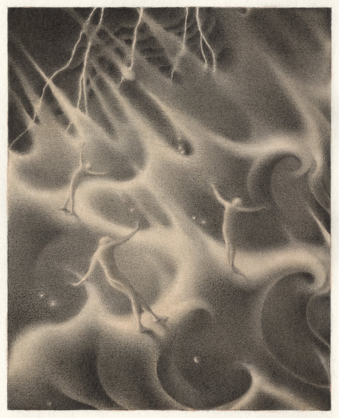
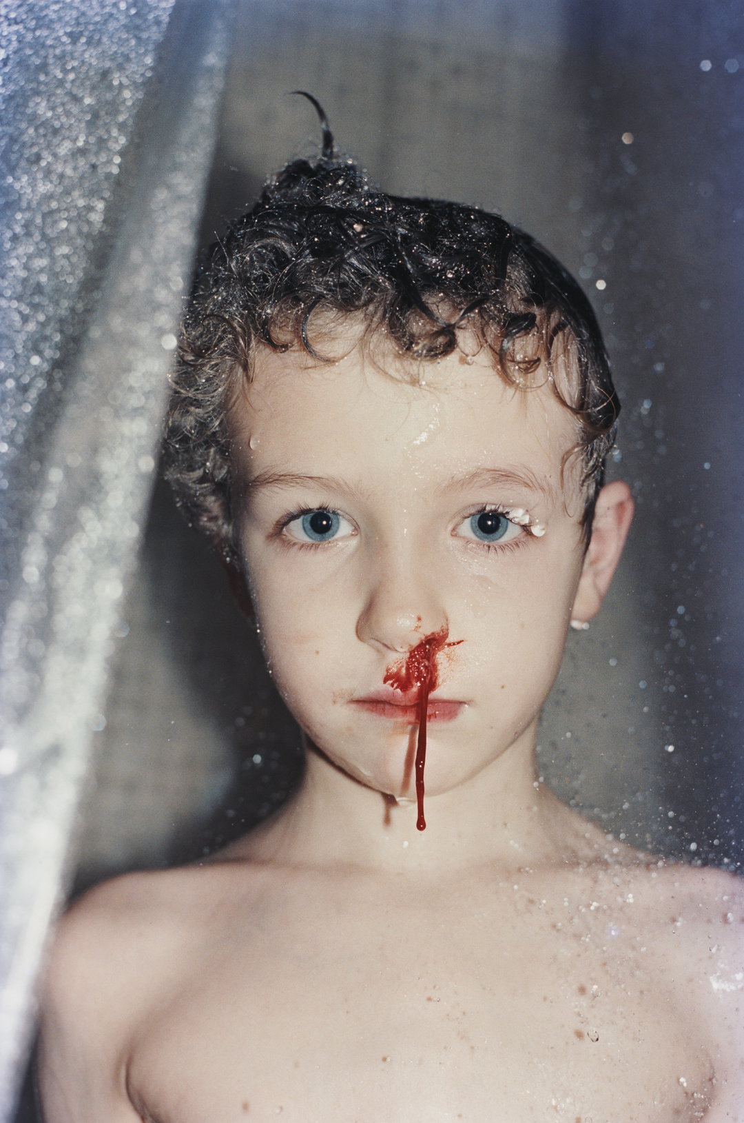
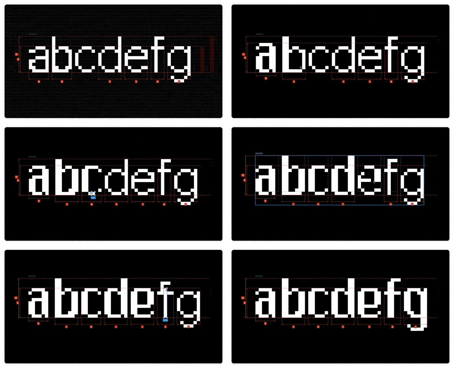
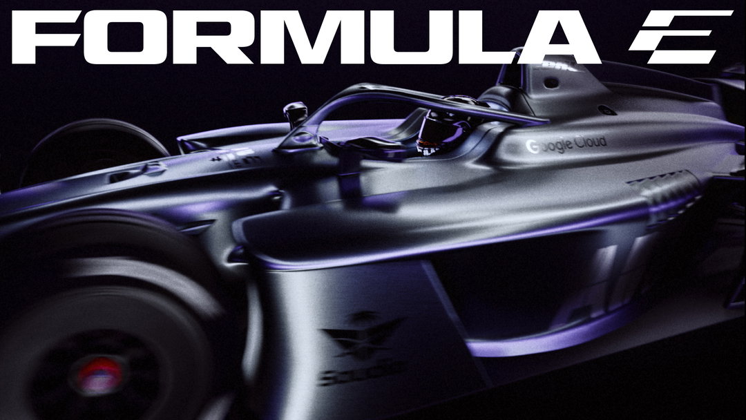
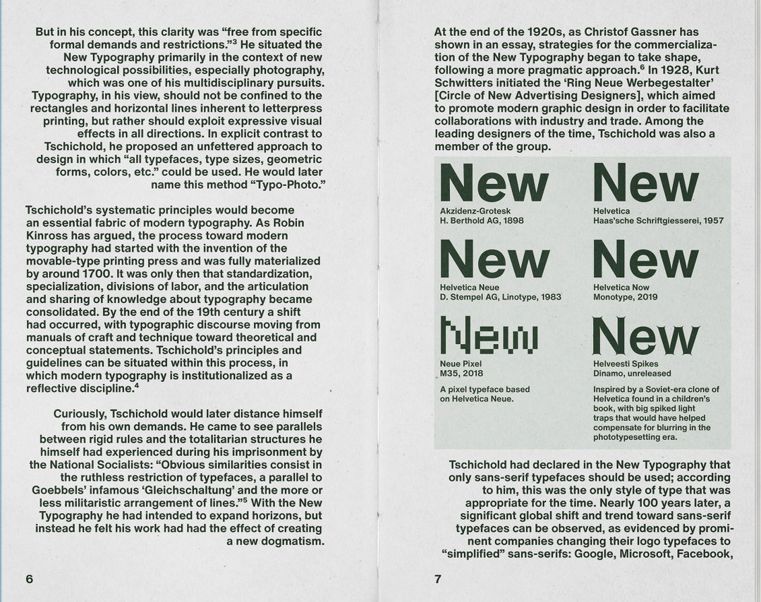
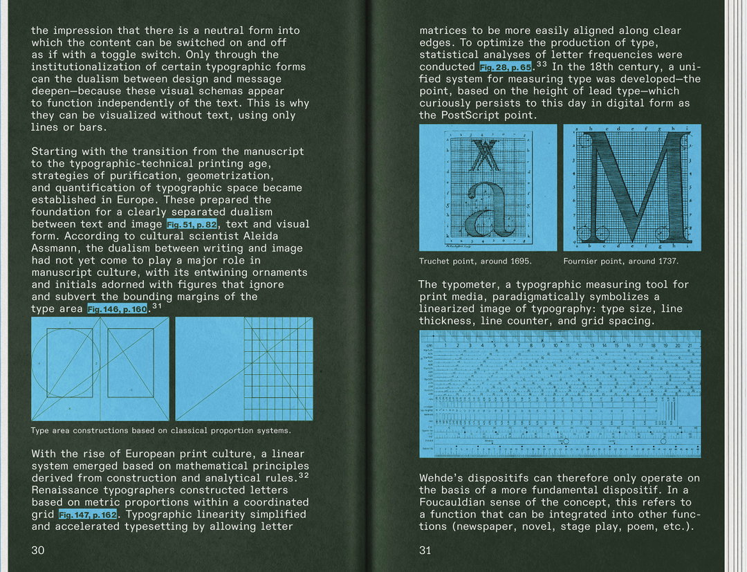
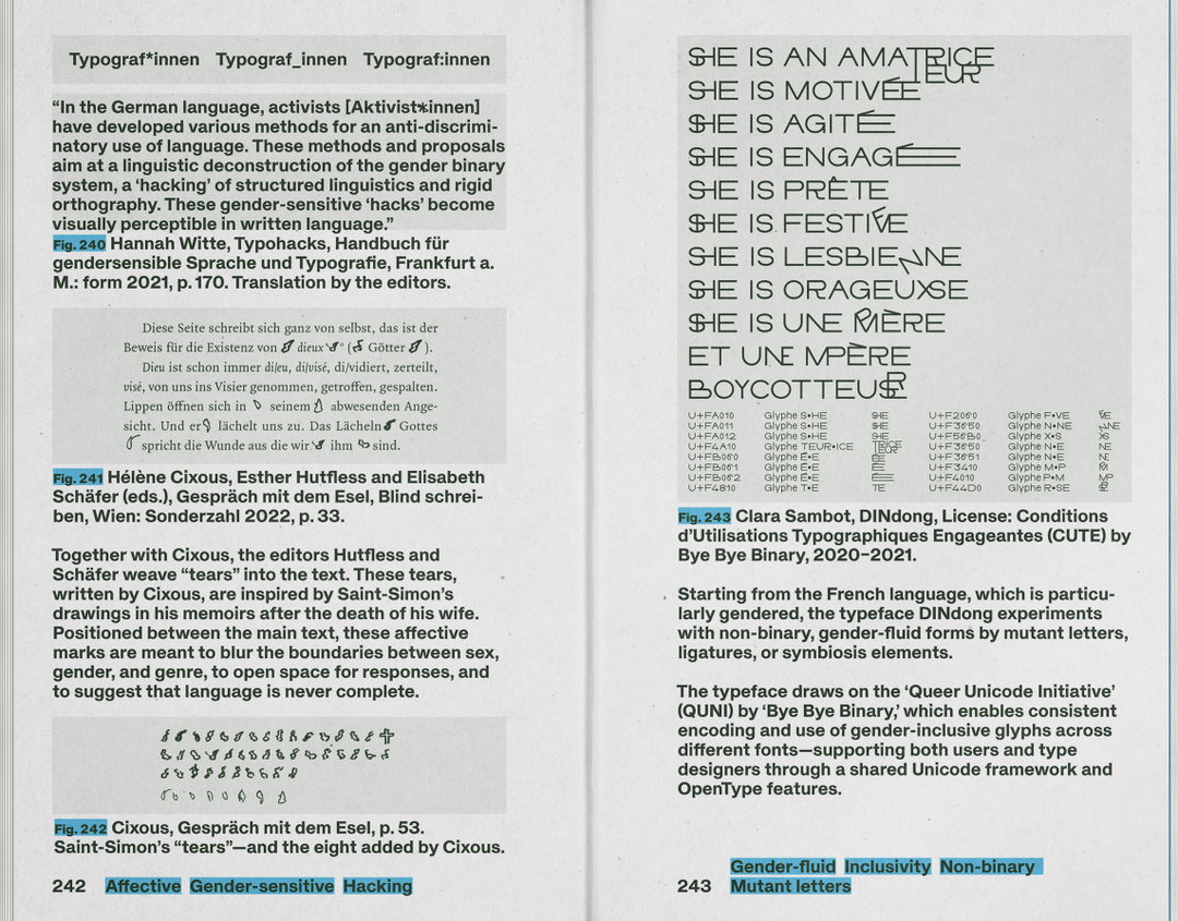
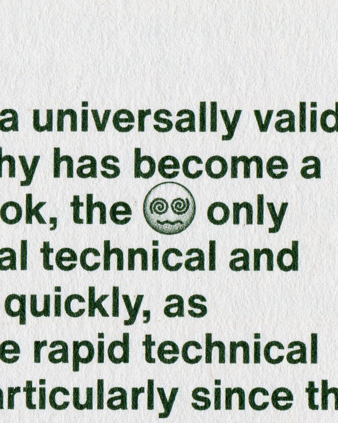
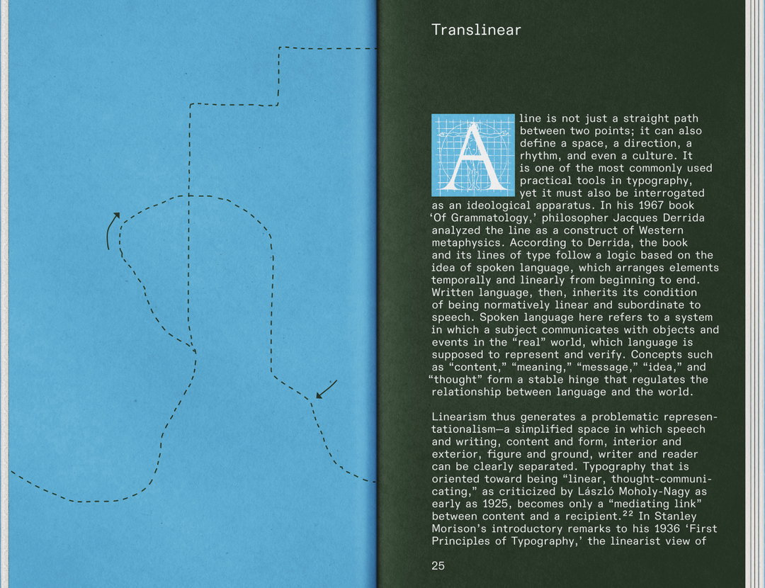
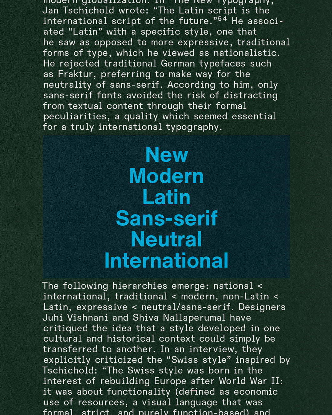
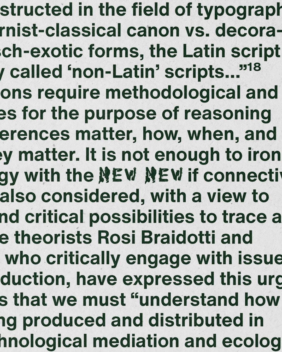
New New Typography makes itself known immediately with its minimalist aesthetic, using black-and-white print with a searing cerulean cutting through the page in disruptive squiggles or sometimes blocks of highlighted text (a conscious effort to make the book look like a textbook blasted with felt-tip markers). The book is designed using six different sans-serif typefaces that alternate across chapters, raising questions in ironic and subtle ways, such as ‘when is a typeface considered new or different?’, playfully reflecting on the evolution of Helvetica, Helvetica Neue, Helvetica Now. To find ways to bring proliferating typographies into relation, the book sketches engagement between the typeface’s different dependencies, all with a tongue planted firmly in cheek.
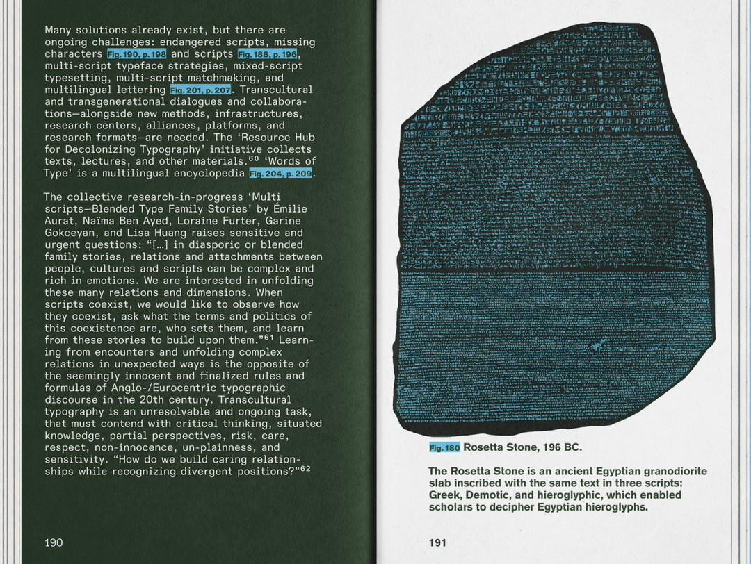
Matter Of: New New Typography (Copyright © Matter Of, 2025)
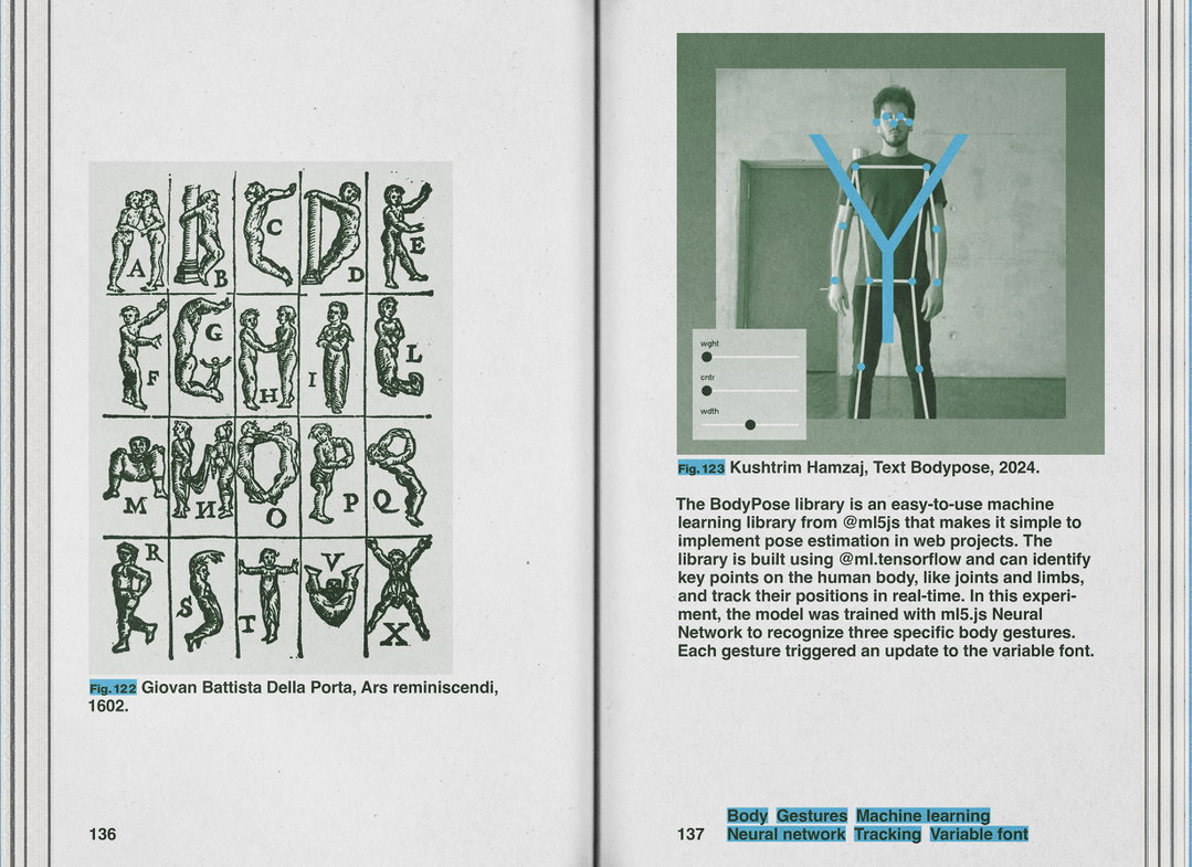
It’s a smorgasbord of collaborators, nearly 100 of them, such as: Adel Faure, Bye Bye Binary, Dinamo, Farah Fayyad, Man Ray, Source Type, TienMin Liao, Words of Type, Workbyworks and more, with work dating back as far as illustrated typefaces from 1602 to type design created through models that scan the shape of the body and turn it into text. The book educates on Renaissance-era design ideals, as well as taking us back to 1925 by quoting László Moholy-Nagy: “The emphasis must be on pure clarity since this distinguishes the character of our own writing from that of ancient pictographic forms,” – meaning, old old writing prioritised beauty and old writing centred legibility. Perhaps new writing is all about malleability or style…so what is new new?
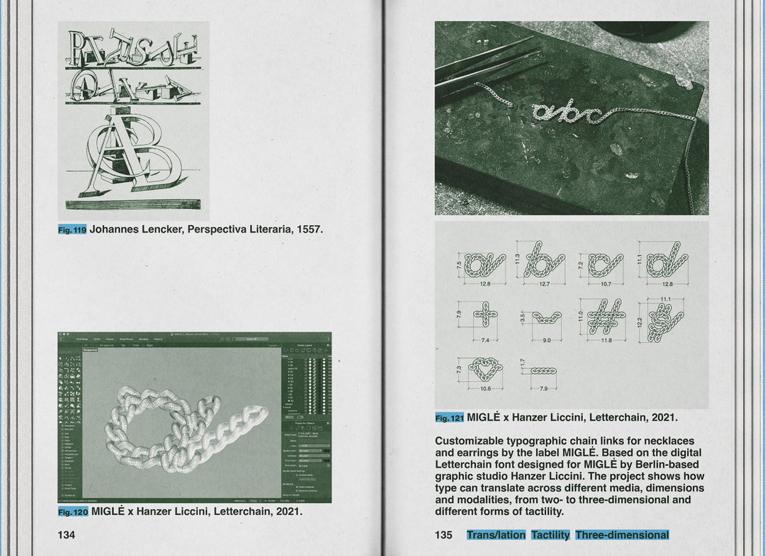
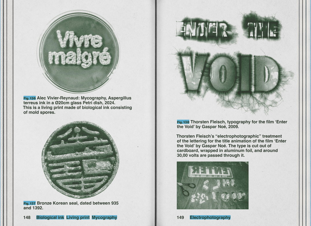
Described as a messy and unstable anti-manual for typography, 243 figures and six theoretical proposals present an overview of the impossibility of an overview on typography – it’s adventurously speculative, blending high design theory with a modern irony and cheekiness. What if the modern typographer isn’t just a typographer, but an active negotiator of political systems? Nevertheless, it isn’t a book about delivering an answer. Nowadays, just daring to imagine the future is enough.
GalleryMatter Of: New New Typography (Copyright © Matter Of, 2025)
Hero Header
Matter Of: New New Typography (Copyright © Matter Of, 2025)
Share Article
Further Info
About the Author
—
Paul M (He/Him) is a Junior Writer at It’s Nice That since May 2025. He has a strong interest in graphic design, digital kitsch, multimedia painting, collage, nostalgia, analogue technology and all matters of strange stuff. pcm@itsnicethat.com
To submit your work to be featured on the site, see our Submissions Guide.