Anatomy’s campaign for the Horniman museum is built on a bespoke typeface foraged from its collections and gardens
The agencies new visual system was built to reflect the excitement of the eclectic discoveries that emerge from a visit to the historical London location.
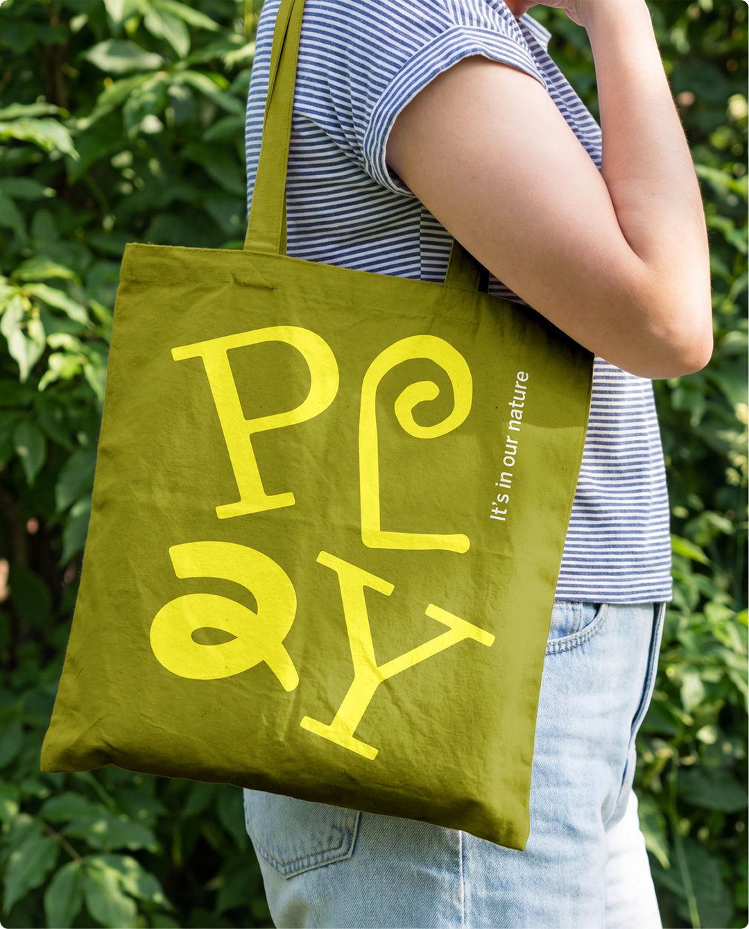
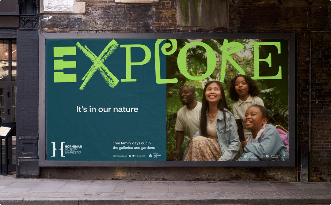
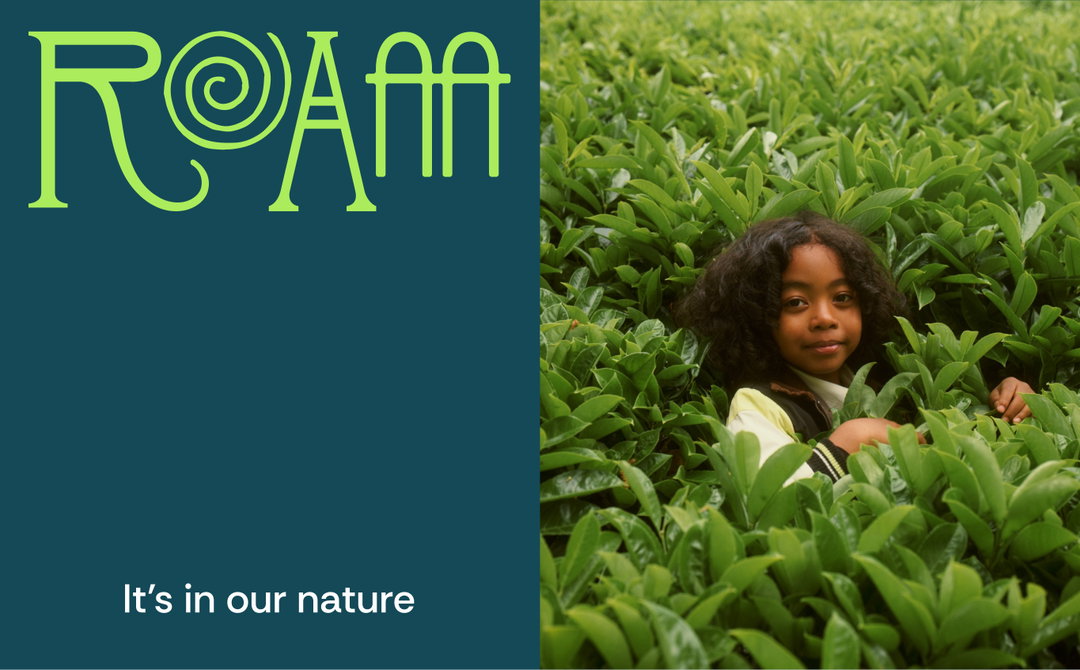
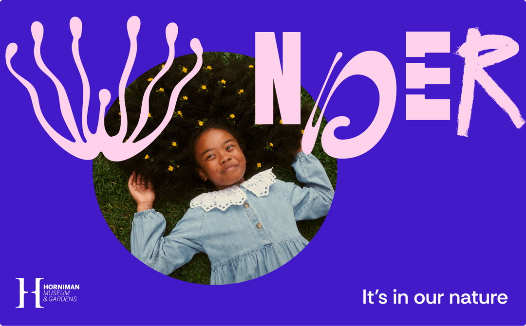
To mark its 125th year, The Horniman Museum has collaborated with London-based design agency Anatomy on a vibrant brand campaign to mark a new chapter for the cultural institution. Launching the museum’s new nature-themed outdoor space, the ‘It’s in our Nature’ campaign seeks to entice a new generation of nature lovers onto the museum’s grounds, reintroducing it as a place where history, culture and getting outdoors can collide. Co-created with local communities, the creative identity was built around a bespoke set of letterforms carved out from Horniman’s very own collections and gardens.
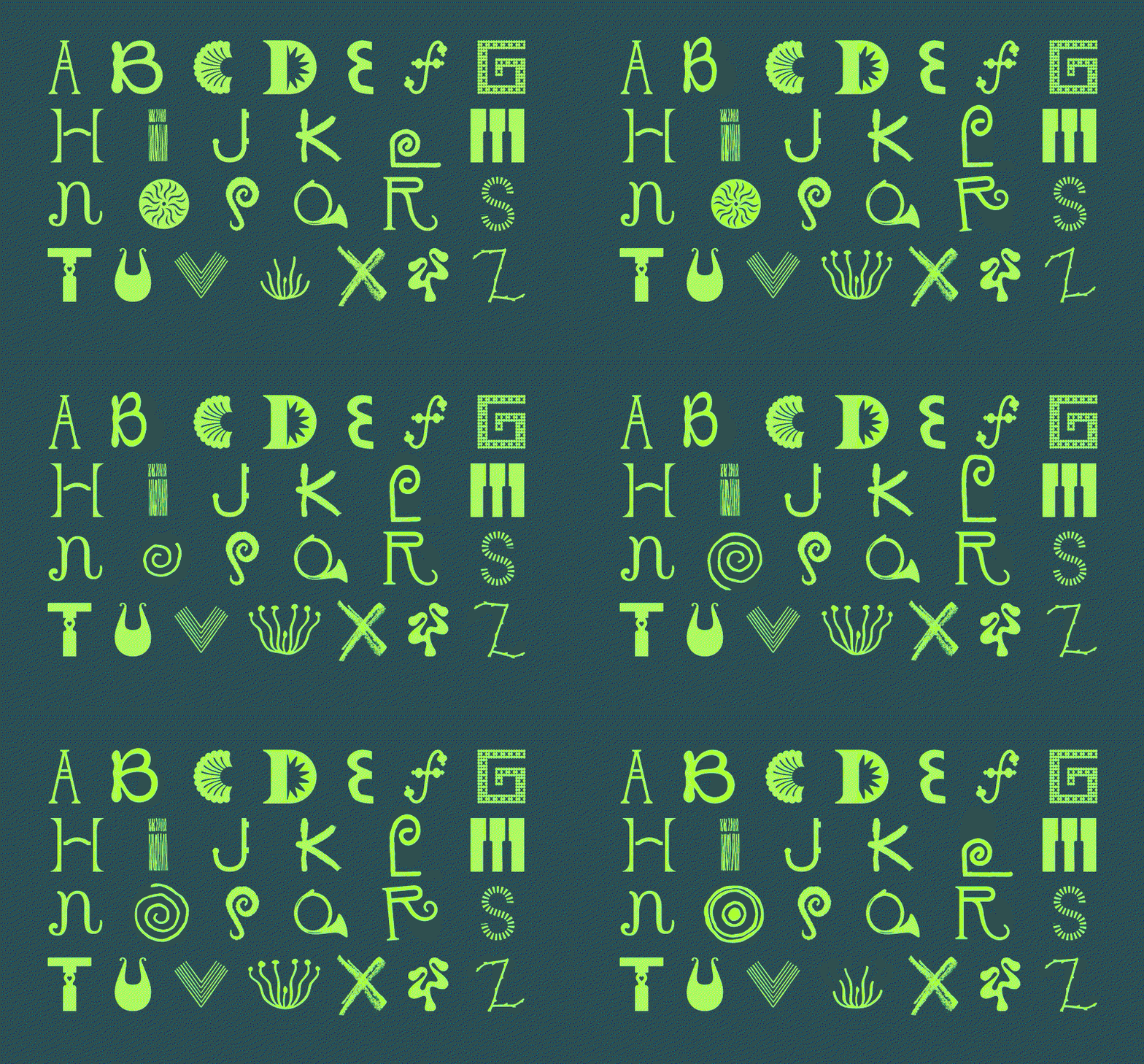
For Anatomy, finding an existing typeface to steer the shape of the visitor-led design project wasn’t really the right fit. From the very beginning the team wanted to build a visual world that would reflect “the experience of visiting the Horniman”, shares Dan Templeton-King, client director and head of strategy at Anatomy. “It’s a place that’s wonderfully eclectic, where nature and culture come together in ways found nowhere else in London,” he says. So instead of a pre-made typeface, the agency foraged for an alphabet of its own from the museum’s gardens and grounds – “uncovering one that already existed”, says Dan.
This bespoke letterset began with research in the form of a team fieldtrip: “we spent time wandering the museum and gardens individually, documenting anything that caught our attention: textures, architectural details, specimens, animals, patterns and unexpected moments,” says Tom Shuttleworth creative partner and co-founder at Anatomy. “We captured hundreds of photographs instinctively on our phones before we came back together for a second walk, comparing what we’d each noticed, debating why particular details had resonated.” This collaborative process crowdsourced a range of found letterforms that were then drawn out from shapes, patterns and objects found on the Horniman’s site: everything from the shape of the building to butterflies in the site’s gardens found its way into a wonderfully organic and lively letterset.
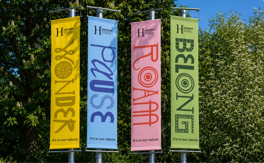
“Typography is often the first thing people experience before they’ve processed a single word, so we wanted that first impression to feel playful and curious,” says Dan. “At the same time, every letter still needed to perform its primary job: being read effortlessly. The process became an exercise in balance, preserving enough character to make the alphabet unmistakably Horniman, while exercising enough restraint for it to work across everything from OOH to social posts and on-site branding.” Another intention behind this patchwork approach to the typeface was to create a format that has the capacity to grow and be built upon by community input – contributions from schools, volunteers and community groups attached to the museum that can add to the lexicon in later campaigns.
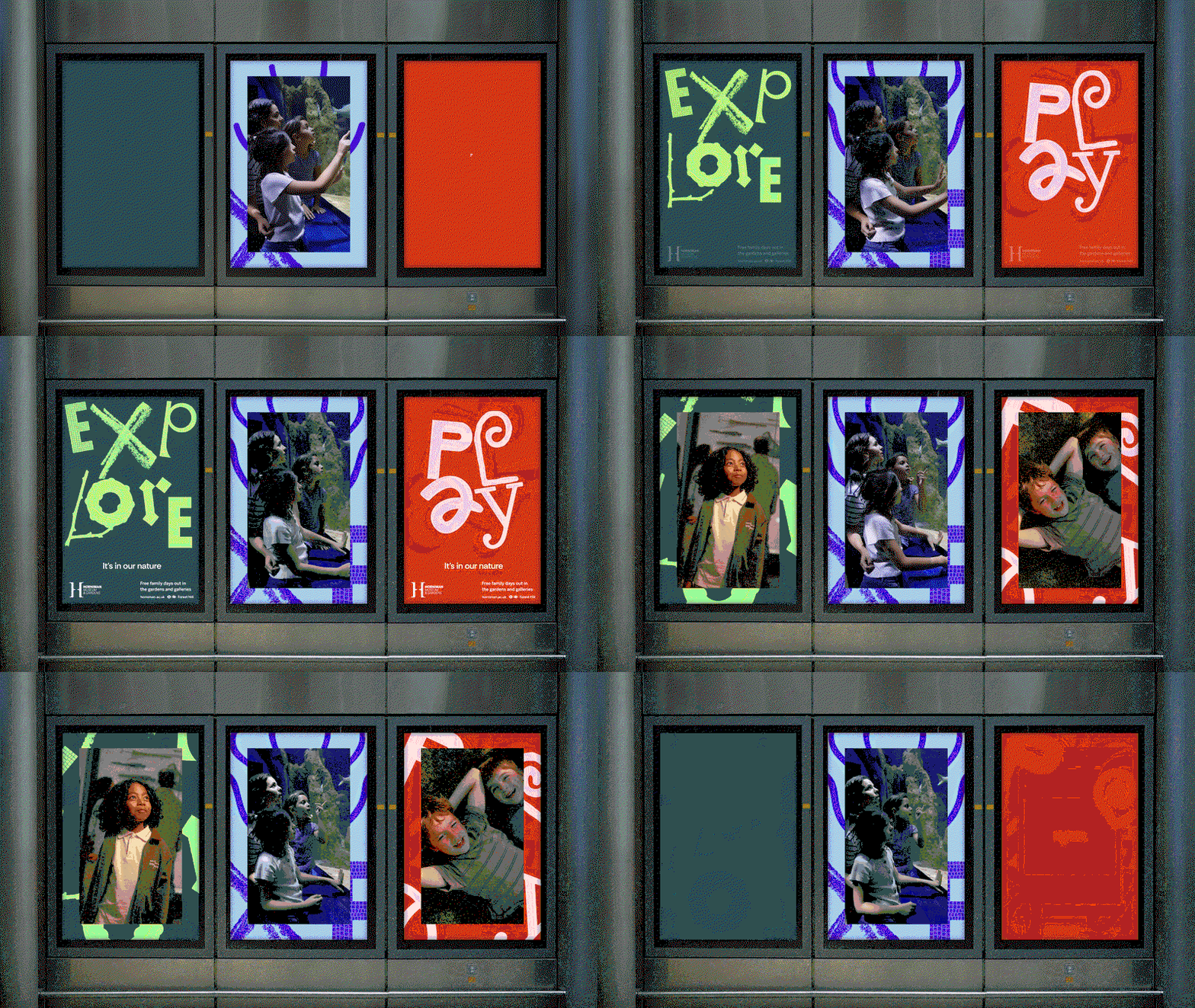
Brought to life with expressive motion design, the campaigns animations across applications were built around this idea of play and curiosity. “Each letterform was animated individually, taking cues for its motion behaviour from the object, specimen or pattern that inspired it – rather than following a single animation style, every character has its own rhythm and personality,” shares Tom. The agency also decided to work at a lower frame rate to introduce a subtle handcrafted quality to the campaigns moving elements, giving it a tactile, almost stop-motion feel that reinforces the hand drawn process behind its letterforms. “It makes the identity feel warmer and more human, rather than overly polished or mechanical,” Tom adds.
The playful system was completed with a colour palette inspired by the warmth and wonder that the museum offers and a campaign photoshoot with members of the local community that were involved in the early research stages that defined Anatomy’s visitor-led approach to the branding. “The result captures the Horniman’s curious, welcoming and unique character in a visual language of its own,” ends Dan. “It shifts the conversation from just what the Horniman contains to what people experience there, making it relevant to many more people and many more future moments.”
GalleryAnatomy: Horniman Museum and Gardens, Brand Campaign, Photography by Rory Langdon-Down (Copyright © Anatomy, 2026)
Hero Header
Anatomy: Horniman Museum and Gardens, Brand Campaign, Photography by Rory Langdon-Down (Copyright © Anatomy, 2026)
Share Article
Further Info
About the Author
—
Ellis Tree (she/her) is a staff writer at It’s Nice That. She joined as a junior writer in April 2024 after graduating from Kingston School of Art with a degree in Graphic Design. Across her research, writing and visual work she has a particular interest in printmaking, self-publishing and expanded approaches to photography. ert@itsnicethat.com
To submit your work to be featured on the site, see our Submissions Guide.