Berlin Museum’s makeover borrows typefaces from the U-Bahn and currywurst stands
The Stadtmuseum is an amazing body of museums all over Berlin, but people don’t know where it is or most importantly, what it is. Design studio Stan Hema reviewed the facts, stepped in and gave it a brand new name, wordmark and attitude.
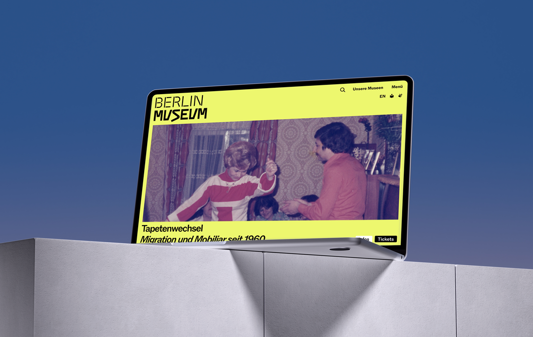
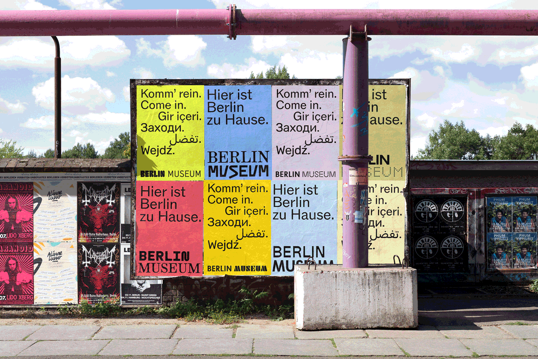
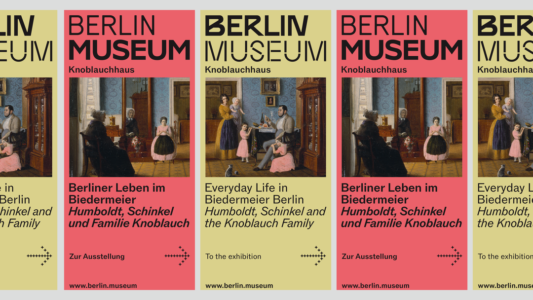
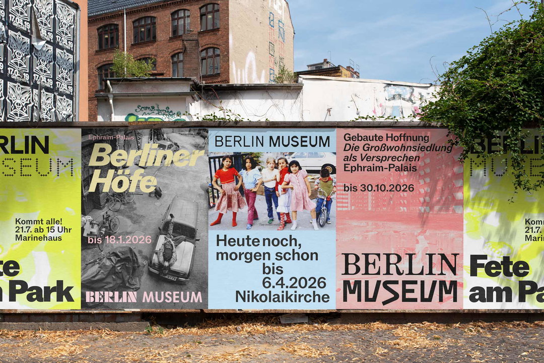
The Stiftung Stadtmuseum, a museum in Berlin, has realigned its master brand, pulling together its various locations such as the Märkisches Museum and the Nikolaikirche under a brand new name: Berlin Museum. It’s simple, straight to the point and accessible, moving away from the image of a dusty history museum to a place for everyone. No need to worry about mispronunciation now, Berlin Museum is as straightforward as it gets, accentuating the museum in Stadtmuseum and making its mark wider across languages.
Before now, Stan Hema’s press release claims “too few people knew of the museum, let alone what it has to offer.” After taking on honest feedback from Berlin residents, such as “Stadtmuseum Berlin? Where is that?” An open call was launched to invite Berliners to critically debate the brand’s current perception, resulting in a strategic repositioning of the museum which has been orchestrated by Berlin-based brand agency Stan Hema in order to create a new identity and logo that represents the variety of the brand’s 4.5 million objects on display.
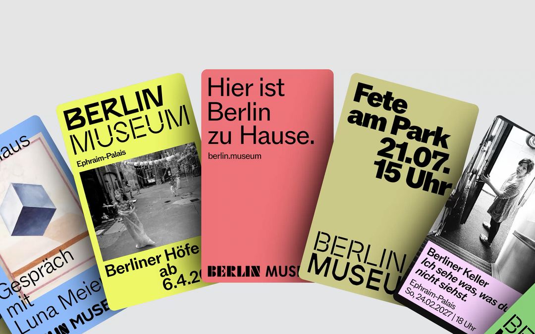
Stan Hema: Berlin Museum (Copyright © Stan Hema, 2026)
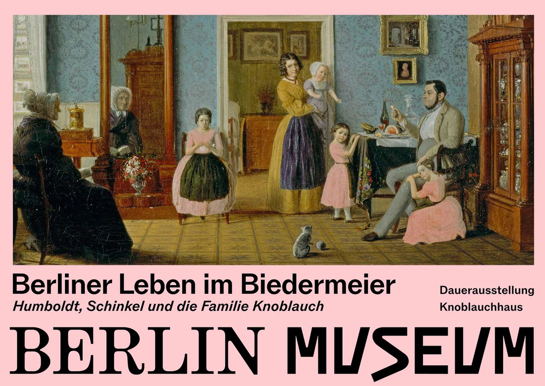
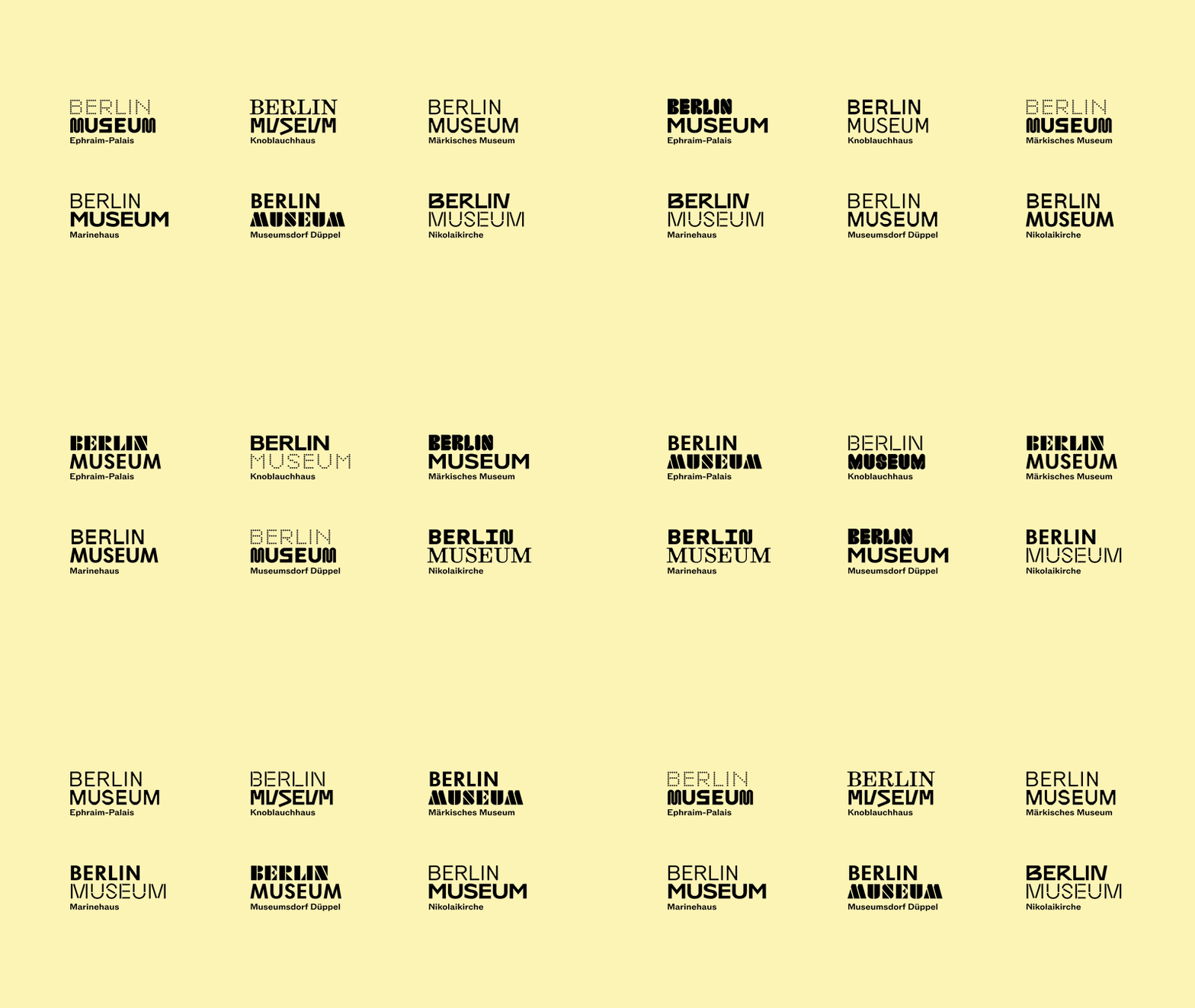
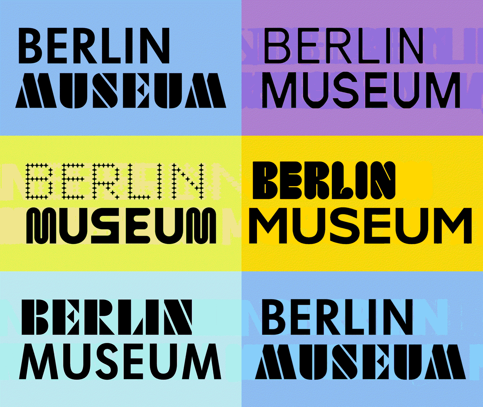
“Berlin comes first for us, and our name reflects that now,” explains Sophie Plagemann, artistic director of the Berlin Museum, as the new identity now puts Berlin first – literally. Stan Hema knew it was impossible for Berlin Museum’s new wordmark to carry the tangibility and multiplicity of Berlin, therefore it manifested into a flexible wordmark that changes and combines. “For us, the wordmark is the identity-defining element of the museum. It is directly connected to the reality of our city,” explains André van Rueth, designer and typographer at Stan Hema. “To achieve this, we gathered typography from everyday Berlin: from U-Bahn stations and iconic buildings to the local currywurst stand. From this mix, we created a logotype system that brings different Berlin typefaces and perspectives into dialogue.”
Think of the new design like a city, with bridges from the physical mainland into the untouchable history – it’s both modern and classical, mix-matched and rebellious. Demonstrating the courage to change and presenting a manifesto for how institutions can reinvent itself through dialogue with the general public, it’s a rebrand that isn’t just for aesthetic’s sake, but a worthwhile message about giving back to the city that created and holds its millions of pieces of history.
“The new Berlin Museum brand is a warm invitation to everyone who lives in and visits Berlin. And if the new brand translates the warmth, intelligence, and passion of the people working in this ‘house’, then we have achieved a great deal,” says Mathias Illgen, managing director at Stan Hema. Launching city-wide in September, 2026, Berlin Museum will be seen on walls and screens from galleries to the Brandenburg gate – as Berliners and tourists alike walk into the new identity of the museum, they’ll feel as if they are personally a part of the history, an essential part of its visual make-up – because they are.
GalleryStan Hema: Berlin Museum (Copyright © Stan Hema, 2026)

Hero Header
Stan Hema: Berlin Museum (Copyright © Stan Hema, 2026)
Share Article
Further Info
About the Author
—
Paul M (He/Him) is a Junior Writer at It’s Nice That since May 2025. He has a strong interest in graphic design, digital kitsch, multimedia painting, collage, nostalgia, analogue technology and all matters of strange stuff. pcm@itsnicethat.com
To submit your work to be featured on the site, see our Submissions Guide.