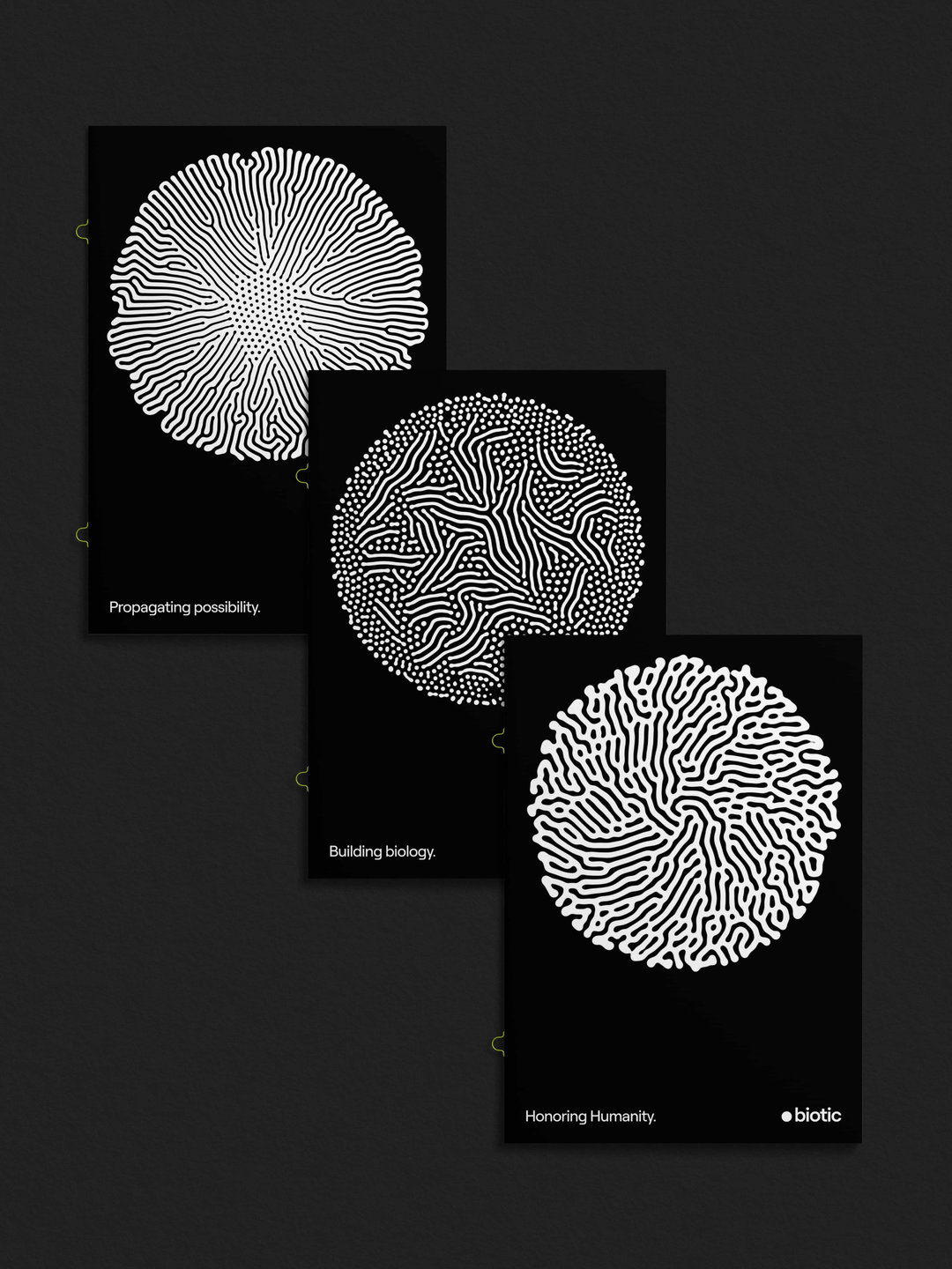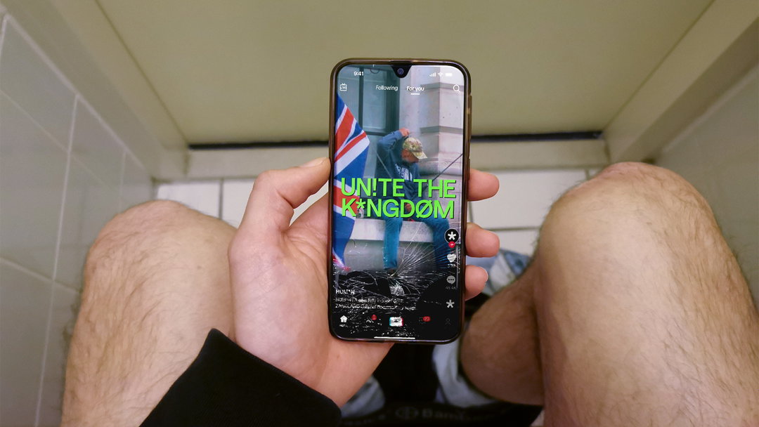
What can punctuation and glyphs say that words can’t? Overview opts for expression over legibility in documentary identity
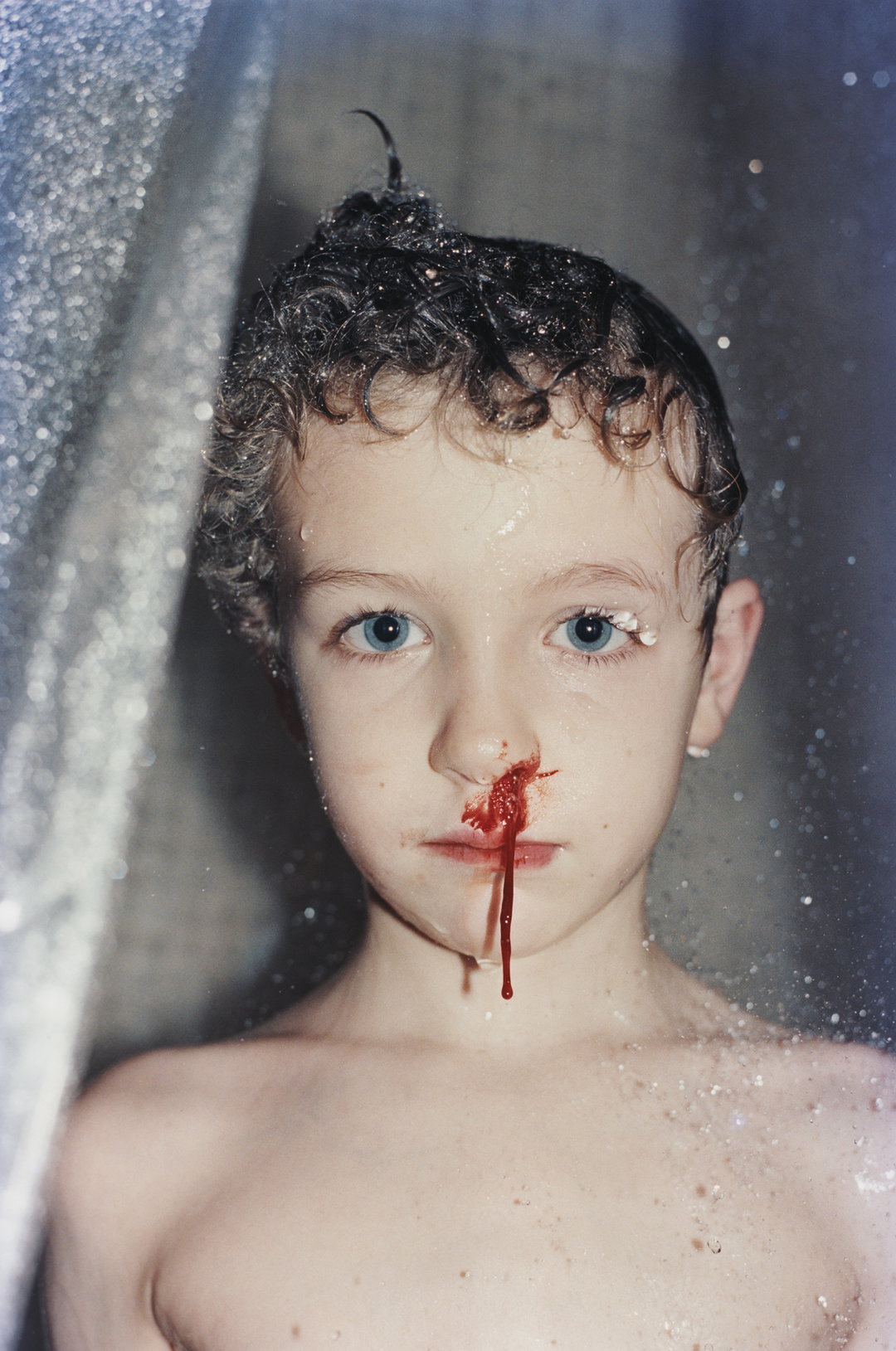
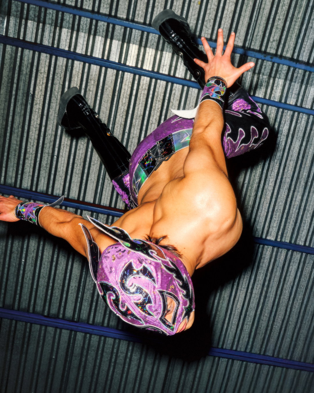
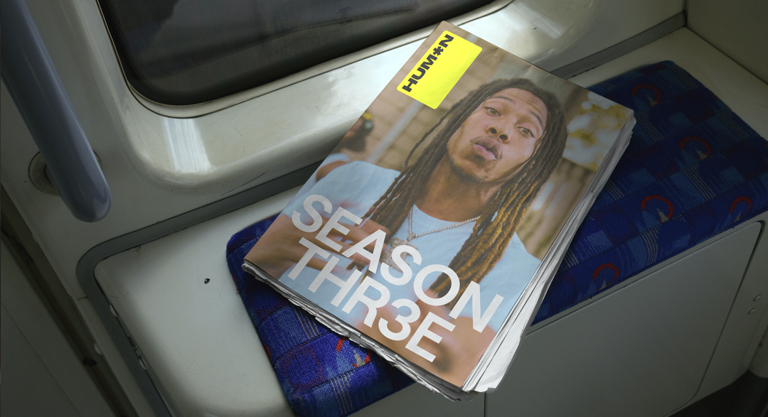
Move over, Vice. Zandland’s documentary series Human is more ambitious than ever, tackling shocking stories that are difficult to comprehend with an identity from Overview that experiments with readability and conversation analysis.
Share
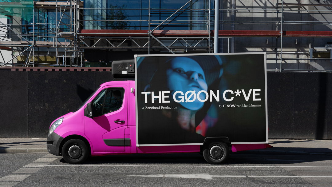
“Journalism is moving through a fundamental shift,” says James Sedgwick Yeung from Overview, a strategy and brand office working with founders in emerging industries (such as medical cannabis, financial and medical tech and creator economies). “Audiences are no longer only looking to institutions to tell them what is happening. They are finding news through platforms, creators, documentaries, clips, conversations and people they feel some connection to. Authority is no longer inherited from an institution.” This is the basis of Human, a new journalism outlet for audiences that yearn for access, honesty and the ability to have complex issues feel understandable in a world that has become harder to explain. Built for that radical shift, the UK-based documentary studio Zandland is leading the charge with Human, factual storytelling created for an era “where understanding matters more than judgment”. With Overview leading on its branding, it’s set out to become the new Vice or a competitor for the in-depth storytelling from the eternally viral Channel 5.
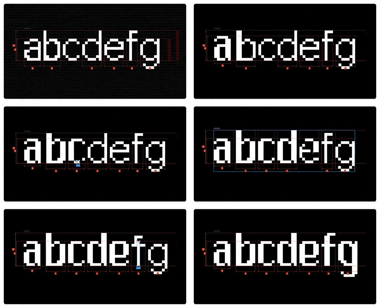
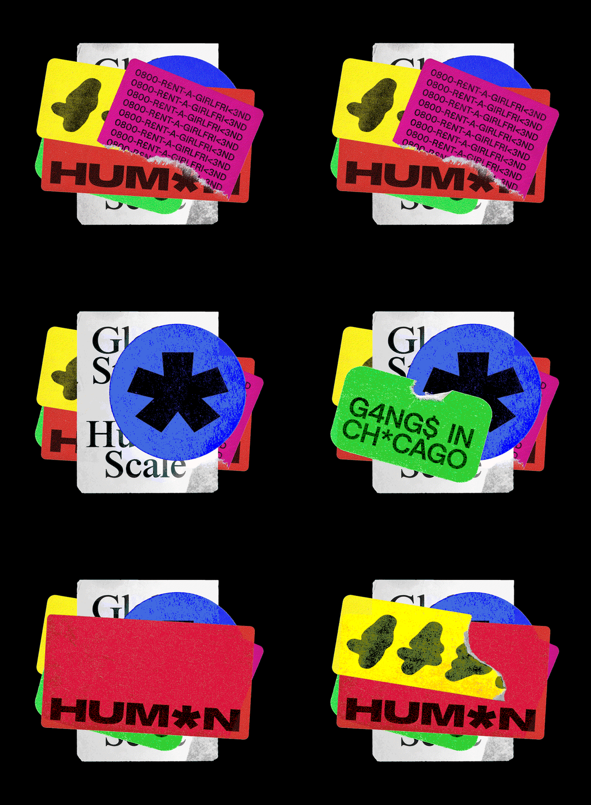
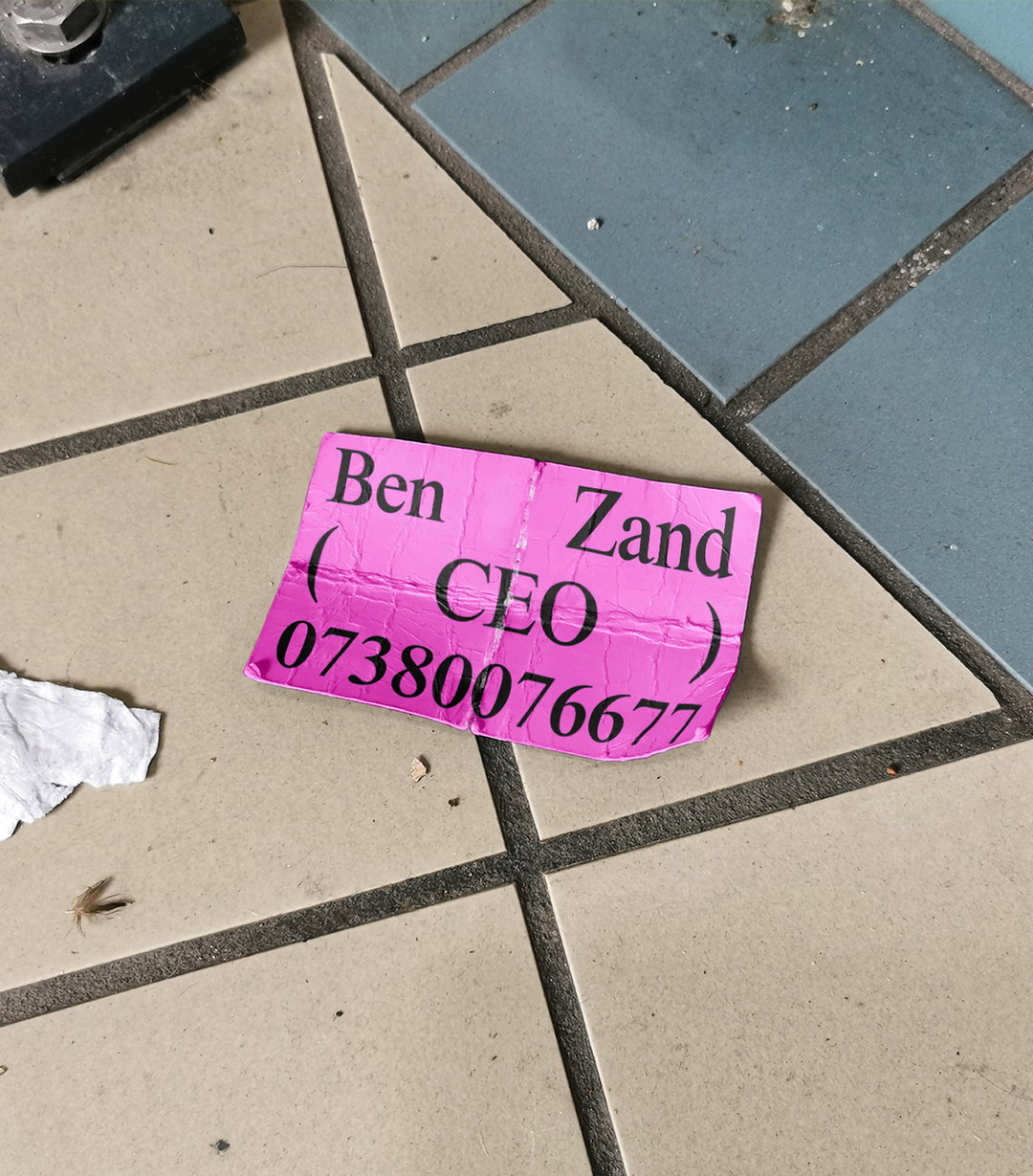
Everything in the visual strategy is rooted in ‘credibility’, which is why the identity takes inspiration from Jeffersonian transcription – when punctuation and glyphs interrupt traditional written communication. It’s a system used in conversation analysis to capture not just what people say, but how they say it – every pause, overlap, hesitation, emphasis. “This became the foundation for Human’s brand world. Rather than polishing every story into a clean institutional voice, the identity embraces the texture of expression,” says James. “A design system that feels observed, not imposed. Edited, but not over-authored. Human, because it allows people to sound like themselves.” The typeface is built from Saans by Display, which already has all of the glyphs Overview needed to demonstrate expression, it was just about how to colour and use it.
GalleryOverview: Human by Zandland (Copyright © Overview, Zandland, 2026)
Overview: Human by Zandland (Copyright © Overview, Zandland, 2026)
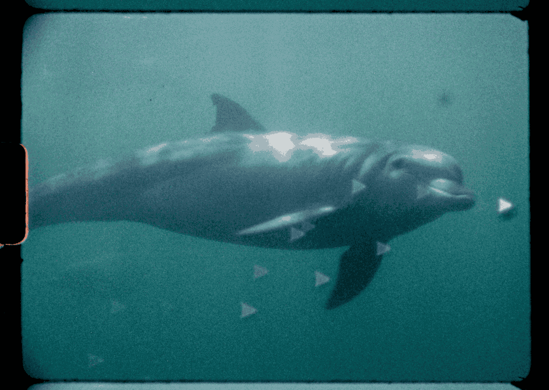
Traditional journalism can sometimes flatten a story, but Human strive to blow them up. Edgy topics such as violent gangs, kingpin cribs, secret services and “whites-only” towns in South Africa – and that’s not all, Human sees the documentary crew go across America to Brazil to Israel and Palestine in Zandland’s most ambitious project yet; fully self-funded and made internally, creating a blue-print for documentaries where fiery ideas go first. The remixing of Saans expresses this fully, allowing textures and tensions of exchanges of ideas feel real, sometimes slightly unreadable, purposefully so. It stresses the way in which we experience friction when understanding other ideas, cultures, cities, people.
“What the design system neatly captures is how beautifully messy the real world is. The most honest reflection of the stories Human tells, can never be captured through AI. Or through a static identity for that matter,” says James. “Each person has a different voice, a different take, an unusual and ultimately personal view of the world around them. That is what makes them interesting.” Overview is not a stranger to using AI in projects such as Odin, but expendable as ever, Overview understood the assignment with Human starts with humanity. Hands, eyes, ears, real speech, real stories. Although the identity’s script may be obfuscated, the reality of people being behind every element of this documentary series isn’t – that’s what makes a documentary so precious in today’s media landscape.
GalleryOverview: Human by Zandland (Copyright © Overview, Zandland, 2026)

Hero Header
Overview: Human by Zandland (Copyright © Overview, Zandland, 2026)
Share Article
Further Info
About the Author
—
Paul M (He/Him) is a Junior Writer at It’s Nice That since May 2025. He has a strong interest in graphic design, digital kitsch, multimedia painting, collage, nostalgia, analogue technology and all matters of strange stuff. pcm@itsnicethat.com
To submit your work to be featured on the site, see our Submissions Guide.