Why a 53-year-old travel brand is going back to guerrilla print: Lonely Planet on its pocket-sized zine, Artifact
Despite everything existing in the digital, the world’s most popular travel guide publisher is sticking close to its roots with a new DIY print offshoot that seeks to connect us with what it truly means to escape.
“Lonely Planet has a rich and recognisable design legacy,” principal visual designer Matthew Johnston tells It’s Nice That, “from the original tightly-kerned wordmark to old guidebooks with bold sans-serif typography, minimal covers and famous blue spines,” he says. It’s true, the travel brands publications are instantly recognisable on any shelf.
With its first publication making a debut all the way back in 1973 in the form of a 94-page, stapled, self-printed and hand-mapped booklet titled Across Asia on the Cheap from its founders Tony and Maureen Wheeler, the publishing project has seen decades of success from the humble start of its practical guidebooks. Which is one of the reasons it started a magazine in 2008 to offer up stories, travel ideas and photography that expanded on their tips.
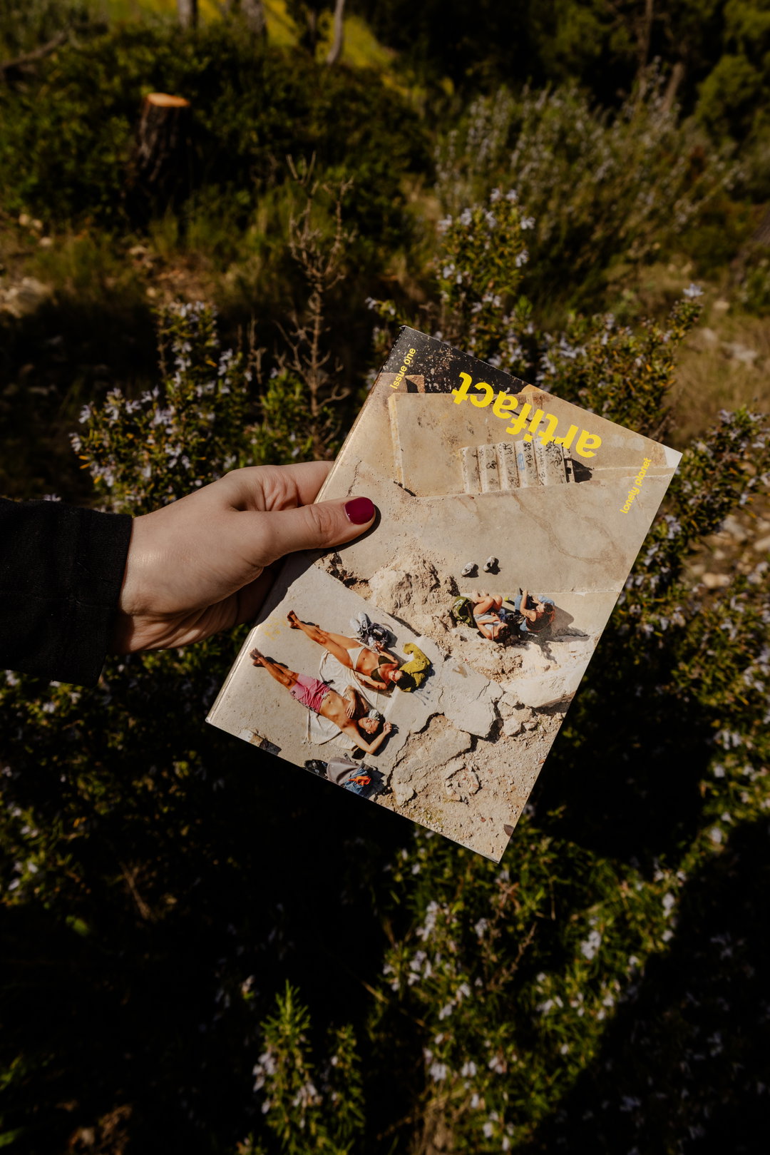
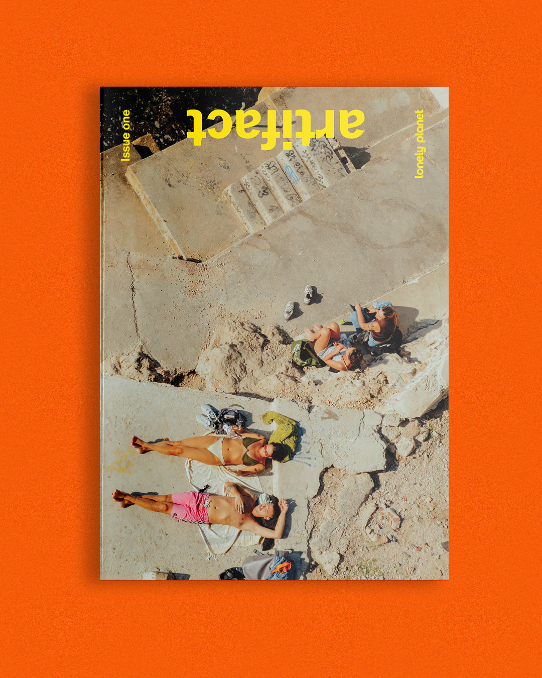
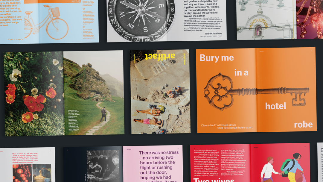
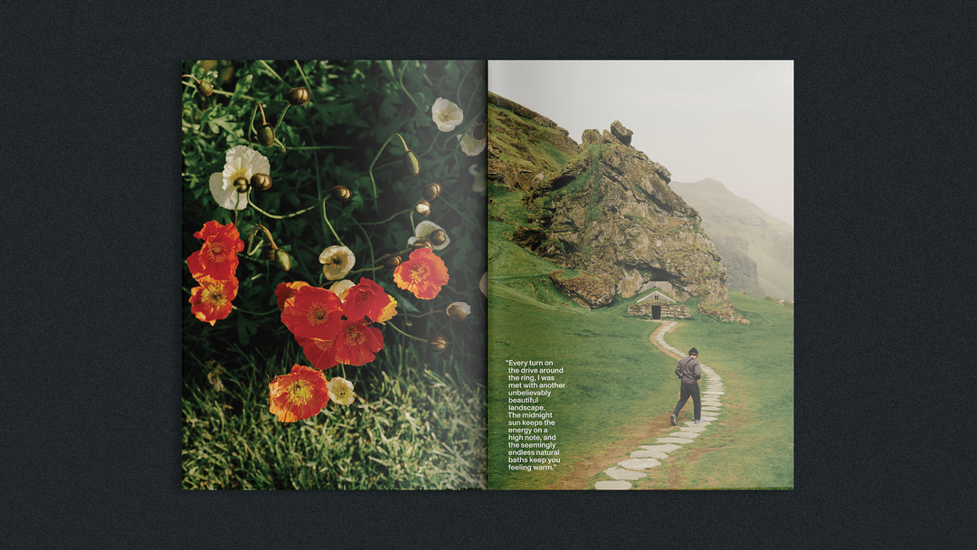
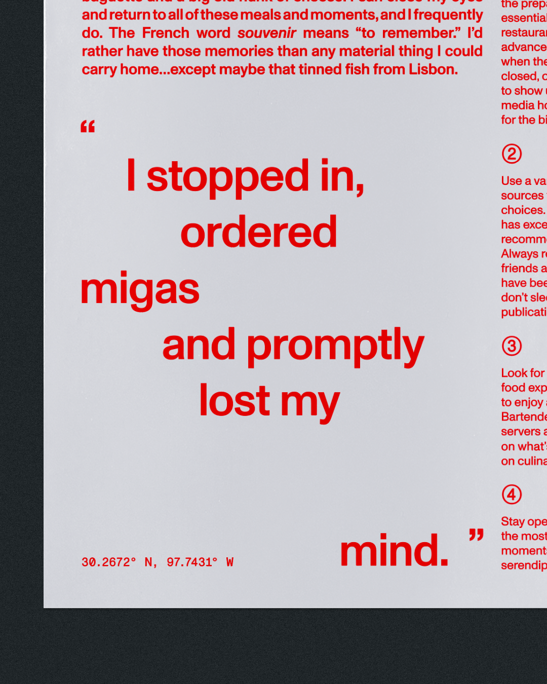
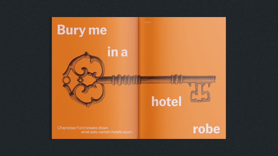
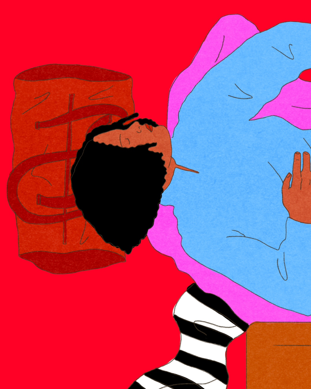
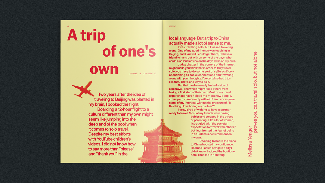
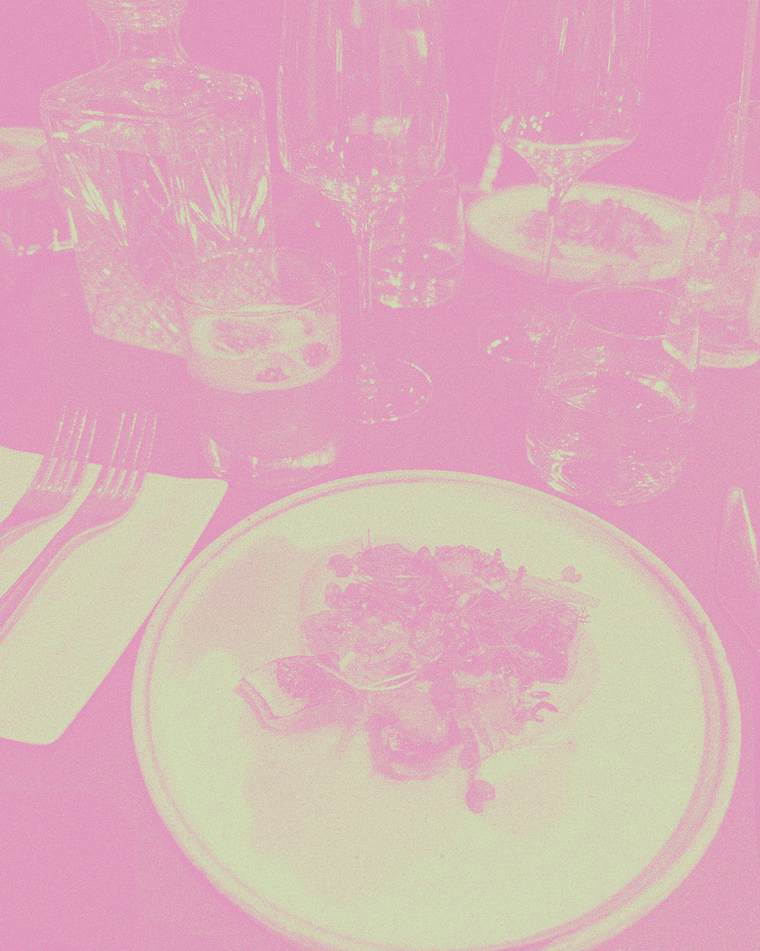
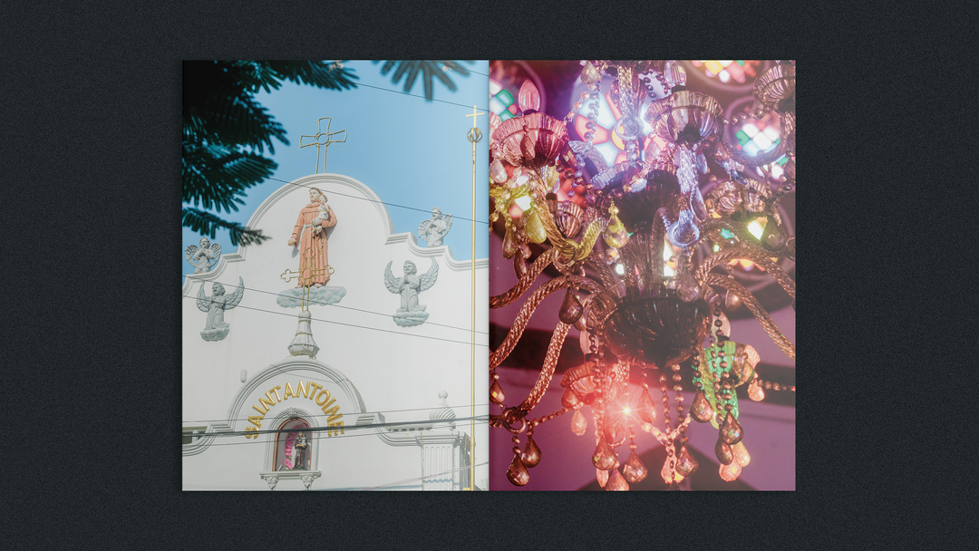
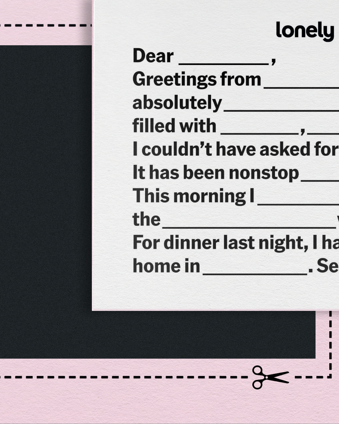
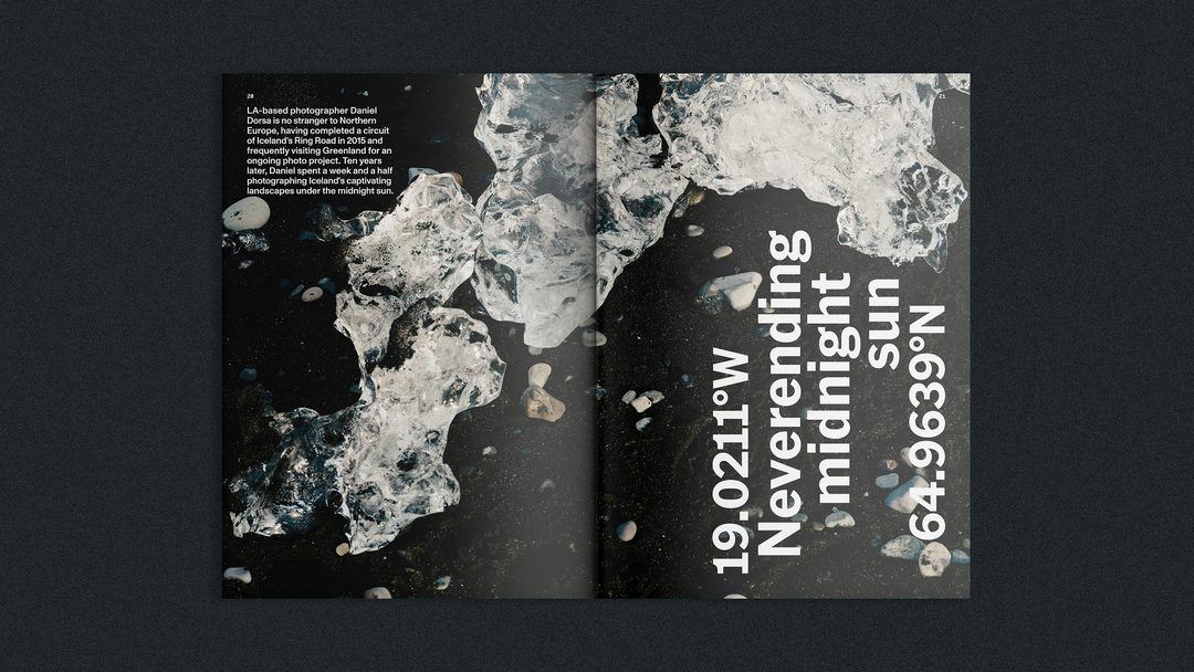
Never straying too far from print, the 53 year old brand is now bridging its traditional guidebooks with digital tools, but a new offshoot has recently emerged from its New York offices: Artifact. A zine that features some beautiful photography from Daniel Dorsa, Gabbie Bhaskar, and Cole Wilson as well as illustration by Kimberly Elliot, the new publication contains a collection of essays and guidance shaped by how and why we travel, whether for food, relationships, solitude or work, all edited by Chamidae Ford.
Lonely Planet: Artifact (Copyright © Lonely Planet, 2026)
The idea for this new print project was initiated by a small group across Lonely Planet’s editorial, design and photography teams that came together to “carve out space for more experimental, creative work”, shares Matthew, led by Nitya Chambers, the brand’s senior vice president. The team at Lonely Planet were keen to lean back into utility with the project, “because that’s fundamentally who we are: travel experts with real depth of knowledge. The interesting part is finding ways to express that with personality,” Matthew says. So the zine ended up taking visual cues from the earliest Lonely Planet editions: DIY photocopies, stapled stacks and stripped back colour palettes with hand drawn elements.
A refreshingly small, pocketable and energetic edition, the zine’s debut was all about creating something that drew on its rich heritage of print but felt distinctly separate from the function of the travel brands trusty guidebooks: something that “doesn’t exist to tell you where to go – it’s about reminding you why you travel in the first place. That shift opens up the format: it can be looser, more tactile and more expressive.” Despite being something that seeks to draw on the emotional connection readers have to the brands guide books, whether they are “kept as souvenir’s, passed between friends or become part of the story of a trip”, Matthew says, the zine is much more about inspiration than any instruction – a slower more considered reading experience and something that you can spend a bit more time with.
Now that Artifact’s first issue has emerged and seen great success, the team have plans for the next edition up their sleeves: “Issue one was something of an experiment pulled together on borrowed time by a small team,” Matthew ends. “It’s exciting to now build on that momentum with a clearer sense of what the format can be.”
GalleryLonely Planet: Artifact (Copyright © Lonely Planet, 2026)
Hero Header
Lonely Planet: Artifact (Copyright © Lonely Planet, 2026)
Share Article
About the Author
—
Ellis Tree (she/her) is a staff writer at It’s Nice That. She joined as a junior writer in April 2024 after graduating from Kingston School of Art with a degree in Graphic Design. Across her research, writing and visual work she has a particular interest in printmaking, self-publishing and expanded approaches to photography. ert@itsnicethat.com
To submit your work to be featured on the site, see our Submissions Guide.