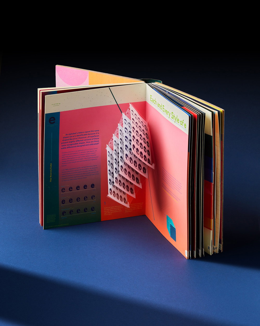
A tactile history of typography comes alive in Kelli Anderson’s new book Alphabet in Motion
For the release of her latest pop up book, we talked to the graphic designer and paper engineer about why her career has been geared towards designing and making “impossible” publications.
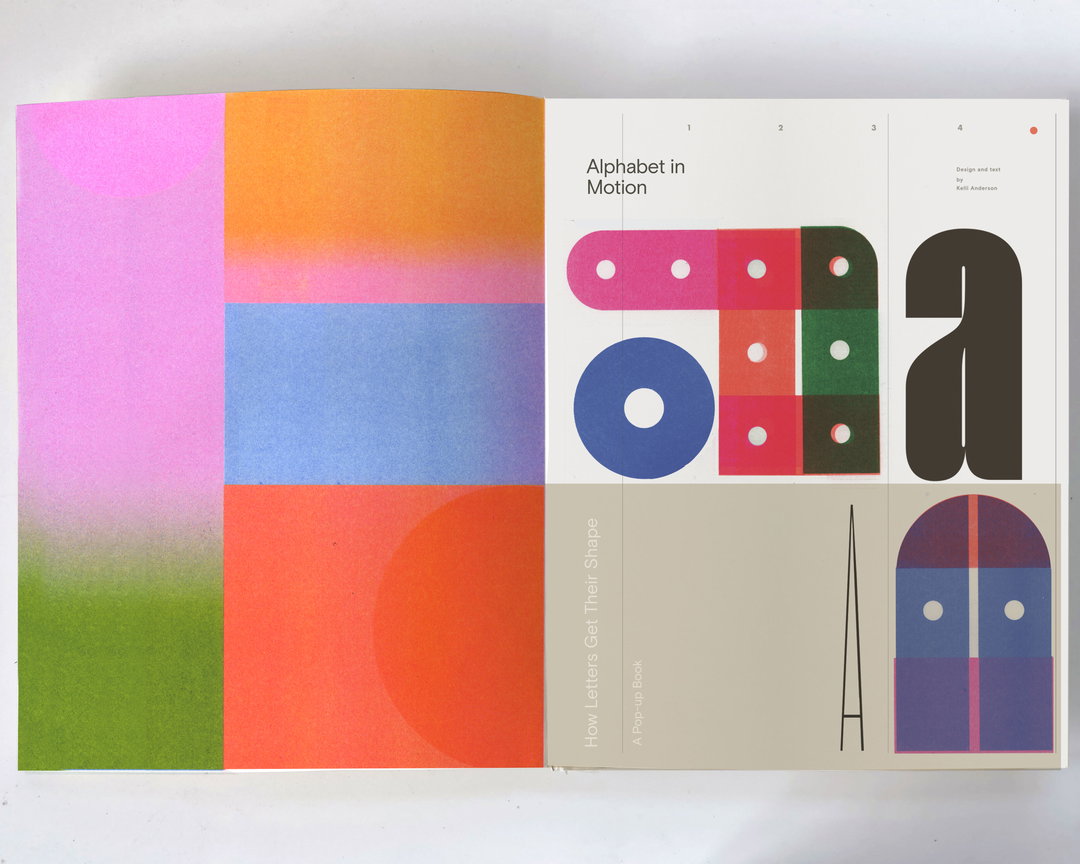
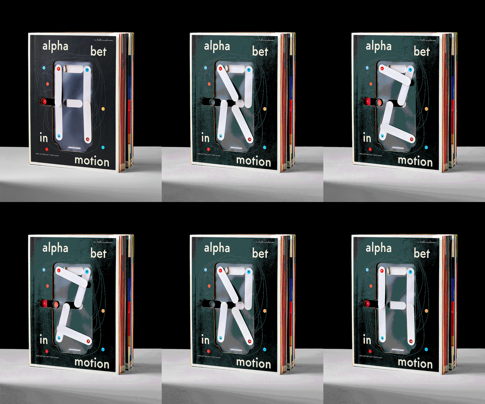
You don’t have to be a graphic designer, or even a paper specialist to take one look at Kelli Anderson new book and know that the research and prototyping process that brought the object into being was extremely rigorous. Nothing short of a feat of engineering, the designer’s latest title Alphabet in Motion: How Letters Get Their Shape is an ingenious interactive pop up book that takes readers through an immersive and tactile history of typography.
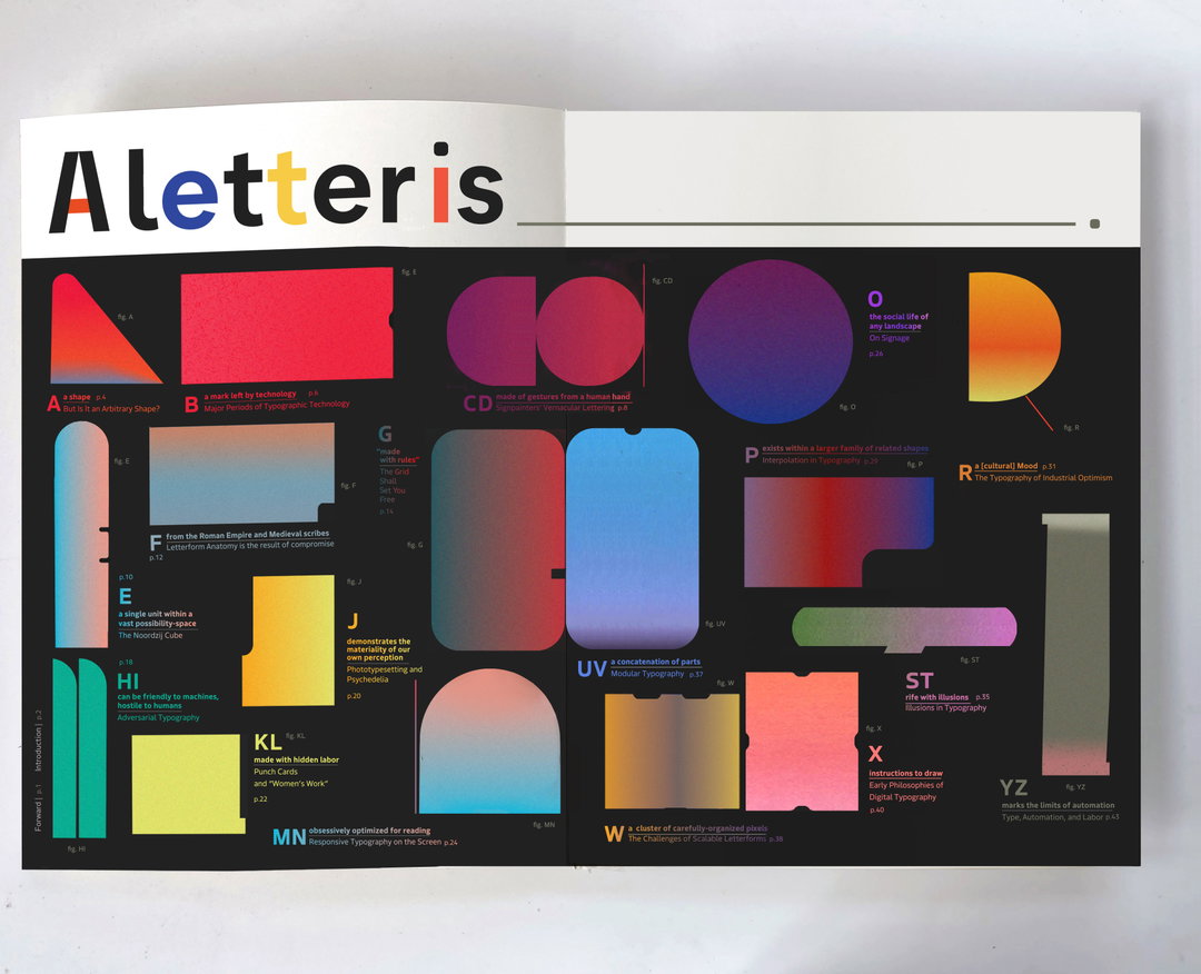
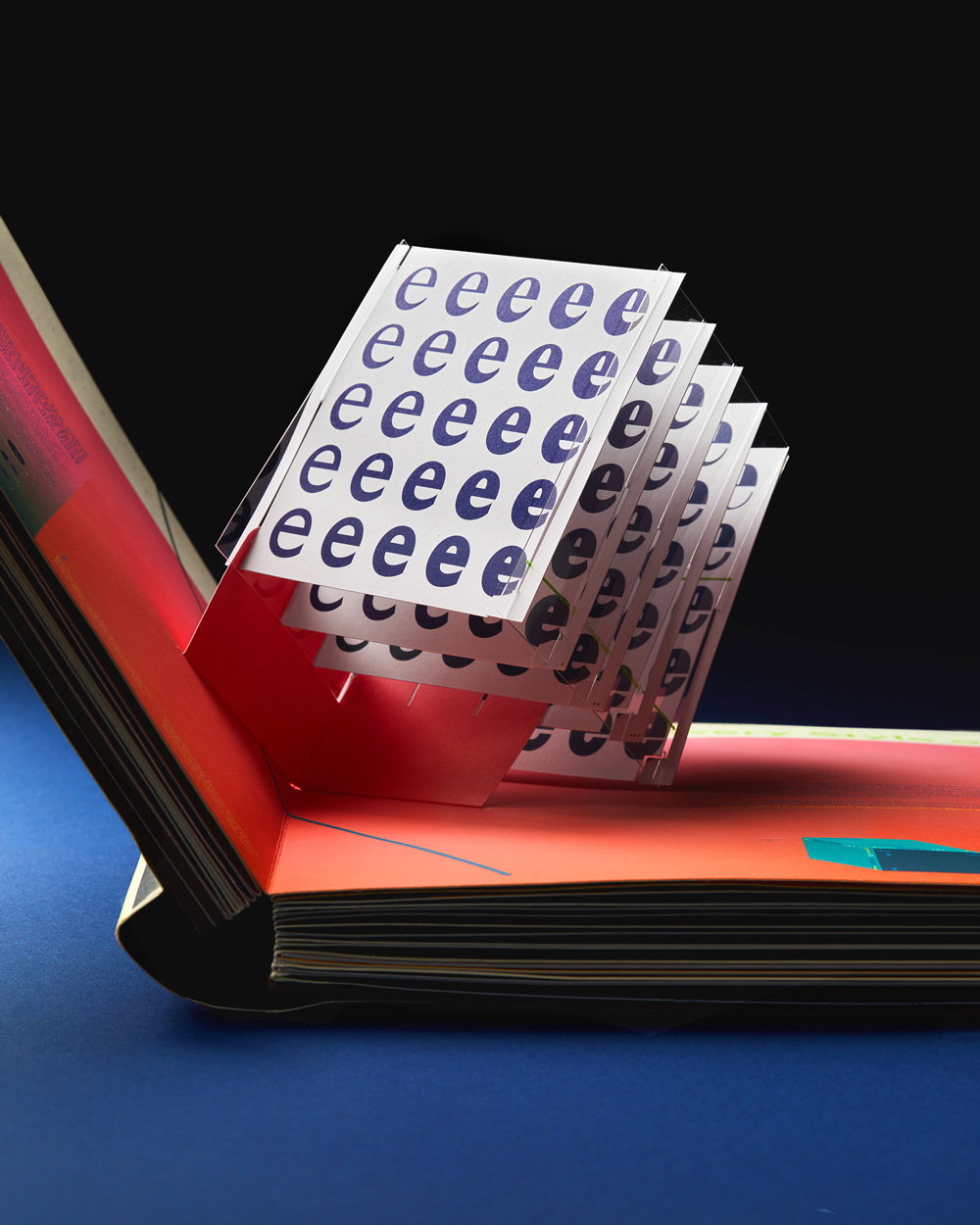
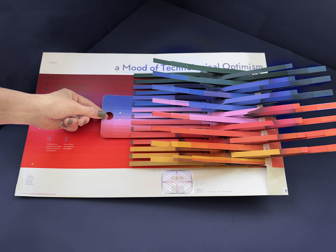
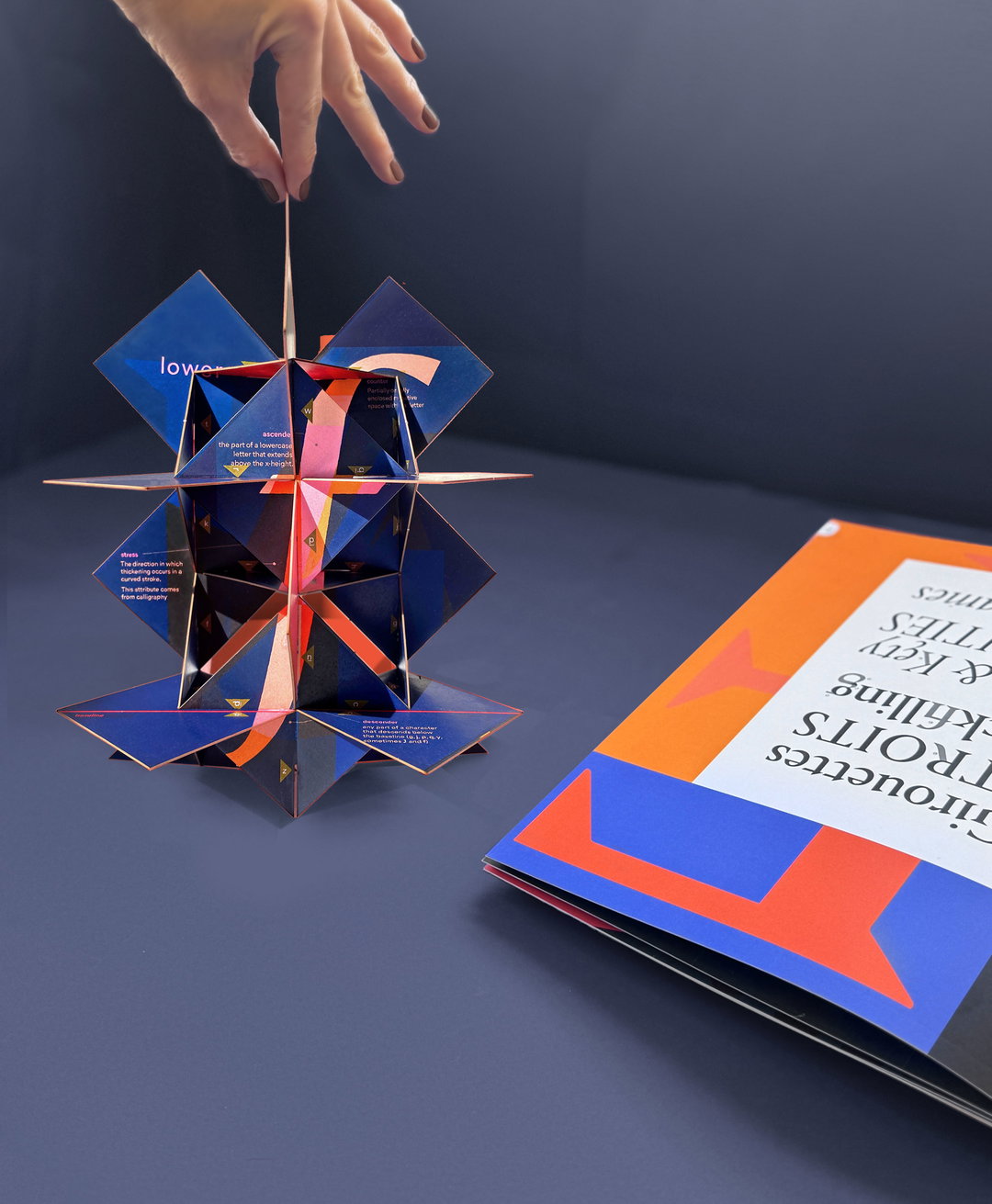
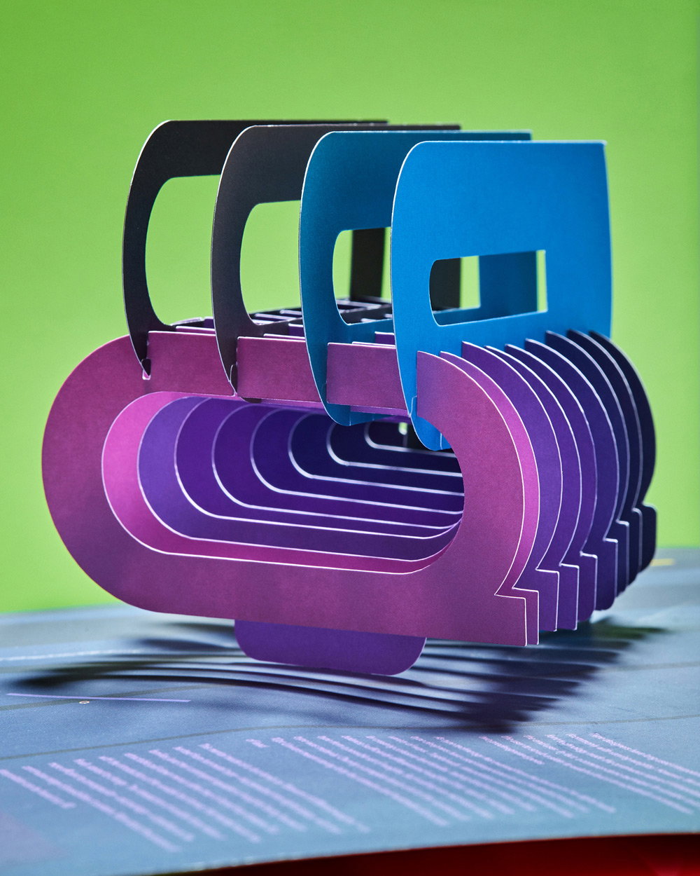
The visual essay encompasses seventeen interactive pop ups that demonstrate some of the key technological advances and ideas that have shaped type design throughout the ages. Something to read or to play with, the publication draws on all of our senses to translate the meaning behind the letterforms that we interact with day to day, on and off our screens.
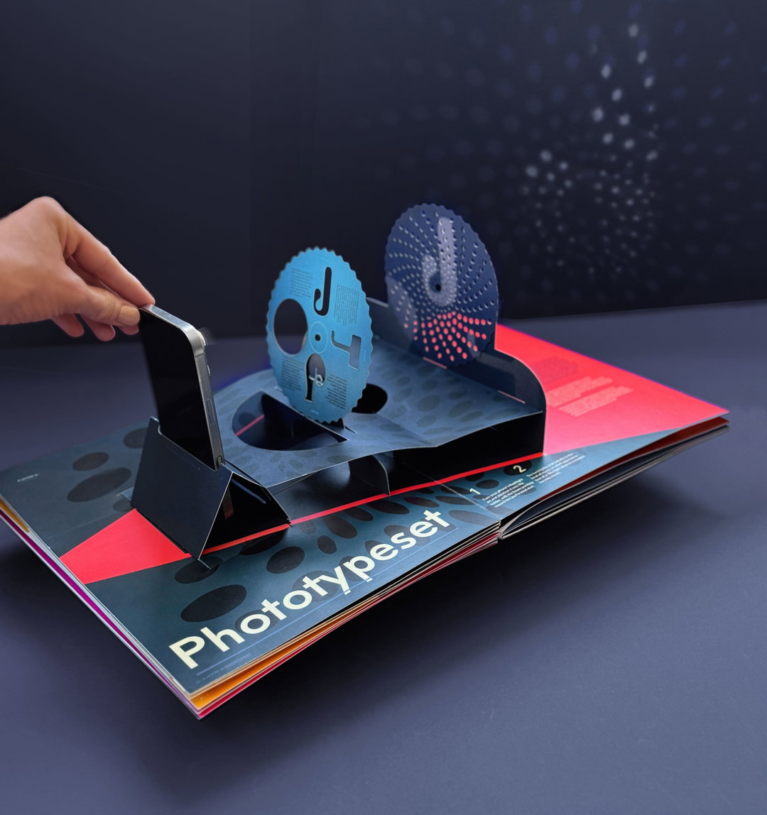
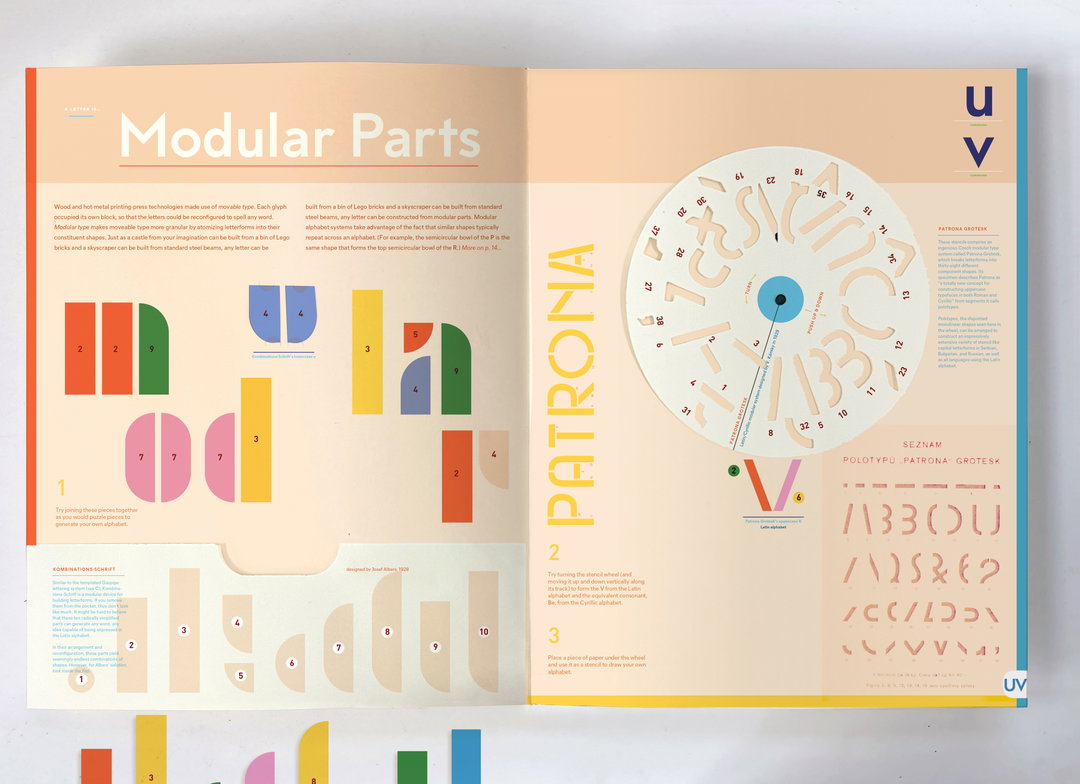
A five year research project all in all, the publication was no simple undertaking. What is now a set of colourful, perfectly engineered pages, was once “a crazy wall of ideas – like in a conspiracy theory movie”, Kelli tells us. The graphic designer and author spent countless hours playing with paper, scissors and glue, scouring every corner of the type world for facts that would shape her thoughtful 3D experiences: everything from a projection pop up to uncover the story behind psychedelic type from the 60s to a paper puzzle to piece together the history of modular lettersets.
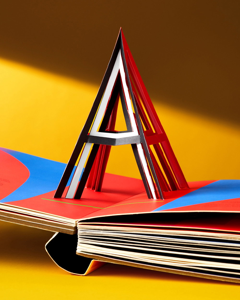
Alphabet in Motion: How Letters Get Their Shape, published by Katherine Small Gallery (Copyright © Kelli Anderson, 2025)
“I moved post-its and matched pop-up structures with essays and typeface examples until the concepts came through,” the designer shares. Slowly arriving at some of the blank prototypes that would make up the book’s final design, Kelli developed illustrator files with cut and score layers for her printer that “we lobbed back and forth for about a year, until the kinks were worked out”, she says.
The harder part of the process, according to the designer, was surprisingly the book’s printing: “My printer had only printed on coated paper previously,” she shares. “The whole production process had to be changed for uncoated [...] we had like 15 proofing rounds, two print consultants, and one Kelli-mega-field-trip to Guangzhou, where I pestered my very talented pressman to ‘make it pinker!’”
The Brooklyn-based designer has quite a lot of stamina for making “impossible” books come to life. Before Alphabet in Motion Kelli published This Book is a Camera, a working 4x5 camera, made from paper and This Book is a Planetarium, a publication that unfolds into a whole host of paper gadgets such as a constellation-projecting planetarium, a strummable musical instrument, and a geometric drawing generator, to name a few.
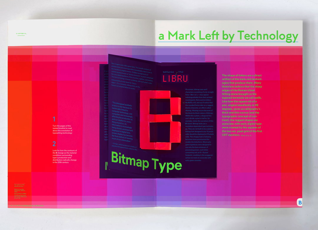
Alphabet in Motion: How Letters Get Their Shape, published by Katherine Small Gallery (Copyright © Kelli Anderson, 2025)
Like her former challenges in paper engineering, Kelli wanted to make abstract ideas about type tangible in Alphabet in Motion, “getting people’s hands and minds working in tandem”, she says. “Letterforms are shaped by culture, but also the technology that renders them. It’s hard to make obsolete technology real and vivid and empowering for a reader who has never (for example) operated a phototypesetting machine. That’s why tinkering is both a very human way of reasoning, and a method to empathically connect with the designer’s hand.”
Turning the pages of Alphabet in Motion, you certainly share in Kelli’s infatuation with letterforms: “tiny, fairly benign-seeming shapes” that have the ability to “transport you” to another time and place, but you also share in the designers love for the handheld revelations and the unlimited number of interactions that are possible with paper. It channels all of the knowledge the designer has acquired over her career about making and designing books that don’t quite behave as we expect.
True to Kelli’s sideways approach, instead of establishing an authority on typographic history, the pop-up publication lets us shape our own experience and understanding of type, firsthand. “The notion of the ‘firsthand’ is at once the most natural, accessible way to learn, and also the most radical,” Kelli concludes. “A person who believes that truth is to be acquired first-and-foremost through their own senses is empowered. My books are intended to engage directly with that part of ourselves.”
GalleryAlphabet in Motion: How Letters Get Their Shape, published by Katherine Small Gallery (Copyright © Kelli Anderson, 2025)
Hero Header
Alphabet in Motion: How Letters Get Their Shape, published by Katherine Small Gallery (Copyright © Kelli Anderson, 2025)
Share Article
About the Author
—
Ellis Tree (she/her) is a staff writer at It’s Nice That. She joined as a junior writer in April 2024 after graduating from Kingston School of Art with a degree in Graphic Design. Across her research, writing and visual work she has a particular interest in printmaking, self-publishing and expanded approaches to photography. ert@itsnicethat.com
To submit your work to be featured on the site, see our Submissions Guide.