Business or pleasure? Grilli Type’s new GT Flaire is the “mullet of typefaces”
The Swiss foundry’s new typeface works hard and plays hard. It launches with a website packed with design quirks and in-jokes, leaning into the tensions of working as a designer today.
“GT Flaire is the mullet of typefaces – business in the front, party and subversion in the back,” says Thierry Blancpain, co-founder of Grilli Type. This playful analogy encapsulates Grilli’s latest release, which is accompanied by a launch website packed with design quirks, in-jokes and interactive UI elements that lean into the theme of “business and pleasure”.
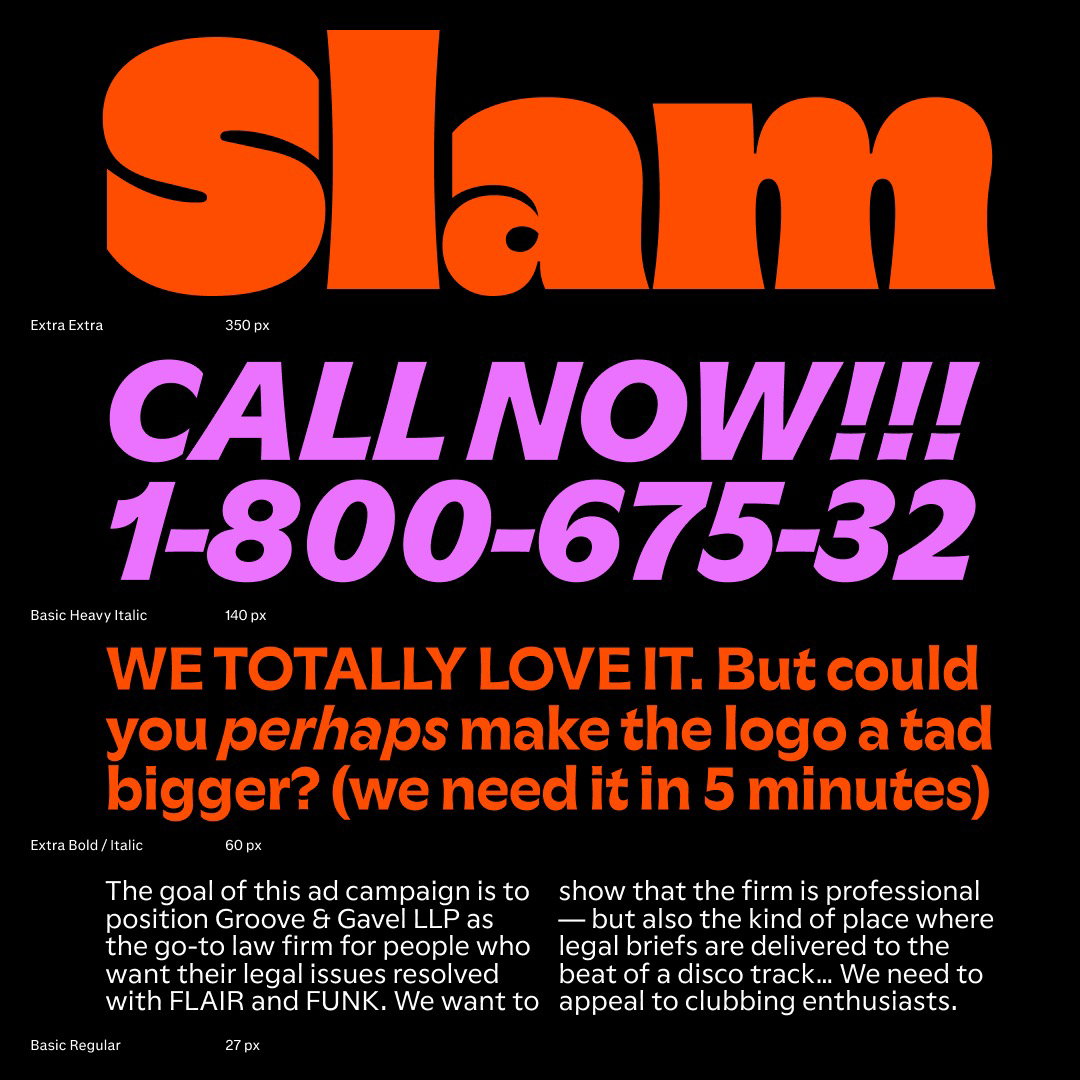
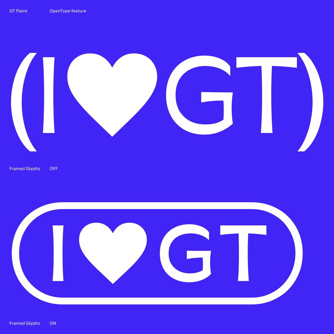
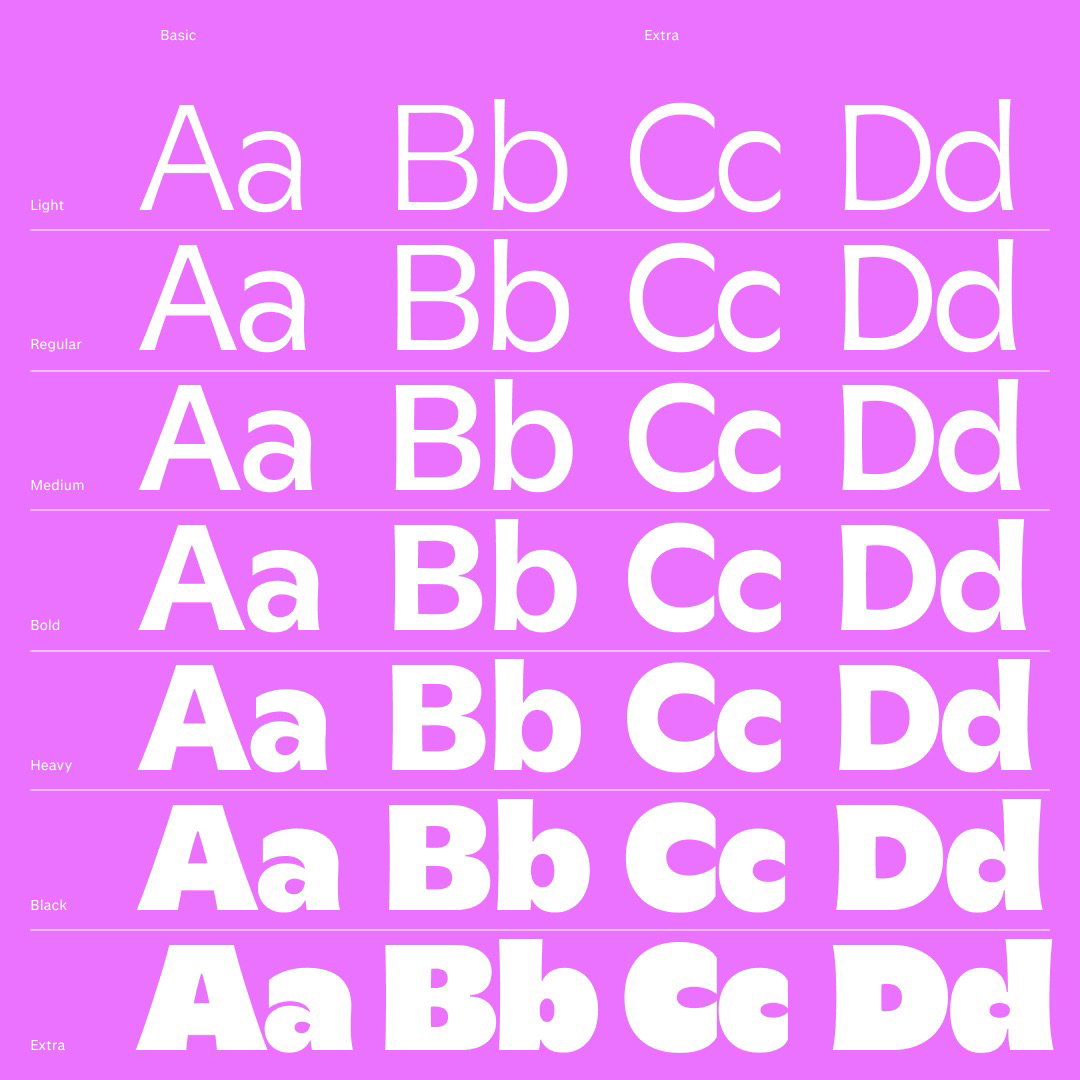
With seven weights in basic and extra styles, the GT Flaire family offers 28 styles – from corporate and sophisticated to loud and expressive. “The tension between the utilitarian basic family and the exuberant extra family drives this design,” says Thierry. “It’s all about the two families – basic and extra… basic is all function, extra is lots of pleasure, and a little business.”
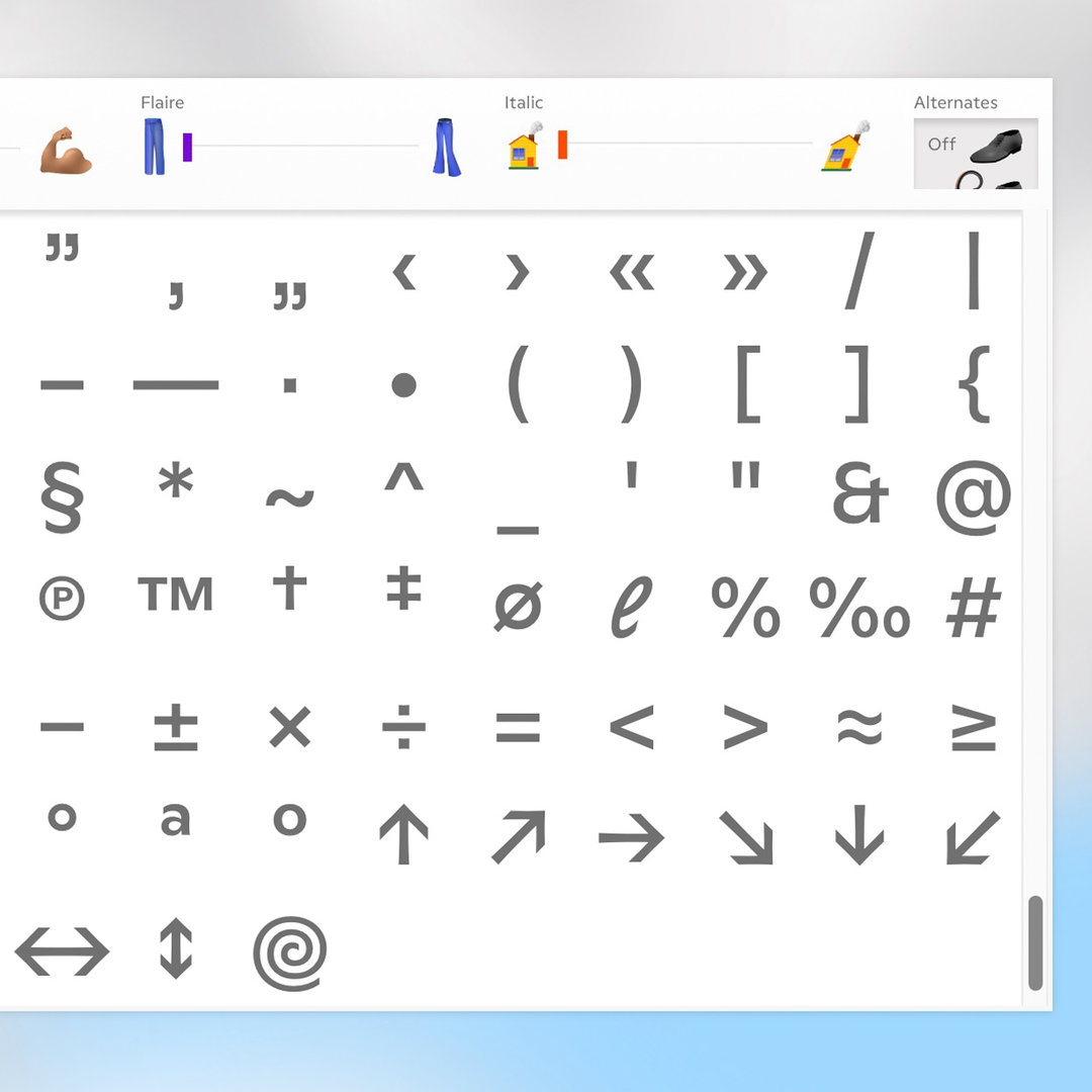
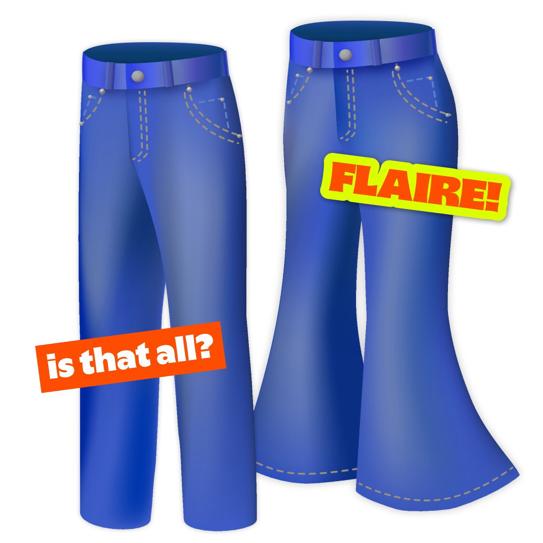
The launch website plays on this tension. It loads up to a chat between a fictional designer and boss: “Add more fun! More pizzazz! More flaire!” There’s a wheel-of-fortune dial that only swings between two possible states, a vacuum icon to delete, and – the star of the show – a toggle between basic and extra, marked by skinny and flared jeans.
“[Our team] all share a deep-running disrespect for corporate bullshit. So once we decided to play with the idea of a typeface that’s supposedly all business, we wanted to go way too far with that concept,” says Thierry. “We had a lot of fun coming up with unusual interactions and icon ideas. But also, how horrible could the boss in this simulated life-of-a-designer be? We actually had to dial it down a bit – it got a little too real there.”
GT Flaire also plays with the idea of what a humanist sans serif can look like. “Humanist sans serifs have a strong background in wayfinding, information graphics, UI and all of these related, more functional design fields,” Thierry explains. “But GT Flaire Extra turns this maxim of a functionality-driven design on its head.” Reto Moser, the designer of GT Flaire, traces its inspiration to Adrian Frutiger’s Gespannte Grotesk – a softer alternative to his Univers typeface. “Frutiger aimed to move away from the harsh design of Univers and create a more lively, softer grotesk,” he says, “this simple aim evolved into GT Flaire”.
More than a typeface, GT Flaire’s launch campaign opens up conversations – about the intersection of utility and creativity, and the realities of being a designer in a corporate-led world. Combining clever copywriting with thoughtful design, Grilli Type proves that in design, there’s always room for business – and a whole lot of pleasure.
GalleryGrilli Type: GT Flaire (Copyright © Grilli Type, 2024)

Hero Header
Grilli Type: GT Flaire (Copyright © Grilli Type, 2024)
Share Article
Further Info
About the Author
—
Marigold Warner is a British-Japanese writer and editor based in Tokyo. She covers art and culture, and is particularly interested in Japanese photography and design.