




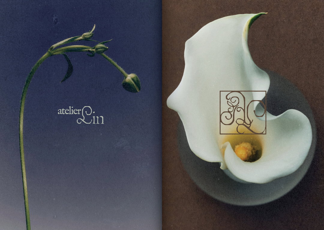
Daryn Roongrawewan doesn’t design logos, she crafts “ornamental icons”
The designers’ visual systems often find their start in off-piste vintage design references and explorations off screen – that’s why they don’t really look like anything else you’ll see today.
It’s clear to see Berlin-based designer Daryn Roongrawewan’s extensive background in editorial design in her approach to branding. Detailed and ornate, with a look and feel that you often only find in old print, her work is a feast for those that love expressive type. Her delicate visual systems draw from vintage design languages and small observations she makes out in the world day to day. For her brand identity for flower shop Atelier Lin, for example, the designer dived deep into Slavic alphabets to craft custom initials for the wordmark.
The florist’s new custom letterforms had to have “ornamental curves for softness and grace, but with purposely rigid edges, like carved metal, for firmness”, she says. For the florists’ care cards the designer also pulled from the distinctive character of the Victorian era, including carpet bedding plans and monograms. The illustrations on the other hand, were “inspired by 1920s children’s books”, she says, and the designers’ bespoke L in Lin is a nifty visual trick that can rotate into a number of different drawings of flower shapes, turning “a single letter into an ornamental icon”, Daryn adds.
For a visual identity for Padma, a Los Angeles art and design studio rooted in ecology, Daryn started things out completely offscreen – instead of constructing a logo, she went out looking for it in the great outdoors: “Nature already holds the shape of letters. The curve of a leaf, the subtle twist of a stem. The initial P for Padma came from watching more than creating,” she says. The final logo draws from the shapes and gestures of the purple sugar magnolia snap pea, paired with a customised wordmark that Daryn designed to mimic the nodes of the plant‘s stem. The designer then worked with clay and raw textures to translate this into some visual elements for Padma’s new website.
“I think my approach to design is a lot like my approach to the things I keep,” Daryn shares – “even my tattoos. Every mark should mean something.” The designer has always been a firm believer that when it comes to branding, taking inspiration for visual forms from something you’ve observed in the world, that people recognise, “carries a warmth that people can feel even if they can’t explain it”, she ends.
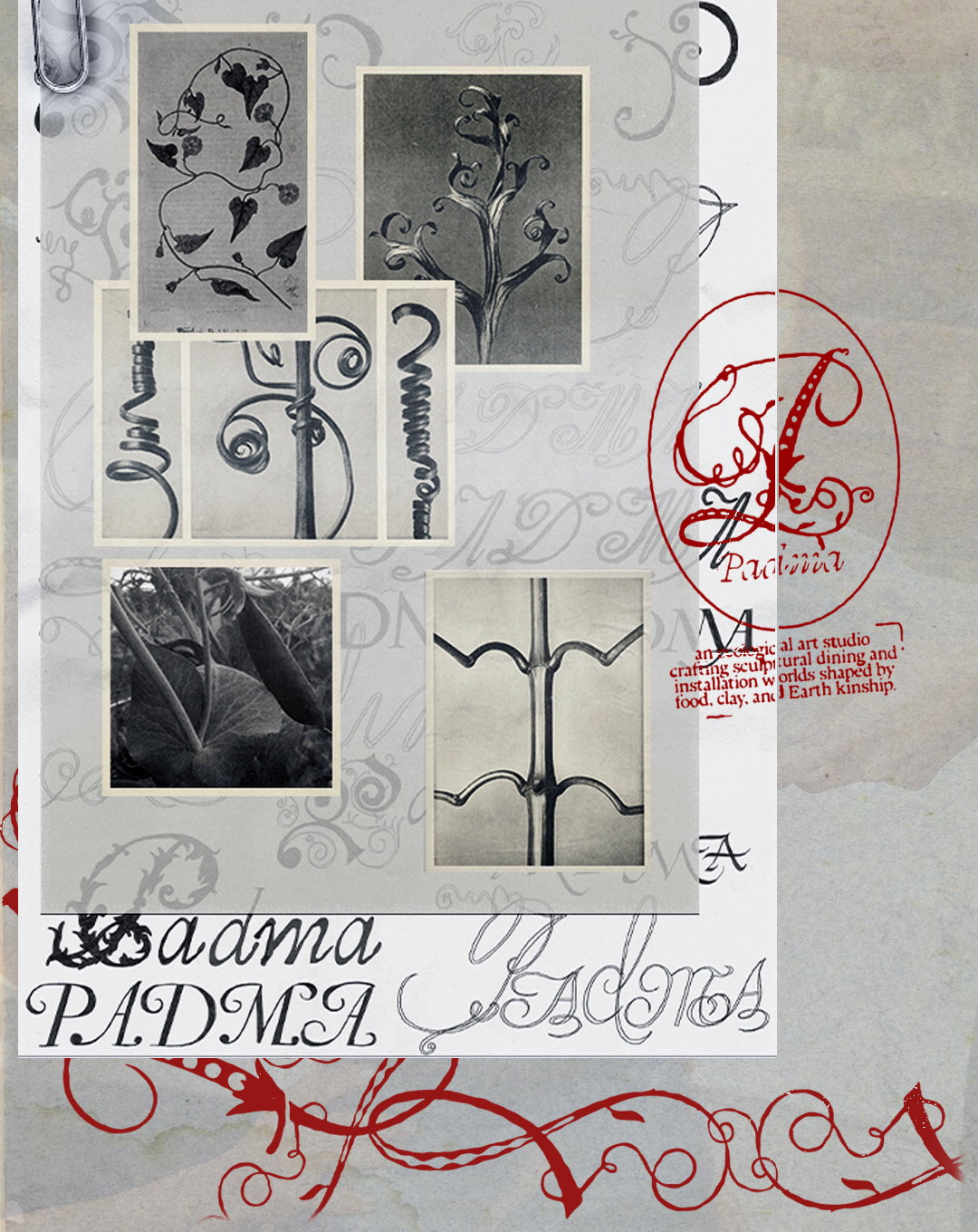
Daryn: PADMA (Copyright © Daryn, 2026)
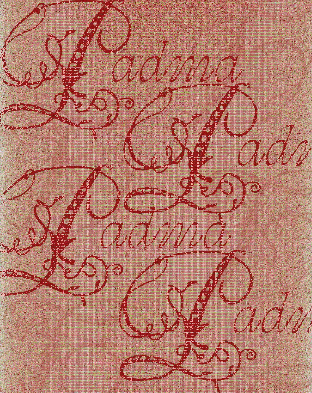
Daryn: PADMA (Copyright © Daryn, 2026)
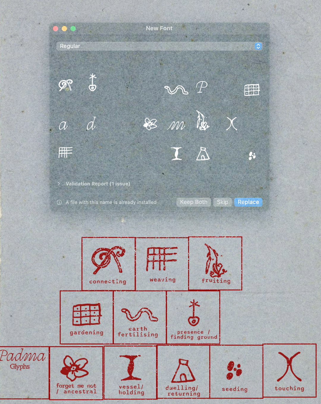
Daryn: PADMA (Copyright © Daryn, 2026)
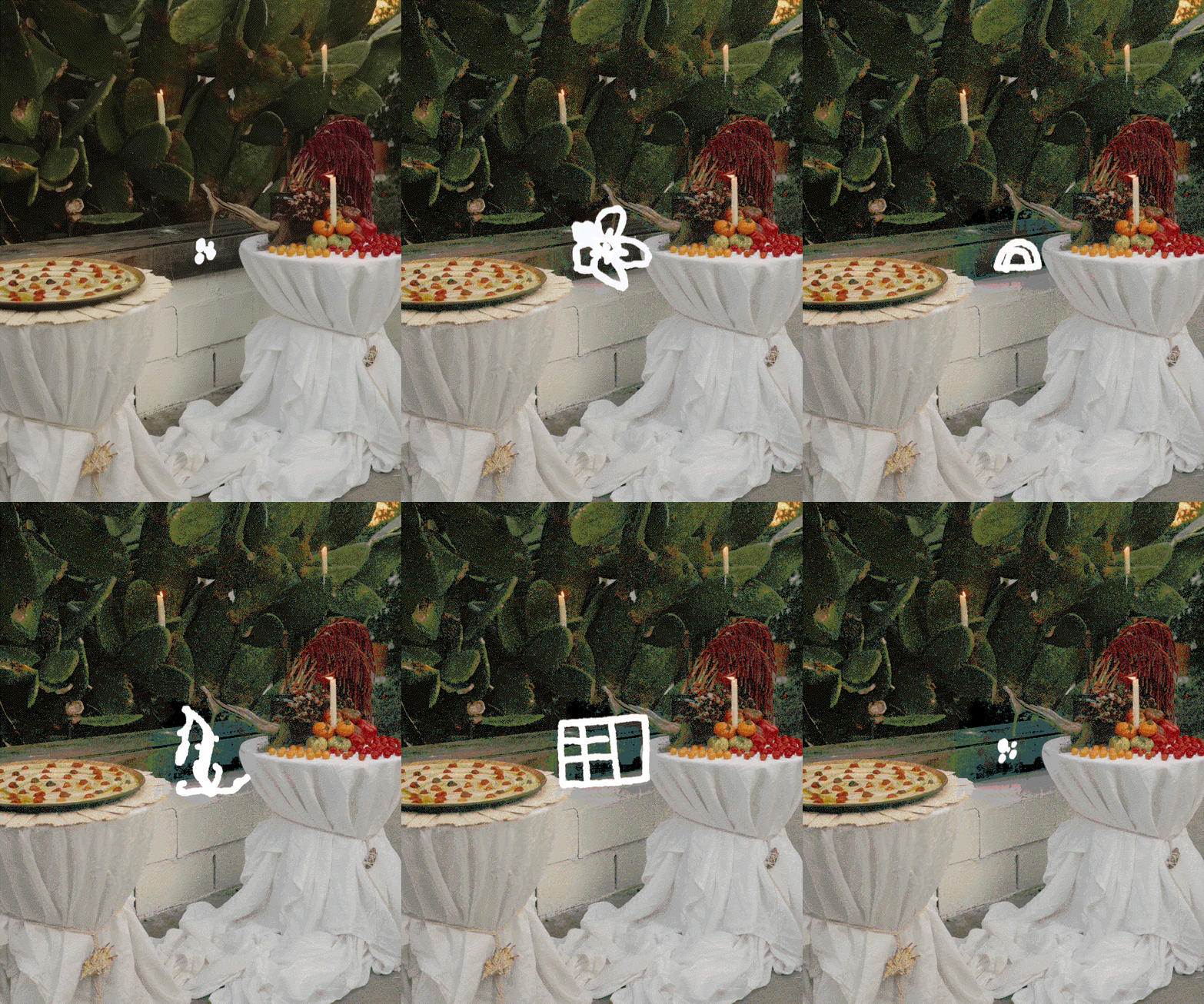
Daryn: PADMA (Copyright © Daryn, 2026)
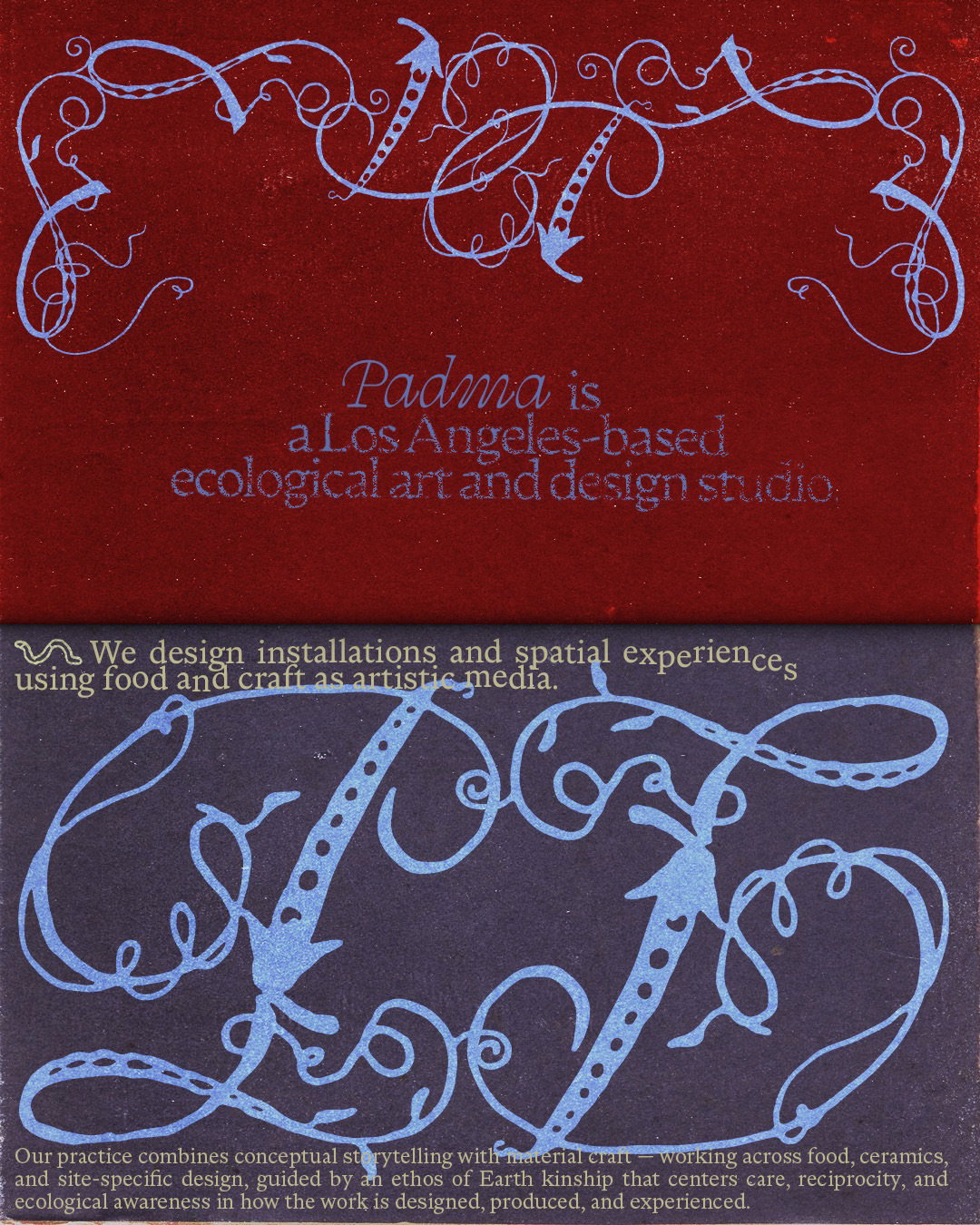
Daryn: PADMA (Copyright © Daryn, 2026)
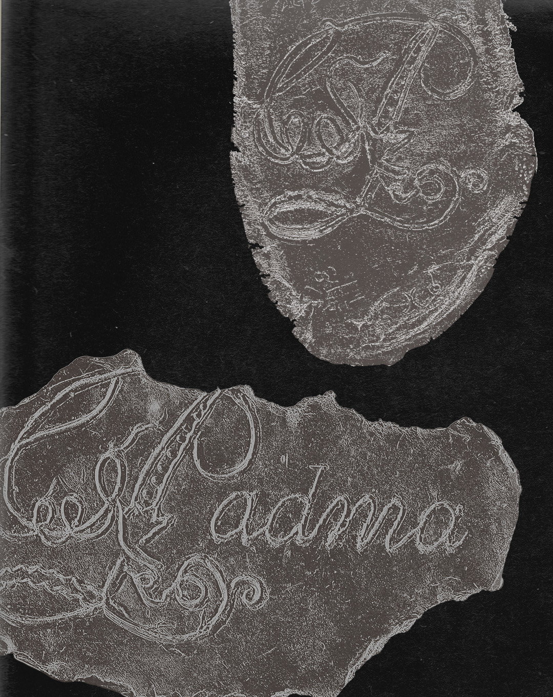
Daryn: PADMA (Copyright © Daryn, 2026)
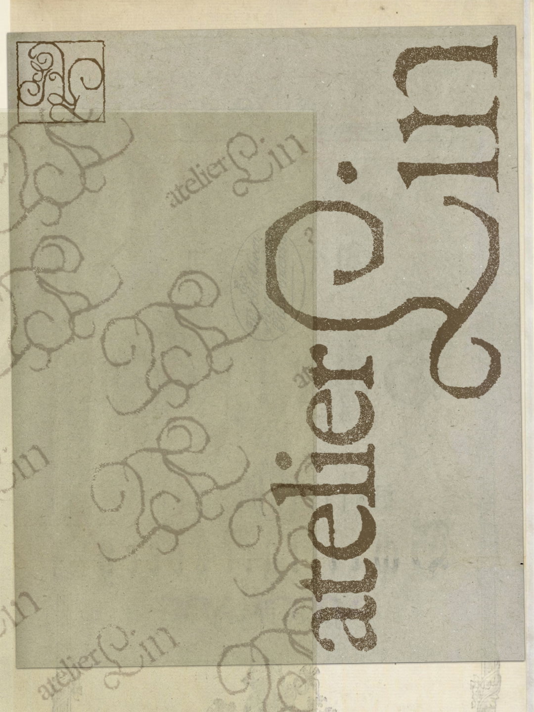
Atelier Lin (Copyright © Daryn, 2025)
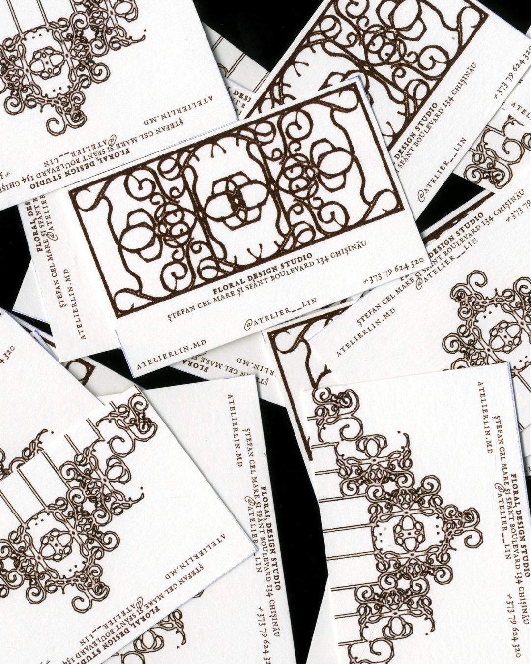
Atelier Lin (Copyright © Daryn, 2025)
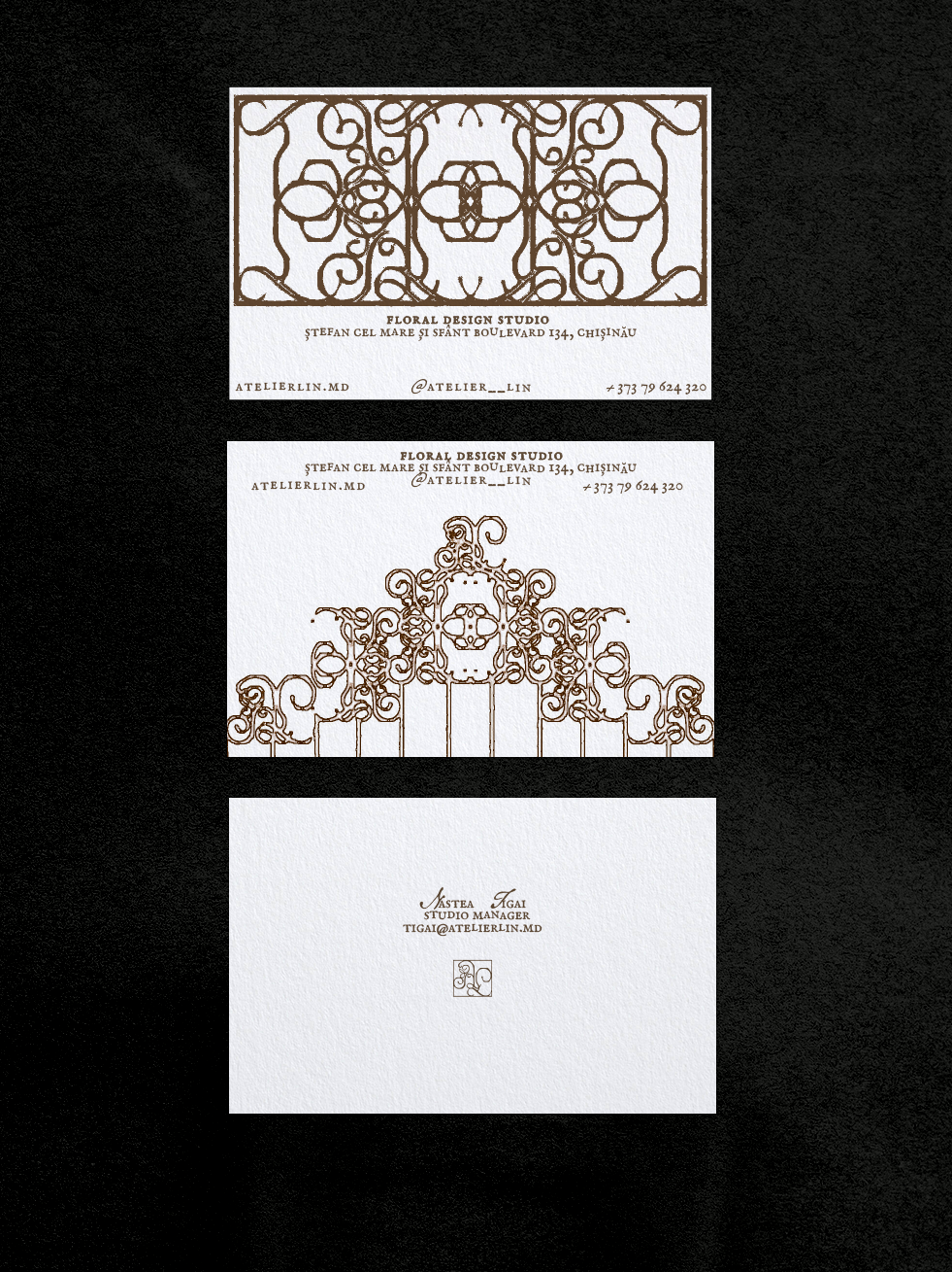
Atelier Lin (Copyright © Daryn, 2025)
Hero Header
Atelier Lin (Copyright © Daryn, 2025)
Share Article
Further Info
About the Author
—
Ellis Tree (she/her) is a staff writer at It’s Nice That. She joined as a junior writer in April 2024 after graduating from Kingston School of Art with a degree in Graphic Design. Across her research, writing and visual work she has a particular interest in printmaking, self-publishing and expanded approaches to photography. ert@itsnicethat.com
To submit your work to be featured on the site, see our Submissions Guide.




