The “glitchy, jittery” visuals of this Pitchfork designer are made with serendipity and his new favourite motion software
Pitchfork Selects is a weekly playlist made up of the most exciting new music drops, so its visuals have to match its audible freshness. Enter Chris Panicker, and the Cavalry app.
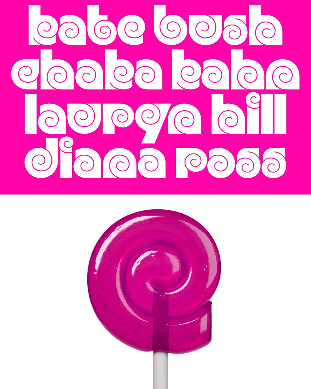
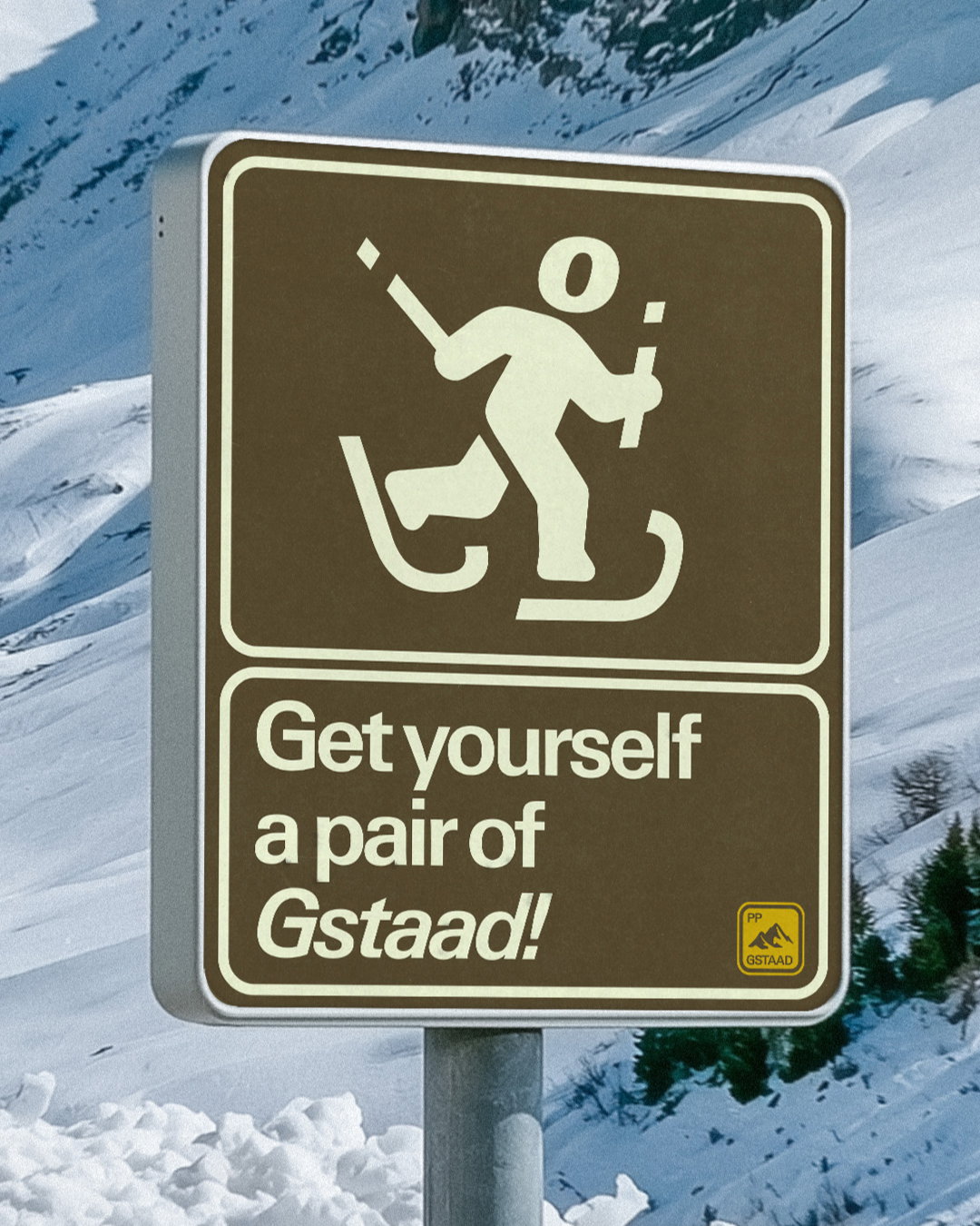
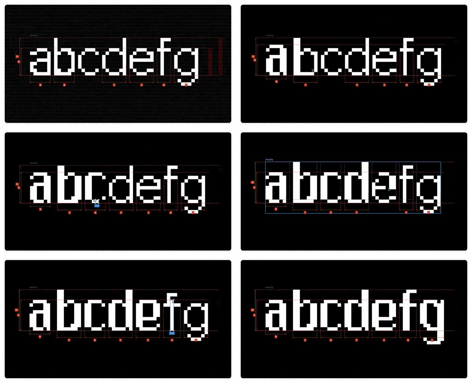
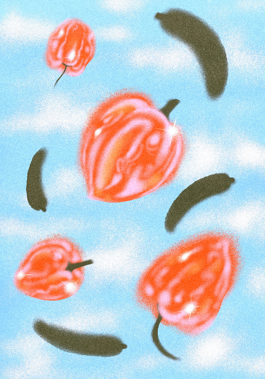
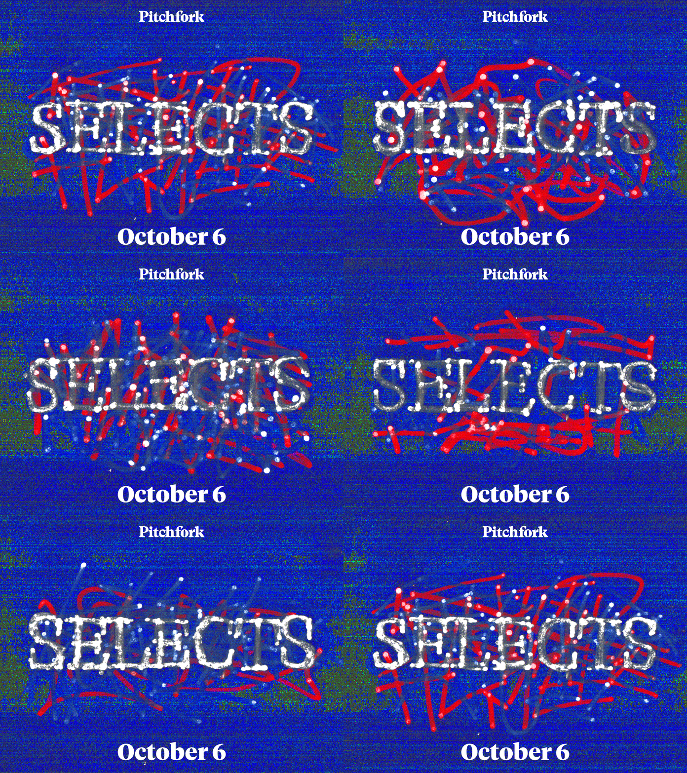
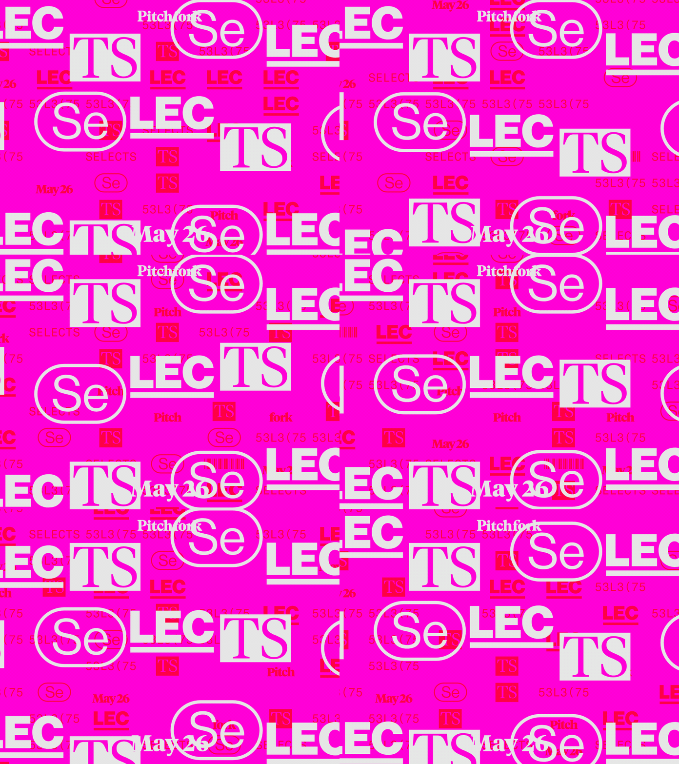
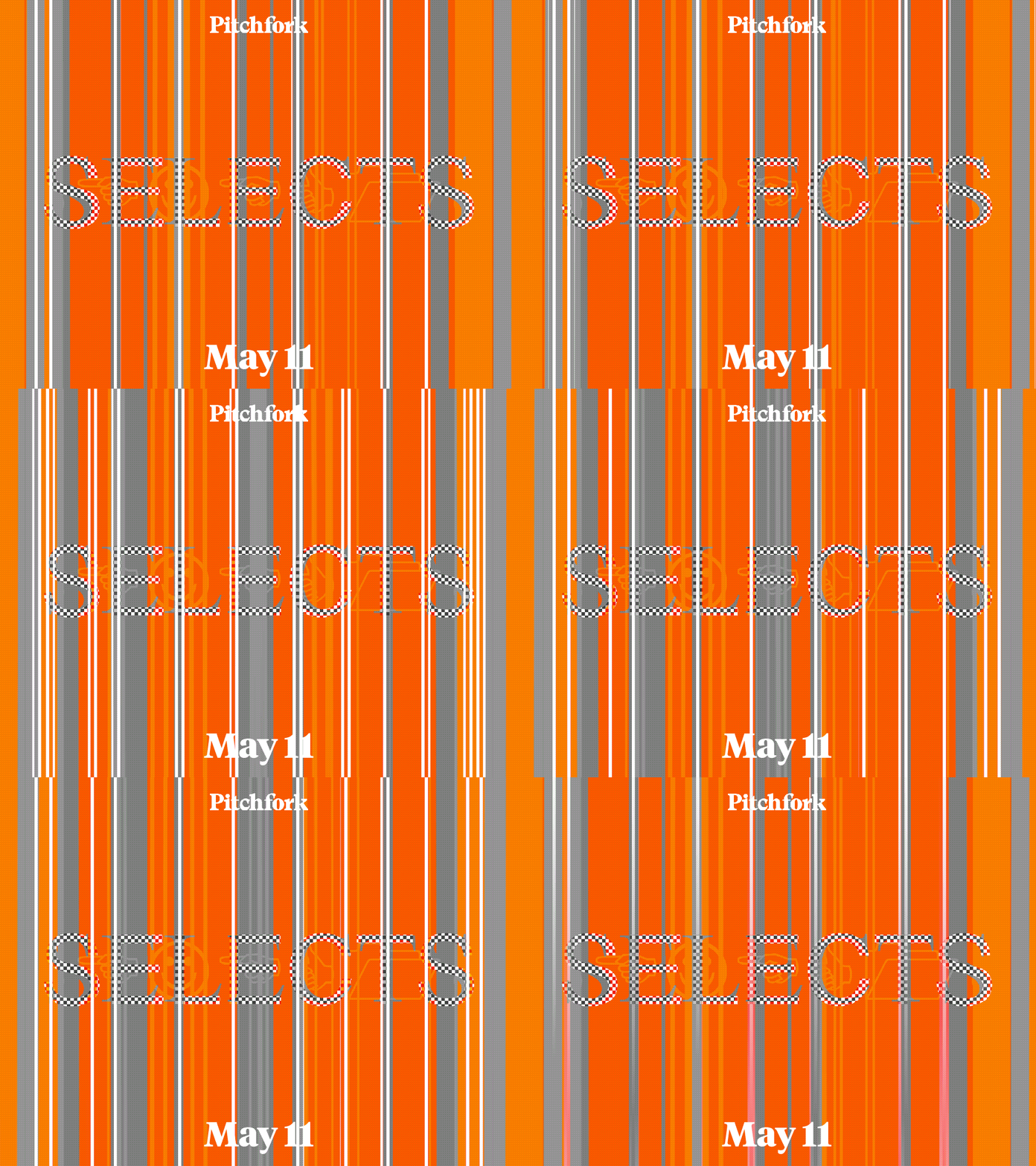
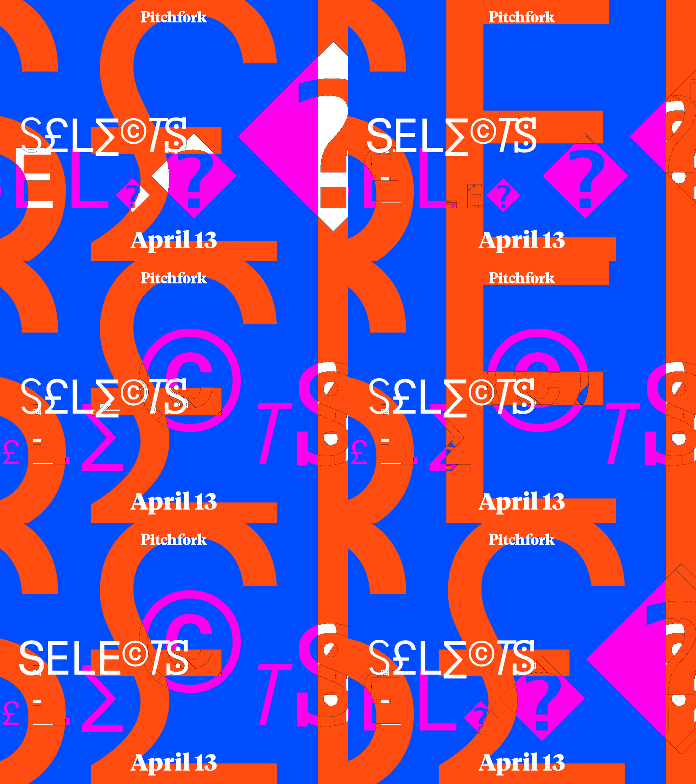
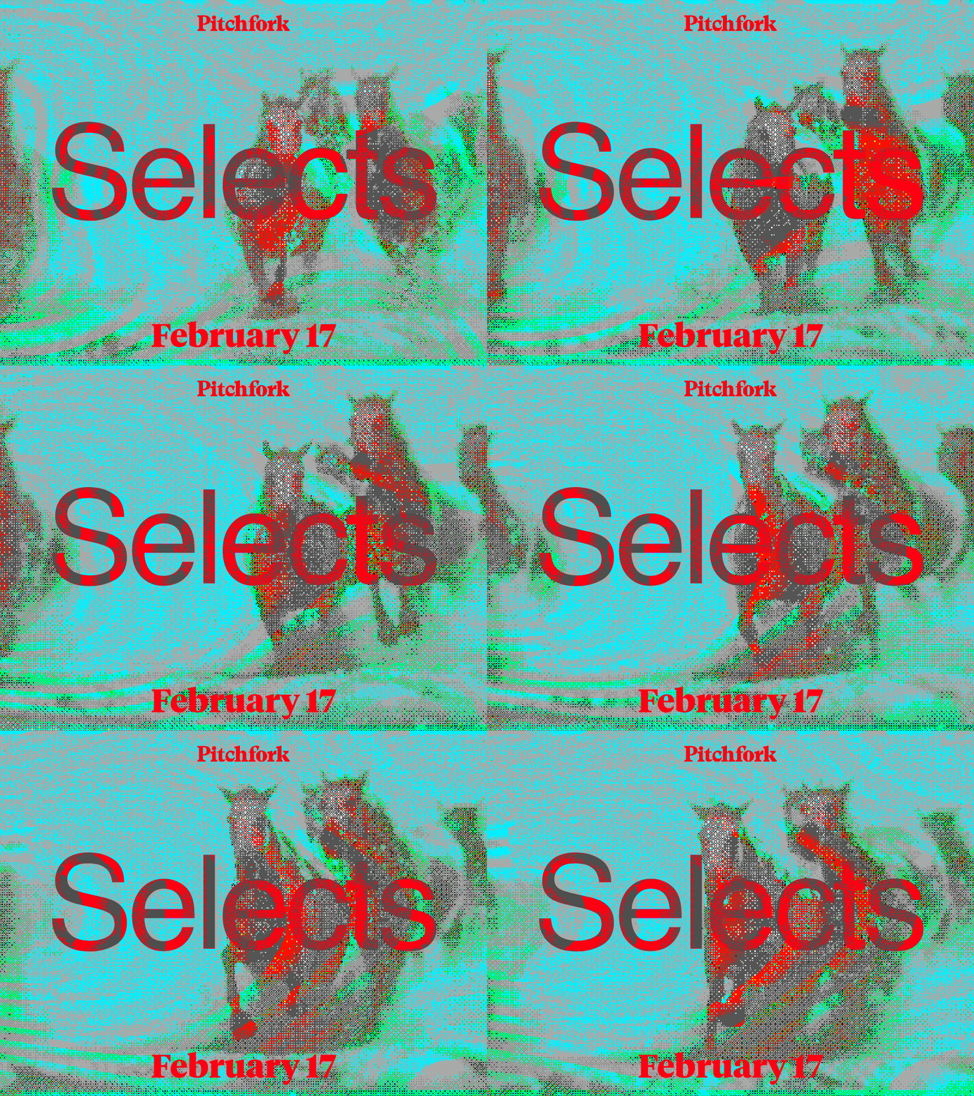
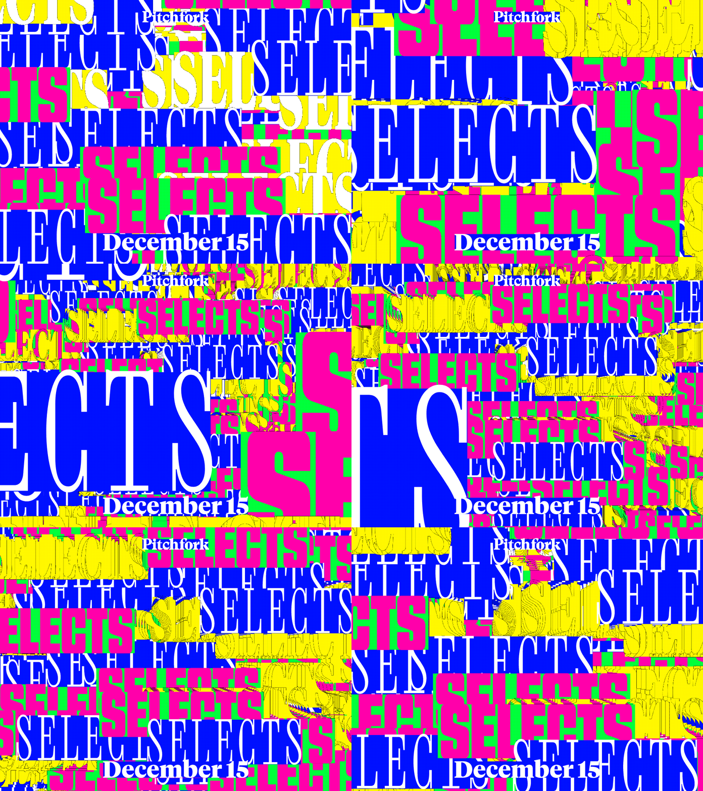
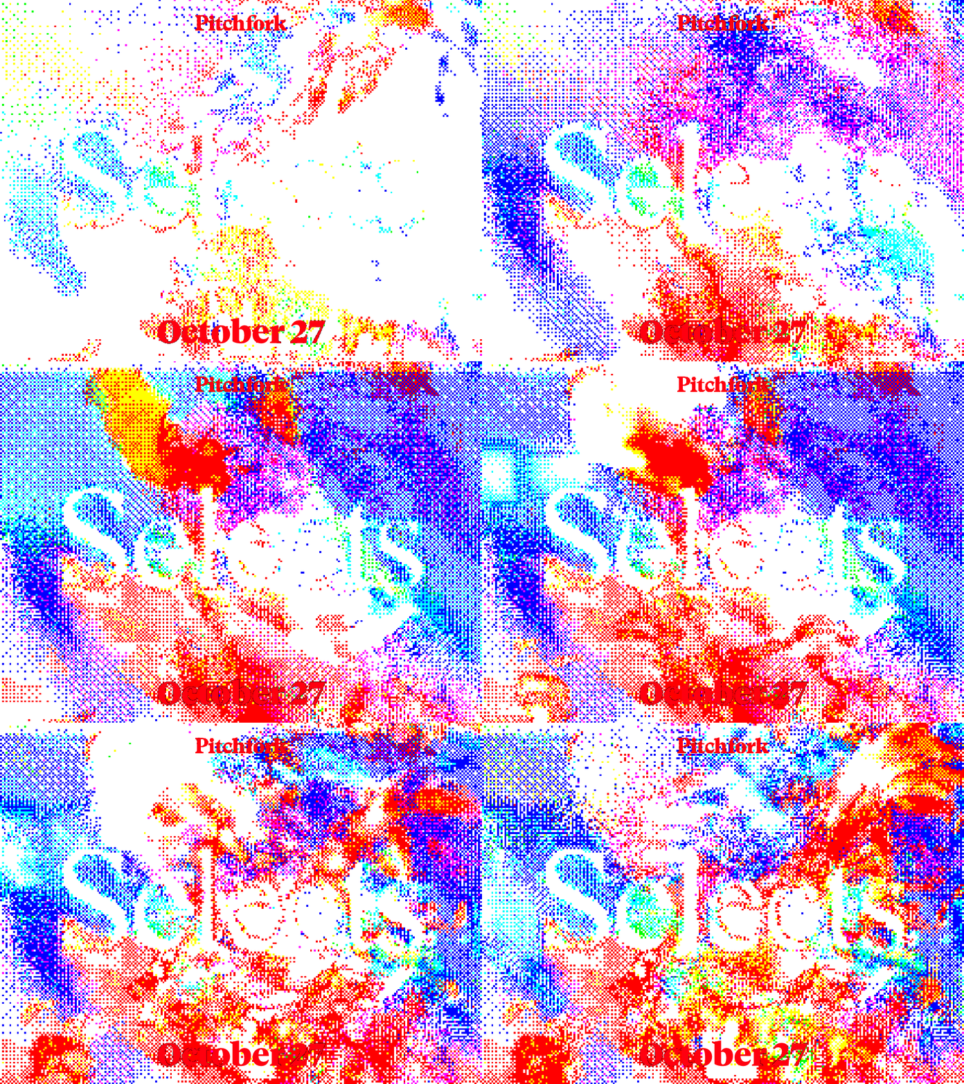
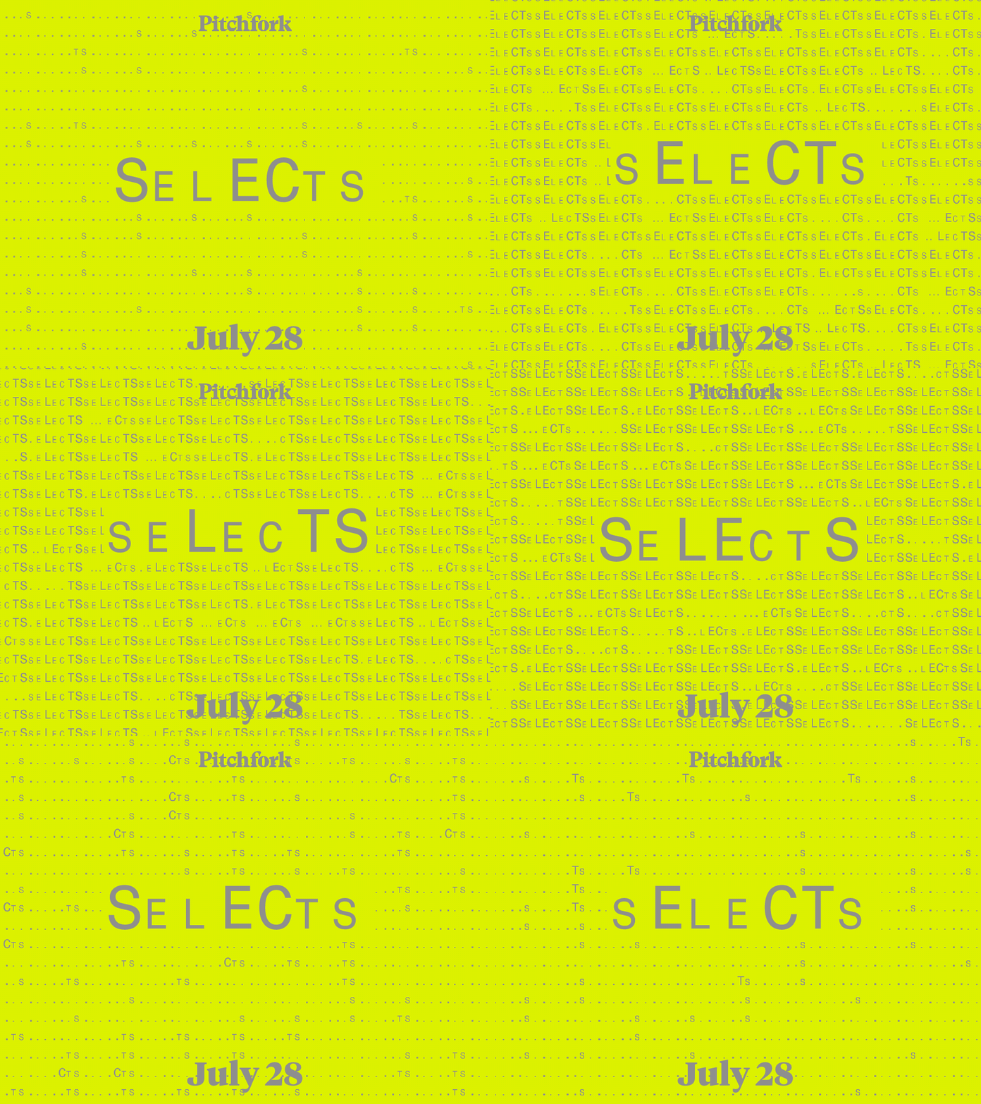
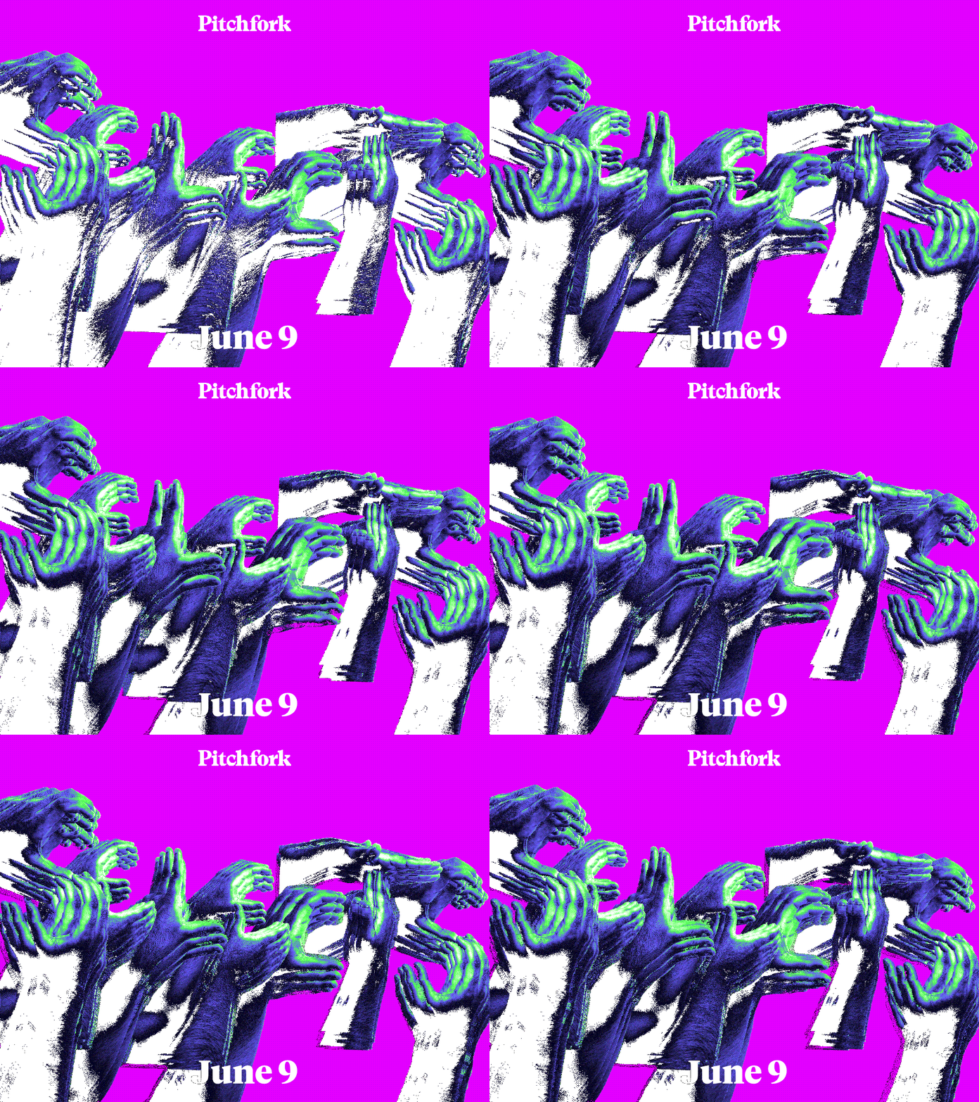
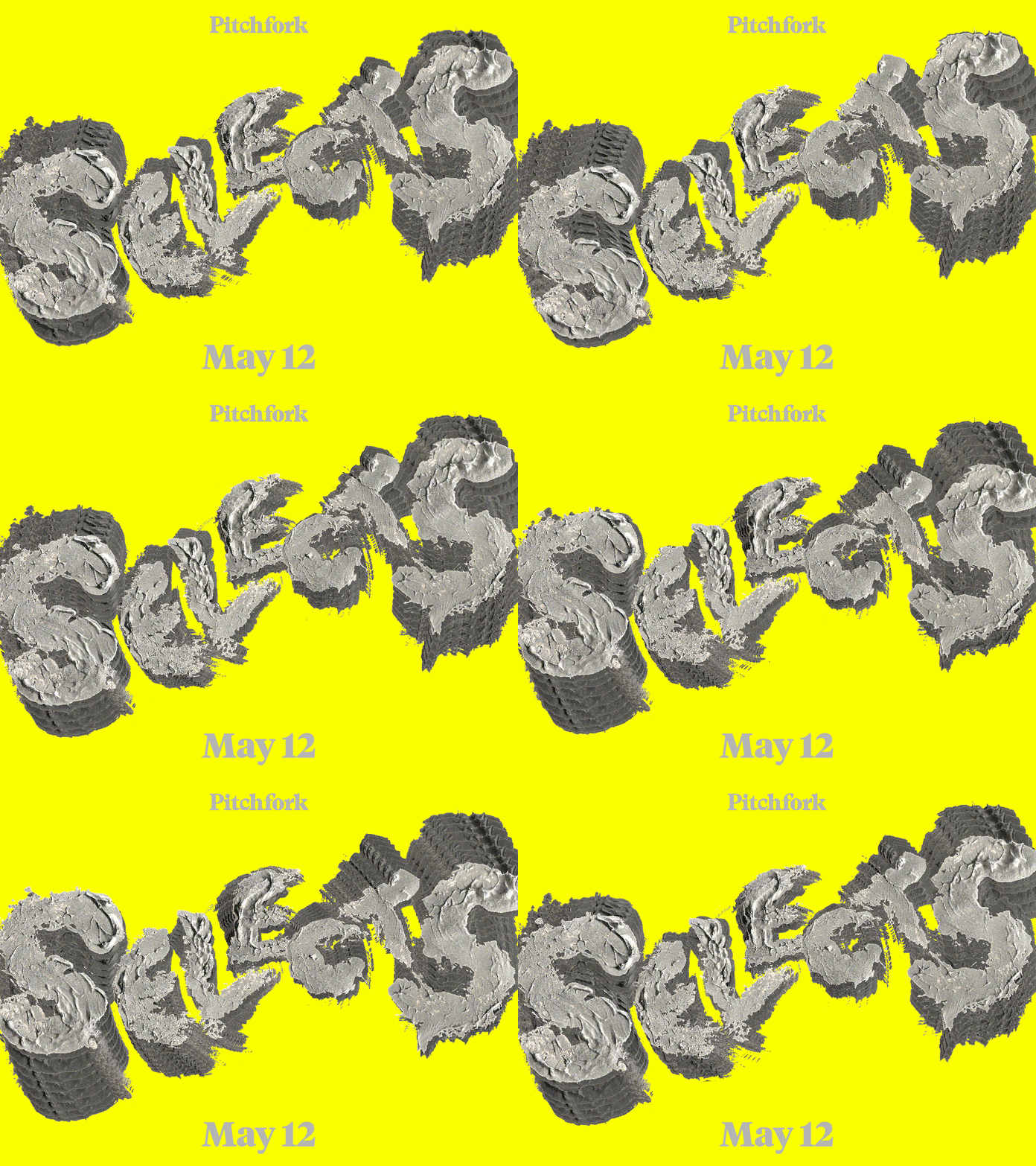
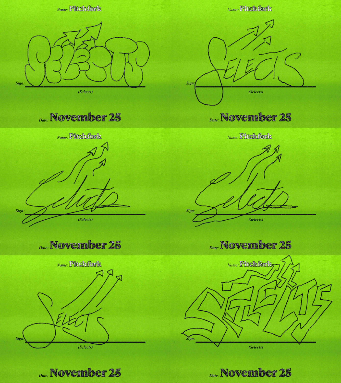
Every Monday, Pitchfork releases its recurring playlist: Selects – a staff-curated list of the best new tracks from the previous week for music lovers to dig into, and it’s in-house senior designer Chris Panicker’s job to create the visuals that let everyone know it’s arrived. The brief and parameters are pretty simple: the Pitchfork logo and publishing date live on the top and bottom of the composition, and the ‘Selects’ name has to be (as Christopher caveats) “relatively” legible somewhere. But this simplicity doesn’t extend into the final result. From sliding cement type and school textbook scrawls to ASCII-style horses galloping straight at you from the screen, Chris’ electric motion work hits the brief perfectly – he visually encapsulates the thrill of finding an unshakeable new earworm.
As the sole designer at Pitchfork, Chris is a busy man. He can often be found doing anything of the following: creating work for editorial columns and features, building out social carousels, designing systems for bigger projects like The Best Music of 2025, redesigning longform YouTube series like Over Under and masterminding the covers for story zines, featuring the likes of Bladee, Turnstile, Oklou, Dijon and most recently Olivia Rodrigo to announce the launch of her women-led festival, Daisy Chain. The latter also coincided with an explainer video with the pop star, featuring frame-by-frame overlay animations made by Chris in Procreate. “There are some real high-highs, in regards to pressure, but also some really fun low-pressure opportunities to experiment and explore new approaches to editorial art,” says Chris.
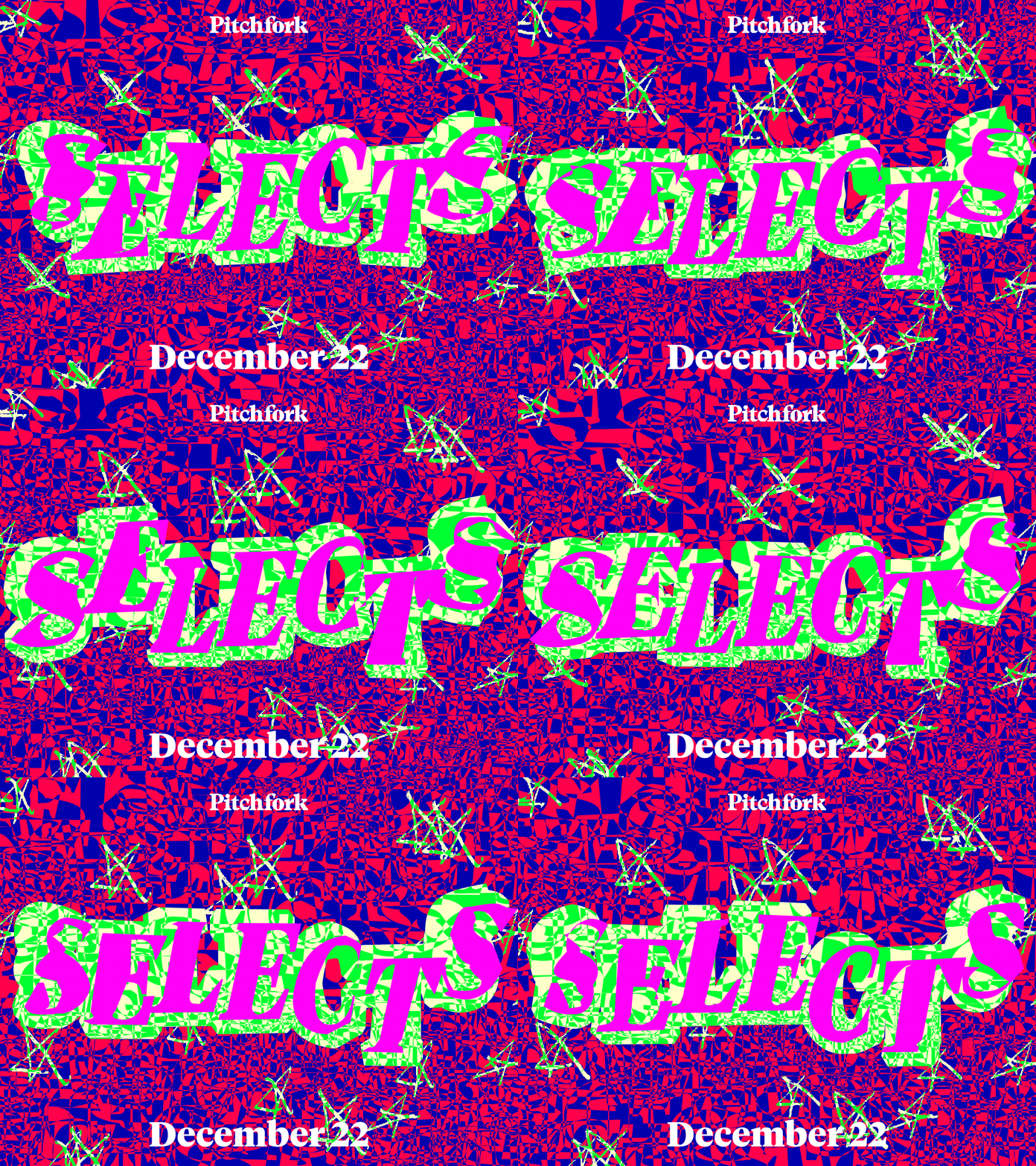
Chris Panicker: Pitchfork Selects (Copyright © Chris Panicker / Pitchfork)
The role is the perfect fit for a creative whose entry into design was intertwined with discovering new music. Born in Mechanicsville, just outside of Richmond, Virginia, Chris whiled away his early years on his dad’s computer, playing around on the abandonware Microsoft Photodraw, making pieces he describes “Kingdom Hearts meets Sonic meets Dragon Ball Z”, which became the wallpapers on his dad’s PC (lucky dad). Chris got a more official introduction to graphic design at high school in a class taught by Erik Leise, which began with tutorials for the Illustrator pen, before morphing into “art school-esque conceptual briefs”. Chris continues: “His class was my favorite partially because it was my first class experiencing these kinds of open-ended assignments and partially because his iPod was a gold mine of great music I hadn’t heard of before meeting him (cut me some slack, I was 14); Death Cab For Cutie, The War on Drugs, and Fiona Apple to name a few.” He later moved to New York, where he’s still based today, to study communication design at Parsons, during which he fell in love with code, analogue animation, motion graphics and all the many way these mediums intersect and overlap.
As you can imagine with a weekly cadence, time constraint is Chris’ biggest challenge with the Selects project. At most he can spend about one or two hours working on the visuals, and so he often won’t get a chance to see or listen to the music being featured; as alternative points of inspiration Chris stays alert to kernels of inspiration around his day-to-day life, or, more serendipitously, he just “follows any whims of an idea”. While motion was never a requirement in the Selects brief, Chris wanted to inject some energy and was keen to set himself a bit of a challenge: “I knew playlist art had to be static on streaming platforms, so I had to find ways to create both a motion asset and static asset that feel equally dynamic.” As an avid coder he began code motion interactions as the primary catalyst for each week, experimenting with unique outputs from self-built models. But one problem arose, as Chris recalls, “it ended up being a little too time consuming for me to reinvent the wheel and develop a new interesting idea weekly in code”.
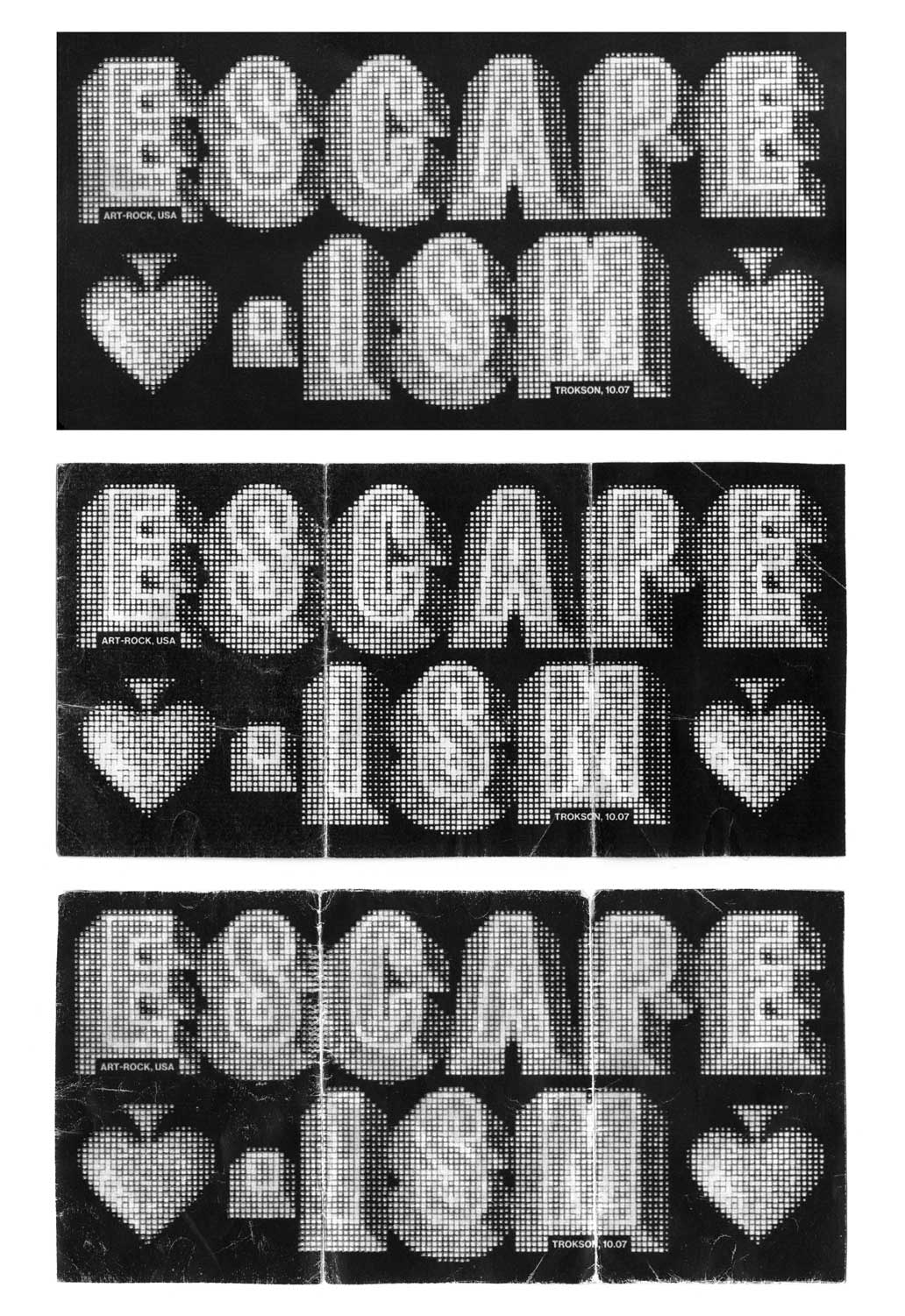
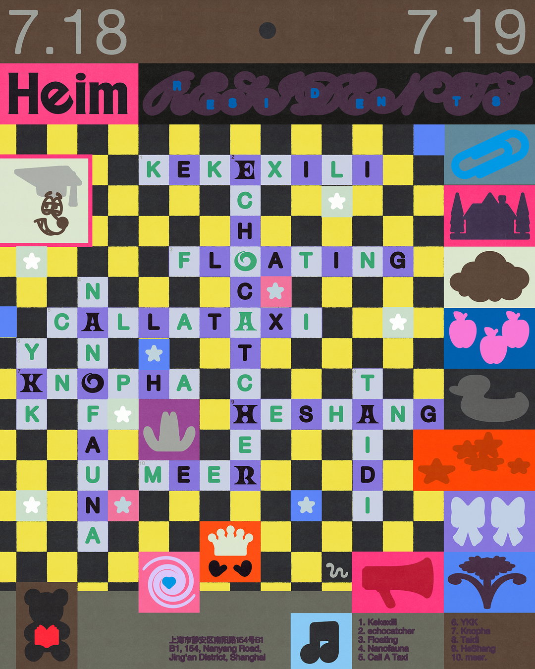
This is where Cavalry came into play. Chris had caught a lot of positive chat about the software, the benefits of its procedural animation and its pre-set modules called ‘Behaviours’, and he decided to use the Selects project to experiment with and learn about the software, watching and rewatching YouTube videos. Once Chris got the hang of it, he realised everything he makes for Selects is married together by an “abstract, glitchy, jittery” style, but each piece has varied origin stories. Some are concept-led, the band of pixelated horses, a celebration of the Year of the Fire Horse, or a cursor chasing buttons that just won’t sit still. Some have more analogue beginnings, with Chris drawing type with cheap art supplies, or photographing his hands to create the Selects letterforms. Whatever the input you know with Selects that the output is going to be great – Chris has raised the bar incredibly high for fast-paced editorial design, and shown how to put your own spin on pre-set software.
GalleryChris Panicker: Pitchfork Selects (Copyright © Chris Panicker / Pitchfork)
Hero Header
Chris Panicker: Pitchfork Selects (Copyright © Chris Panicker / Pitchfork)
Share Article
Further Info
About the Author
—
Olivia (she/her) is associate editor of the website, overseeing the day-to-day editorial projects as well as Nicer Tuesdays events. She joined the It’s Nice That team in 2021. ofh@itsnicethat.com
To submit your work to be featured on the site, see our Submissions Guide.