Design studio Supersystème builds visual worlds by treating typography as image
Masters in the art of letters and layouts, the Montreal-based design studio creates identities, publications and posters where words become an essential part of the message.
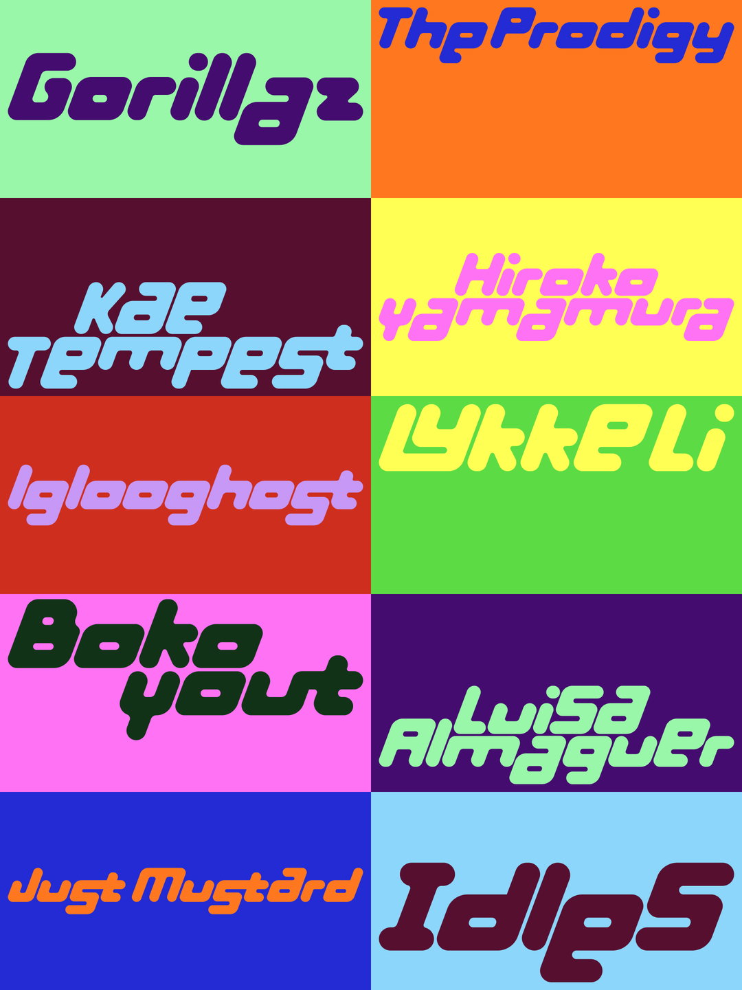
Eveline Lupien and Marie-France Gaudet of Montreal design studio Supersystème have a pretty multifaceted design practice that stretches across editorial, visual identity and website projects for individuals and institutions in the field of arts and culture. Yet there is also a single line of enquiry that leaves an impression on everything they touch. If you’re listening closely, much of their visual work asks a question, says Eveline: “how can typography operate simultaneously as language and image?”
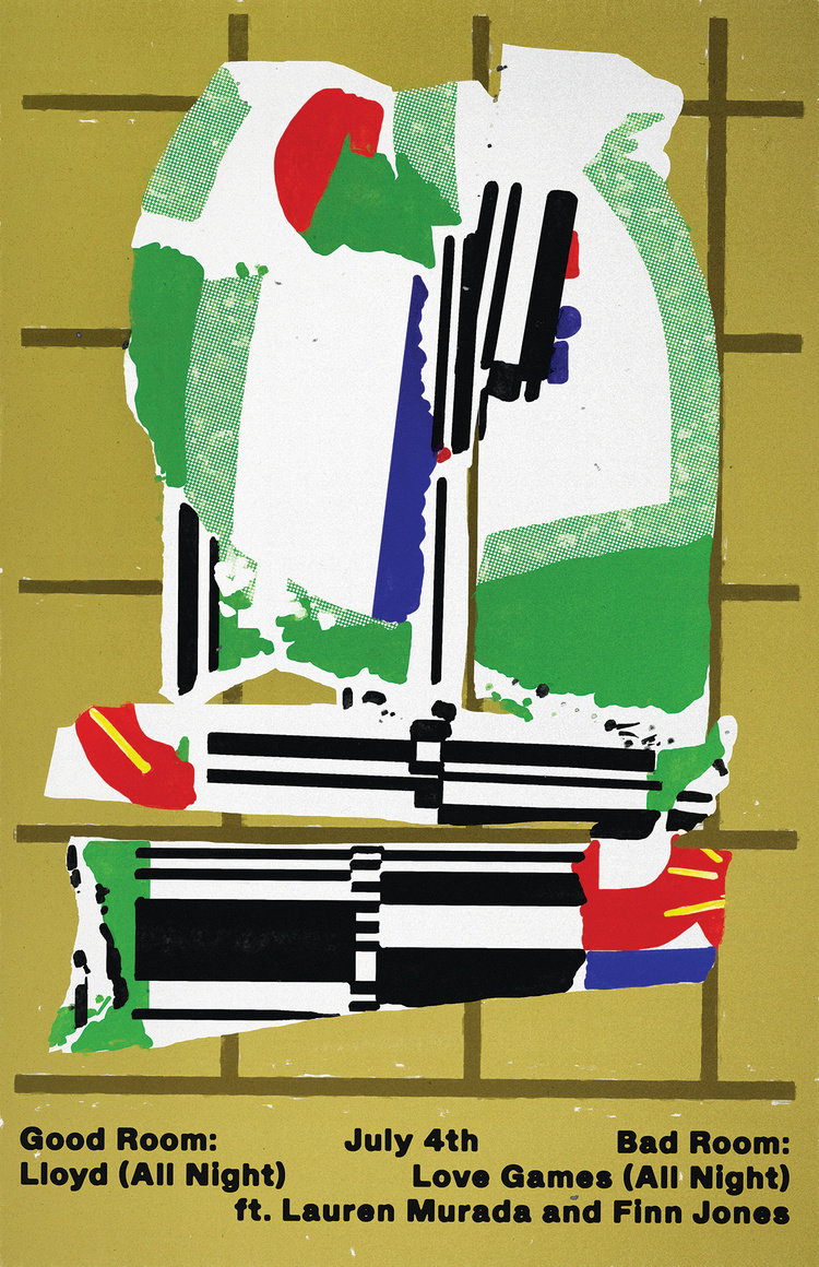
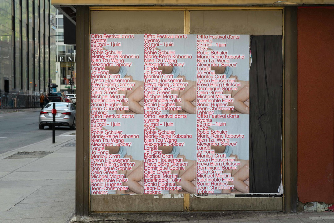
The studio’s muli-layered typographic interventions produces work you never want to look away from – like the letters that become puzzle pieces on poster grids for Festival des Faubourgs or the heap of language that marked the 2025 identity for Offta Arts Festival. Through an interesting use of scale, direction and juxtaposition, type ceases to function as solely a tool or accessory in the pair’s cultural projects – it’s a central component to the message. Although careful attention is paid to letterforms in each new visual equation, the studio is “interested in moments where typographic interventions connect visual concepts, images and context to produce a new reading, something neither element could communicate on its own”, Marie says.
The system’s language is also a recurring influence for Eveline and Marie’s practice – “hence our name!” Eveline shares. “Not necessarily as rigid structures, but as broader concepts through which meaning is produced and understood, but also allow it to be shifted, bent or re-read through design interventions.” Restraint and restriction also play a part in shaping the work. The contexts that the designer’s visual systems can often sit within (such as artist-run centres, grant-funded initiatives and self-organised projects) “operate with limited resources and shifting conditions”, says Marie. “This reality naturally shapes how we approach design, and reinforces our interest in building frameworks that allow content, research and cultural discourse to circulate clearly and meaningfully within those constraints.”
Each project in their growing archive of design work starts with a lot of subject-specific research and a whole lot of visual exploration to land on the right solutions. “Over the years we have developed a specific work rhythm, like a ping-pong game,” says Eveline. “We share files mid-process, borrowing, editing and building on each other’s ideas. The studio has become something that emerges in between us, a third space formed through exchange, iteration and mutual input.”
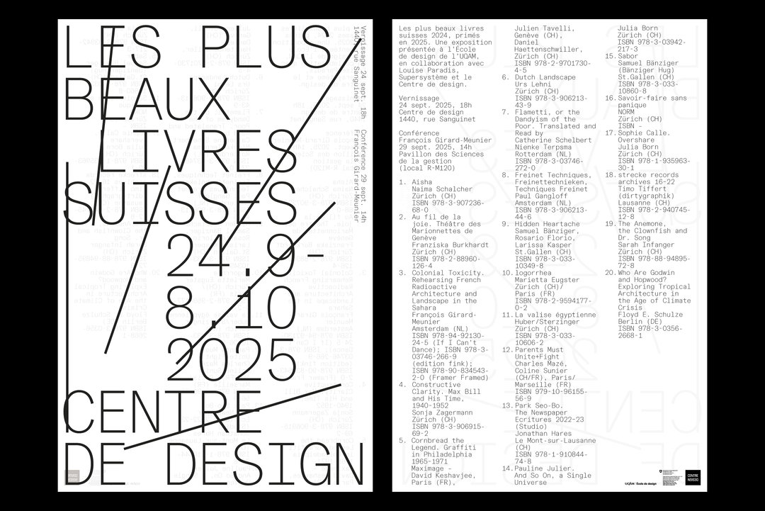
Supersystème: Les plus beaux livres suisses, project initiated by Louise Paradis (Copyright © Supersystème, 2025)
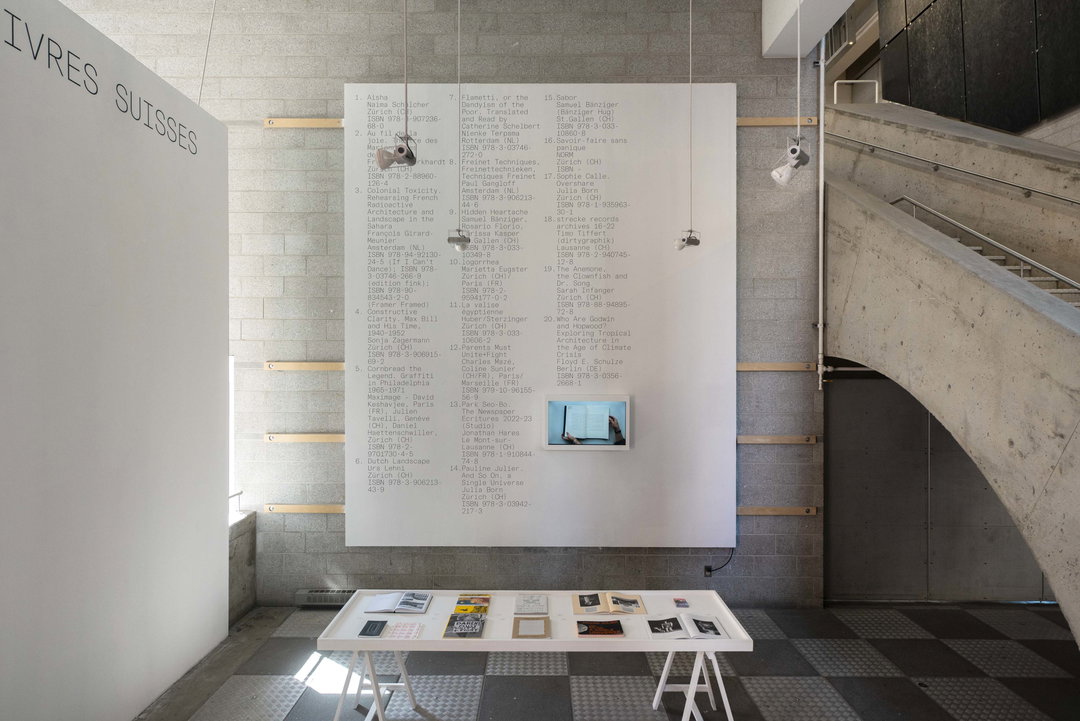
Supersystème: Les plus beaux livres suisses, project initiated by Louise Paradis (Copyright © Supersystème, 2025)
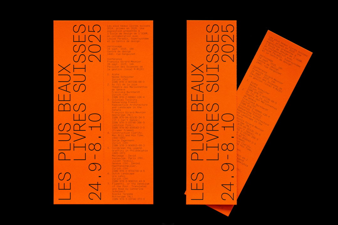
Supersystème: Les plus beaux livres suisses, project initiated by Louise Paradis (Copyright © Supersystème, 2025)
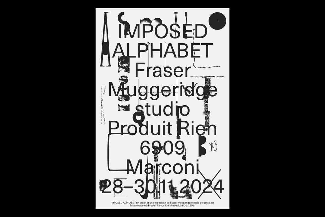
Supersystème: Imposed Alphabet, exhibition by Fraser Muggeridge studio (Copyright © Supersystème, 2024)
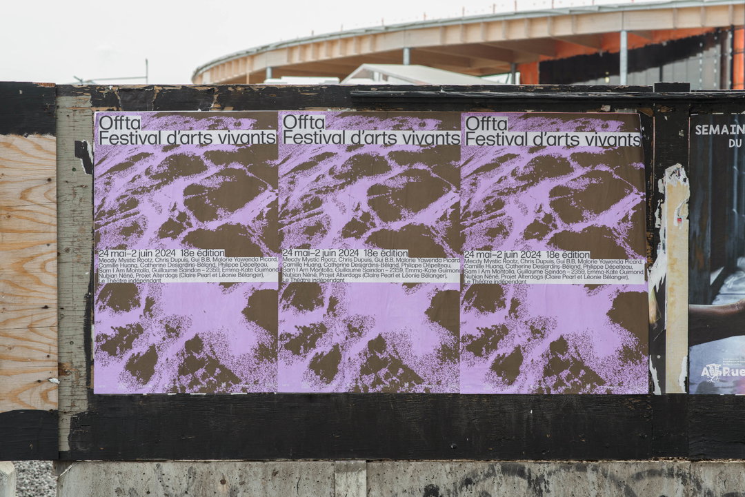
Supersystème: Offta (Copyright © Supersystème, 2024)
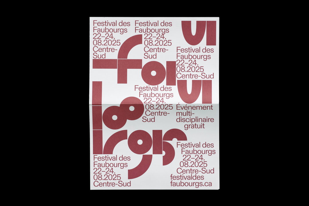
Supersystème: Festival des Faubourgs (Copyright © Supersystème, 2025)
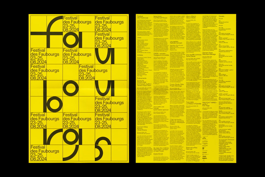
Supersystème: Festival des Faubourgs (Copyright © Supersystème, 2025)
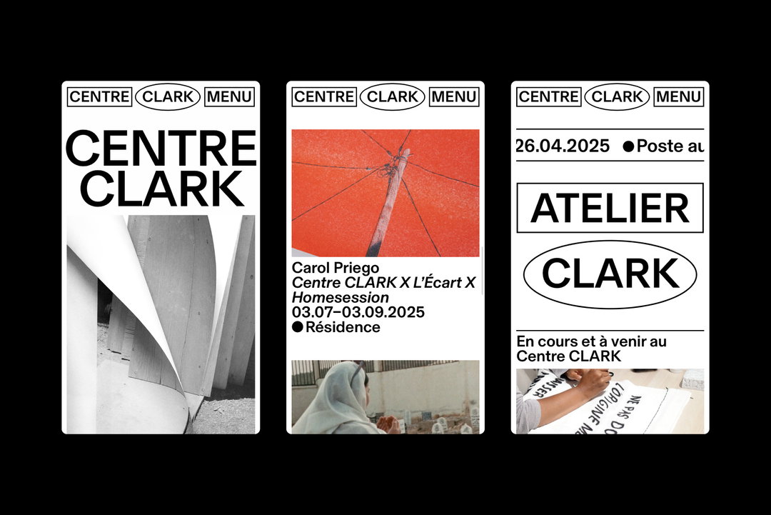
Supersystème: Centre CLARK (Copyright © Supersystème, 2024)
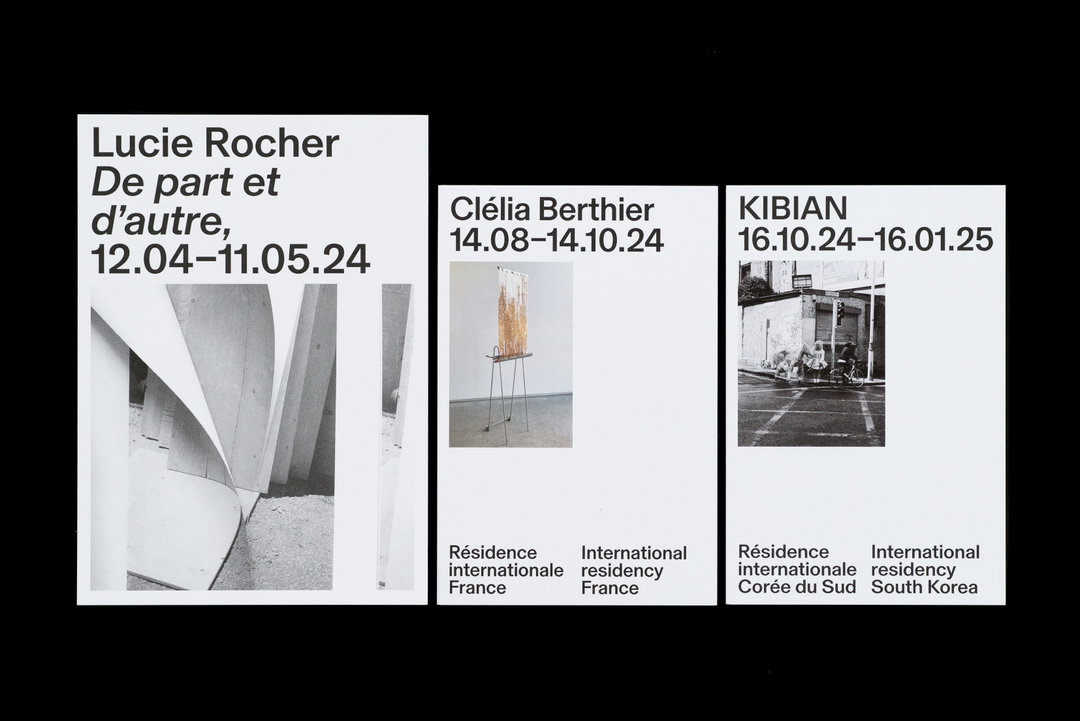
Supersystème: Centre CLARK (Copyright © Supersystème, 2024)
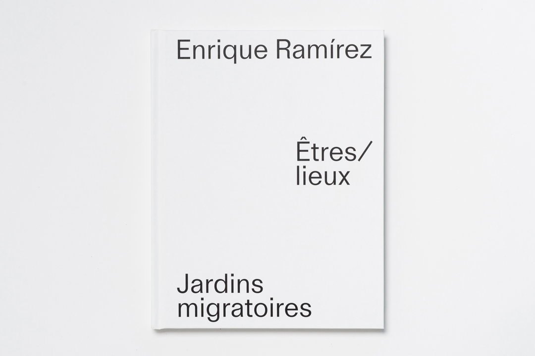
Supersystème: Enrique Ramírez Êtres/lieux Jardins migratoires (Copyright © Supersystème, 2022)
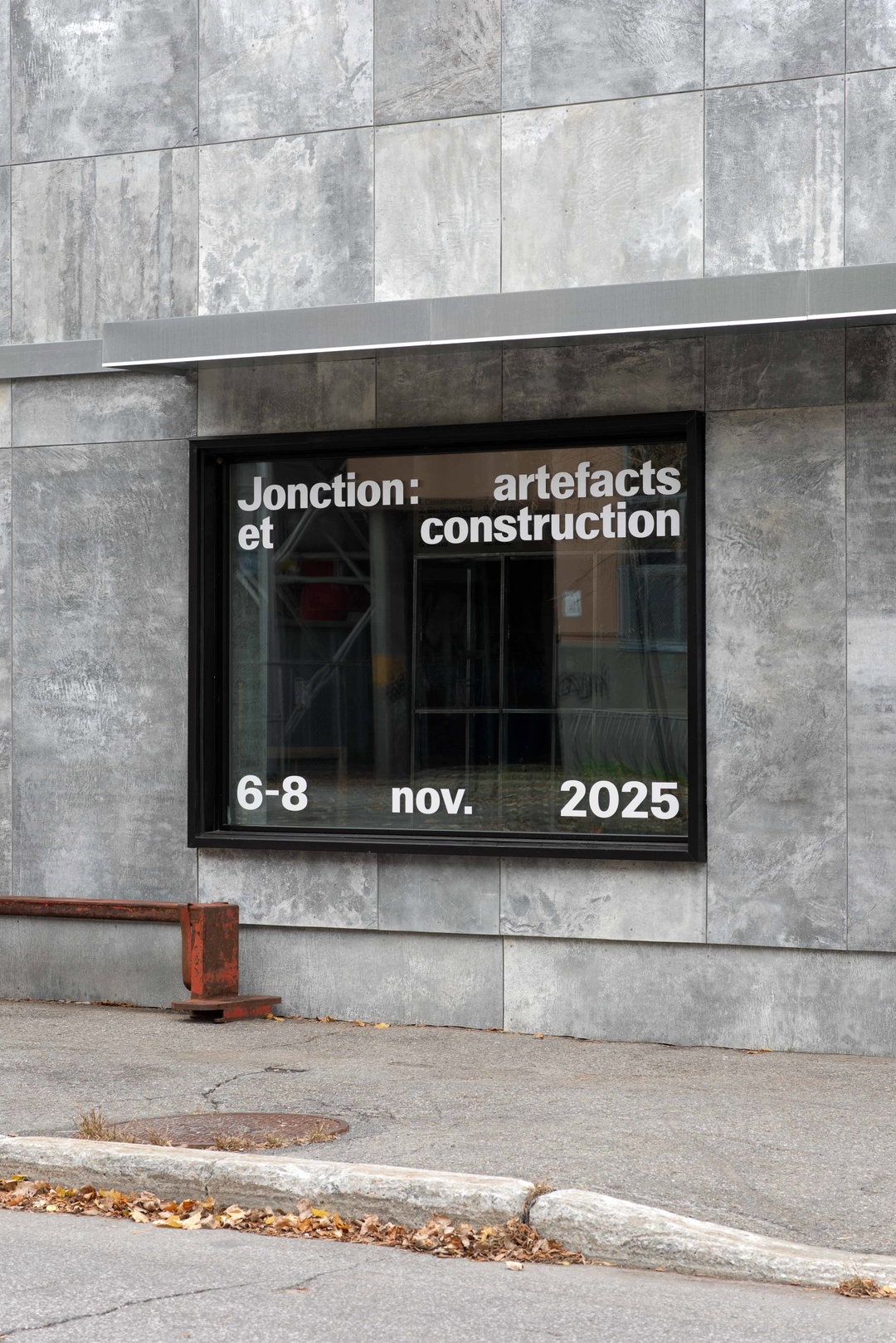
Supersystème: Jonction, exhibition by Essai, Hamster and MDT Mobilier (Copyright © Supersystème, 2025)
Hero Header
Supersystème: Offta (Copyright © Supersystème, 2024)
Share Article
Further Info
About the Author
—
Ellis Tree (she/her) is a staff writer at It’s Nice That. She joined as a junior writer in April 2024 after graduating from Kingston School of Art with a degree in Graphic Design. Across her research, writing and visual work she has a particular interest in printmaking, self-publishing and expanded approaches to photography. ert@itsnicethat.com
To submit your work to be featured on the site, see our Submissions Guide.