




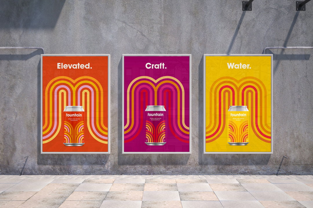
Pentagram injects “youthfulness and fun” into identity for new CBD water, Fountain
Led by Pentagram partner Michael Bierut of the agency’s New York office, the project features custom type, colourful graphics and a friendly approach to the hemp-derived drink.
Share
Pentagram partner Michael Bierut has created a colourful visual identity for a new CBD-infused sparkling flavoured water brand called Fountain, which aims to cut though the existing market with its playfulness and energy.
CBD or cannabidiol is a non-psychoactive ingredient derived from either hemp or marijuana plants that has a range of benefits from alleviating pain to easing symptoms of anxiety and depression. Fountain, which is hemp-based, exists at the epicentre of two big trends in the healthy living sector right now, Pentagram explains. The demand for CBD-infused products is rapidly increasing, with the US market alone projected to reach $15 billion by 2025. Simultaneously the sparkling water sector is one of the fastest growing categories in the beverage industry, totting up sales to the tune of $2.45 billion in the US in 2019.
The brief to the studio was to create an identity that would stand out in its category. “We noticed that lot of other CBD-infused products tend to look clean and elegant but kind of medicinal,” Bierut tells It's Nice That. "We wanted to inject more youthfulness and fun."
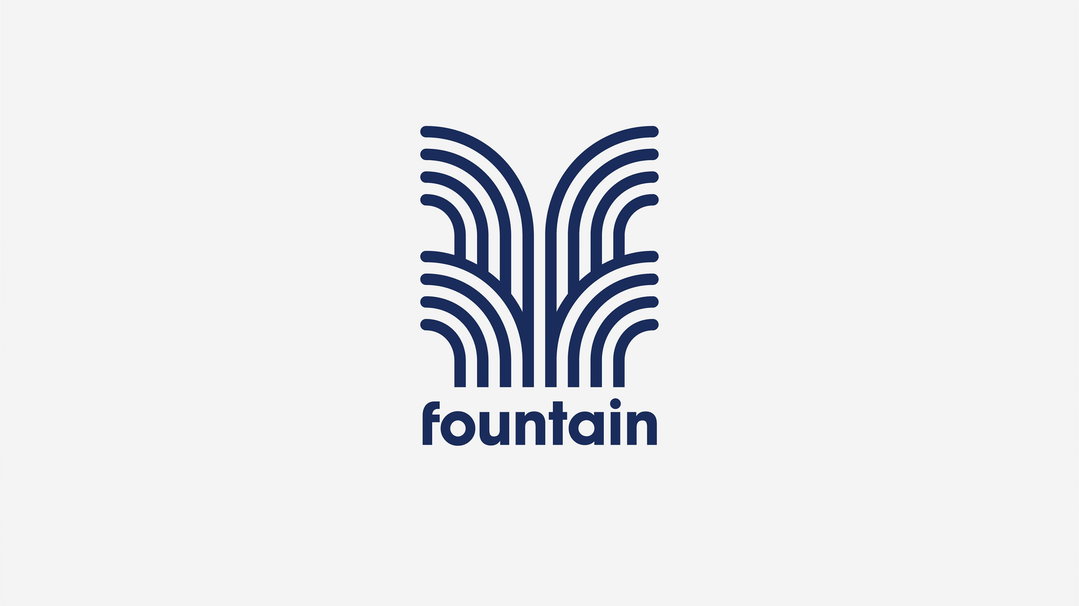
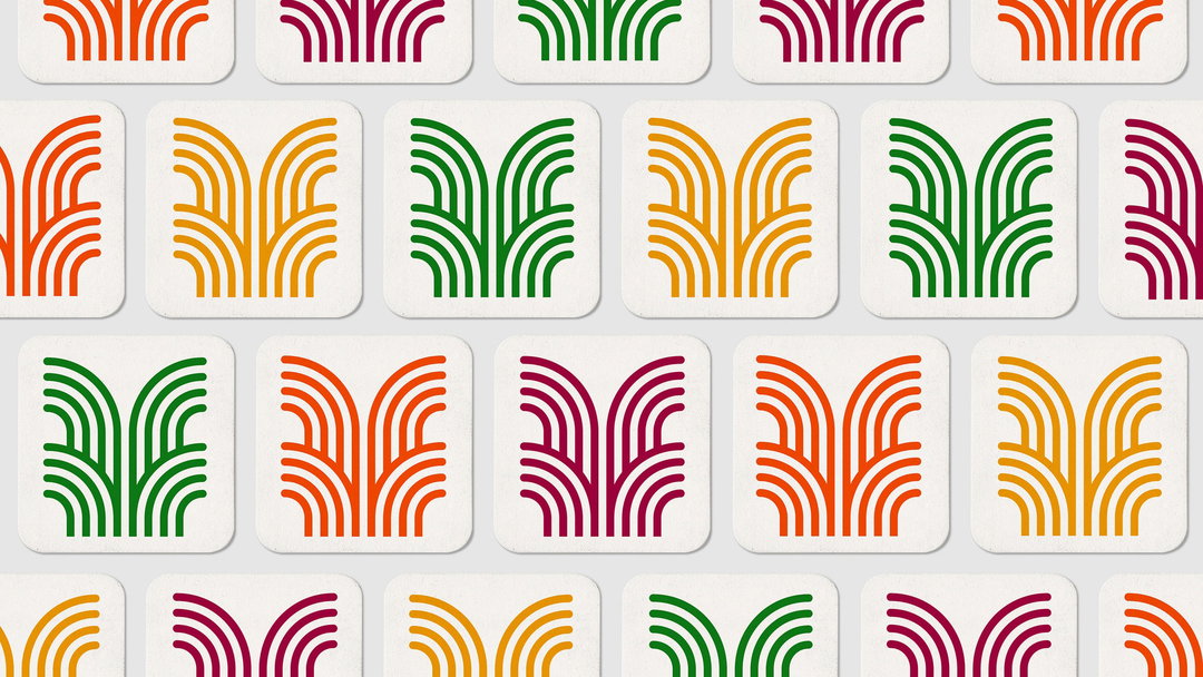
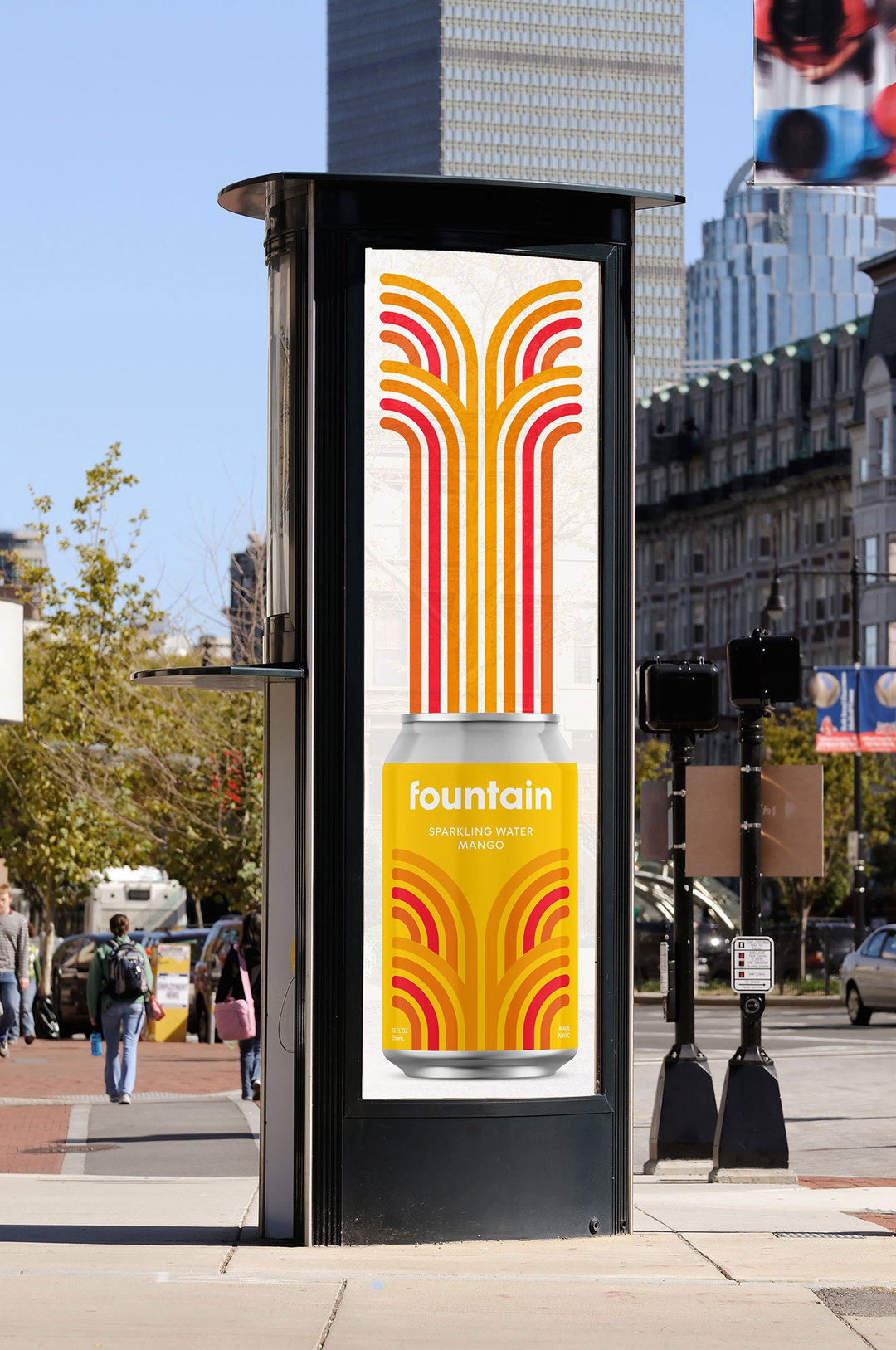
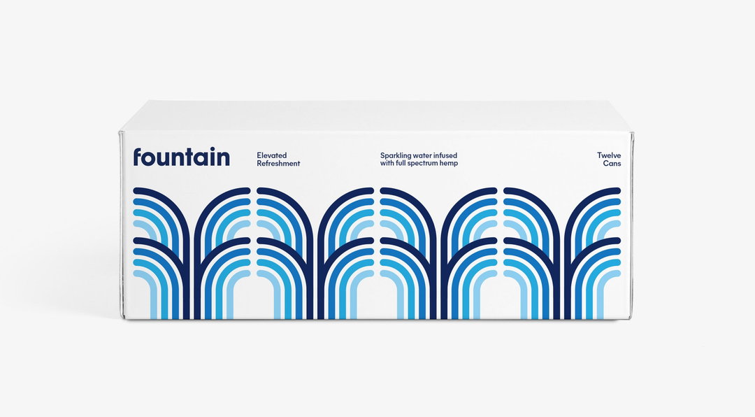
Pentagram created a new logo for Fountain that features a pattern of curved lines resembling a spume of water – a nod to the drink’s name. “Our project team — me, Jonny Sikov, Martin Azambuja and Abby Matousek — were a bit obsessed with the name, and particularly that initial letter F,” explains Bierut. “As a result we did a lot of purely typography studies for the packaging’s key artwork.” During the process, the team discovered that if you took a stylised lower case f and “juxtaposed it with its mirror image”, it suggested a fountain. “The stripes are meant to add motion and 'liquid-ness' while creating a motif that we can extend to other uses,” Bierut adds.
Pentagram / Michael Bierut: Fountain identity
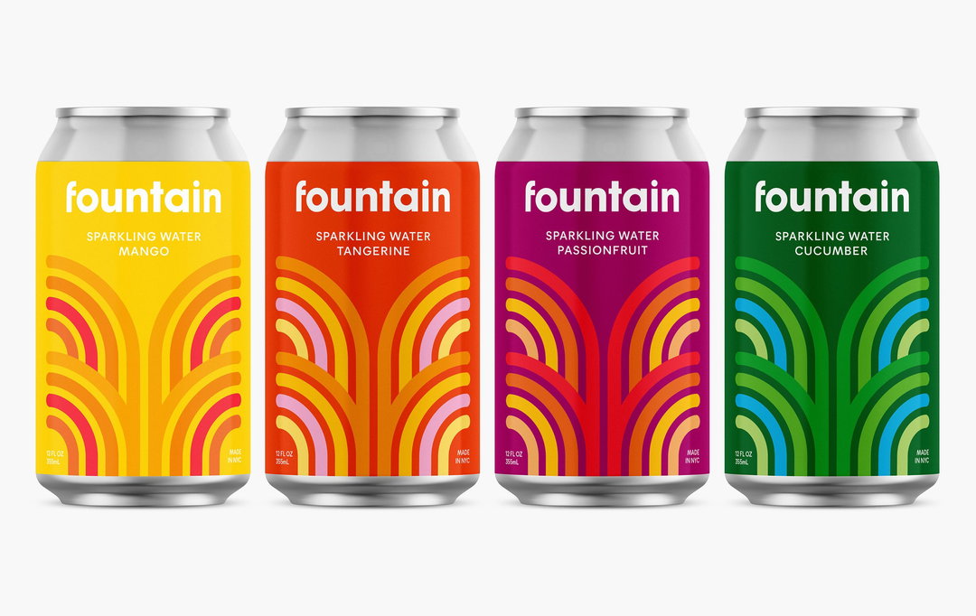
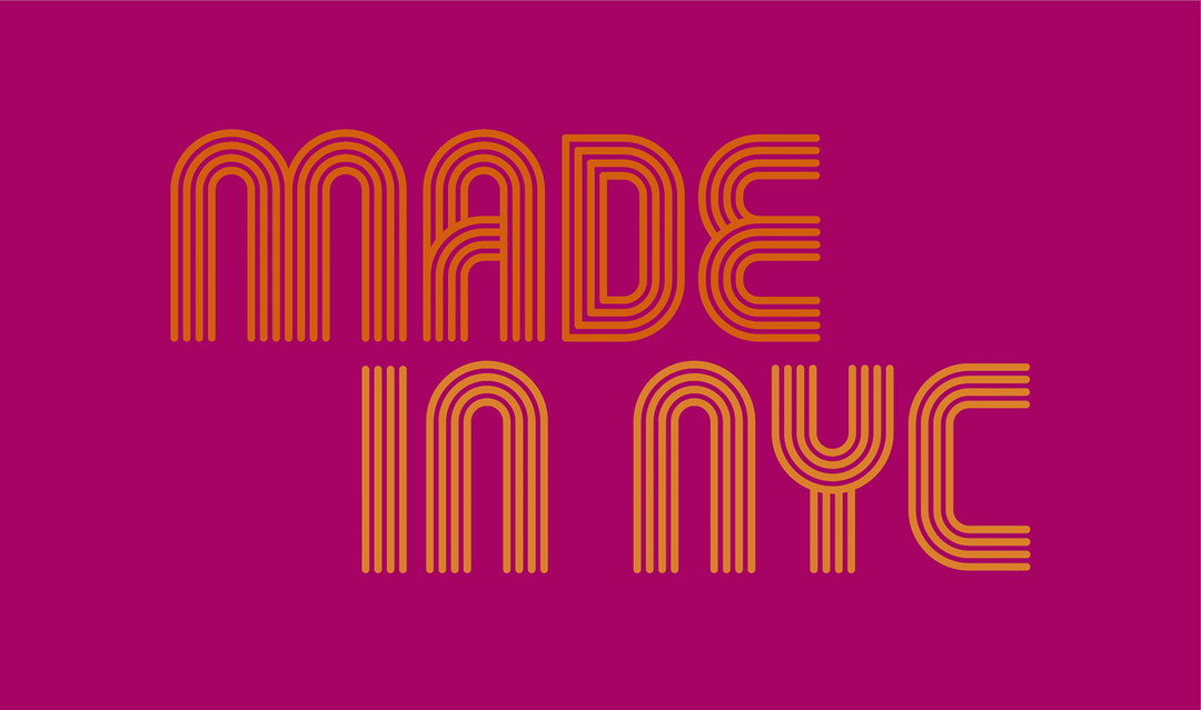
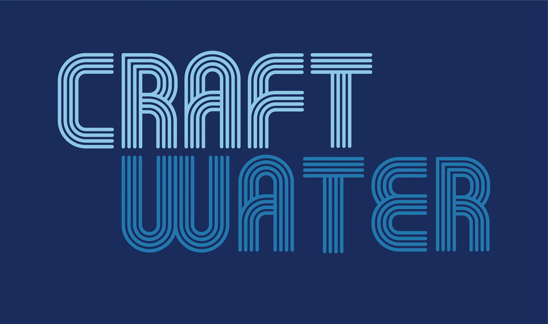
Different colours can be applied to the pattern to express different flavours. There's a palette of blues and greens for cucumber, for example, or shades of red, orange and purple for passionfruit. The patterned logo is accompanied by a san serif word mark in Avant Garde, a typeface designed by Herb Lubalin and Tom Carnese in 1970. “It has the same geometric forms and regular stroke weights as the logo,” says Bierut. The designers also altered the initial f to echo the central curve in the logo, adding even more approachability and friendliness.
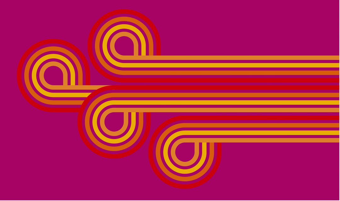
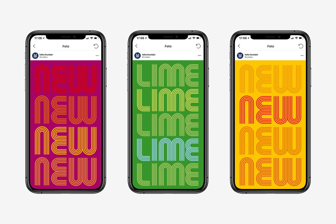
Pentagram has also used the fountain-like pattern to create a bespoke typeface that has been used across posters and the brand’s digital offer. The new identity will be rolled out across cans and packaging, posters, in-store displays, merchandise and other promotional materials.
This is not Pentagram’s first venture into cannabis-related products. Partner Eddie Opara designed Dan Michaels’ book Green: A Field Guide to Marijuana, while Emily Oberman developed the brand identity, packaging, and website design for Leafs, Snoop Dogg's line of medical and recreational marijuana-related products.
We recently investigated how designers should navigate the marijuana business in our feature The cannabis conundrum – featuring interviews with Opara, the founders of Gossamer, David Weiner and Verena von Pfetten, and Daye founder Valentina Milanova.
GalleryPentagram / Michael Bierut: Fountain identity

Hero Header
Pentagram: Fountain identity
Share Article
Further Info
About the Author
—
Laura is a London-based arts journalist who has been working for It’s Nice That on a freelance basis since 2016.


