





Hay Festival’s new rotating “open book” logo represents its literary core and global span
Edit Brand Studio rebrands the prominent literature festival, introducing a nifty motion logo and broad colour palette.
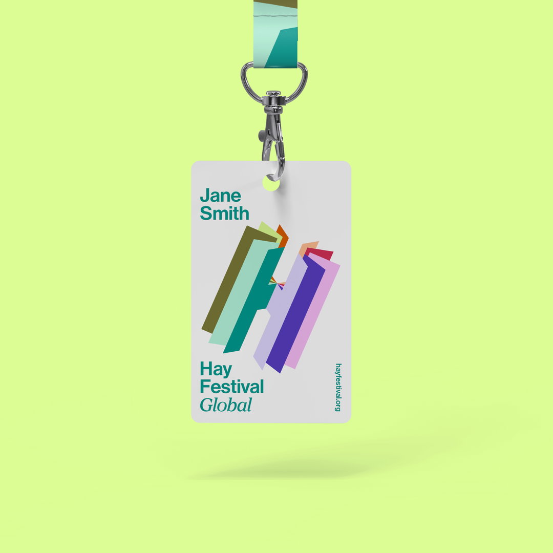
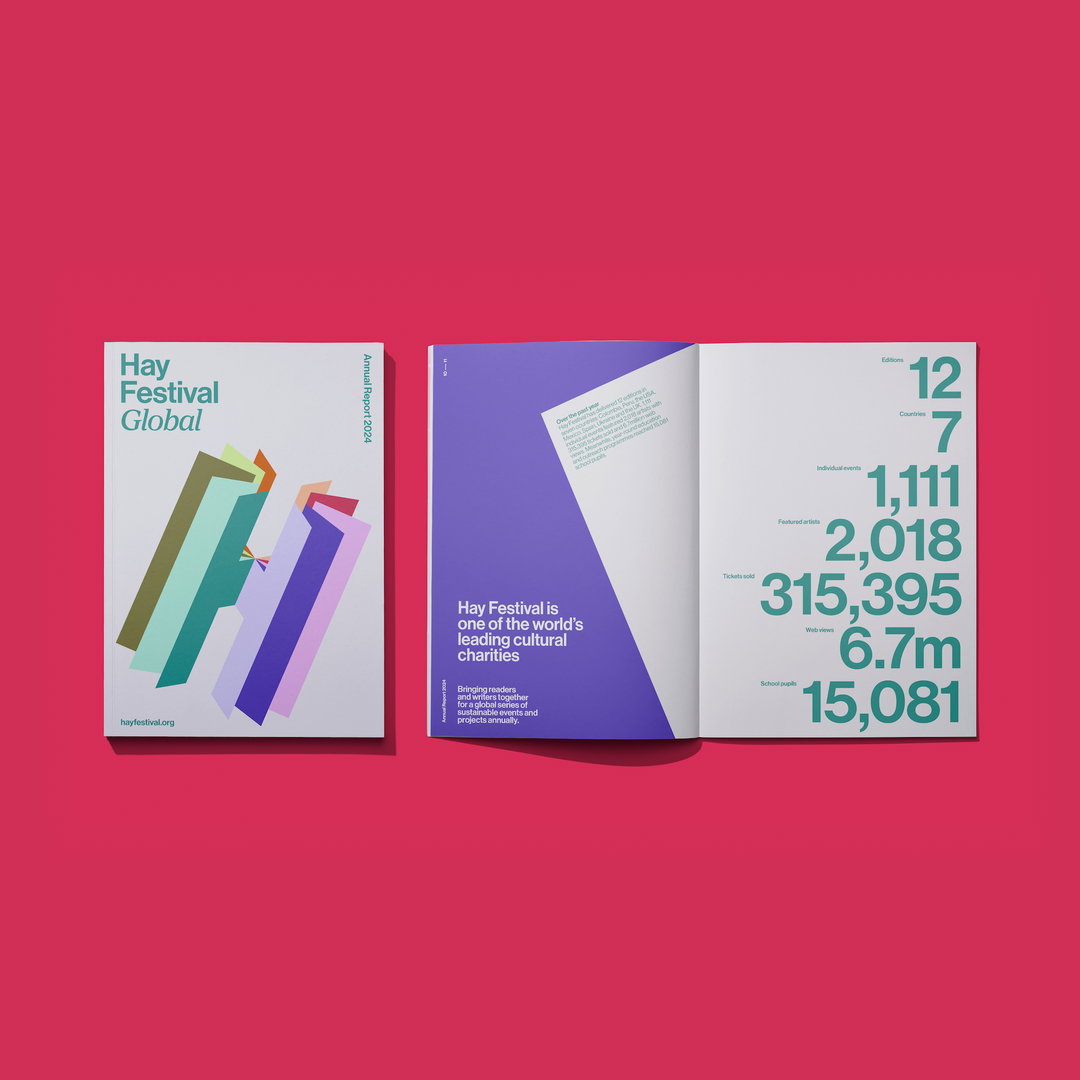
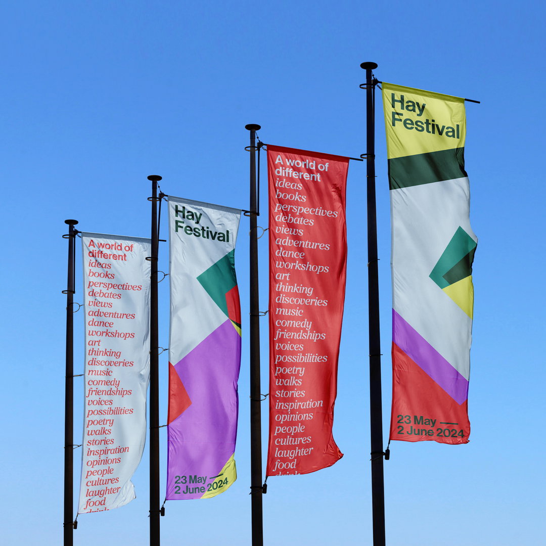
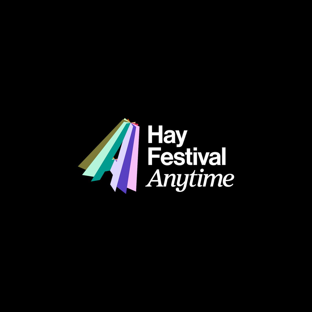
Yesterday, 13 February, Hay Festival launched its new identity – marking 100 days until the flagship event. The new look is driven by the incentive to better represent its global nature; first opening in the Welsh town of Hay-on-Wye in 1987, the event now has satellites in Colombia, Mexico, Peru and Spain, and has also recently become a charity organisation. To visualise this shift and changing mission, Edit Brand Studio has introduced a rotating logomark, nodding to Hay’s global reach, and a varied colour palette, which allows differentiation between countries.
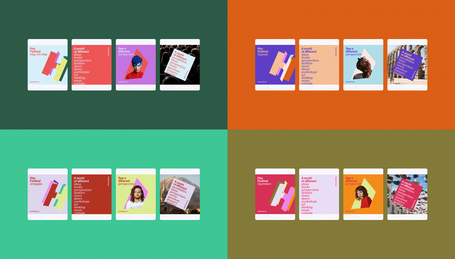
The main springboard for the identity was the phrase “a world of different”. For Julie Finch, Hay’s CEO, this phrase encapsulates the organisation’s new purpose as well as its legacy, with the likes of Arthur Miller, Maya Angelou, Toni Morrison, Margaret Atwood, Arundhati Roy, Naomi Klein, Edward Said and Seamus Heaney having graced its stages in years past.
“This clearly expresses our purpose, inviting people into a world of different stories, ideas and new possibilities,” Julie says. “Our events and platforms bring together diverse voices to listen, talk, debate and create, tackling some of the world’s biggest political, social and environmental challenges.”
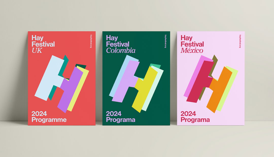
Edit Brand Studio & Hay: Hay Festival Identity (Copyright © Edit Brand Studio / Hay, 2024)
The biggest development from Hay’s previous look, designed by Pentagram’s Marina Willer, was a shift away from the tree ident, which was used to represent the festival’s organic development. Instead, Edit opted for a simple H, which represents Hay’s many “chapters”, including festivals, forums, events, educational programmes and more. The logo is also positioned on a 23.5 degree angle, the same as the earth’s rotation axis.
It was through colour choices that Edit ensured visual difference between each iteration of the festival. Each country has their own six-colour palette, “synonymous with their respective culture and social nuances”, says a press release. “This means that different festivals can feel part of the Hay Festival global master brand while retaining their own unique identities and fun festival feel.”
GalleryEdit Brand Studio & Hay: Hay Festival Identity (Copyright © Edit Brand Studio / Hay, 2024)

Hero Header
Edit Brand Studio & Hay: Hay Festival Identity (Copyright © Edit Brand Studio / Hay, 2024)
Share Article
Further Info
About the Author
—
Olivia (she/her) is associate editor of the website, overseeing the day-to-day editorial projects as well as Nicer Tuesdays events. She joined the It’s Nice That team in 2021. ofh@itsnicethat.com
To submit your work to be featured on the site, see our Submissions Guide.





