Matty Matheson’s new packaging is not retro, it’s 1930s can core
Inspired by products like Hereford Corned Beef, Matheson’s boxes of mac and cheese and bottles of BBQ sauce link back to the beginning of commercialised food packaging.
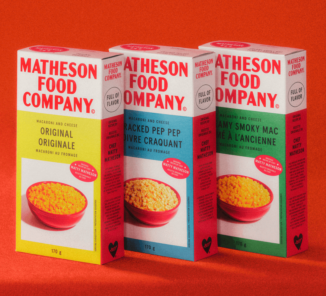
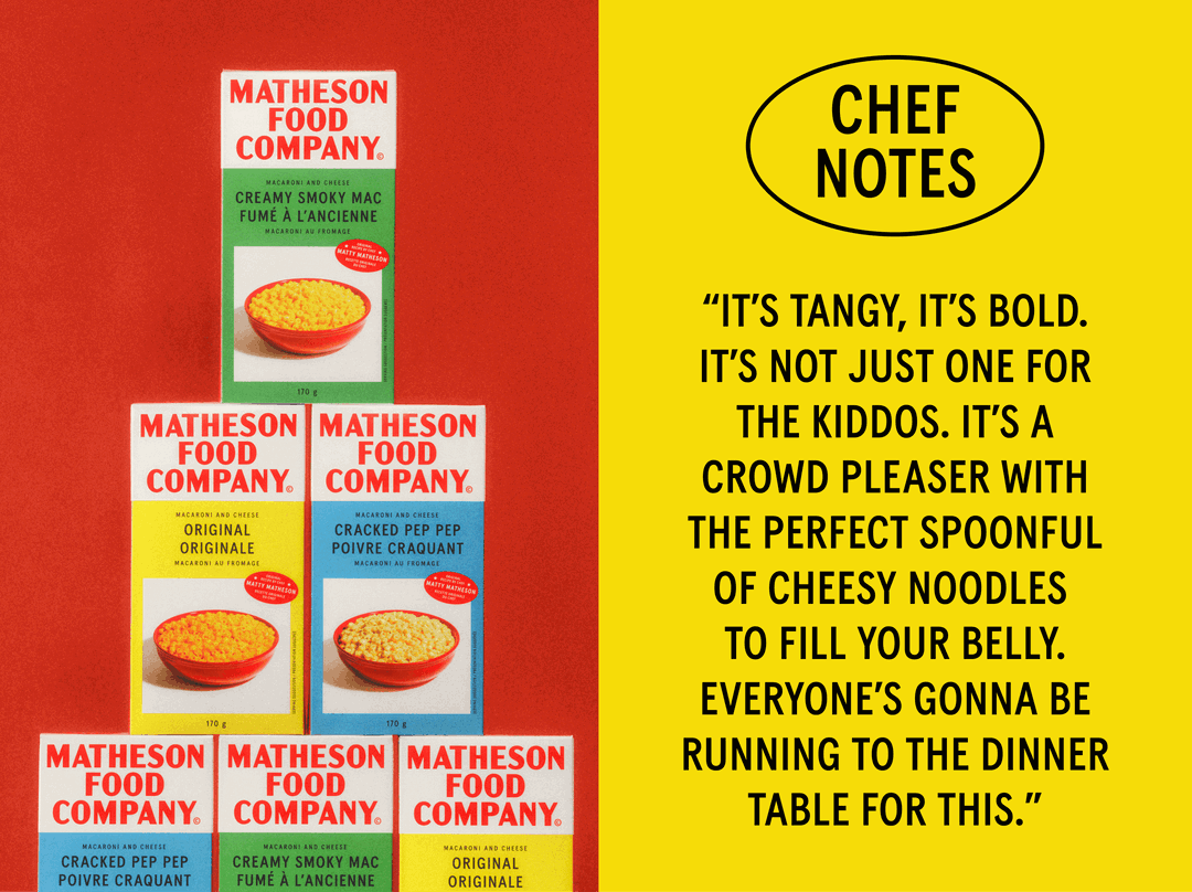
Matty Matheson’s new food brand – Matheson Food Company – takes inspiration from specific moments for its packaging. Like in 1937, when Kraft debuted the first box of mac and cheese on the American market for 19 cents. (The box was primary yellow with a photograph of a bowl of macaroni and the tagline “a meal for four in nine minutes”; nine million flew off the shelf in its first year.) The straightforwardness of packaging like this was what design studio Wedge wanted to tap into when branding Matheson Food Company – and it’s a perfect example of the benefits of imbuing “nostalgic” brand design with historic specificity.
Wedge was brought in through a friend of Matty’s who had his eye on the studio’s work. From the get-go, Matty had clear aims. “Nothing trendy. Nothing too modern,” says Wedge founder and chief design officer Justin Lortie. “Matty is very anti-superfluousness.” So, while in the past, Wedge has sought inspiration from the likes of futurist Campari artworks and the 1986 film Club Med for its packaging design, this time it looked to one of Matty Matheson’s favourite childhood foods: Hereford Corned Beef.
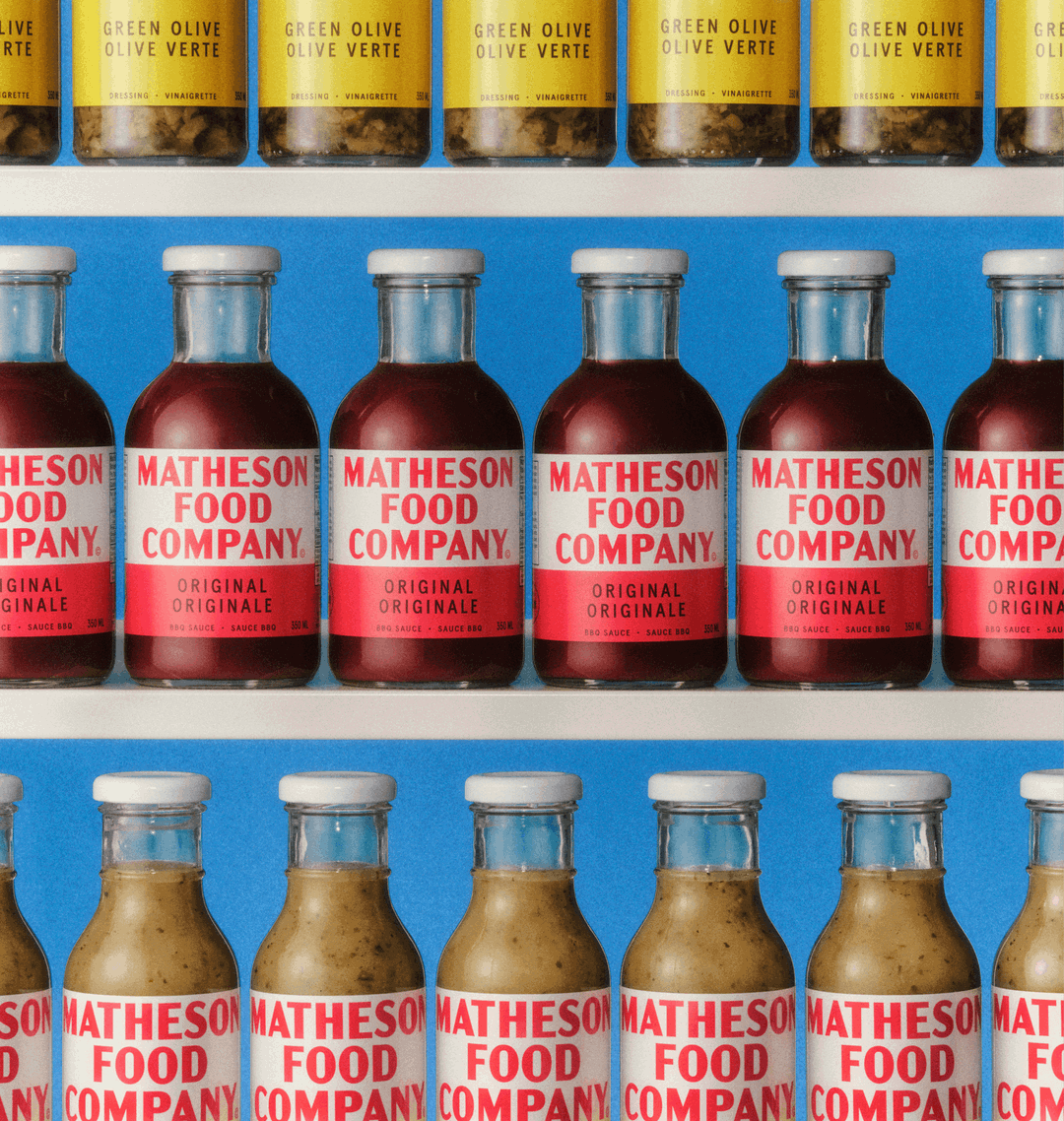
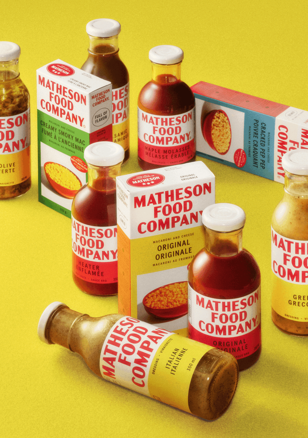
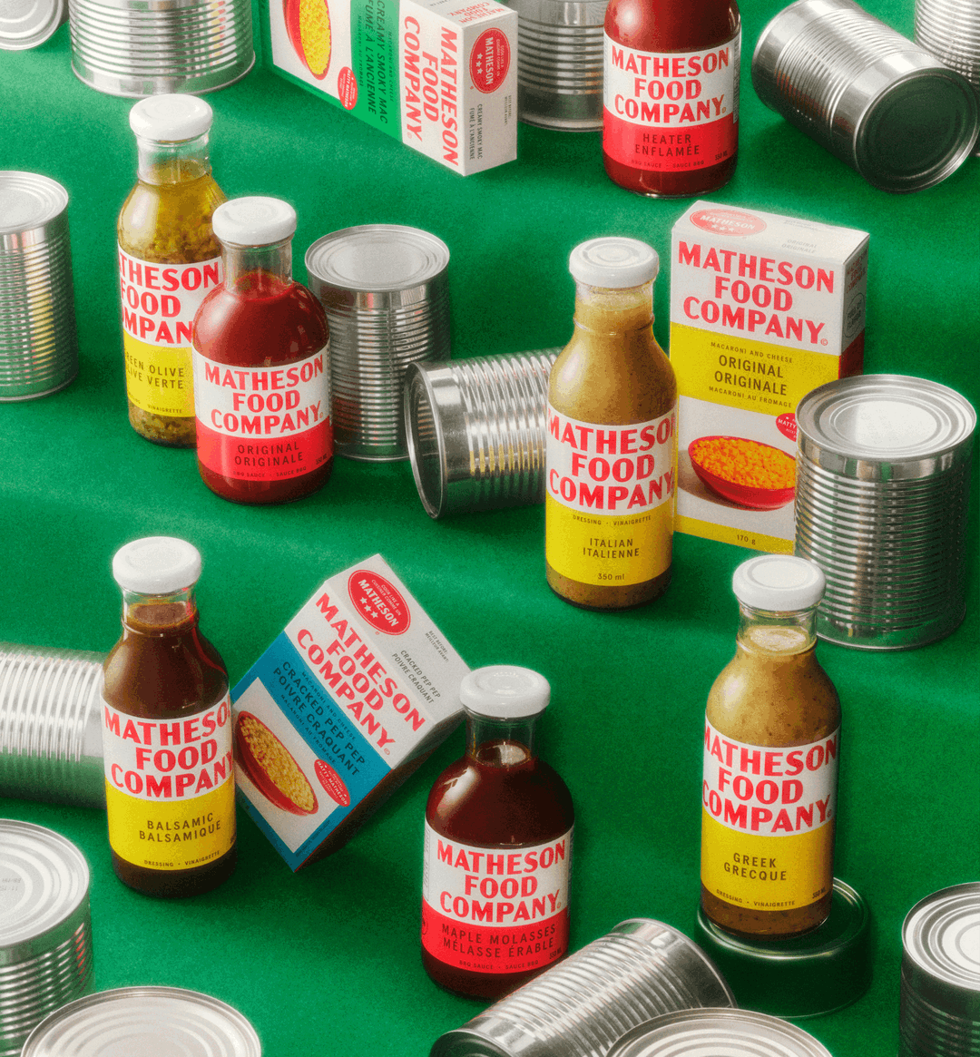
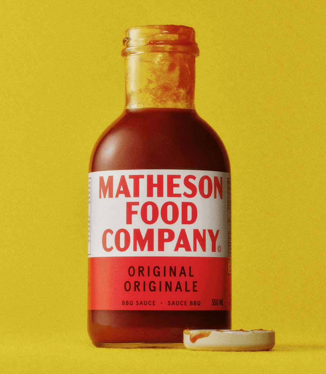
“[Matty] grew up eating that specific brand of corned beef,” says Justin, “there’s something very nostalgic about it for him. Internally, they always went back to the Hereford can.” The packaging is stripped back, just like Hereford Corned Beef, and the custom wordmark pays direct homage to the Corned Beef typeface. There are softer ways Wedge has borrowed from products from days past too. Like primary colours, which taps into the vernacular of other American convenience foods from brands like Heinz and Kraft.
Wedge: Matheson Food Company (Copyright © Wedge, 2024)
“When these products were introduced on the market in the 30s, the use of primary colours and appealing packaging was truly the start of commercialising food on shelves, even adding photography of the food on the package like a bowl of pasta,” says Justin. Today, most products have a more elaborate colour palette, making Matheson Food Company feel older and different by sticking to a back-to-basics colour palette. The same thinking is applied to packaging forms (the line is composed of traditional cans, boxes and bottles you have to give a good shake).
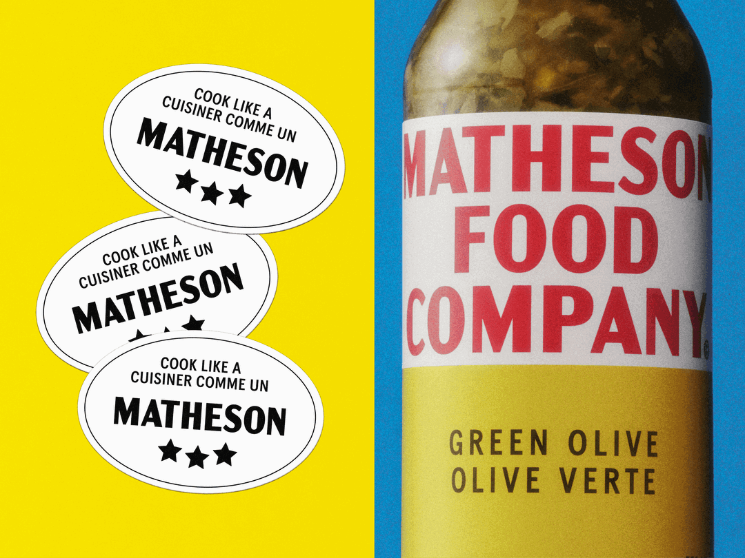
According to Wedge, the challenge was not to figure out how to capture a well-known personality through packaging – audiences are likely to know Matty Matheson from his work with Vice or his appearance on The Bear – but to create a heritage brand that outlives the personality. Even the name, Matheson Food Company, speaks to the brand’s desire to situate itself in food history. “Adding ‘Food Company’ adopts a vernacular you’d find on products like Hereford where ‘brand’ was literally written under the name, instead of adding a TM to the end of it,” says Justin.
It heralds something of a change in retro graphic design, whereby brands are not just borrowing from the past to ride an aesthetic wave, but because it could foster longevity too.
GalleryWedge: Matheson Food Company (Copyright © Wedge, 2024)

Hero Header
Wedge: Matheson Food Company (Copyright © Wedge, 2024)
Share Article
Further Info
About the Author
—
Liz (she/they) is the senior editor at Insights, a research-driven department within It’s Nice That. They previously ran the news section of the website. Get in contact with them for potential Insights collaborations or to discuss Insights’ public-facing reports.