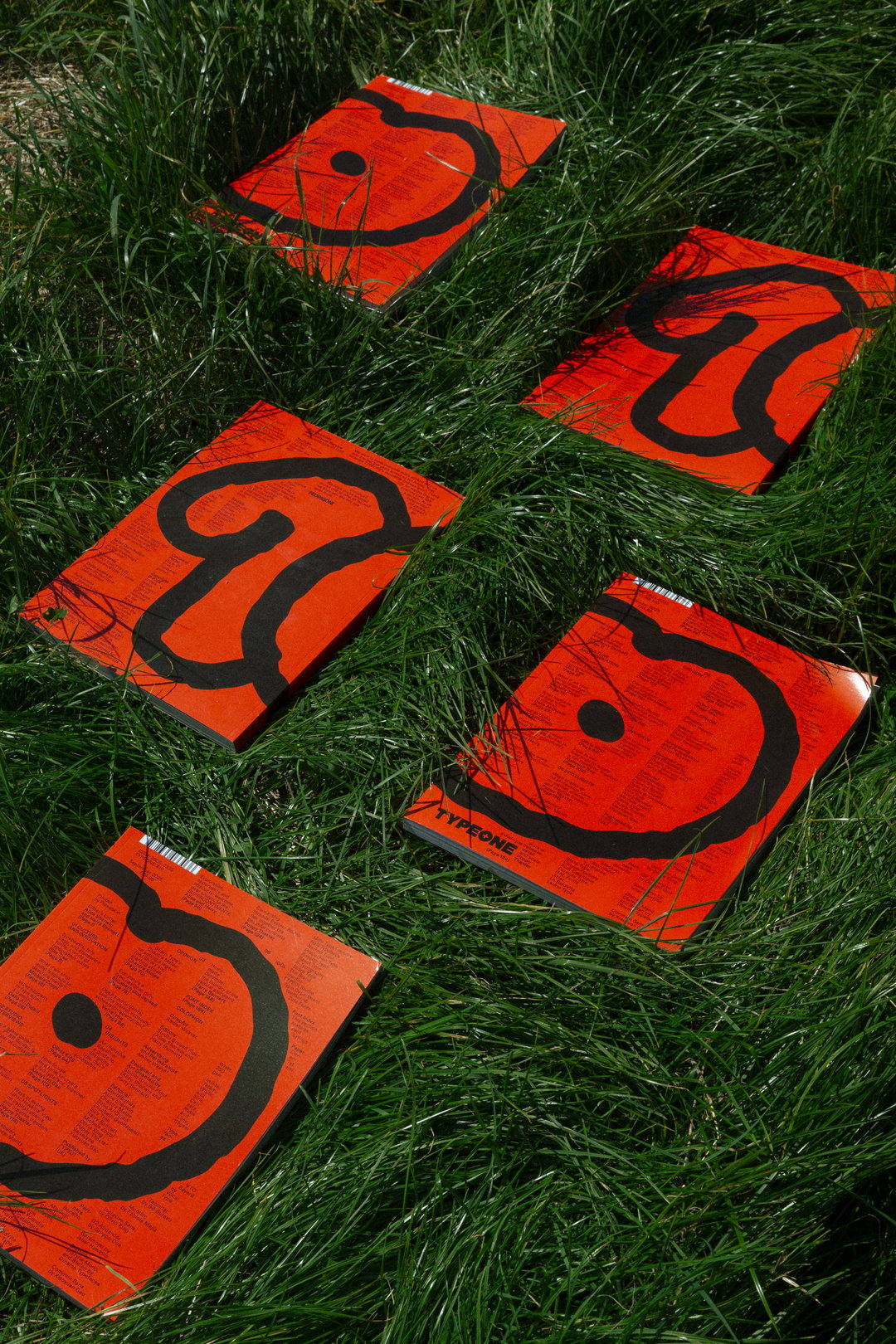
Typeone’s tenth issue shows us the important type design of 2025
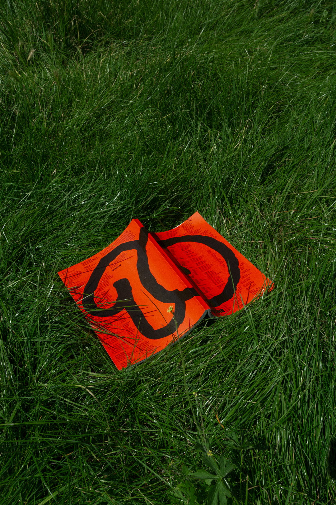
Studio Ground Floor have been carving the identity of this designer-led magazine for ten issues. In a key milestone of reflection, they take the editorial seat to look at what the type design scene looks like after 25 years of the 21st century.
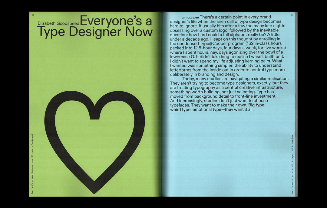
Look at that! We’ve already made it over a quarter way through the century. But what does the type design scene look like 25 years into the 21st century? The tenth issue of Typeone (founded back in 2020 by Amber Weaver) is tackling that very question through commissioning, interviewing and chatting to plenty of incredible writers and thinkers, from Xiaoyuan Gao, Olivia King, Elizabeth Goodspeed and Tré Seals, putting forward a picture of how the type design scene has evolved from 2000 and what it looks like today, as well as positioning what could lie ahead.
Returning contributors Alice Sherwin and Harry Bennett (who make up Studio Ground Floor, a London-based design studio) spoke to It’s Nice That about the process of creating this landmark issue, using their specialities in editorial design, publishing and brand identities to make it sing.
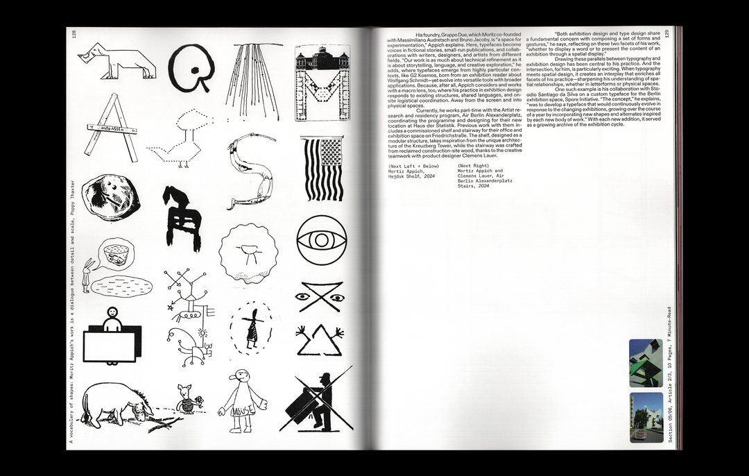
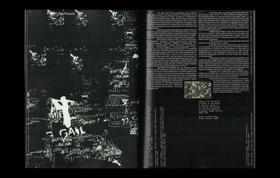
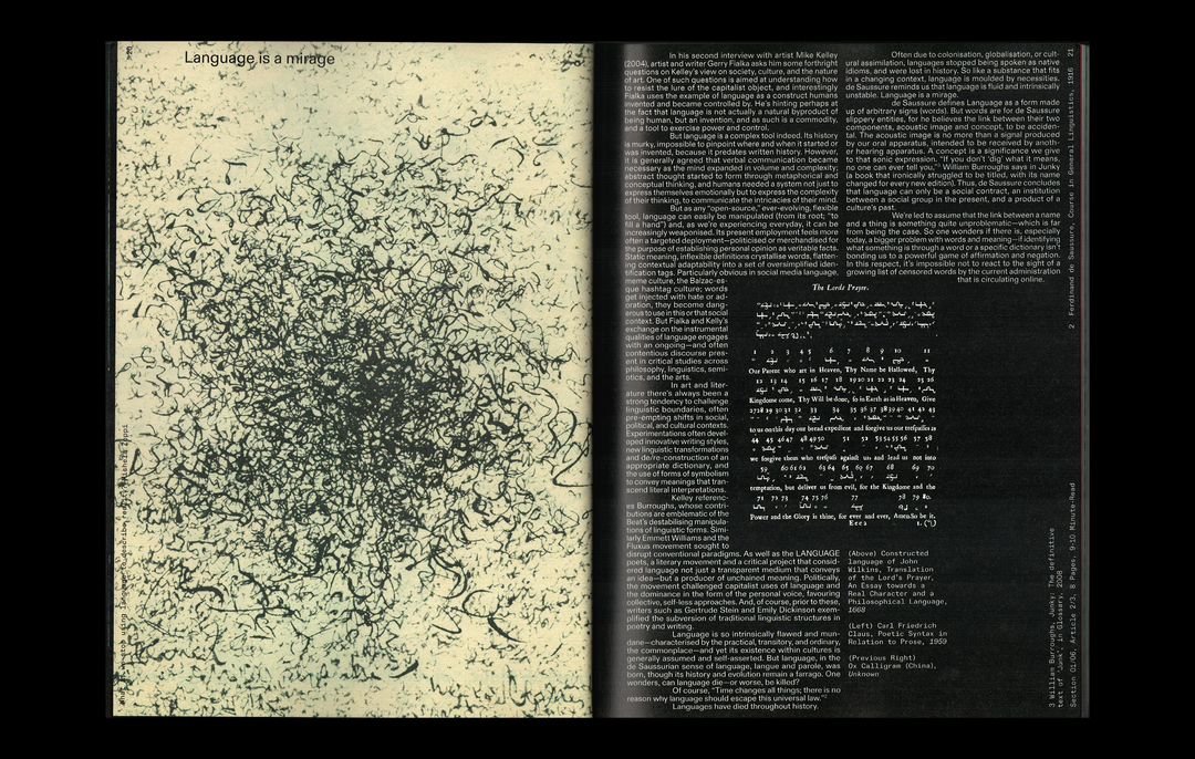
“Things have started to shift. With so many typefaces being released, in one sense, the craftsmanship of type design has somewhat retreated in importance,” says Harry. “However, what this is a symptom of is the democratisation of the discipline, which is very exciting. The increasing accessibility of the industry (be it through software or access to research) means more characters, people, backgrounds and minds are being channeled through type, creating new, unexpected things.” From the purely academic to the experimental, Typeone #10 represents today's design industry with a breadth of perspectives informed by the last 25 years.
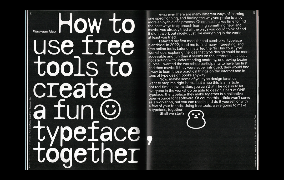
Studio Ground Floor: Typeone #10 (Copyright © Type01, 2025)
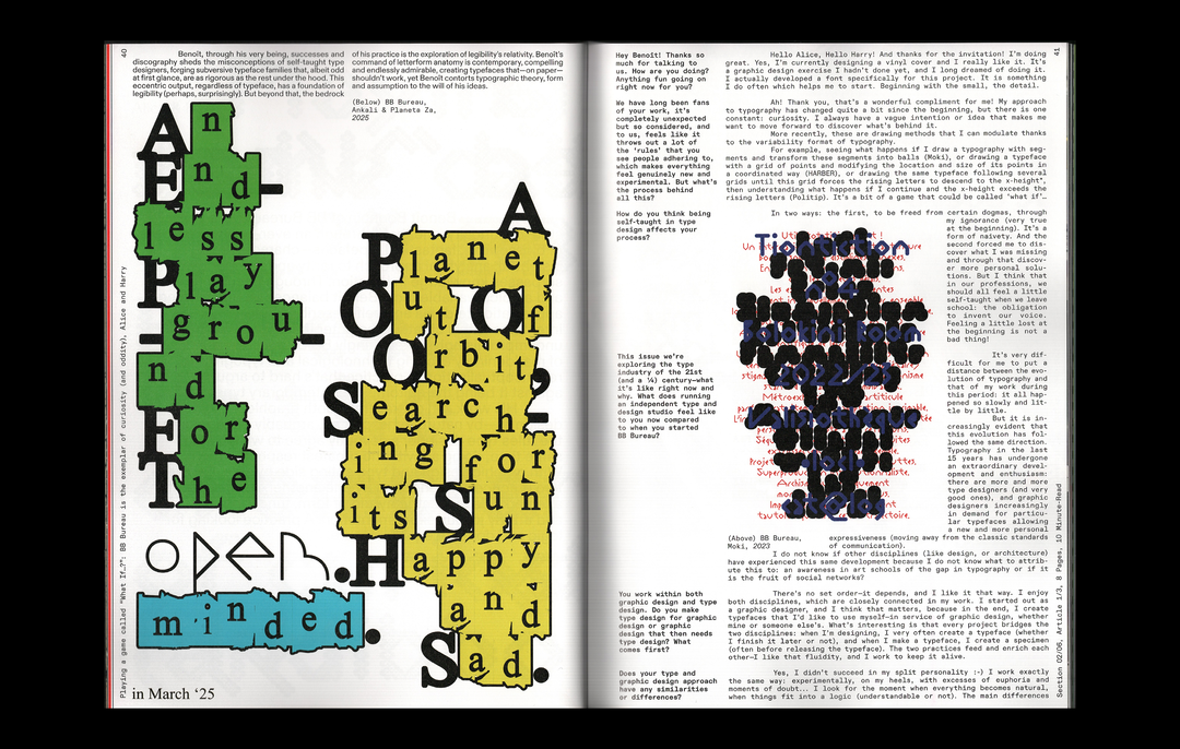
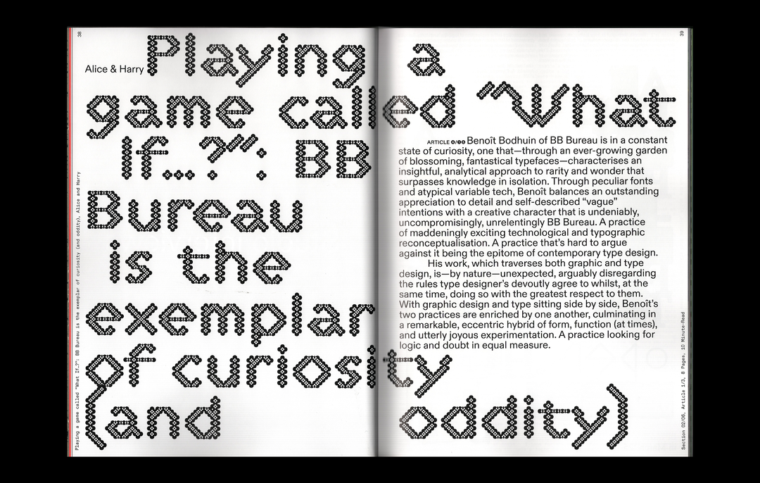
Nodding back to the first issue of Typeone, the design system features Diatype from Dinamo, with Xiaoyuan Gao’s Common Sans which, for a moment, was nearly the solo typeface of the whole magazine for its “exuberance and sincerity”, says Harry. Alongside these two, VTC Bayard by Vocal Type, Tacmitac by BB Bureau, Montiac by Fabiola Mejía and G2 Airdancer by Ishar Hawkins all feature. “The magazine itself wears its skeleton on its sleeve,” says Alice. “Ultimately, what makes up the creative scene of today is the people actually making, doing, writing, thinking and crafting. That’s why we used their typefaces throughout – with each person we spoke to’s article being set in their own typefaces.”
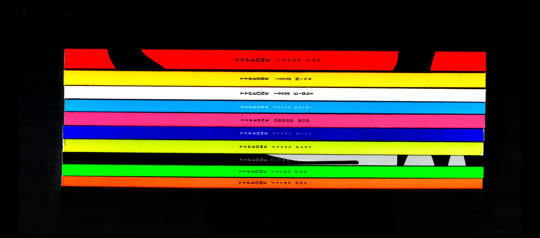
Led by designers, edited by designers and filled with designers, Typeone’s best quality is that it feels like a living, breathing thing – actively responding to the industry it serves and depicts. During the lockdown in 2020, Alice and Harry jumped in after the original designer dropped out, finding themselves building the editorial identity from scratch – the spontaneity and flexibility that defined the first issue still prevails to its tenth. “At the outset of the magazine back in 2020, we created an editorial design system with set systematic restrictions that allowed each issue to be uniquely designed in response to its specific theme,” says Harry. “It meant it was flexible in all the right places, and nice and strict in others so that over all ten issues, you can see the consistent moments and the places that really reflect the theme.” It’s not precious, which is what makes it “a capsule of contemporary type and design”, as Harry puts it.
After 25 years into this century’s prolific output of design, Harry thinks it’s now “a matter of remixing things”. Historical revivals are increasingly more common with digital influences completely changing the form. “Typefaces are our digital way of expressing language,” says Alice. “How we think, write and communicate and what typefaces we do that with are so intrinsically interlinked that I’m excited to see how these keep evolving alongside and because of each other.” Whether it’s experiments in AI, how languages change or how type design thrives in today’s busy visual culture, Typeone is going to continue responding, wherever typography goes.
GalleryStudio Ground Floor: Typeone #10 (Copyright © Type01, 2025)
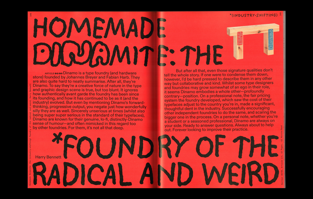
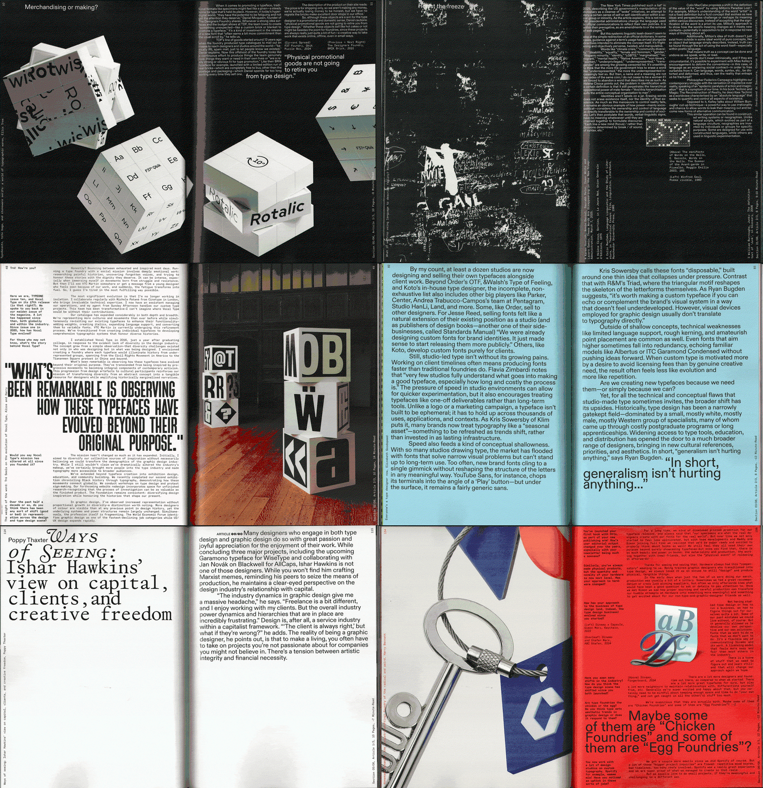
Johanna Schütze: Typeone #10 (Copyright © Johanna Schütze, 2025)
Hero Header
Johanna Schütze: Typeone #10 (Copyright © Johanna Schütze, 2025)
Share Article
About the Author
—
Paul M (He/Him) is a Junior Writer at It’s Nice That since May 2025. He has a strong interest in graphic design, digital kitsch, multimedia painting, collage, nostalgia, analogue technology and all matters of strange stuff. pcm@itsnicethat.com
To submit your work to be featured on the site, see our Submissions Guide.