




That Thing creates a compass logo and “hyperreal” buds for a cannabis information site
The London-based agency strikes a balance between evoking a grocery delivery service and premium healthtech for the German website Weed.de.
That Thing is a brand agency that prioritises the copy that defines a brand just as much as its visual world. “We started when we realised that writing and design working hand in hand could help important businesses to stand out and step up by turning brilliant but complex ideas into a ‘Thing’ everyone can relate to,” says co-founder and creative director Mark Williams. That Thing works with a range of industries, though they gravitate toward business that change the way we operate and think. And that’s exactly why Weed.de – a German site that helps users to navigate the world of cannabis by offering sound advice on strains and local dispensaries – stood out.
The rebrand arose after Germany partially decriminalised weed possession in April of this year. But, despite this lack of restriction, it didn’t mean That Thing wouldn’t still be battling with negative preconceptions. “The Weed.de project was bigger than branding a business,” says writing creative director and co-founder of That Thing Joe Weir. “We had to take on stigma, myths and uncertainty around a whole plant and redefine the category.”
That Thing: Weed.de (Copyright © That Thing, 2024)
The benefits of cannabis were demonstrated to That Thing when working on a previous identity for Leva, one of the UK’s first online chronic pain clinics. “Despite its often one-note reputation, there really is no universal cannabis ‘experience’,” says Joe. He notes just a few of the many uses, from helping cancer patients increase appetite and providing pain relief for people with endometriosis, to those looking for better sleep, or enhanced creativity and focus. “The new brand needed to bring clarity first and foremost, give people access to the right information, show an understanding of patient needs and build trust with the medical community,” says Mark.
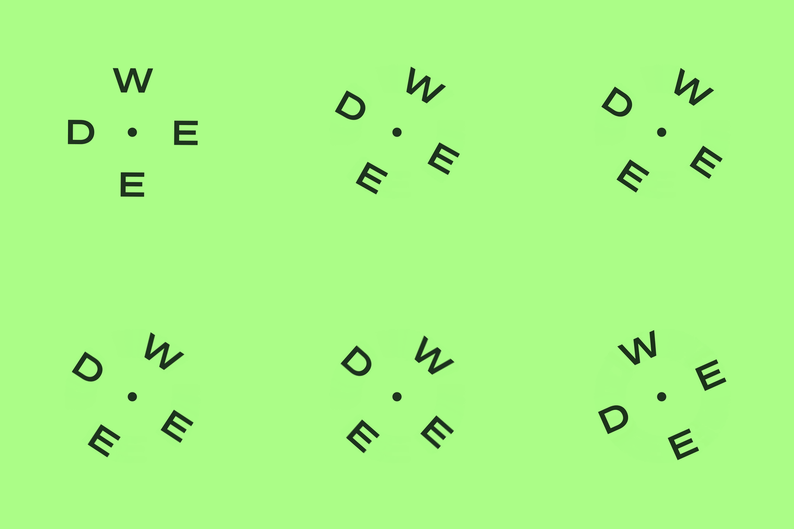
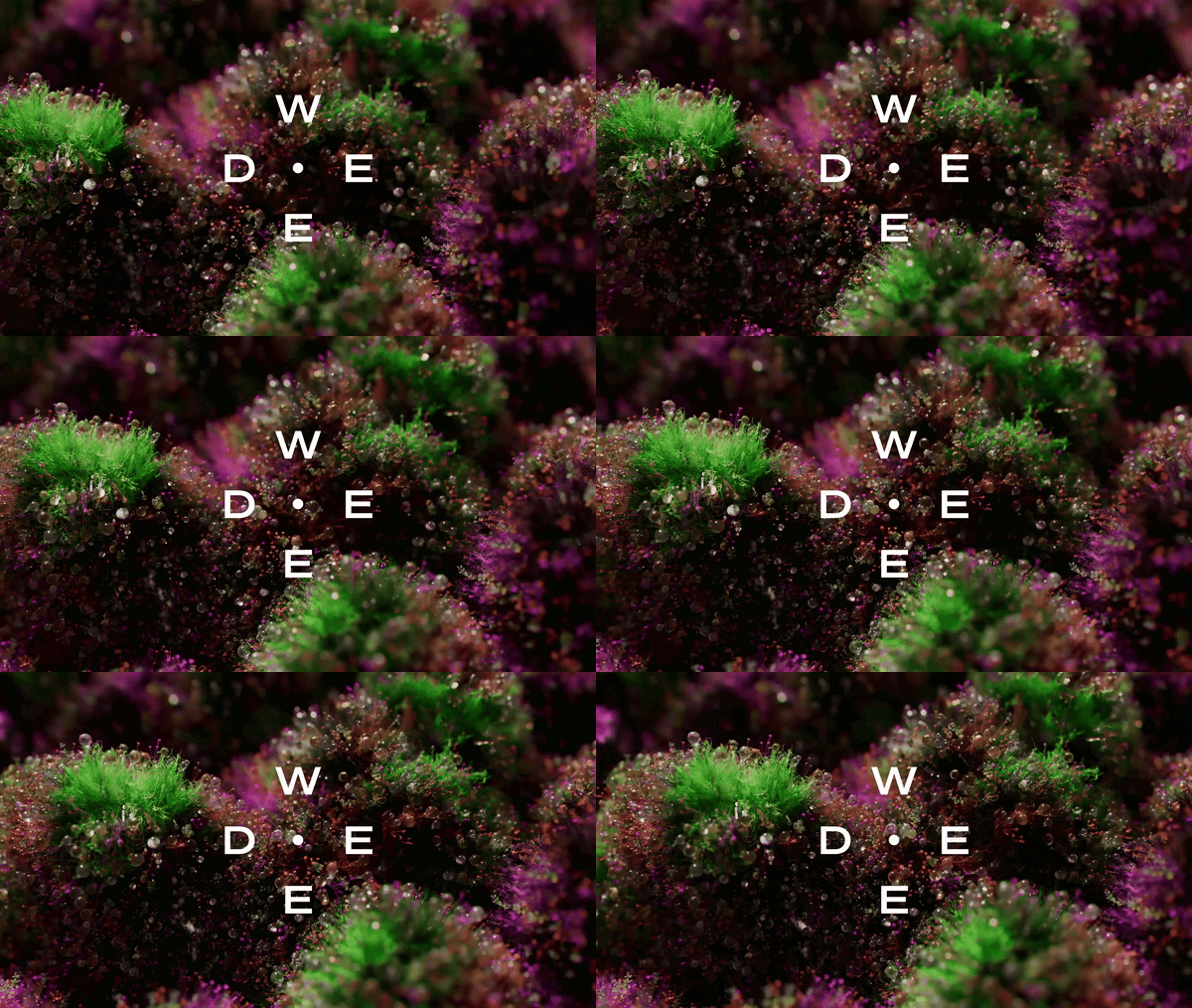
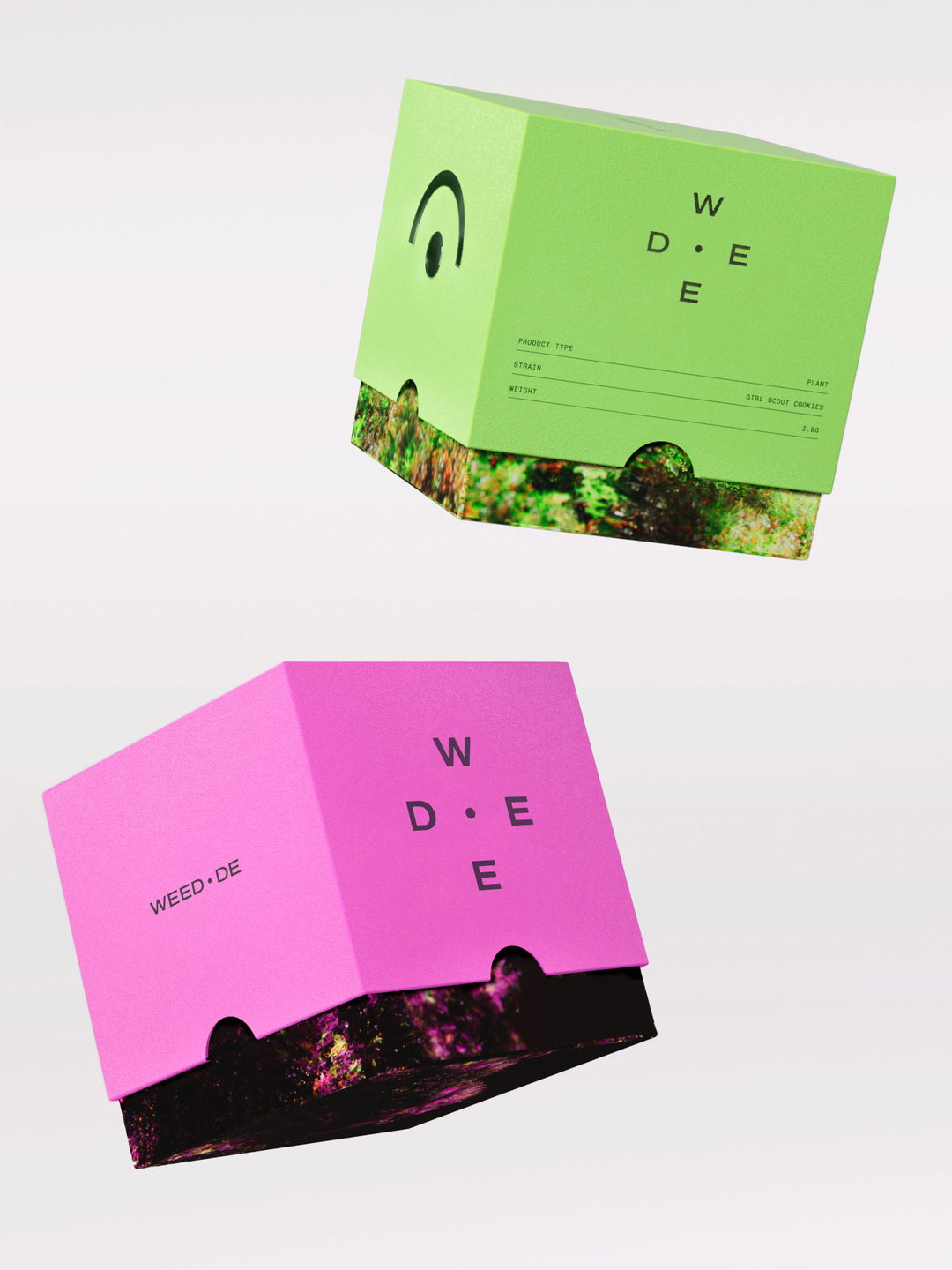
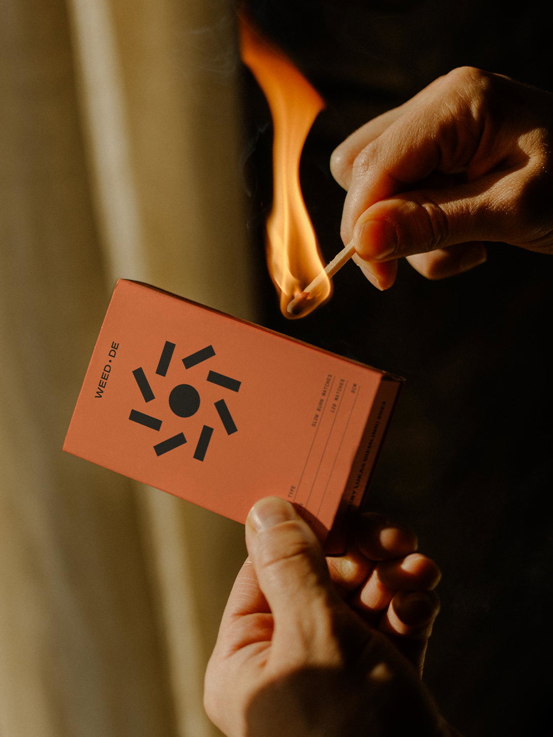
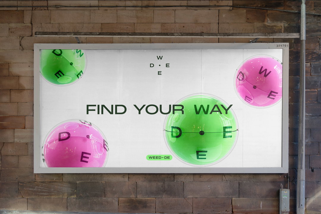
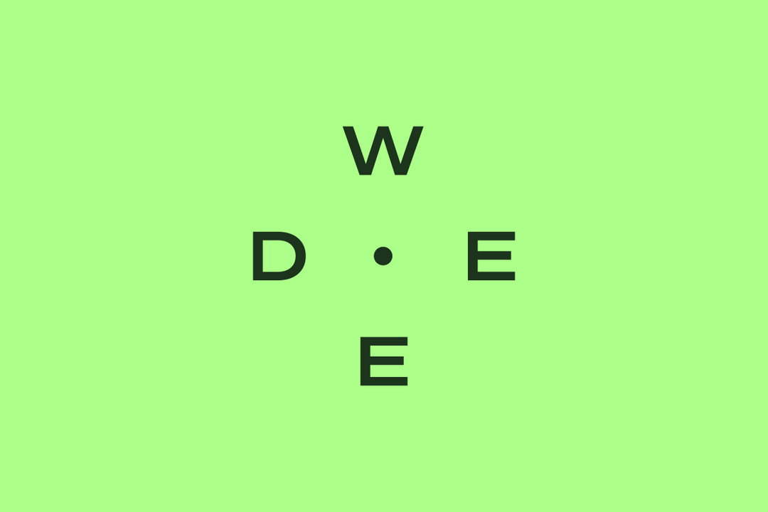
The one major issue with Weed.de’s previous branding is that it didn’t showcase its expertise. “In an industry that wasn’t fully established it was important that the brand gave people the right gut feel – that this was a business they could trust,” says Mark. Therefore, the team decided to, primarily position the site as a “guide”, making its tagline ‘Find Your Way’. This concept is given a clever geographical nod by the addition of a logo reminiscent of a compass, with a central dot and four equidistant points, which spell out ‘weed’. In a particularly nice touch, a double read occurs in the logo, with the two horizontal points reading DE, Germany’s country code.
While weed has been legalised, it’s still classed as a drug (the same class as paracetamol and ibuprofen) which means there’s still some constraints on visual reproduction, namely, that you can’t show the drug (or plant) on the pack. To bypass this issue, the team used 3D and motion to create a series of “hyperreal buds”, loosely based on the three varieties. “Each one was designed to reflect different characteristics and gave the client some big beautiful textures to use throughout the brand,” says design director Lizzie Honess.
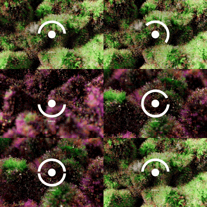
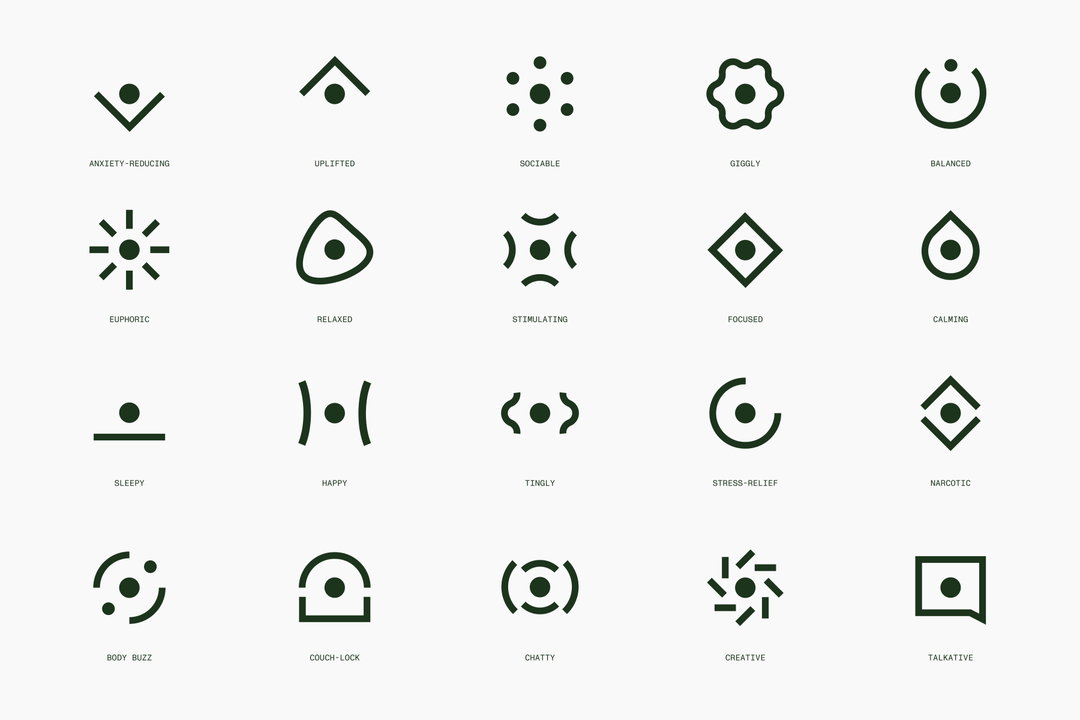
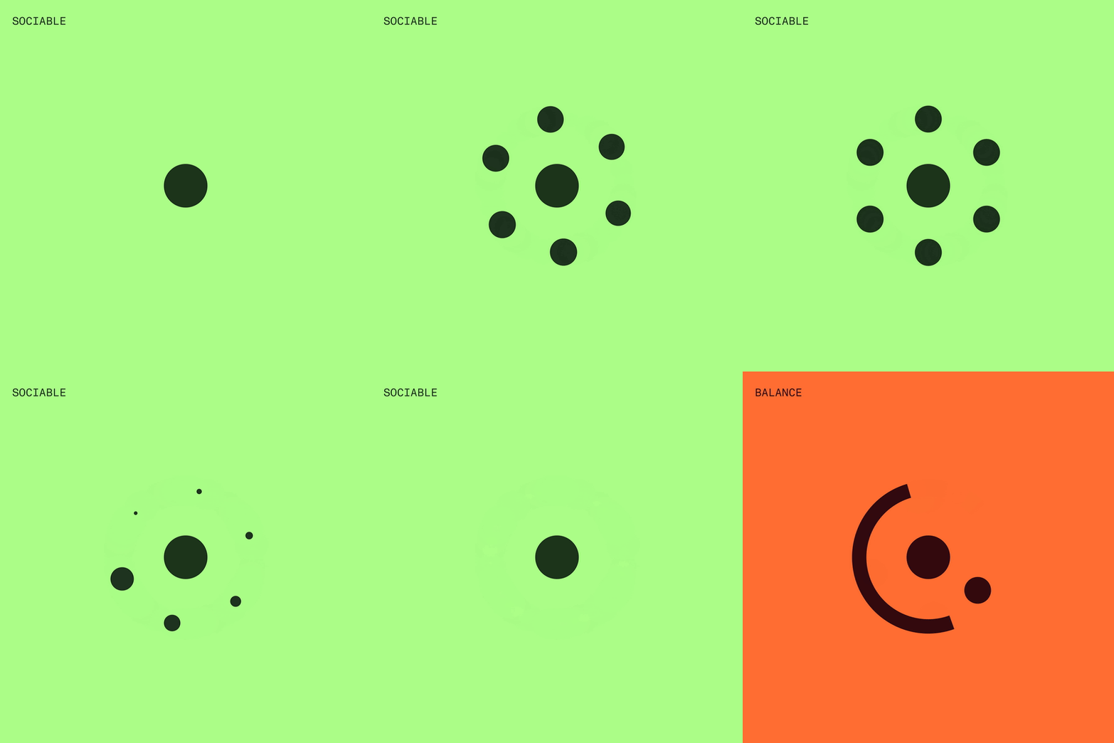
Simple illustrated icons also populate the site. Composed of lines and dots, the abstract formations indicate what sort of effects each strain has: making users talkative, calming, giggly or tingly, for example. This aspect, while still being medically informed, enhances the fun and choice that also comes with choosing your strain. “We created a brand with this in mind, to help normalise weed by striking the balance between education, excitement, and ease,” says writer Natalie Hart. “A cross between the convenience of a grocery delivery service and the relatable science of the best consumer healthtech.”
GalleryThat Thing: Weed.de (Copyright © That Thing, 2024)

Hero Header
That Thing: Weed.de (Copyright © That Thing, 2024)
Share Article
Further Info
About the Author
—
Olivia (she/her) is associate editor of the website, overseeing the day-to-day editorial projects as well as Nicer Tuesdays events. She joined the It’s Nice That team in 2021. ofh@itsnicethat.com
To submit your work to be featured on the site, see our Submissions Guide.





