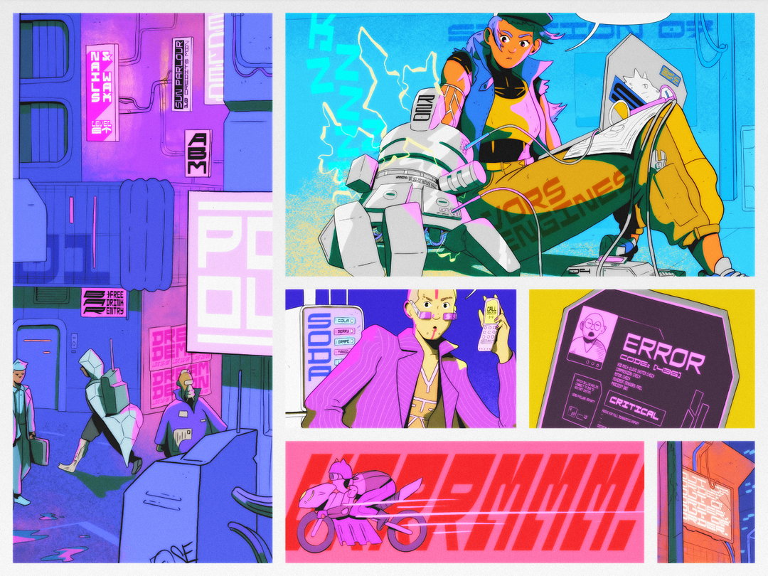
Swim Type’s monospaced, modular typeface Dysto offers a glimpse into the not-so-distant future
The recent launch from the Australian independent type studio, run by designer and art director Joseph Dennis, marries retro-futuristic design, narrative storytelling and illustration.
Share
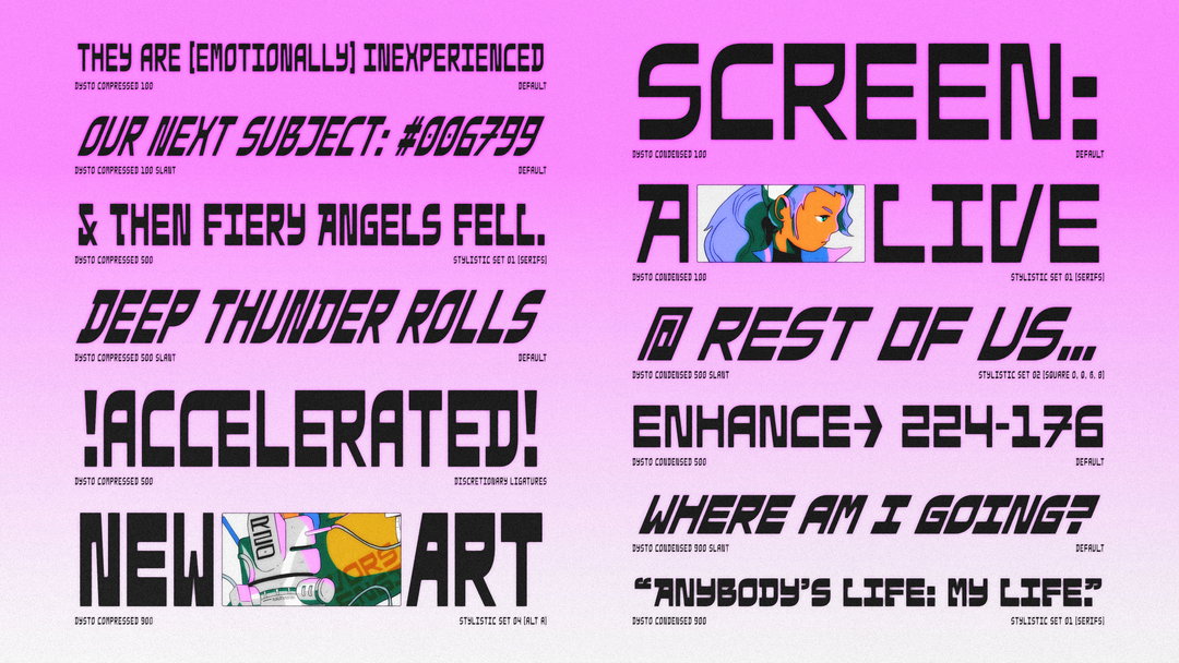
It was whilst working in branding, his first job after university, that Joseph Dennis first dabbled in type design. Happening semi-accidentally, the project he was working on required a grungy, spray-painted aesthetic, leading him to cut stencils by hand and spray paint letterforms. From there, his interest was sparked and it soon gathered momentum. After finding himself using any excuse to craft custom type, he decided to launch his type studio Swim Type in 2021, which runs alongside his freelance career. Three years and three typefaces later, Swim Type welcomes its latest six-width, three-weight, six-stylistic set monospace: Dysto.
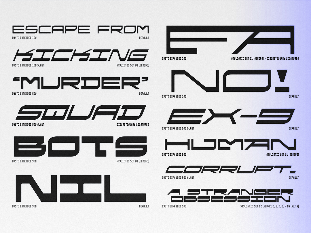
Modular and monospaced in its construction, with reverse contrast strokes, Dysto draws directly from 1980s sci-fi films for graphic inspiration – a genre that has long influenced Joseph. “ I’ve always been a fan of dystopian sci-fi films,” Joseph tells us, naming Blade Runner, Alien, and Terminator as key examples. “I love the aesthetics, the technology, and the combination of mechanical and holographic,” he explains. “I also love the ways they take our world and warp it, change it, or develop it in a particular direction,” he adds.
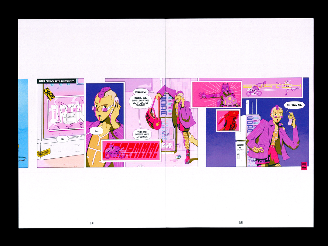
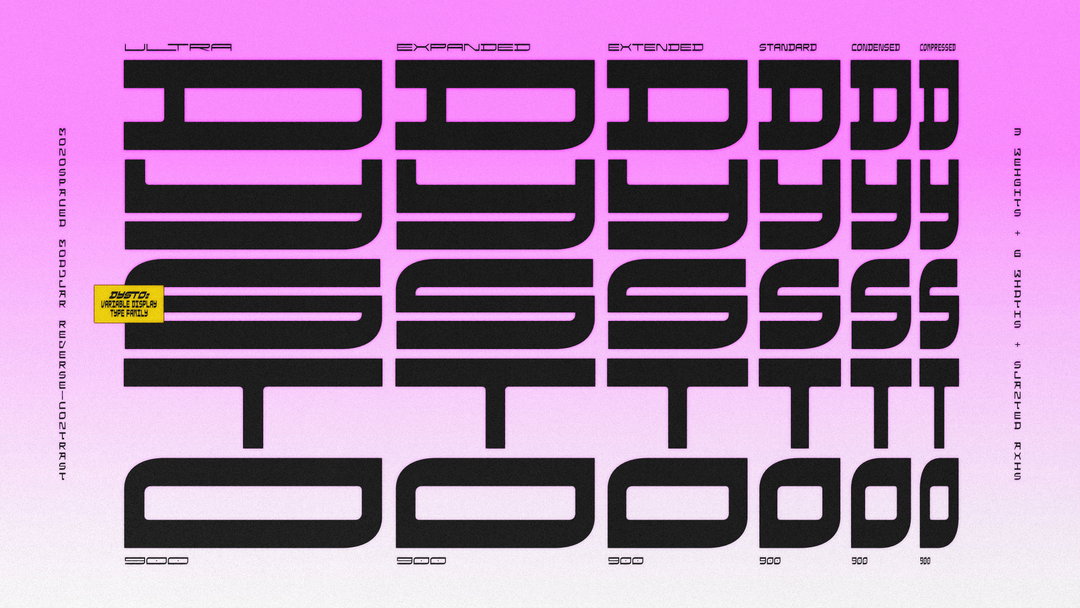
Due to the generally mechanical aesthetics of Dysto’s cinematic inspirations, Joseph began by basing the typeface’s design on strict repeating modules, sat upon a rigid 90-degree grid, and, in doing so, constructed a creative foundation that – albeit restrictive – led to acts of expressive problem-solving. “As I ran into each new problem, I would solve it by adding a new module to solve my problems,” he says. He then slowly began to build each letterform piece by piece. “One of my main aims for the typeface was to design it to type both horizontally and vertically,” he continues, subsequently opting for a monospaced design to achieve as much. “I had a shot from Blade Runner in my head where a collection of tall neon signs flash in the dark with vertical text on them,” Joseph says, “this was the world I was designing Dysto for.”
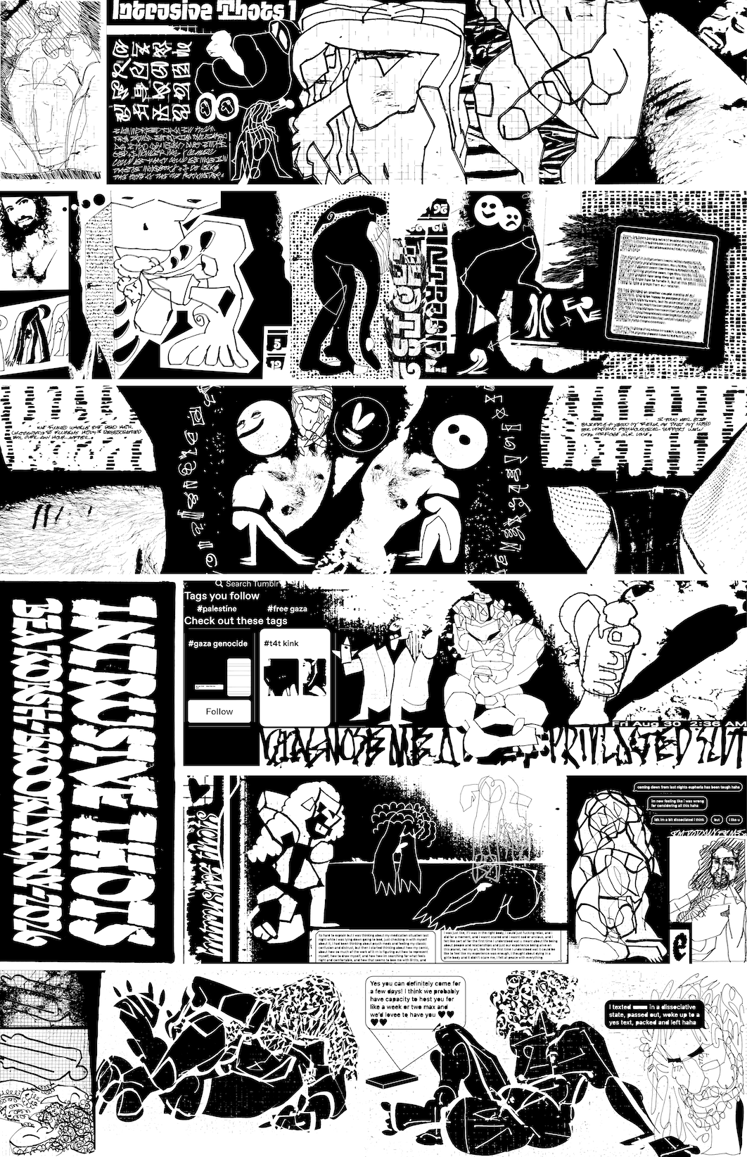
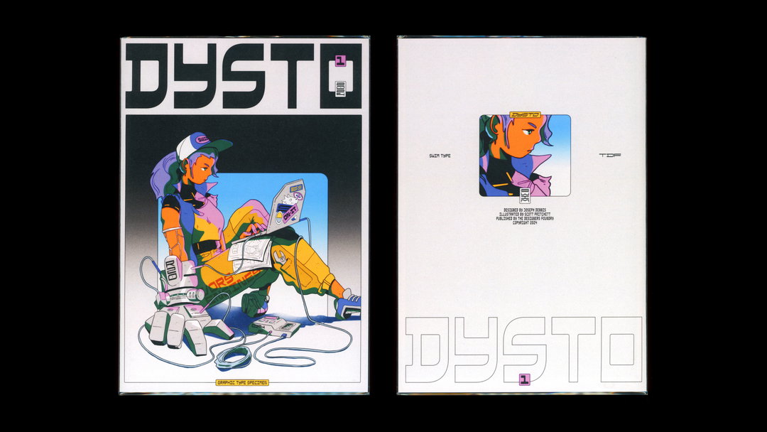
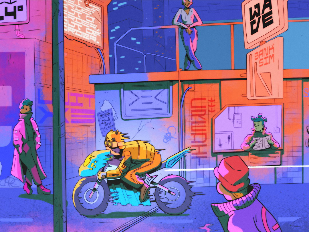
Taking the narrative nature of Dysto to the next level, Joseph turned to illustrator and writer Scott Pritchett to create the characters, scenes and settings that would inhabit Dysto’s universe. “My favourite part of the process was creating this world the type would live within,” says Joseph. “I briefed him to illustrate a dystopian world in graphic novel form,” he expands, asking Scott to create smaller excerpts and tableaus from a larger, universe-spanning story. “Working on the promotional illustrations and the typeface at the same time was very beneficial to the outcome,” he adds. “We built this world together, and it happens to have a typeface in it.”
Practically, Dysto is equally as future-focused as its influences: befit with three axes of modification, contextual alternatives and slanted variations alongside its six widths with three weights – all in a single variable font file. “It’s made for holographic advertising and augmented environments,” Joseph concludes, “it’s bold enough for the latest outer space outerwear, and its 22.5-degree slant pushes further than others dare to venture.”
GallerySwim Type: Dysto (Copyright © Swim Type, 2024)
Hero Header
Swim Type: Dysto (Copyright © Swim Type, 2024)
Share Article
Further Info
About the Author
—
Hailing from the West Midlands, and having originally joined It’s Nice That as an editorial assistant in March 2020, Harry is a freelance writer and designer – running his own independent practice, as well as being one-half of the Studio Ground Floor.