

Raw and unrefined: Studio Tyrrell’s identity for Manta Chocolate leans into the tension between purity and pleasure
Focusing on the Manta’s minimal ingredients, Studio Tyrrell built an identity based on the idea that chocolate can be a source of both nutrition and pleasure.
Chocolatiers have long leaned on richness and abundance to market its treats, advertising silky textures and gooey centres often rendered through generous helpings of butter and sugar. For Manta, it’s quite the opposite. This chocolate company is committed to making healthier chocolate snacks, creating its bars and bites out of raw, plant-based, and unrefined ingredients without dairy, gluten or refined sugar.
“What stood out to us immediately was the almost ascetic use of ingredients, in contrast to the rich, sensorial world of chocolate,” says Oliver Tyrrell, founder of Studio Tyrrell. When developing with Manta’s visual identity, the design studio found themselves drawn to this tension between the purity of Manta’s craft and the pleasure of eating.
Gallery(Copyright © Studio Tyrrell, 2026)
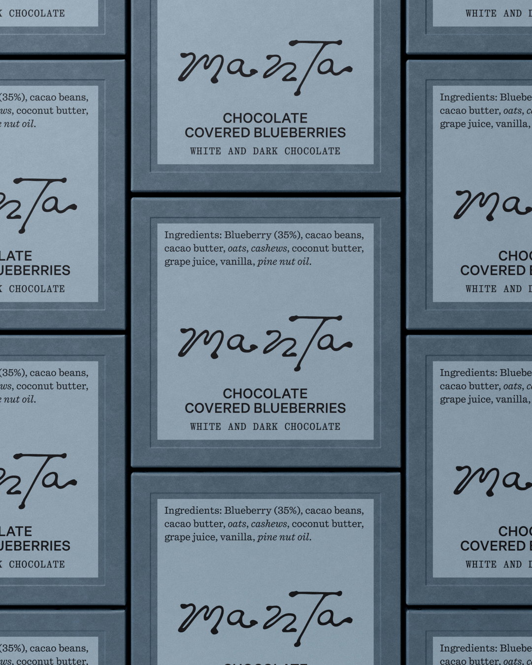
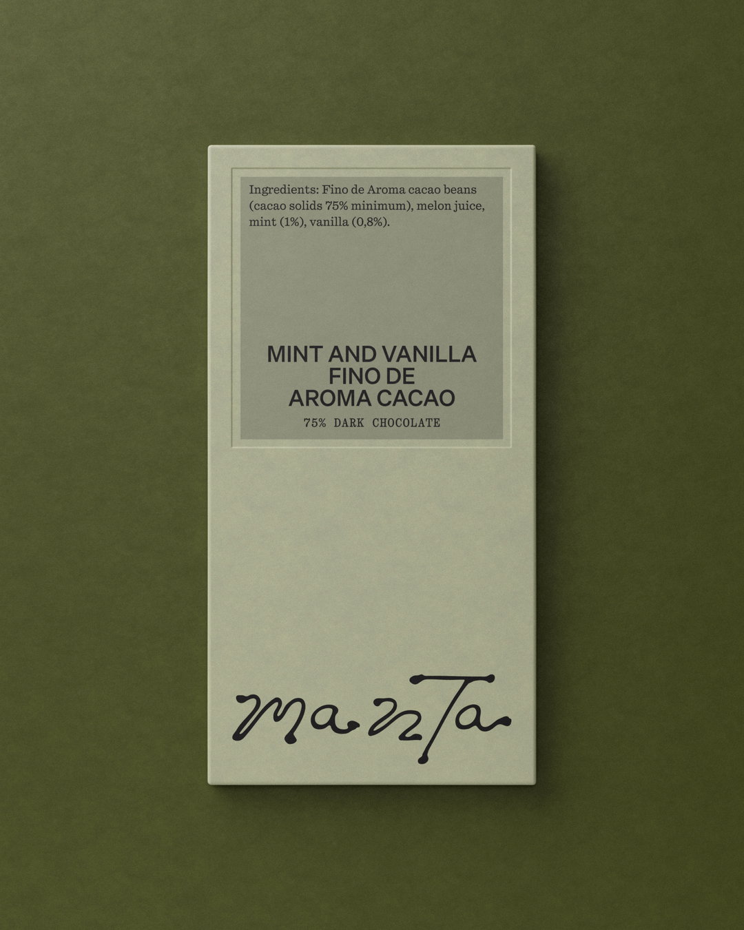
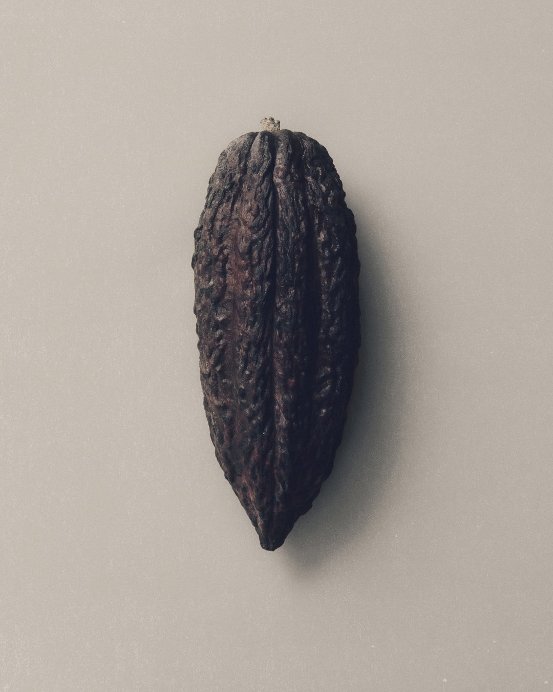
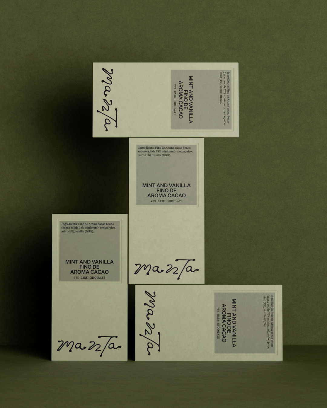
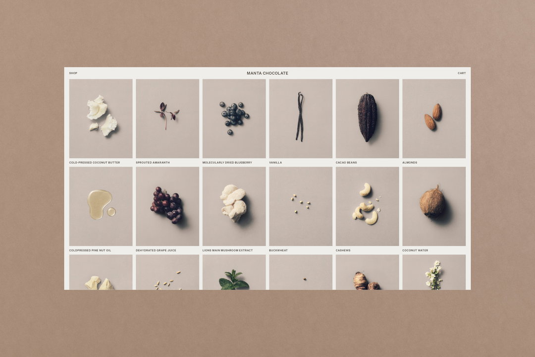
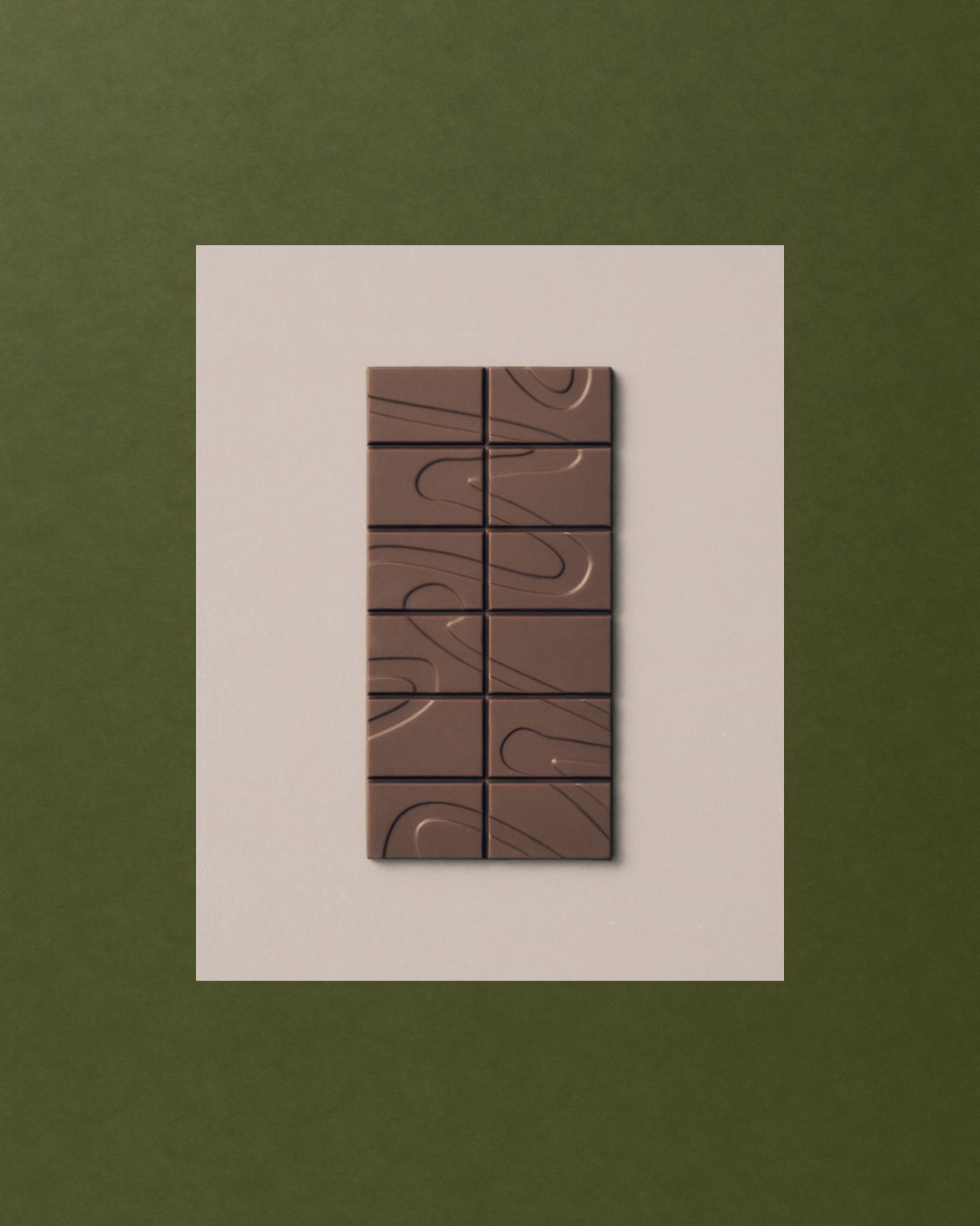
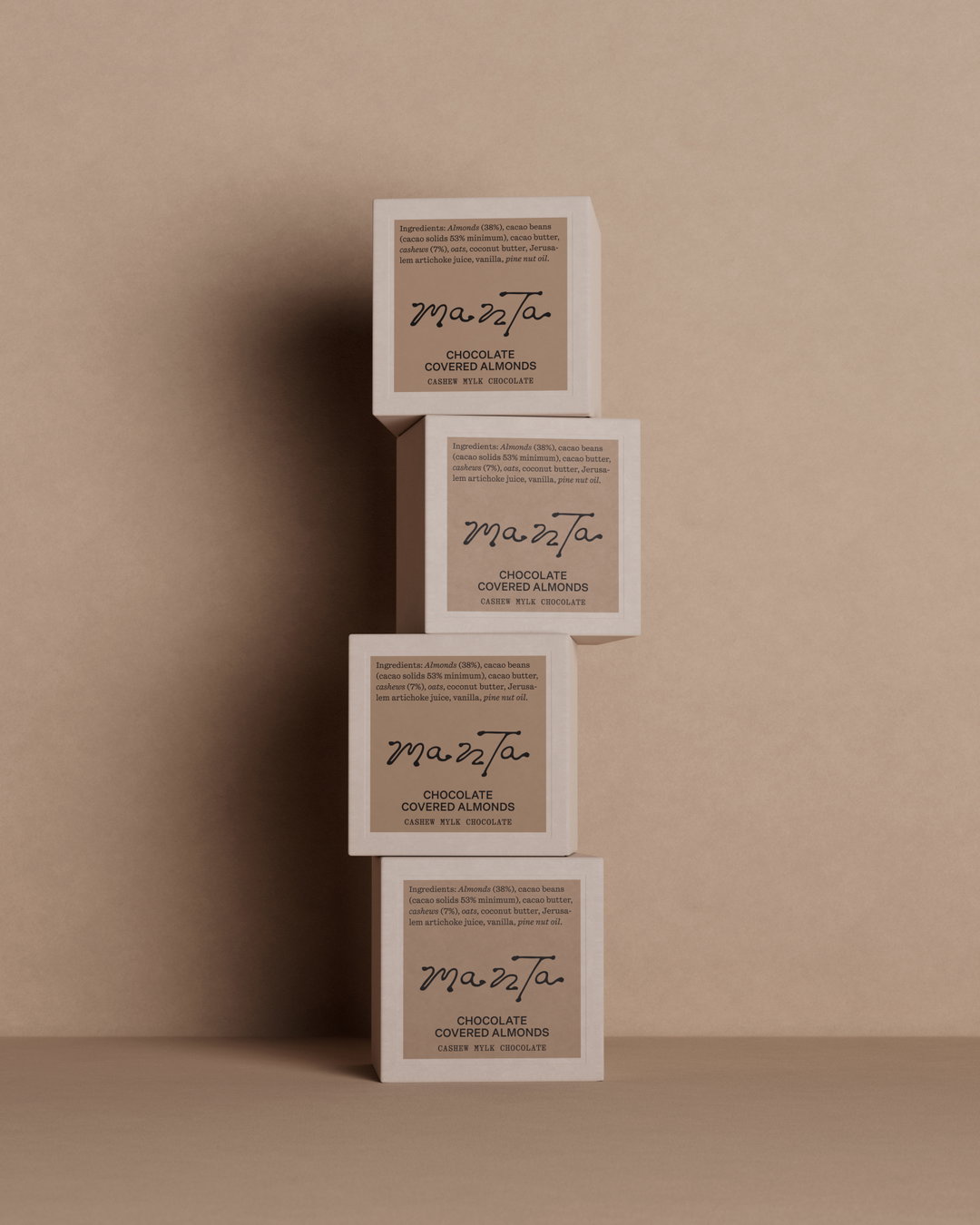
Combining a slinky logotype with an elegant square label, Studio Tyrrell decided to place the ingredients top and centre, rather than hiding them away into a small print on the back. Online, they catalogued these ingredients into a visual archive to make dietary decisions easier for customers.
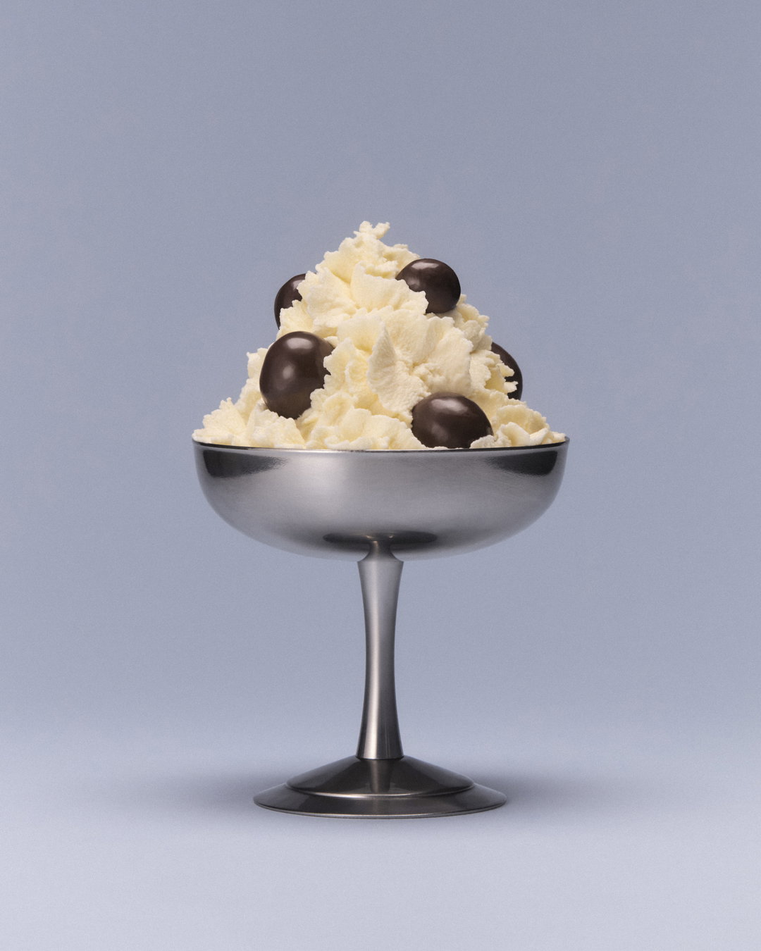
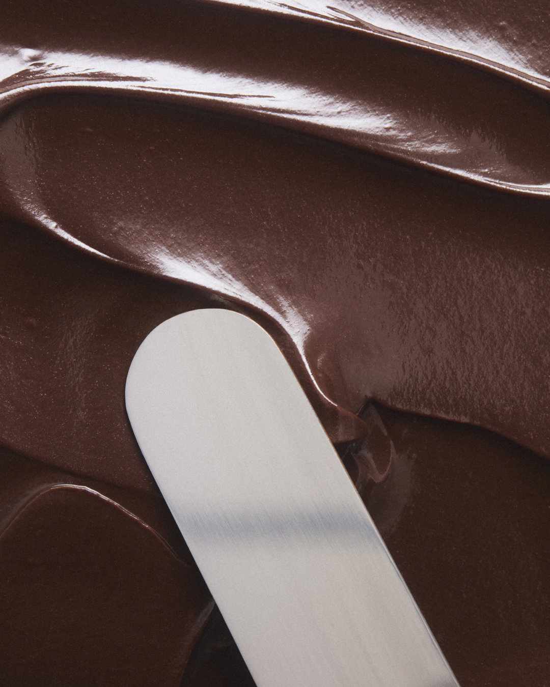
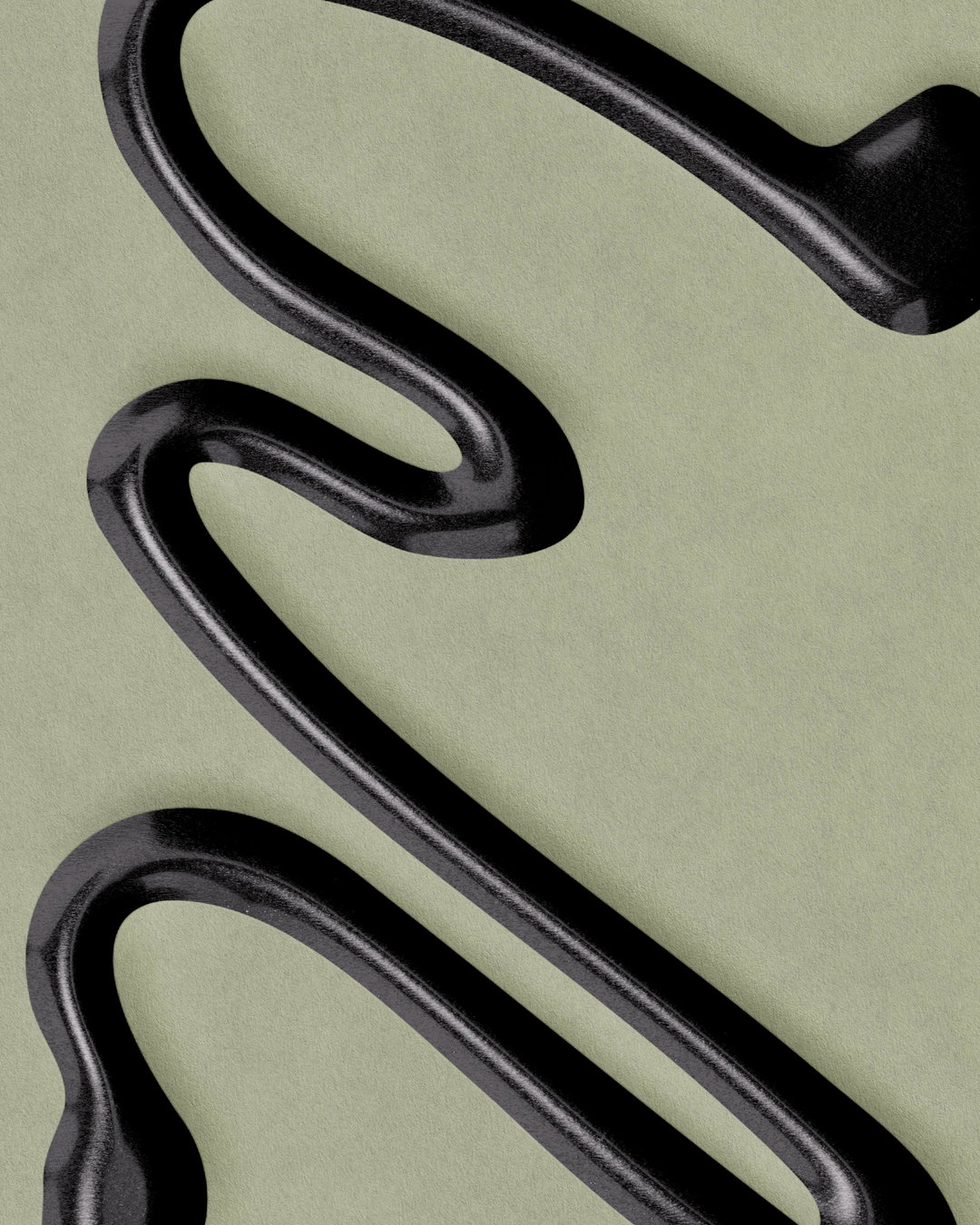
To contrast this functional approach to the ingredients, they introduced a visual language that felt closer to the way chocolate is enjoyed as a luxury. “Colour, texture, and organic forms brought tactility to the brand,” Oliver explains. The logo encapsulates this too: “a handmade gesture that sits deliberately outside the structure, introducing something imperfect to an otherwise rigorous system.”
Here the ingredients – both written and pictured – feel active and purposeful, while tapping into the simple pleasure of eating chocolate. “Every element of the identity became an expression of the idea that chocolate could be a source of both nutrition and pleasure,” says Oliver. “We’d like to think that Manta feels at home in the world of chocolate while sitting slightly outside the category.”
Gallery(Copyright © Studio Tyrrell, 2026)

Hero Header
(Copyright © Studio Tyrrell, 2026)
Share Article
Further Info
About the Author
—
Marigold Warner is a British-Japanese writer and editor based in Tokyo. She covers art and culture, and is particularly interested in Japanese photography and design.