Moving Brands’ identity for Eppo sets data science apart with evolving graphic systems and shifting forms
The fresh new look for the San Francisco-based software platform shows off its experimental, ever-evolving approach to data.
When software company Eppo reached out to Moving Brands, the team quickly realised that the platform needed an identity and website that reflects their difference in the data market: “Eppo is an experimentation platform that was founded by a data scientist in a landscape dominated by engineering-founded competitors”, says Jordan Heber, strategy director at Moving Brands. The A/B testing platform that allows companies to successfully compare two versions of a web page or app against each other to determine which one performs better, gives companies the chance to grow, by using their own data as a tool for business. Moving brands’ aimed to reimagine a visual identity for Eppo’s model that “celebrates transformation, creating new ideas from disparate inputs, and the brand’s dynamic, athletic nature”, all whilst leaving room for flexibility, for the brand to expand in future.
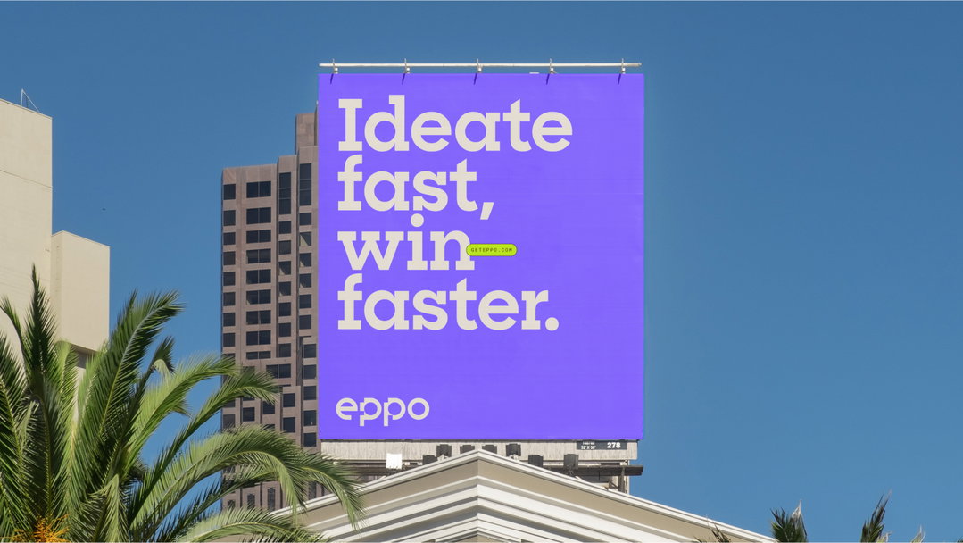
Delivered by a multidisciplinary team across London and the US, the independent design studio reimagined Eppo’s brand's identity to constantly evolve, with a system of modular visuals that allow for “endless iterations and expressions”, says Joel Smith, design director at Moving Brands. The data company challenged us to “lean into the weird”, he adds, in order to help them differentiate their unique background in data science and showcase their experimental spirit. From a palette of bold and unusual colour pairings designed to “evoke the ‘discomfort’ of embracing a culture of experimentation”, to a modular new Eppo logo that shapes and rearranges itself: “it becomes more experimental as it scales up – just like the best tech companies do”, says Joel, all aspects of the user experience are constantly in motion, with an experimental feel across print and digital. This new logo for Eppo, with its many graphic expressions, is “based on MMcN Diode, a typeface designed by Natasha Lucas and MuirMcNeil”, explains Joel.

Moving Brands: Eppo (Copyright © Moving Brands, 2024)
Steering away from the visual conventions of the world of digital tech, Moving Brands “aimed to differentiate the brand from industry norms, avoiding dark backgrounds, bright gradients, and generic symbols with san serif wordmarks”, says Jordan. The studio wanted the brand’s new visual catalogue to display “data visualisations that are unapologetically technical”, says Joel, all whilst remaining approachable to Eppo’s new audiences. Eppo’s new headline typeface Sharp Slab aims to be an antidote to “instinct sans serif typefaces” that dominate the data and tech scene, making it stand out from the crowd. Tom Caiger, designer at Moving Brands, sums up: “Eppo has a proud culture of experimentation and a commitment to meticulous craftsmanship. These qualities inspired the graphic expression, where we see modular patterns shift, rearrange themselves and transform.”
GalleryMoving Brands: Eppo (Copyright © Moving Brands, 2024)







Hero Header
Moving Brands: Eppo (Copyright © Moving Brands, 2024)
Share Article
About the Author
—
Ellis Tree (she/her) is a staff writer at It’s Nice That. She joined as a junior writer in April 2024 after graduating from Kingston School of Art with a degree in Graphic Design. Across her research, writing and visual work she has a particular interest in printmaking, self-publishing and expanded approaches to photography. ert@itsnicethat.com
To submit your work to be featured on the site, see our Submissions Guide.