Dive into Mira Joyce's portfolio with its “healthy balance of calculated and convoluted silliness"
The portfolio of Mira Joyce shows how sometimes, not following the traditional route into graphic design can provide a more eclectic output. With just an Instagram account displaying her design flair, Mira’s work jumps between the silly and the serious as she nestles her way into the design world, adopting the title of a designer, creative director and artist.
Born in Chicago before moving to Los Angeles and now living and working in New York, Mira is still exploring the possibilities of a design career at the age of just 23. Experimenting with Photoshop was her entry point to design, creating bits and pieces since she was just a kid. “My early work was all personal work,” she tells It’s Nice That. “I was making digital collages and video art purely for myself, attempting to push software to its extremes.”
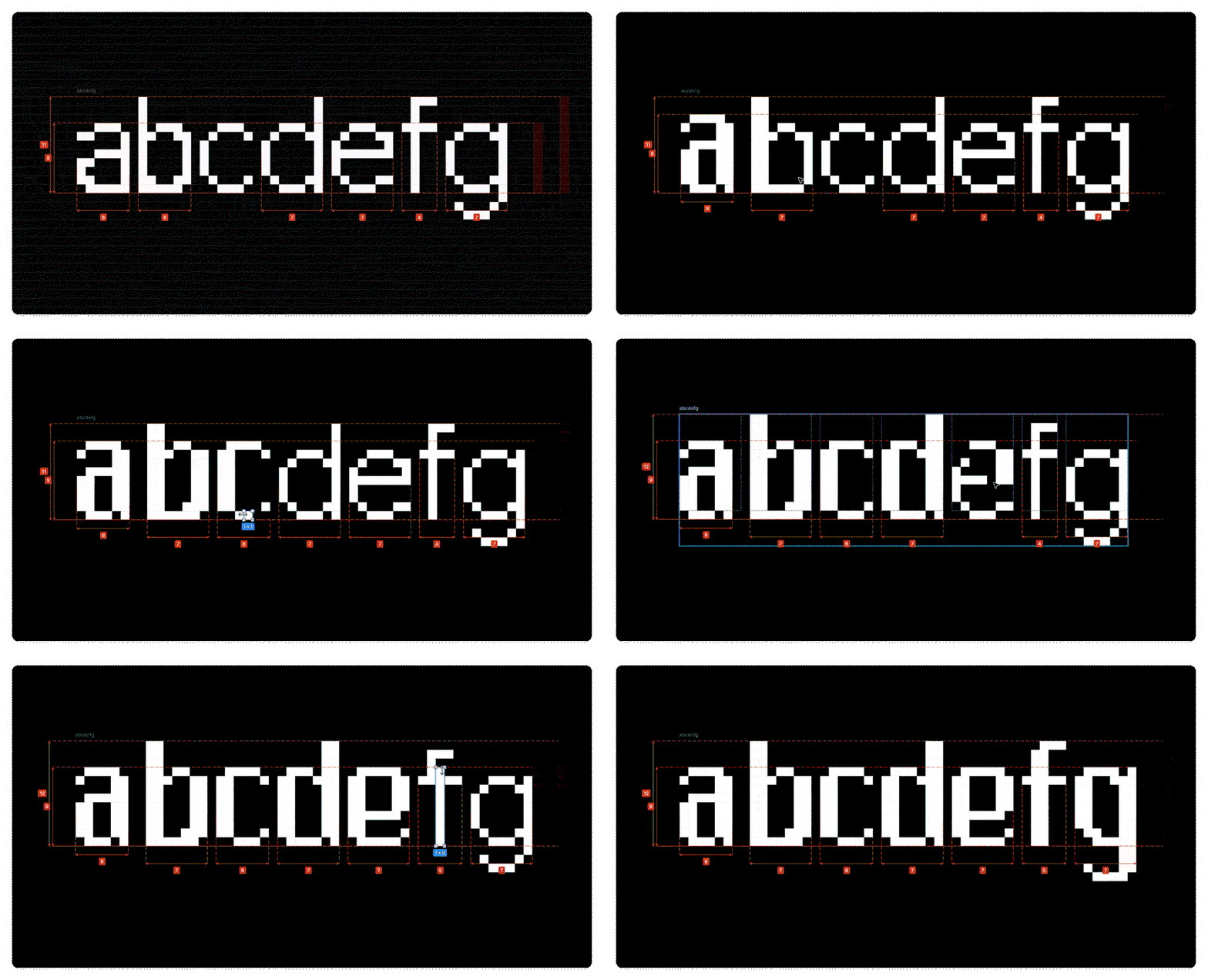
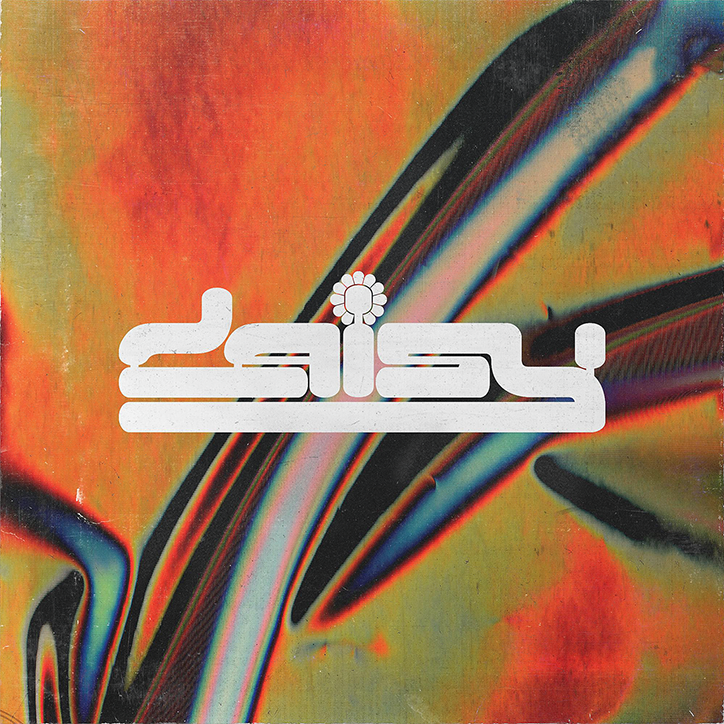
Consequently Mira has a signature design style, one that merges typography, illustration and photography, in a music-focused portfolio that on first glance is difficult to date. Some record sleeves or posters appear entirely modern, such as the use of photography on the sleeve work for Lewis Grant, whereas other pieces like her Daisy record sleeve are reminiscent of a 90s dance pop hit artwork. This broad design scope is inspired by a number of influences, her current home being the most visually obvious. “The maximalism and grit of New York City is pretty evident in my work,” she explains. “Being constantly surrounded by garbage, unreadable graffiti, mangled trucks and crazy shop signage is extremely disorienting and I love it.” Music is also clearly a driving creative force for Mira too, particularly club music, as “there’s no escape unless you really try to avoid it,” she points out. “The unrelenting energy always peeks through my work in the forms of texture, colour, rave-inspired custom type, or sometimes literal collages of garbage.”
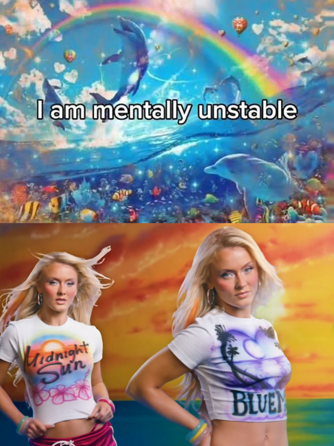
In terms of a graphic tone, the designer notes humour as “the most important element in my work,” she says. “I’m still super young and using my early 20s to only focus on serious design seems like a misuse of time I’ll never get back. That’s not to say silliness dictates my entire output — I’m versatile enough to work within a professional scope, but it’s pretty obvious that the serious straightforward projects in my body of work are punctuated by ridiculousness.” Examples of this include poking fun at her own branding by “falsely claiming that a graphic of a fairy sparkle next to an illustration of Mickey Mouse is my new logo,” or translating her music taste into design in a “graphic tee that sarcastically lists the sins that apply to everybody that listens to music with high frequencies”. Despite the self mockery that inspires these projects, Mira’s following eat it up, for instance her t-shirt design post is full of comments by fans begging for a restock.
Looking towards the rest of the year, Mira plans to continue to keep “a healthy balance of calculated and convoluted silliness,” that clearly seems to be working. “I like to stay on my toes, and in the near future hope to experiment more with apparel design, fleshing out my custom type into complete display typefaces, and video art.”
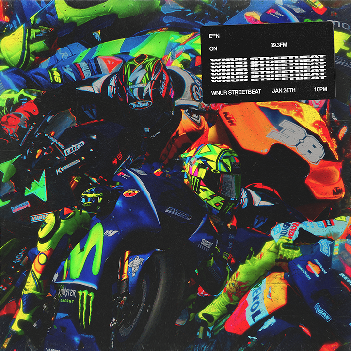
Mira Joyce: E**N
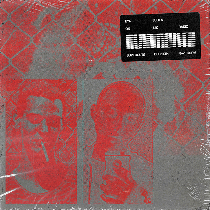
Mira Joyce: E**N
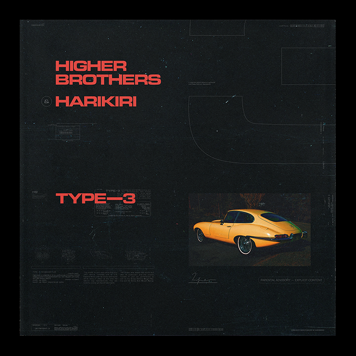
Mira Joyce: Higher Brothers
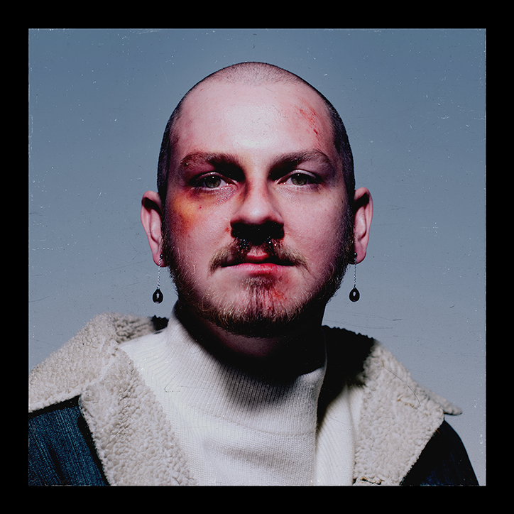
Mira Joyce: Lewis Grant
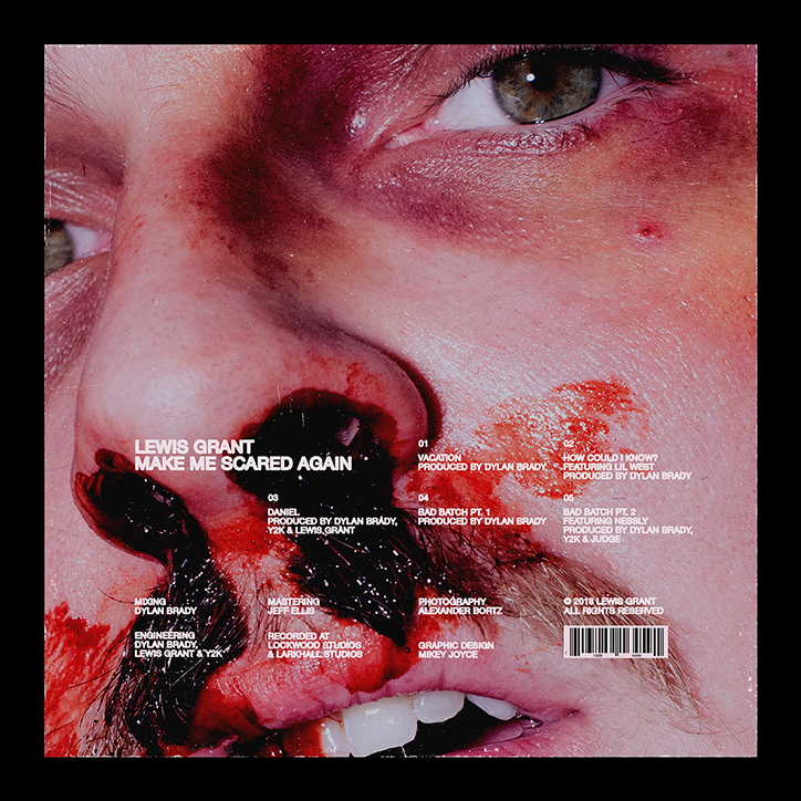
Mira Joyce: Lewis Grant
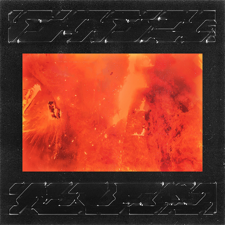
Mira Joyce: Misc
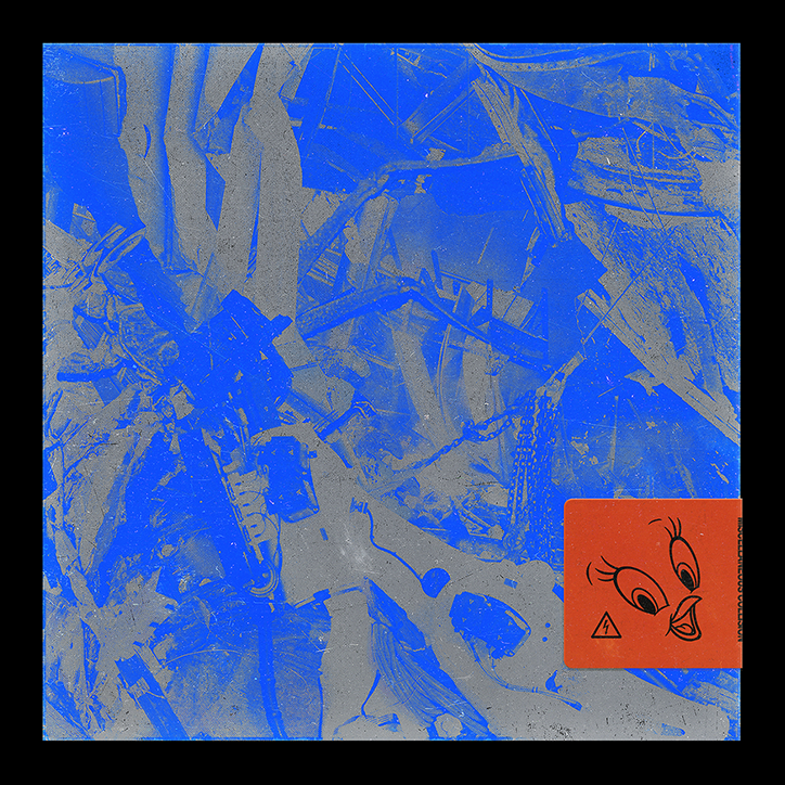
Mira Joyce: Misc
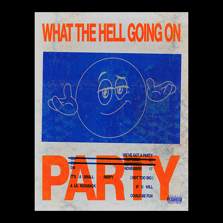
Mira Joyce: Party
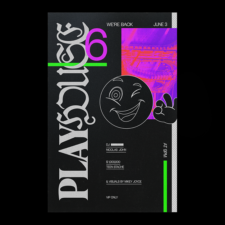
Mira Joyce: Playhouse
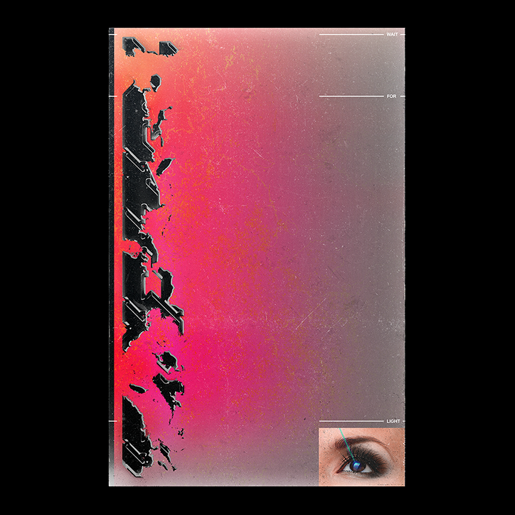
Mira Joyce: Wait for Light
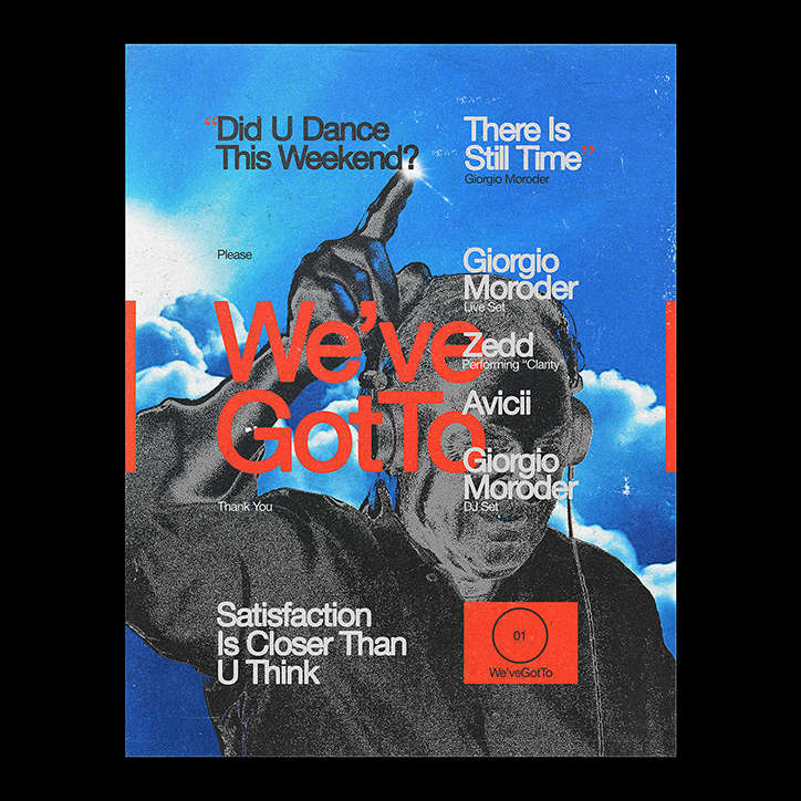
Mira Joyce: We’ve Got To
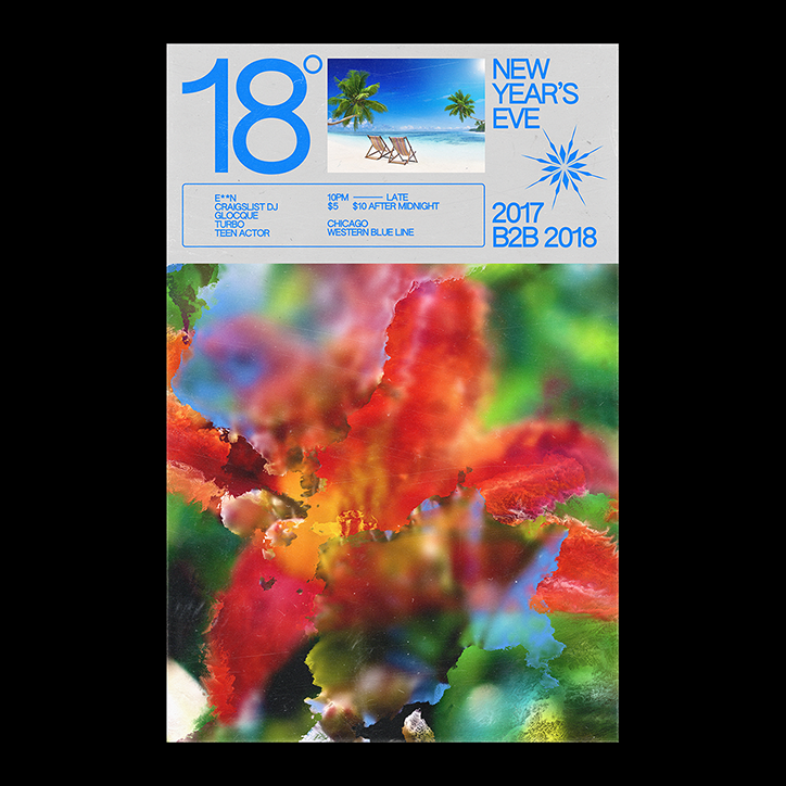
Mira Joyce: NYE
Share Article
Further Info
About the Author
—
Lucy (she/her) was part of the It’s Nice That team from 2016–2025, first joining as a staff writer after graduating from Chelsea College of Art with a degree in Graphic Design Communication, eventually becoming a senior editor on our editorial team, and most recently at Insights, a research-driven department with It’s Nice That.