Graphic designer Louise Borinski's practice focusses on symbols and their meanings
Graphic designer Louise Borinski’s practice centres around abstract shapes, their inherent symbolism and how you can attach meaning to them. She began her creative career as a photographer, before switching to design after seeing how it offered her the possibility to combine imagery, typography and editorial design. Born in Switzerland and having grown up in Germany and Austria, she is now based in Berlin where she recently graduated from the University of the Arts Berlin.
Although claiming she’s still figuring out who she is a designer, Louise has a distinctive approach to creating. “I work a lot with abstract shapes that appear to have no specific historical visual reference,” she tells us. “I sketch and develop these, very intuitively, in what I call ‘primitive sessions’, a way for me to get off the screens and keep in touch with the tangible world.” Alongside this, she conducts research into already existing symbols, their meaning and their background. “I feel that to create new symbols it’s important to be aware of what is already out there.”
It’s this topic, specifically, which formed the basis of her bachelor’s thesis titled A Manifesto of Signs for Equality. For the project, Louise created a visualisation of symbols which “supposedly act as guidelines in an equal society”. These signs acts as a language plucked from a world in which equality is the norm; “In which femininity and masculinity are no longer important as constructs of society. In which we communicate with each other not only through language but also through new signs, appreciating each other and meet as equals, manifesting our social diversity as well as our individual diversity.”
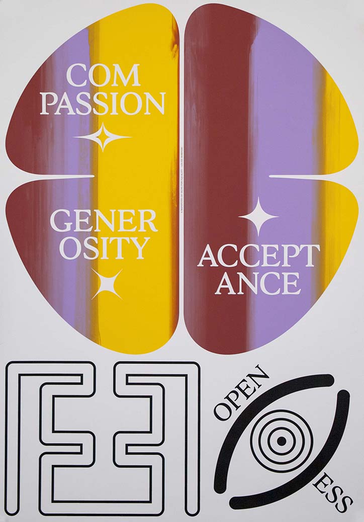
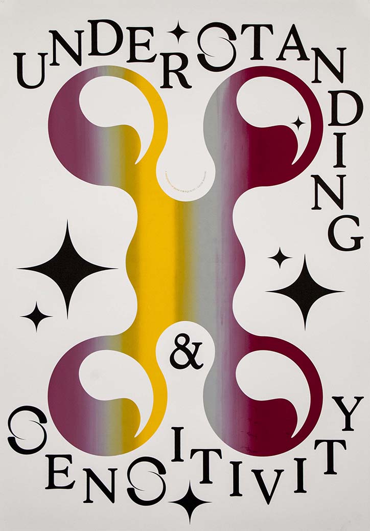
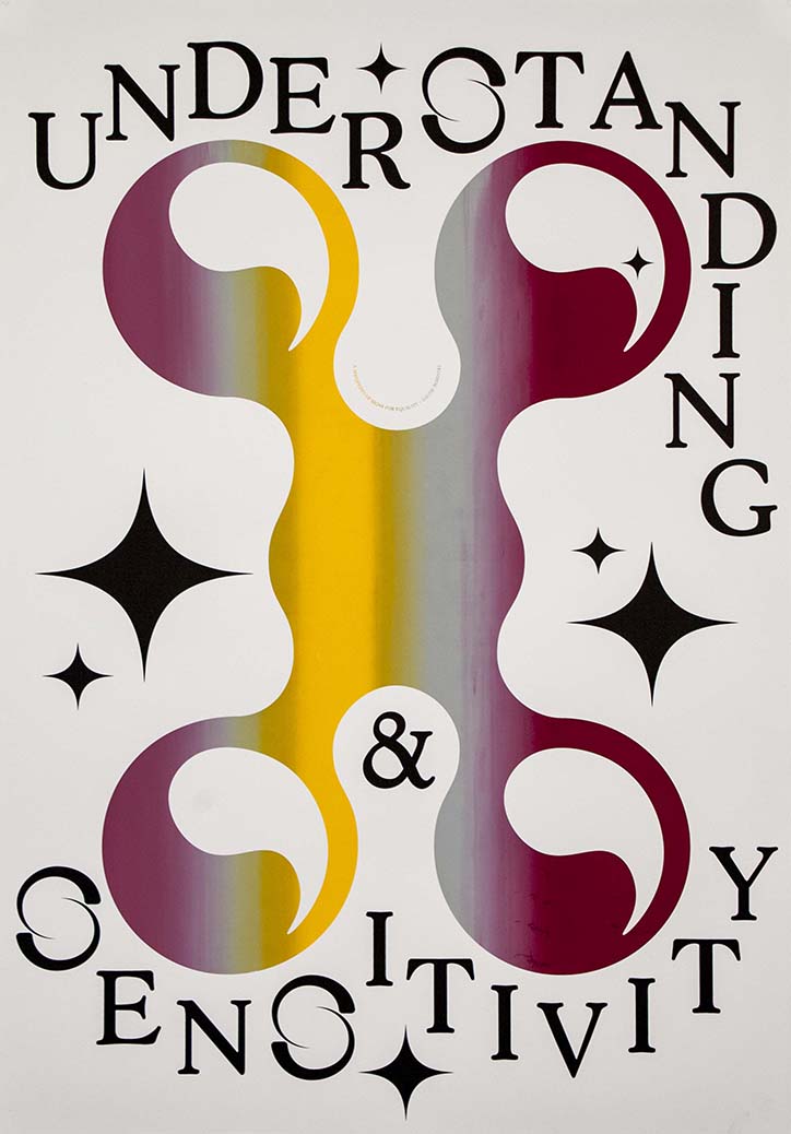
Louise Borinski: A Manifesto for Signs of Equality
Louise Borinski: A Manifesto for Signs of Equality
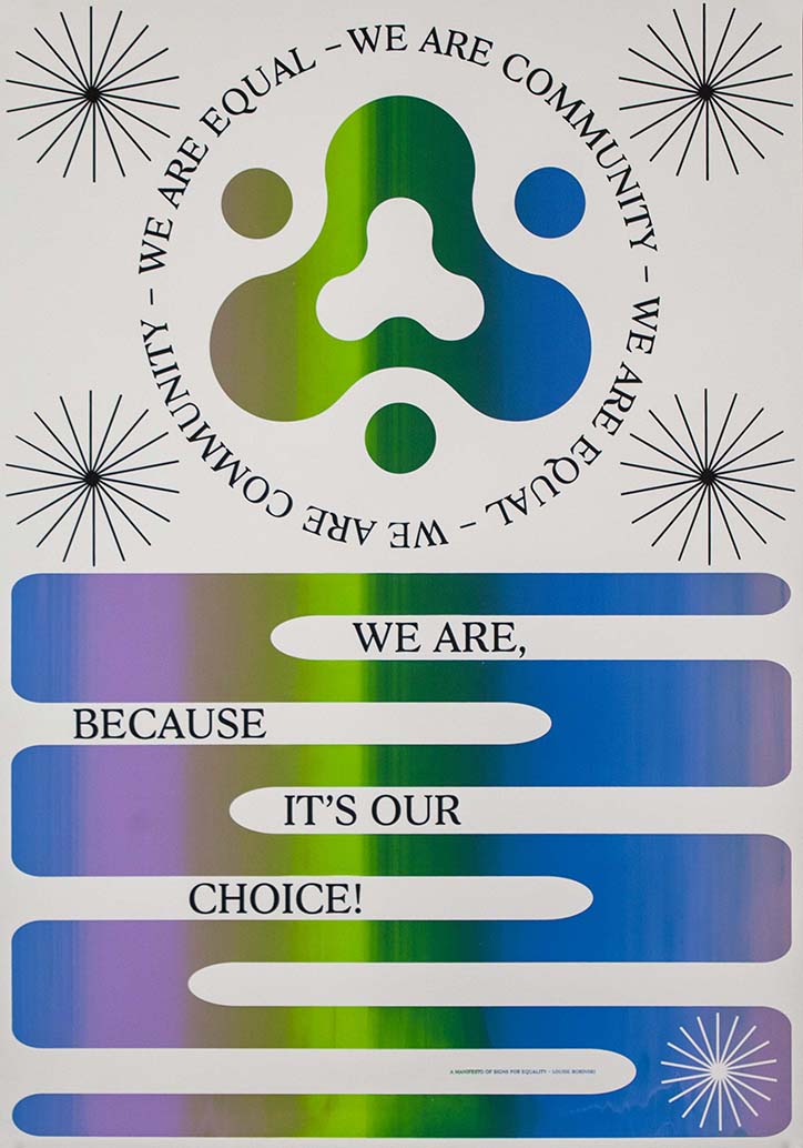
Louise Borinski: A Manifesto for Signs of Equality
The results – a series of screen-printed posters and a Risograph-printed booklet – are visually compelling for their bold, graphic quality. And, they represent an exercise into translating emotion and feeling onto the printed page, not with words but with imagery. This decision, to not use words as her primary medium, was purposeful on Louise’s part: “From the beginning, my aim was to write a manifesto. The problem is that I’m not much of a writer. So I decided to create signs because it’s something I know how to do, it’s my personal language,” she explains. In turn, the series demonstrates the design’s ability to offer everyone a chance to communicate, whether it be through photographs, icons, typography or layout.
A Manifesto of Signs for Equality comprises of 12 symbols which act as pillars for a life in a world of equality and harmony. “I gave them literal meanings, but not in a way that I want to force the meanings onto someone. It’s about creating a new language closer to our intuitive self, one that relies less on words,” Louise continues. “Spoken language can be very limiting, especially regarding gender. It forces us to decide who we are, how in-between we are and how to define ourselves.” It’s this element that makes the project so intriguing. Not only does it communicate on an aesthetic level but it probes into an oft-discussed subject with authentic interest and offers a potential solution.
Louise is now working a freelancer graphic designer in Berlin, mainly focussing on printed matter.
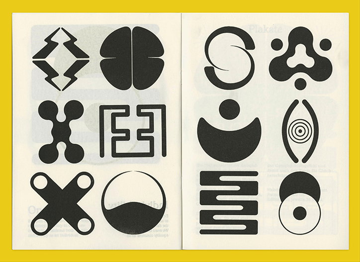
Louise Borinski: A Manifesto for Signs of Equality
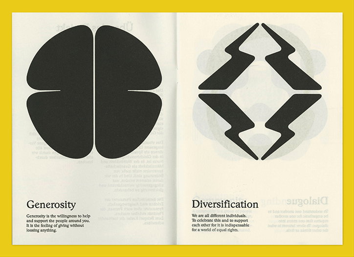
Louise Borinski: A Manifesto for Signs of Equality
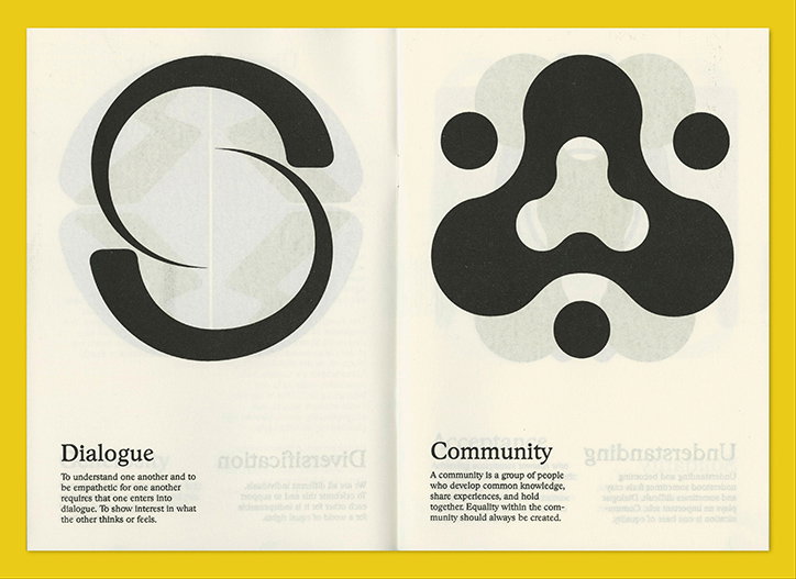
Louise Borinski: A Manifesto for Signs of Equality
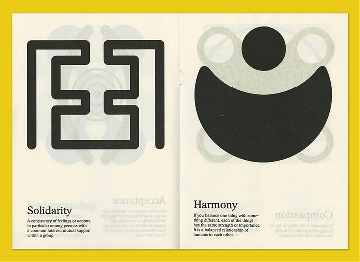
Louise Borinski: A Manifesto for Signs of Equality
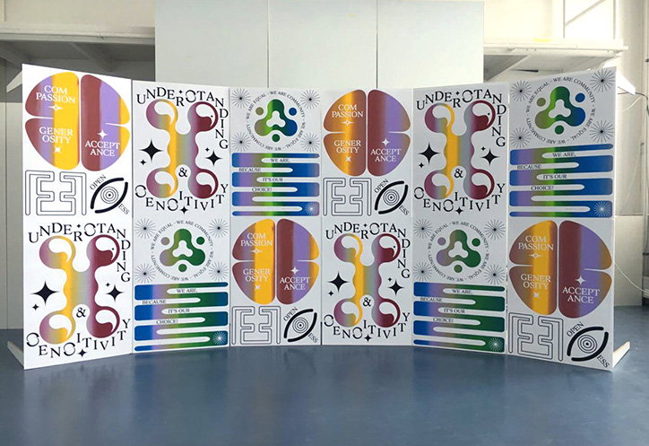
Louise Borinski: A Manifesto for Signs of Equality
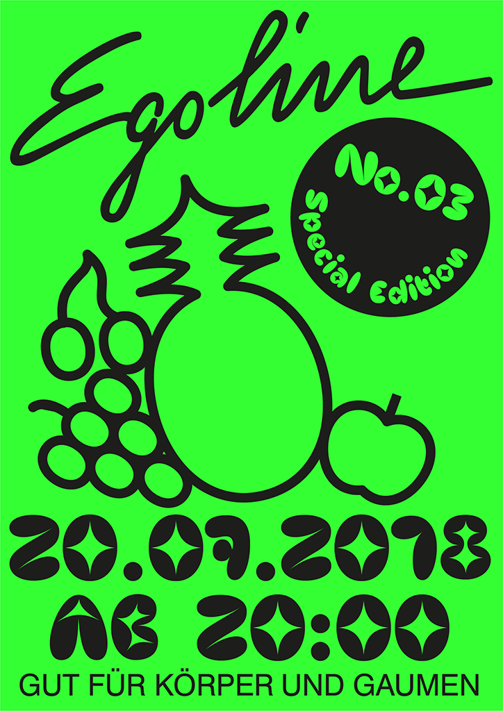
Louise Borinski in collaboration with Elsa Müller
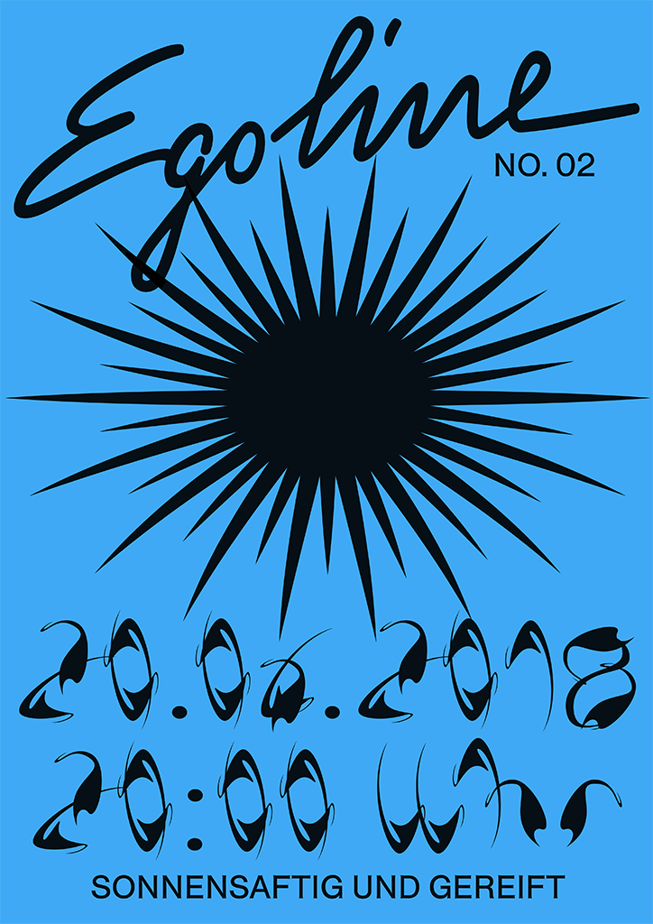
Louise Borinski in collaboration with Elsa Müller
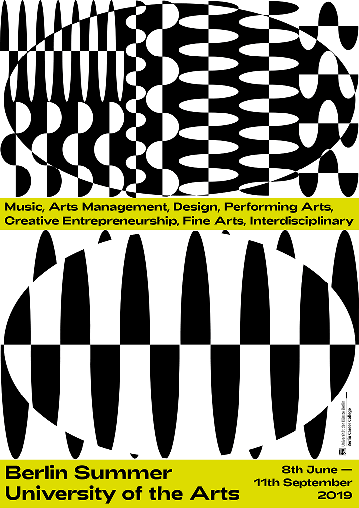
Louise Borinski
Share Article
Further Info
About the Author
—
Ruby is Senior Creative at It's Nice That, overseeing our visual output across platforms and projects. Before that, she was associate editor on the editorial team, after joining in September 2017 following graduation from Central Saint Martins.