




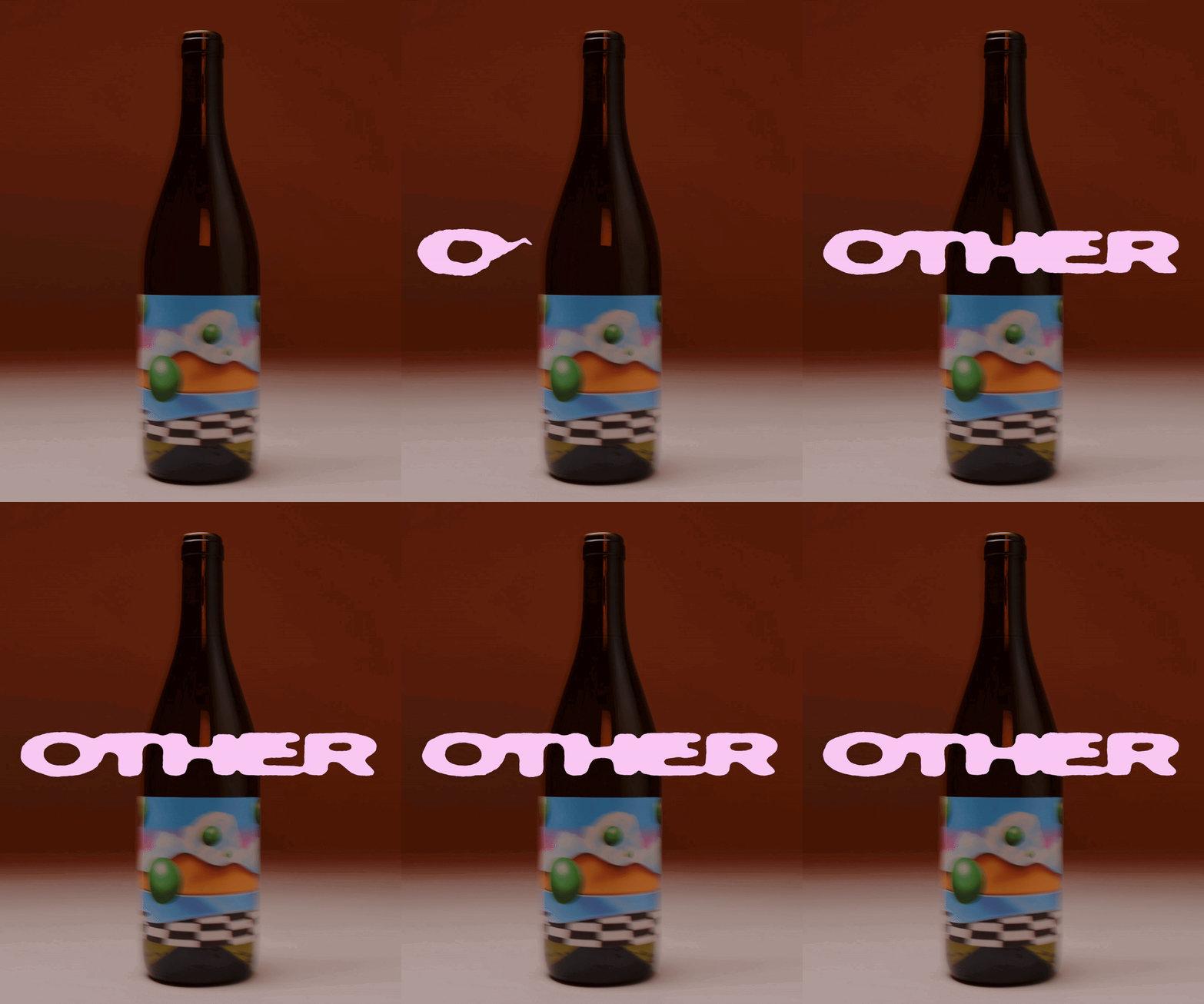
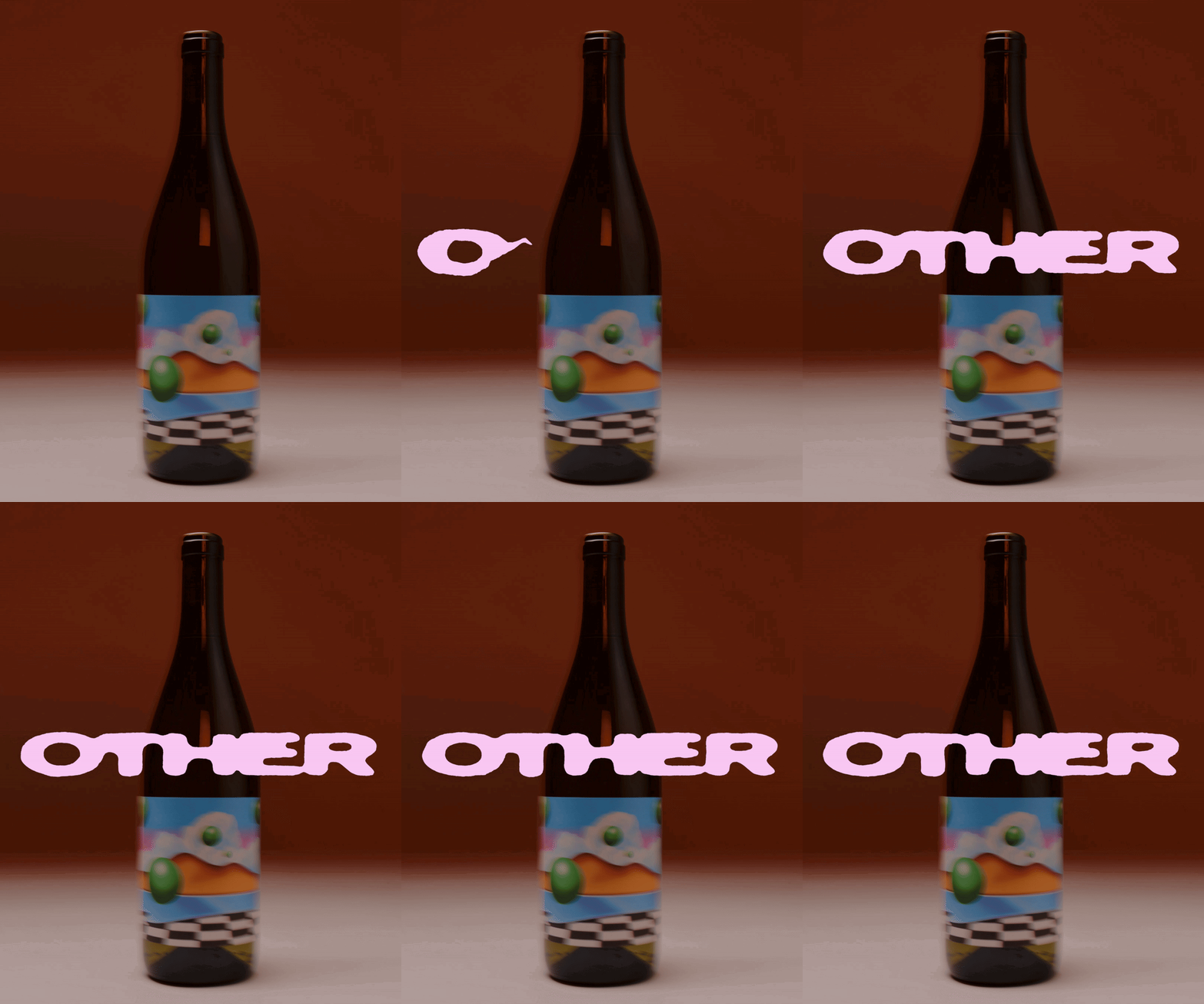
Cash & Carry’s animated wordmark for Other matches the flow and pour of a bottle of wine
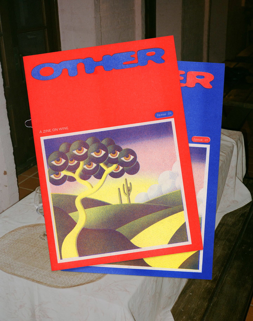
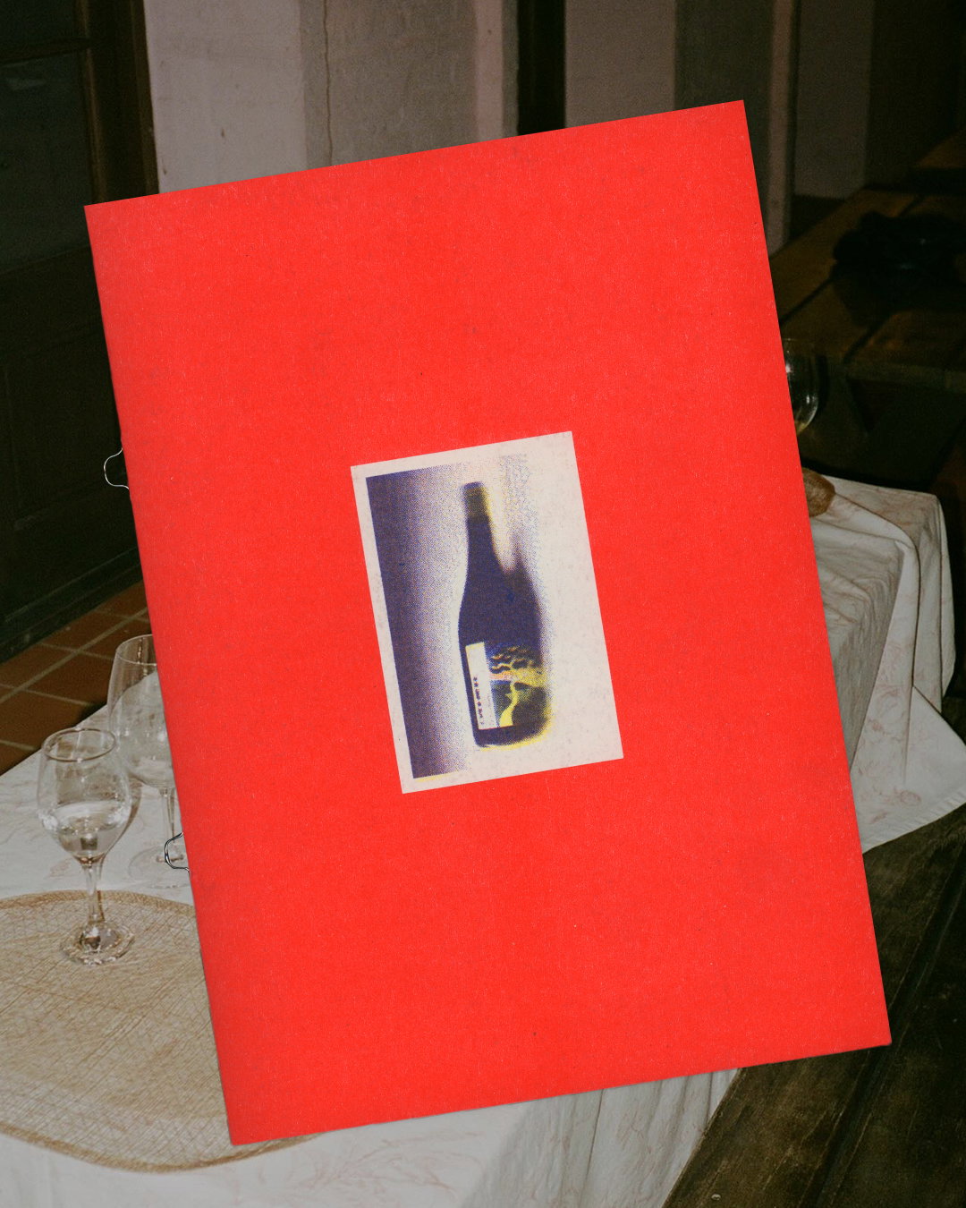
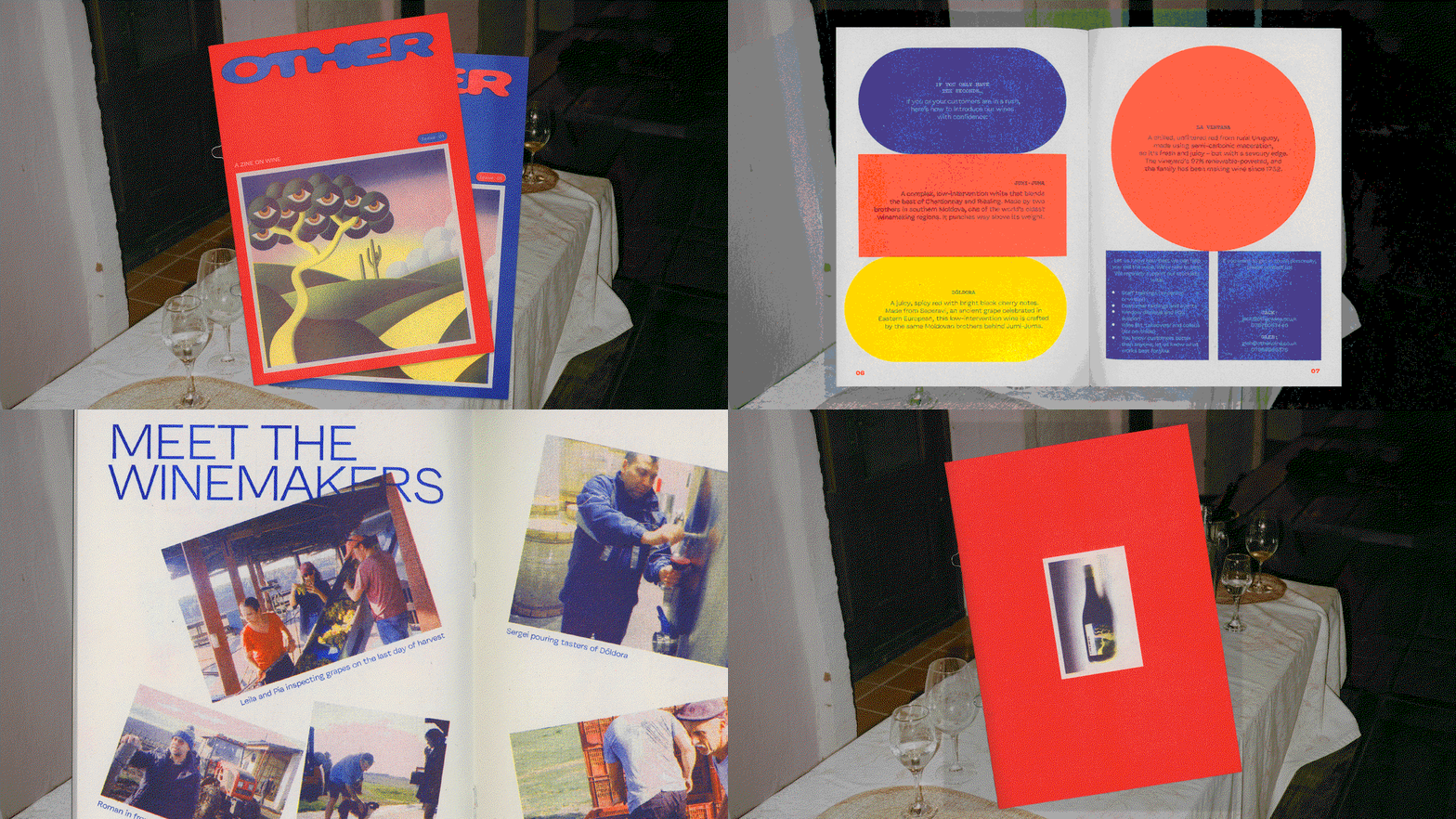
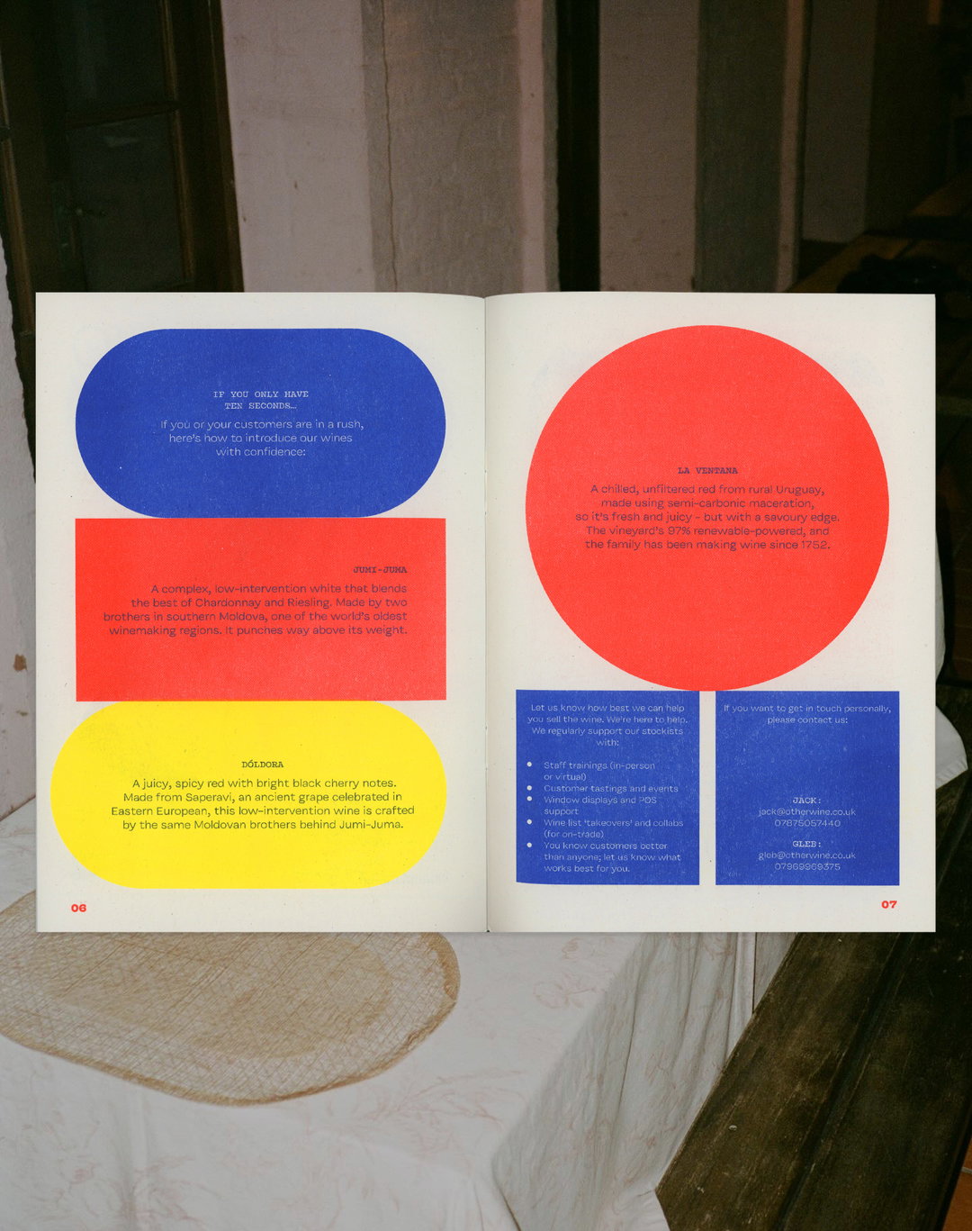
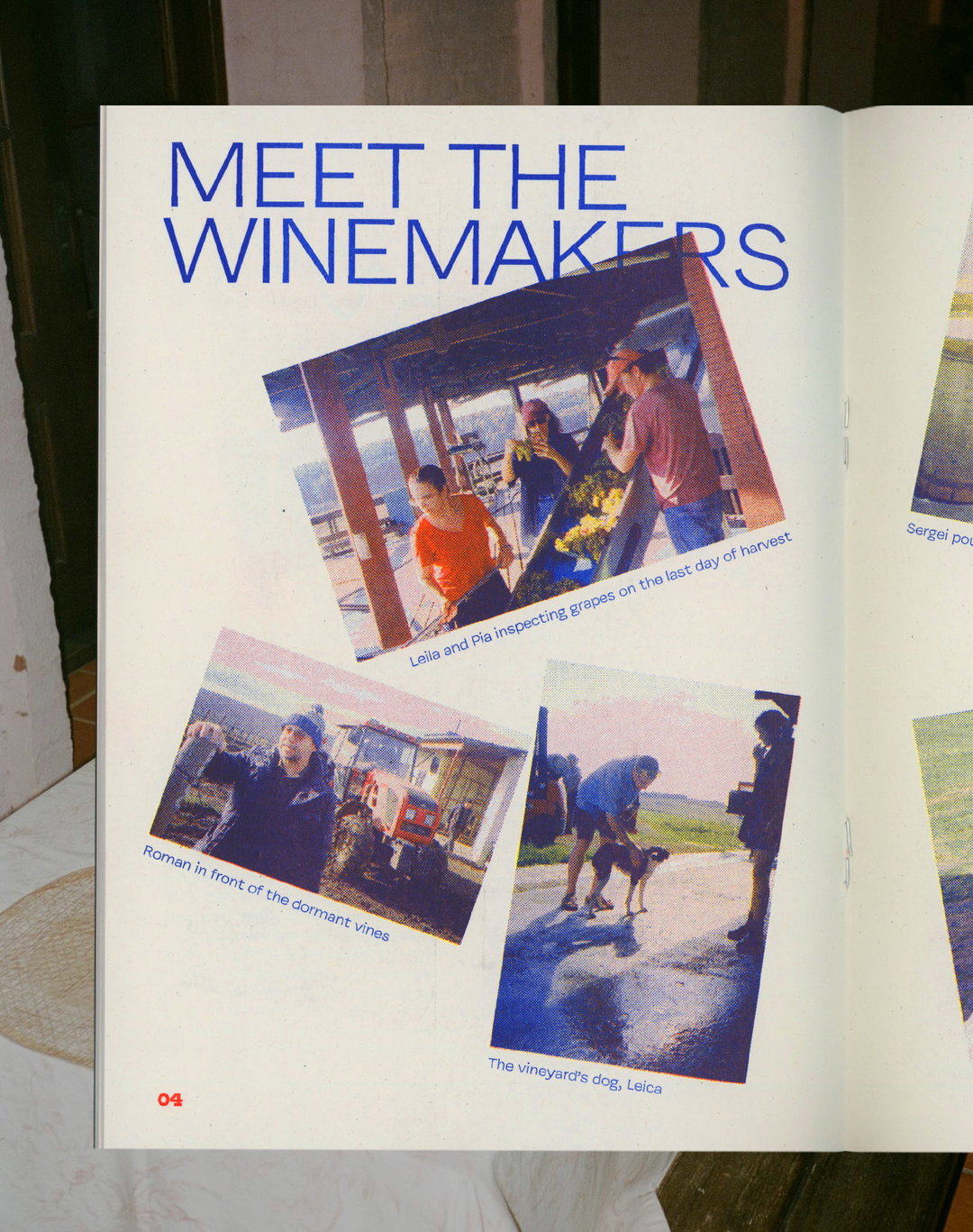
To coincide with the brand update for the wine supplier, Cash & Carry has crafted a Risograph zine featuring anecdotes, recipes and stories connected to sharing a bottle.
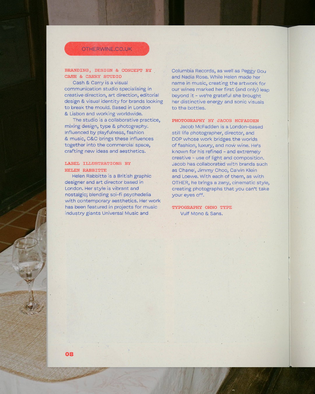
When Beatriz Cóias, founder of Cash & Carry studio, received the brief for a brand update of Other wines, she knew that even despite the tight budget, she could do something “really cool”. Having graphic elements and art direction as well as tone of voice and the name to play around with, the brief was what Beatriz describes as “well-rounded”, something she and the team could really sink their teeth into. More broadly, the wine supplier’s mission also struck a chord with Beatriz: “They offer wines that come from places we’re not used to seeing and tasting in the UK, and as an immigrant, the idea of telling people’s stories really resonated with me,” she says.
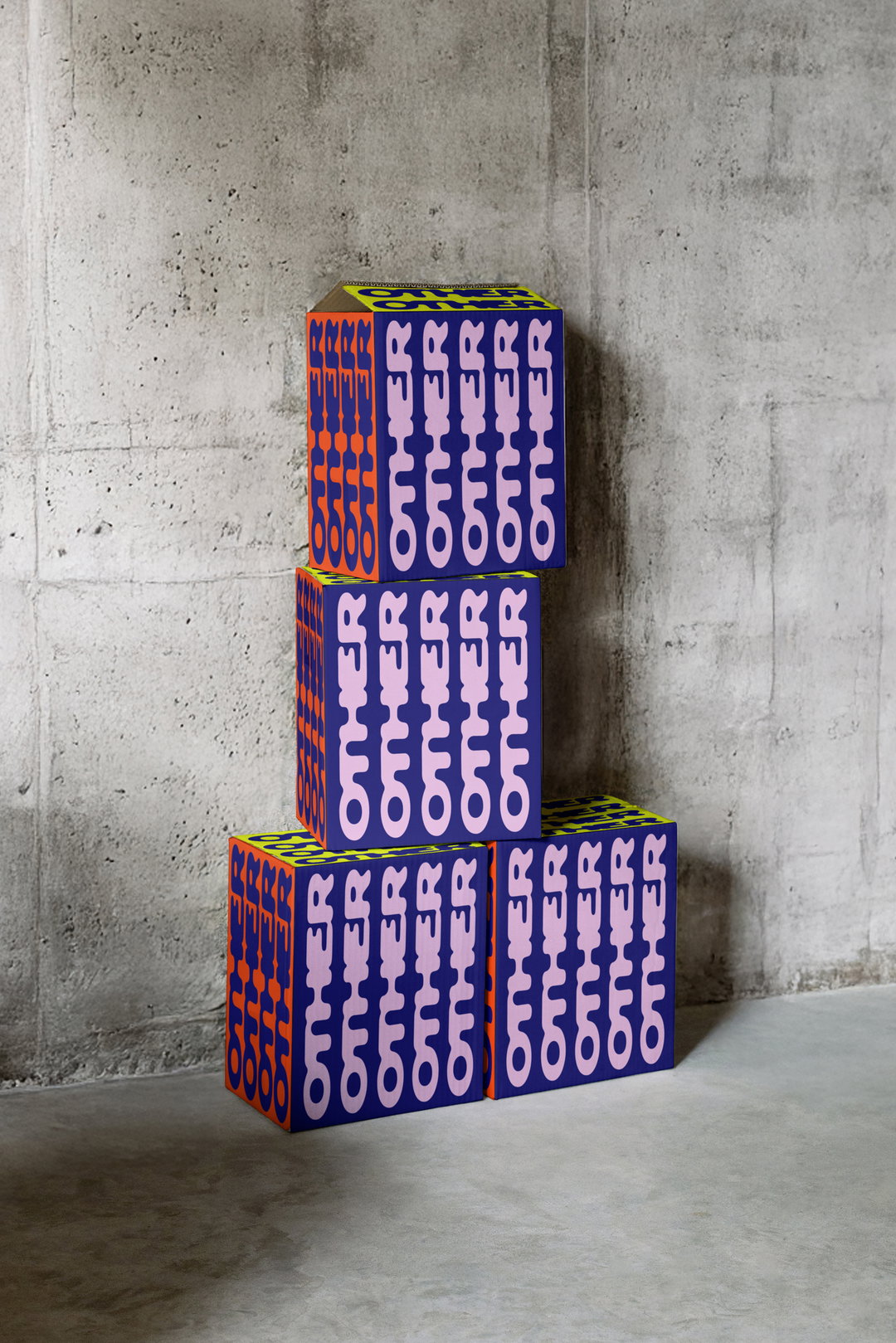
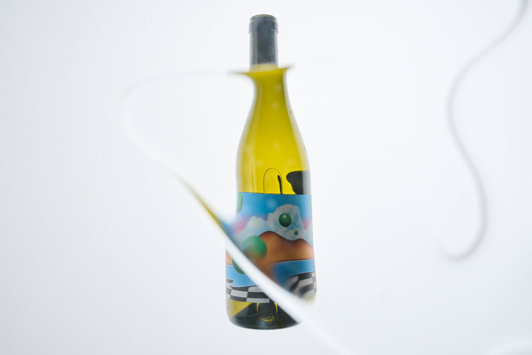
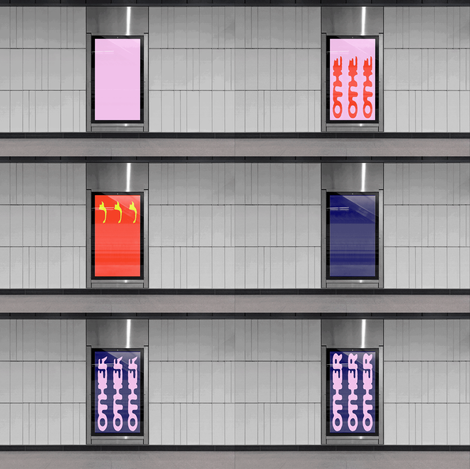
The core pillar of the project was to create something that was “perfectly imperfect”, and feels like it was made by a human hand. Sitting at its centre is its wordmark. Fluid letterforms are conjoined and stretched, resulting in a dynamic design that comes to life when animated, and directly references the product it’s selling. “The whole identity stems from the logo, which has this fluid DIY essence to it that reflects some of the small vineyards and family-run places the wine is from.”
Cash & Carry: Other (Copyright © Cash & Carry, 2025)
When in motion – and particularly when it’s also flipped on its head – the wordmark mirrors the flow of a bottle of wine, matching its seesaw pour and liquid body. As the wordmark holds such character, Beatriz says that they decided to pair it with a “very complete but fairly clean type family that didn’t feel overpowering, complemented the logo well, but still has a level of interest to it to allow us to make type-only applications”.
As a companion to the fresh identity, Beatriz and the team recently created a zine, something that felt like a “natural progression” for the brand, says Beatriz, reflecting its spirit of connection. With a core tri-colour palette of red, blue and yellow, finished on an off-white backdrop, the zine has an earthy, down-to-earth feel compared to other “luxury” alcohol supplements. This is ensured by the zine’s production, being printed via Risograph. Usually a “self-funded artist” print method, Beatriz found it refreshing to use the medium for a client project, especially in the context of “a design world that is going more and more corporate and digital”.
GalleryCash & Carry: Other (Copyright © Cash & Carry, 2025)

Hero Header
Cash & Carry: Other (Copyright © Cash & Carry, 2025)
Share Article
Further Info
About the Author
—
Olivia (she/her) is associate editor of the website, overseeing the day-to-day editorial projects as well as Nicer Tuesdays events. She joined the It’s Nice That team in 2021. ofh@itsnicethat.com
To submit your work to be featured on the site, see our Submissions Guide.




