Launch Recite Me assistive technology
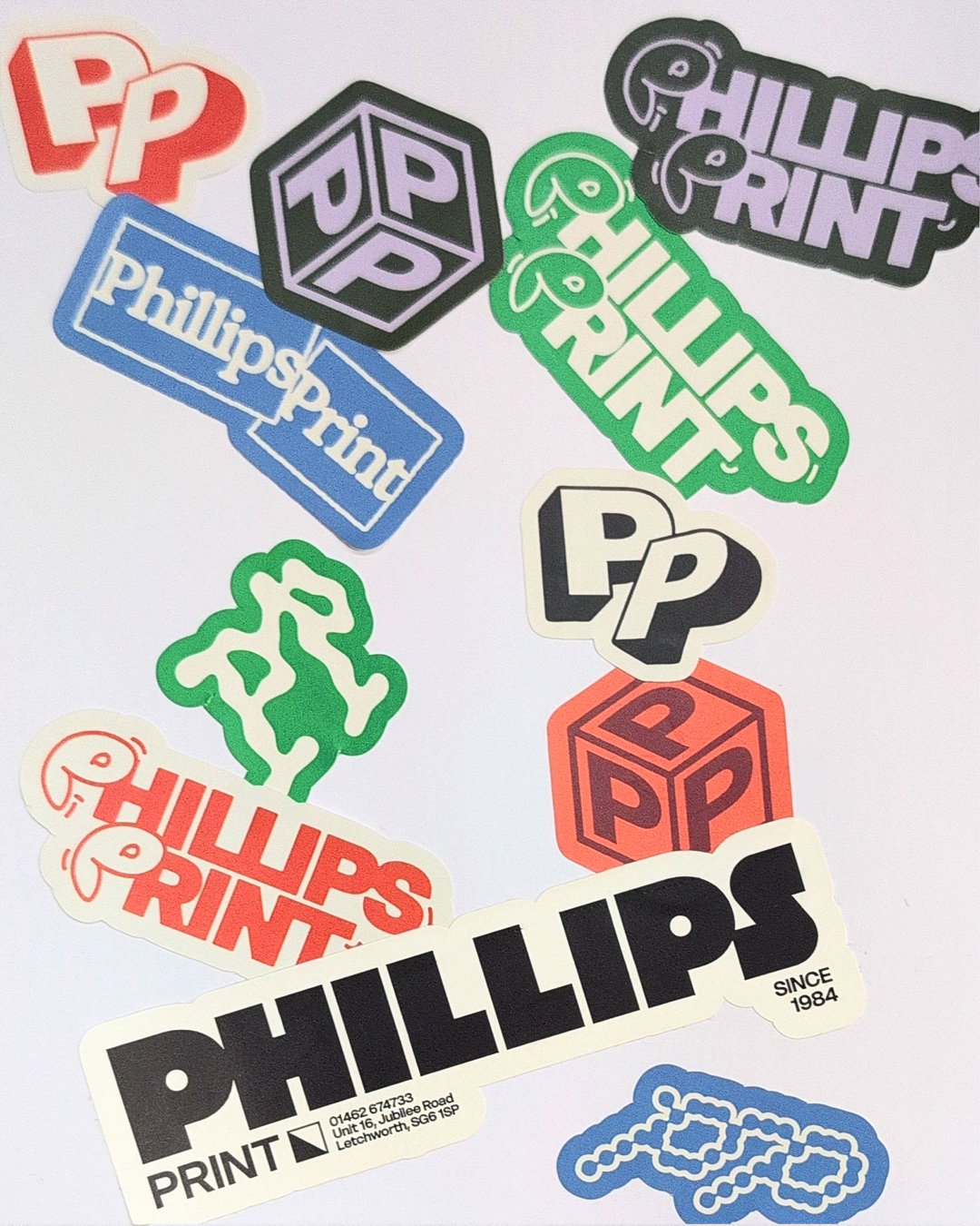
A collection of stickers for a business called Phillips Print. The stickers feature various logos and typographic styles in red, blue, green, purple and black.

Laura Clink designs a flexible identity for family-run print shop Phillips Print

Created around nine interchangeable logos and a hands-on approach to print, the designer’s new identity reflects the warmth, versatility and community at the heart of the third-generation business.

—
Date
24 August 2026

Phillips Print is a third-generation, family-run printer based just outside of London. It’s a company with a staunch ethos “built on handshakes, repeat business and knowing their customers by name”, says designer Laura Clink. When she was approached by Liam Phillips – the current director – to give the business a fresh identity, it was clear that their humble approach should be reflected in every touchpoint.

“The strength of Phillips Print is in being the opposite of a big corporate brand,” says Laura. “It’s personal, local and built around relationships, so the identity needed to capture that rather than feel overly polished.” The designer had come across Liam Phillips in the design world, so she already knew the director well. “That made the design process really collaborative, fun and playful, which I think comes across in the identity.”

GalleryLaura Clink: Phillips Print (Copyright © Laura Clink, 2026)
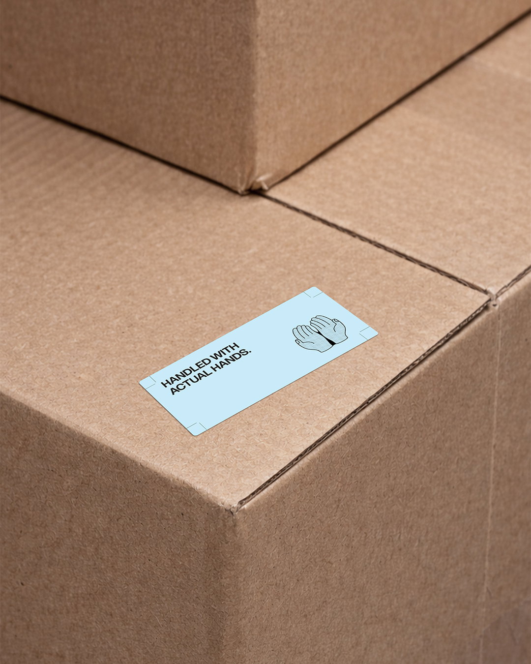
A light blue sticker is attached to a brown cardboard box. It features an illustration of two hands and the text “HANDLED WITH ACTUAL HANDS.”
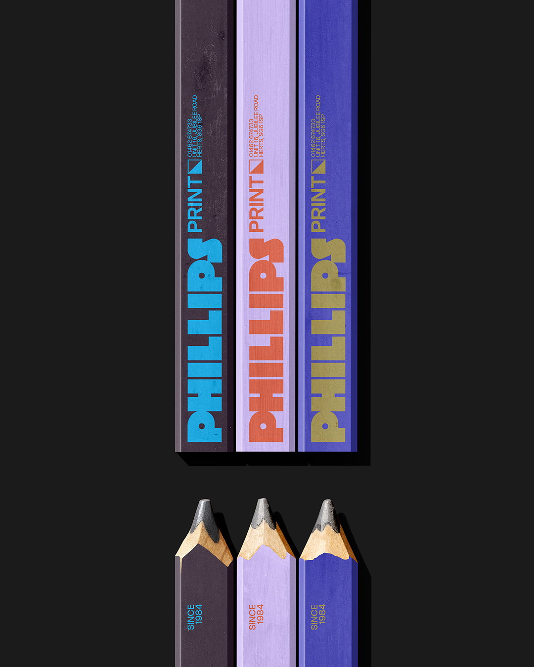
Three pencils in shades of purple and blue are arranged vertically against a black background. Each pencil features the word “PHILLIPS” in a bold, chunky typeface, followed by the word “PRINT” in a smaller font.
An animation in which a black abstract shape morphs into a dark green “pp” logo. The logo then transforms into a white version filled with diagonal black lines.

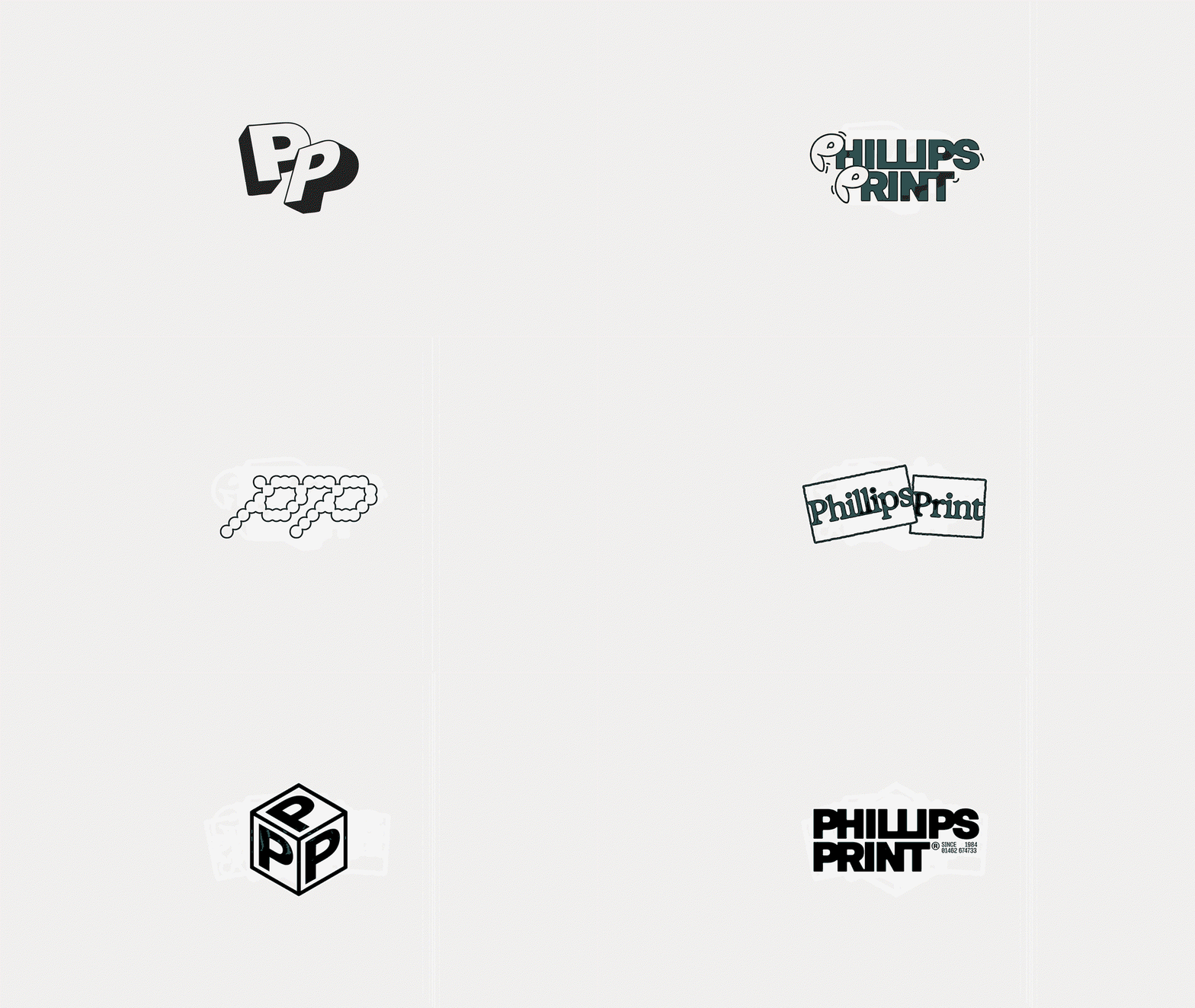
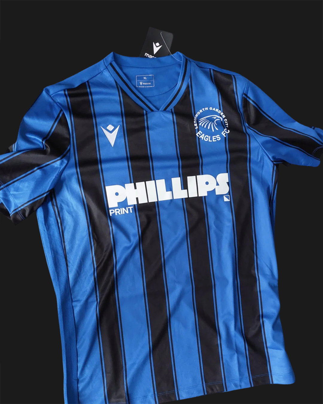
Warm and tactile, the resulting identity is made up of a flexible system with lots of different expressions. A bold but approachable custom-drawn wordmark is accompanied by nine different logos. “That flexibility really speaks to the idea of community – literally a community of logos – and brings a level of play into the identity,” says Laura. It also gives the client freedom to experiment with the identity themselves, whether it’s for company merch, or printed on football kits for their local football team – the Letchworth Garden City Eagles – which Liam played for as a kid. This versatility is completely in line with the company’s spirit of being hands-on in every project and personalised to each client’s needs.

The core deliverable was a new website, so it was important for the branding to translate easily into the digital space while holding onto its essence as a print-based company. “The benefit of having a printer as a client, though, was that Liam was super hands-on,” says Clink. “He was constantly printing flyers, stickers, merch and vinyls and sending me things as he tested them. It meant we could see how the identity behaved in the real world as we developed it, so the process became really collaborative.”

GalleryLaura Clink: Phillips Print (Copyright © Laura Clink, 2026)
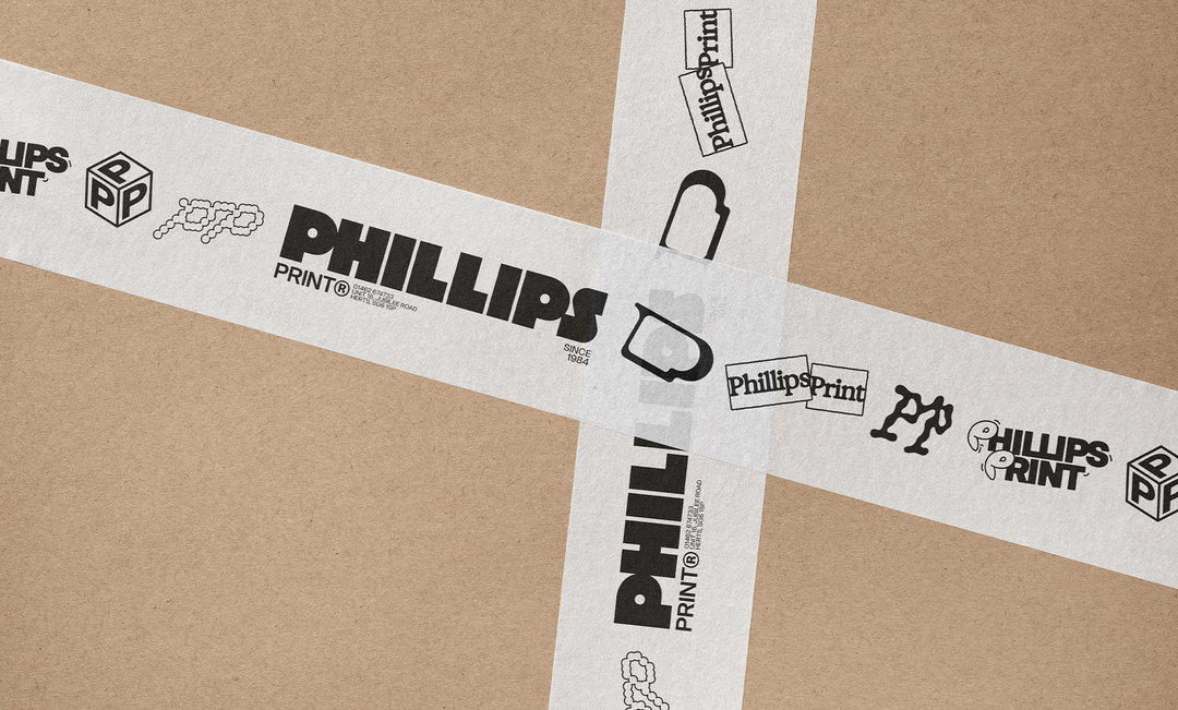
Two strips of white packing tape cross over a brown cardboard surface. The tape is printed with various black logos and the words “Phillips Print” in different typographic styles.
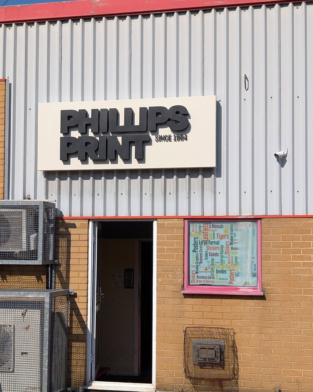
A white sign on a corrugated metal wall reads “PHILLIPS PRINT” in bold black lettering, with “SINCE 1984” in smaller text. Below, an open doorway leads into a building, next to a window filled with a colourful list of services including “Posters”, “Flyers” and “Business Cards”.
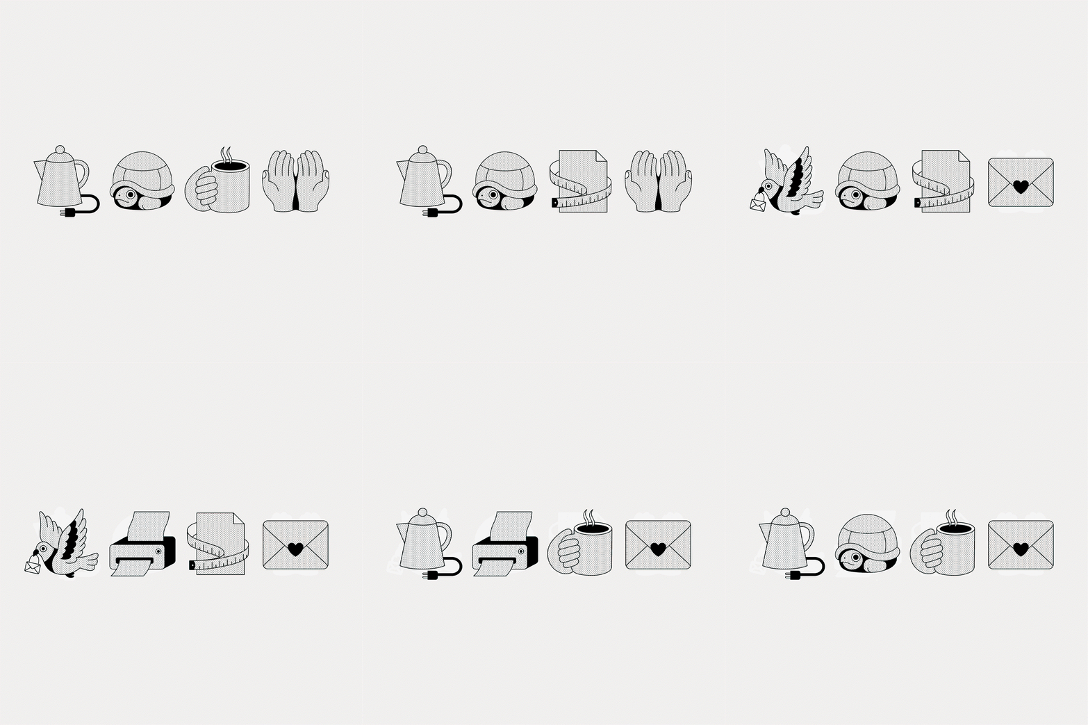
An animation of four black and white stippled icons in a row that morph into new shapes. A kettle, turtle, piece of paper with a measuring tape and two hands change into a bird, turtle, paper and a heart-sealed envelope, before becoming a kettle, printer, coffee cup and envelope.
A blue and black striped football shirt featuring the “Phillips Print” logo across the chest. A circular club crest on the left reads “Letchworth Garden City FC Eagles”.
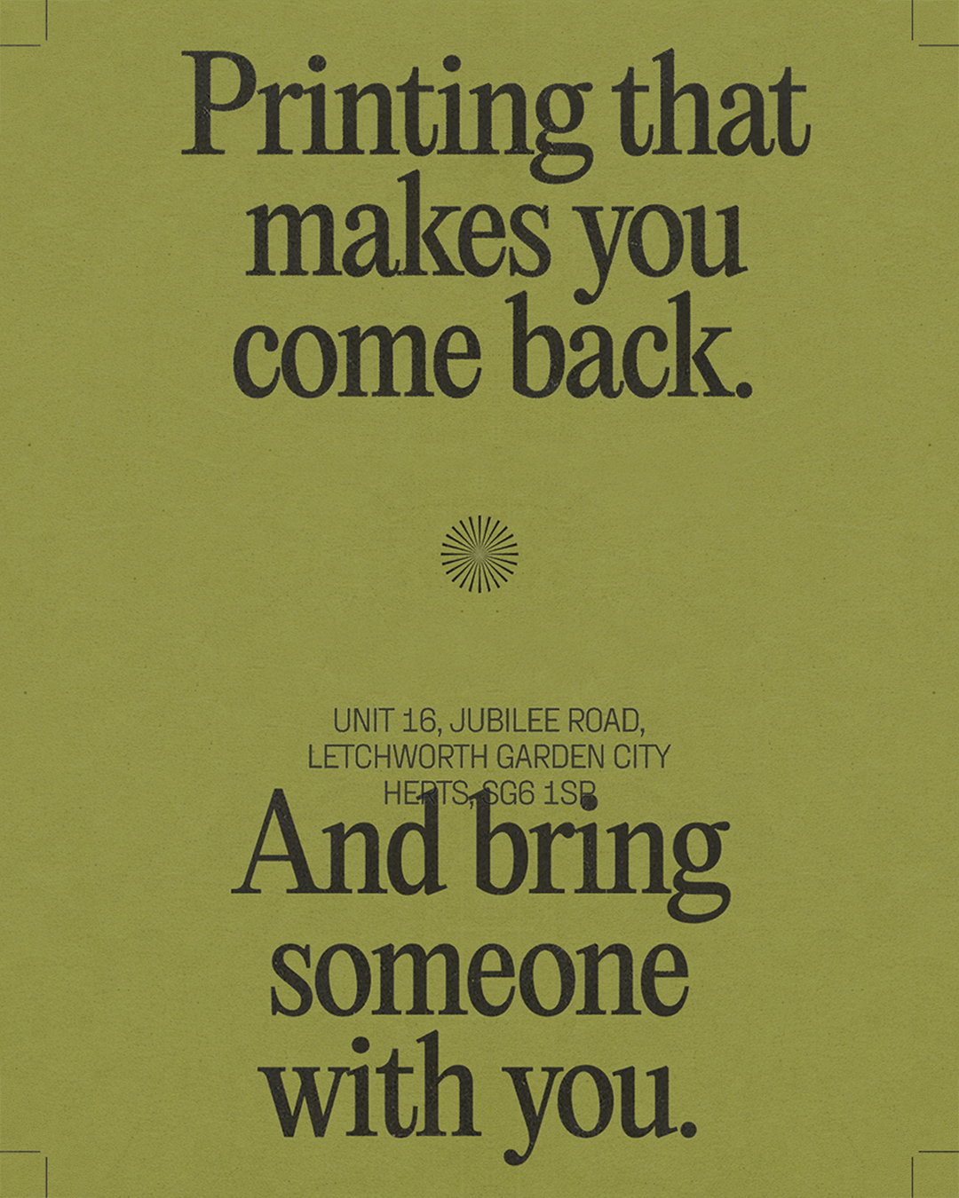
A green poster with bold, dark grey typography. It reads “Printing that makes you come back.” and “And bring someone with you.” Smaller text in the centre provides an address in Letchworth Garden City.
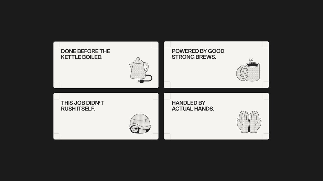
Four white rectangular cards with black text and simple line illustrations. The cards read “Done before the kettle boiled.”, “Powered by good strong brews.”, “This job didn’t rush itself.” and “Handled by actual hands.”
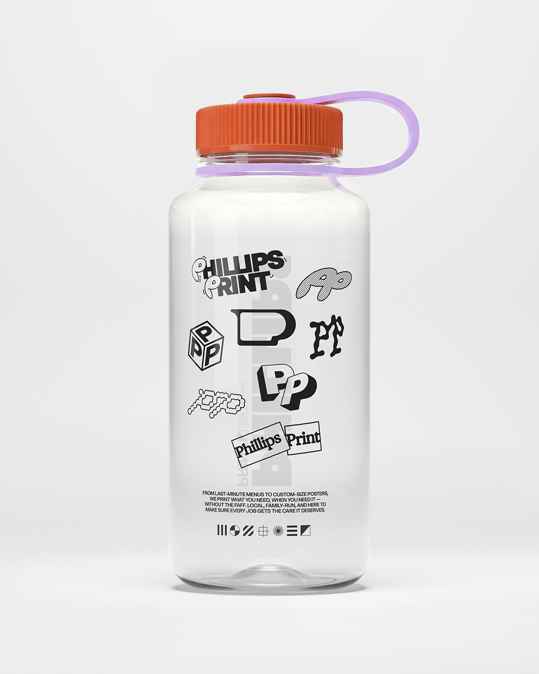
A clear water bottle with an orange lid and purple handle. The bottle is covered in various black and white logos for “Phillips Print”, including a block of text at the bottom describing their printing services.
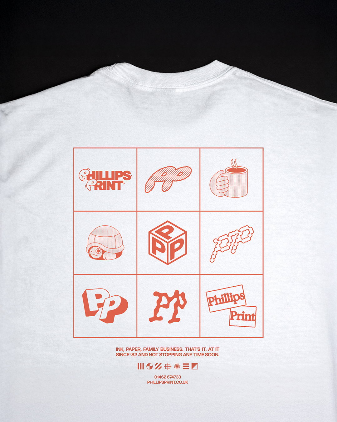
The back of a white T-shirt features a red grid of nine graphic icons. The icons include various stylised versions of the “Phillips Print” logo and a steaming mug. Below the grid, red text reads “Ink, paper, family business. That’s it. At it since ’82 and not stopping any time soon.” A phone number and the website “phillipsprint.co.uk” are listed at the bottom.
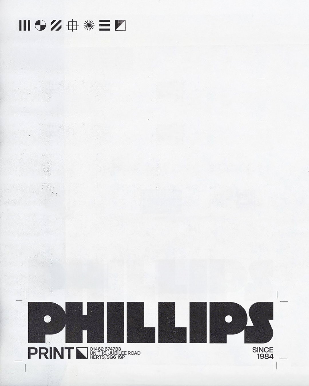
A minimalist black and white print advertisement for “Phillips Print”. The company name is written in a bold, heavy typeface across the bottom, with “Since 1984” and contact details listed below. A row of small geometric symbols sits at the top of the page.

Hero Header

Share Article

Further Info

About the Author

Marigold Warner

—

Marigold Warner is a British-Japanese writer and editor based in Tokyo. She covers art and culture, and is particularly interested in Japanese photography and design.

It's Nice That Newsletters

Fancy a bit of It's Nice That in your inbox? Sign up to our newsletters and we'll keep you in the loop with everything good going on in the creative world.