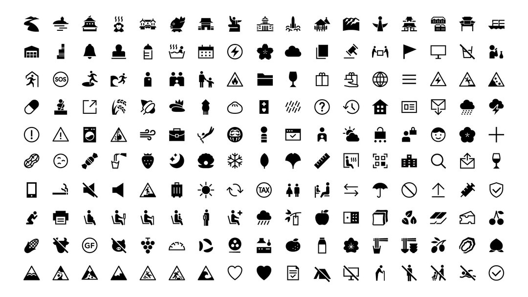
This exhibition showcases the universal language of Japanese pictograms
“By distilling complex ideas into simple, elegant visuals, Japanese designers set a precedent for design as a force for problem-solving and innovation. Design is a very powerful tool.”
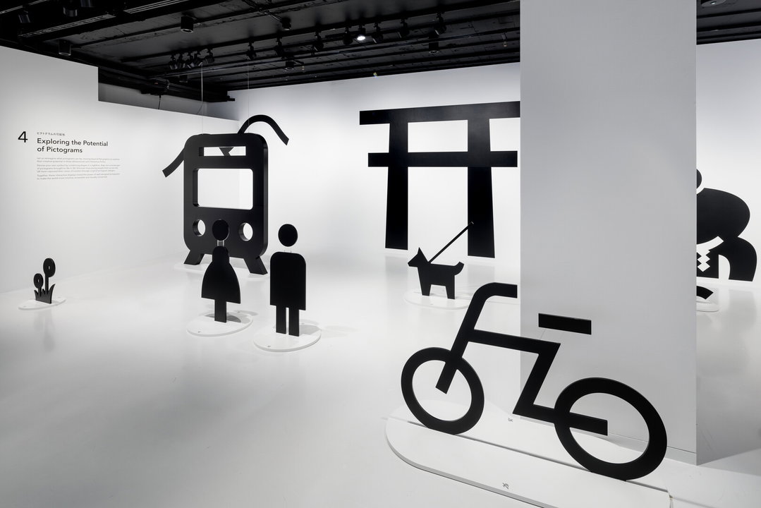
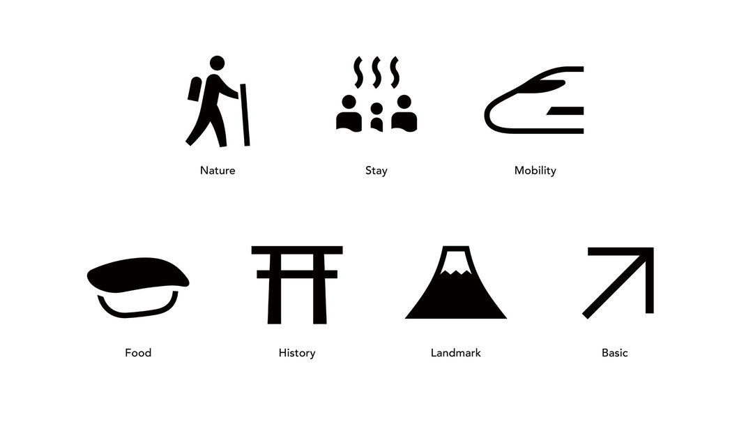
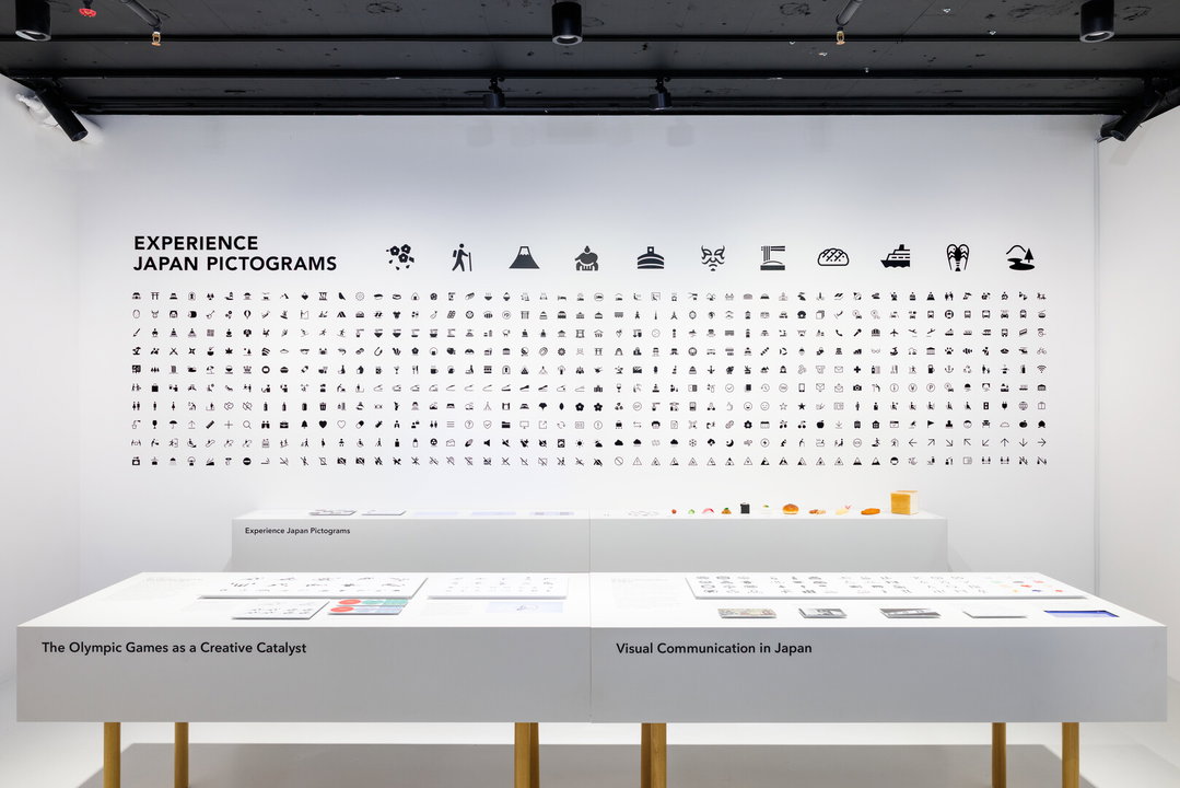
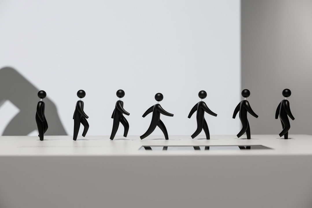
“In Japan, our language is not phonetic,” says Daikoku Daigo, curator of Japan House’s Pictograms exhibition in London. “We take a visual-led approach.” Pictograms are old school graphic design – pictures and symbols that represent data, the most recognisable pictograms are the classic “male” and “female” symbols on bathroom doors or road safety signs, or even those seen at the Olympics, which are beautifully customised every quadrennial. In essence, pictograms are a universal language that is woven deep into the fabric of our everyday lives, as the new exhibition demonstrates.
In the 1964 Tokyo Olympic Games, Japan made a grand reintroduction to the post-war world. An emblem of recovery and economical revitalisation, the games became a symbol of their own. For Japan, it was a pivotal moment to reclaim its place on the world stage. “But there was one obstacle: language,” says Daikoku. “With thousands of athletes, officials, and visitors arriving from around the globe, how could the host nation ensure clear communication without relying solely on words? The answer came in the form of a universal language – pictograms.” Developed specifically for the Olympics, Yasaku Kamekura’s logo and posters became truly revolutionary in how design permeates throughout the biggest sports event of the year. They didn’t just decorate the Olympics, “they solved a global communication challenge”.
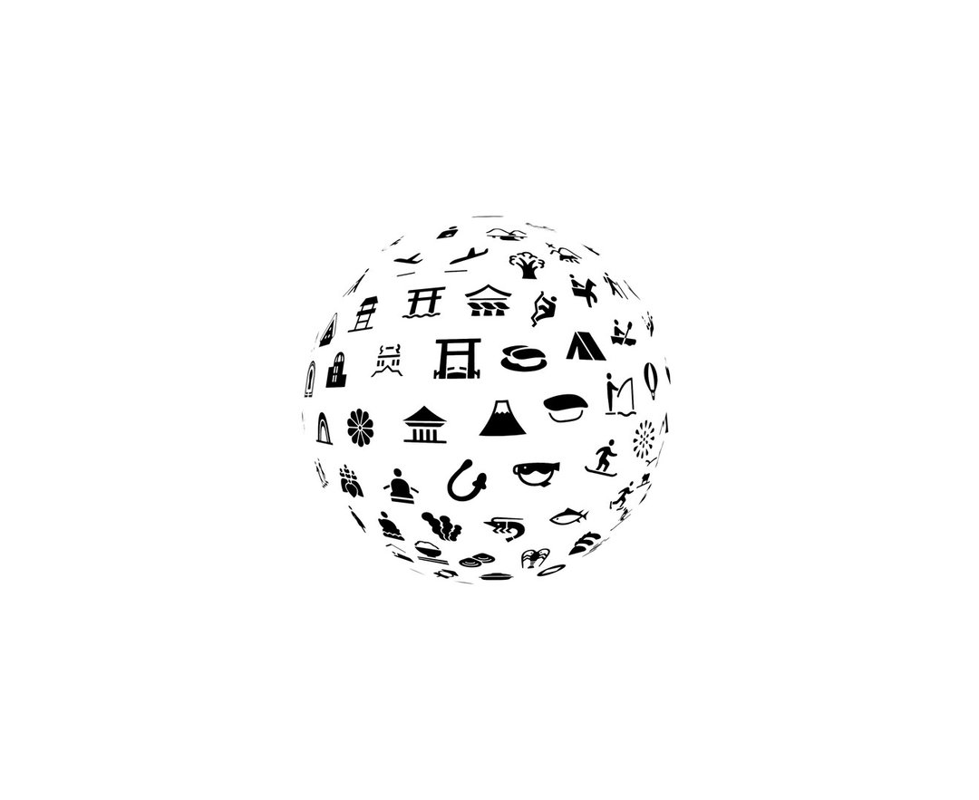
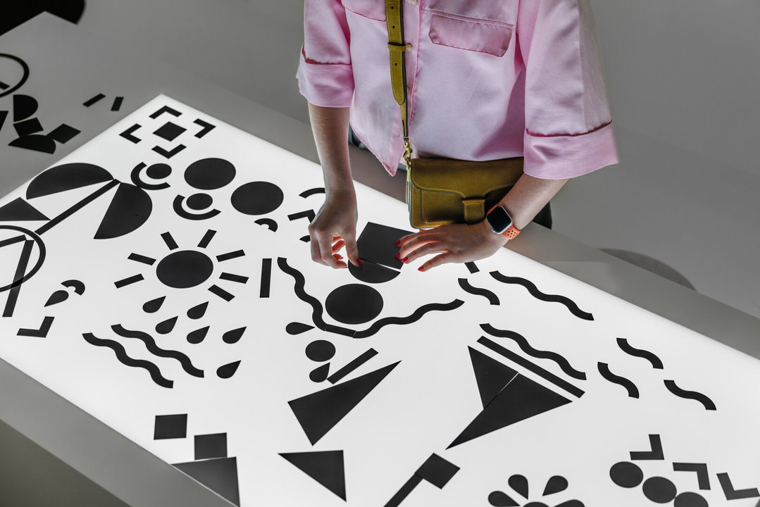
One portion of the exhibition, titled ‘My London’, is a pictogram making competition featuring designs from young people from the United Kingdom. Although pictograms are universal, they can contain local design language – with widespread symbols having different connotations across cultures. Aiming to centre designers who have lived experience in London, the exhibition asked local students to identify their city’s possible icons – once they conceptualised and sketched their pictograms, the designers working with the exhibition completed them. The Japanese designers learned about London throughout this process: “For instance, Tower Bridge opens its gates for vessels and boats. This is an important fact for London residents, but our designers have never seen the bridge gates open,” says Daikoku. “We drew Tower Bridge with the gates closed first. Local staff and students pointed out that it is important to depict the gates open. Local students retained the essence of London and taught us many lessons.”
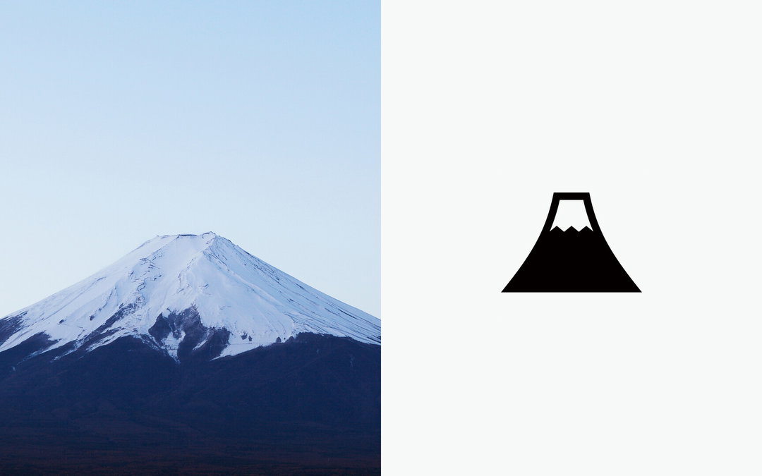
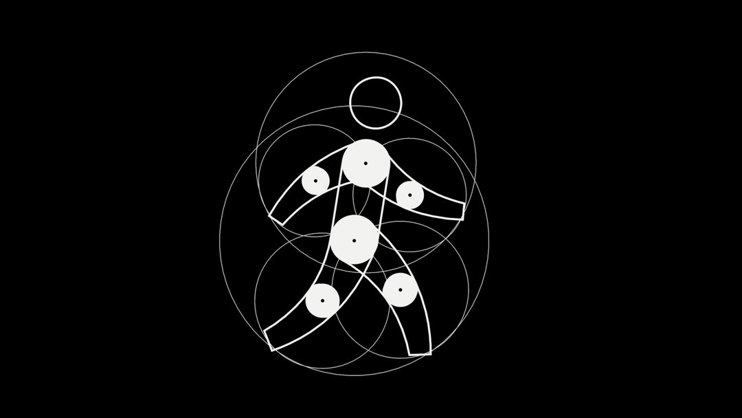
The exhibition also argues for what makes a good pictogram, which Daikoku says should go “beyond pure functionality”, and achieve a deeper level of impact and connection with the viewer. Working with the Digital Agency, the newest ministry in Japan since 2021, the teams collaborated on their mission to accelerate digital transformation to improve people’s lives, such as streamlining public administration and bridging the digital divide. It’s important for this reason to connect to old and young generations in order to encourage friendly communication.
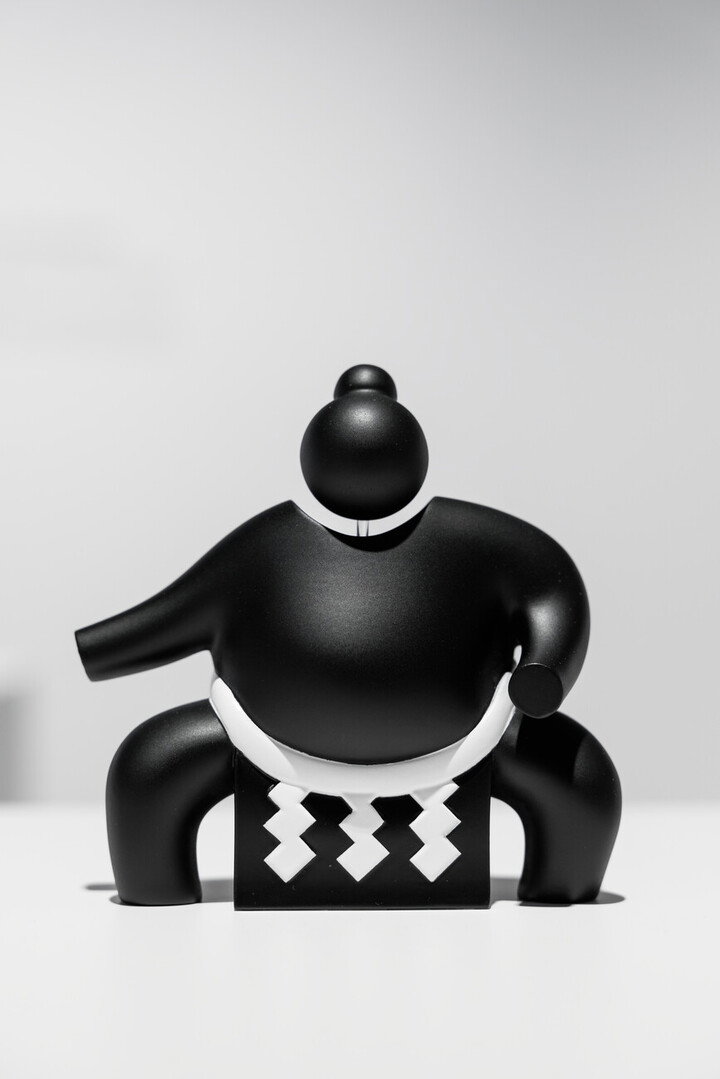
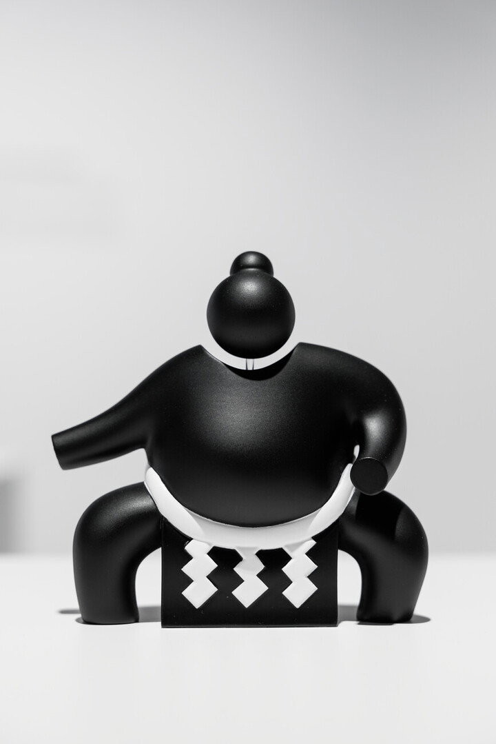
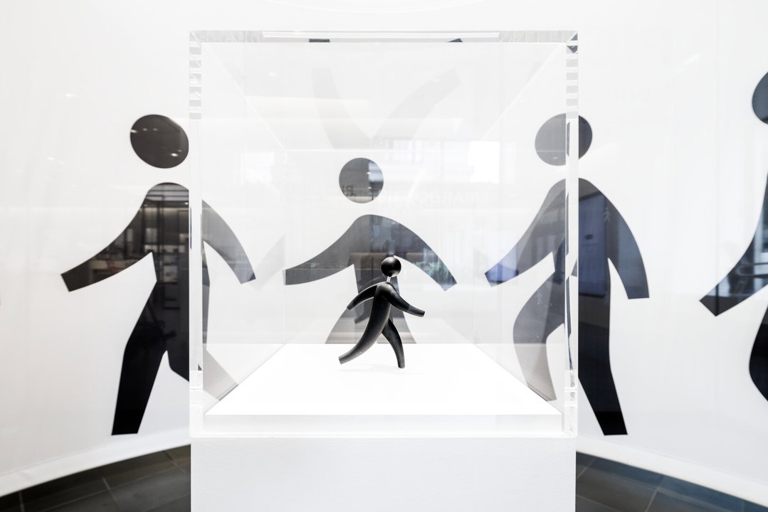
During the process of curating the exhibition, Daikoku and his team of designers developed motion graphics to convey Japanese etiquette, experimented with 3D printed pictograms and even life-size pictograms for visitor immersion. Given the high usage of emojis and even “kaomojis” (Japanese emoticons) across the world, it seems our cultures have moved towards pictograms more and more, not just to avoid language barriers and danger, but also to express emotions in simple pictorial fashions. Japan House’s Pictograms is a welcoming spotlight on the benefits of our image based languages rather than an indictment.
Gallery(Copyright © Japan House London, 2025)
Hero Header
(Copyright © Japan House London, 2025)
Share Article
Further Info
About the Author
—
Paul M (He/Him) is a Junior Writer at It’s Nice That since May 2025. He has a strong interest in graphic design, digital kitsch, multimedia painting, collage, nostalgia, analogue technology and all matters of strange stuff. pcm@itsnicethat.com
To submit your work to be featured on the site, see our Submissions Guide.