




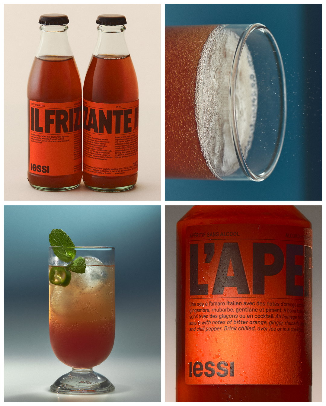
This non-alcoholic aperitif branding takes tips from Italian traditions
The design team behind iessi share how they created a luxurious visual look that was “unapologetically” alcohol-free.
Unlike years past, it’s now pretty easy to get your hands on a non-alcoholic beverage. No-secco is a staple on supermarket shelves, fancy alcohol-free gins taste remarkably like their counterpart, and some pubs have even started testing out 0 per cent beer pumps. But one alcoholic strand that is still yet to make a convincing transition is that of aperitifs – that’s even despite their recent ‘Negroni Sbagliaaato’-induced surge in popularity.
This gap in the market was one noticed by iessi founder Nicolas Maiarelli. Over time his relationship with alcohol had changed; he had realised that it wasn’t the alcohol in aperitifs that he was drawn to, but instead the “complex flavours and tastes”. Being born in Italy and coming from a large Italian family, Nicolas was a keen aperitif drinker – a staple beverage in the country’s culinary culture. But growing up in the US – where non-alcoholic alternatives are more popular – he began to see the potential for an alcohol-free aperitif, compelling him to return to the amaro recipe honed by his Friulan nonna.
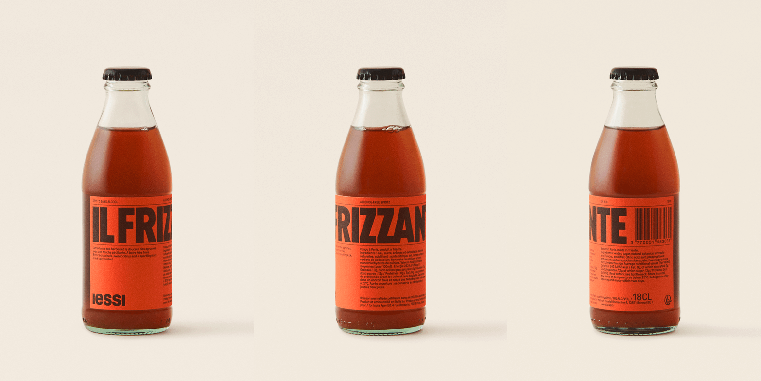
Maiarelli Studio & Florent Gomez Siso: iessi Brand Identity (Copyright © Maiarelli Studio & Florent Gomez Siso, 2023)
The familial collaboration on iessi doesn’t end at the drink itself as Nicolas enlisted the help of his father Giona Maiarelli – former designer at the studio of Milton Glaser and Walter Bernard and co-founder of Maiarelli Studio – to creatively direct the project. From the get-go Giona knew that the overall visual look needed to be in its own distinct category, removed from other drinks like wine and spirits and soft drinks too, to avoid any compartmentalisation. Moreover, being an Italian recipe, the design needed to nod to the country, though subtly. “We wanted to pay homage to Italy without riding on the coattails of typically ‘Italian’ imagery,” Giona says. “Our hope is that iessi would feel contemporary and comfortably at home anywhere in the world.” When passing on his vision to Giona, Nicolas insisted on a very limited palette of colours and few decorative elements, instead turning focus to printing techniques and high quality paper, all to ensure an element of luxury.
As Maiarelli Studio exists as a small studio, Giona advised Nicolas to enlist some additional able hands, and the pair turned to some of the studio’s past employees and interns.
Florent Gomez Siso, a designer currently working at Pentagram London, was enlisted as creative director and designer for the brand identity and label design, bringing a clear typographic vision with him. The brand’s name and logo is bold, and its sleek custom headline font, iessi Sans, is inspired by the French painter, commercial poster artist and typeface designer Cassandre. The single weight GT Pressure that is used to display information throughout is a modern font that allows the product name and logo to take centre stage. In terms of colour, Florent explains that the bright orange was a very conscious choice, rather than trying to contrast with the liquid in the bottle, the aim was instead to compliment it, a choice which “gives the bottle a lot of presence whether it is displayed in a bar, a living room or on a shelf,” Florent says.
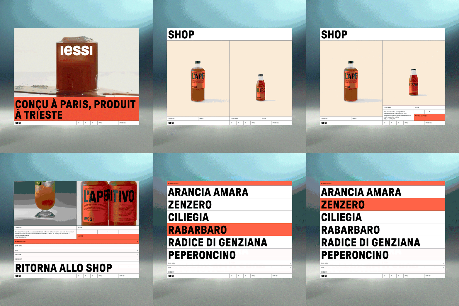
Leila Čičić: iessi (Copyright © Leila Čičić/Web Development by Oliver Buckley - TAW Vision/Photography by Alecio Ferrari, 2023)
A new product on any market needs a impactful website, and Leila Čičic – a designer and art director who’s worked at the likes of &Walsh and Bureau Borsche – was the perfect person for the job. Primarily, the website took inspiration from the bottle itself, specifically the label. The objective, Leila says, was to create a user experience that focussed heavily on the products. “This involved maintaining bold and unmistakable indications through impactful headlines, subtle uses of colour to underscore the brand, trilingual options to speak to the iessi heritage, and sleek lines for organisation,” says Leila. One decision Leila sees as “significant and potentially controversial” is the decision to keep the entire website white, a further effort to let the products shine.
Alongside these core design elements, Giona sees the teaser poster campaign as being integral to getting the new beverage off the ground. To create something striking, the art director and set designer Laura Doardo and photographer Alecio Ferrari created “at once richly saturated and clean-lined” images, with hints of 70s retro Italia, and a capitalised Pressura by Grilli Type headed up the designs, intended to emulate the letters stamped on shipping boxes, Giona says.
Nicolas and Giona wanted to create a brand that was both beautiful and “unapologetic”; a product that didn’t need to justify its lack of alcohol, nor need to be virtuous, claiming moral superiority over such drinks – a goal they’ve certainly achieved.
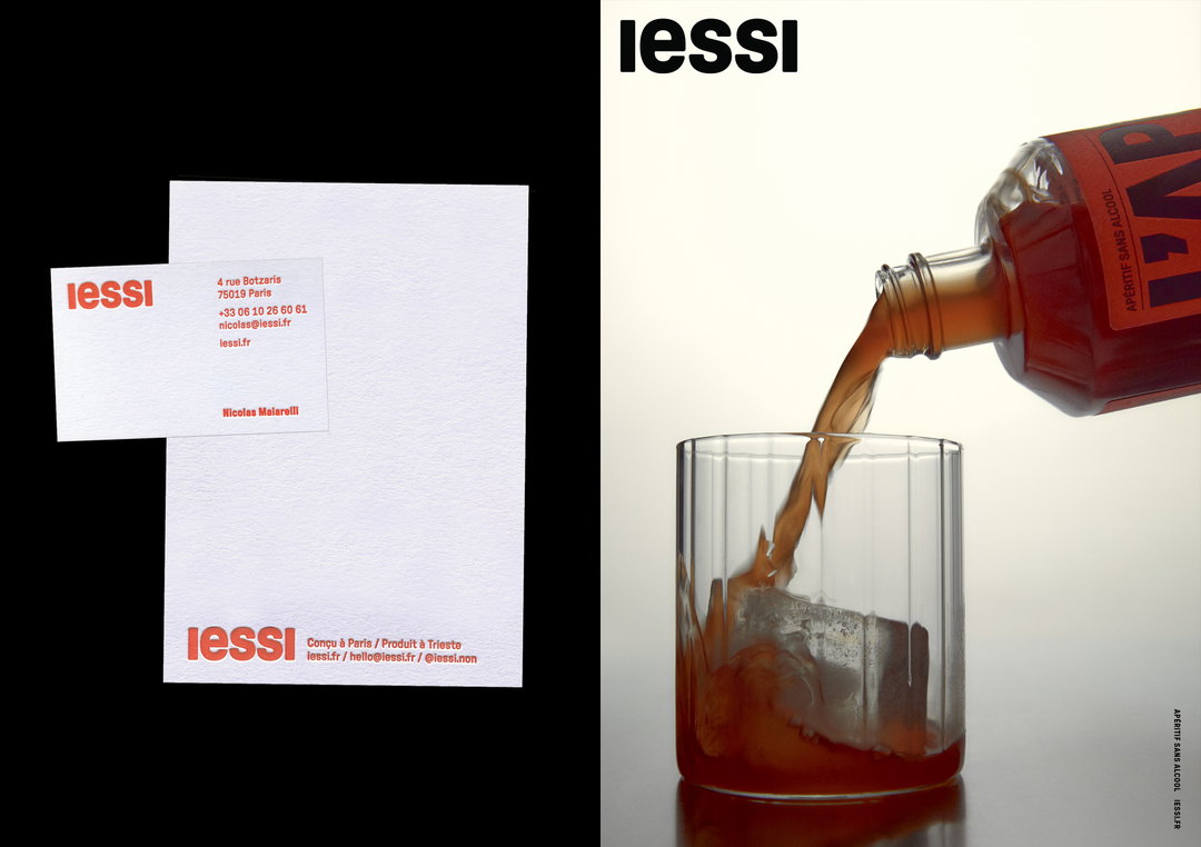
Maiarelli Studio & Florent Gomez Siso: iessi Brand Identity (Copyright © Maiarelli Studio & Florent Gomez Siso, 2023)
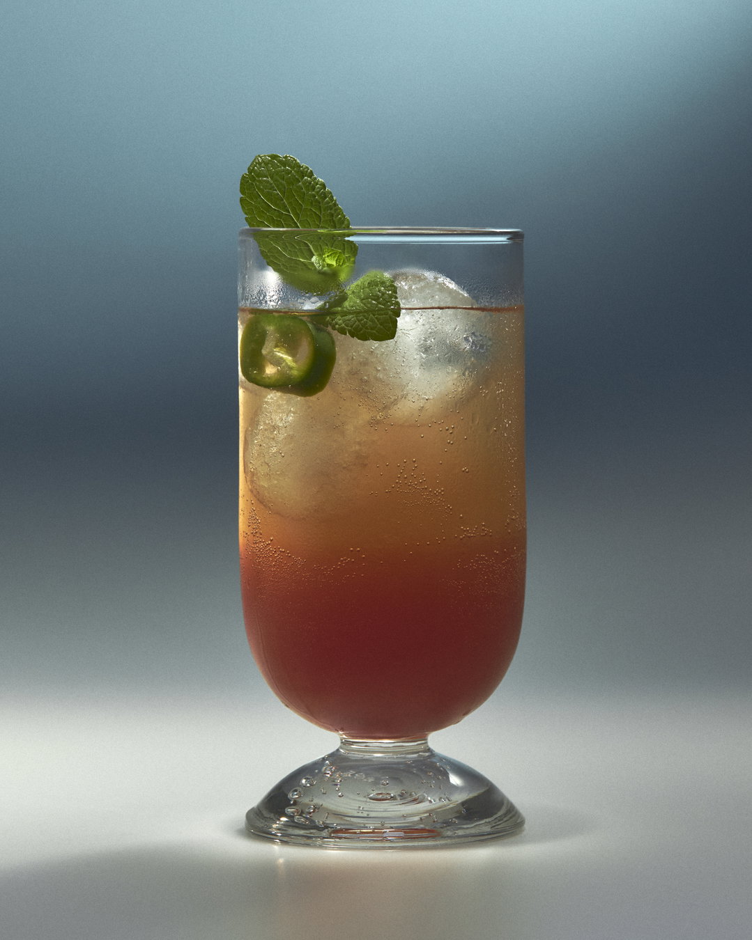
Alecio Ferrari: iessi Photography Copyright © Alecio Ferrari, 2023)
Alecio Ferrari: iessi Photography Copyright © Alecio Ferrari, 2023)
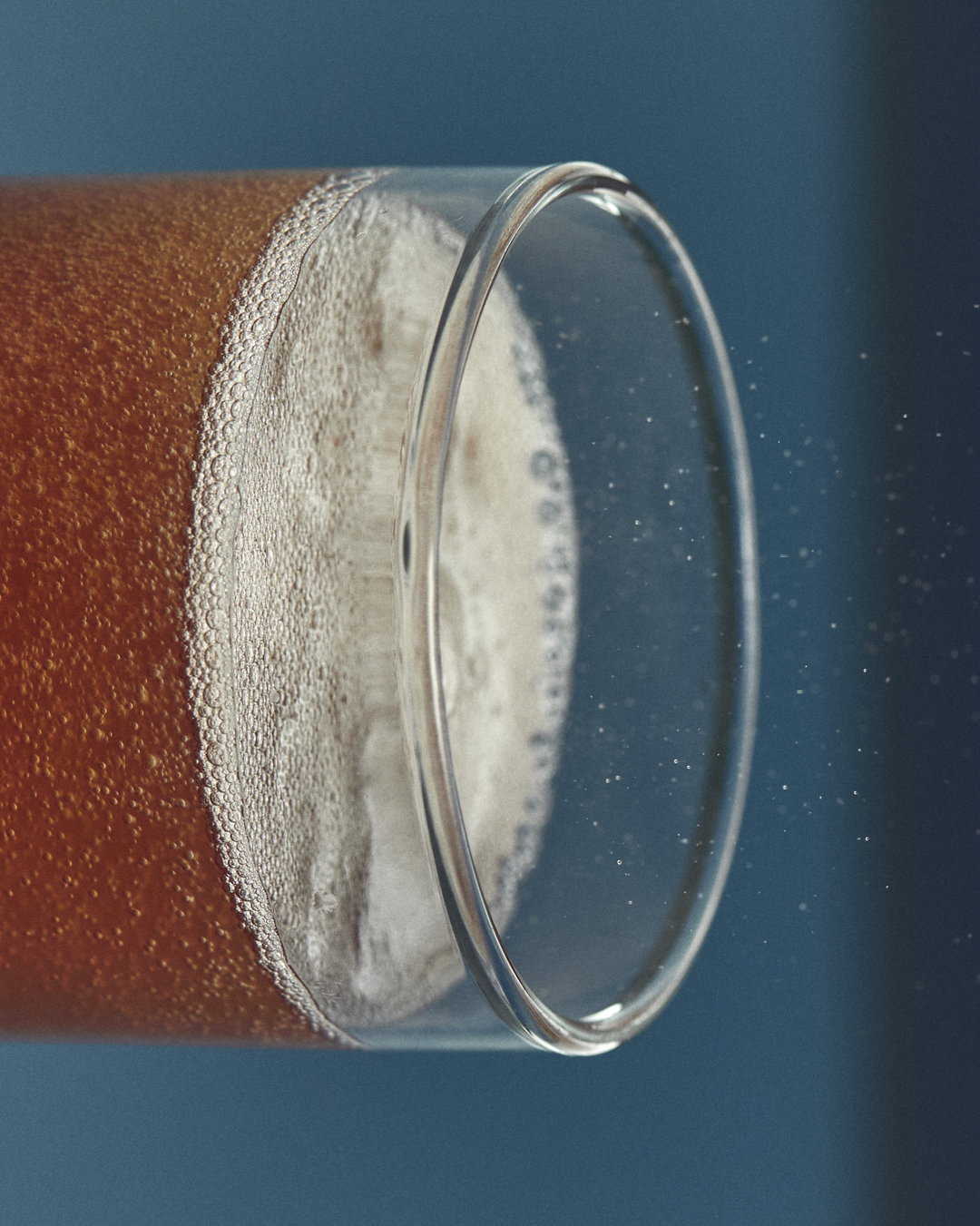
Alecio Ferrari: iessi Photography Copyright © Alecio Ferrari, 2023)
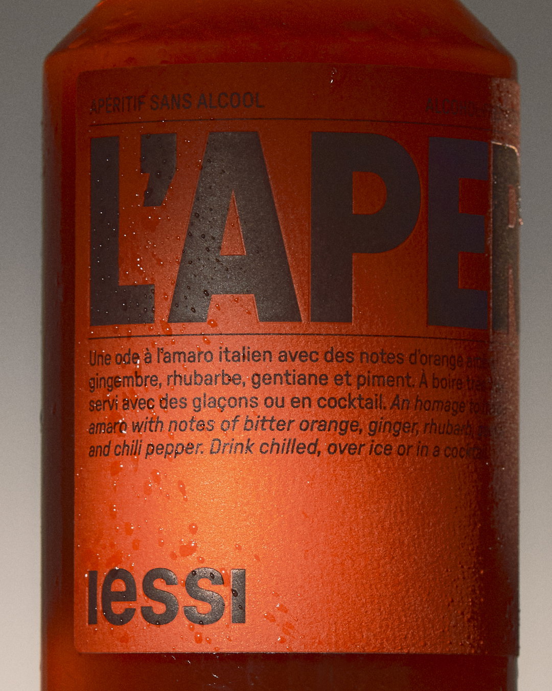
Maiarelli Studio & Florent Gomez Siso: iessi Brand Identity (Copyright © Maiarelli Studio & Florent Gomez Siso, 2023)
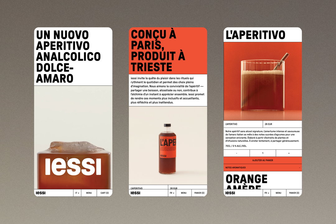
Leila Čičić: iessi (Copyright © Leila Čičić/Web Development by Oliver Buckley - TAW Vision/Photography by Alecio Ferrari, 2023)
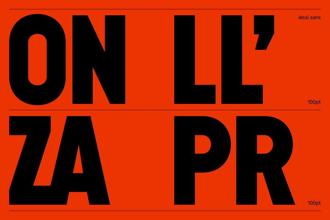
Florent Gomez Siso: iessi (Copyright (c) Florent Gomez Siso, 2023)
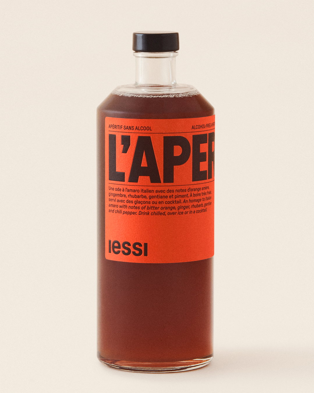
Maiarelli Studio & Florent Gomez Siso: iessi Brand Identity (Copyright © Maiarelli Studio & Florent Gomez Siso, 2023)

Florent Gomez Siso: iessi (Copyright (c) Florent Gomez Siso, 2023)
Hero Header
Maiarelli Studio & Florent Gomez Siso: iessi Brand Identity (Copyright © Maiarelli Studio & Florent Gomez Siso, 2023)
Share Article
Further Info
Credits
Creative Direction & Design by Maiarelli Studio & Florent Gomez Siso
Brand Identity by Florent Gomez Siso
Web Design by Leila Čičić
Web Development by Oliver Buckley - TAW Vision
Translation by Khaoula Zouine - Common Courtesy Studio & Alessandra Maiarelli
Photography by Alecio Ferrari
Set Design by Laura Doardo
Video by Michele Foti
About the Author
—
Olivia (she/her) is associate editor of the website, overseeing the day-to-day editorial projects as well as Nicer Tuesdays events. She joined the It’s Nice That team in 2021. ofh@itsnicethat.com
To submit your work to be featured on the site, see our Submissions Guide.





