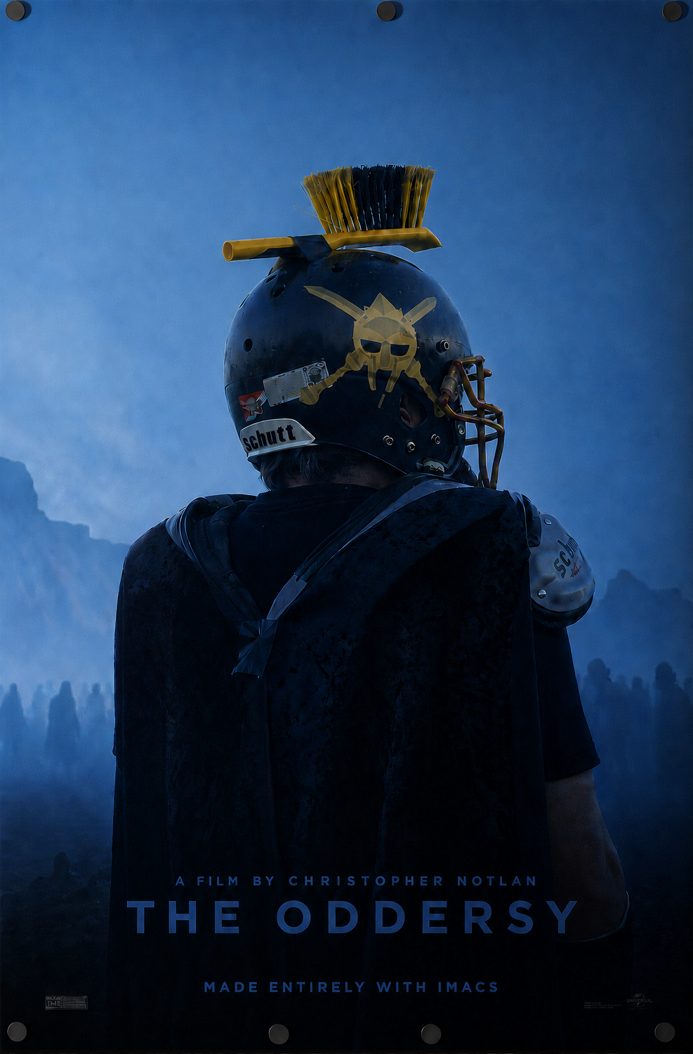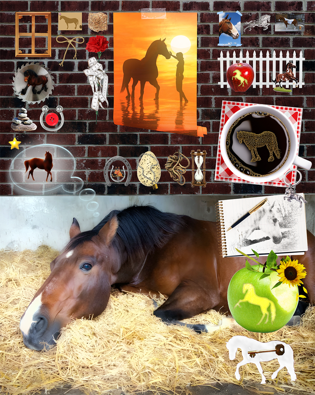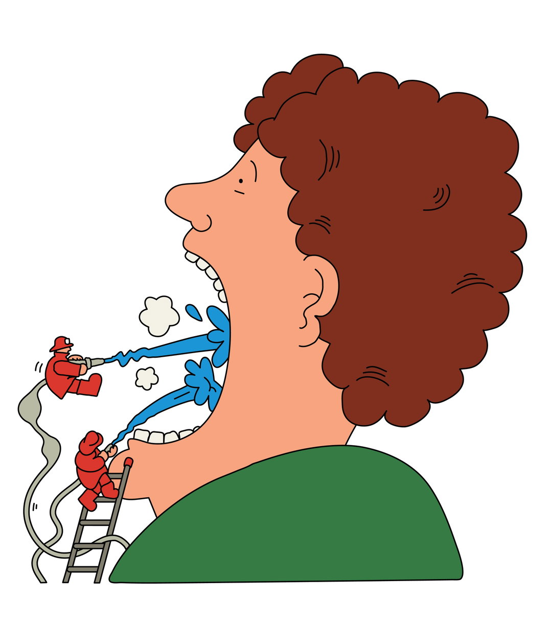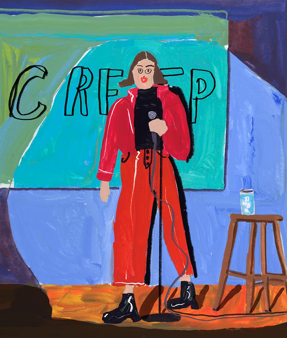
Hunter Harvey’s “text paintings” are graphic parodies where the typeface is the main character
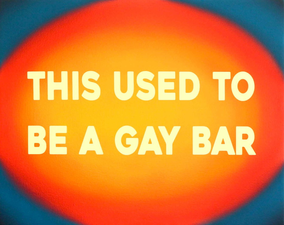
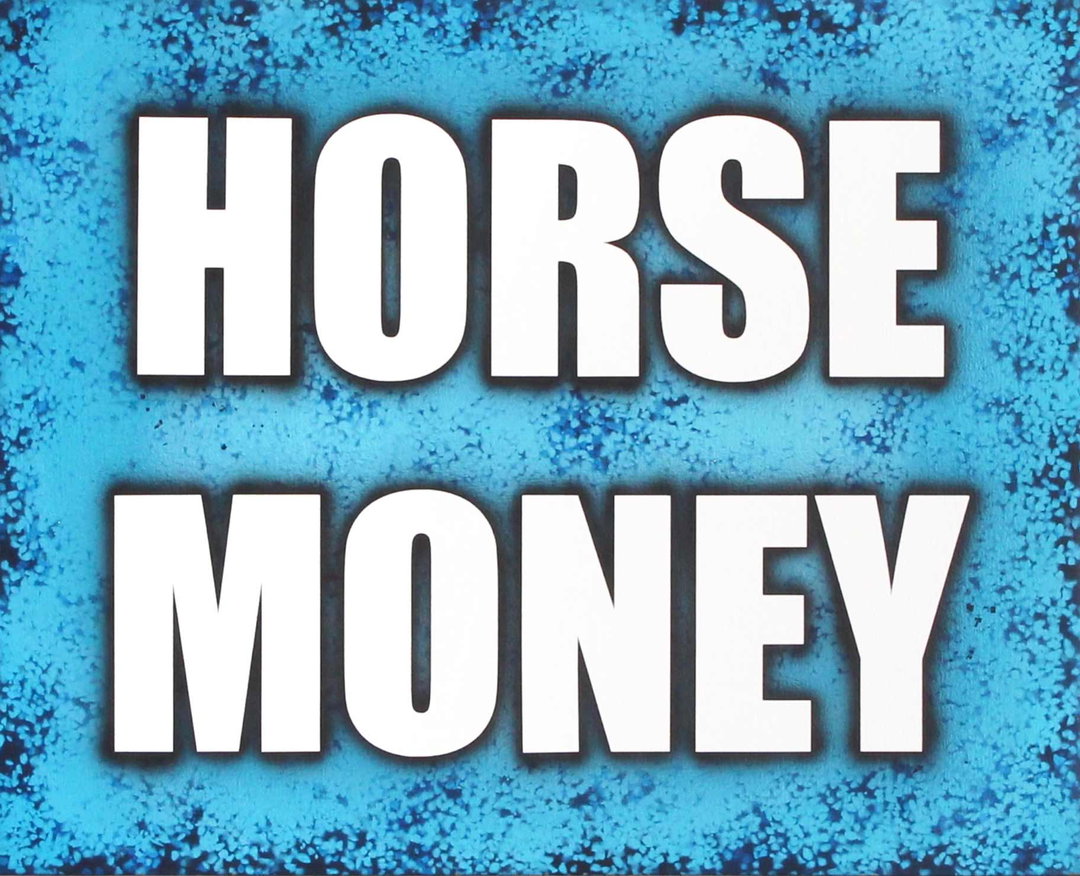
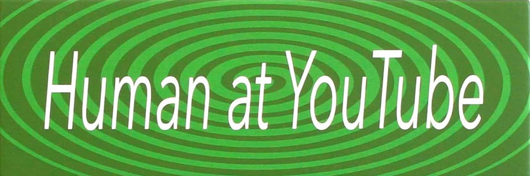
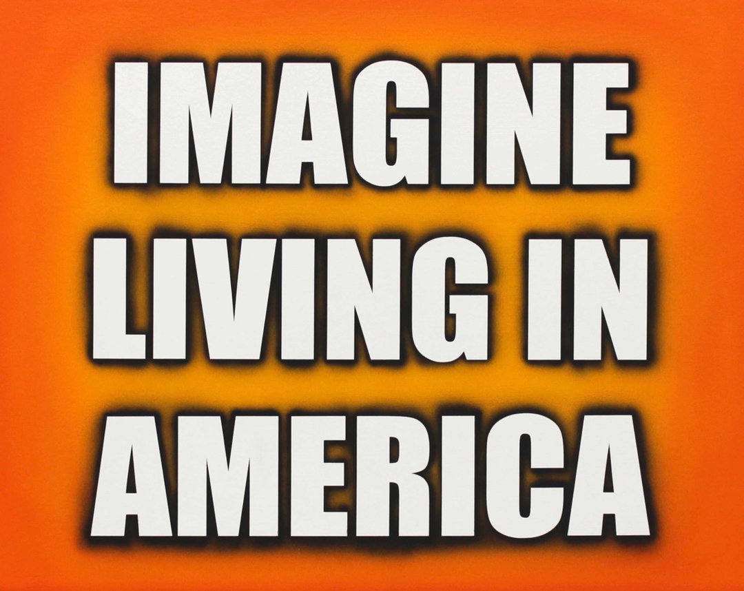
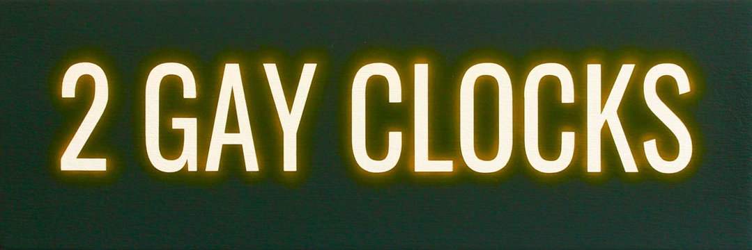
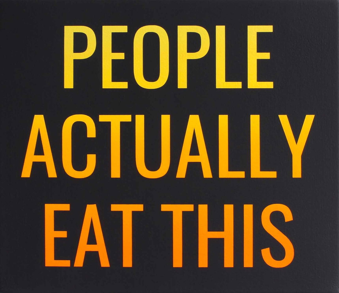
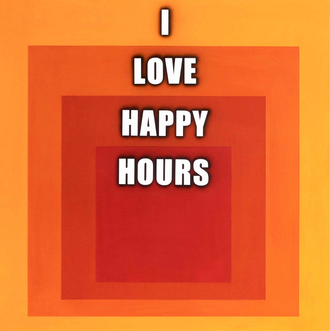
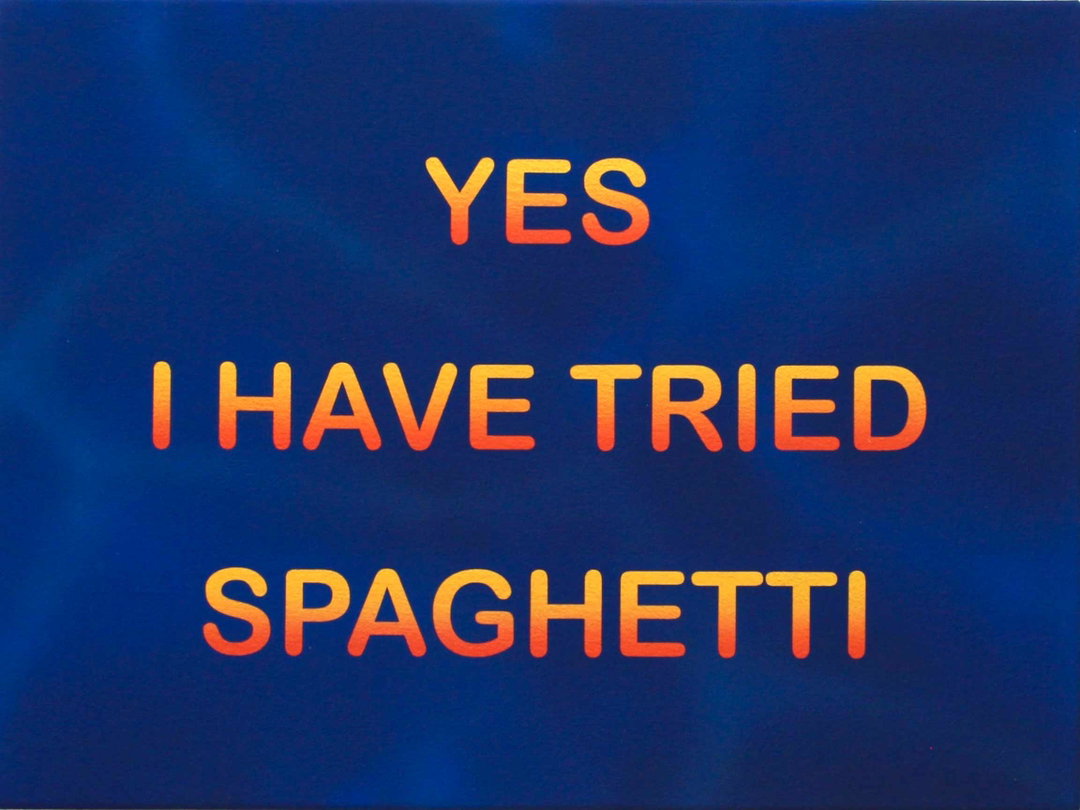
A mix between bumper stickers, overheard conversations, billboards and Microsoft Powerpoint graphics, these unique paintings seem straight to the point, but conceal hidden meanings about the aesthetic functions of type design.
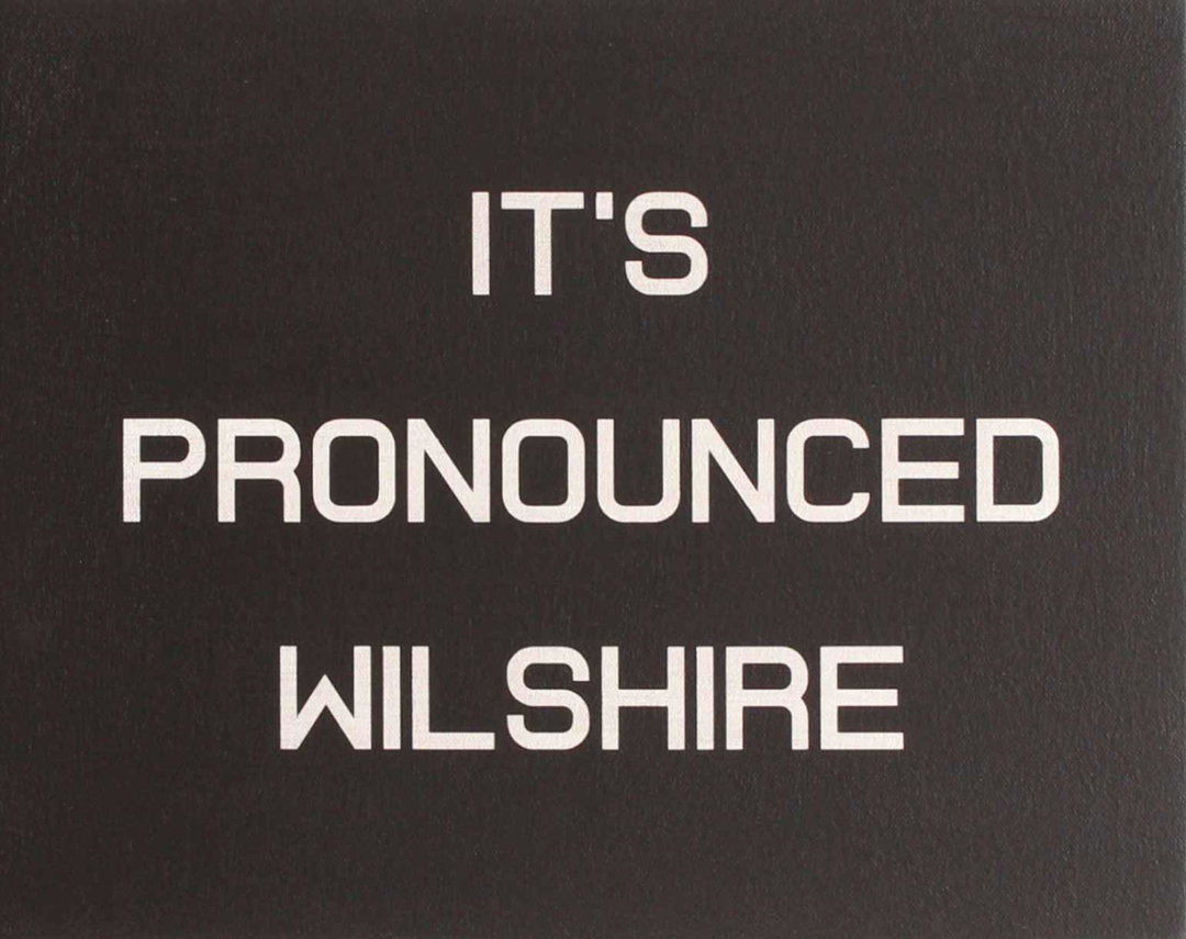
How do you pronounce ‘wilshire’? Los Angeles-based artist Hunter Harvey tells you exactly how – by writing it. Hunter’s “text paintings”, made with flashe paint (a hyper-saturated vinyl-based paint that dries to a velvety matte finish), airbrush and masking techniques, are a sharp break away from his naughty figurative work over the years, think of bears with voluptuous breasts – actually don’t! Hunter came to realise he had painted himself into a corner through paintings of characters from The Flintstones having sex and mega-colourful remixes of Smokey The Bear. What is infinitely flexible, however, is text. Hunter’s newer paintings carry the same wink-wink humour as his previous works, but now his craftsmanship is even more impressive, through faithfully recreating old Microsoft slideshow fonts and kitschy digital gradients, the famous “you wouldn’t download a car” anti-piracy meme-font and the amusing vulgarity of bumper stickers.
“I pull text from anywhere: signage while driving, overheard conversations on LA streets, drunk people at parties, TV. I’m always waiting for the right words – short, unresolved phrases that leave the door ajar,” says Hunter. “I can make paintings that might appear to be jokes or very serious statements, though it’s not always clear which ones are which – and that’s the point.” Living in LA drives this interest in language, where billboards and signage define the landscape – it’s what helps Hunter’s paintings appear deceptively simple; these graphics hold cultural ideas, inner thoughts, hidden sentiments. Through mini-investigations into typefaces, Hunter deconstructs ideas about classic fonts like Helvetica, which is one he calls “trusted” and “authoritative” because it appears on our screens often. “At the other end is Impact, the classic meme font. It’s bold, unapologetic and harder to take seriously,” says Hunter. Simply, Hunter summarises: “The typeface becomes part of the message.”
GalleryHunter Harvey: Collected Text Paintings (Copyright © Hunter Harvey, 2026)
Hero Header
Hunter Harvey: Collected Text Paintings (Copyright © Hunter Harvey, 2026)
Share Article
Further Info
About the Author
—
Paul M (He/Him) is a Junior Writer at It’s Nice That since May 2025. He studied (BA) Fine Art and has a strong interest in digital kitsch, multimedia painting, collage, nostalgia, analogue technology and all matters of strange stuff. pcm@itsnicethat.com
To submit your work to be featured on the site, see our Submissions Guide.