




How&How’s colourful and collaged Bristol Dockyards rebrand makes nautical cliches walk the plank
Taking tips from the city itself this brand system uses iron clad typography and photo collage to bring the heart of Bristol back up to date.
If you’ve been to Bristol you’ll know that there is a piece of history hiding in the historic floating harbour – Britain’s very first great ocean faring steam ship. Since its triumphant return to Bristol in the 1970s, the SS Great Britain has been a treasured centrepiece of the city, preserved in Bristol’s Great Western Dockyard with a museum that celebrates the ship (which was built by inventor Isambard Brunel in 1843) and its multifaceted two-century history. But while the landmark has been long celebrated, “the attraction recently faced dwindling ticket sales, an ageing visitor demographic, and a lack of public visibility into its ongoing preservation efforts,” says Cat How, founder of global design and branding agency How&How.
When the museum reached out to How&How for a new brand identity, the agency was keen to build an all new experience of the decades-old dockyard, reframing it as a wider cultural quarter rather than just a number of singular museums. This required a refresh of the brand architecture and “a broader name above the gates”, says Cat. Expanding beyond just the ship itself, How&How wanted to tie the areas three central experiences together: The Being Brunel Museum, the Brunel Institute’s maritime archive and the ship itself, under one namesake – Bristol Dockyards.
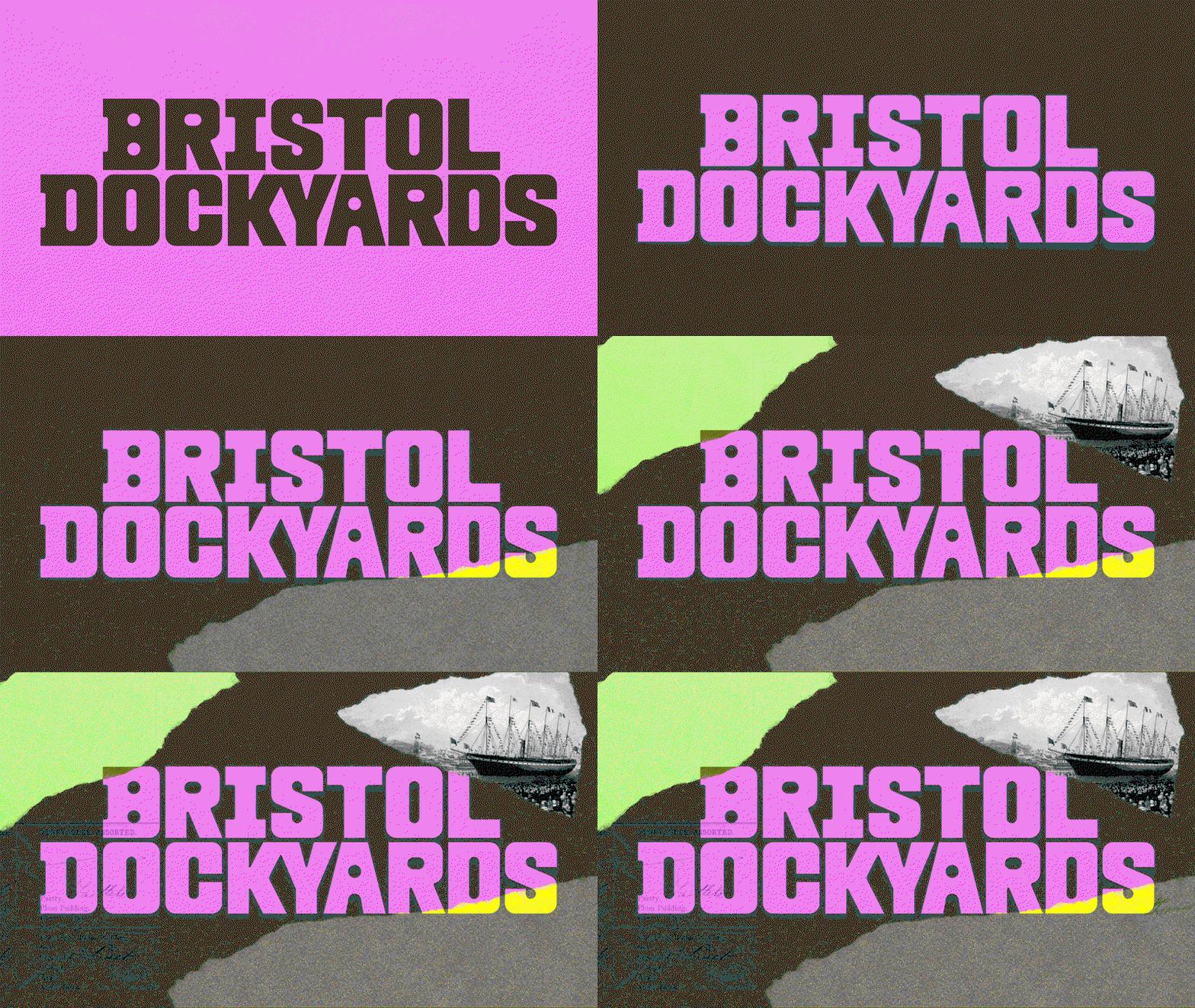
How&How: Bristol Dockyards Identity (Copright © How&How, 2026)
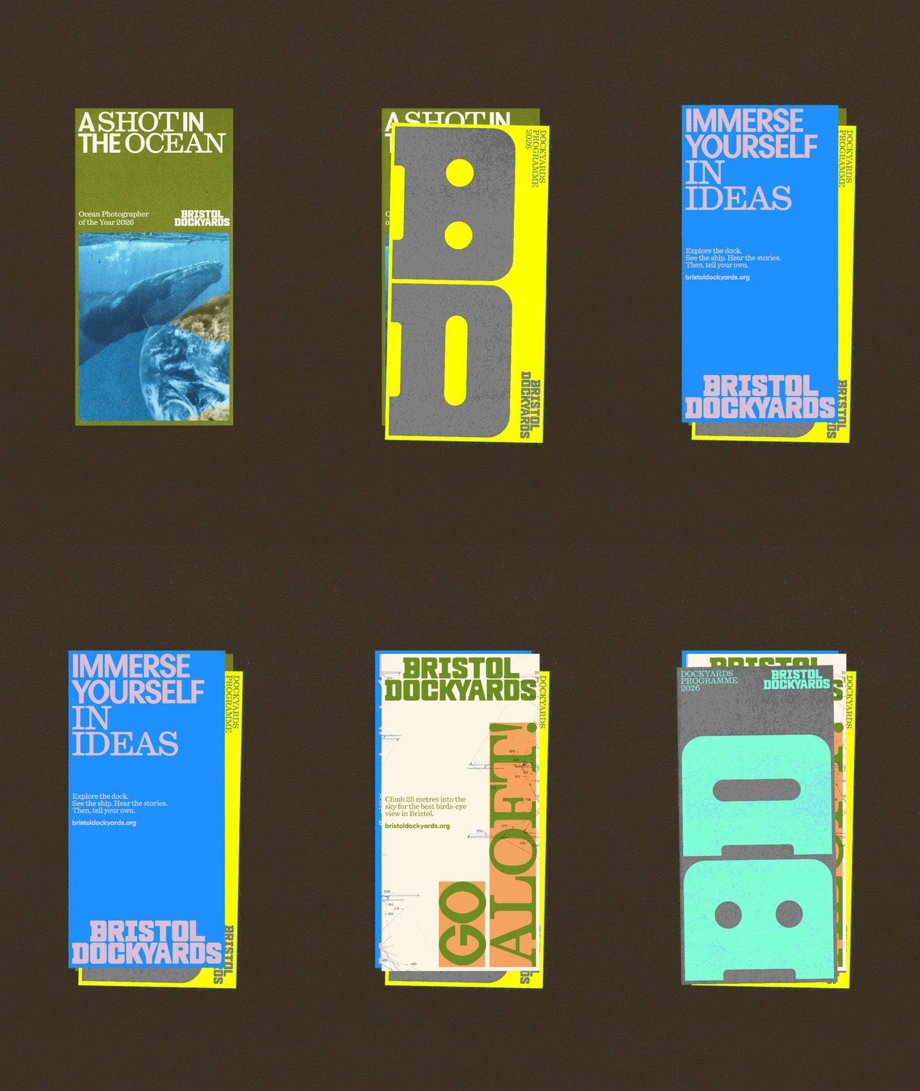
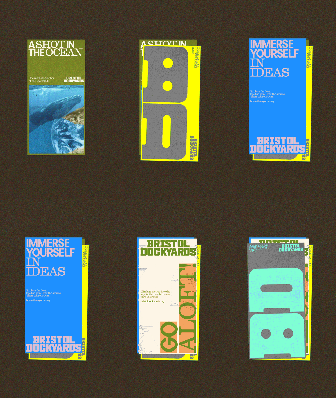
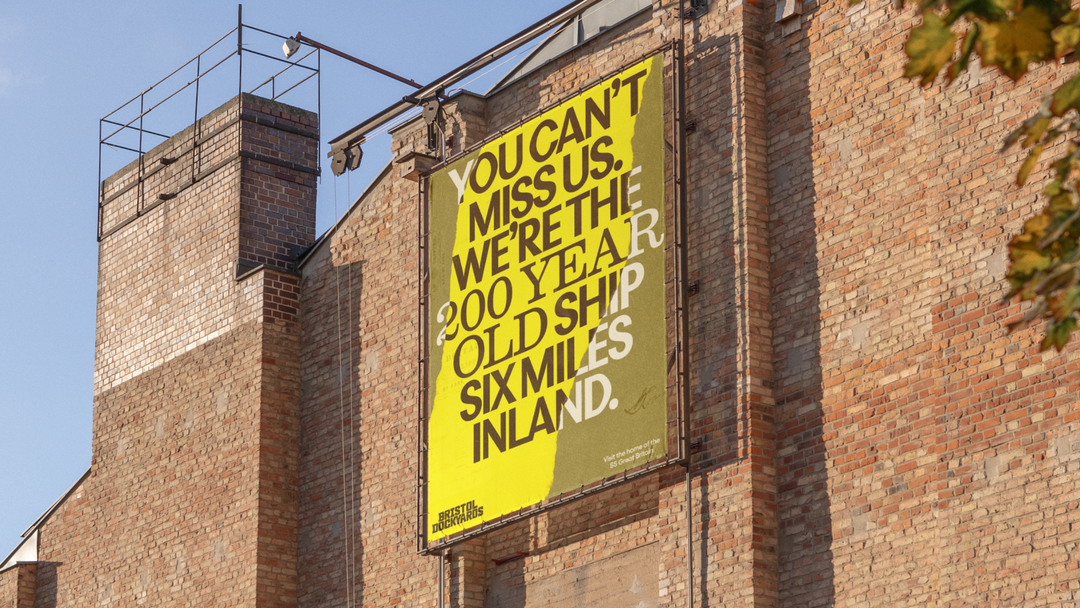
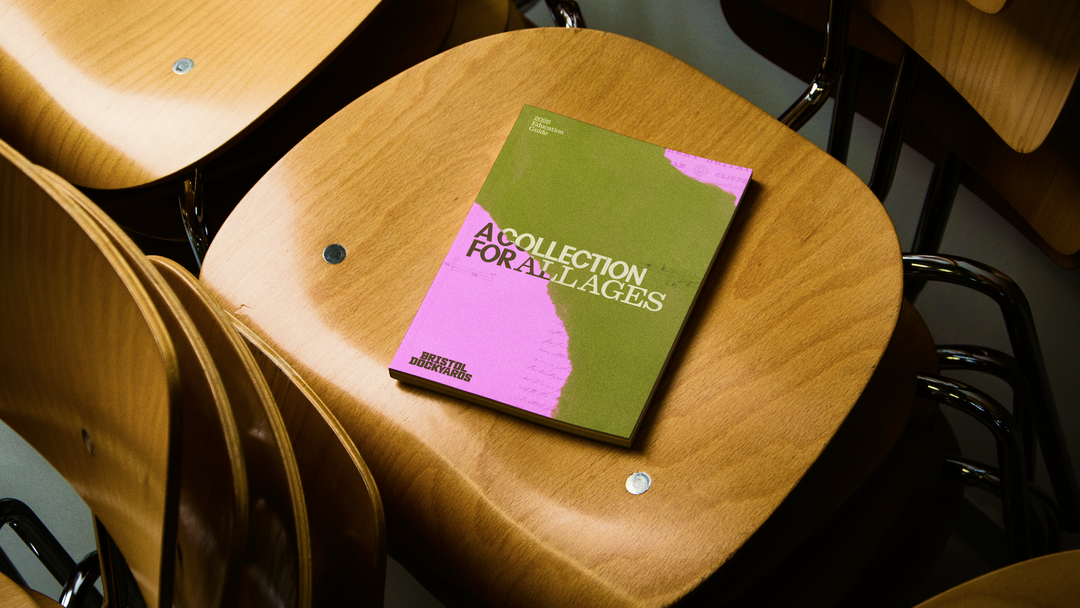
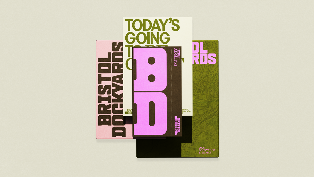
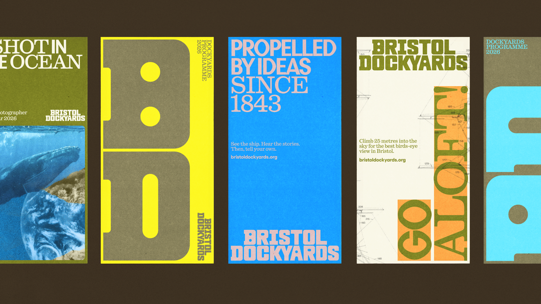
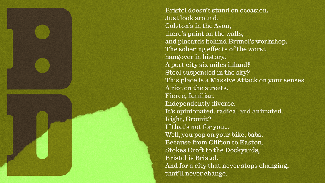
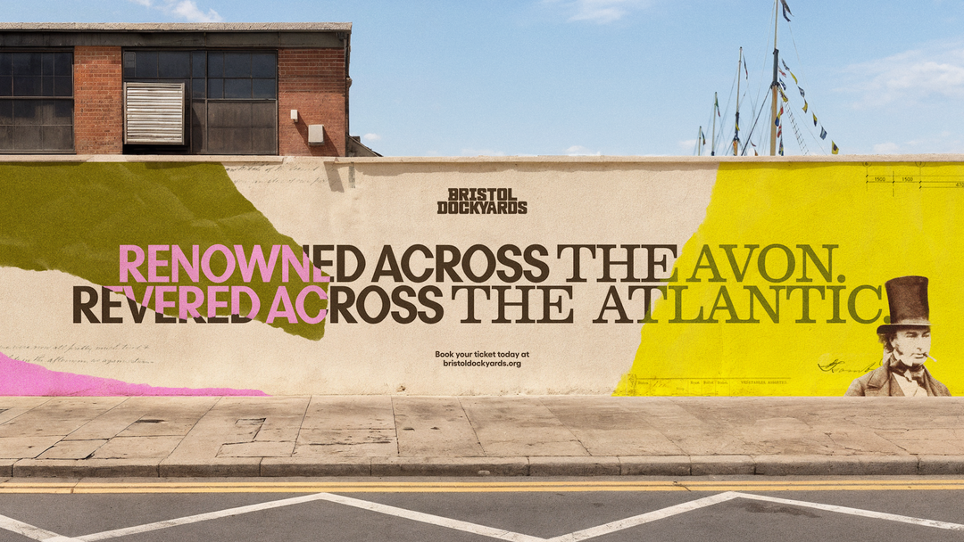
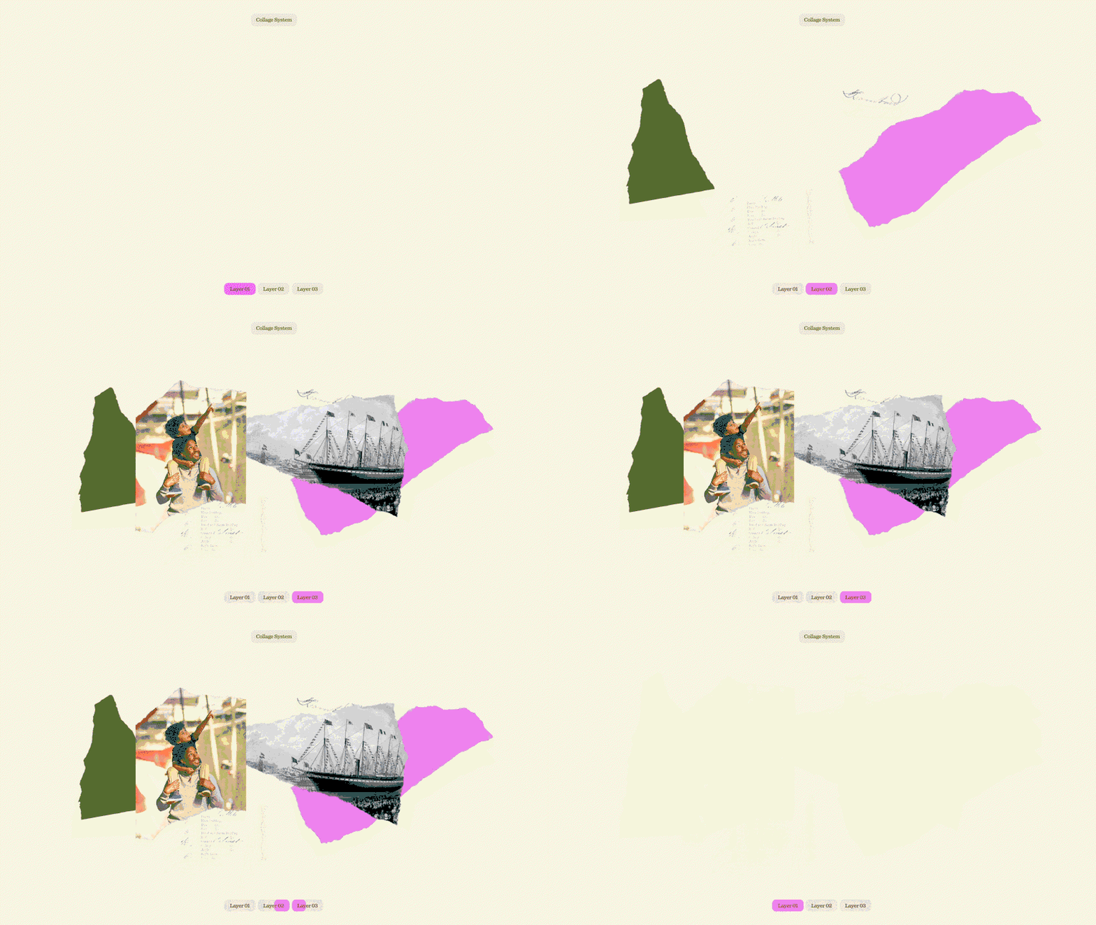
Bringing a cohesive visual identity together for the entire area for the first time, Bristol Dockyards new branding from How&How uses a dynamic system of photo collage to look at the locations history anew. “Less about painting pretty pictures,” Cat says, the approach instead “merges timelines, textures, typography and Dockyard trinkets together in an immersive, tactile and unmistakable-across-the-river visual.” The copy for the rebrand pays homage to Bristol history alongside more recent instances of activism. ‘Bristol doesn’t stand on occasion. Just look around. Colston’s in the Avon, theres paint on the walls, and placards behind Burnel’s workshop,’ reads one manifesto, referencing the iconic toppling of slave trader Edwards Colston’s statue in 2020.
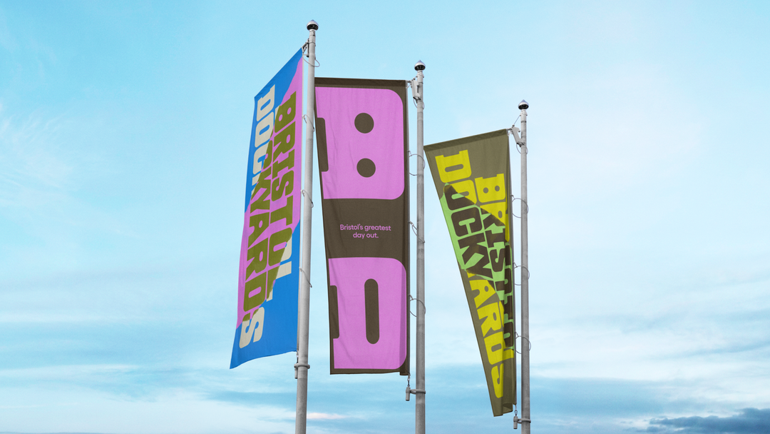
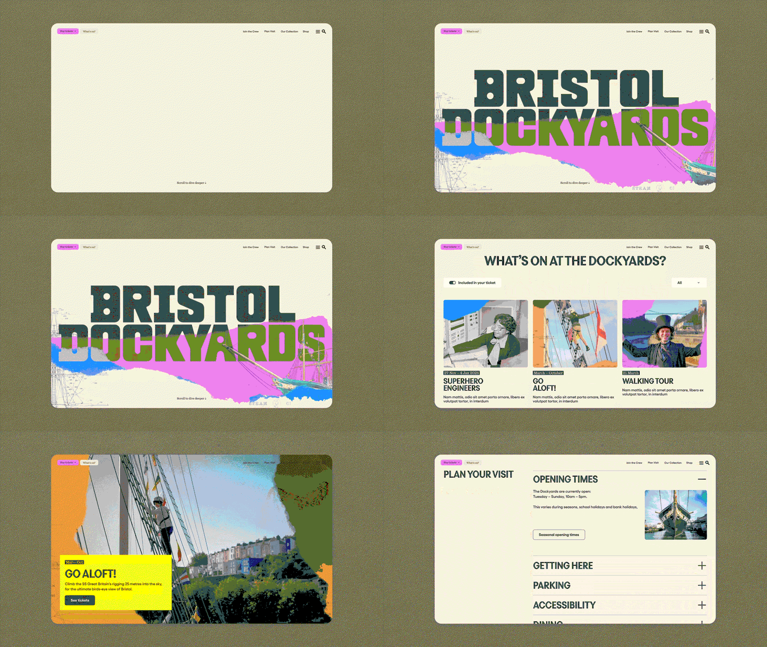
While the agency has deliberately expanded outside of the constraints of classic nautical colors and visual cues there are subtle, tasteful hints that make us feel at sea; like the collaged ripped paper shards and edges that feel like land outlines on a map, or the drift down on the button of the museum’s new website is like a tide coming into shore. The identity’s primary pink is taken from Bristol’s iconic Totterdown’s terraces and has been combined with a palette of bright yellows, greens and oranges for digital assets, print ephemera and way-finding to tie the identity in with surroundings sights in the city. As for the bold iron-clad typography, this industrial touch sits somewhere between “a classic serif and a semi-bold sans”, leaving a modern stamp on the quarter when reduced down its two letterform logo.
“The Dockyards have always been a place of radical thinking,” Cat ends, “Now the brand matches up. And How&How cannot wait for people to once again line the banks of the Avon, desperate to catch a glimpse of Bristol’s – and one of the UK’s – most enduring icons.”
GalleryHow&How: Bristol Dockyards Identity (Copright © How&How, 2026)
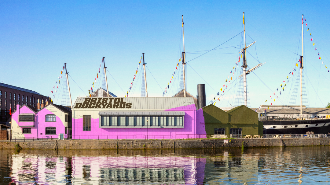
Hero Header
How&How: Bristol Dockyards Identity (Copright © How&How, 2026)
Share Article
About the Author
—
Ellis Tree (she/her) is a staff writer at It’s Nice That. She joined as a junior writer in April 2024 after graduating from Kingston School of Art with a degree in Graphic Design. Across her research, writing and visual work she has a particular interest in printmaking, self-publishing and expanded approaches to photography. ert@itsnicethat.com
To submit your work to be featured on the site, see our Submissions Guide.




