Gruppo Due’s typefaces offer a softer alternative to systematised workhorse fonts
The European foundry’s wildly variable typeface, G2 Airdancer, perfectly encapsulates Gruppo Due’s inquisitive, exploratory practice.
Gruppo Due, a type foundry spanning Germany, Switzerland and Belgium, was first composed of three friends – Bruno Jacoby, Moritz Appich and Massimiliano Audretsch – who all met at while studying at HfG Karlsruhe. Originally launching as an outlet and incentive for finalising and publishing the typefaces the trio developed in their own practices, it soon became more than the sum of its parts. It’s now transformed into a playful space where Bruno, Mortiz and Massimiliano can dig deep into their type and design interests.
Having all come from graphic design backgrounds rather than the type design field, the foundry enjoys developing designs “holistically” and on “project-specific concepts”, says Bruno. After officially forming the foundry Gruppo Due welcomed developer and media artist Jonas Grünwald to the team who then built the foundry’s website, featuring Gruppo Due’s trusty, clippy-inspired stone companion. Now, after five years, the foundry have ushered in a website that is more specific to it’s job: showcasing typefaces. It champions not only the individual fonts but the relationships different styles have with one another. “Some of our typefaces [like G2 Ciao and G2 Airdancer] have a lot of different cuts which we designed to be in use in combination with each other,” Mortiz says, “we noticed that this was not happening as much as we wanted to and hope this will help.”
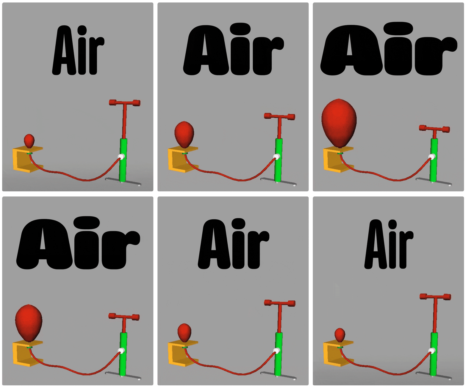
Gruppo Due’s new website is not alone in its half-decade celebration. The European foundry has also launched its latest flagship typeface, G2 Airdancer – a wildly variable, inflatable dancing man-inspired sans serif that’s seven years in the making. They drew the first version of the typeface in a single night before slowly adding different widths, weights and styles over the coming six years. “Rather than following a revivalist narrative, G2 Airdancer explores the technological properties of type design,” Massimiliano says. Taking inspiration from the movement of inflatable tube people, it now culminating in a jam-packed typeface with two variable axes and 18 overall static styles.
“Beyond a learning field for professionalisation in licensing and typeface mastering, Gruppo Due remains a space for experimentation,” Jonas ends. “Our work is as much about technical refinement as it is about storytelling, language, and creative exploration.”
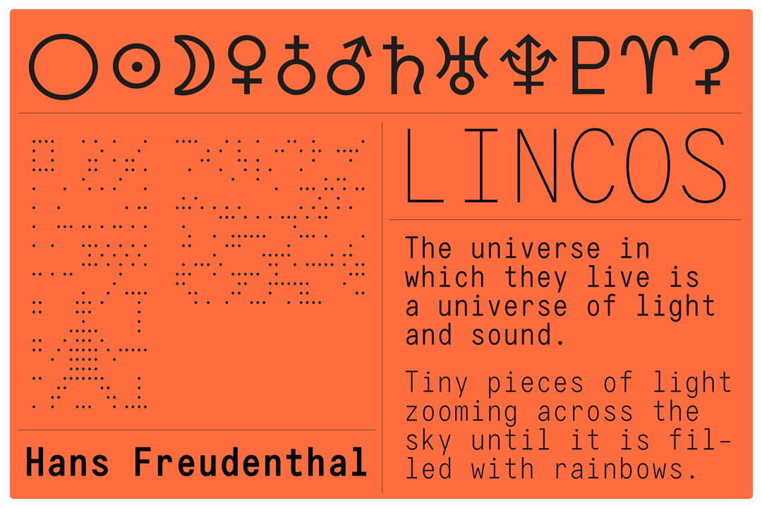
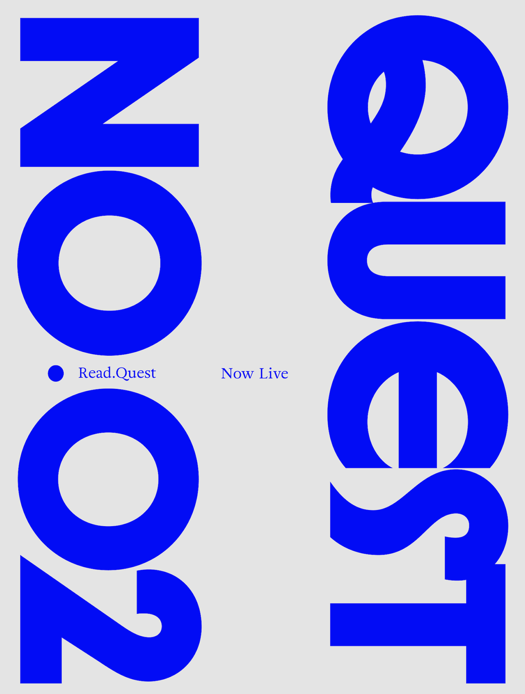
Gruppo Due: G2 Erika Specimen (Copyright © Gruppo Due, 2025)
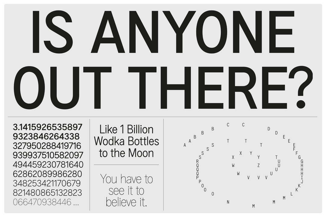
Gruppo Due: G2 Erika Specimen (Copyright © Gruppo Due, 2025)
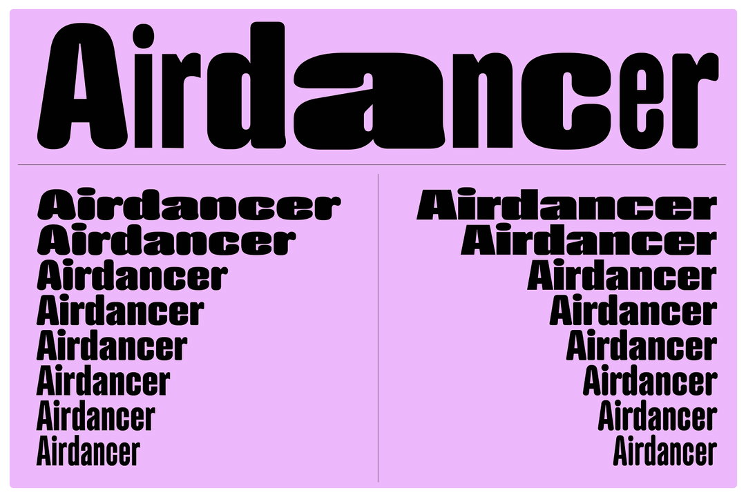
Gruppo Due: G2 Airdancer Specimen (Copyright © Gruppo Due, 2025)
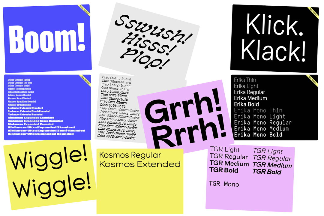
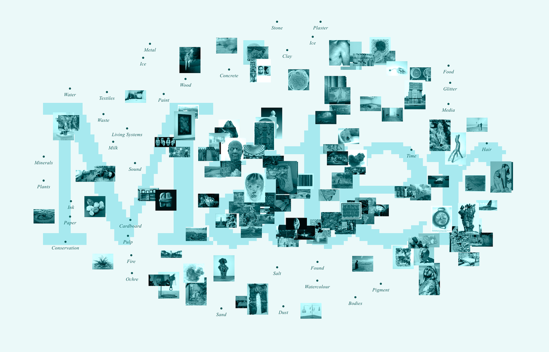
Gruppo Due: Overview of Typeface Catalogue (Copyright © Gruppo Due, 2025)
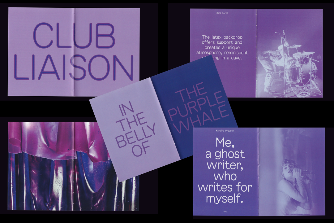
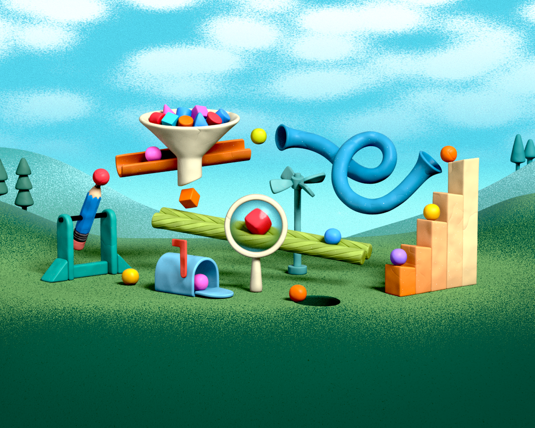
Gruppo Due: G2 Honey Early Use by Hannah Sakai for CLUB LIAISON by Liesl Raff (Copyright © Gruppo Due/Hannah Sakai, 2024)
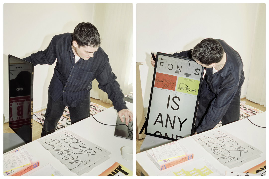
Gruppo Due: Massimiliano Showing the New Website (Copyright © Gruppo Due/Jan Buschmann, 2025)
Hero Header
Gruppo Due: G2 Airdancer Specimen (Copyright © Gruppo Due, 2025)
Share Article
Further Info
About the Author
—
Hailing from the West Midlands, and having originally joined It’s Nice That as an editorial assistant in March 2020, Harry is a freelance writer and designer – running his own independent practice, as well as being one-half of the Studio Ground Floor.