




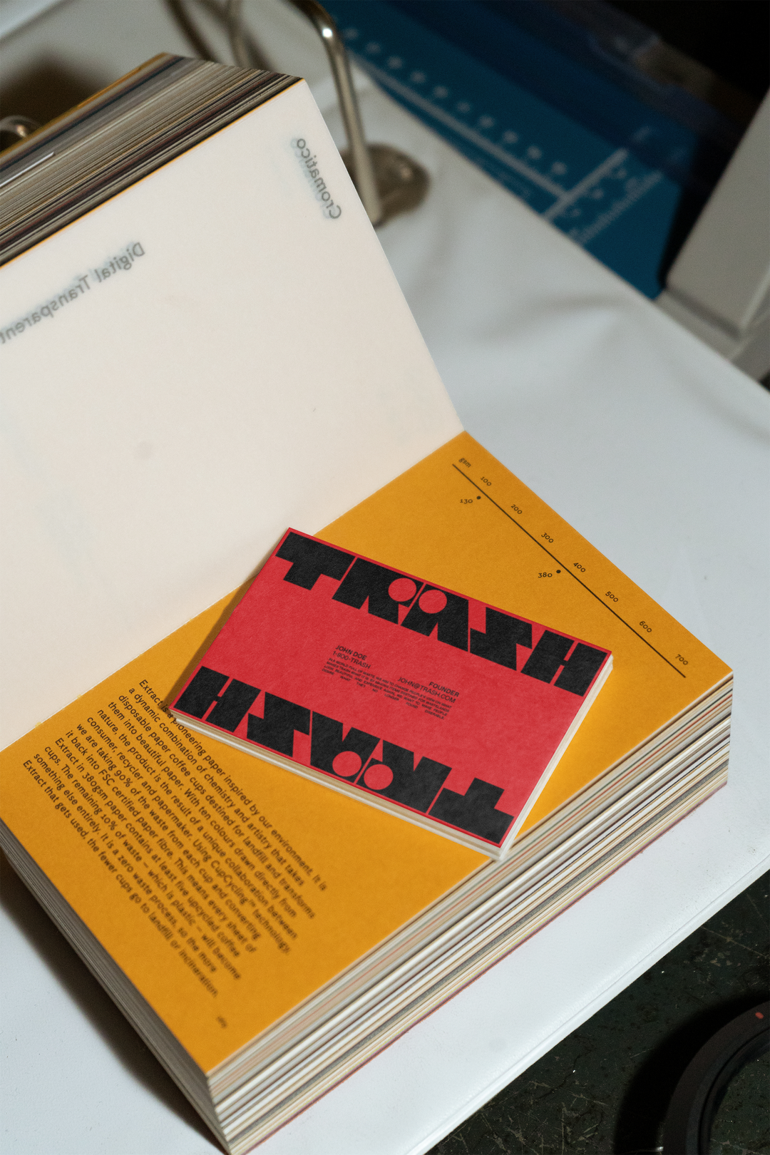
Designer Gabrielle Adam is finding inspiration in everything cheesy, kitsch and fun
The more silly something is, the more likely it is the freelance designer is going to be a fan.
The inspiration behind Gabrielle Adam’s bold branding work is usually anything “cheesy, kitsch or fun”, she says. “I’m drawn to big type, lots of colours, and a silly, catchy tone of voice.” Old Americana ads, the kinds of prints and posters you’ll find rummaging in stacks at flea markets, and the movement of illustrations in Disney cartoons are all on the list of things that “elicit a really strong feeling within me, one of amazement, excitement, curiosity, like an electric shock in my gut and chest”, the designer shares. Amongst all her influences a sense of playfulness comes to the fore – “It’s what continues to surprise and impress me,” Gabrielle says.
Part Belgian, French and American, the freelance designer grew up in Luxembourg and has been based in Copenhagen since 2023, following a stint in London. As a type enthusiast, beautiful lettersets are often a focal point for Gabrielle’s thoughtful branding work: whether that’s elegant de-bossed serifs for a new packaging system for print house Marceli or chunky block letters on brat green for Brussel’s burger joint Gars Gras. The creative is regularly keeping us updated with a range of her fun letterform experiments over on Instagram and completes this love for type through thoughtful, humorous copywriting that has a knack for nailing a brand’s tone of voice.
The graphic designer was led into the branding space by a love of storytelling through design. Working with a range of clients across sectors, Gabrielle is always drawn to those projects that strike a chord with her interests. “I often need to find the subject matter interesting in order to feel creative”, she says, “(thanks ADHD!).” So once she’s locked in on a brand’s purpose and story, her process relies on a heavy dose of research and strategy, with just enough room for something bold and different to creep its way into her designs. “I get random ideas when watching shows, going for walks, listening to podcasts – I find it fun to bring those visions to life through conceptual designs,” she ends.
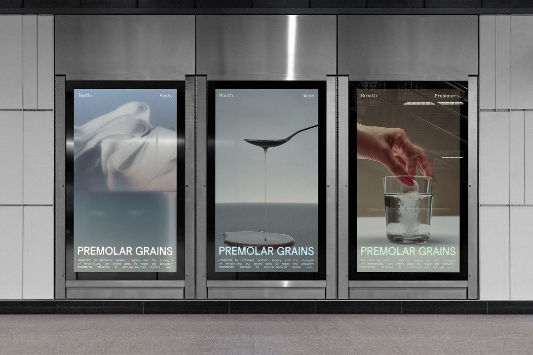
Gabrielle Adam: Premolar Grains (Copyright © Gabrielle Adam, 2024)
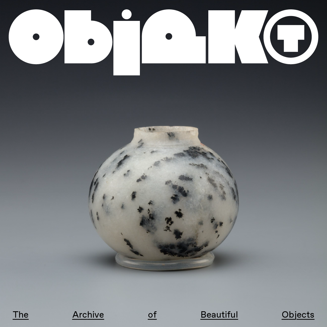
Gabrielle Adam: Objekt (Copyright © Gabrielle Adam, 2024)
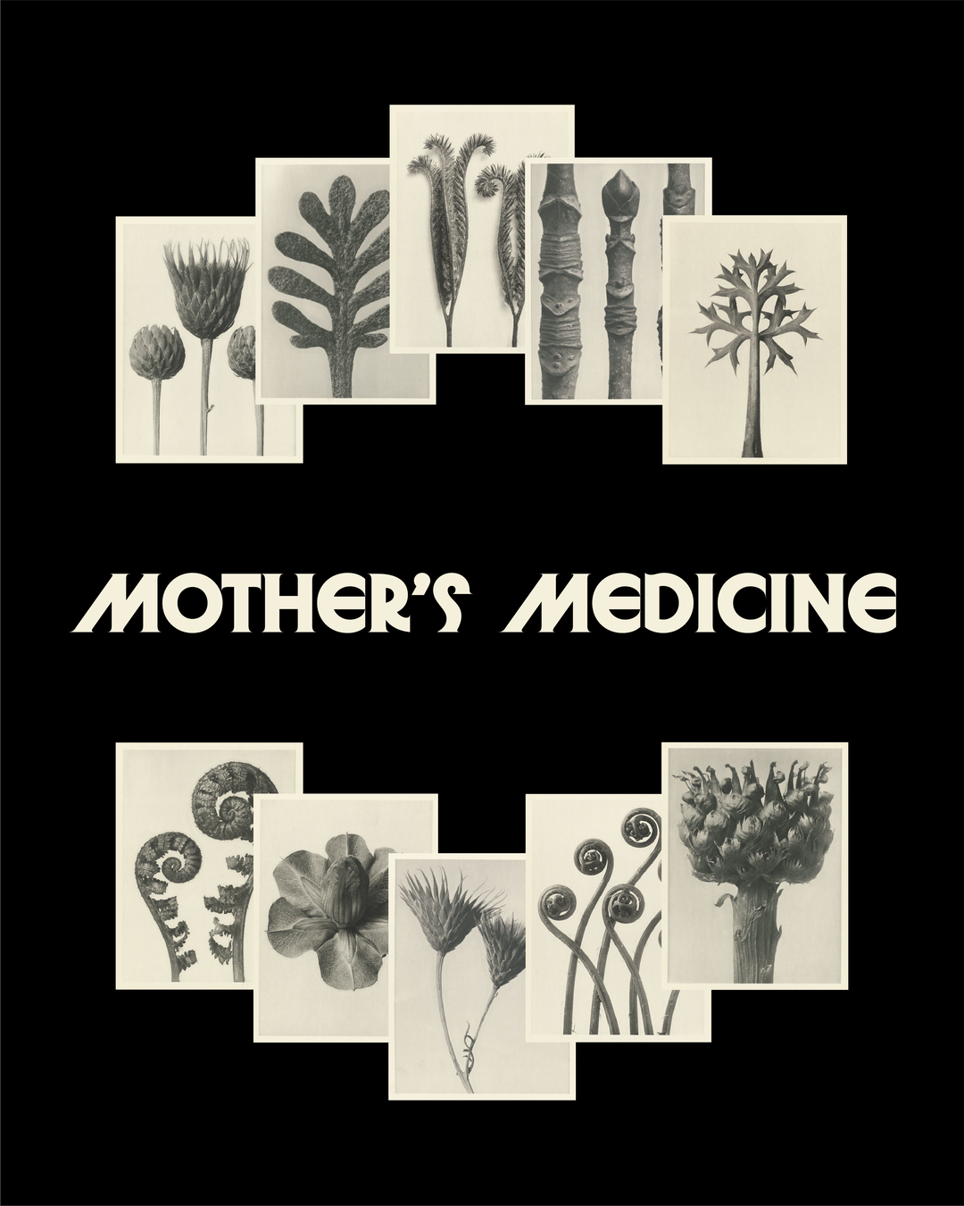
Gabrielle Adam: Mother’s Medicine (Copyright © Gabrielle Adam, 2025)
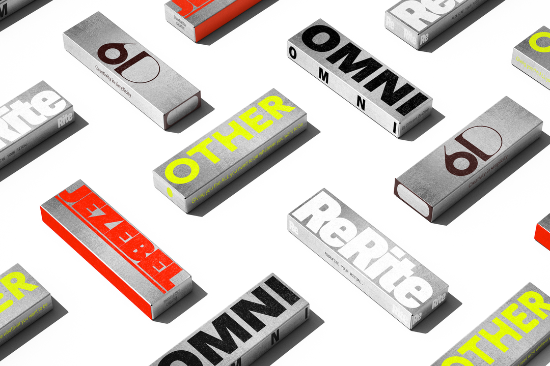
Gabrielle Adam: OSSO (Copyright © Gabrielle Adam, 2023)
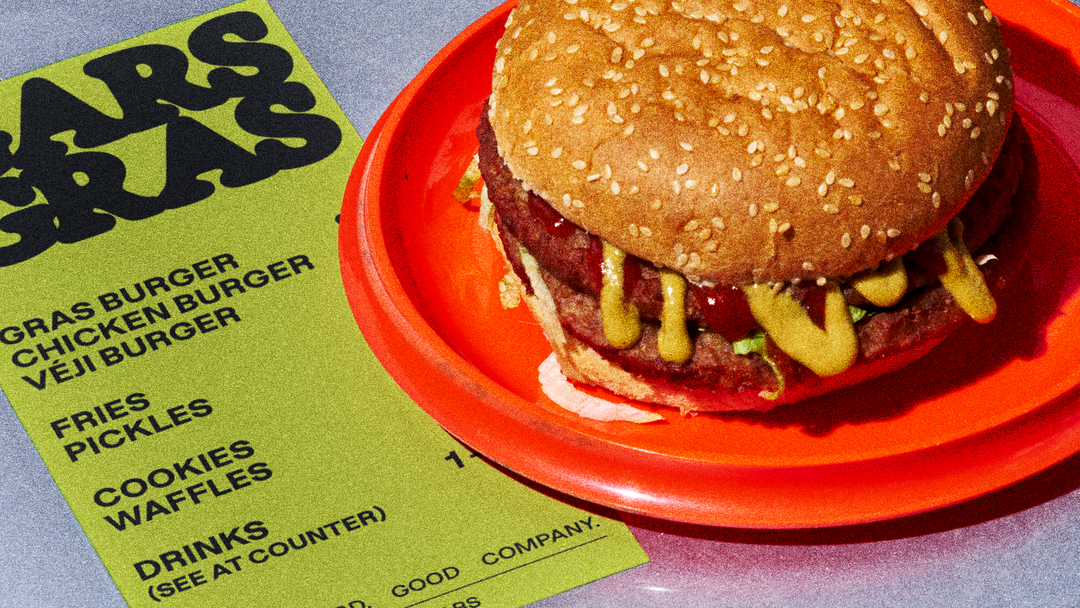
Gabrielle Adam: Gars Gras (Copyright © Gabrielle Adam, 2024)
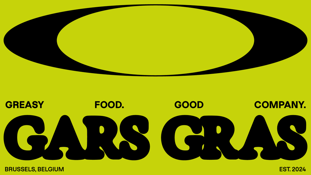
Gabrielle Adam: Gars Gras (Copyright © Gabrielle Adam, 2024)
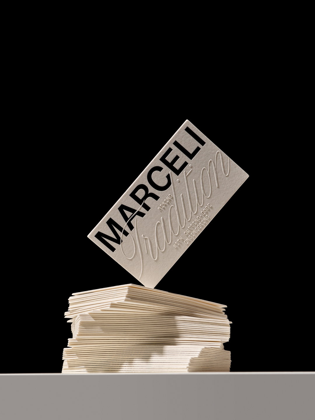
Gabrielle Adam: Marceli idenitity for Hugmun Studio (Copyright © Hugmun, 2025)
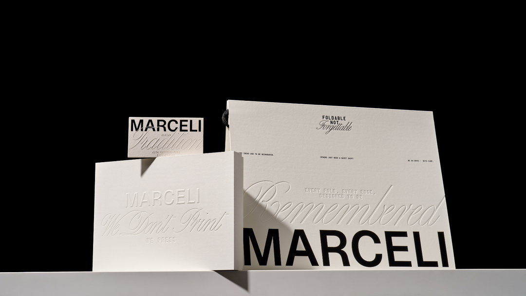
Gabrielle Adam: Marceli idenitity for Hugmun Studio (Copyright © Hugmun, 2025)
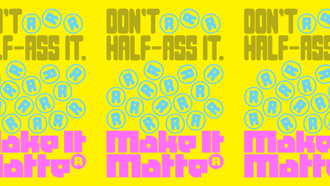
Gabrielle Adam: Make It Matte® for Benito Mockups (Copyright © Bendito, 2024)
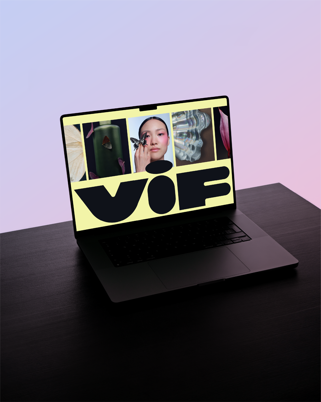
Gabrielle Adam: VIF (Copyright © Gabrielle Adam, 2025)
Gabrielle Adam: VIF (Copyright © Gabrielle Adam, 2025)
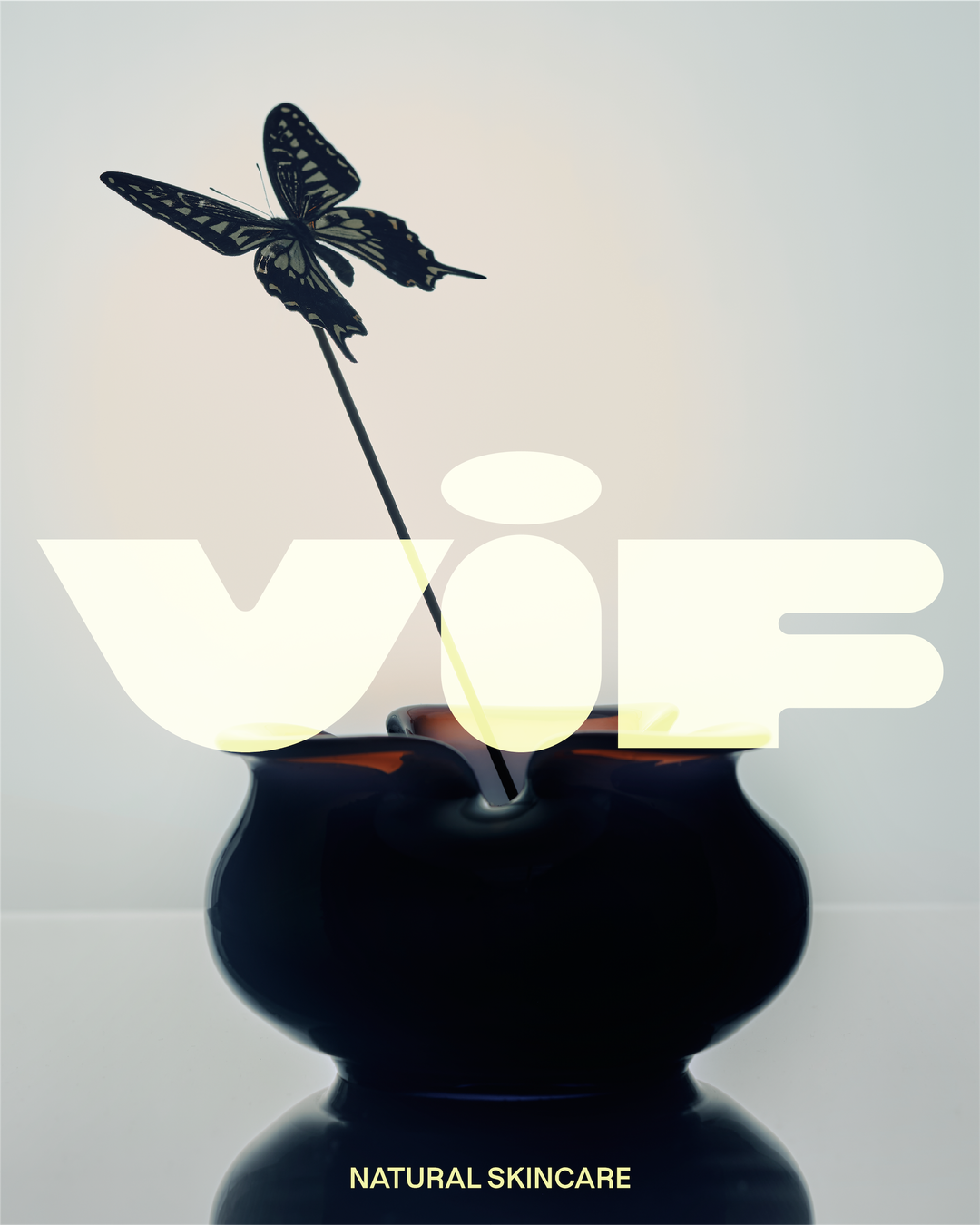
Gabrielle Adam: VIF (Copyright © Gabrielle Adam, 2025)
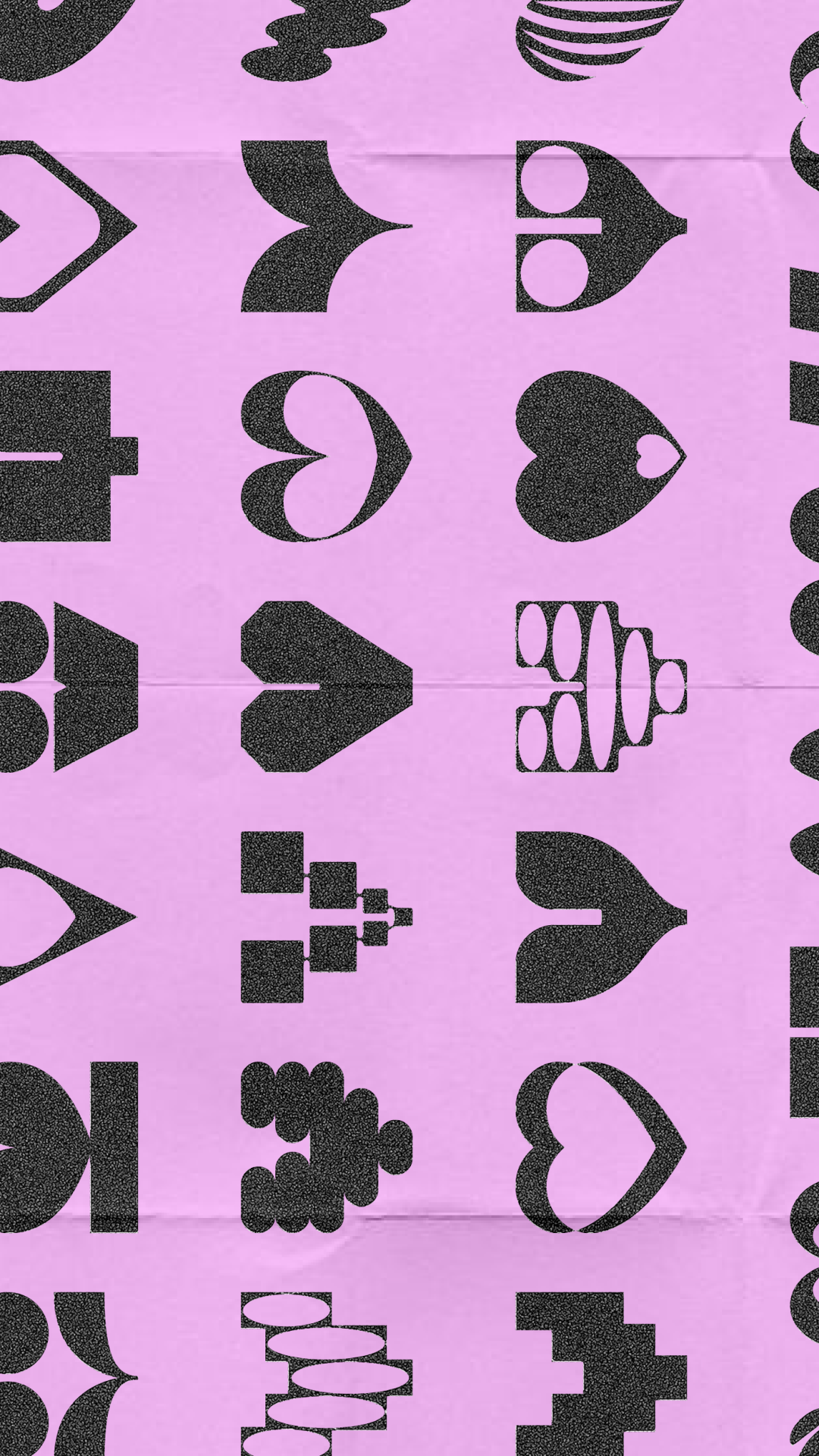
Gabrielle Adam: We Love Founders identity for Substance Studio (Copyright © Substance, 2024)
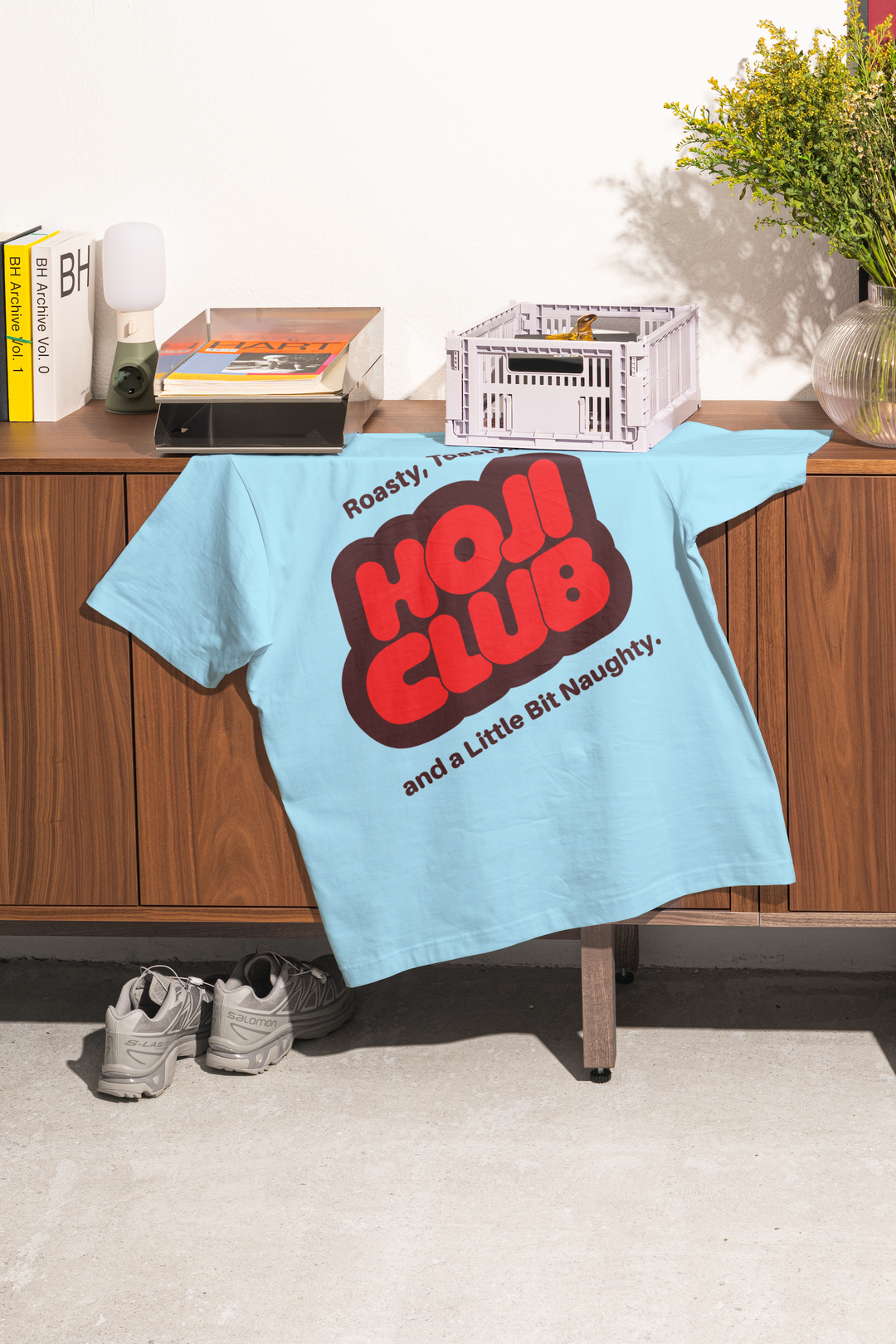
Gabrielle Adam: Hoji Club (Copyright © Gabrielle Adam, 2025)
Hero Header
Gabrielle Adam: Trash (Copyright © Gabrielle Adam, 2024)
Share Article
About the Author
—
Ellis Tree (she/her) is a staff writer at It’s Nice That. She joined as a junior writer in April 2024 after graduating from Kingston School of Art with a degree in Graphic Design. Across her research, writing and visual work she has a particular interest in printmaking, self-publishing and expanded approaches to photography. ert@itsnicethat.com
To submit your work to be featured on the site, see our Submissions Guide.




