Heralding the ancient and otherworldly charm of Future Medieval graphics
Gargoyles, griffins, and graphic design – welcome to blackletter summer.
Share
If you spend time in design-y circles of the internet, you may have already heard about Swedish electronics brand Teenage Engineering’s new release, the EP–1320 medieval: a synthesiser pre-loaded with hundreds of built-in medieval sounds like hurdy-gurdies, lutes, clashing swords, and yes, even a dragon’s roar (forget Brat summer; we’ve moved on to Gregorian chants). But the EP-1320 doesn’t just sound medieval — it looks the part too. With a blackletter LCD display, parchment-coloured body, and quilted carrying case, it wouldn’t feel out of place in a thatched hut. And that’s not even counting the synthesiser’s Kibbo Kift-meets-Jodorowsky launch video, plus a promotional microsite that resembles an illuminated manuscript more than a viral tech launch. Hark! Dost thou hearest something? ’Tis but the sound of a new graphic design trend: Ye Olde Future Medieval.

Teenage Engineering: EP–1320 Medieval device (Copyright Teenage Engineering, 2024)


Teenage Engineering: EP–1320 Medieval audio (Copyright Teenage Engineering, 2024)

Teenage Engineering: EP–1320 Medieval illustrations (Copyright Teenage Engineering, 2024)
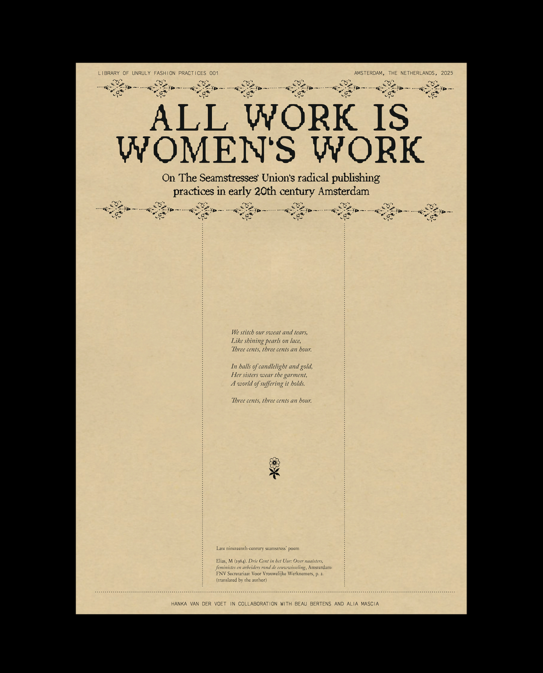
Future Medieval is a bit harder to pin down visually than other recent historic revivals like Neo-Y2K or 1980s Editorial, but this visual chaos is part of its appeal. Ornamentation plays a key role in the style, but it’s a ways away from the delicate, whimsical flourishes seen in other decorative trends like last year’s surge of coquettish bows. Instead, these embellishments are dense, dark and laden with symbolism. One of the most obvious cues within this new wave of Middle Aged aesthetics is, of course, blackletter typography — whether rendered in sharp, geometric forms or in more fluid, calligraphic strokes. Blackletter has been enjoying a resurrection for a few years now, but until recently, it was mostly seen in the form of modern, stylised versions like Respira or Harbour. These fonts gave a nod to the gothic without fully embracing its more extreme characteristics. But now, we’re going straight to the source — embracing detailed, intricate and borderline unreadable typefaces like Clavichord or Ready Bygone.


Sophy Hollington: Bone House—New York Times (Copyright Sophy Hollington, 2019)

Sophy Hollington: The Gates of Hell (Copyright Sophy Hollington, 2024)
Sophy Hollington: Dante’s Inferno Plate 7 (Copyright Sophy Hollington, 2024)

Sophy Hollington: Dante’s Inferno Plate 7 (Copyright Sophy Hollington, 2024)
Then there are all the “weird little guys” — fucked up creatures like gargoyles, griffins or just plain badly drawn cats that flank the sides of contemporary posters and Instagram posts like marginalia (a far cry from the chipper midcentury brand mascots going around the past few years). Alongside this bestiary, you’ll also find lots of actual paintings and drawings from the Medieval Period being used as background imagery or clip art — unlike 20th-century artwork, 16th-century work is all undeniably in the public domain, after all. Compositions are often symmetrical or utilise framing borders, echoing the meticulous balance seen in medieval paintings. Then again, this symmetry is frequently accompanied by a peculiar irregularity as well — one that mirrors the off-kilter qualities of a medieval artist population that hadn’t quite cracked two-point perspective yet.
We can probably tie the revival of Medieval aesthetics to the resurgence of media about the Middle Ages and the fantasy genre more generally. The 2020s have seen a smattering of humorously anachronous medieval dark comedies, like My Lady Jane, The Green Knight, Catherine Called Birdy, Decameron and the soon-to-be-released Seize Them, not to mention all the fantasy content that mines the era for mise-en-scène like The Rings of Power, House of the Dragon, Baldur’s Gate and Dungeons & Dragons (the game and the 2023 film). The rise of Catholic-core and occult aesthetics on TikTok seems relevant here too, with both traditions offering visually rich and highly symbolic imagery that resonates strongly with a disenchanted population. Gold crucifixes, lace mantillas, pentagrams (the star, not the international design conglomerate) and tarot cards all feel both ancient and otherworldly, appealing to a generation fascinated by spirituality, mysticism and the supernatural.

Mattiel Brown: Mattiel—Georgia Gothic Album Artwork (Copyright Mattiel, 2022)
Mattiel Brown: Mattiel—Georgia Gothic Album Artwork (Copyright Mattiel, 2022)

Mattiel Brown: Mattiel—Georgia Gothic Album Artwork (Copyright Mattiel, 2022)


Katie Buckley: titles for Saltburn (Copyright Amazon MGM Studios and Warner Bros. Pictures, 2023)
In the creative world, illustrators like Sophy Hollington and Maddie Fischer have been leading the charge, creating works that evoke gothic bestiaries, full of demons, sprites and ladies in decorative wimples (Sophy’s new collaboration with Beehive Books on an illustrated version of Dante’s Inferno takes this to its logical extreme). We’ve seen lots of the style in the music industry, too — which, like fashion, often seems to be where young trends are nurtured — as in Ciaran Birch or Nicola Tirabasso’s posters, and Mattiel’s design for her album Georgia Gothic. The trend has slowly been making its way into some branding work too, like Silk Studio’s work for Barquette or Madison Tierney’s for Graze.
If you squint, you start to see Future Medieval everywhere. Liquid Death. Saltburn’s opening credits. Som Bhatt’s pixelated illustrations. Balenciaga’s Chevalier Derby. Most posters by David Rudnick. In a way, Future Medieval really isn’t so different from what we’ve already been seeing in a certain sludgy subset of graphic design already for the past few years; lots of blackletter, heavy layered elements and a healthy dose of dark pessimism. It’s a bit of horseshoe theory: if you go far enough into acid graphics, you accidentally come back around to the 15th century. Pixels become cross-stitched tapestries; Fraktur stops looking like a trendy headline font and feels like a clerical proclamation again.

Nicola Tirabasso: Maxwell Sterling - Turn of Phrase, centre label (Copyright © AD93, Nicola Tirabasso, 2022)

Nicola Tirabasso: Empty Gallery Poster (Copyright © Empty Gallery HK, Nicola Tirabasso, 2022)
Nicola Tirabasso: Club Mutante poster (Copyright © Nicola Tirabasso, 2022)

Nicola Tirabasso: Club Mutante poster (Copyright © Nicola Tirabasso, 2022)
I find it especially interesting to contrast the current medieval revival with another moment in the 21st century when antiquity was in vogue: when clean white Greek and Roman statues became inexplicably popular among graphic designers in the 2010s. This niche fascination with ancient sculpture coincided with a broader embrace of classic, minimalist branding at the time: logos that followed the golden ratio, geometric sans serifs reminiscent of Roman square capitals, and an overall emphasis on purity and simplicity (no matter that we now know most of these Greek and Roman statues were actually painted bright colours!). This all coincided with a period of time that felt like a brief moment of respite, when the world seemed to be catching its breath. One big economic crisis was over and the political turmoil of the late 2010s and pandemic had yet to unfold. The buttoned-up aesthetics of that era, in many ways, reflected this fleeting sense of stability.
Meanwhile — it goes without saying — we find ourselves in a very different context in 2024. The looping back from hyper-modern digital design to medieval motifs reflects a deeper cultural impulse — a reaction against the sterile, minimalist trends that have dominated design for so long, as well as a maturing of the technicolour “dopamine-dressing” inspired maximalism that followed soon after. We’ve tried perfection, we’ve tried joy and now we’re embracing something more goth, more arcane. Future Medieval is a collective acknowledgment of the messiness of our current reality: an era marked by chaos, uncertainty and deep societal divides. It’s no surprise that the aesthetic language has shifted accordingly. The dense, esoteric forms of Future Medieval reflect a world grappling with upheaval, much like the original medieval period, a time of both the Black Plague and a stark divide between the haves and the have-nots (how different is a feudal landowner from a 21st-century tech billionaire, really?).

All True: Green Supper (Copyright All True, 2023)

All True: Green Supper (Copyright All True, 2023)
All True: Green Supper (Copyright All True, 2023)

All True: Green Supper (Copyright All True, 2023)

The way we interpret the past reveals as much about our present-day concerns as it does about the historical moments we’re referencing. The current wave of medieval aesthetics, with its emphasis on darkness and complexity, in fact contrasts quite sharply with how previous generations reimagined the same period. The 1970s medieval revival, called “Mid Century Medieval” by the wizards at CARI, was a kitschy movement characterised by its bright, cheerful take on the Middle Ages (the quickest way to get a sense of this aesthetic is to watch Disney’s 1963 movie The Sword in the Stone) – more Mary Blair than Mary Shelley.
This approach softened the more austere elements of medievalism, making it accessible and appealing to a post-war generation eager for optimism and playfulness. The resurgence of medieval motifs in Tudor-style suburban architecture, the newly-created Renaissance Faire and themed establishments like the Knights Inn and the Steak & Ale restaurant chain reflected a desire to blend the familiar with the fantastical, creating spaces that were at once nostalgic and imaginative. To the baby boomers, Mid Century Medieval offered a comforting retreat into a romanticised vision of history, one that stood in stark contrast to the sleek Modernism that dominated much of the design landscape at the time.

Ciaran Birch: Bleep (Copyright Ciaran Birch, 2019)

Ciaran Birch: Creature Glyphs (Copyright Ciaran Birch, 2020)
Ciaran Birch: Creamed Horn (Copyright Ciaran Birch, 2022)

Ciaran Birch: Creamed Horn (Copyright Ciaran Birch, 2022)
Historic revivals have always involved a certain degree of cherry-picking, where elements from different eras are blended and reassembled to suit contemporary tastes. The fact that Renaissance paintings pop up in so much of current medieval-inspired work is a clear indicator that our revivals are driven more by vibes than by strict historical accuracy (there’s that Strange Historicism we talked about in my past column about heritage!). In this context, calling this wave ‘Future Medieval’ might be a bit of a misnomer — what we’re really seeing is a creative pastiche that transcends any single period. As trend cycles accelerate and imagery floods our digital spaces, the past becomes an ever more valuable resource, endlessly repurposed to fit modern times.

Maddie Fischer: Lion (Copyright Maddie Fischer, 2024)


Maddie Fischer: Rabbits (Copyright Maddie Fischer, 2024)
Maddie Fischer: Nobles (Copyright Maddie Fischer, 2024)

Maddie Fischer: Nobles (Copyright Maddie Fischer, 2024)
But even an art history freak like myself will admit that this kind of historic eclecticism isn’t necessarily a bad thing. Viewing the past through a modern lens allows us to see new connections and contrasts, making history a living, breathing part of our cultural dialogue. When we reinterpret history with fluidity and creativity, it becomes a tool to explore both our shared humanity and the unique challenges of our time. When I asked illustrator Maddie Fischer why she’s so inspired by the Middle Ages, she agreed with this personal angle. “I think medieval art is a fascinating portal into an era of human history that sometimes seems so ancient and so distant, and yet is ultimately not that far in the past,” she said. “Life, alone, in that era is so wild to imagine — and how anyone managed to be an artist on top of it all blows my mind. We’re all likely stumbling and failing in ways we don’t even know. What will artists of the future think of our work 700 years from now? Probably that it’s wonky and misguided — but hopefully our humanity and spirit can still come through.” I couldn’t agreeith more.

Madison Tierney: Graze Wine Bar (Copyright Madison Tierney, 2017)

Silk Studio: Barquette (Copyright Silk Studio, 2024)
Silk Studio: Barquette (Copyright Silk Studio, 2024)

Silk Studio: Barquette (Copyright Silk Studio, 2024)

Silk Studio: Barquette (Copyright Silk Studio, 2024)
Share Article
Further Info
About the Author
—
Elizabeth Goodspeed is It’s Nice That’s US editor-at-large, as well as an independent designer, art director, educator and writer. Working between New York and Providence, she’s a devoted generalist, but specialises in idea-driven and historically inspired projects. She’s passionate about lesser-known design history, and regularly researches and writes about various archive and trend-oriented topics. She also publishes Casual Archivist, a design history focused newsletter.