




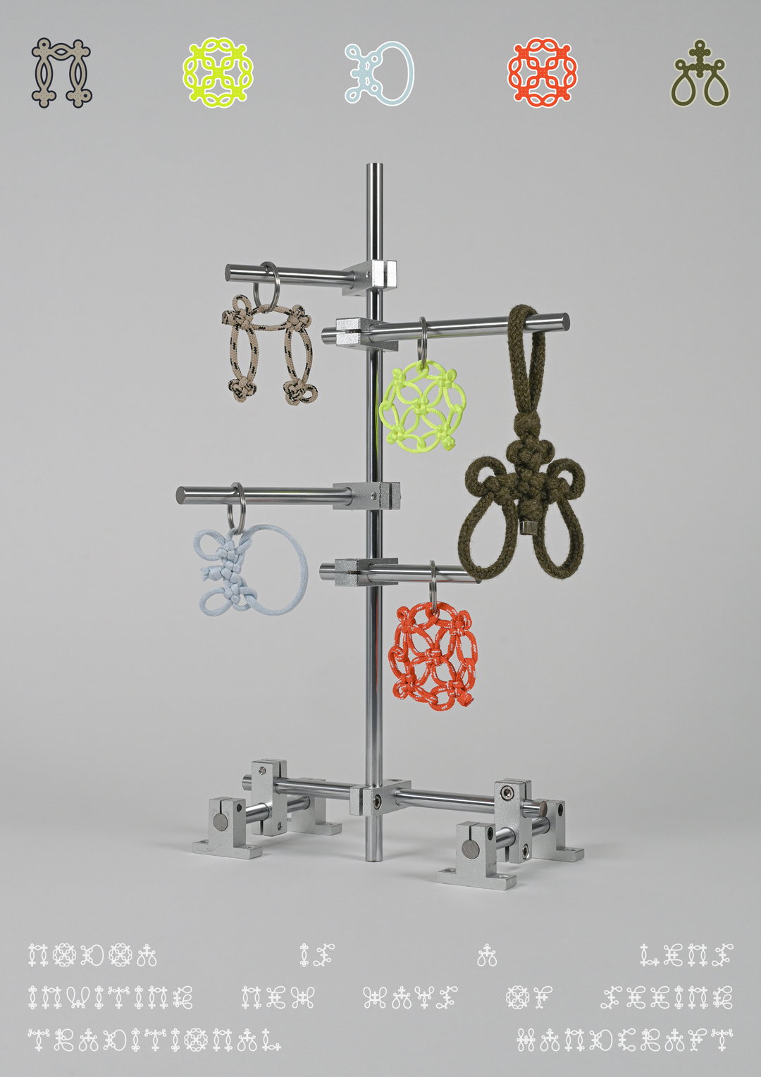
Tied up in tradition: This decorative typeface celebrates the craftsmanship of knotting
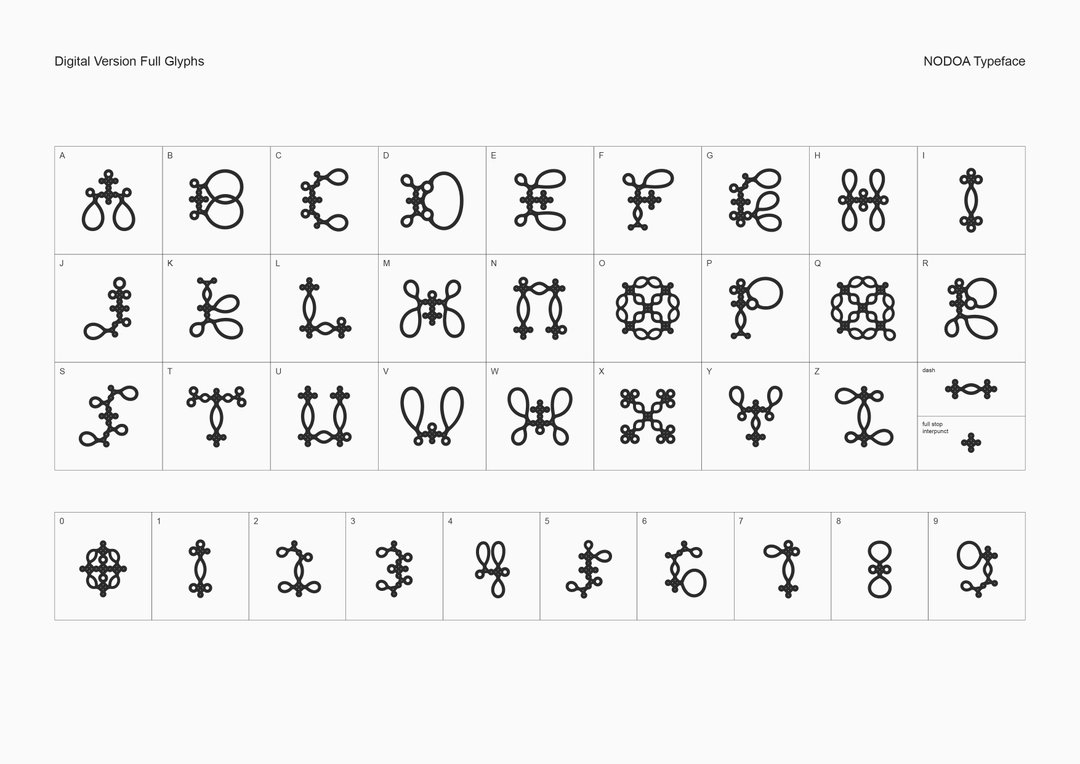
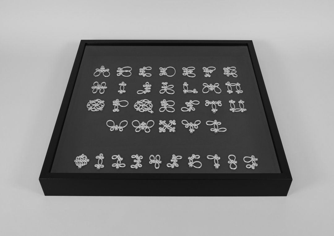
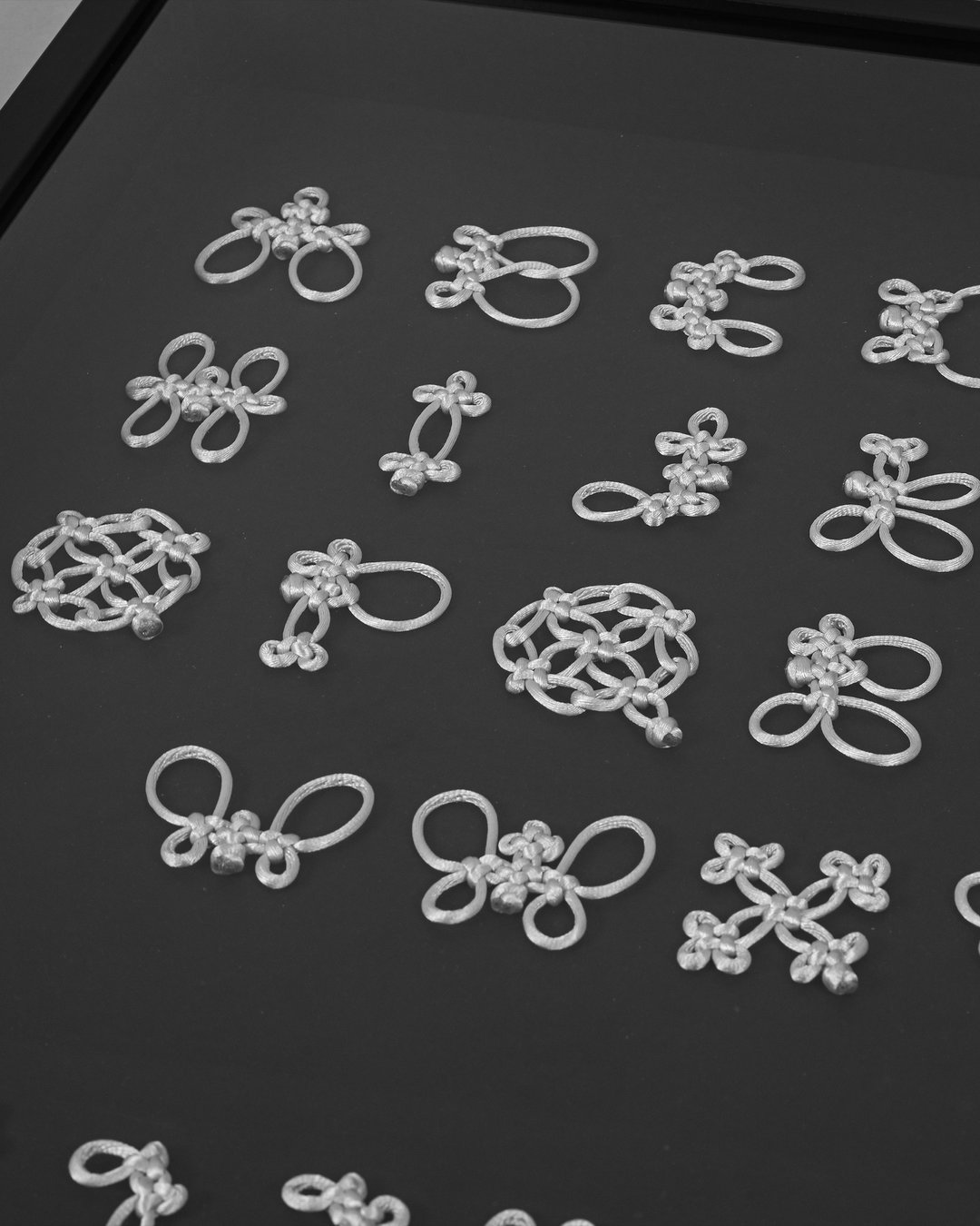
Applying his background in fashion design to letterforms, graphic designer Eikou Zhang has managed to configure a full latin letterset with one classic Chinese knot at its core.
Before the idea for Eikou Zhang’s decorative display typeface Nodoa came about, the London-based designer was very interested knotting. Growing up in Beijing, China, where the craftsmanship of knotting is not only commonplace, but “often carries stereotypical associations”, he says, the graphic designer became very interested in both the hands-on practice of knotting and its cultural and historical ties. Delving head first into a wider research project on the topic, Eikou couldn’t find much surrounding the subject of “dissemination and reinterpretation of Chinese knotting in a contemporary context”, outside of the fine art or fashion worlds. “As a practitioner in graphic design” he says, “I wanted to contribute ideas rooted in this discipline.”
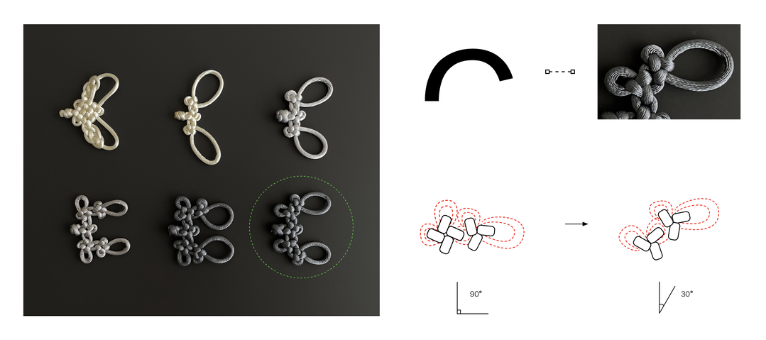
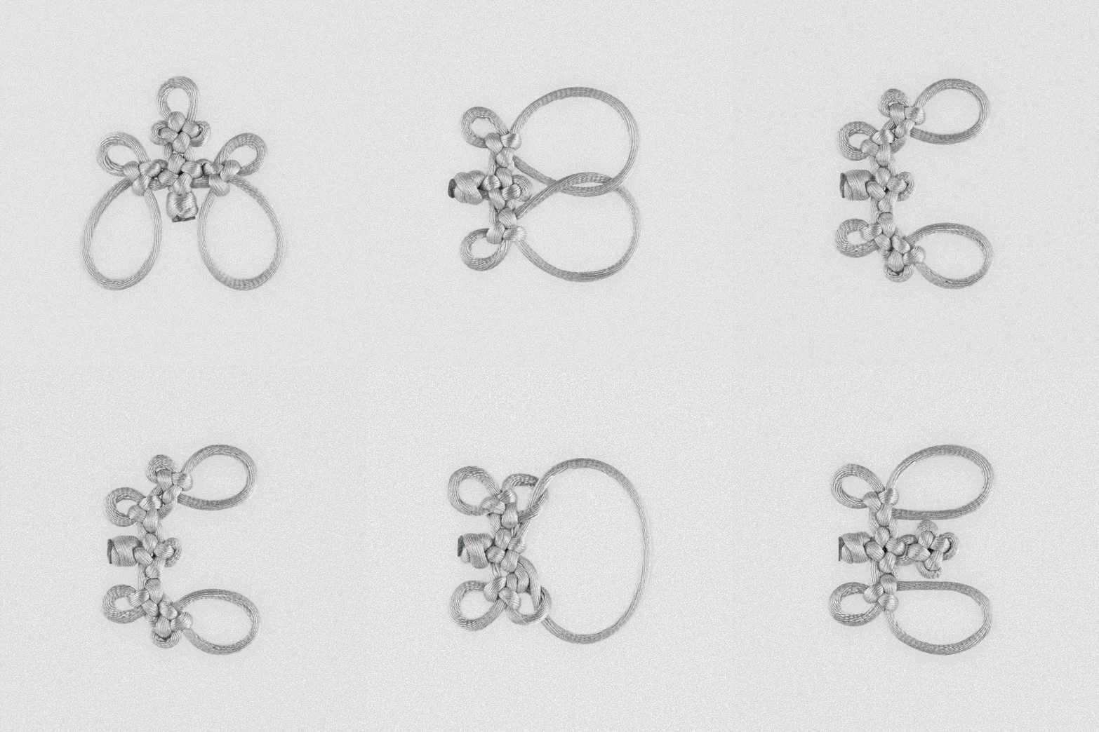
This is where The complete book of Chinese knotting: A compendium of Techniques and Variations by Lydia Chen came in. Using this printed anthology amongst other resources to teach himself some of the traditional craft techniques that surrounded the practice from scratch, the designer uncovered that the cloverleaf knot, in particular, was “a highly flexible and constructive core unit”. The strong structural qualities of which “resonated with the logic of modular type design”, Eikou says.
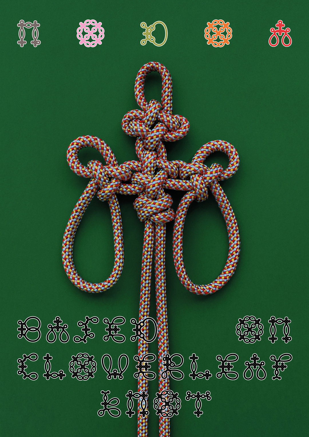
Eikou Zhang: Nodoa Typeface (Copyright © Eikou Zhang, 2025)
With two types of the knot structure to play with: the four-loop and the three-loop clover knot, Eikou began the slow process of analysing which configurations could build the forms of a Latin alphabet. “Initially, four-loop alone limited curves like the letter C and S, to the construction of straight directions”, he shares. “Adding the three-loop knot solved this and showed more craft diversity within the rules.”
There was a stage, the designer tells us (one that we all might reach in a project), when he thought he might never reach a full character set. “The challenge was to keep the typeface consistent without making the letters too literal, while still letting the knots’ characteristics come through,” he shares. “Every single connection between knots required testing.” After much trial and error, tediously searching for ways to integrate the knot patterns into unique forms, Eikou was able to construct an entire system of rules that would form the basis for a beautifully ornate display typeface Nodoa.
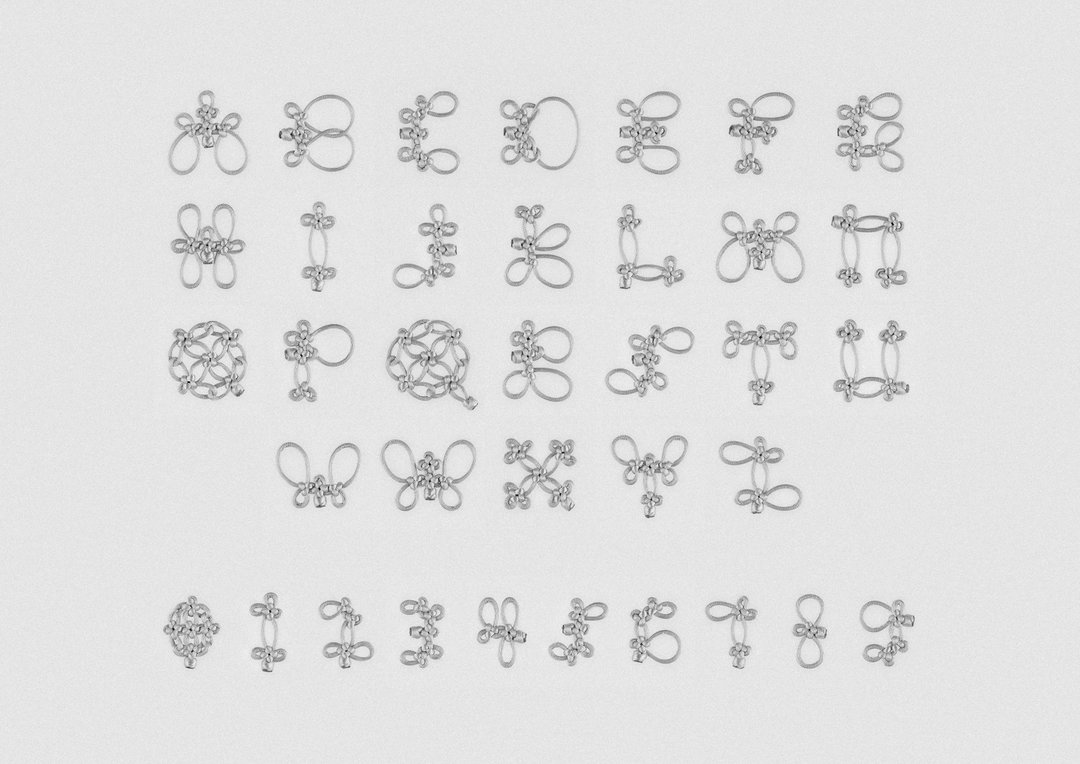
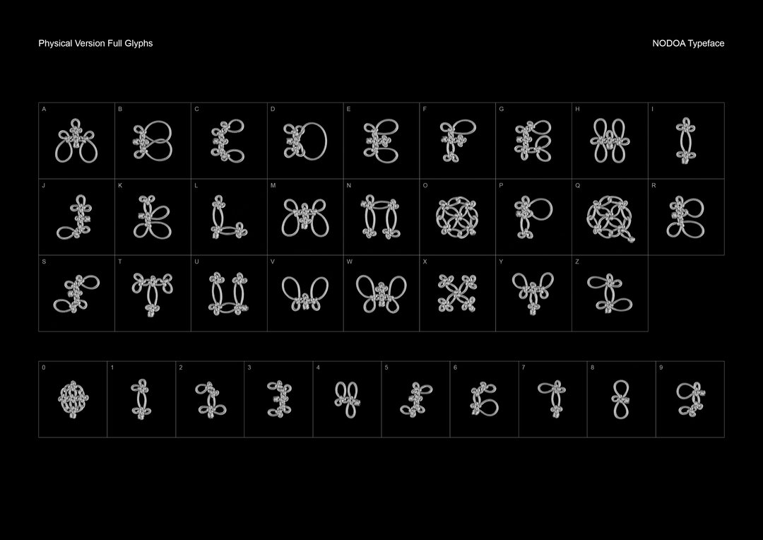
The delicacy and complexity of the resulting letterset is certainly not something you could create digitally – the scale of the handcrafted alphabet in 3D form an even more intricate and impressive sight. Now moving his handmade mastery towards a complete digital version of the typeface, the designer has been working out how he can translate the project’s core into succinct on screen forms: “The most fun aspect of the project for me is the dual physical and digital versions,” he says. “They can be combined in layout design, with the handmade version showing different appearances depending on materials and media, and the digital version adding another layer of possibilities.”
Now tying up the project, the designer is considering crafting a kind of type specimen of the work in the form of a handbook that guides people through tying the full knotting alphabet. Although Nodoa’s digital version has no fixed release plan as of yet, like his countless hours of playing with the shape of string, Eikou is allowing it to develop quite naturally. He hopes that it will bring audiences and designers an opportunity to appreciate and understand a bit more about this traditional Chinese handicraft in whatever form it takes.
GalleryEikou Zhang: Nodoa Typeface (Copyright © Eikou Zhang, 2025)
Hero Header
Eikou Zhang: Nodoa Typeface (Copyright © Eikou Zhang, 2025)
Share Article
Further Info
About the Author
—
Ellis Tree (she/her) is a staff writer at It’s Nice That. She joined as a junior writer in April 2024 after graduating from Kingston School of Art with a degree in Graphic Design. Across her research, writing and visual work she has a particular interest in printmaking, self-publishing and expanded approaches to photography. ert@itsnicethat.com
To submit your work to be featured on the site, see our Submissions Guide.


