Yee Hawr: horsegiirL is the new long face of Dinamo’s half sans half serif experiment in type design
The foundry’s first OOH print campaign is a hay fever dream that stretches across streetside billboards and fold out posters – it even includes some variable font karaoke.
A pretty revolutionary collaboration occurred between type foundry Dinamo and designer Elias Hanzer in 2021. ABC Arizona was the first typeface to merge multiple genres into a single unified font family – a sans to serif superfamily and an all-in-one toolbox for designers, “even the haters respected the move,” says Johannes Breyer, co-founder of Dinamo. Although Arizona pretty much did anything you needed it to do already, the foundry decided to return for a round two of sorts this month, when they brought two new compressed and condensed subfamilies onto the scene.
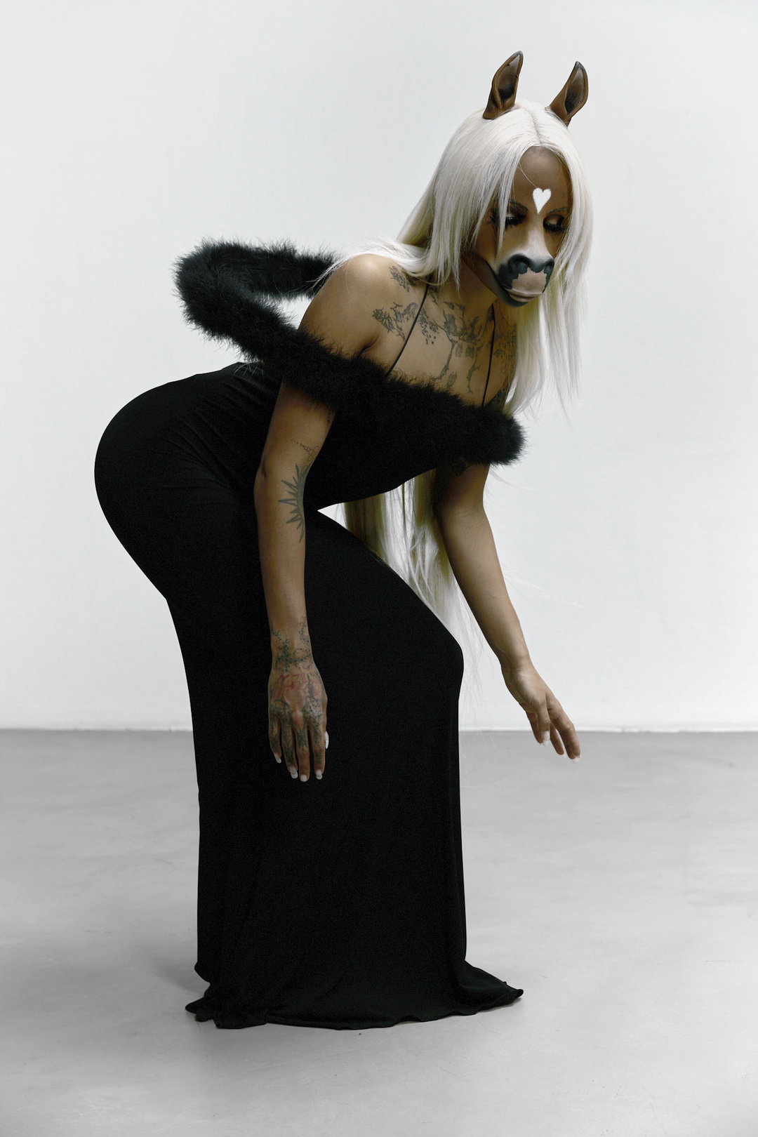
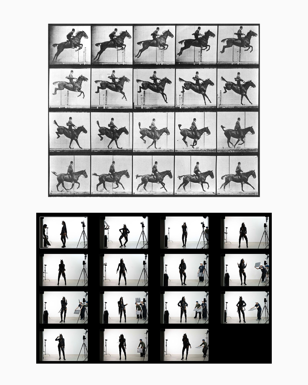
This re-release called for a new celebration of everything the font has to offer. When the team started to push around some ideas, though, “western themes and cowboys felt uninspiring pretty quickly,” Johannes says. Dinamo needed someone who embodied the sans to serif duality of the type family – and who better than part human part horse Berlin-based DJ and singer horsegiirL? “We came up with this formula: Arizona is a variable font, variable fonts move, the first moving image was a moving horse, horsegiirL is half horse, half human. It felt like the perfect match!,” Johannes tells us. So the team asked if the musician would like to be the face of Arizona’s new campaign – “essentially being our first true type-face”, he says.

Dinamo Typefaces: Arizona b2b horsegiirL (Copyright © Dinamo Typefaces, 2026)
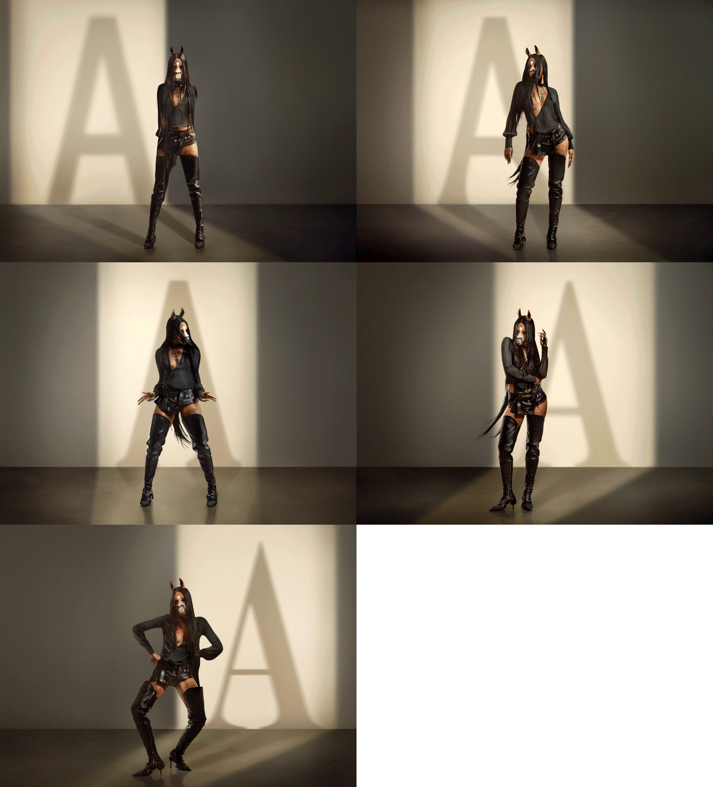
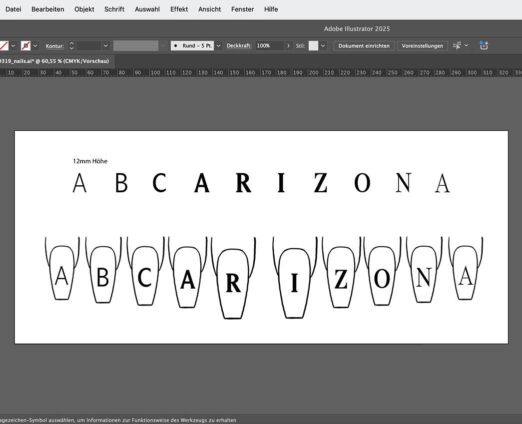
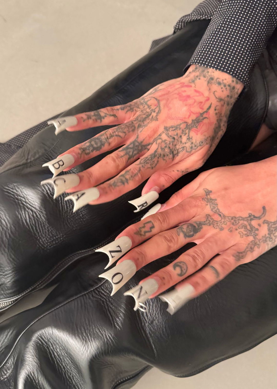
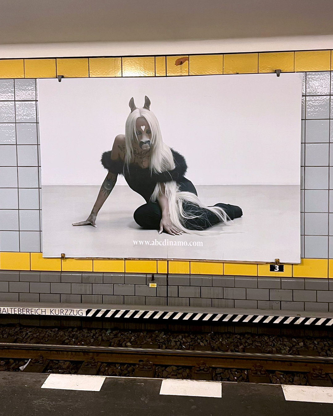
HorsegiirL was on board and it wasn’t long until she was on billboards and posters across Berlin, London and New York which featured a series of cinematic studio shots of the DJ, with a seriously good manicure, stood in front of “a hot desert sun casting five different, alphabetical shadows – an awful-sounding idea that we took very seriously”, says Johannes. With art direction led by Dinamo and Veryes and photography by Tereza Mundilová, the foundry’s first OOH campaign for a typeface was a move that Dinamo thinks only made sense to share in the real world: “horsegiirL is a musician who plays festivals and clubs – she exists in physical space, in front of crowds. It felt right to take the campaign out of phone-screen-sized social media and into the streets,” Johannes says.
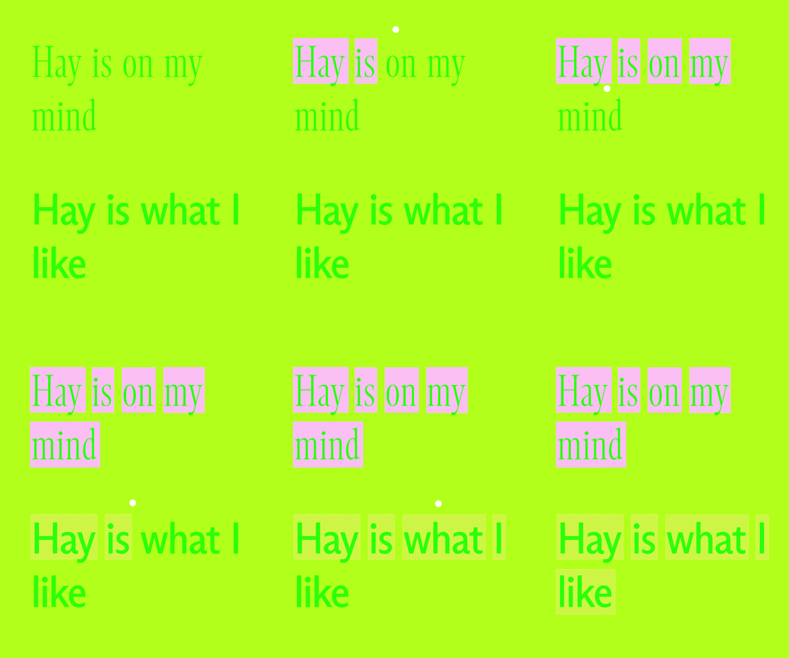
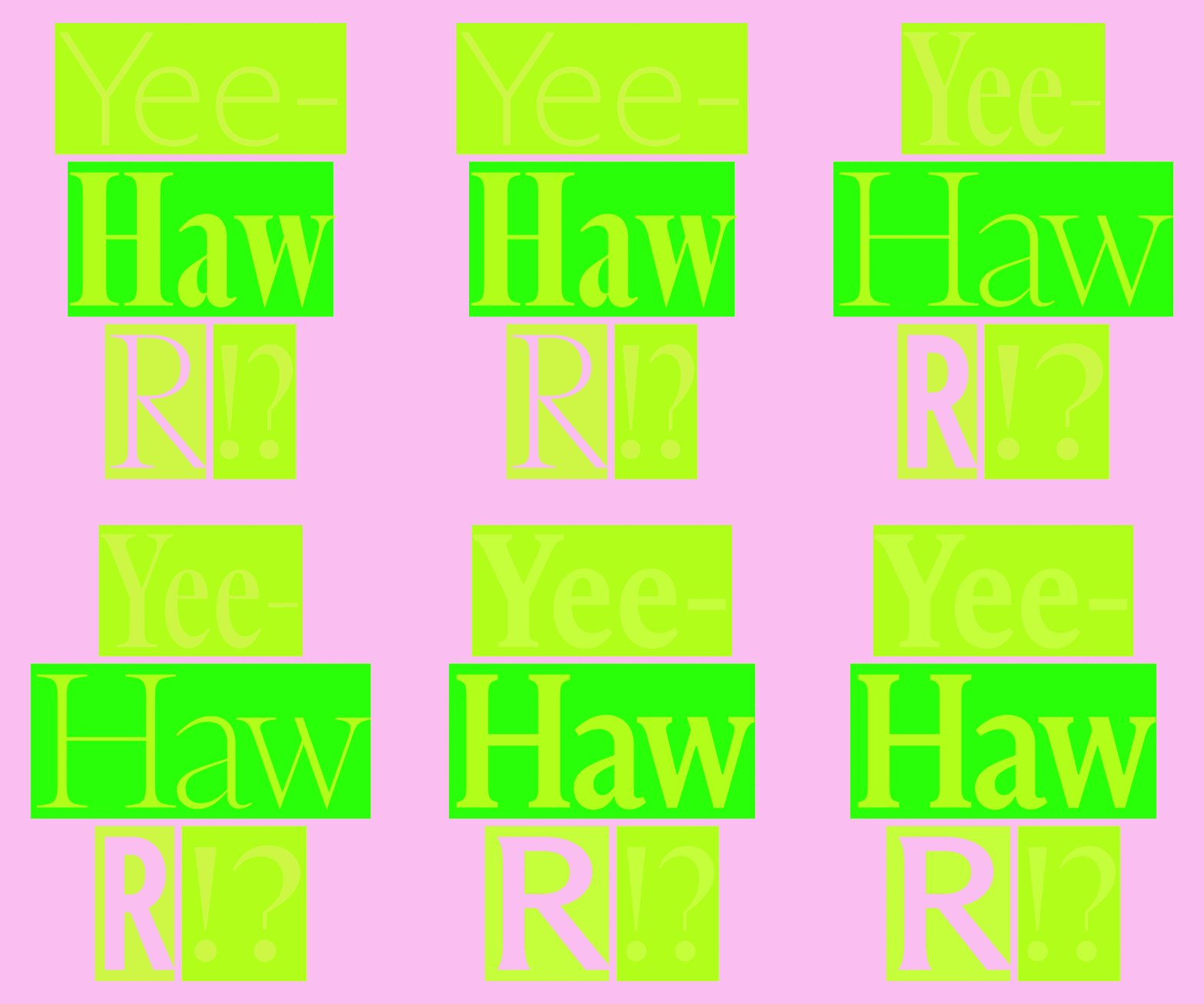
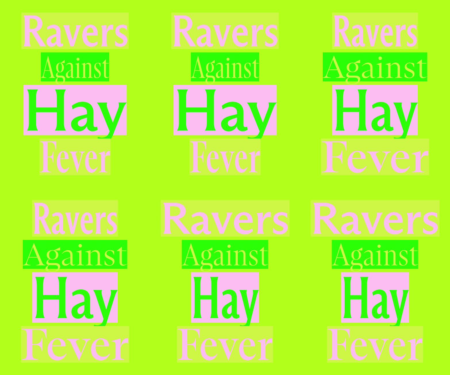
This line of thinking also informed Dinamo’s approach to the updated type specimen that the team self published via their imprint Dinamo Editions for Arizona. Inspired by teen magazines that come with a fold out poster of your favourite popstar, each subfamily including the newcomers has been displayed in a newspaper that works the same way – “five loose sheets, half type specimen, half reader, and most importantly five posters you can put on your bedroom wall,” Johannes explains. “A nice added bonus is that when you flip through the pages on a table, you get rewarded with nice, unintentional combinations of text and image.”
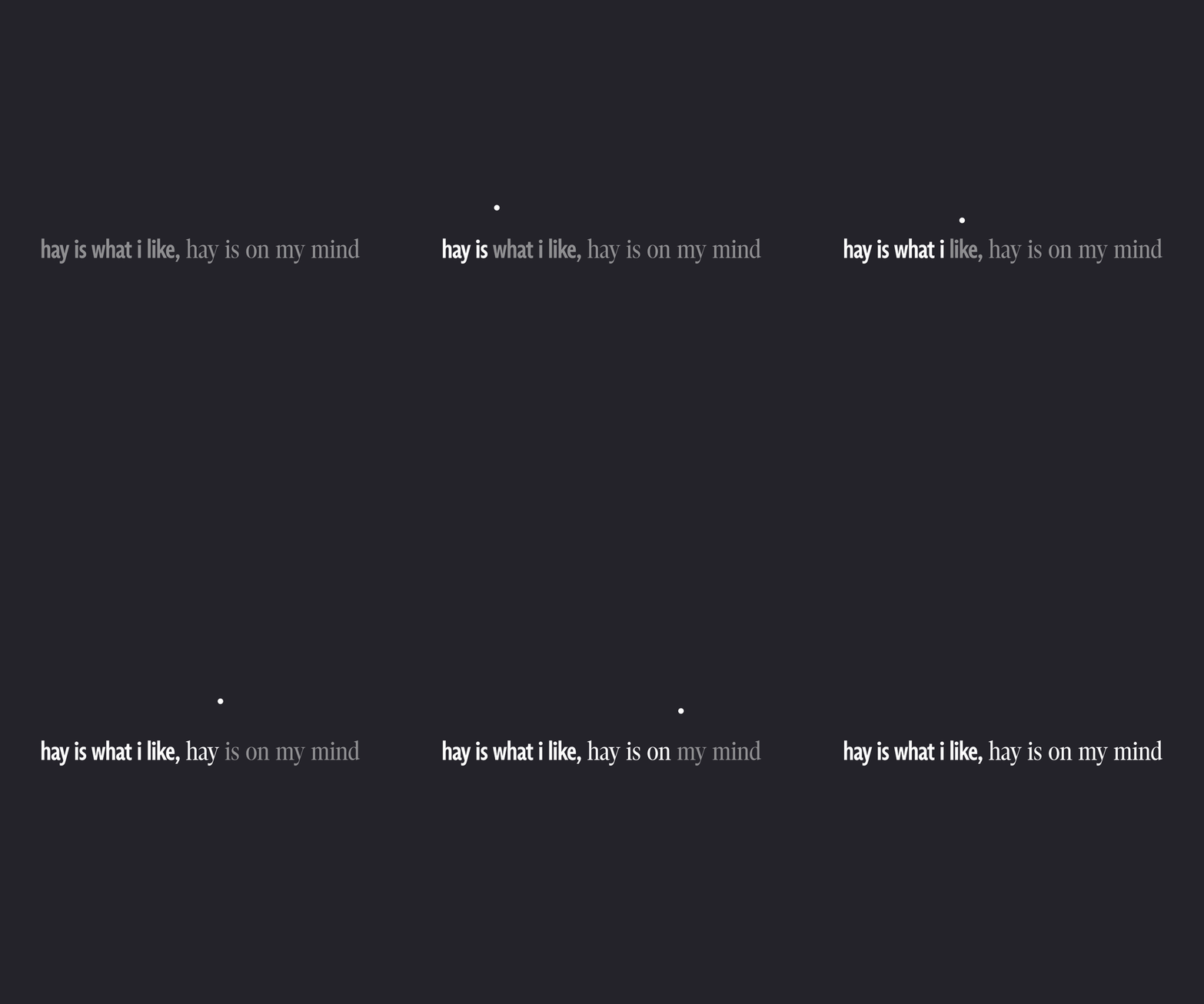
Although the focus of the typefaces campaign was in print, the launch came along with some very fun variable font karaoke that really makes you want to join the party. In motion the variability to the equally precise and flexible system comes out in full force, with the new compressed and condensed styles adding “another layer to this variable beast,” ends Johannes. “Tightly-set headlines, compact small-size body copy, there’s even more width to play with. A designer can now cover a whole project – expressive display, functional text – without ever leaving the family.”
GalleryDinamo Typefaces: Arizona b2b horsegiirL (Copyright © Dinamo Typefaces, 2026)
Hero Header
Dinamo Typefaces: Arizona b2b horsegiirL (Copyright © Dinamo Typefaces, 2026)
Share Article
Further Info
About the Author
—
Ellis Tree (she/her) is a staff writer at It’s Nice That. She joined as a junior writer in April 2024 after graduating from Kingston School of Art with a degree in Graphic Design. Across her research, writing and visual work she has a particular interest in printmaking, self-publishing and expanded approaches to photography. ert@itsnicethat.com
To submit your work to be featured on the site, see our Submissions Guide.