





Fifa rebrands as EA Sports FC and debuts reworked geometric logo
Uncommon’s triangular brand marque is inspired by the history of gaming, passing patterns and the player control indicator in every edition of Fifa thus far.
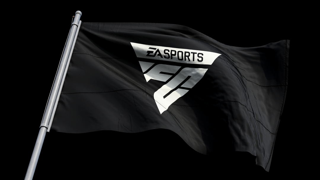
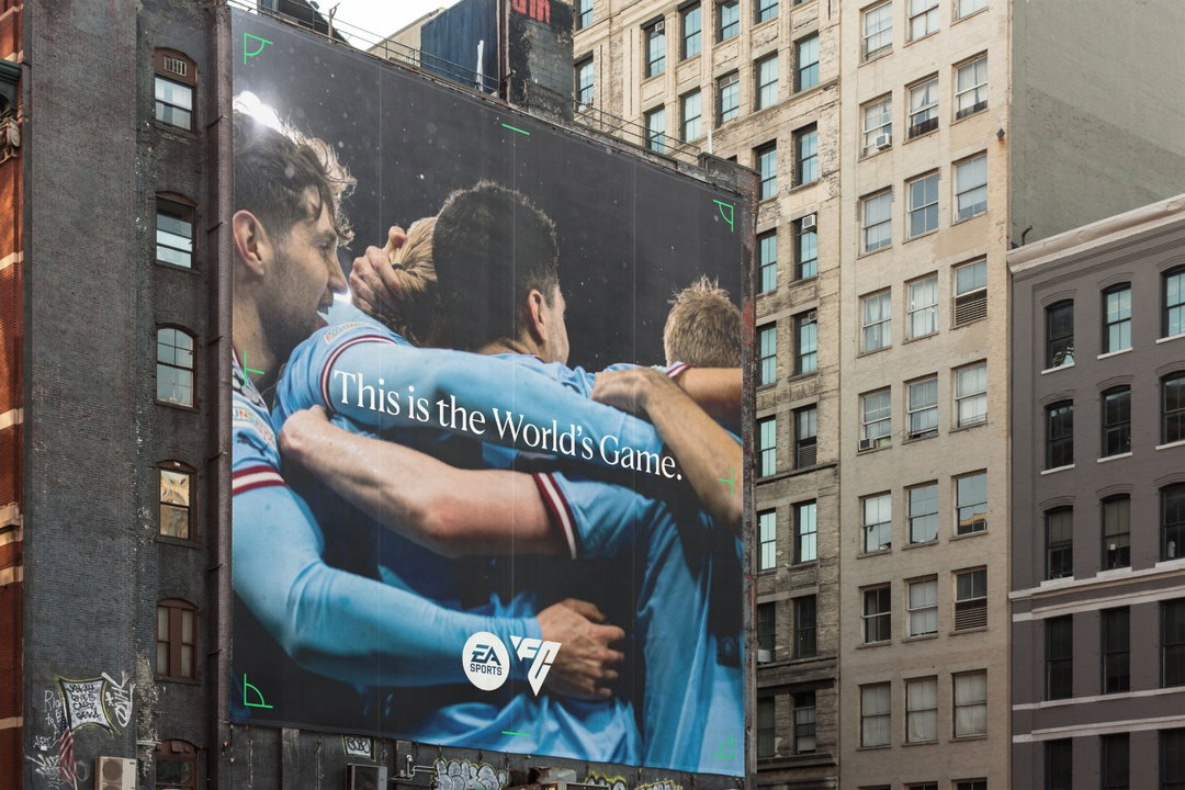
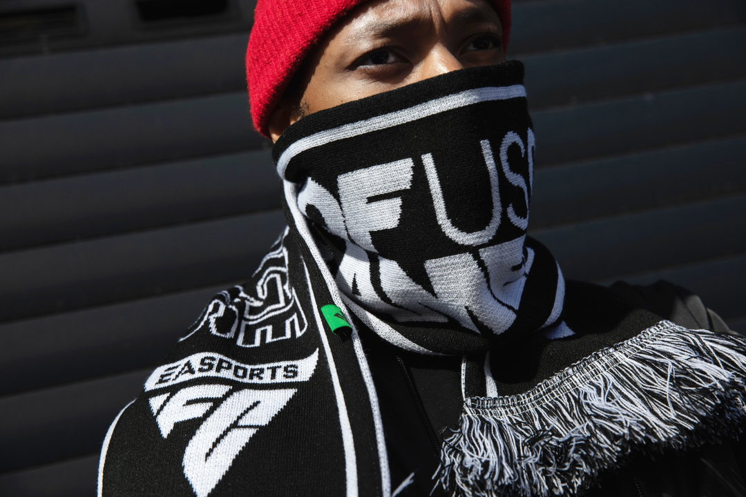
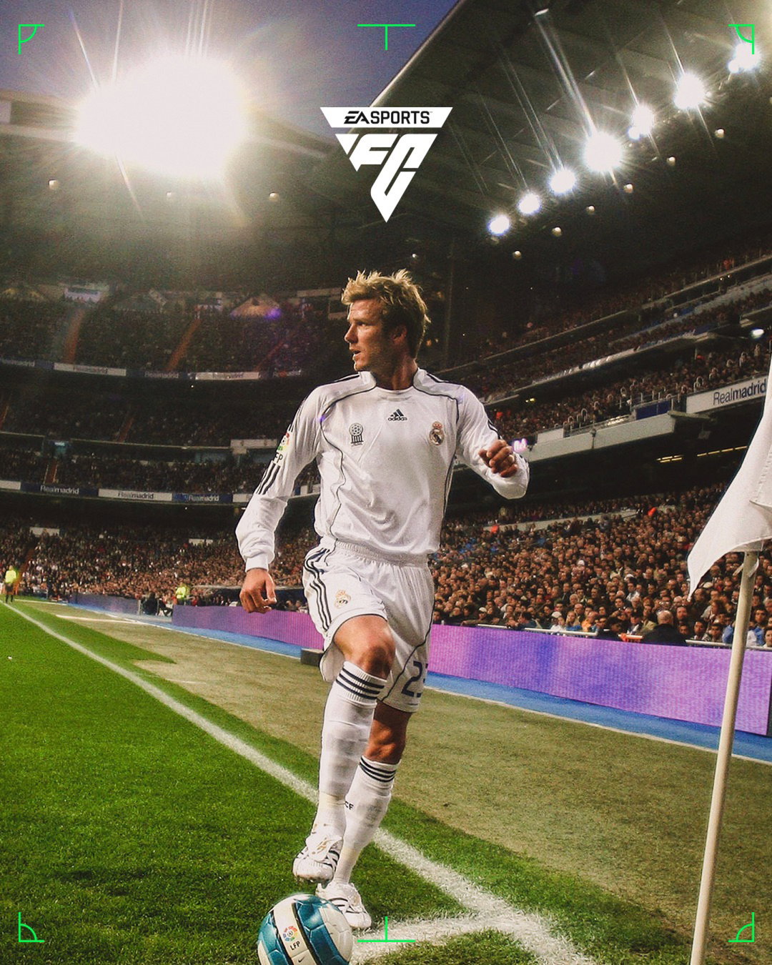
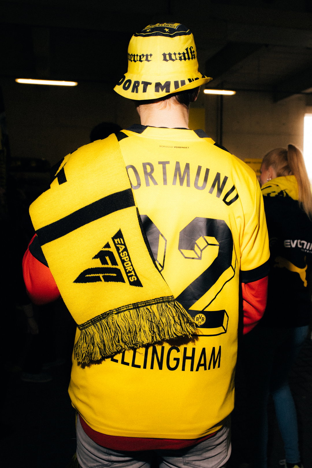
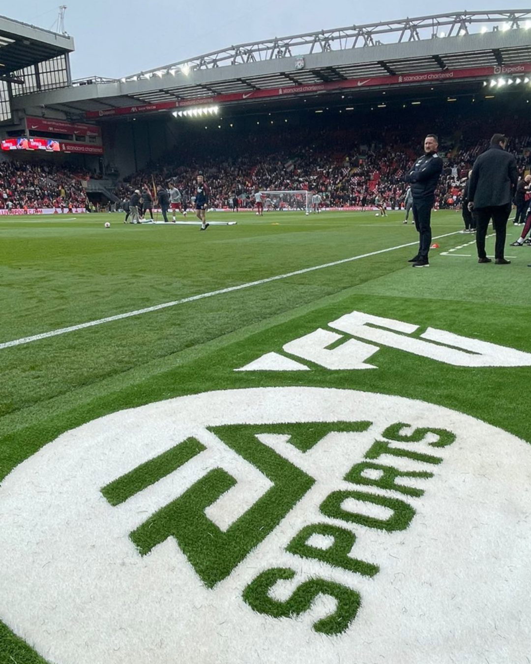
EA Sports has shifted away from the Fifa brand launching EA Sports FC with a new vision and identity from Uncommon Creative Studio, plus motion design from Buck. A new triangular logo takes its cue from an overlooked design element of the Fifa games which crops up repeatedly across its 30-year history.
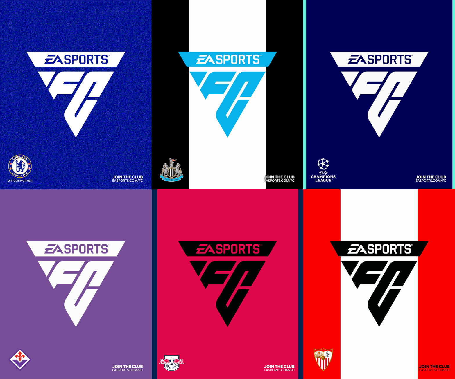
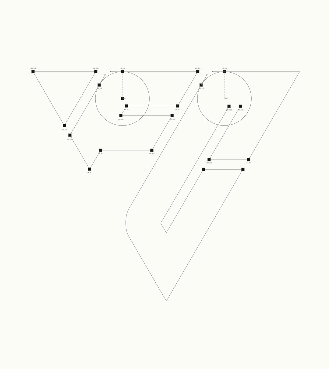
It draws primarily from the floating triangle which appears above player characters in the electronic game. Although, Uncommon outlines the presence of this shape within football too – in passing patterns and set plays – and in the isometric angles and triangular polygons of vintage and modern video games. The new marque sets the FC initials in a triangular grid system; it appears in three versions across the identity: a primary logo, two letter product prefix and authenticity mark.
“The task of partnering with EA Sports to brand not only one of the most iconic games ever to exist, but also arguably the biggest football club in the world was irresistible,” says Nils Leonard, co-founder at Uncommon. “Without knowing it, the new logo had been in our hands for almost 30 years. Above the heads of our heroes. Between passes and the feet of legends celebrated the world over.”
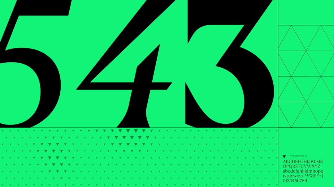
Two custom typefaces were developed for EA Sports FC in partnership with F37 Foundry, inspired by two players: Johan Cruyff and Marta. The first font draws from Cruyff to guide the structural form of character stems, with ink traps adhering to a triangular system; the second “romanticises the style and flair of [the] Brazilian footballer, Marta”, explains an Uncommon release.
Buck continues this game-focused approach in the motion design and 2D animation. “We see the motion design system as an integral piece of the puzzle in the launch of the EA Sports FC brand,” says Jon Gorman, creative director at Buck. Our goal was to imbue the visual identity with the energy of the game itself – its structure, dynamics, forward momentum – to evoke how football feels, both as player and fan.”
GalleryUncommon: EA Sports FC (Copyright © Uncommon, 2023)

Hero Header
Uncommon: EA Sports FC (Copyright © Uncommon, 2023)
Share Article
Further Info
About the Author
—
Liz (she/they) is the senior editor at Insights, a research-driven department within It’s Nice That. They previously ran the news section of the website. Get in contact with them for potential Insights collaborations or to discuss Insights’ public-facing reports.





