



Launch Recite Me assistive technology

The equaliser bar inspired Transmission Roundhouse’s monogram by Only
—
Date
15 August 2019
A white logo on a black background reads “Transmission Roundhouse”. To the left of the text is a geometric symbol made of two white squares.
Above

Only: Transmission Roundhouse identity

Transmission Roundhouse is the online station run by the established Camden venue, the Roundhouse, and since launching in 2018 has given a voice to young emerging talents in radio. With a workforce of show presenters and producers aged 18-25, the station is a platform for experimental content, radical opinions, and innovative, forward-thinking approaches to broadcasting. Its identity by Manchester design studio Only therefore had to convey some of that spirit, and appeal to its young audience.

Its brief was to “capture the full spectrum of underserved youth cultures represented by the station,” – no mean feat, but one that Only has tackled by ensuring the visual language is “current, not commercial,” it explains, “authentic, not faddy”. It began with the monogram, a blocky icon inspired by the movement of dynamic equaliser bars, hinting, Only says, at broadcast and transmission. As such, a cube of the T initial has been turned into a slider, and situated at the top corner of the rest of the monogram, it symbolises broadcasting frequencies.

This slider theme travels through the rest of the identity, with bold type – Univers LT Std – laid on top of photography by Kirsten Kerr in vertical and horizontal grids, used in a huge range of sizes or “volumes” as Only puts it. This embraces “individual identity and unique self-expression.”

Underlying the design is a concept coined by Only and Roundhouse as “cut through the noise” – a tagline to position the station as the home of experimental youth content, and convey its radical spirit.

Only previously worked with another London venue, Printworks, on its graphic identity which drew inspiration from the building’s former life as a printing press for the Evening Standard newspaper.
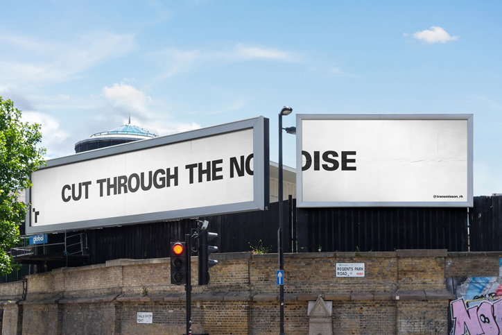
Two large white billboards stand side by side against a blue sky. Together they read “CUT THROUGH THE NOISE”, with the word “NOISE” split across the two boards.
Above

Only: Transmission Roundhouse identity
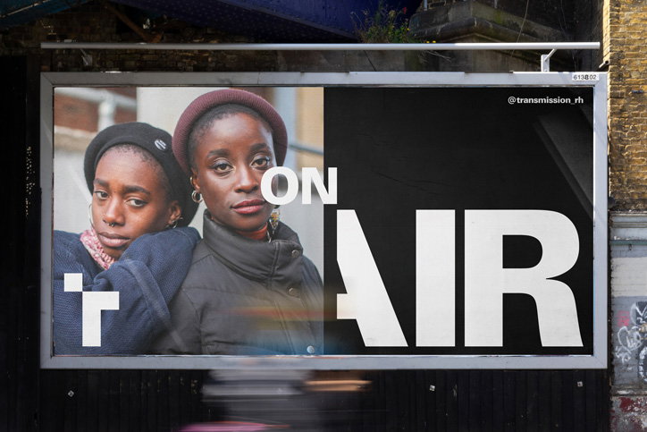
A billboard features two people looking at the camera, partially overlaid by bold white text that reads “ON AIR”. A small handle, “@transmission_rh”, is visible in the top right corner.
Above

Only: Transmission Roundhouse identity
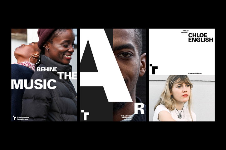
Three vertical posters side by side. The first shows two people smiling, with the text “BEHIND THE MUSIC”. The second features a close-up of a person’s eye behind a large white letter “A”. The third shows a person looking upwards, with the name “CHLOE ENGLISH” at the top.
Above

Only: Transmission Roundhouse identity
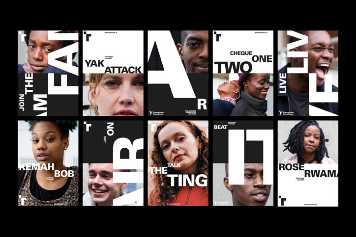
A grid of ten graphic posters featuring close-up portraits of people paired with bold, fragmented typography. The black and white designs use high-contrast layouts with phrases such as “Join the fair”, “Yak attack” and “Talk the ting”.
Above

Only: Transmission Roundhouse identity
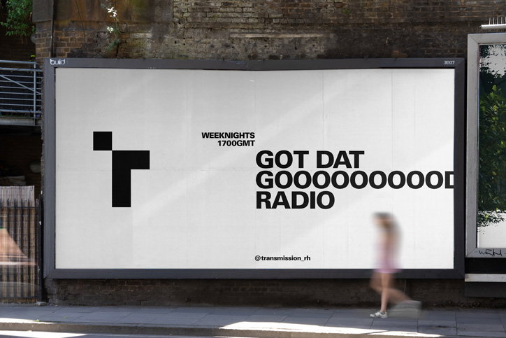
A large white billboard on a brick wall reads “GOT DAT GOOOOOOOOOOOD RADIO”. Smaller text above reads “Weeknights 1700GMT” and a handle below reads “@transmission_rh”.
Above

Only: Transmission Roundhouse identity
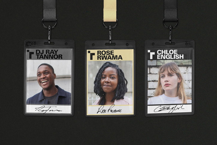
Three ID badges hang against a black background. Each features a portrait, a name in bold capitals, and a handwritten signature below. The names read “DJ Ray Tannor”, “Rose Rwama” and “Chloe English”.
Above

Only: Transmission Roundhouse identity
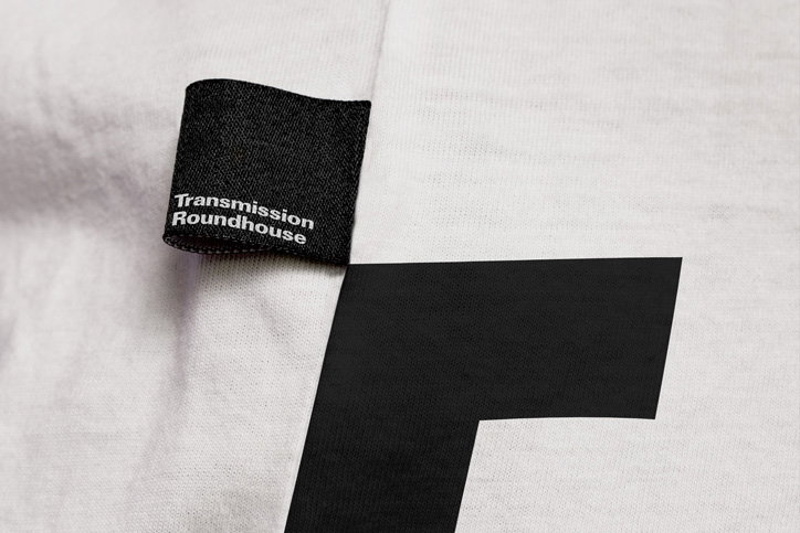
A close-up of a white fabric garment featuring a black woven label that reads “Transmission Roundhouse”. A large, bold black graphic shape is printed on the fabric below the label.
Above

Only: Transmission Roundhouse identity
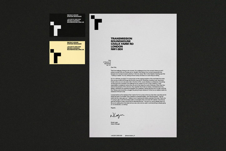
A set of black and cream stationery including two business cards and a letter. The layout features a bold, minimalist “T” logo and the text “Transmission Roundhouse” in a clean sans-serif typeface.
Above

Only: Transmission Roundhouse identity
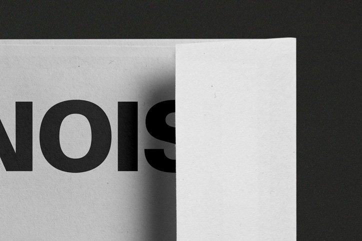
A close-up of a white folded page. Bold black lettering is partially visible, showing the letters “NOIS”.
Above

Only: Transmission Roundhouse identity
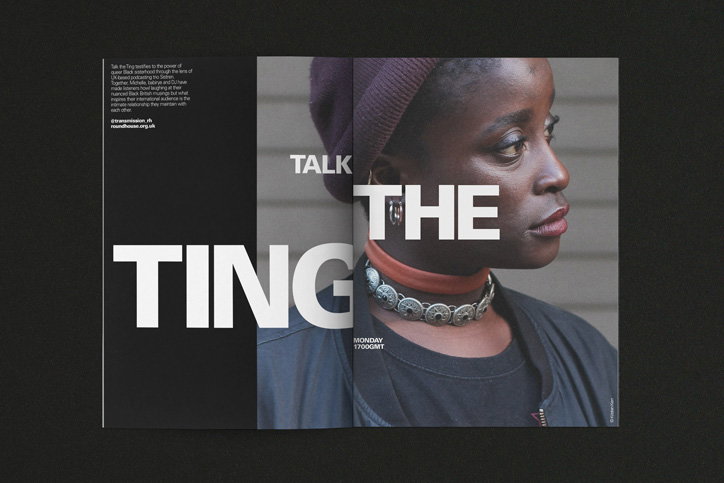
A magazine spread featuring a close-up profile of a person wearing a burgundy beanie and a chunky silver necklace. Bold white typography across the pages reads “TALK THE TING”.
Above

Only: Transmission Roundhouse identity
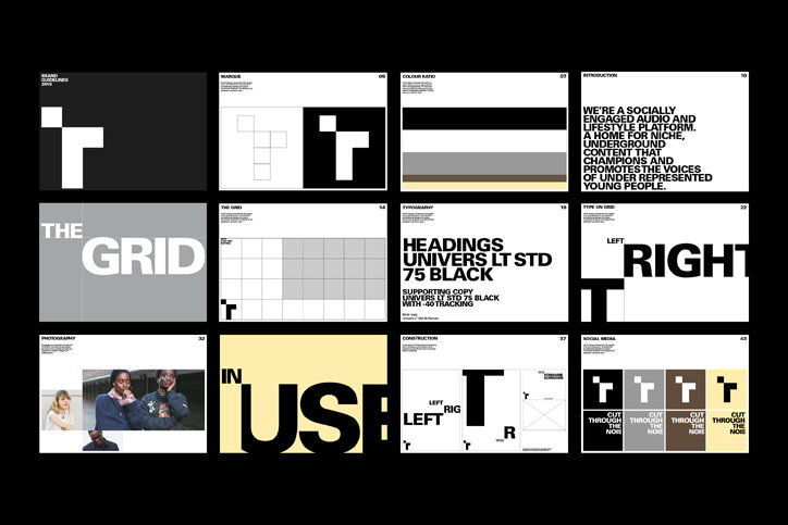
A brand guidelines document presented as a grid of 12 slides. The pages detail the visual identity of a platform, including a bold black and white logo, typography, and a colour palette.
Above

Only: Transmission Roundhouse identity
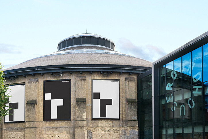
Three large posters are displayed on the curved stone wall of a domed building. Each poster features a bold, black and white geometric graphic resembling a stylised letter “T”.
Above

Only: Transmission Roundhouse identity

Share Article

Further Info

About the Author

Jenny Brewer

—

Jenny oversees editorial output across It’s Nice That. Get in touch with writing pitches for features or opinion pieces, big creative story tips, or questions about all things editorial. jb@itsnicethat.com

To submit your work to be featured on the site, please see our Submissions Guide.
It's Nice That Newsletters

Fancy a bit of It's Nice That in your inbox? Sign up to our newsletters and we'll keep you in the loop with everything good going on in the creative world.