




The Globe unveils reinvented logo in the form of a wooden ‘O’
The Partners: The Globe logo rebrand
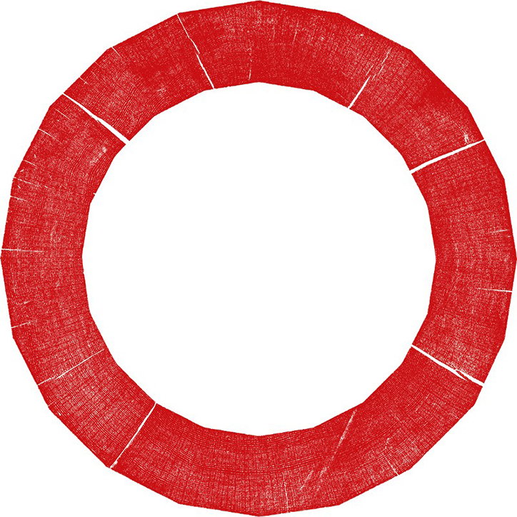
Shakespeare’s Globe has revealed the historic London theatre’s redesigned logo in the shape of a printed wooden ‘O’. The logo’s restoration is part of an updated identity by branding agency The Partners, which spent the past year researching the Globe’s archives, as well as interviewing staff and audiences, to better understand its history and culture.
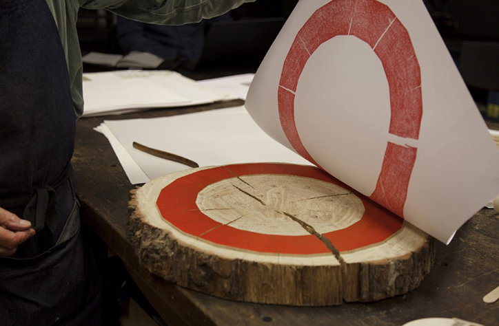
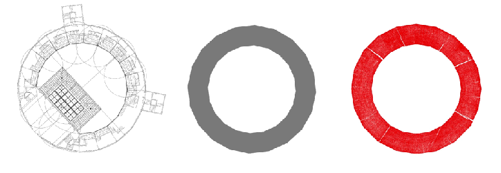
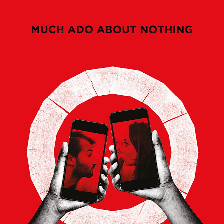
The final design was inspired by a line from Henry V’s prologue which refers to the famous site as a “wooden O”. After discovering that the Globe was in fact a 20-sided polygon, the creative team decided to incorporate a piece of oak into their design. The wooden segment was on display in the Globe’s permanent exhibition dedicated to the theatre’s reconstruction: “It appears to be the only remaining circular piece of oak from the timber used to rebuild the Globe,” creative director Nick Eagleton writes in a Medium post by the theatre. The new logo was printed in red ink, preserving the initial texture of the wooden block with cracks clearly visible. The new typeface, Effra, is also inspired by historical artefacts. It is a modernised version of a font from 1816 called Calson Junior. Even the colour palette, red, black and white, was chosen with the colours of early printing processes in mind.
The logo can be seen on the Globe’s website, on its printed material and social media. The new website is set to launch in April. The logo’s restoration occurs after the addition of the new Sam Wanamaker Playhouse as well as the anticipated £30m project to develop a new library, archive and exhibition space.
The Partners: The Globe logo rebrand
The Partners: The Globe logo rebrand
The Partners: The Globe logo rebrand
The Partners: The Globe logo rebrand

The Partners: The Globe logo rebrand
Share Article
Further Info
About the Author
—
Daphne has worked for us for a few years now as a freelance writer. She covers everything from photography and graphic design to the ways in which artists are using AI.