




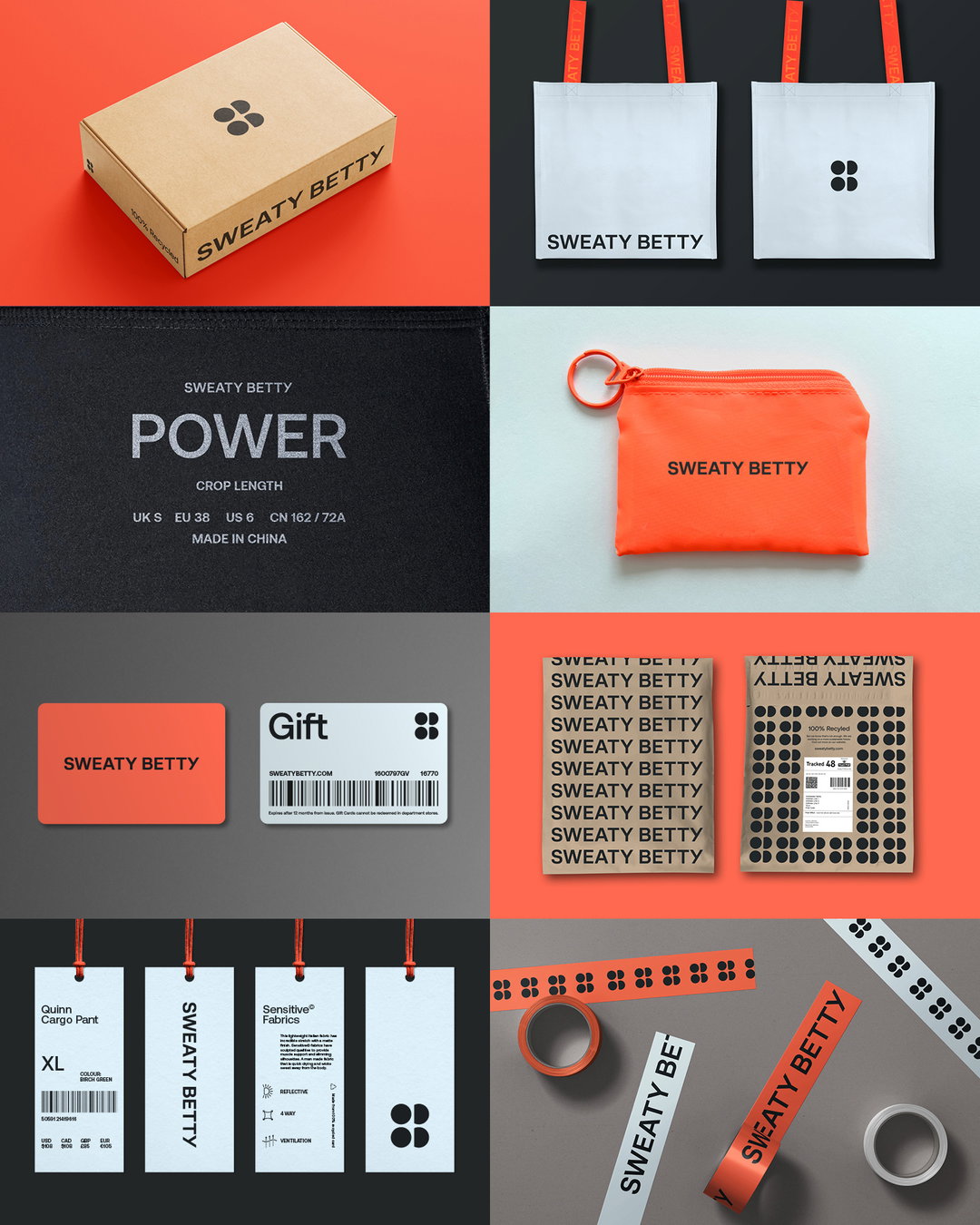
Sweaty Betty ditches boutique branding to keep up with modern attitudes
Gone are the days of the sleek thin sans; activewear brand Sweaty Betty debuts an identity system from Fluoro that stresses new brand message, “don’t sweat it”.
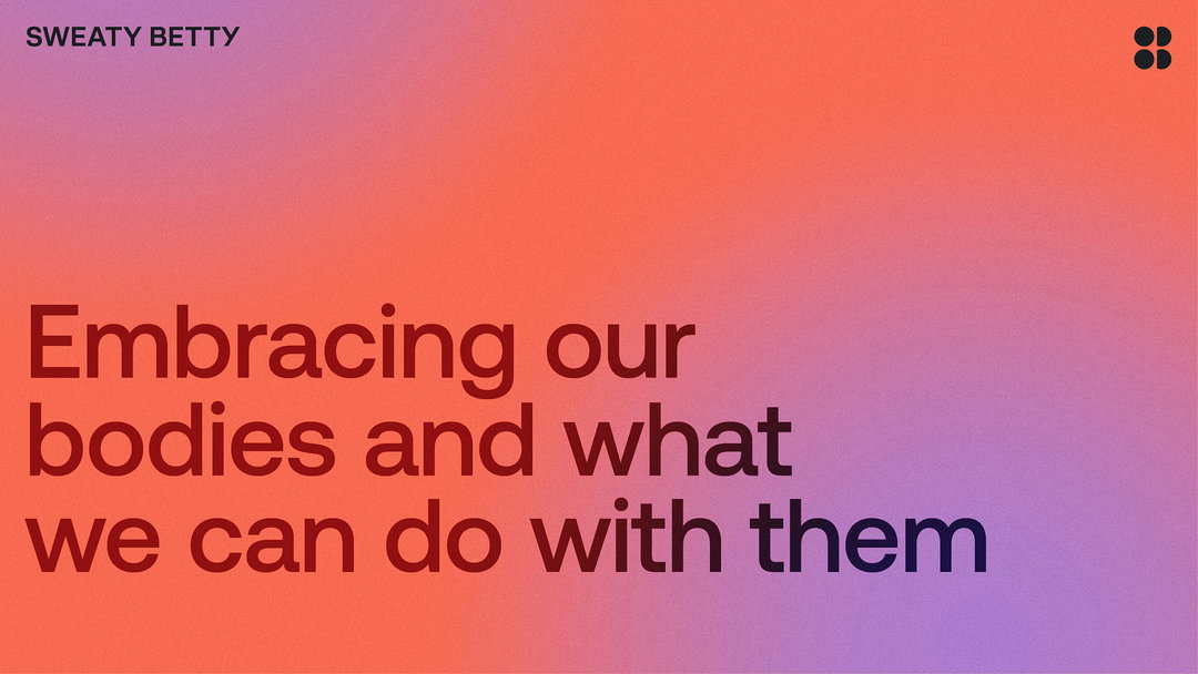
Last year, F37 reworked the Sweaty Betty brand typeface. Moving from the thin, sans serif that dominated boutique retail signs in the early 2000s, Sweaty Betty was given a capitalised logotype with a subdued character – so as not to clash with the brand symbol – and a small imperfection in the form of two differently shaped Ys. F37’s work has been retained in a new brand overhaul by creative agency Fluoro, who is rethinking how the entire brand shows up in the sticky space of ‘female empowerment’ lifestyle brands.
“Through Sweaty Betty’s existing consumer research and a series of brand workshops we conducted ourselves, it was clear the brand wanted and needed to be more real, representative and relatable to achieve their vision,” says Fluoro. “So much of the content and messaging you see around fitness these days is so prescriptive, exclusionary and – to be honest – unhelpful. Rather than pushing this notion that everything about exercise has to be ‘to the max’ or it’s not worth doing, we wanted to give women more space to be real, and focus on the more intrinsic aspect of exercise.”
In line with a more straightforward brand typeface, Fluoro wanted to strip back all the less personable aspects of the brand. “The main challenge – and also the fun bit – was removing all the stereotypical codes of luxury and fashion and replacing them with something more intriguing and real.”
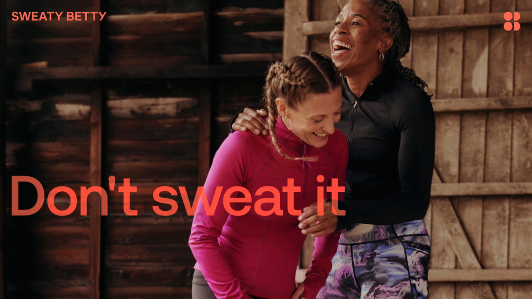
Fluoro: Sweaty Betty (Copyright © Fluoro, 2024)
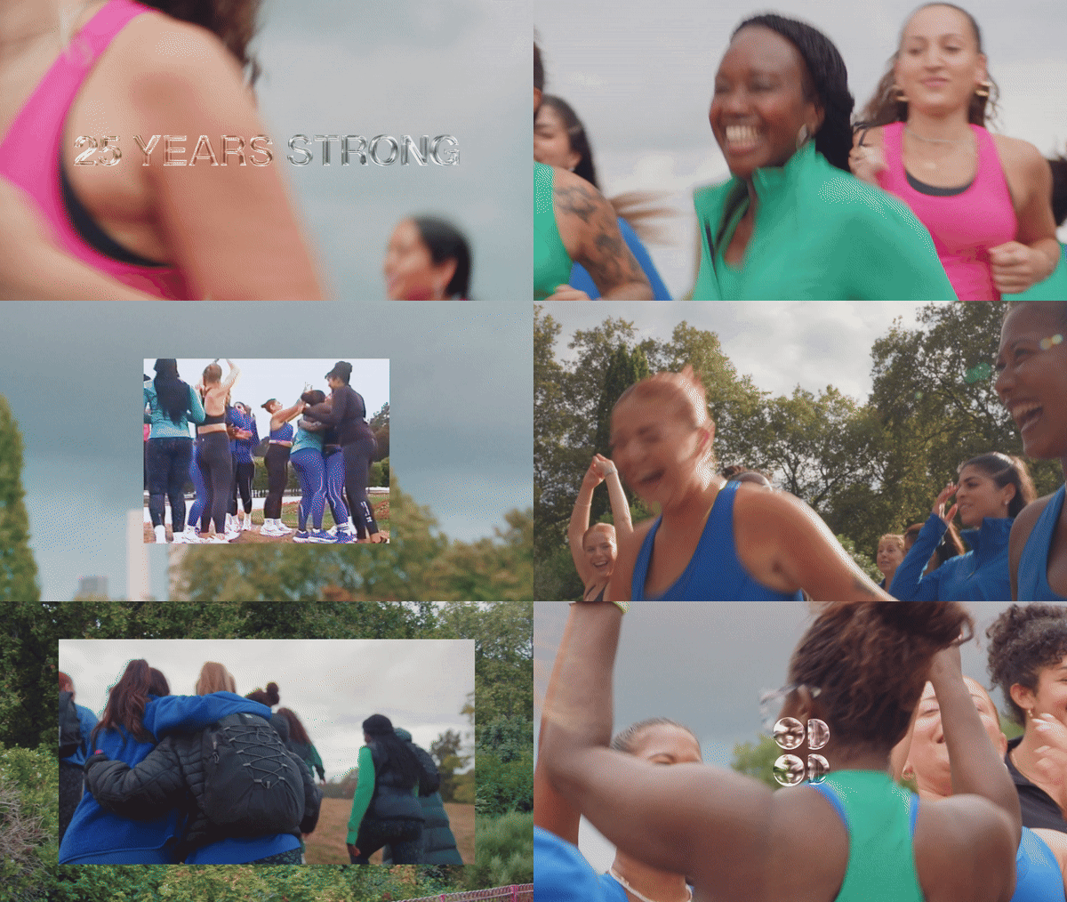
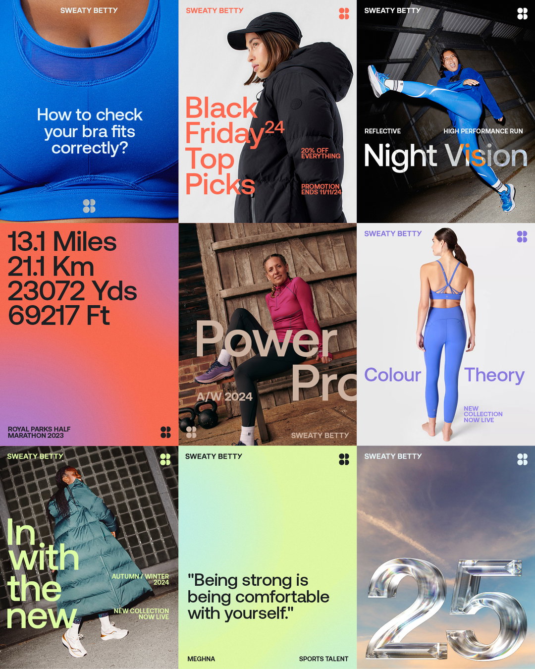
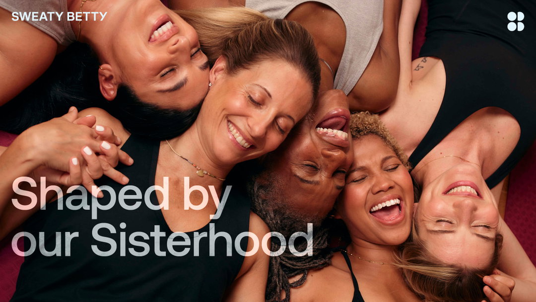
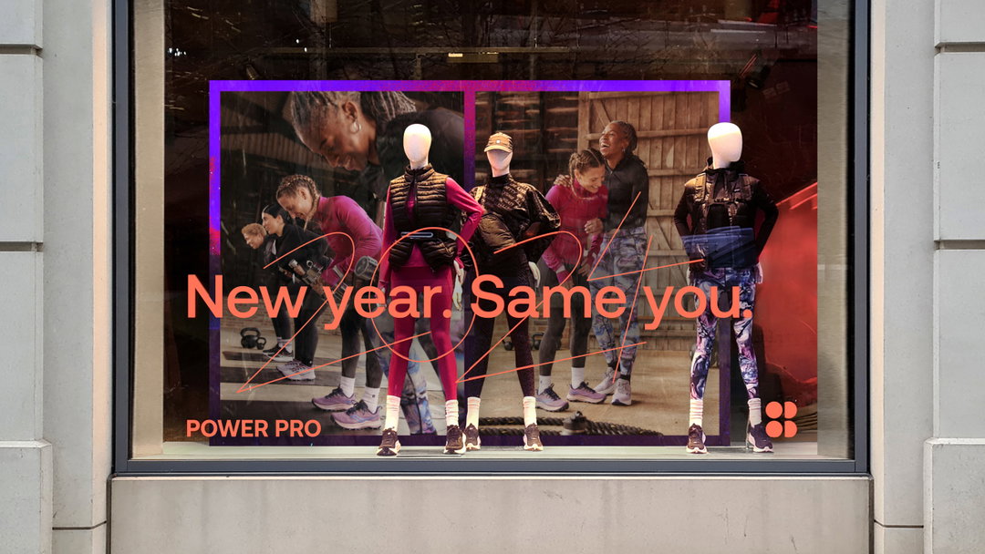
A series of ad campaigns have been introduced, as well as updates to the brand identity. Design updates include a new, more “conversational” brand typeface and the renewal of the original Sweaty Betty orange. Ad campaigns focus more on the tonal shift towards self-acceptance in the activewear sector; Flouro says it wanted to capture women’s “evolving relationship with exercise, as they increasingly prioritise health, wellness and capability over conforming to body ideals”.
Three new brand pillars underline the overhaul: “shaped by our sisterhood”, “crafted to create joy”, and “we sweat the small stuff” (referencing the details in Sweaty Betty’s product design).
GalleryFluoro: Sweaty Betty (Copyright © Fluoro, 2024)



Hero Header
Fluoro: Sweaty Betty (Copyright © Fluoro, 2024)
Share Article
Further Info
About the Author
—
Liz (she/they) is the senior editor at Insights, a research-driven department within It’s Nice That. They previously ran the news section of the website. Get in contact with them for potential Insights collaborations or to discuss Insights’ public-facing reports.





