The Week’s red masthead sits at the centre of a story-driven design system
Luis Mendo has worked on a series of simple illustrations to contrast the title’s detailed cover caricatures.
Global news title The Week has teamed up with Elmwood, the design consultancy behind Extra’s latest rebrand, on a new brand project. At the core of the work is the aim “to help The Week connect more deeply with readers”, the Elmwood release explains, and create a “memorable” brand experience. As such, the consultancy looked to embellish The Week’s primary design asset: its red masthead.
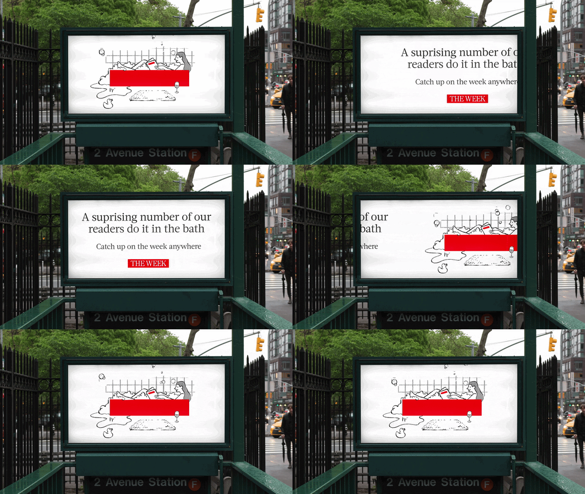
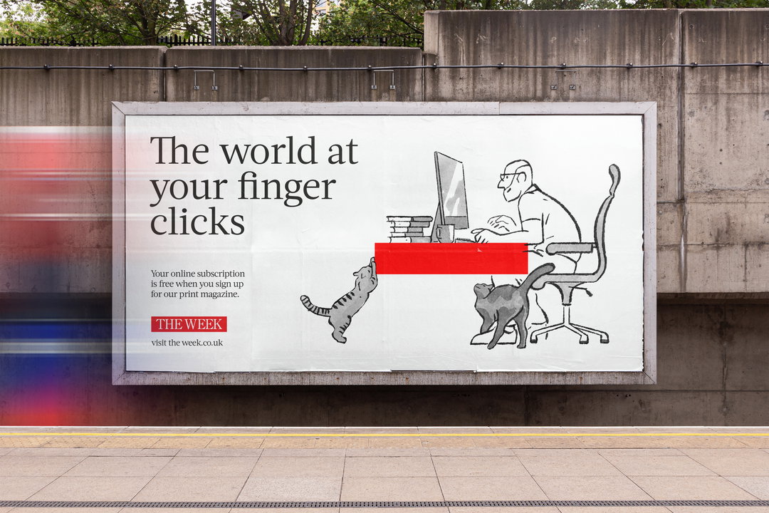
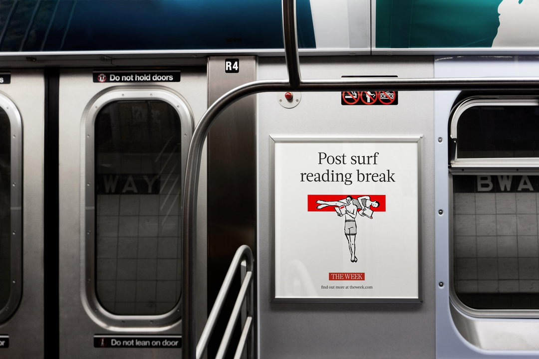
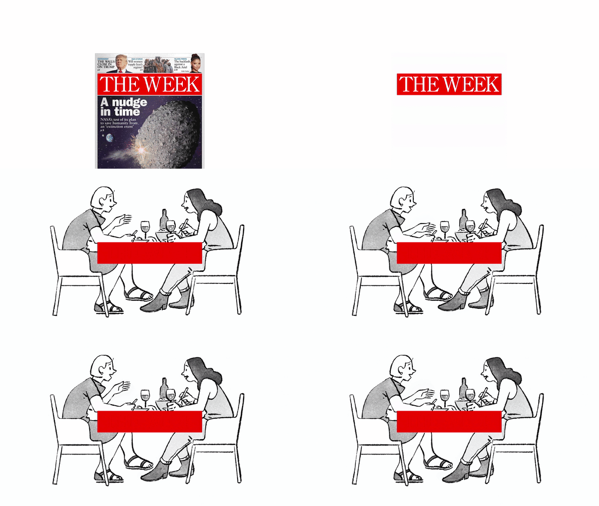
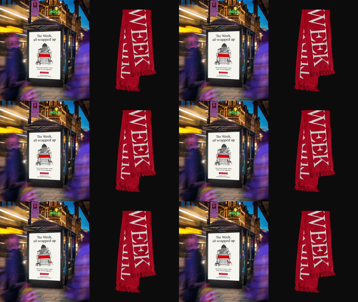
Enlisting Tokyo-based illustrator Luis Mendo – whose work has previously appeared across various publications including The New York Times, The Washington Post, Wired, New York Magazine and Monocle – Elmwood turns the red bar into a springboard for a selection of stories. For example, in one asset, the masthead might become a WFH desk, in others, a bubble bath, a dining room table and an athlete vault. Taglines often correspond to the scenarios chosen, for example the WFH depiction features the copy: “News at your finger clicks”.
The illustrative direction is kept “free yet simple”, says Elmwood, with Mendo’s approach serving as “stylistic foil to The Week’s more detailed, painterly cover caricatures”. “Warmth” and “gentle wit” are among the aesthetic directions Elmwood looks to emulate.
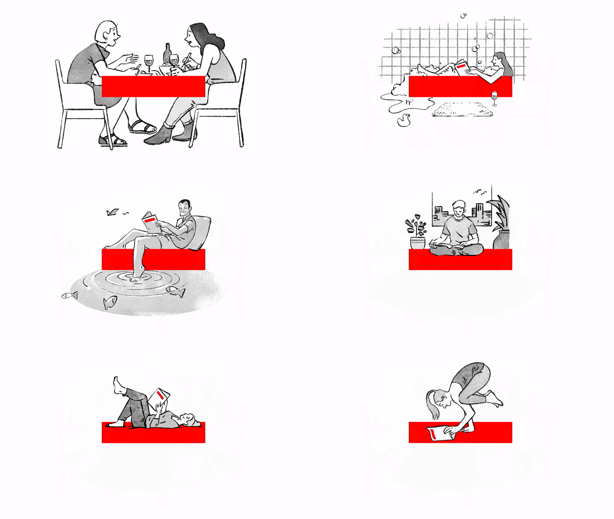
Elmwood: The Week, illustration by Luis Mendo (Copyright © The Week / Elmwood, 2022)
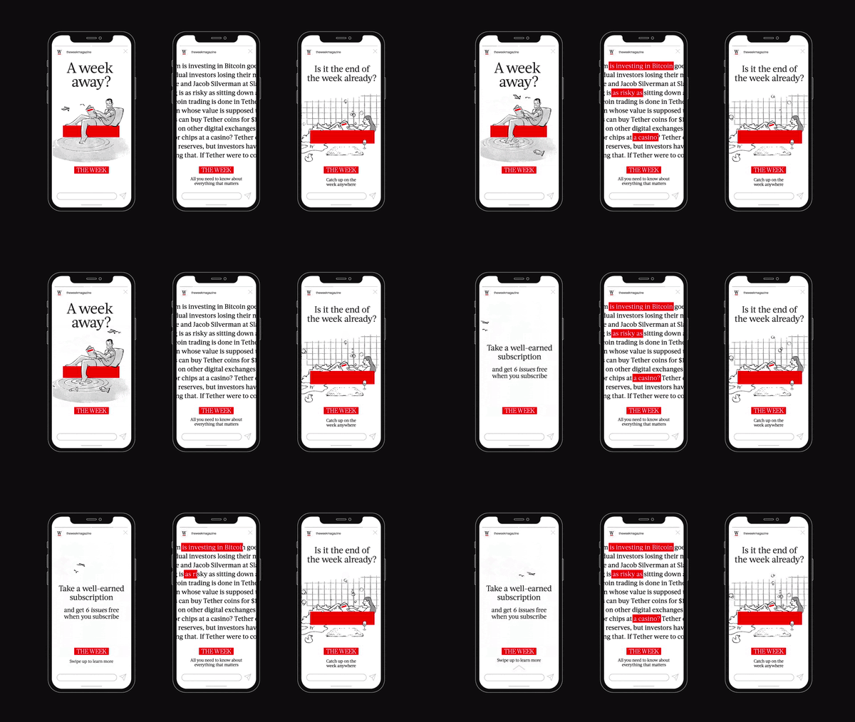
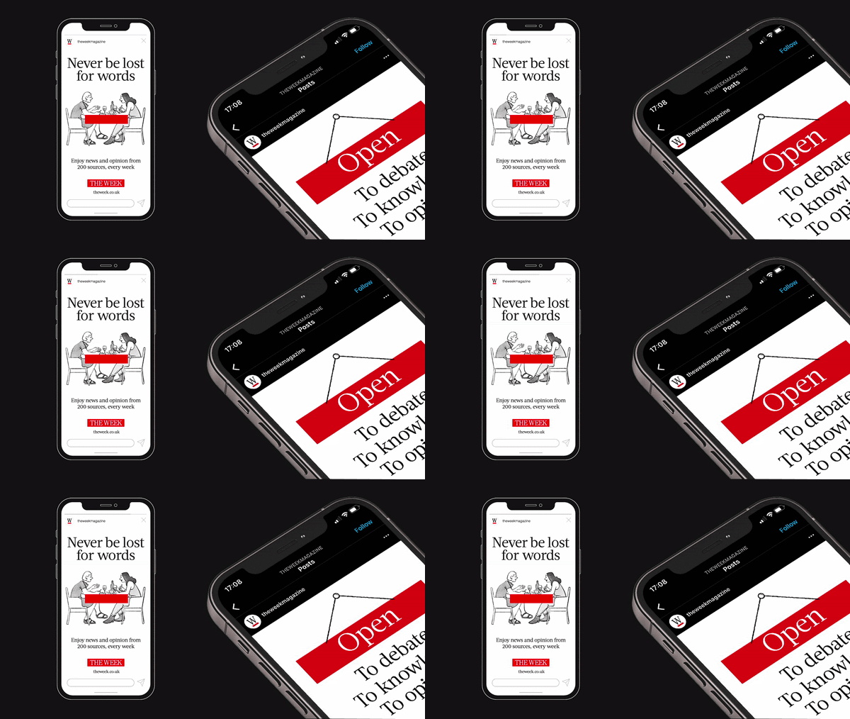
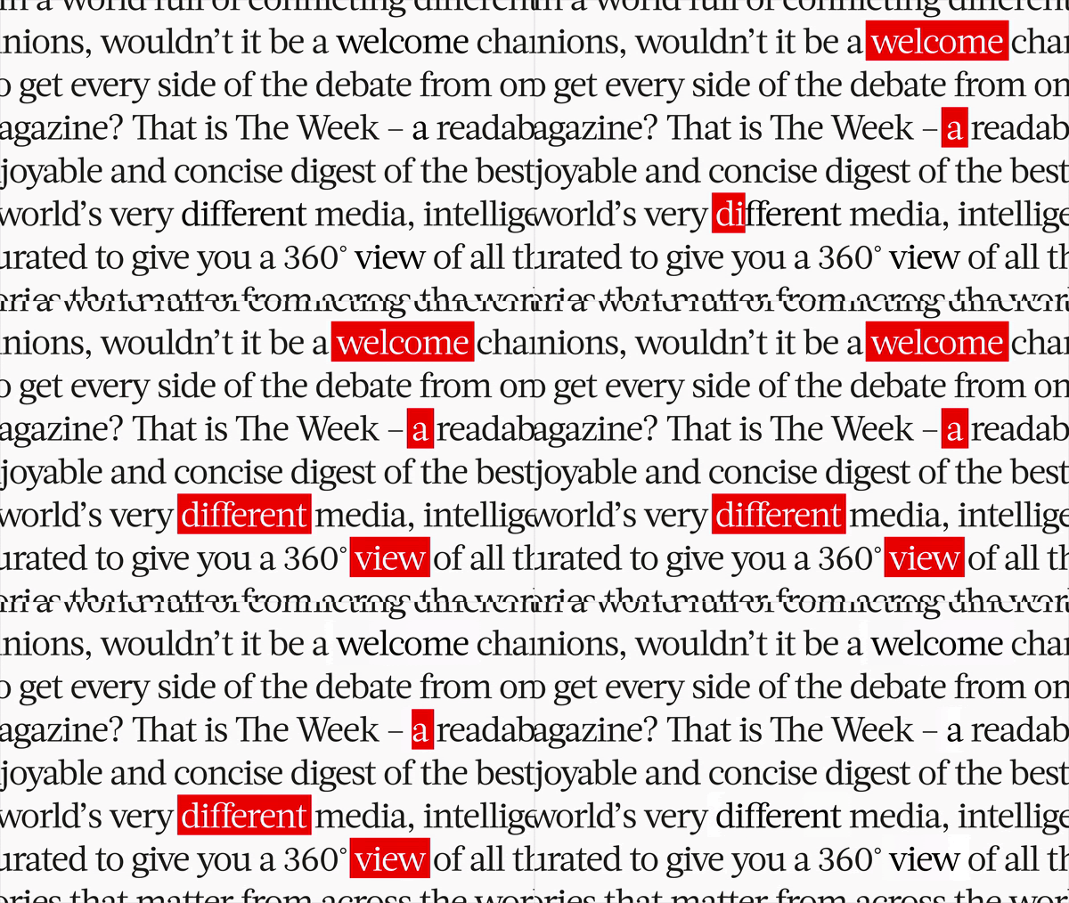
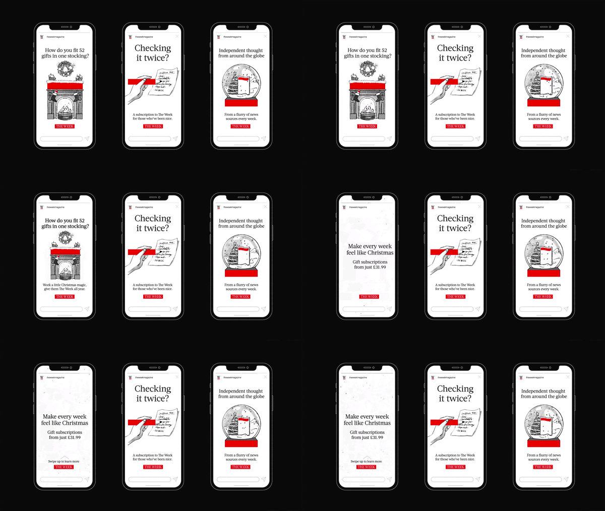
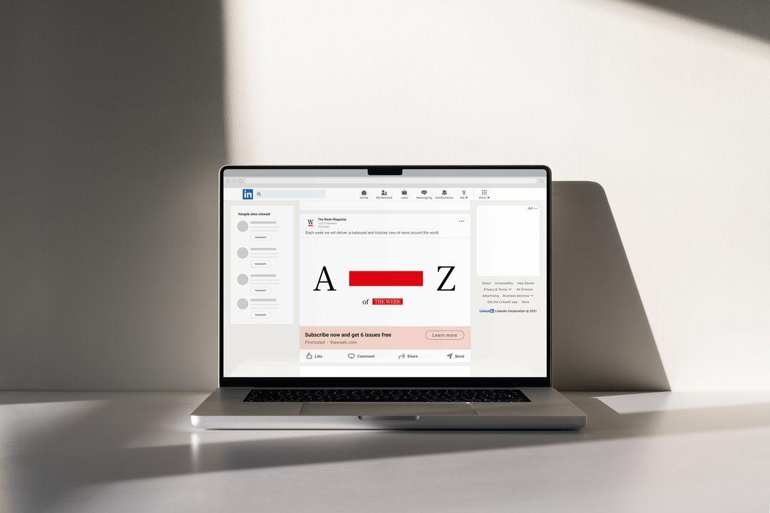
The campaign shows how the bar will sit at the centre of a whole new flexible design system. For example, the masthead will now feature across The Week’s digital current affairs coverage – whether reimagined as a hyphen, used as a highlighting tool to emphasise passages of copy, or a speech bubble to create a “quick tactical accent”. The new system will also be rolled out across other key digital assets, including social media, sales careers and promotional billboard messaging.
“The Week red masthead is so unique and versatile,” Andrew Lawrence, global executive creative director at Elmwood explains. “We quickly realised that, in design terms, it’s this potent symbol that’s hiding in plain sight. By heightening it into a key asset that cleverly interacts with copy, photography and illustrations, we recognised that we could hardwire The Week’s motto, ‘Enjoy a different view’. And we could do so in a manner that is infused with simplicity and a human touch, to expand the magazine’s reach.”
GalleryElmwood: The Week, illustration by Luis Mendo (Copyright © The Week / Elmwood, 2022)

Hero Header
Elmwood: The Week, illustration by Luis Mendo (Copyright © The Week / Elmwood, 2022)
Share Article
Further Info
About the Author
—
Liz (she/they) is the senior editor at Insights, a research-driven department within It’s Nice That. They previously ran the news section of the website. Get in contact with them for potential Insights collaborations or to discuss Insights’ public-facing reports.