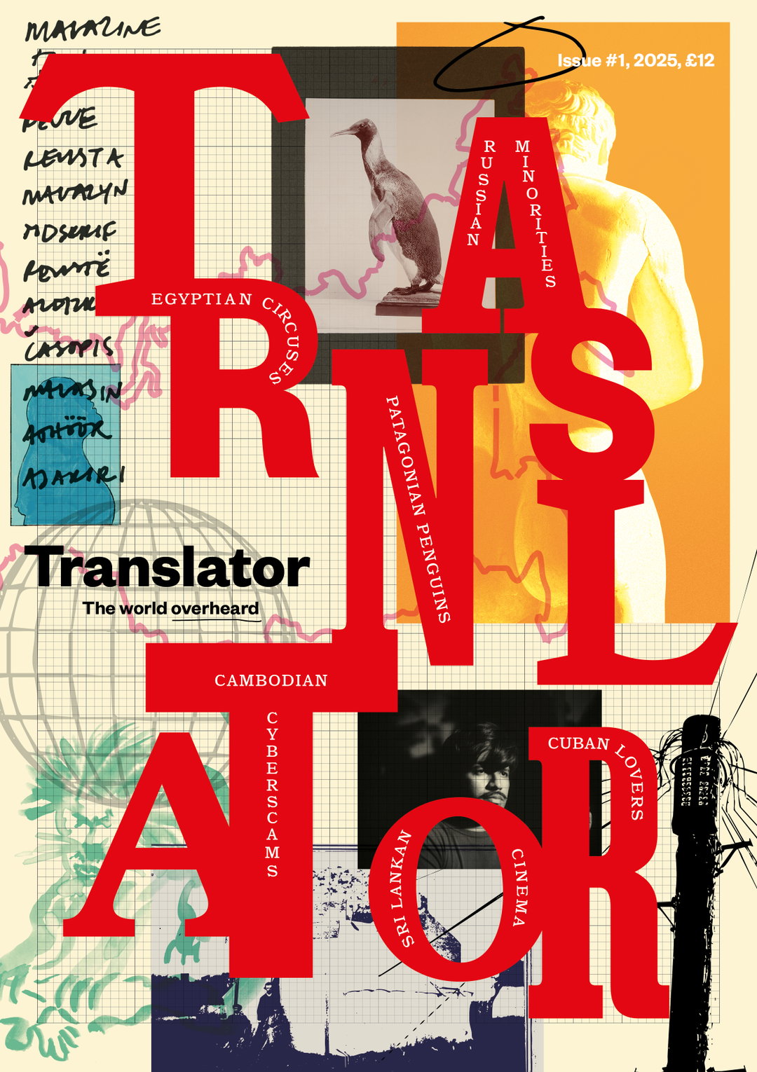
New translation publication from Magculture “combines the logics of newspaper and magazine design”
Translator pops the English-speaking bubble as it crosses linguistic borderlines, all powered by it’s rich and attentive design system.
Translator is a new globalised magazine that translates global journalism into English. On why he felt the need for such a publication, it’s founder and editor Charles Emmerson says it’s as if “the world only takes place in English.” Translator brings a solution to this mono-linguistic norm. In Charles’ words it, “gives readers a sense of the richness of media landscapes – and their preoccupation – beyond English, by translating what’s actually being read and written beyond the Anglosphere.” By expanding the lifespan of these articles across territories, they sit in a liminal borderline, made rich with various perspectives.
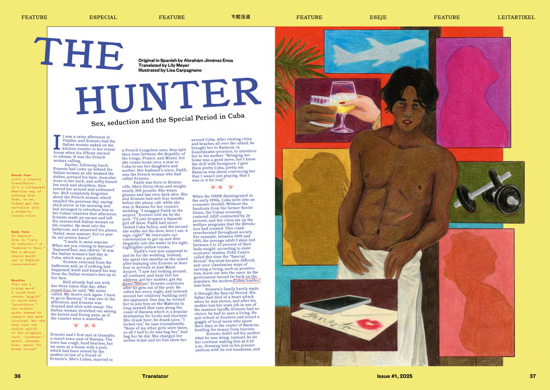
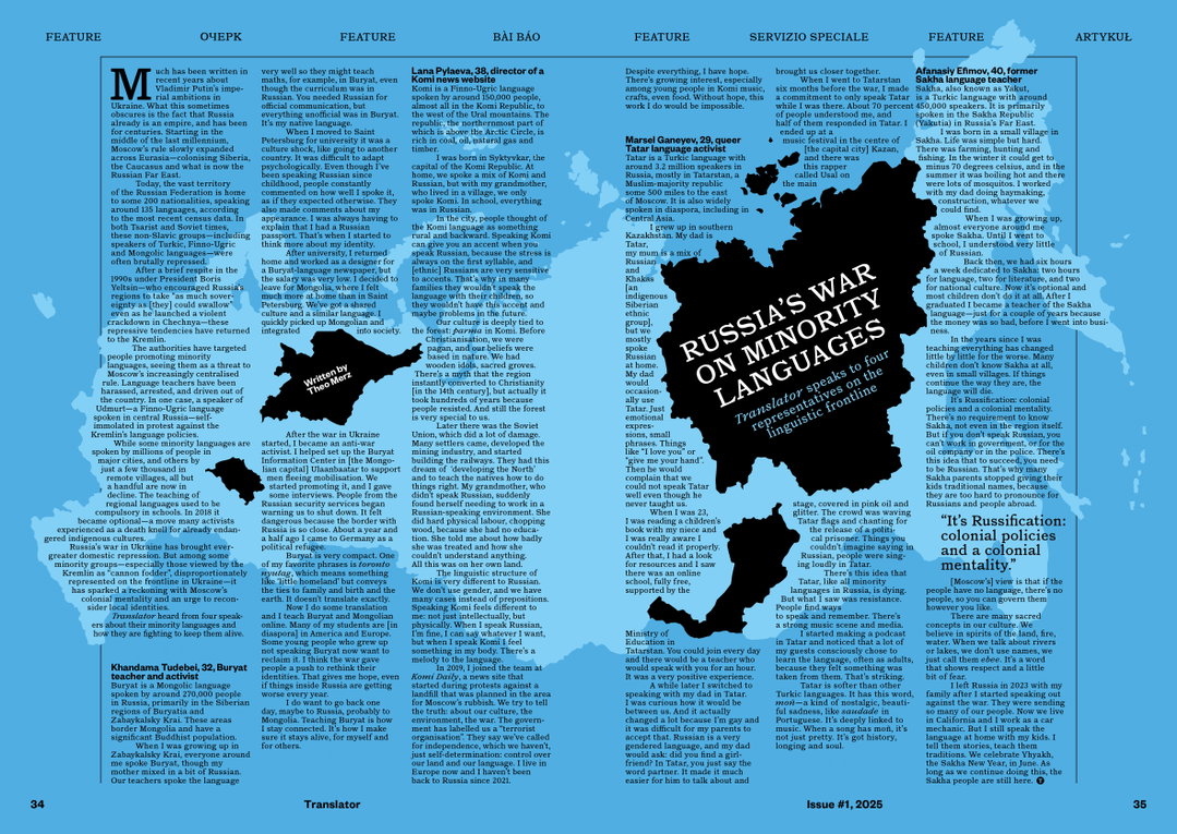
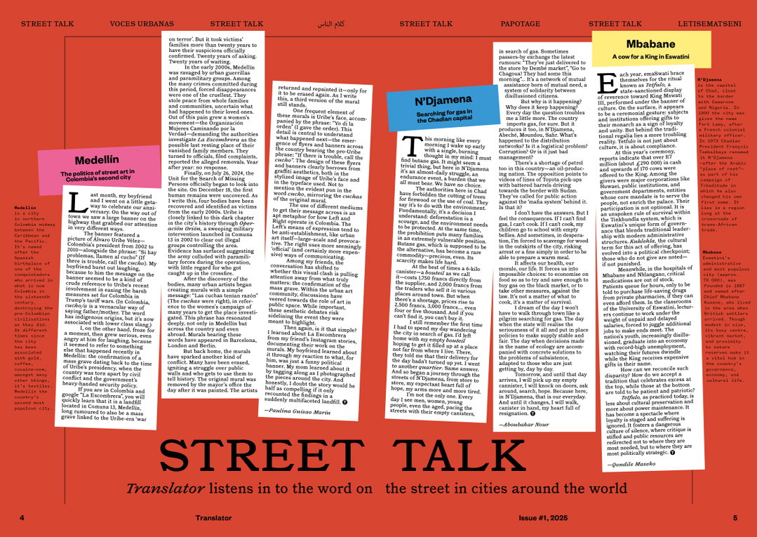
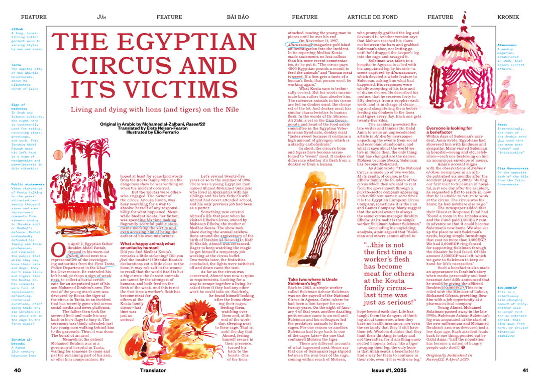
The publication is something of hybrid. Made in collaboration with Magculture’s creative director Jeremy Leslie, Canadian art director Osman Bari, and intern Harvey Scott Pirie, it “combines the logics of newspaper and magazine design,” says Jeremy, blending long-form journalistic pieces with responsive design.
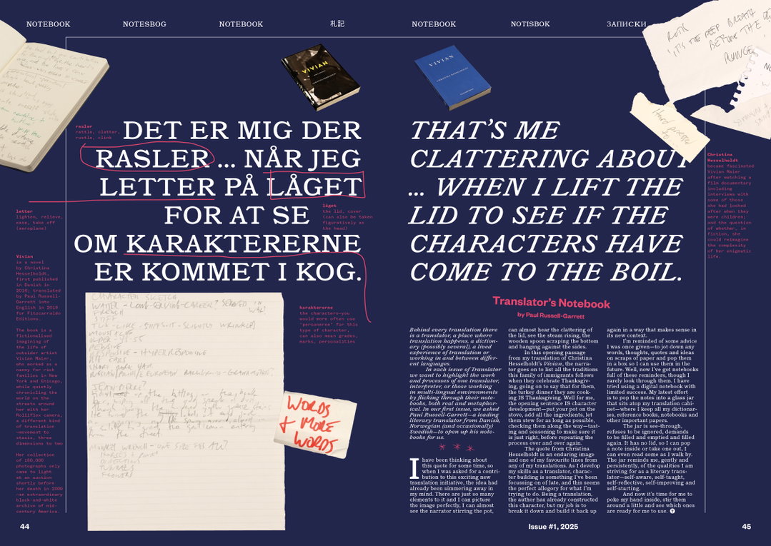
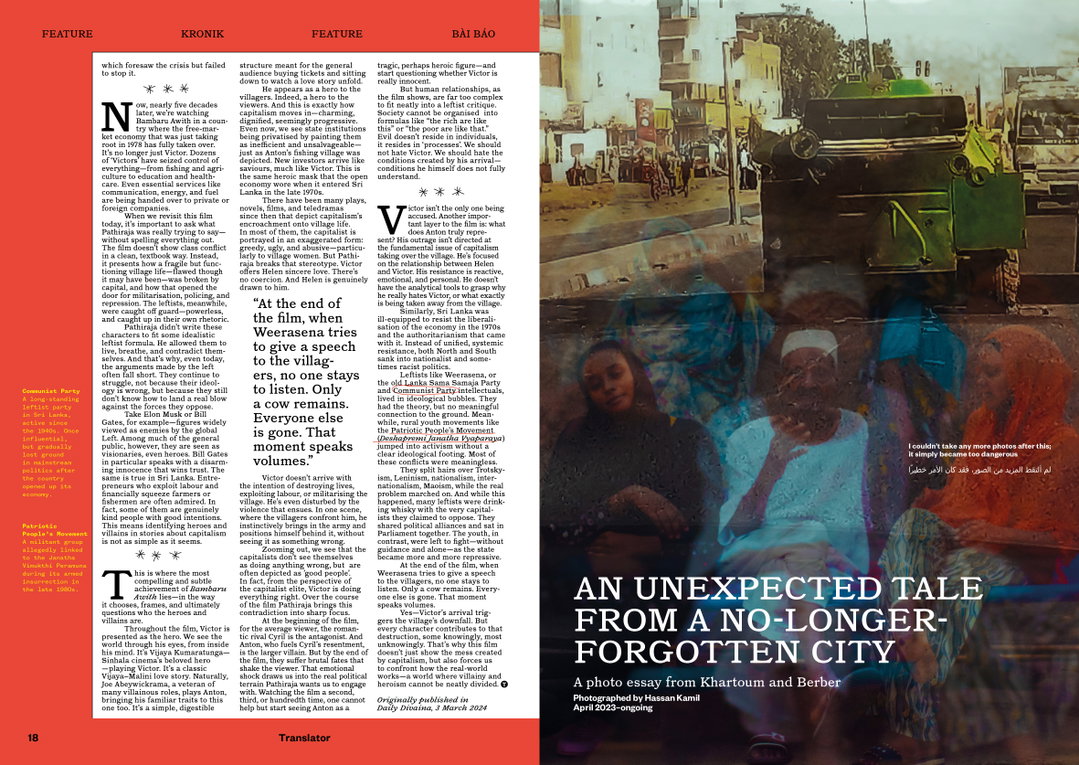
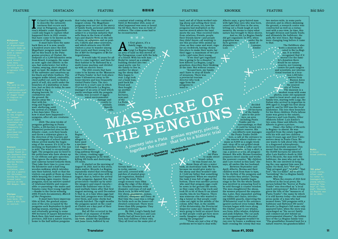
The Magculture team have considered every element of each page, even the glossaries beside articles are well placed and fitting of each page’s design ecosystem. An example of this is the striking page on Sri Lankan film Bambaru Avith (The Wasps Are Here) where informative meets aesthetic, strengthening immersion by it’s breaking down of the Sinhala language. Design is utilised to inform, accommodating readership with translator notes to create a diversity of thought – not only outside of the English language but cultures outside our own personal spheres of thought. Jeremy continues: “We wanted the pages to reference the international nature of the stories, but avoid flags, maps, and other cliches.” Instead, colour, marginalia, and cross-linguistic headers envelop and hold up the page.
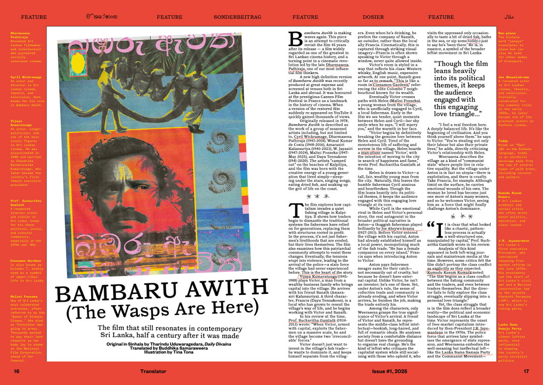
Translator (Copyright © Magculture / Charles Emmerson, 2025)
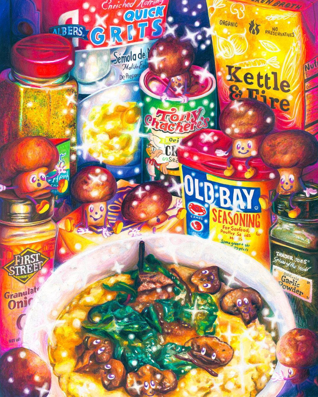
When bringing together varying styles of writing, all from differing sources and tones, the page needs to rely on design to create cohesion across the publication. The primary typeface used throughout Translator is LL Catalogue by Lineto, “chosen for the slight quirkiness it brought to the text, balancing character with newsy authority, especially when used for headlines”, Osman Bari says. Various art styles take centre stage across disciplines of pencil, digital, watercolour, and vector graphic formats.
This thoughtful long-form publication design marks a shift in remedying the harmful impacts social media has wreaked, serving as an antidote to the fast-moving world. Jeremy says: “What’s valuable about print? It offers more flexibility for bespoke design page by page; and leading from that, we humans take in and remember more from print than screen.” Osman continues to say that print offers “the choice to dip in and out of stories” when coupled with responsive design. When there is more on the plate, and you can chew with more intention.
As the world becomes more siloed off by personalised social media algorithms and greater exposure to smaller pools of opinion, while simultaneously becoming more interlinked, Translator offers a refreshing alternative. “Global journalism – the kind that allows us to understand each other better and hold power to account – is under threat from the inter-connected forces of economic, technological, and political change, and the flattening effects of monolingualism,” Jeremy concludes.
GalleryTranslator (Copyright © Magculture / Charles Emmerson, 2025)
Hero Header
Translator (Copyright © Magculture / Charles Emmerson, 2025)
Share Article
Further Info
About the Author
—
Sudi Jama (any pronouns) was a staff writer at It’s Nice That from April 2025–January 2026, and is now a freelance writer. They have a keen interest and research-driven approach to design and visual cultures in contextualising the realms of film, TV, and music.