Launch Recite Me assistive technology
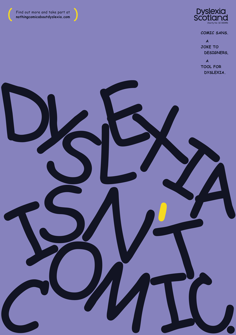
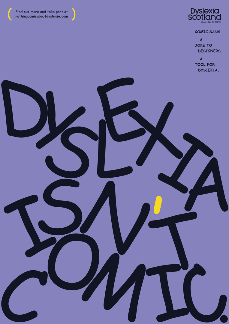
A purple poster featuring the words “DYSLEXIA ISN’T COMIC.” in large, distorted, hand-drawn black lettering. A single yellow mark sits above the “T” in “ISN’T”. In the top right, the Dyslexia Scotland logo appears above the text “COMIC SANS. A JOKE TO DESIGNERS, A TOOL FOR DYSLEXIA.”

If Comic Sans can help people with dyslexia, why is it still a punchline? A new campaign explores

This Dyslexia Awareness Month, Dyslexia Scotland asking designers to rethink how inclusive their design decisions are, harnessing the ultimate eye-catcher of a font.

—
Date
5 October 2022

Comic Sans is the comedic low-hanging fruit of the design world. Chastised for its unprofessional, primary school print-off capabilities, it’s a typeface that at one point or another, like Coldplay or Twilight, became cool to hate. But the denunciation of Comic Sans in design overlooks one of its greatest strengths: it can help people with dyslexia read texts more easily. As such, it’s the focal point of a new campaign from Dyslexia Scotland, together with Innocean Berlin and WeTransfer, for Dyslexia Awareness Month. Though the font is the eye-catching poster child, the campaign speaks to an even wider problem, hoping to raise awareness around the need for a more inclusive mindset at large in design.

So what makes Comic Sans so special? As a recent release from WeTransfer and Dyslexia Scotland explains, the “same irregularity which makes it so undesirable to designers is what helps people with dyslexia put into focus texts that otherwise feel overwhelmingly chaotic.” The campaign, titled There’s Nothing Comic About Dyslexia, adopts the use of the font across all assets, which range from print, film, OOH, social media posts and digital. WeTransfer supports the campaign with ad inventory, using its digital wallpapers and workflow features to spread the word on why “beautiful design and being dyslexia-friendly don’t need to be mutually exclusive,” the release adds.
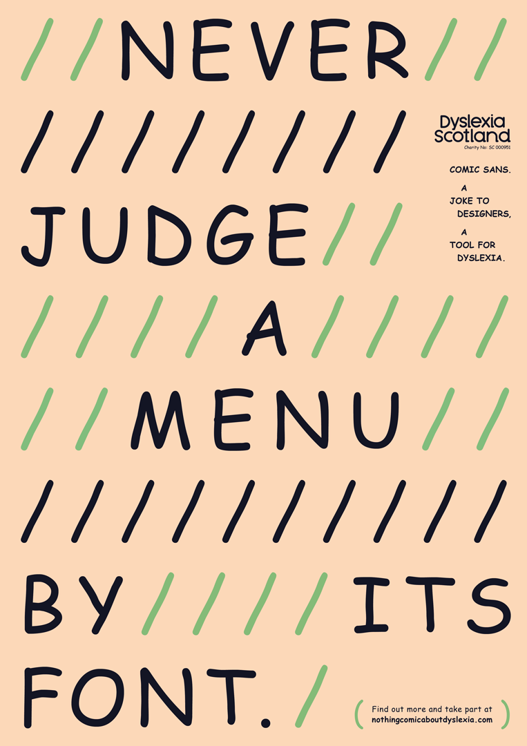
A typographic poster on a pale peach background reads “NEVER JUDGE A MENU BY ITS FONT.” The text is interrupted by rows of diagonal slashes in black and green. In the top right, the Dyslexia Scotland logo appears above text that reads “COMIC SANS. A JOKE TO DESIGNERS, A TOOL FOR DYSLEXIA.”
Above

Dyslexia Scotland / Innocean Berlin / WeTransfer: There’s Nothing Comic About Dyslexia (Copyright © Dyslexia Scotland / Innocean Berlin / WeTransfer, 2022)
Of course, “the objective of the campaign is not to make designers magically fall in love with Comic Sans,” the press release continues. Instead, it aims to serve as a reminder to all designers of the major role that they carry “to reflect the realities of people everywhere and use their influence to push for a more inclusive design mindset”. Even if this doesn’t mean turning to Comic Sans for their next project, it does mean designing or exploring dyslexia-friendly fonts.

“There’s Nothing Comic About Dyslexia creates the opportunity for designers to make a significant social impact, as well as an amazing creative one, for the dyslexic community,” Katie Carmichael, lead for creative and digital at Dyslexia Scotland explains. “ We hope that the campaign activates many more individuals, groups and whole sectors to take strides towards being innovative changemakers and we applaud the design community for being bold trailblazers on the journey to a more dyslexia-friendly mindset.”

GalleryDyslexia Scotland / Innocean Berlin / WeTransfer: There’s Nothing Comic About Dyslexia (Copyright © Dyslexia Scotland / Innocean Berlin / WeTransfer, 2022)
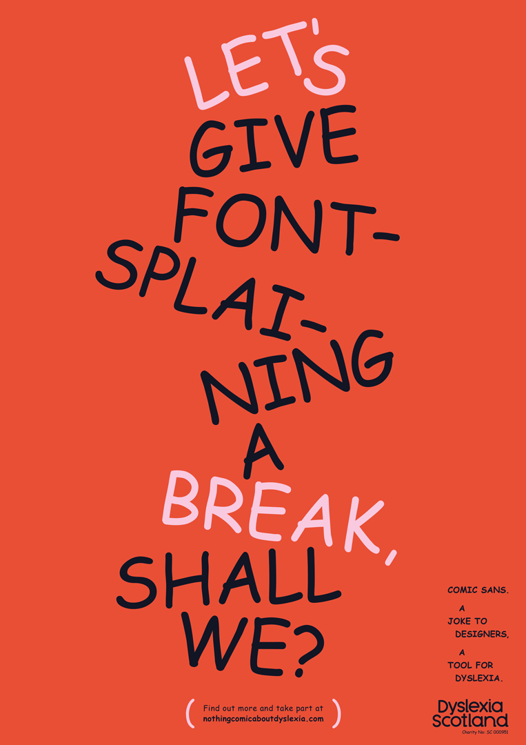
A bold typographic poster on a red background reads “LET’S GIVE FONT-SPLAINING A BREAK, SHALL WE?”. The text is arranged in a playful, curving layout using a handwritten style. Smaller text in the bottom right reads “COMIC SANS. A JOKE TO DESIGNERS, A TOOL FOR DYSLEXIA.” alongside the Dyslexia Scotland logo.
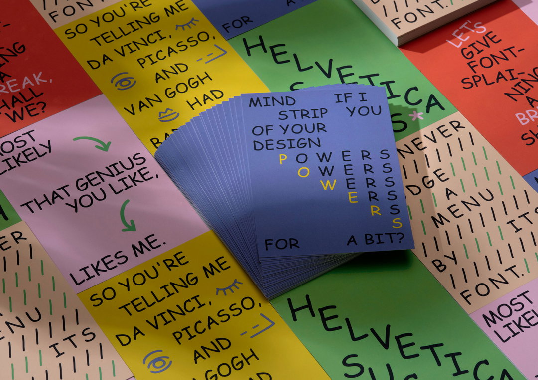
A stack of blue cards sits atop a collection of colourful cards featuring typographic jokes and design commentary. One blue card reads “Mind strip of your design” and “If I you a bit?” with the word “powers” repeated in a staggered layout.
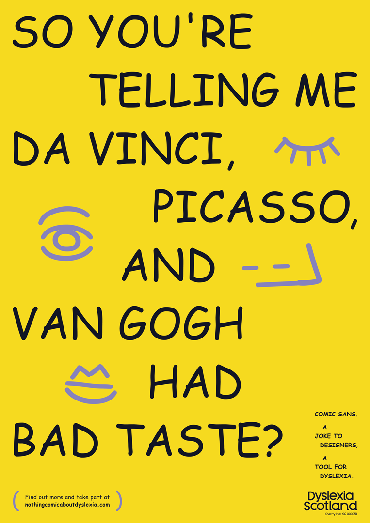
A yellow poster featuring bold, hand-drawn black text that reads “So you’re telling me Da Vinci, Picasso, and Van Gogh had bad taste?”. Simple purple line drawings of eyes are scattered around the names. Small text in the bottom right reads “Comic Sans. A joke to designers. A tool for dyslexia.” alongside the Dyslexia Scotland logo.
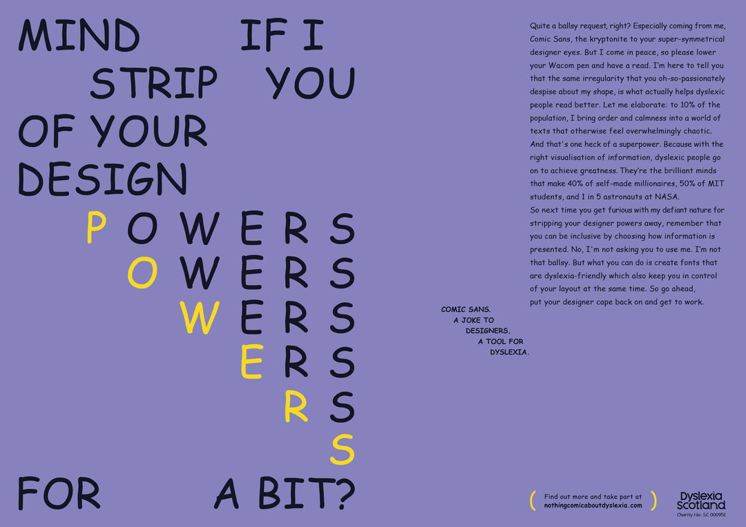
A purple poster featuring a typographic layout. The text reads “Mind if I strip you of your design powers for a bit?” with the word “powers” repeating and losing its first letter in each line. A block of text on the right explains the utility of Comic Sans for people with dyslexia, ending with the phrase “Comic Sans. A joke to designers, a tool for dyslexia.”
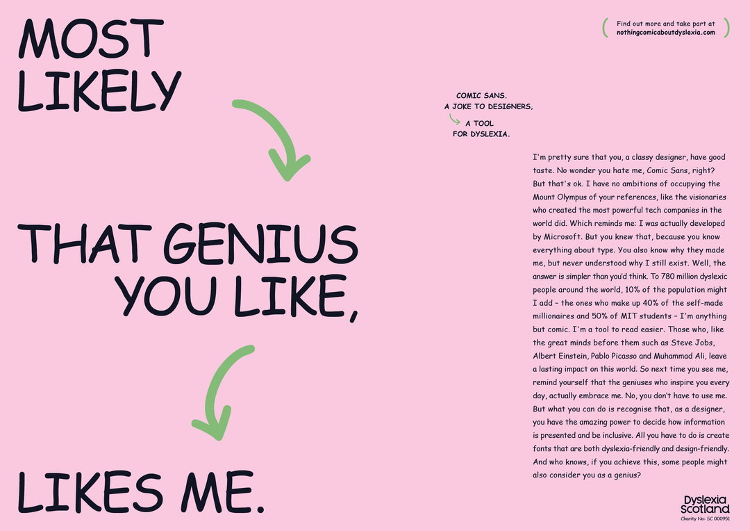
A pink graphic featuring bold, black typography that reads “MOST LIKELY THAT GENIUS YOU LIKE, LIKES ME.” Green arrows curve between the phrases. To the right, a block of text written from the perspective of the Comic Sans typeface explains its utility for people with dyslexia. The Dyslexia Scotland logo appears in the bottom right corner.
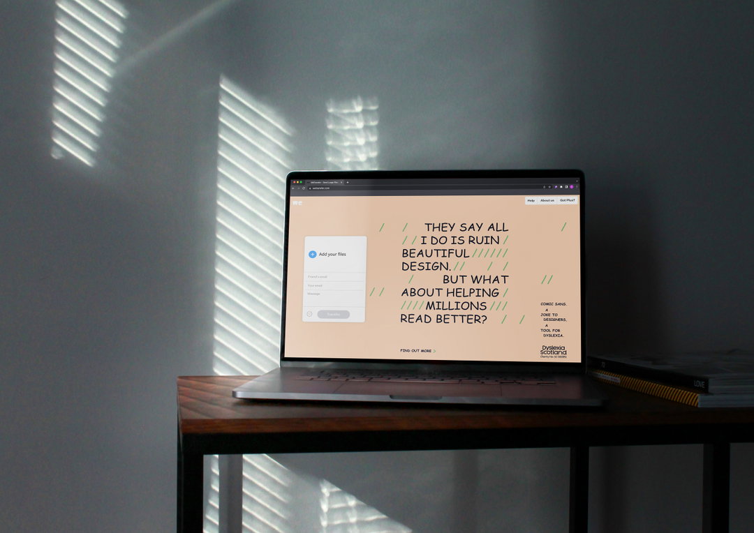
A laptop sits on a wooden desk against a grey wall, lit by sunlight filtering through blinds. The screen shows a website with a peach background and bold text that reads “THEY SAY ALL I DO IS RUIN BEAUTIFUL DESIGN. BUT WHAT ABOUT HELPING MILLIONS READ BETTER?”.
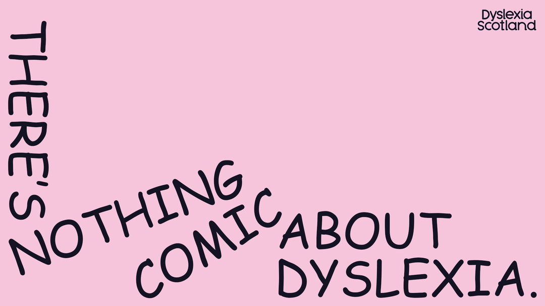
A typographic poster on a pink background reads “THERE’S NOTHING COMIC ABOUT DYSLEXIA.” The words are arranged in a jumbled, uneven layout. The Dyslexia Scotland logo appears in the top right corner.
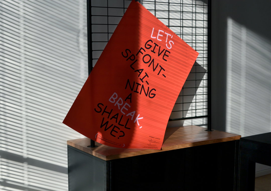
A red poster leans against a black metal grid, resting on a wooden surface. Bold black text reads “LET’S GIVE FONT-SPLAINING A BREAK, SHALL WE?”.
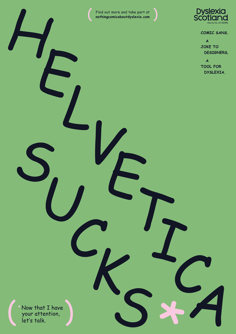
A green poster features the words “HELVETICA SUCKS” written in a bold, hand-drawn black script. A small pink asterisk sits at the end of the phrase. Text in the top right reads “Dyslexia Scotland” and “COMIC SANS. A JOKE TO DESIGNERS, A TOOL FOR DYSLEXIA.” A small note at the bottom reads, “Now that I have your attention, let’s talk.”

Hero Header

Dyslexia Scotland / Innocean Berlin / WeTransfer: There’s Nothing Comic About Dyslexia (Copyright © Dyslexia Scotland / Innocean Berlin / WeTransfer, 2022)
Share Article

About the Author

Liz Gorny

—

Liz (she/they) is the senior editor at Insights, a research-driven department within It’s Nice That. They previously ran the news section of the website. Get in contact with them for potential Insights collaborations or to discuss Insights’ public-facing reports.


It's Nice That Newsletters

Fancy a bit of It's Nice That in your inbox? Sign up to our newsletters and we'll keep you in the loop with everything good going on in the creative world.