Deliveroo reveals new logo, identity and courier kit by DesignStudio
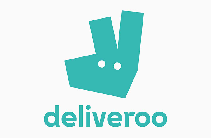
DesignStudio has rebranded food delivery app Deliveroo with a new logo and visual identity, including a cycling kit for its delivery couriers. The agency worked in collaboration with the brand’s in-house design team.
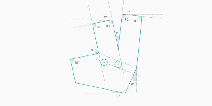
The new logo mark is an abstracted kangaroo face, “an evolution” of the original logo that also featured an illustration of the animal. It uses the brand’s teal colour in the icon, which is a less literal, more graphical and geometric symbol that can “work as a favicon as well as it could on a billboard,” says the design team. Sketches on Deliveroo’s blog show rough concepts for the new logo exploring whether or not to retain the “Roo” in the company branding.
DesignStudio has also introduced a lower case type treatment for the visual identity, which is used in the cycling kit for its delivery couriers. The kit, including jerseys and jackets, was designed in collaboration with road safety organisation Brake to be safer and more comfortable.
The studio has also redesigned the company’s app and website.
DesignStudio: Deliveroo rebrand
DesignStudio: Deliveroo rebrand
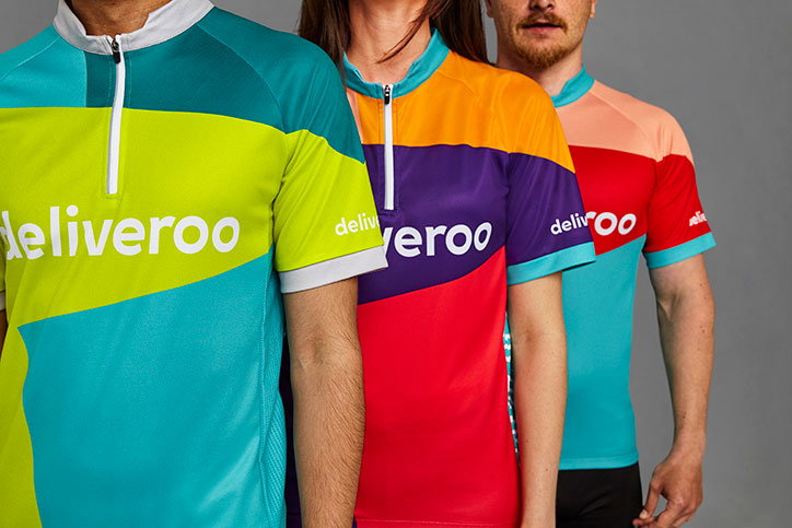
DesignStudio: Deliveroo rebrand
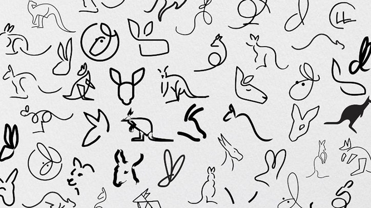
DesignStudio: Deliveroo rebrand
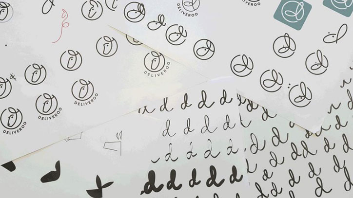
DesignStudio: Deliveroo rebrand
Share Article
Further Info
About the Author
—
Jenny oversees editorial output across It’s Nice That. Get in touch with writing pitches for features or opinion pieces, big creative story tips, or questions about all things editorial. jb@itsnicethat.com
To submit your work to be featured on the site, please see our Submissions Guide.