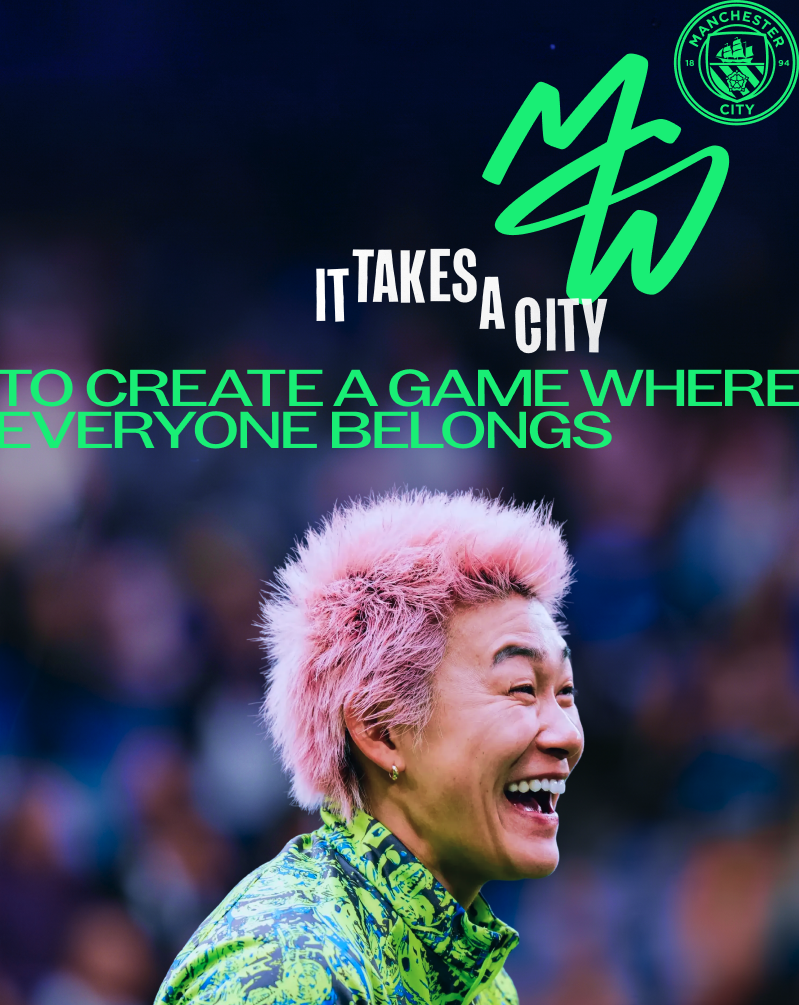
Manchester City Women becomes the first WSL team have its own distinct identity
Football specialist Nomad Studio has been enlisted to bring something unique and ‘ownable’ to women-first fans, resulting in a sleek monogram made out of ‘light’.
Manchester City has become the first team in the Women’s Super League, the highest level of women’s football in the UK, to receive a brand and identity distinct from its adjacent men’s team. While the club’s visual world will still stay closely connected to and in harmony with the club’s overarching master brand, the move comes after extensive internal club research revealed that the women’s team audience significantly diverges from the men’s. The new look has been devised by Nomad, a studio with extensive experience in the footballing world, having created for the likes of FA Women’s Super League, FA Premier League, the East London women’s grassroots team Hackney Laces, and the Football Manager game.
It was the team’s historic double last 2025/26 season, winning the league and FA Cup, that Sally Sheppard, director of marketing, stadium revenue and fan experience at Manchester City Women, says solidified the team’s need for its own brand. “It became really clear that we needed a more consistent way to tell the story of the women’s team,” says Sally, “our pioneering spirit, the number of firsts [Manchester City was the first club to take its women’s team professional], our individuality, our ambition, and this genuine sense of togetherness.”
The decision also came after long-running, extensive research into the club’s audience demographics which revealed three core groups, ‘men’s-first fans’ at one end of the spectrum, and ‘women’s-first fans’ at the other end, with a smaller group of ‘equally-interested fans’ sitting in the middle. Research into the women’s-first group differed significantly from the men’s-first, and uncovered that fans were predominantly women, younger, families and likely to be part of LGBTQ+ community. “We found that we needed to find a new and different way to connect with this new wave of women’s football fans coming in that felt really relevant to them,” adds Sally.
Copyright © Nomad Studios / Manchester City Women, 2026
The rebrand is underpinned by interviews with both players and fans from the official Supporters Club. What the team wanted to uncover from both sets of interviews was the “connection points” between the two, where their stories and connections to the club intersected. “What we found was that their loyalty and connection was really deep,” says Sally. “Man City Women is more than a football team. It’s a community, it’s a family.” This led the team to create a guiding position that went beyond the football on the pitch, but encapsulated the players, the staff, the fans as one, resulting in the tagline: ‘It takes a city’.
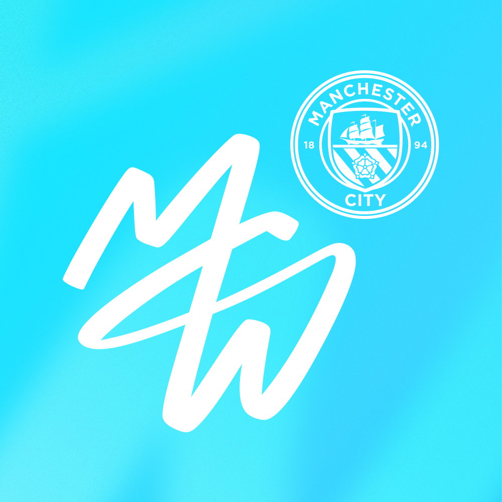
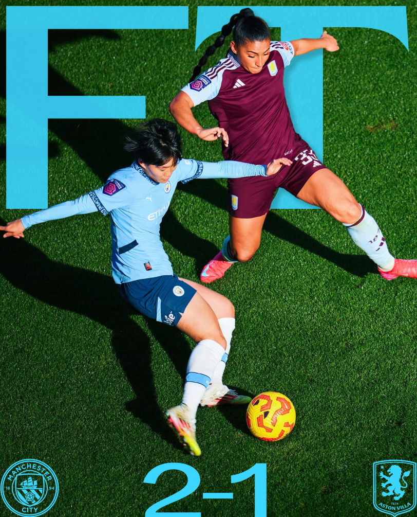
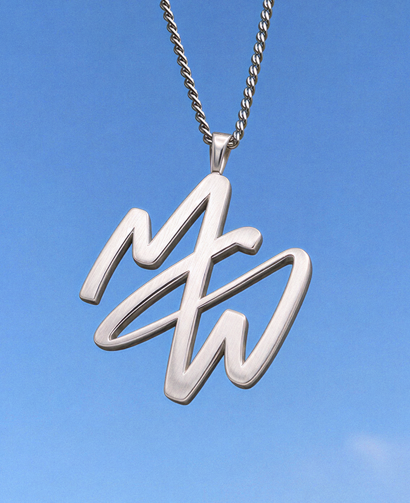
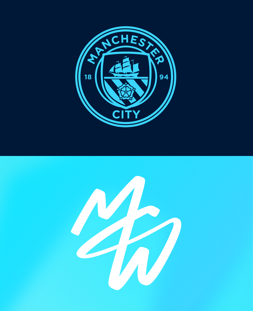
Sitting at the heart of the new look is a sleek monogram. It takes the M, C and W of Manchester City Women and joins them together with one flourish that adapts to applications, as seen finished with sky blue, neon colours and flashy chrome accents. The concept behind this secondary IP symbol is that it’s made of light, and referred to internally as the ‘light trail’; as Sally puts it, “it’s the light leading the way”. Having an icon that the Women’s supporters could ‘own’, identify with and fully get behind was important to designers Nomad: “In 2017, we rebranded the FA WSL – a milestone moment for women’s football and the start of a much bigger shift,” says Natalie Doto, creative director at Nomad. “Since then, the women’s game has stopped asking how it can mirror men’s football and started defining what makes it different.” While staying true to aspects of the lasting Manchester City brand (the crest will stay central in all visual output), the monogram offers something unique. “Inspired by City Women’s history of firsts, the monogram is a promise to light the path for others,” says Natalie. “It serves as a universal symbol, something anyone can recreate or sign up to – grounded in the team’s ambition, culture, and supporters.”
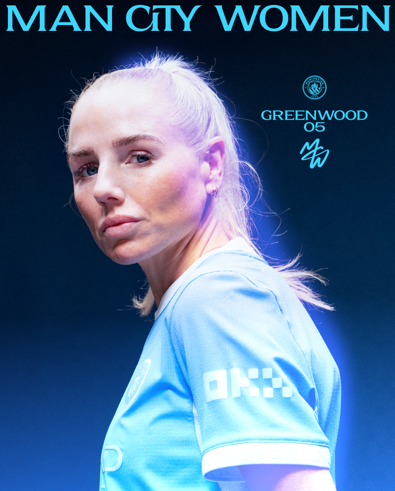
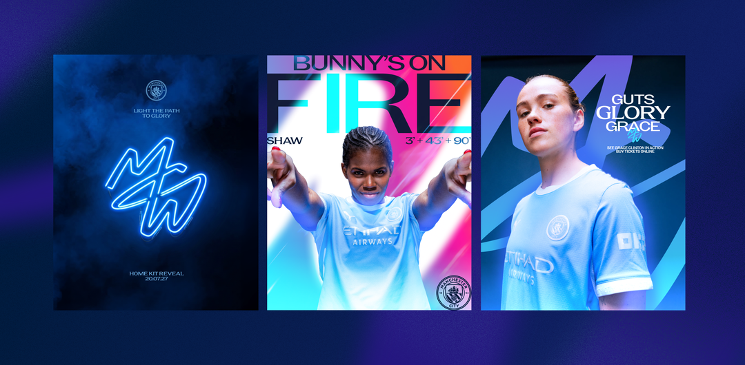
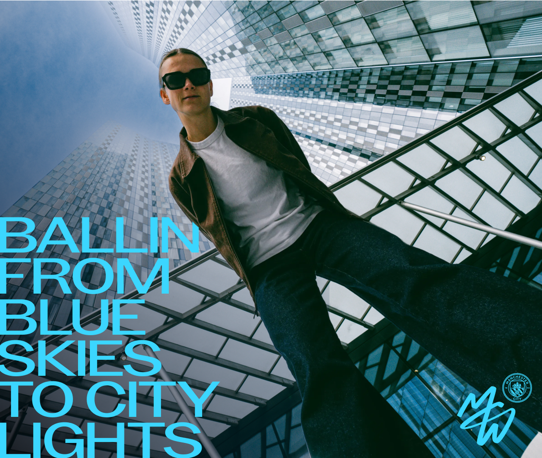
Much of the new look is still to be rolled out, with retail options also coming soon. One thing you can be sure to expect is more vibrancy and colour from the identity. While the iconic City sky blue will remain integral, a more varied wash of hues is being used to “reflect the match day experience”, says Sally. “I think we’ve struck the right balance between connection and distinction, and it’s going to be really interesting to see how that goes moving forwards,” ends Sally. “I’m really excited to start seeing it come to life.”
GalleryCopyright © Nomad Studios / Manchester City Women, 2026
Hero Header
Copyright © Nomad Studios / Manchester City Women, 2026
Share Article
Further Info
About the Author
—
Olivia (she/her) is associate editor of the website, overseeing the day-to-day editorial projects as well as Nicer Tuesdays events. She joined the It’s Nice That team in 2021. ofh@itsnicethat.com
To submit your work to be featured on the site, see our Submissions Guide.